10,000 search results
(0.019 seconds)
- Castorgate Wide - Unknown license

- Brenda Spencer - Unknown license

- Valeria Script by Lián Types,
$7.00Valeria Script is an experimental font, calligraphy based, with attractive results. Go for Valeria Script Cola pen for more ink explosion! - Nightingale by Teweka,
$10.00 Introducing Nightingale calligraphy font. Nightingale have a 631 glyph, Nightingale works well in Logo, poster, title, header, clothing and many more.
 - Raisley by Forberas Club,
$16.00 Raisley si handwritten font. Nice to application for wedding party, invitation, memorable moment, love story and many more with special moment.
 - Secca Stencil by astype,
$42.00Secca Stencil is a special display font for the Secca font series. For more info look for Secca and Secca Soft . - Presentation JNL by Jeff Levine,
$29.00 Presentation JNL is built on the letterforms of Gilbert JNL (which in turn was modeled after Eric Gill's classic sanserif design).
 - Bilanthy by Maulana Creative,
$13.00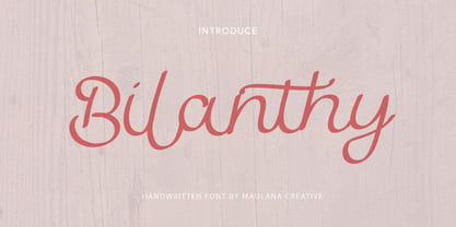 Give your designs an authentic handcrafted feel. � Bilanthy Handwritten Font� is perfectly suited to stationery, logos and much more. Many Thanks!
 - Chinese Menu JNL by Jeff Levine,
$29.00Modeled after an old sign on a building in New York City, Chinese Menu JNL is a modular style Oriental typeface. - My Home by Typefactory,
$14.00 My Home is a Fun Handwritten Font, Perfectly suitable for creating quotes, kids book, t-shirts, poster, mockup, and many more.
 - Easy Living JNL by Jeff Levine,
$29.00 Easy Living JNL is a bold Art Deco type face modeled from the name of a 1930s magazine entitled "Country Living".
 - Number5 Reg by Wooden Type Fonts,
$15.00 A William Page font, a variation of the William Page 500 font, with wider lower case, more clearly worked upper case.
 - One Thin Line by Gleb Guralnyk,
$13.00 Hi! Introducing a simple minimalistic font named "One Thin Line". Because almost all letters and characters are made of one line.
 - Story by Suomi,
$25.00 Story font is an experiment to convert the script-style calligraphy into bitmap format. Made alongside Tale fonts, with different design.
 - Logistra by Riasyletter_Studio,
$19.00 Make the typography logo on your brand more elegant and professional by using the Logistra font, The Logistra font is a serif font that has thick and thin strokes that contrast in the glyphs and is made with a straight line structure and smooth curves so that the Logistra font looks professional and elegant, and there are alternative letters and ligatures to make your typography design look unique and attractive. Logistra font is also perfect for various projects such as hand lettering, merchandise, advertisements, invitations, social media posts, video thumbnails, quotes and etc. What's Included : - Logistra (otf/ttf/woff) - More than 280 of glyphs (include Uppercase, Lowercase, Numerals & Punctuations,Ligatures and Stylistic) - multilingual support - Works on PC & Mac - Simple installations - Accessible in the Adobe Illustrator, Adobe Photoshop, Adobe InDesign, even work on Microsoft Word. - PUA Encoded Characters (fully accessible without additional design software) Support For Language : Albanian, Basque, Breton, Chamorro, Danish, Dutch, English, Finnish, French, Frisian, Galician, German, Italian, Malagasy, Norwegian, Portuguese, Spanish, Alsatian, Aragonese, Arapaho, Arrernte, Asturian, Aymara, Bislama, Cebuano, Corsican, Fijian, French_creole, Genoese, Gilbertese, Greenlandic, Haitian_creole, Hiligaynon, Hmong, Hopi, Ibanag, Iloko_ilokano, Indonesian, Interglossa_glosa, Interlingua, Irish_gaelic, Jerriais, Lojban, Lombard, Luxembourgeois, Manx, Mohawk, Norfolk_pitcairnese, Occitan, Oromo, Pangasinan, Papiamento, Piedmontese, Potawatomi, Rhaeto-romance, Romansh, Rotokas, Sami_lule, Samoan, Sardinian, Scots_gaelic, Seychelles_creole, Shona, Sicilian, Somali, Southern_ndebele, Swahili, Swati_swazi, Tagalog_filipino_pilipino, Tetum, Tok_pisin, Uyghur_latinized, Volapuk, Walloon, Warlpiri, Xhosa, Yapese, Zulu, Latinbasic, Ubasic, Demo
 - FF DIN Paneuropean Variable by FontFont,
$629.99 FF DIN: the famous, faithful and first revival of DIN 1451. FF DIN originates in the lettering models from the German standard DIN 1451, and is considered the perfect standard typeface due to methodical and engineered design. FF DIN Variable offers you more FF DIN than ever before. Pushing font technology to its limits, Variable fonts provide creatives a tool to dial in hyper specific variations which thrive in any design space. FF DIN Variable take bold steps in engineering, which the typefaces behaviour which brings in FF DIN’s technical look-and-feel into the smooth and almost organic world of Variable Fonts. Available in both upright and italic styles, there is a lot more FF DIN to discover with new era of type technology. FF DIN Italic is a sloped roman style, however it is optically corrected – slightly thinner, slightly narrower. As a result, FF DIN Italic stands out subtly. FF DIN Variable stays faithful to its parent’s DNA, the utmost care was taken to ensure that the new instances of FF DIN Variable remained consistent with all the well-known weights. Precision is the mantra of FF DIN, the FF DIN Variable is no exception to this design philosophy. Produce exquisitely fine-tuned typography and expressive animated headlines for any design. Infinite styles, intelligent, and powerful.
 - Qualion Text by ROHH,
$39.00 Qualion Text™ is a modern geometric sans serif typeface with humanist and calligraphic inspirations. It is a text family designed for excellent legibility. Qualion Text™ is a sibling of Qualion™ & Qualion Round™, geometric family with lots of swashes and ornaments. Letter shapes and proportions has been adjusted to fit paragraph text and small sizes: - typeface is narrower now in order to fit more text in the design space - larger stroke contrast - pronounced ink traps and tapering - elegant true italics made even more calligraphic - adjusted spacing and kerning - adjusted font weights The main purpose of the family is clean and legible paragraph text, however it is very attractive choice for branding, headlines and display use, too. The italic styles as well as thin, bold and black upright styles have very strong character and look great in display sizes. Italics are very fluent, calligraphic, subtle and elegant, from the other side bold and black uprigths are very modern, powerful and unique thanks to the pronounced ink traps. Qualion Text™ family consists of 20 styles - 10 weights with corresponding true italics. Both have extended language support, as well as broad number of OpenType features, such as small caps, case sensitive forms, standard and discretionary ligatures, swashes, stylistic sets, contextual alternates, lining, oldstyle, tabular and small cap figures, slashed zero, fractions, superscript and subscript, ordinals, currencies and symbols.
 - Right Swipe by Din Studio,
$25.00 Right Swipe is a fantastic sans serif brush font duo. The sans serif font, in the Right Swipe, is the epitome of simplicity and elegance. Designed in uppercase, it boasts clean lines and a minimalist aesthetic, making a versatile look. This sans serif typeface is all about timeless sophistication and modern appeal. In contrast to its sans serif, the brush font adds a touch of creativity and spontaneity to the duo. The brush font's characters are made in round shapes and consistent proportions, creating a harmonious appearance. Each letter is meticulously crafted with fluid strokes, evoking a sense of warmth and approachability. Together, this duo offers a harmonious balance of elegance and creativity. This combination of a simple and refined sans serif font with a warm and inviting brush font allows you to strike the perfect tone for your design projects. In addition, enjoy the features here. Features: Multilingual Supports PUA Encoded Numerals and Punctuations Right Swipe fits in headlines, logos, posters, flyers, branding materials, print media, editorial layouts, and many more vintage-inspired designs. Find out more ways to use this font by taking a look at the font preview. Thanks for purchasing our fonts. Hopefully, you have a great time using our font. Feel free to contact us anytime for further information or when you have trouble with the font. Thanks a lot and happy designing.
 - Kaizen by Colllab Studio,
$9.00 Presenting Kaizen! A Bold Handbrush Font in 2 Versions. This font made with the perfect combination of each character. You can combine with Extra to get a unique combination. It looks original and can be used for all your project needs. Each glyph has its own uniqueness and when meeting with others will provide dynamic and pleasing proximity. This font can be used at any time and in any project. You can see in the presentation picture above, Kaizen looks unique and Japanese style on design projects. So, Kaizen can't wait to give its touch to all your design projects such as quotes, poster design, personal branding, promotional materials, website, logotype, product packaging, etc. WHAT'S INCLUDED? 1. Kaizen Version One (Solid) • The first version comes with uppercase, lowercase, ligatures, numeral, punctuation, symbols, and Standard Latin Multilingual Support (Afrikaans, Albanian, Catalan, Danish, Dutch, English, French, German, Icelandic, Indonesian, Italian, Malay, Norwegian, Portuguese, Spanisch, Swedish, Zulu, and More). 2. Kaizen Version Two (Inline texture) • The first version comes with uppercase, lowercase, ligatures, numeral, punctuation, symbols, and Standard Latin Multilingual Support (Afrikaans, Albanian, Catalan, Danish, Dutch, English, French, German, Icelandic, Indonesian, Italian, Malay, Norwegian, Portuguese, Spanisch, Swedish, Zulu, and More). 2. Extra Swashes • Included 6 Underline Swashes. You can feature all with typing c_1 until c_6 (in both versions) A Million Thanks Colllab Studio
 - Studio Neon by LLW Studio,
$22.00 Studio Neon is an all-caps display font constructed with three rounded-end strokes; the lowercase set is included as a repeat of the uppercase to make setting type just that little bit easier. It’s a modern rendition of neon sign lettering, with a decidedly art deco pedigree, and is intended for use in larger sizes of type, upwards of 36 pt. It’s perfect for a design that wants to imitate neon — use Photoshop layer effects to light it up! I originally started this font with only a few letters, since I could not find a neon-style font made with 3 strokes that looked modern. (Once I started, I found out why. It's a LOT of work!) Most traditional neon fonts include a “bent tube” element in the design; however, not all modern neon signage is constructed with the tubes bent. I also wanted to design a fun font that would have more life than just as an imitation of signage — something to inspire designers who love the geometry of art-deco type. So I made all the corners consistent, with no references to bent tubes. Use this font for any application that needs a bold and decorative look. Studio Neon should work well for sign production and even vinyl cut applications at larger sizes.
 - Belugia by Riasyletter_Studio,
$19.00 Make the typography logo on your brand more elegant and professional by using the Belugia font, Belugia font is a serif font that has thick and thin strokes that contrast in the glyphs and is made with a straight line structure and smooth curves so that the Belugia font looks professional and elegant, and there are alternative letters and ligatures to make your typography design look unique and attractive. Belugia font is also perfect for various projects such as hand lettering, merchandise, advertisements, invitations, social media posts, video thumbnails, quotes and etc. What's Included : - More than 310 of glyphs (include Uppercase, Lowercase, Numerals & Punctuations, Ligatures and Stylistic) - multilingual support - Works on PC & Mac - Simple installations - Accessible in the Adobe Illustrator, Adobe Photoshop, Adobe InDesign, even work on Microsoft Word. - PUA Encoded Characters (fully accessible without additional design software) Support For Language : Albanian, Basque, Breton, Chamorro, Danish, Dutch, English, Finnish, French, Frisian, Galician, German, Italian, Malagasy, Norwegian, Portuguese, Spanish, Alsatian, Aragonese, Arapaho, Arrernte, Asturian, Aymara, Bislama, Cebuano, Corsican, Fijian, French_creole, Genoese, Gilbertese, Greenlandic, Haitian_creole, Hiligaynon, Hmong, Hopi, Ibanag, Iloko_ilokano, Indonesian, Interglossa_glosa, Interlingua, Irish_gaelic, Jerriais, Lojban, Lombard, Luxembourgeois, Manx, Mohawk, Norfolk_pitcairnese, Occitan, Oromo, Pangasinan, Papiamento, Piedmontese, Potawatomi, Rhaeto-romance, Romansh, Rotokas, Sami_lule, Samoan, Sardinian, Scots_gaelic, Seychelles_creole, Shona, Sicilian, Somali, Southern_ndebele, Swahili, Swati_swazi, Tagalog_filipino_pilipino, Tetum, Tok_pisin, Uyghur_latinized, Volapuk, Walloon, Warlpiri, Xhosa, Yapese, Zulu, Latinbasic, Ubasic, Demo
 - Akagi Pro by Positype,
$29.00 Akagi Pro is a complete rebuild and expansion of my popular Akagi typeface. Contemporary, clean, simple and friendly continue to serve as the adjectives for an expansion that includes 250+ additional characters per weight, many new ligature options, expanded stylistic alternates, 4 sets of figures, new symbols, case-sensitive punctuation, superscripts, subscripts, ordinals, expanded language support and two new styles that provide even more flexibility within the lighter weights of the family. When I designed Akagi in 2007, I wanted this new sans serif to "smile" at you — with this new expansion, I hope you smile back. Akagi Pro is economical while keeping a distinctive, expressive personality on the page that distinguishes it from among many of the mechanical/rigid/emotionless sans out there without becoming cliché. Perfect for the page and the screen, the flexible weights available allow for pinpoint selection at whatever size. Each style of Akagi Pro has a robust character set made even more functional with expansive OpenType features. A typesetter's dream — case-sensitive punctuation, tabular and proportional variants of lining and oldstyle numerals, true italics, small caps, expansive language support, an alternate 'g' and 'y', highlight a wealth of features of the typeface. This versatility infused within Akagi Pro will allow it to assume both roles of the utilitarian workhorse and light-hearted go-to typeface — and make the user happy.
 - Street Punks by Wing's Art Studio,
$10.00 Street Punks: Graffiti Inspired Marker Pen and Paint Brush Font A hand-drawn font inspired by graffiti and skate culture that comes in two pen and paint styles. Plus a shed-load of alternatives for designs that come straight off the pen (or brush). What happens when you combine graffiti, skate culture and 80s movies? You get Street Punks; a gritty, no-nonsense design that's equally at home on a ripped t-shirt or opening a horror movie (with ninjas!) Choose the slick look of marker pens or the textured roughness of paint brushes. Mix them up, play around and have fun. It's up to you! Street Punks comes with a complete set of alternatives and underlines with each style, so you’ll never have to repeat an E or an I; the tale-tell signs that give away other hand-made fonts. It also features all-caps uppercase and lowercase characters, along with numerals, punctuation and language support. It's a font that gives you tools to create some truly unique designs with just a little bit of work. The perfect choice for t-shirts, posters, stickers, movie titles, YouTubers and more! Street Punks: Marker and Paint Marker Regular Marker Alternative Marker Underlines* Paint Regular Paint Alternative Paint Underlines* *Underlines are assigned to keys: ABCDEFGHIJKLMNOP Find more from The Video Store Collection at Wingsart Studio
 - Axial cut by deFharo,
$21.00 Axial Cut is a sans serif typeface (Latin Extended-A), a contemporary and rounded evolution of geometric fonts for screen, but this time the letters are built on an axial axis that results in trapezoidal counter-shapes, joints with reduced antlers and rounded corners that correct optical effects in small sizes to make the typography more legible, and at the same time, in large sizes it shows its original shapes. The Axial Cut typeface family is made up of four weights: Light, Regular, Medium and Bold, each with 785 characters. I have taken particular care with the metrics and dimensions of each letter or sign, with a very careful and precise kerning configuration to achieve the For maximum readability, these are fonts with slightly higher ascenders than capitals and short descenders to make it more compact. The editing possibilities and unique designs with these complex typefaces are very wide, the fonts have a complete set of uppercase letters and a lowercase set with alternative characters as well as lowercase letters and numbers in different positions (lowercase, denominators, numerals, and uppercase) that They also work as automatic fractions, they also incorporate small capital letters and three sets of alternative numbers (Normal, Old style numbers, Square numbers), etc. Discover other alternative signs, characters and Open Type functions in the PDF: Specimen & The Cheat Sheet.
 - FF DIN Paneuropean by FontFont,
$92.99FF DIN: the famous, faithful and first revival of DIN 1451. FF DIN originates in the lettering models from the German standard DIN 1451, and is considered the perfect standard typeface due to methodical and engineered design. FF DIN Variable offers you more FF DIN than ever before. Pushing font technology to its limits, Variable fonts provide creatives a tool to dial in hyper specific variations which thrive in any design space. FF DIN Variable take bold steps in engineering, which the typefaces behaviour which brings in FF DIN’s technical look-and-feel into the smooth and almost organic world of Variable Fonts. Available in both upright and italic styles, there is a lot more FF DIN to discover with new era of type technology. FF DIN Italic is a sloped roman style, however it is optically corrected – slightly thinner, slightly narrower. As a result, FF DIN Italic stands out subtly. FF DIN Variable stays faithful to its parent’s DNA, the utmost care was taken to ensure that the new instances of FF DIN Variable remained consistent with all the well-known weights. Precision is the mantra of FF DIN, the FF DIN Variable is no exception to this design philosophy. Produce exquisitely fine-tuned typography and expressive animated headlines for any design. Infinite styles, intelligent, and powerful. - Adventure Island by Larin Type Co,
$12.00 Adventure Island this is a stunning font family that consists of two types of fonts, script and sans serif, and each has 8 weights (Regular, Rough, Halftone, Pressed, Bold, Bold rough, Bold halftone, Bold pressed,). With their help, a lot of options are opened for you to create your projects, both in vintage and in modern style. These fonts are like twin brothers, they fit perfectly and complement each other. The Script type has flowing shapes and is made to shine and lively for the full hand-signature effect. Sans serif type is also made in monoline and has rounded corners and smooth lines. The script style has alternatives for uppercases and many alternates for lowercaes, with them you can make your design more expressive, varied and playful, change them and you will see how many options you can get for your design, also use swashes touches to complement your design. Enjoy using! The font includes 8 script fonts and 8 sans serif fonts (Regular, Rough, Halftone, Pressed, Bold, Bold rough, Bold halftone, Bold pressed,) Full alphabet with Uppercase and Lowercase A-z for script Full alphabet with Uppercase for sans serif Numbers, fractions for all fonts Punctuation and mathematical symbols for all fonts Alternates Uppercase and Lowercase also ampersand for script Swashes for script Multilingual support all fonts
 - Woodford Bourne PRO by Monotype,
$25.99 Woodford Bourne PRO is the evolution of my original Woodford Bourne typeface that was inspired by the iconic stone cast letters on the façades of the 19th century Woodford, Bourne & Co. buildings in Cork City, Ireland. Woodford Bourne PRO has matured with numerous improvements to make it an even more versatile font family. The fonts have been completely redrawn and spaced, there are now an additional 500 glyphs for you to use across 9 stylistic sets. The additions include underlined caps, small caps, petite caps, catchwords, discretionary ligatures and more. Please view the specification sheet before you purchase to see all the glyphs and features. Key features: • Woodford Bourne PRO is a vintage geometric sans, optically adjusted for improved aesthetics and legibility 2 FONTS IN 1 – Use the default contemporary character set, or switch to vintage style with stylistic sets 9 Weights in Roman and Italic Thin | ExtraLight | Light | Regular | Medium | SemiBold | Bold | Black | Ultra Underlined Caps, Small Caps, Petite Caps, Catchwords, Discretionary Ligatures Full European character set 1000+ glyphs per font UPDATED JULY 2021 (v.3) Woodford Bourne PRO v.3 update includes numerous improvements including rebalanced /S/s/ glyphs to make them less ‘top heavy’. Italics have been redrawn to smoothe out irregularities. Improvements have been made to diacritics and glyph coverage now supports all Latin European languages.
 - Metro Office by Linotype,
$50.99The Metro Office family is designed after the model of the original sans serif family – Metro No.1 – produced by W.A. Dwiggins and Mergenthaler Linotype’s design studio during the late 1920s and 1930s. A distinctly new interpretation of the sans serif idea, Metro was a thoroughly “American” sans serif when it was released. However, over the ensuing decades, it became a favorite the world over. Moreover, it is one of the first “humanist” sans serif typefaces designed. While redesigning Metro in 2006, Linotype’s Type Director Akira Kobayashi drew from his own knowledge of humanistic letterforms. The result is a redefined Metro; a typeface that is finally ready for heavy text setting. The original Linotype Metro No.1 never had italic variants. Kobayashi has created oblique variants, extending its use in document setting. A double-storey a and g, as well as a wider w were features of Dwiggins’ original Metro design that were filtered out by Mergenthaler Linotype in the 1930s. Kobayashi remedied this historical slight, retooling Dwiggins’ original forms and optimizing their legibility. Kobayashi has additionally retooled some of Metro’s more troublesome letters, which has black elements that became too dense. By opening up the troublesome joins (like that on the Q), Kobayashi has given his new Metro a more even color in text, improving its legibility while retaining its original spirit. - Glorial by Runsell Type,
$17.00 Introducing Glorial - An Elegant Script Font The handwritten calligraphy script works perfectly for classy designs. Glorial Script includes a full set of uppercase & lowercase letters with beginning swashes , a full set of lowercase letters with ending swashes, a full set of contextual alternates lowercase letters , 50+ ligatures features that makes the font look more natural. Glorial fonts that special for fashion and matches applies in some designs such as the logotype, brand, magazine, website or blog headlines, packaging, branding, quotes, invitation cards, greeting cards, business cards, and wedding more. Glorial is coded with PUA Unicode, which allows full access to all the extra characters without having special designing software. Mac users can use Font Book, and Windows users can use Character Map to view and copy any of the extra characters to paste into your favorite text editor/app. Glorial Includes: - 50+ Ligatures, Contextual alternates, Stylistic alternates, and Swash - Uppercase, lowercase, numeral, punctuation and symbol - .OTF format files - PUA Encoded Characters - Fully accessible without additional design software - Multilingual support for English, French, Italian, Spanish, Portuguese, German, Swedish, Norwegian, Danish, Dutch, Finnish, Indonesian, Malay, Hungarian, Polish, Croatian, Turkish, Romanian, Czech, Latvian, Lithuanian, Slovak, Slovenian How to get access alternate glyphs with designing software to open type fonts check this link : http: //adobe.ly/1m1fn4Y If you have any question please do not hesitate to contact me. Happy creating!
 - Kunstler Grotesk by HiH,
$12.00 Künstler Grotesk ML is one of a number of typeface designs that attempts to reconcile Germany’s blackletter tradition with the international familiarity of roman letterforms in a simple, robust design suitable for meeting the demands of a modern industrial economy, while rejecting the extraneous ornamentation of the departing Victorian era. It is an all-cap design with a number of playful ligatures. It has an appealing boldness that reverses well. Künstler means ‘artist’ in German. I had always assumed it was a person’s name until I came across the translation. Lesson: conjecture is not fact. Grotesk refers to a sans serif letterform tradition. Kunstler Grotesk was originally released by Bauer'sche Giesserei of Frankfurt am Main circa 1900. Künstler Grotesk ML represents a major extension of the original release, with the following changes: 1. Added glyphs for the 1250 Central Europe, the 1252 Turkish and the 1257 Baltic Code Pages. Added glyphs to complete standard 1252 Western Europe Code Page. Special glyphs relocated and assigned Unicode codepoints, some in Private Use area. Total of 350 glyphs, 260 kerning pairs. 2. Added OpenType GSUB layout features: pnum, salt, dlig (19) and hist. 3. Revised vertical metrics for improved cross-platform line spacing. 4. Redesigned mathematical operators. 5. Included tabular (std) & proportional (opt) numbers. 6. Refined various glyph outlines. 7. Made CcNnOoSsZz-kreska available (salt). 8. Incorporated alternate glyphs in lower case.
 - Engria by Eclectotype,
$40.00 Engria is a type family of four weights with corresponding italics that treads the fine line between sans and serif. There are serifs, of a sort, inspired by the brush. Not the marks made by a brush, but the actual splayed shape the bristles make when clamped together. Wedge-like chunks that resemble engraved forms, as the name Engria hints at. But it also has the appearance of a stressed, flared sans. This mixed approach lends a unique voice. Highly legible at text sizes, as indeed it is optimized for, Engria does however shine at display sizes thanks to its characteristic details – flared stems, angular counterforms, rugged ink traps and fluid curves. (I would recommend tracking it a little tighter at larger sizes.) Engria started life way back in 2014, and has been worked and reworked tirelessly to get to this finished product. My intent was to really push the idea of the white shapes being as important, if not more so, than the black. Engria is equipped for typographically demanding applications, boasting as it does an array of OpenType features, including small caps, automatic fractions, stylistic sets, various figure styles, arrows, case sensitive forms and more. It will make a very useful addition to your typographic arsenal, with a flare (ahem) for editorial work, but the individuality for packaging, branding, and logo work.
 - Analisa by Gatype,
$12.00 Analisa is a special modern style font. Crafted with pinpoint accuracy with beautiful curves. with alternate characters and bonds that make your work very special. Analisa is perfect for use in watercolor designs or bold handwriting styles, such as blog headers, branding, t-shirts, Great for branding designs, logos, greeting cards, title packaging, weddings, social media, product design, stationery , advertising, clothing, book covers, business cards, greeting cards, branding, merchandise, handmade invitations and quotes, and more. Immediately use our fonts to make your work more amazing. Feature analisa of OpenType style alternatives, International binders and support for most Western Languages included. To enable the OpenType Stylistic alternative, you need a program that supports OpenType features such as Adobe Illustrator CS, Adobe Indesign & CorelDraw X6-X7, Microsoft Word 2010 or later versions. How to access all alternative characters using Adobe Illustrator: https://www.youtube.com/watch?v=XzwjMkbB-wQ Analisa are coded with PUA Unicode, which allows full access to all additional characters without having to design special software. Mac users can use Font Book , and Windows users can use Character Map to view and copy any additional characters to paste into your favorite text editor/application. How to access all alternative characters, using the Windows Character Map with Photoshop: https://www.youtube.com/watch?v=Go9vacoYmBw If you need help or have any questions, let me know. I'm happy to help. Thanks & Happy Designing.
 - Thicker by Zetafonts,
$39.00 Thicker is a type-family designed for Zetafonts by Francesco Canovaro with Andrea Tartarelli. A geometric sans typeface on steroids, it was first designed in the muscular Extrablack weight with the aesthetics of high-power dynamic typefaces used in sports communication, and then developed in the lighter weights where the shapes show some vintage-inspired proportions and the slightly squared look that nods to Novarese famous Eurostile, eponymous with retro-futurism. With these diverse influences the typeface allows for both impressive display use and effective logo design as well as more fine-tuned editorial use in body text - with a natural inclination for effective and powerful advertising. Sports typography usually uses italics to add dynamism and impact, and Thicker complies with this by offering a choice of three alternate italic forms with different slant, made even more customizable by the inclusion of variable font technology that allows fine tuning of the weight range as well as precise choice of typeface slant. In each of the 44 weights of the typeface family (as well as in the all-in-one variable type solution) Thicker offers a extended charset of over 900 latin, Cyrillic and Greek glyphs, covering over two hundred languages and including useful Open Type features (Alternate forms, Positional Numerals, Small Caps and Case Sensitive Forms) for flawless typesetting.
 - Minigap by Gravitype,
$19.90 Minigap is a geometric sans serif family that has a minimal height difference between upper and lower case. In other words for those who are into typography, it has a very high x-height. The choice was made to finally have a typeface that could appear very neat, reducing ascending and descending parts of the glyphs (b, d, g, j, l, ...) that could interfere with the lines above and below. All of that without going to extremes in a unicase style but also without renouncing to a great legibility. This aesthetic, in fact, translates into a pleasant visual effect that creates well-defined lines and enhances the layout, looking excellent also on small screens. The pointed corners of capital letters and numbers have been kept even in the heavier styles, to give consistency to the family. Stylistic alternates are included: “i” and “j” can be set to the x-height, to have a more common aesthetic; by default they are set in the lower version, fitting better the purpose of this typeface. the two-story “a” is also available, to give you one more customizable option and extend the range of use. Minigap is available in 14 styles (7 uprights + matching italics), has OpenType features and supports multiple languages. The Regular weight is offered for free, try it!
 - Fashion Experiment by PeachCreme,
$21.00 "Fashion Experiment" is an all-caps handwritten display font featuring a funky and expressive gel pen-style that is perfect for creating impactful header text, poster designs, album covers, product designs, and merchandise. The font's unique and playful appearance is crafted to maintain an authentic look, with alternative letters and ligatures adding to its creative potential. The font includes alternative letters and ligatures coded for uppercase letters. The font also features more than 100k kerning pairs, ensuring optimal precision and readability. To maintain the authentic appearance of ligatures, this font was crafted from the handwritten text. However, as ligatures that complement one combination of letters may not work for another, it is essential to have the option of switching to alternate letters or avoiding the use of ligatures altogether. The frequency of use for certain letters varies, resulting in some letters having more alternates than others. For example, letters such as A, E, L, M, S, and T are more commonly used than letters like X, Z, and Q, which explains the difference in alternate options. We recommend using programs that support OpenType features to fully access the font's features. This will allow you to access glyphs directly on the same panel without copying/pasting each glyph. Additionally, the OpenType panel allows you to turn on standard ligatures, which can automatically change letters for available ligatures. Even if you are using a program that does not support OpenType, you can still access the alternates and ligatures of this font through Fontbook or Character Map, as the glyphs are PUA-encoded. However, please note that you will have to copy and paste each ligature or alternate individually, which can be time-consuming and require extra effort. Happy designing, Gulya
 - Mirantz by insigne,
$32.00 Y’all ready for this? Now starting for Insigne: the new serif Mirantz. This rookie all-star plays a precise game every game, cutting at all the right angles to leave your reader impressed and ready to see more. You can always count on Mirantz to lead with solid mechanics and a clean style, but don’t be surprised when the face keeps it real with a little individual flare and creativity. This personal touch is nothing short of elegance in every appearance. So what makes us love this rookie above the other great players in the field? Contrast, for one. Mirantz brings more contrast to the game than most serifs out there. The serifs on this face have a crisp, sharp wedge that naturally draws the reader’s eye. You can’t help but fall in love with its clean, natural style. Mirantz also features a tall x-height and regular proportions that can play a number of positions on the page and still stay strong through the last half of the copy or even the final period. Mirantz is a solid powerhouse player, containing a complete set of small capitals and nine weights from thin to bold. It can play well both down low and up top with its subscripts and superscripts and can move your reader’s eye easily across the copy with its titling capitals, condensed and extended variants, and open style figures. With its options covering more than 72 Latin-based languages, look for this newcomer to have international success in the near future. It you haven’t set your draft picks for this next round of projects, think hard before passing up Mirantz. A capable serif like this one is a guaranteed asset to any team of fonts. Production assistance from Lucas Azevedo.
 - HWT Konop by Hamilton Wood Type Collection,
$24.95 HWT Konop is a monospaced (fixed-width) typeface that is also square! Designed by Mark Simonson (Proxima Nova) as square characters that can be arranged vertically or horizontally and in any orientation. To a traditional letterpress job printer, a font like this wouldn’t make much sense. But to a modern letterpress printer it is an unusual and creative design toolkit. The bold gothic style is reminiscent of gothic wood types but more geometric. Since the characters are meant to be used in any orientation, the usual optical adjustments, such as making verticals thicker than horizontals and making tops smaller than bottoms are set aside. This results in a quirky but charming design. To provide more design options, Simonson came up with a modular system consisting of three sizes: 12-line, 8-line, and 6-line. These three sizes can be used together like Lego® bricks, with endless arrangements possible. And the sidebearing match so that characters always align when different sizes are used together. The digital version of Konop replicates the wood type version as much as possible, including the three different size designs. It includes OpenType stylistic sets that allow most characters to be rotated in place, 90° left, 90° right, or 180°, just like the wood type version. Extra characters not available in the wood type version are included with the digital fonts. The set of 3 is priced just $5 more than one single font, so order via "Package Options" HWT Konop is named for Don Konop, a retired Hamilton Manufacturing employee, who worked from 1959 to 2003. In addition to serving on the Two Rivers Historical Society Board from 2004 to present-day, he was also instrumental as a volunteer in helping with the museum’s move to its current home in 2013.
 - Zapfino Extra Paneuropean by Linotype,
$103.99ZapfinoExtra is an OpenType format typeface available in two versions. The Contextual version contains a treasure-trove of extra contextual features. When created in 2004, this was the most advanced OpenType font released to date. By purchasing the Contextual version, users of OpenType-supporting applications, such as Adobe InDesign, may access all of the features available in the entire Zapfino family through just two fonts, Zapfino Extra LT Pro (Contextual), and Zapfino Forte LT Pro! Unfortunately, most non-Adobe applications currently do not support the contextual features made possible by recent OpenType developments. Users of Quark XPress and Microsoft Office should instead purchase all of the non-contextual fonts of Zapfino Extra Pro family, in order to access all of the Zapfino family's 1676 glyphs. The Zapfino family's character set supports 48 western and central European languages. More Zapfino History: Today's digital font technology allowed the world-renowned typeface designer/calligrapher Hermann Zapf to finally realize a vision he first had more than fifty years ago: creating a typeface that could capture the freedom and liveliness of beautiful handwriting. The basic Zapfino™ font family, released in 1998, consists of four alphabets with many additional stylistic alternates that can be freely mixed together to emulate the variations in handwritten text. In 2003, Herman Zapf completely reworked the Zapfino design, creating Zapfino™ Extra. This large expansion of the Zapfino family was designed in close collaboration with Akira Kobayashi. Zapfino™ Extra includes a cornucopia of new characters. It features exuberant hyper-flourishes, elegant small caps, dozens of ornaments, more alternates and ligatures, index characters, and a very useful bold version-named Zapfino™ Forte. Use Zapfino to produce unusual and graceful advertisements, packaging, and invitations. Zapfino Extra is so joyously abundant that it's tempting to over-indulge, so be sure to check out the tips for working well with the possibilities!" - ÉconoSans Pro by Ingo,
$41.00 The most space-saving sans serif This font saves more space than any of its kind! Slim proportions, but not “condensed” Characters which nearly touch Sparse ascenders and descenders Distinct forms How close to each other can the characters of a font get? Theoretically, as close as you want. But obviously, the words should still be legible. And as any designer knows, body clearance of characters also depends on other parameters such as point size and line spacing. In practice, there are always situations in which as much information as possible has to be positioned in as little space as possible. The ingoFont ÉconoSans is made for exactly this purpose. Even the name of the font implies its function: French for the infinitive “to save” is “économiser.” Now if that doesn’t sound good… The shapes of the upper and lower case letters are completely matter-of-fact, the way a modern font has got to be. The letters c e, and s are wide open to their neighbors. An especially distinguished trait of this font is the design of the “triangular” characters v w y x k z and A V W Y Z K X M N. And the open form of B R and P is also not typical in a sans serif. The distance between letters is kept tight and often the characters nearly touch, but only nearly. With ÉconoSans you gain approximately 20% more text in a line than with »Tahoma«, and even still more than 10% compared to »Helvetica«. ÉconoSans also includes tabular figures as well as ligatures. Among the ligatures, the double mm is especially unusual and is hardly familiar, but can contribute greatly to saving space without catching the reader’s eye.
 - FF Kaytek Sans by FontFont,
$50.99 Kaytek™ Sans is a fresh take on the correspondence typefaces of the 90s - which were originally designed for the demands of office environments. Just like its predecessors, this text typeface is robust and hard-working - meaning it works well in challenging design or printing environments - but it’s not without personality. Look closer at the lowercase g and a, especially in the italic, and you can see some unexpected elements of subversiveness within the design. This blend of sturdiness and quirkiness means it’s just as relevant for information-heavy projects, such as annual reports, as it is in more expressive environments. Although first and foremost designed for text, Kaytek Sans’ details shine through in its heavier weights and larger sizes, meaning it also has display potential. Every style of the typeface takes up exactly the same amount of space, thanks to the way Radek Łukasiewicz created the design. He based the entire typeface on a single, master set of proportions. This means designers can switch between styles without the text being reflowed, making it particularly useful in magazines, where space might be limited, and also on the internet, where hover links appear in a different style. As well as its roots in the office, Kaytek Sans draws on a little bit more 90s nostalgia. It’s named for the first and only Polish walkman, and embodies the same solid, no-nonsense shapes that made the analogue technology of the era so charming. Just like these early personal music devices, Kaytek Sans is practical, but not clinical, able to work hard while still exuding warmth and personality. It pairs effortlessly with Kaytek Slab, which is a sturdier and more expressive take on the design. Kaytek Sans comes in 12 weights, from Thin to Black Italic, and offers multi-language support. Kaytek Slab, Kaytek Headline and Kaytek Rounded are also available.

