10,000 search results
(0.018 seconds)
- Contenu by Hackberry Font Foundry,
$24.95 Because Contenu is designed for text use, it is spaced for body copy in the 9-12 point range. That is far too much spacing for heads, subheads, and the like. So I made the display version of Contenu Book to use for headers. In the process of tightening the spacing at the very large sizes, I also made some minor modifications to the glyph shapes to make this version a little more elegant. Contenu Opentype has two Opentype families for print design. Contenu Book has five fonts: Regular, Italic, Bold, Bold Italic, and Display. Contenu has Medium, Medium Italic, Black, and Black Italic. The name is French for content and this is what the family is designed for: text, body copy, and book layout. If it has a style, it is a modern take on oldstyle serif font using Jenson as a mask. There are no plans for display versions of the bolder weights or the italics. If you want them, use Contenu Medium, Book Bold, Contenu Black, or any of the four italics and tighten the tracking.
 - Witch Hazel by Missy Meyer,
$16.00 Witch Hazel has been quite a while in the making; a fun font with slightly flared serifs, lots of ligatures and alternates, and over 1150 glyphs! This font is great for holiday designs, from Valentine's Day to Halloween to Christmas! It also bridges modern and vintage styling, so you can use it for fairy tales and pirates, or for your company's branding and logo! I just couldn't stop adding more and more to this font. Witch Hazel includes: - The usual A-Z, a-z, 0-9, and tons of punctuation; - Greek uppercase letters; - Cyrillic uppercase letters; - Over 430 extended Latin characters; - Small caps; - Decorative alternates for all letters (some letters have up to 8 alternates!); - Numbers and uppercase letters with pointy spurs; - Numbers and uppercase letters with rounded spurs; - 40 two-letter ligatures! All characters are OpenType coded and PUA-encoded, so they can be accessed by all design programs. And I'm including a PDF with the full character list; you can use it for reference, or you can copy/paste directly from the PDF into your project!
 - House Easter by Gilar Studio,
$16.00 House Easte a Handwritten Display Font With 3 Style (Regular,Outline and Shadow) You Can Mix And Match for Your Awesome Project This fonts is ideal for crafting, branding and decorate your any project. This fonts are perfect for wedding invitation or your blog. Also with their help, you can create a logo or beautiful frame for your home. Or just use for your business, book covers, stationery, marketing, magazines and more. FEATURES : Uppercase & Lowercase Number & Punctuation More than 244 of glyphs PUA Encode 10 Ligatures Alternate 8 OpenType features were detected in the font (aalt dlig frac liga ordn salt sups kern) Support for 67 languages detected The alternative characters were divided into several Open Type features can be accessed by using Open Type savvy programs such as Adobe Illustrator, Adobe InDesign, Adobe Photoshop Corel Draw X version, And Microsoft Word. And this Font has given PUA unicode (specially coded fonts). so that all the alternate characters can easily be accessed in full by a craftsman or designer. Check my other Font here https://gilarstudio.com/
 - Maudhia by BBA Key,
$12.00Hello, all. I Want To Introduce New Fonts Maudhia Script Maudhia Script New fresh & modern style with handmade calligraphy, decorative characters and dancing lineage! So wonderful are invitations like greeting cards, branding material, business cards, quotes, posters, and more !! Maudhia Script The comes with 331 glyphs. Alternate characters are divided into several Open Type features such as Swash, Stylistic Sets, Stylistic Alternate, Contextual Alternate. Open Type features are accessible by using Open Type savvy programs such as Adobe Illustrator, Adobe InDesign, Adobe Photoshop Corel Draw X versions, and Microsoft Word. And this font has code PUA unicode (font with special code). So that all alternative characters can be easily accessed by craftsmen or designers. Maudhia Script Uppercase & lowercase International signature & symbol Punctuation Support & PUA number Unicode Style Style Alternative Style Style Range 1-6 Contextual Character Variations. If you do not have programs that support OpenType features like Adobe Illustrator and CorelDraw X Versions, you can access all alternative flying machines using Font Book (Mac) or Character Map (Windows). Thanks and good luck :-) Thank you for buying! - Ongunkan Sweden Dalecarlian Run by Runic World Tamgacı,
$50.00 The Dalecarlian runes, or dalrunes, was a late version of the runic script that was in use in the Swedish province of Dalarna until the 20th century.The province has consequently been called the "last stronghold of the Germanic script. When Carl Linnaeus visited Älvdalen in Dalarna in 1734, he made the following note in his diary: The peasants in the community here, apart from using rune staves, still today write their names and ownership marks with runic letters, as is seen on walls, corner stones, bowls, etc. Which one does not know to be still continued anywhere else in Sweden. The Dalecarlian runes were derived from the medieval runes, but the runic letters were combined with Latin ones, and Latin letters would progressively replace the runes. At the end of the 16th century, the Dalecarlian runic inventory was almost exclusively runic, but during the following centuries more and more individual runes were replaced with Latin characters. In its last stage almost every rune had been replaced with a Latin letter, or with special versions that were influenced by Latin characters.
 - Contenu Book by Hackberry Font Foundry,
$24.95Because Contenu is designed for text use, it is spaced for body copy in the 9-12 point range. That is far too much spacing for heads, subheads, and the like. So I made the display version of Contenu Book to use for headers. In the process of tightening the spacing at the very large sizes, I also made some minor modifications to the glyph shapes to make this version a little more elegant. Contenu Opentype has two Opentype families for print design. Contenu Book has five fonts: Regular, Italic, Bold, Bold Italic, and Display. Contenu has Medium, Medium Italic, Black, and Black Italic. The name is French for content and this is what the family is designed for: text, body copy, and book layout. If it has a style, it is a modern take on oldstyle serif font using Jenson as a mask. There are no plans for display versions of the bolder weights or the italics. If you want them, use Contenu Medium, Book Bold, Contenu Black, or any of the four italics and tighten the tracking. - Magical Story by Gilar Studio,
$16.00 Magical Story a Handwritten Display Font With 3 Style (Regular,Outline and Shadow) You Can Mix And Match for Your Awesome Project This fonts is ideal for crafting, branding and decorate your any project. This fonts are perfect for wedding invitation or your blog. Also with their help, you can create a logo or beautiful frame for your home. Or just use for your business, book covers, stationery, marketing, magazines and more. FEATURES : Uppercase & Lowercase Number & Punctuation More than 240 of glyphs PUA Encode 14 Ligatures Alternate 8 OpenType features were detected in the font (aalt dlig frac liga ordn salt sups kern) Support for 67 languages detected The alternative characters were divided into several Open Type features can be accessed by using Open Type savvy programs such as Adobe Illustrator, Adobe InDesign, Adobe Photoshop Corel Draw X version, And Microsoft Word. And this Font has given PUA unicode (specially coded fonts). so that all the alternate characters can easily be accessed in full by a craftsman or designer. Check my other Font here https://gilarstudio.com/
 - Carlino by Pío Pío,
$17.00 Carlino is named after the cutest dog on earth. Why? Because it’s the cutest font ever made. Especially intended for stationery use, it’s loaded with lots of alternates and ligatures, not only in the lowercase but in the uppercase. All of them are Open-Type programmed, so the possibilities of having something unique are endless. Following nowadays trend, Carlino is a multi-layered font: shades, holes and dots were made to work alone or all together with fantastic results! The way it works is so easy that It’s impossible not to enjoy it: Just type a word; then the same one set in another style and voilà! The font has also a lot of sweet ornaments to embellish your projects. Find inside: hearts, fleurons, party icons, flags, and the funniest animals. To accompany Carlino, there’s nothing better than Carlino Capitals. Its cute flavor makes everything more lovely. Have fun with Carlino and oh! don't forget to feed this little pug or it will bark all day long! Special thanks to Maximiliano Sproviero, whose advice helped me make this dream come true.
 - Lyllo by Eurotypo,
$34.00 Lyllo is a casual script font with a huge personality and a bouncy baseline. Each glyph was drawn by hand with a calligraphy pen for later, to be digitized with great precision, carefully guarding the authentic look. It is perfect if you want to convey individuality and style. Lyllo has 745 glyphs: a lot of ligatures that help to sustain the natural flow of handwriting, swashes, finishes, initial shapes and a lot of alternatives for a realistic look with handwriting and for you to give a personalized flare to your designs. Lyllo also offers many catchwords and adornments that complement the charm and uniqueness of the font. To activate the optional glyphs you may click on buttons in any OpenType savvy program or manually choose the characters from Glyph Palette. This lovely font has already an extended character set to support Central and Eastern as well as Western European languages. Lyllo is a perfect choice for greeting cards, posters, labels, t-shirt design, logos, and more. Lyllo was made to make your project more beautiful and attractive!
 - Mortdecai Script by Redy Studio,
$19.00 Mortdecai is a luxurious signature font that’s perfect for any branding, logo design, and much more. Along with its OpenType features, the unique structure of this typeface makes it highly usable, easy to work with, and elegant in all sizes. The result is really easy to use, professional and elegant. We’re sure you will fall in love with it! All the features of this typeface were specially made and interpreted to offer a better and more modern experience while working on your designs. Thanks to its specially designed structure it’s highly usable, easy to work with, and extremely elegant on all sizes – from small header titles to huge logo designs. This is a luxury signature font especially for you! Mortdecai features: A full set of upper & lowercase characters Numbers & punctuation Ligatures Uppercase beginning swashes Lowercase ending swashes Stylistic alternatives Accented characters PUA Encoded Characters – Fully accessible without additional design software. Feel free to give me a message if you have a problem or question. Thank you so much for taking the time to look at one of our products.
 - Milonguita by Sudtipos,
$49.00 Milonga is one of the most characteristic dances of Argentina and it is usually compared to Tango. However, couples perform shorter and more energetic movements when dancing to the beat of Milonga. In addition, while Tango evokes the idea of nostalgia and reminiscence, Milonga conjures up more light-hearted memories in people's minds. Milonguita was designed so that readers can experience the passion and spontaneity of this dancing style through words. Users can play with the upwards and downwards patterns of the letters creating different images and textures and thus, making texts flow smoothly and naturally, just as a warm piece of Milonga would. The irregularity of the strokes conveys emotions and establishes a bond between the font and the sensitivity of the writer. The result will be a typographic combination of elegance, energy and rhythm which will surely reach the heart of the reader. Milonguita comes in all font formats, including a Opentype version plenty of built-in alternates and a simulated random code. Digitized by Alejandro Paul.
 - Nona Manis by Gilar Studio,
$16.00 Nona Manis is a Handwritten Display Font With 3 Style (Regular,Outline and Shadow) You Can Mix And Match for Your Awesome Project This fonts is ideal for crafting, branding and decorate your any project. This fonts are perfect for wedding invitation or your blog. Also with their help, you can create a logo or beautiful frame for your home. Or just use for your business, book covers, stationery, marketing, magazines and more. FEATURES : Uppercase & Lowercase Number & Punctuation More than 244 of glyphs Support for 60+ Multilingual languages PUA Encode 12 Ligatures Alternate 7 OpenType features ( aalt dlig frac liga ordn sups kern ) The font Nona Manis contains 18 ligatures in 3 OpenType features The alternative characters were divided into several Open Type features can be accessed by using Open Type savvy programs such as Adobe Illustrator, Adobe InDesign, Adobe Photoshop Corel Draw X version, And Microsoft Word. And this Font has given PUA unicode (specially coded fonts). so that all the alternate characters can easily be accessed in full by a craftsman or designer. Check my other Font here https://gilarstudio.com/
 - Bronto by W Type Foundry,
$29.00 Bronto is a typeface that mutated many times: it went from being morphologically conventional, to have soft features, to finally have some inverted contrasts that made it more dynamical; but all this without losing sight of the meaning of a typefamily, and the aim pursued by this work: Bronto doesn’t behave as a piece of art, but as a tool. In some weights, this typeface possesses fluffy characteristics and is boldly bighead, while in other versions is slightly contrasted and controlled; this in order to maintain the essential features of the typefamily along the versatility and usability of the 20 variations that composed it. Bronto it’s inspired in neo humanists typographies of the 20th century, and in Chilean lettering. This kind of work was made by the spontaneity of the paintbrush, which gave an inverted contrast to some characters. This typeface has plenty of OpenType features, specially an extensive set of ligatures in all weights. Bronto is well suited for motion graphics, letterings, web, advertisings, magazines and books.
 - Bodoni Sans by J Foundry,
$25.00Bodoni Sans is a new classic built on the foundation of two centuries of history. Fresh and contemporary, while feeling familiar. Stylish and sophisticated, confident and elegant. Bodoni Sans is more than just chopping off the serifs. The classical proportions of the capitals and x-heights were maintained, but the letterforms were rebalanced for use without serifs. Contemporary modifications were made to some widths, as well as an all new Light weight was created. High contrast is the key feature of Bodoni Sans. To maintain this contrast over a wide range of sizes, three optical sizes were drawn: Standard, Display and Text. Contrast adjustments were made for each optical size for optimal performance. The Standard was designed for the mid range of 12 to 60pt, Display for 48pt and above, and Text for 6 to 12pt. Web/Digital use was also considered while developing Bodoni Sans. The fonts were tested as web formats, and examined on a variety of screens, to ensure seamless use in both print and digital applications. - Ondfuturs by Maculinc,
$18.00 Introducing Ondfuturs, the script font I designed which is so neat, with the theme of a nuanced heart that was upset about the feeling from losing a memory. This created something new to keep moving forward with confidence. This font is inspired by a tale from antiquity to the future with many points of view. Ondfuturs Script is a typeface thick, easy to read, and so comfortable to wear. You can use it as a logo, badge, insignia, packaging, headline, poster, t-shirt/apparel, greeting card, business card, and wedding invitation and more. The flowing characters are ideal to make an attractive messages to your taste. With this font you can make various sentences that are quite unique and simple, mix and match with a bunch of alternative characters to fit your project. It will be more interesting if you add swash characters. These alternative characters in this font were divided into several OpenType features such as Stylistic Alternates, Ligature and Ligature Alternates. Mail support : maculinc@gmail.com Thank you! Maculinc
 - Invitation Script by Intellecta Design,
$69.00 Iza W and Intellecta Design are proud to announce Invitation Script, a modern and clean revival of the classic work of the Portuguese master penman Manuel de Andrade de Figueiredo, whose work can be seen in “Nova Escola para aprender a ler, escrever, e contar (...)'' (1722). Invitation Script is the third script superfamily published by Intellecta Design, after Penabico and Van den Velde Script. Invitation Script has original letters designed by Iza W. Creative direction and core programming were provided by Paulo W. Chyrllene K assisted with some work on unusual and archaic styles, resulting in a special font - Invitation Script Archaic (soon available). Invitation started out from Andrade’s script style and evolved into a voluptuous script font family. The result is a typeface ideal for beautiful headings, signatures, art work typography, titles and short pieces of hand-lettered text. Invitation family includes two multi-table Opentype fonts, three supplementary fonts for ornaments and fleurons, and the Archaic font with some of the Andrade’s original characters. Embedded in the regular fonts are additional sets of letters. Over 40 variations are available for certain letters via the Special Sets Opentype table. The two regular versions of Invitation Script contains the following: (i) An extensive set of ligatures providing letterform variations that make eye-popping designs or simulate real handwriting. These are accessible via contextual alternates and other open-type features. (ii) Many stylistic alternates for each letter (upper and lowercase, accessed via the glyph palette, encoded in the ranges of the Special Set Opentype feature). Since there are over 1100 glyphs in each font, we suggest using the glyph palette. (iii) A set of ornaments and fleurons accessed with the glyph palette or using the Ornaments feature. Additional ornaments can be found in the two Invitation Script Ornaments fonts. (iv) Initial and final letters with artistic variations accessible using the initial and final form open-type features. (v) Major kerning work: over 6000 kerning pairs, hand-set to avoid collisions and to create intricate combinations of letters, using swashes and other resources. These powerful features are all accessible in InDesign, Illustrator, QuarkXpress and similar software. We recommend exploring the magic of this font using the glyph palette. Our sample illustrations and PDF brochures showcase the power and pizzazz of this calligraphic script. Let your imagination go wild and use Invitation Script in ways that Andrade could not have foreseen. In non-OpenType-savvy applications, Invitation Script is still an exceptionally beautiful calligraphic typeface that stands up to the competition. The regular fonts contains the complete Latin alphabet, including Central European, Vietnamese, Baltic and Turkish, with a full set of diacritics and punctuation marks. --- 1 FIGUEIREDO, Manuel de Andrade de, 1670-1735 Nova Escola para aprender a ler, escrever, e contar. Offerecida á Augusta Magestade do Senhor Dom Joaõ V. Rey de Portugal. Primeira parte / por Manoel de Andrade de Figueiredo, Mestre desta Arte nas cidades de Lisboa Occidental, e Oriental. - Lisboa Occidental: na Officina de Bernardo da Costa de Carvalho, Impressor do Serenissimo Senhor Infante, 1722. - [18], 156 p., 44 f. grav. a buril : il., ; 2º (31 cm)Engraved royal coat of arms supported by angels over the city of Lisbon, engraved portrait of the author (both of the foregoing by Bernard Picart), (12)ff., 156pp., engraved calligraphic section title, 44 engraved plates. Wood-engraved culs-de-lampe and lettrines. Sm. folio. “Andrade de Figueiredo was born in Espirito Santo, where his father was Governor of the ‘Capitania.’ The fine portrait is dated 1721 and is showing Figueiredo at the age of 48. He was an eminent calligrapher and a creator of the Portuguese handwriting until the reign of Don José I (ca. 1755). His work follows the style of the great Italian masters in its use of clubbed ascenders and descenders, and of Diaz Morante, the famous Spanish writing master, in its very elaborate show of command of hand. By his contemporaries, he was known as the ‘Morante portugues’” (Ekström). “Ce livre est un manuel, composé de quatre parties, destiné à apprendre à lire, à écrire, à conter ainsi que l’orthographe. Les planches comportent des examples d’écritures, d’alphabets et de textes ornés de remarquables traits de plume exécutés d’une main sûre et enjouée” (Jammes).
 - Mr Eaves Modern by Emigre,
$59.00 Mr Eaves is the often requested and finally finished sans-serif companion to Mrs Eaves, one of Emigre’s classic typeface designs. Created by Zuzana Licko, this 2009 addition to the Emigre Type Library expands the versatility of the original Mrs Eaves with two complimentary families: Mr Eaves Sans and Mr Eaves Modern. Mr Eaves was based on the proportions of Mrs Eaves, but Licko took some liberty with its design. One of the main concerns was to avoid creating a typeface that looked like it simply had its serifs cut off. And while it matches Mrs Eaves in weight, color, and armature, Mr Eaves stands as its own typeface with many unique characteristics. The Sans version relates most directly to the original serif version, noticeably in the roman lower case letters a, e, and g, as well as in subtle details such as the angled lead in strokes, the counter forms of the b, d, p, and q, and the flared leg of the capital R, the tail of the Q. The distinctly loose-fitting letter spacing of Mrs Eaves was applied also to the Sans version. This, together with generous built-in line spacing due to a small x-height and extended ascenders and descenders, renders the same kind of lightness and airiness when setting text that is so characteristic of Mrs Eaves. Deviations from the original Mrs Eaves are evident in the overall decrease of contrast, as well as in details such as the flag and tail of the f and j, and the finial of the t, which were shortened to maintain a cleaner, sans serif look. And the lower case c had to be balanced out differently after it lost its top ball terminal. And with the loss of serifs, Mr Eaves set width is slightly narrower. Mr Eaves Italic also carries over many forms from its Mrs Eaves model, most notably the v, w, and z, which are unusually flamboyant for a sans italic design. It also utilizes lead in and terminal tails that are reminiscent of the serif italic. The biggest departure here is the width of the characters. The extra narrow gauge and delicate features seemed more appropriate for the Serif than the Sans. To allow for a comfortable fit, Mr Eaves Italic has a more robust design and wider character width. Meanwhile, the Modern family provides an overall less humanistic look, with simpler and more geometric-looking shapes, most noticeably in the squared-off terminals and symmetric lower case counters. This family has moved furthest from its roots, yet still contains some of Mrs Eaves’ DNA. The Modern Italic is free of tails, and overall the Modern exhibits more repetition of forms, projecting a cleaner look. This provides stronger differentiation from the serif version whenever a more contrasting look is desired. Each version (Sans and Modern) contains its own set of alternates providing unique options for applications such as headlines, word logos, letterheads, pull quotes, and other short text settings. Both the Sans and Modern come in six weights. The simpler forms of a sans-serif provide the opportunity of more weights than do serif letter forms, which are more complex in structure, making it difficult to accommodate additional weight without distortions. Regular and Bold match the original Mrs Eaves weights, while the Heavy provides an additional weight for extra emphasis.
 - Mr Eaves Sans by Emigre,
$59.00 Mr Eaves is the sans-serif companion to Mrs Eaves, one of Emigre’s classic typeface designs. Created by Zuzana Licko, this 2009 addition to the Emigre Type Library expands the versatility of the original Mrs Eaves with two complementary families: Mr Eaves Sans and Mr Eaves Modern. Mr Eaves was based on the proportions of Mrs Eaves, but Licko took some liberty with its design. One of the main concerns was to avoid creating a typeface that looked like it simply had its serifs cut off. And while it matches Mrs Eaves in weight, color, and armature, Mr Eaves stands as its own typeface with many unique characteristics. The Sans version relates most directly to the original serif version, noticeably in the roman lower case letters a, e, and g, as well as in subtle details such as the angled lead in strokes, the counter forms of the b, d, p, and q, and the flared leg of the capital R, the tail of the Q. The distinctly loose-fitting letter spacing of Mrs Eaves was applied also to the Sans version. This, together with generous built-in line spacing due to a small x-height and extended ascenders and descenders, renders the same kind of lightness and airiness when setting text that is so characteristic of Mrs Eaves. Deviations from the original Mrs Eaves are evident in the overall decrease of contrast, as well as in details such as the flag and tail of the f and j, and the finial of the t, which were shortened to maintain a cleaner, sans serif look. And the lower case c had to be balanced out differently after it lost its top ball terminal. And with the loss of serifs, Mr Eaves set width is slightly narrower. Mr Eaves Italic also carries over many forms from its Mrs Eaves model, most notably the v, w, and z, which are unusually flamboyant for a sans italic design. It also utilizes lead in and terminal tails that are reminiscent of the serif italic. The biggest departure here is the width of the characters. The extra narrow gauge and delicate features seemed more appropriate for the Serif than the Sans. To allow for a comfortable fit, Mr Eaves Italic has a more robust design and wider character width. Meanwhile, the Modern family provides an overall less humanistic look, with simpler and more geometric-looking shapes, most noticeably in the squared-off terminals and symmetric lower case counters. This family has moved furthest from its roots, yet still contains some of Mrs Eaves' DNA. The Modern Italic is free of tails, and overall the Modern exhibits more repetition of forms, projecting a cleaner look. This provides stronger differentiation from the serif version whenever a more contrasting look is desired. Each version (Sans and Modern) contains its own set of alternates providing unique options for applications such as headlines, word logos, letterheads, pull quotes, and other short text settings. Both the Sans and Modern come in three weights. The simpler forms of a sans-serif provide the opportunity of more weights than do serif letter forms, which are more complex in structure, making it difficult to accommodate additional weight without distortions. Regular and Bold match the original Mrs Eaves weights, while the Heavy provides an additional weight for extra emphasis.
 - Querygrand by Almarkha Type,
$25.00 Introducing Querygrand - Authentic Condensed Bold Sans with strong and challenging nuances. very suitable for the title, typography, magazines, brochures, packaging and much more for your design needs, making your designs more modern and professional.
 - Baskerville No. 2 by Bitstream,
$29.99This redesign is made from proofs, rather than the metal, and so is heavier, with particular attention to the Harris and the Monotype revision, which was made from proofs of Baskerville’s Great Primer (16pt). - Racerz by Almarkha Type,
$29.00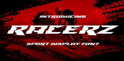 Introducing Racerz - Sport Display with strong and Sport nuances. very suitable for the title, logo, typography, clothes, magazines, brochures, packaging and much more for your design needs, making your designs more modern and professional.
 - Marcus Traianus by Eurotypo,
$48.00 The famous lettering “Capital Trajana” (inscription at the bottom of the column that bears its name erected in the year114 A.D.) is usually identified as the classic example that defines Imperial Capital forms. However, much earlier, there were already countless examples of Greco-Roman epigraphy of excellent execution, as evidenced by the monumental inscriptions from year 2 b.C. sculpted in the Portico di Gaio e Lucio Cesari in front of the facade of the Basilica Emilia, in the Roman Forum, erected by Augustus, dedicated to his two grandchildren for propaganda and dynastic needs. It has been more than two thousand years and the forms of these letters are still part of our daily life, product of their qualities of readability and beauty. It is probably the added semantic value that have made them an icon full of symbolism that expresses majesty, monumentality, order and universal power. Numerous authors, calligraphers and designers have studied this legacy such as Giovanni Francesco Cresci, Edward Catich, L.C. Evetts, Armando Petrucci, Carol Twombly, John Stevens, Claude Mediavilla, just to name a few. Marcus Traianus font is a fitted version of the two models mentioned, which is accompanied by Small Caps, lowercase (carolingas) and a set of numbers (Indo-Arabics) in addition to the Romans figures and diacritics for Central European languages Marcus Traianus is presented in two weight: Regular, Italic, Bold and ExtraBold.
 - Baritta Script by madjack.font,
$18.00 Baritta is a modern script font made with brushes and ink, thick and irregular lines. It contains the complete set of lowercase, uppercase, alternative, binder, punctuation, numbers, and multilingual support. Get inspiration from the preview above. Baritta is perfect for use in watercolor designs or bold handwriting styles, such as blog headings, branding, t-shirts, weddings, social media, product design, stationery, advertisements, clothing, cover books, business cards, greeting cards, branding, merchandise, invitations and handmade quotes and more. Baritta features alternative OpenType styles, binders and international support for most Western Languages included. To enable the OpenType Stylistic alternative, you need a program that supports OpenType features such as Adobe Illustrator CS, Adobe Indesign & CorelDraw X6-X7, Microsoft Word 2010 or newer versions. How to access all alternative characters using Adobe Illustrator: https://www.youtube.com/watch?v=XzwjMkbB-wQ Baritta is coded with Unicode PUA, which allows full access to all additional characters without having special design software. Mac users can use the Font Book, and Windows users can use the Character Map to view and copy one of the additional characters to paste into your favorite text editor / application. How to access all alternative characters, using Windows Character Map with Photoshop: https://www.youtube.com/watch?v=Go9vacoYmBw If you need help or have questions, please let me know. I am happy to help :) Thank you & Happy Designing!
 - Swissa Piccola by Jeremia Adatte,
$30.00 The Swiss typewriters were famous for their unique precision. As complex digitalizations and macro shots were a start for the inspiration and studies, each character has been carefully re-crafted from the ultra high def scans of the printouts made on a special bleed-proof paper. Today’s characters such as @, euro sign and most of accents have been crafted according the original alphabet design. The idea was to digitize and keep a saving of the original typewriter including all its functions (e.g. underlining key) . It’s surprisingly very legible at small sizes. Thanks to an x-height tighter and more spaced, a glyph design less detailed and more neutral/simple than other fonts found on american or italian typewriters. The final artwork can be set at very large sizes due to the highly detailed glyph design. Swissa Piccola Regular is loaded with more than 150 glyphs created with the typewriter to avoid letter repetition in a word. This OpenType feature can be accessed through the 'discretionary ligatures' option. Plus it comes with two stylistic sets : one with an original underlining feature, another with a slashed-x feature. In which all characters are unique and also have been originally typed with the typewriter. It contains more 600 glyphs in total. The two features are separated in another two fonts (Swissa Piccola Slashed x and Underlined) in case a non OT-savvy app is used. If you wish to obtain exactly the same prints as the original Swissa Piccola typewriter, you should set your font at 11.3 pt and 19.5 pt of line spacing. The Swissa Piccola font was originally offered in a dedicated limited edition packaging.
 - Monotalic by Kostic,
$30.00 Monotalic was created as a fun experiment, exploring better solutions for the monospaced type design. Most monospaced (fixed-width) typefaces have the same main design problem regarding the lowercase – filling the empty space around l, f, i, j and r. That usually brings the addition of slab serifs to those narrow characters, causing many monospaced fonts to look and feel alike. Monotalic solves that problem by adopting the handwritten (or cursive) form for those problematic characters, which allows them to be defined in more strokes, thus getting a better distribution of form in that fixed-width space. On the other hand, cursive writing usually lacks the legibility of a Roman (Regular upright) style, so Monotalic was created to be a hybrid, taking the best of both worlds. Monospaced fonts today are mostly used for coding. Modern code editors use colored text in order to differentiate between different kinds of code. So, in that environment there’s actually no need for traditional text styling by adding Italics, Bold or other styles, because the code lines are overstated as it is. That is why Monotalic focuses on one style only, in three widths and four weights. The weights allow users to choose the perfect contrast of text on screen, depending on their monitor resolution and background color in the editor. Movie scripts are almost exclusively set in 12pt Courier. It became the industry standard because when set in the specific “screenplay format" it helps with the breakdown of the schedule and budgeting process of the film production. Although it looks completely different, text set in Monotalic (Normal width) will take the same amount of space as Courier.
 - Lil' Diddles One by Patricia Lillie,
$25.00Aliens, toys, lawn ornaments and more. - Writing Machine by TypeArt Foundry,
$45.00 Typewriter simulation with moderate inking imperfections.
 - Curvalith by RagamKata,
$14.00 Curvalith rich serif with letters that seem modern unique serif typefaces. Perfect for branding, logos, invitations, mastheads, and more. Mariegold has 15 ligature on Uppercase and Lowercase thus making it look more attractive and unique
 - Deeney by DawnCreative.Id,
$13.00 Deeney is a handwritten style font. The natural form will make your work look more natural, like normal handwriting. This font is perfect for you to use in art, invitation, video, children's books and more.
 - Redzein by Almarkha Type,
$15.00 Introducing our latest Vintage Slab called Redzein Retro Display Slab with vintage taste can make your logotype become more interesting. inspired by the decorative arts and architecture movement. Redzein fonts is perfect for your project and allows you to create designs, headlines, posters, logos, badges, t-shirts and many more that are beautiful. It is also best used for posts, logos, posters, certificates, labels and more.
 - Sewing Patterns 2 by Lauren Ashpole,
$15.00 If Sewing Patterns wasn't quite vintage enough for you, Sewing Patterns 2 is the answer to your early twentieth century wishes. Spanning the years 1910 to 1949, it's more Downton Abbey than Mad Men, more Katharine than Audrey, and definitely contains more hats. Like the original, the upper and lowercase letters feature what the well-dressed woman was wearing and the numbers are popular children's fashions.
 - Sketchup by Almarkha Type,
$25.00 Introducing our latest Sketch Display Slab called Sketchup Display Slab with Sketch taste can make your logotype become more interesting. inspired by the decorative arts and architecture movement Sketchup fonts is perfect for your project and allows you to create designs, headlines, posters, logos, badges, t-shirts and many more that are beautiful. It is also best used for posts, logos, posters, certificates, labels and more.
 - Jodler by Beau Williamson,
$4.99 Inspired by show card lettering and the more human side of art deco, I wanted this font to retain the casual unevenness of informal hand lettering. As decorative as the font looks, I do envision it being used for text more than display. Obviously not a workhorse, but rather a quirky niche font. I find it makes dense philosophic texts more friendly to read.
 - Stay ALive by Storictype,
$17.00 Stay Alive Typeface is Inspired by victorian style, poster, sign painter, 1800s bring classic touch on this decade, which is combining modern and classic typography with some awesome features that have a strong shapes so it will create more attention for people to look more closely. You can use this font for various purposes.such as logo, t-shirt, posters, lable, letterhead, book cover, and many more.
 - Bellagium by Silverdav,
$18.00 Introducing “Bellagium font” is a serif font that is truly unique, with a more modern style and unique curves that add a special and glamorous feel to your designs. There are lots of alternates that you can use to make your designs more beautiful and charming, plus ligatures, of course, your designs will be more charming. If you have any questions, please contact us
 - Natured by MuSan,
$16.00 Natured is a fun, playful, bold display typeface. This font will bring joy and happiness to all of us. Natured is best suited for display, heading, text, print, branding, signage, and more. It comes with a lot of ligature that will give your design a more unique touch in any purpose. Natured contains: • Character set A-Z • Numerals • Punctuation • Multilingual • More than 40 Ligatures
 - Brexo by Almarkha Type,
$25.00 Hello Everyone, Introduce our new collection, Brexo – Extended Sans Display famous logos of Technology and brands that have very strong characteristics, very suitable for posters, t-shirt, packaging, branding, logotype and more. Brexo font with strong and challenging nuances. very suitable for the title, typography, clothes, Poster, magazines, brochures, packaging,Websites and much more for your design needs, making your designs more modern and professional.
 - Piersob by Almarkha Type,
$25.00 Hello Everyone, Introduce our new collection, Piersob - Extended Display Sans Serif inspired by famous logos of Technology and brands that have very strong characteristics, very suitable for posters, packaging, branding, logotype and more. Piersob font with strong and challenging nuances. very suitable for the title, typography, Poster, magazines, brochures, packaging,Websites and much more for your design needs, making your designs more modern and professional.
 - Thematheka by Almarkha Type,
$29.00 Hello Everyone, Introduce our new collection, Thematheka - Bold Display Sans With 29 Ligatures, Inspired from famous logos of Technology and brands that have very strong characteristics, very suitable for posters, packaging, branding, logotype and more. Thematheka font with strong and challenging nuances. very suitable for the title, typography, Poster, magazines, brochures, packaging,Websites and much more for your design needs, making your designs more modern and professional.
 - Suntage by Almarkha Type,
$15.00 Introducing our latest called Suntage Retro Display Sans with 4 Style vintage taste can make your logotype become more interesting. inspired by the Retro Poster arts and architecture movement Suntage fonts is perfect for your project and allows you to create designs, headlines, posters, logos, badges, and more that are beautiful. It is also best used for posts, logos, posters, certificates, labels and more.