10,000 search results
(0.028 seconds)
- ITC Zapf Chancery by ITC,
$29.99 Zapf Chancery font is a work of German designer Hermann Zapf. It was named after a typeface used in Anglo-Saxon lands during the Renaissance as well as inspired by such scripts. This font makes it possible to give printed items an individual character. The handwriting of the designer can be seen in the forms of this classic, elegant font.
 - ITC Zapf Dingbats by ITC,
$40.99 The Zapf Dingbats originally had been a selection of 360 symbols, ornaments and typographic elements from over 1200 designs. (For the first time a lady's hand is shown for the index symbol, the fist). The exisiting Zapf Dingbats offers a small selection out of this great offer. Therefore Hermann Zapf created new symbols for the set of the Zapf Dingbats, which are available today from Linotype as "Zapf Essentials?" 6 fonts with new and fresh symbols like fax, cell phone and internet symbols.
 - ITC Zapf International by ITC,
$39.00 Zapf International font is the work of German designer Hermann Zapf, formal enough for widespread use yet tempered with calligraphic warmth. Vigor in the italics is achieved more from design than from slant. One of the distinguishing characteristics of Zapf International is its graduation of weights. Light and medium are relatively close and equally eloquent for text. Demi is a full two steps heavier than medium and heavy several steps beyond demi.
 - ITC Zapf Book by ITC,
$29.99 Zapf Book font is the work of German designer Hermann Zapf, a blend of the characteristics of Walbaum, Melior and the contrasting weights of Bodoni. It is a typical Zapf font, distinction without eccentricity and superb sensitivity and letterfit, and clearly demonstrates his concern that an alphabet work not just as a collection of single letters, but also have a sense of unity in itself.
 - Offenbach Chancery - Unknown license

- Chancery Lane by K-Type,
$20.00 Chancery Lane is a condensed cursive with a breezy, flowing feel. Many of the lowercase characters join up, some uppercase ones too, and the two fonts are slantier than many other chancery-inspired faces, inclined at almost 20°. Each glyph has slightly rounded corners to bestow softness and warmth. The typeface emerged from a study of pen lettering, italic scripts and chancery hands – down a rabbit hole and along the Chancery Lane. The research ranged from early cancellaresca manuscripts to contemporary fonts, and also calligraphic work, most notably that of Indian artist Mayank Baranwal whose lowercase letters inspired many of the Chancery Lane glyphs. Uppercase characters have been designed to harmonise with the lowercase rather than providing overly ornamental openers, true to origins that were functional rather than fancy. Both the capitals and the uppercase alternates are unfussy and relatively simple, and the lowercase swash characters are similarly understated, only modestly flourished. Stylistic alternates and lowercase swash characters can be accessed using OpenType-aware applications or font management software.
 - Unger Chancery by profonts,
$41.99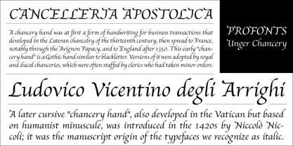
- Offenbach Chancery by Scriptorium,
$18.00 - Zapf Essentials by Linotype,
$29.99Linotype Zapf Essentials is the modernized version of Zapf Dingbats and was also designed by Hermann Zapf himself. Over 372 characters and symbols are included within six fonts and make life a little more communicative, a little more informative, and a lot more interesting. The fonts contain symbols for both professional and everyday uses. With their markers, ornaments and arrows they are informative as well as versatile, timeless and lively. An interesting note to the story of Zapf Essentials: in 1977, Hermann Zapf created about 1000 sketches of signs and symbols. ITC chose those which became known around the world as Zapf Dingbats. For a typesetter, dingbats are the characters in the corner of the type box which can be used for just about anything. The last decade has seen the appearance of new symbols for e-mail, fax, mobile phones and other developments. These are now part of Linotype Zapf Essentials, just as they are now a part of everyday life. For a quick overview of the different Linotype Essentials variations, see the keyboard layout PDF in the Gallery section. It shows the keyboard layout of each font. A helpful hint from Hermann Zapf: Linotype Zapf Essentials should be used sparingly so that the characters retain their emphasis. - Chamberí by Extratype,
$40.00 Chamberí is designed to be Vogue España's bestpoke typeface. An ambitious typographic branding project made for one of the most iconic magazine headers of the world, it defines the Spanish edition’s personality through a blending of the functionality of XIX Century Modern Romans (also known as “Scotch" typefaces) and the gestural expressiveness of typographic Baroque. Chamberí is a peculiar combination of the rational and the delicate, the sturdy and the feminine. The family is organised in a broad spectrum of 56 variants in which the transition from the restrained text version to the flamboyant, elegant display is modulated by contrast. The family is organised in seven weights: from Extra Light to Black, plus four optical sizes : Text, Headline, Display and Superdisplay. All this with its own Italics, Small Caps and Old Style Figures, besides the due refinement to resolve any editorial and communicative requirement.
 - Zape by Corradine Fonts,
$14.95 Based in Manuel Corradine's handwriting, Zape is a very spontaneous font. It could be used in almost any informal project.
 - Chanley by Flawlessandco,
$9.00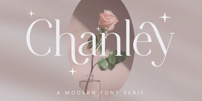 Chanley, a sleek and sophisticated modern serif font that is sure to make a statement. With its clean lines and contemporary design, Chanley strikes the perfect balance between elegance and versatility. An Original typeface that suitable for any graphic designs such as branding materials, t-shirt, print, business cards, logo, poster, t-shirt, photography, quotes .etc This font support for some multilingual. Modern Sweet Retro that contains uppercase A-Z and lowercase a-z, alternate character, numbers 0-9, and some punctuation. If you need help, just write me! Thanks so much for checking out my shop!
 - Chaucer by Volcano Type,
$19.00 Geoffrey Chaucer (1340-1400) was a English poet, one of the most important figures in English literature.
 - Changer by Fikryal,
$18.00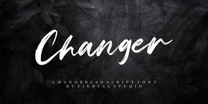 Changer is a hand brush font perfect for crafting, branding, invitation, stationery, wedding designs, social media posts, advertisements, product packaging, product designs, label, photography, watermark, special events, or anything. Changer comes with a full set of uppercase and lowercase letters, ligatures, multilingual symbols, numerals, and punctuation.
 - LTC Law Italic by Lanston Type Co.,
$24.95 Law Italic was designed as an imitation of a formal style of penmanship used in legal documents. It has a more pronounced angle than standard italics. It is intended to be used by itself but can be combined with other faces to suit a designer's inclination. Historically, this face was once used by Bruce Rogers strictly for headings.
 - Zapped - Unknown license

- Zapped by Cool Fonts,
$24.00 Zapped is a grungy font with a sort of extruded look. I was working on a poster for the punk band MAXILLA (they are hot check'm out). It looks like it came out of a war zone. Abuse it!
 - ZAP by Wannatype,
$9.90 ZAP is an all-caps monospaced and (almost) monolined typeface family. ZAP comes along in square and round shape, 2 widths (ZAP 360 and ZAP 500), and 8 weights. ZAP also offers Slant and BAckslant styles. ZAP covers multiple languages with Extended Latin. Even complete Greek alphabets are part of the ZAP keymap.
 - Bodoni Classic Chancery by Wiescher Design,
$55.00 I became interested in designing Bodoni Classic because of a lazy graphic designer at Jacques Damase publishing house. He had to change a single letter on a bookcover about J. B. BODONI. The French call him Jean Baptiste instead of Giambattista! And that unknown graphic designer just took any old “J” from some newly cut Bodoni. All the new Bodoni cuts have square serifs, whereas the originals had rounded serifs and slightly concave feet. The single letter “J” with the squared off serif was for me like a road sign to start redesigning the entire Bodoni family. That’s exactly what I started in 1993 and a dozen years later I am finished. Okay, I am still adding new Bodoni Classics, but those are my personal additions. Yours very retro, Gert Wiescher
 - Zapf Elliptical 711 by ParaType,
$30.00 The Bitstream version of Melior, a twentieth century modern face commissioned by Stempel and designed by Hermann Zapf in 1952. It is based on Zapf’s thoughts about the squared-off circle known as a super-ellipse. The type was originally intended as a newspaper text face by Linotype. Hermann Zapf’s Melior exhibits a robust character through classic and objective forms. Versatile and extremely legible, it can be used for a variety of texts and point sizes. Cyrillic version was developed by Natalya Vasilyeva and licensed by ParaType in 2002.
 - Zapf Calligraphic 801 by Bitstream,
$29.99 - Zapf Elliptical 711 by Bitstream,
$29.99 - Zapf Humanist 601 by Bitstream,
$29.99
- Zapf Renaissance Antiqua by Linotype,
$29.99The Zapf Renaissance Antiqua type family was designed by Hermann Zapf for the German Scangraphic Dr. Böger GmbH in Hamburg, from 1984–1986. The typefaces were engineered for use in digital CRT phototypesetting. This version was based on Scangraphic SH version (For Display use) and not on the SB version (for text use). - Chattery Teeth - Unknown license

- Chandelier Signature by Pointlab,
$15.00 Chandelier Signature a new fresh & modern script with a handmade calligraphic style, decorative characters and a dancing baseline! So beautiful on invitation like greeting cards, branding materials, business cards, quotes, posters, and more!! Chandelier Signature come with 530 glyphs+. The alternative characters were divided into several Open Type features such as Swash, Stylistic Sets, Stylistic Alternates, and Ligature. The Open Type features can be accessed by using Open Type savvy programs such as Adobe Illustrator, Adobe InDesign, Adobe Photoshop Corel Draw X version, And Microsoft Word. And this Font has given PUA unicode (specially coded fonts. so that all the alternate characters can easily be accessed in full by a craftsman or designer. Chandelier Signature Features : - Uppercase & Lowercase - International Languange & Symbols Support, Punctuation & Numbers, PUA Unicode Range Standard Ligatures, Discretionary Ligatures, Stylistic Alternates, Stylistic Set 01-05 Character. If you have any question, don't hesitate to contact me by email pointlab23@gmail.com Thanks!
 - Zapf Renaissance Antiqua SH by Scangraphic Digital Type Collection,
$26.00 Since the release of these fonts most typefaces in the Scangraphic Type Collection appear in two versions. One is designed specifically for headline typesetting (SH: Scangraphic Headline Types) and one specifically for text typesetting (SB Scangraphic Bodytypes). The most obvious differentiation can be found in the spacing. That of the Bodytypes is adjusted for readability. That of the Headline Types is decidedly more narrow in order to do justice to the requirements of headline typesetting. The kerning tables, as well, have been individualized for each of these type varieties. In addition to the adjustment of spacing, there are also adjustments in the design. For the Bodytypes, fine spaces were created which prevented the smear effect on acute angles in small typesizes. For a number of Bodytypes, hairlines and serifs were thickened or the whole typeface was adjusted to meet the optical requirements for setting type in small sizes. For the German lower-case diacritical marks, all Headline Types complements contain alternative integrated accents which allow the compact setting of lower-case headlines.
 - Zapf Renaissance Antiqua SB by Scangraphic Digital Type Collection,
$26.00 Since the release of these fonts most typefaces in the Scangraphic Type Collection appear in two versions. One is designed specifically for headline typesetting (SH: Scangraphic Headline Types) and one specifically for text typesetting (SB Scangraphic Bodytypes). The most obvious differentiation can be found in the spacing. That of the Bodytypes is adjusted for readability. That of the Headline Types is decidedly more narrow in order to do justice to the requirements of headline typesetting. The kerning tables, as well, have been individualized for each of these type varieties. In addition to the adjustment of spacing, there are also adjustments in the design. For the Bodytypes, fine spaces were created which prevented the smear effect on acute angles in small typesizes. For a number of Bodytypes, hairlines and serifs were thickened or the whole typeface was adjusted to meet the optical requirements for setting type in small sizes. For the German lower-case diacritical marks, all Headline Types complements contain alternative integrated accents which allow the compact setting of lower-case headlines.
 - Zapf Renaissance Antiqua EF by Elsner+Flake,
$35.00 - Chancy JNL by Jeff Levine,
$29.00 A short-lived TV game show from 1977 called “Second Chance” has its logo lettered in a bold, block type style with slightly chamfered corners. This inspired Chancy JNL, which is available in both regular and oblique versions. While “Second Chance” only lasted one season, the show was re-tooled - and debuted in 1983 as “Press Your Luck” – which ran until 1986.
 - Zapped Sticks - Personal use only

- Zap Bats by Elemeno,
$10.00 - ITC Eras by ITC,
$40.99 ITC Eras font is the work of French designers Albert Boton and Albert Hollenstein. It is a typical sans serif typeface distinguished by its unusual slight forward slant and subtle variations in stroke weight. ITC Eras is an open and airy typeface inspired by both Greek stone-cut lapidary letters as well as Roman capitals.
 - ITC Cerigo by ITC,
$29.99ITC Cerigo is the result of a challenge which designer Jean-Renaud Cuaz set for himself: to create a typeface with the grace of Renaissance calligraphy but different from the numerous Chancery scripts. He calls Cerigo a 'vertical italic' and based it on 15th century calligraphic forms. The weights are carefully designed to complement each other and are made more flexible by a number of italic swash capitals. The flexible ITC Cerigo is suitable for both text and display. - ITC Photoplay by ITC,
$29.99ITC Photoplay is another gem from Nick Curtis. Unearthed from the 1927 edition of Samuel Welo's Studio Handbook for Artists and Advertisers, the design's original suggested use was for title and caption cards for silent movies. A monoweight design that bridges the gap between turn-of-the-century decorative type and Art Deco, ITC Photoplay is both casual and stylish. And, yes, the cap S" is supposed to look that that. To expand this already handy typeface's versatility, a Black weight has been added to the original design. Curtis has also created an array of alternate characters, a couple of conjunctions, and a handful of "bishop's fingers" to help make your point. ITC Photoplay is eminently suitable for all those occasions when you need to say, "Unhand that fair damsel, you dastardly cad!", and really mean it." - ITC Gargoonies by ITC,
$29.99 - ITC Johnston by ITC,
$29.00ITC Johnston is the result of the combined talents of Dave Farey and Richard Dawson, based on the work of Edward Johnston. In developing ITC Johnston, says London type designer Dave Farey, he did “lots of research on not only the face but the man.” Edward Johnston was something of an eccentric, “famous for sitting in a deck chair and carrying toast in his pockets.” (The deck chair was his preferred furniture in his own living room; the toast was so that he’d always have sustenance near at hand.) Johnston was also almost single-handedly responsible, early in this century, for the revival in Britain of the Renaissance calligraphic tradition of the chancery italic. His book Writing & Illuminating, & Lettering (with its peculiar extraneous comma in the title) is a classic on its subject, and his influence on his contemporaries was tremendous. He is perhaps best remembered, however, for the alphabet that he designed in 1916 for the London Underground Railway (now London Transport), which was based on his original “block letter” model. Johnston’s letters were constructed very carefully, based on his study of historical writing techniques at the British Museum. His capital letters took their form from the best classical Roman inscriptions. “He had serious rules for his sans serif style,” says Farey, “particularly the height-to-weight ratio of 1:7 for the construction of line weight, and therefore horizontals and verticals were to be the same thickness. Johnston’s O’s and C’s and G’s and even his S’s were constructions of perfect circles. This was a bit of a problem as far as text sizes were concerned, or in reality sizes smaller than half an inch. It also precluded any other weight but medium ‘ any weight lighter or heavier than his 1:7 relationship.” Johnston was famously slow at any project he undertook, says Farey. “He did eventually, under protest, create a bolder weight, in capitals only ‘ which took twenty years to complete.” Farey and his colleague Richard Dawson have based ITC Johnston on Edward Johnston’s original block letters, expanding them into a three-weight type family. Johnston himself never called his Underground lettering a typeface, according to Farey. It was an alphabet meant for signage and other display purposes, designed to be legible at a glance rather than readable in passages of text. Farey and Dawson’s adaptation retains the sparkling starkness of Johnston’s letters while combining comfortably into text. Johnston’s block letter bears an obvious resemblance to Gill Sans, the highly successful type family developed by Monotype in the 1920s. The young Eric Gill had studied under Johnston at the London College of Printing, worked on the Underground project with him, and followed many of the same principles in developing his own sans serif typeface. The Johnston letters gave a characteristic look to London’s transport system after the First World War, but it was Gill Sans that became the emblematic letter form of British graphic design for decades. (Johnston’s sans serif continued in use in the Underground until the early ‘80s, when a revised and modernized version, with a tighter fit and a larger x-height, was designed by the London design firm Banks and Miles.) Farey and Dawson, working from their studio in London’s Clerkenwell, wanted to create a type family that was neither a museum piece nor a bastardization, and that would “provide an alternative of the same school” to the omnipresent Gill Sans. “These alphabets,” says Farey, referring to the Johnston letters, “have never been developed as contemporary styles.” He and Dawson not only devised three weights of ITC Johnston but gave it a full set of small capitals in each weight ‘ something that neither the original Johnston face nor the Gill faces have ‘ as well as old-style figures and several alternate characters. - ITC Atmosphere by ITC,
$29.00The Algerian designer Taouffik Semmad created the fonts in 1997. Taouffik Semmad grew up speaking Algerian-Arabic dialect and French, studied Russian, and is now living in Montreal. This could perhaps explain his current passion, to "find a universal writing", which he admits is a Utopian idea. Created with brush and Chinese ink, the characters of ITC Atmosphere came from Semmad's hand but only after they were fully formed in his mind's eye. - ITC Jamille by ITC,
$29.99Mark Jamra based the design for Jamille on the forms of the 18th century Modern Face fonts of Didot and Bodoni, but was also influenced by the work of artists like Adrian Frutiger, who reworked such fonts to adapt to the demands of modern technology. A very legible font, Jamille will give text a classic, elegant feel. - ITC Clearface by ITC,
$45.99 The Clearface types were originally designed by Morris Fuller Benton in 1907. Their forms expressed the Zeitgeist of the turn of the 20th century; typical and distinguishing characteristics are the forms of the a" and the "k." The ATF version did not include an accompanying Italic. In 1978, ITC's Victor Caruso was licensed by ATF to develop a new serif typeface and matching italic based on the forms of Clearface. The result was ITC Clearface, a serif typeface with marked stroke contrast and italic weights. The teardrop-formed endings of the lowercase a, c and f (also found in Caslon) define the character of the face. The type's design is also distinguished by its small -- almost slab -- serifs, a large x-height, and little stroke contrast. ITC Clearface, with its historical touch, is good for both texts and headlines, but its slightly condensed nature performs at its best when it is allowed its space.


Page 1 of 250Next page