10,000 search results
(0.041 seconds)
- Wafterby by Paramajan,
$8.00 Wafterby is a handsome sans serif typeface family. It comes in eight weights which have a minimal and clean feel. Its design is based on circle and line geometric shapes. It can be used as a cute minimal-style header display or as a stylish text for magazine, blog, corporate branding, packaging, wedding invitation project, etc.
 - Artegra Slab by Artegra,
$29.00 Artegra Slab is the latest addition to the Artegra superfamily. It contains 54 fonts with over 1000 glyphs per font in condensed, normal and extended widths. With Cyrillic and Greek sets it supports more than a hundred languages. It’s based on the perfectionist geometric shapes of Artegra Sans, which makes it beautiful to look at and easy to read.
 - Tumbletype by Greater Albion Typefounders,
$6.95 Tumbletype offers two faces with a fun antique look. This is a rough and tumble Roman face with a hand-cast and much-used look, ideal for recreating early printed documents. Use it for headings and feature paragraphs. It's the irregularity of this face which makes it so special-give it a try and join in the fun!
 - Fictionalism by Haiku Monkey,
$10.00 Fictionalism is carefully handcrafted slab serif, slightly condensed to fit lots of beautiful text wherever you need. It's handwritten, but neat as a pin; it's tidy, but has a lively character that grabs attention in a friendly way. Use it for branding, posters, text, or a million and one other design applications.
 - Rambla by TipoType,
$31.90 Rambla is a humanist sans for medium-long texts. It’s slightly condensed, with a generous x-height and short ascender/descenders. Its proportions have as objective to gain space in height and width. It’s elegant at large sizes and legible at the same time, with a lot of rhythm in small sizes.
 - Kaeswaii by insigne,
$29.99 Introducing Kaeswaii, a font that is ideal for anyone wishing to infuse their creations with a dash of inspiration and delight. It's ideal for producing fresh designs that will stand out thanks to its unique contrast and rounded serifs. It has a joyful feel because of its high x-height, and its playful serifs give it a funky touch. Kaeswaii has enough variety to help your project look better than the rest with forty-eight different styles. Select from nine weights and italics for the standard, condensed, and extended styles. It has rounded corners and a luscious texture and a squishy, gloopy vibe. Atarimae, the hint is to use Kaeswaii when you want to infuse your products with a dash of inspiration and delight. It has a happy feel with its high x-height and rounded serifs. It's ideal for producing fresh designs. Put a playful spin on your work with the unique personality of Kaeswaii's rounded terminals. Let Kaeswaii bring life to your ideas!
 - Higery by Craft Supply Co,
$20.00 Higery – Serif Typeface: Uniquely Engaging Distinctive Tapered Details: Higery – Serif Typeface stands out with its unique tapered serifs. These details add a sophisticated charm. This font is ideal for captivating visual displays. Perfect for Visual Displays: Higery’s elegant tapering makes it perfect for eye-catching displays. It excels in adding an artistic touch to posters, ads, and more. Its uniqueness ensures your design stands out. Versatility in Design: Though unique, Higery remains versatile for various design needs. It seamlessly fits into digital and print media. This adaptability makes it a valuable tool for designers. Ease of Use for All: Higery is designed with user-friendliness in mind. It’s easy to use for designers of all skill levels. This approachability makes it a popular choice in the design community. Elevating Aesthetic Appeal: Incorporating Higery into your projects can significantly enhance their aesthetic appeal. Its distinctive serifs and elegant design elevate any content. Higery isn’t just a typeface; it’s a visual experience.
 - Carrigallen Display by Tony Fahy Font Foundry,
$20.00 The Carrigallen family of fonts has roots in Megalithic and Celtic Ireland. It has six weights—Light, Regular and Bold and their corresponding italics. The distinctiveness of the Carrigallen family, is in it's sculpted, spiral nature, inspired by the graphics at the entrance stones and kerbstones at the Newgrange passage graves in Ireland. This is where it derives it’s decorative nature and suitability, as a very distinct Display font. Exceptionally suited for Logos and Headlines, it can increase the corporate presentation of a company as its main identifying feature—and with high memorability! The three separately designed letterforms—differing in line weight—are held in place by the white space within and without the character giving a distinctive twenty first century flavour! It is this dynamic that makes the font unique! Carrigallen Display is a modern font. It draws from its nomadic influences allowing it to be culturally representative of all languages.
 - Times Eighteen by Linotype,
$29.00In 1931, The Times of London commissioned a new text type design from Stanley Morison and the Monotype Corporation, after Morison had written an article criticizing The Times for being badly printed and typographically behind the times. The new design was supervised by Stanley Morison and drawn by Victor Lardent, an artist from the advertising department of The Times. Morison used an older typeface, Plantin, as the basis for his design, but made revisions for legibility and economy of space (always important concerns for newspapers). As the old type used by the newspaper had been called Times Old Roman," Morison's revision became "Times New Roman." The Times of London debuted the new typeface in October 1932, and after one year the design was released for commercial sale. The Linotype version, called simply "Times," was optimized for line-casting technology, though the differences in the basic design are subtle. The typeface was very successful for the Times of London, which used a higher grade of newsprint than most newspapers. The better, whiter paper enhanced the new typeface's high degree of contrast and sharp serifs, and created a sparkling, modern look. In 1972, Walter Tracy designed Times Europa for The Times of London. This was a sturdier version, and it was needed to hold up to the newest demands of newspaper printing: faster presses and cheaper paper. In the United States, the Times font family has enjoyed popularity as a magazine and book type since the 1940s. Times continues to be very popular around the world because of its versatility and readability. And because it is a standard font on most computers and digital printers, it has become universally familiar as the office workhorse. Times™, Times™ Europa, and Times New Roman™ are sure bets for proposals, annual reports, office correspondence, magazines, and newspapers. Linotype offers many versions of this font: Times™ is the universal version of Times, used formerly as the matrices for the Linotype hot metal line-casting machines. The basic four weights of roman, italic, bold and bold italic are standard fonts on most printers. There are also small caps, Old style Figures, phonetic characters, and Central European characters. Times™ Ten is the version specially designed for smaller text (12 point and below); its characters are wider and the hairlines are a little stronger. Times Ten has many weights for Latin typography, as well as several weights for Central European, Cyrillic, and Greek typesetting. Times™ Eighteen is the headline version, ideal for point sizes of 18 and larger. The characters are subtly condensed and the hairlines are finer. Times™ Europa is the Walter Tracy re-design of 1972, its sturdier characters and open counterspaces maintain readability in rougher printing conditions. Times New Roman™ is the historic font version first drawn by Victor Lardent and Stanley Morison for the Monotype hot metal caster." - Times Europa LT by Linotype,
$29.99In 1931, The Times of London commissioned a new text type design from Stanley Morison and the Monotype Corporation, after Morison had written an article criticizing The Times for being badly printed and typographically behind the times. The new design was supervised by Stanley Morison and drawn by Victor Lardent, an artist from the advertising department of The Times. Morison used an older typeface, Plantin, as the basis for his design, but made revisions for legibility and economy of space (always important concerns for newspapers). As the old type used by the newspaper had been called Times Old Roman," Morison's revision became "Times New Roman." The Times of London debuted the new typeface in October 1932, and after one year the design was released for commercial sale. The Linotype version, called simply "Times," was optimized for line-casting technology, though the differences in the basic design are subtle. The typeface was very successful for the Times of London, which used a higher grade of newsprint than most newspapers. The better, whiter paper enhanced the new typeface's high degree of contrast and sharp serifs, and created a sparkling, modern look. In 1972, Walter Tracy designed Times Europa for The Times of London. This was a sturdier version, and it was needed to hold up to the newest demands of newspaper printing: faster presses and cheaper paper. In the United States, the Times font family has enjoyed popularity as a magazine and book type since the 1940s. Times continues to be very popular around the world because of its versatility and readability. And because it is a standard font on most computers and digital printers, it has become universally familiar as the office workhorse. Times™, Times™ Europa, and Times New Roman™ are sure bets for proposals, annual reports, office correspondence, magazines, and newspapers. Linotype offers many versions of this font: Times™ is the universal version of Times, used formerly as the matrices for the Linotype hot metal line-casting machines. The basic four weights of roman, italic, bold and bold italic are standard fonts on most printers. There are also small caps, Old style Figures, phonetic characters, and Central European characters. Times™ Ten is the version specially designed for smaller text (12 point and below); its characters are wider and the hairlines are a little stronger. Times Ten has many weights for Latin typography, as well as several weights for Central European, Cyrillic, and Greek typesetting. Times™ Eighteen is the headline version, ideal for point sizes of 18 and larger. The characters are subtly condensed and the hairlines are finer. Times™ Europa is the Walter Tracy re-design of 1972, its sturdier characters and open counterspaces maintain readability in rougher printing conditions. Times New Roman™ is the historic font version first drawn by Victor Lardent and Stanley Morison for the Monotype hot metal caster." - Times Ten by Linotype,
$40.99In 1931, The Times of London commissioned a new text type design from Stanley Morison and the Monotype Corporation, after Morison had written an article criticizing The Times for being badly printed and typographically behind the times. The new design was supervised by Stanley Morison and drawn by Victor Lardent, an artist from the advertising department of The Times. Morison used an older typeface, Plantin, as the basis for his design, but made revisions for legibility and economy of space (always important concerns for newspapers). As the old type used by the newspaper had been called Times Old Roman," Morison's revision became "Times New Roman." The Times of London debuted the new typeface in October 1932, and after one year the design was released for commercial sale. The Linotype version, called simply "Times," was optimized for line-casting technology, though the differences in the basic design are subtle. The typeface was very successful for the Times of London, which used a higher grade of newsprint than most newspapers. The better, whiter paper enhanced the new typeface's high degree of contrast and sharp serifs, and created a sparkling, modern look. In 1972, Walter Tracy designed Times Europa for The Times of London. This was a sturdier version, and it was needed to hold up to the newest demands of newspaper printing: faster presses and cheaper paper. In the United States, the Times font family has enjoyed popularity as a magazine and book type since the 1940s. Times continues to be very popular around the world because of its versatility and readability. And because it is a standard font on most computers and digital printers, it has become universally familiar as the office workhorse. Times™, Times™ Europa, and Times New Roman™ are sure bets for proposals, annual reports, office correspondence, magazines, and newspapers. Linotype offers many versions of this font: Times™ is the universal version of Times, used formerly as the matrices for the Linotype hot metal line-casting machines. The basic four weights of roman, italic, bold and bold italic are standard fonts on most printers. There are also small caps, Old style Figures, phonetic characters, and Central European characters. Times™ Ten is the version specially designed for smaller text (12 point and below); its characters are wider and the hairlines are a little stronger. Times Ten has many weights for Latin typography, as well as several weights for Central European, Cyrillic, and Greek typesetting. Times™ Eighteen is the headline version, ideal for point sizes of 18 and larger. The characters are subtly condensed and the hairlines are finer. Times™ Europa is the Walter Tracy re-design of 1972, its sturdier characters and open counterspaces maintain readability in rougher printing conditions. Times New Roman™ is the historic font version first drawn by Victor Lardent and Stanley Morison for the Monotype hot metal caster." - Times Ten Paneuropean by Linotype,
$92.99In 1931, The Times of London commissioned a new text type design from Stanley Morison and the Monotype Corporation, after Morison had written an article criticizing The Times for being badly printed and typographically behind the times. The new design was supervised by Stanley Morison and drawn by Victor Lardent, an artist from the advertising department of The Times. Morison used an older typeface, Plantin, as the basis for his design, but made revisions for legibility and economy of space (always important concerns for newspapers). As the old type used by the newspaper had been called Times Old Roman," Morison's revision became "Times New Roman." The Times of London debuted the new typeface in October 1932, and after one year the design was released for commercial sale. The Linotype version, called simply "Times," was optimized for line-casting technology, though the differences in the basic design are subtle. The typeface was very successful for the Times of London, which used a higher grade of newsprint than most newspapers. The better, whiter paper enhanced the new typeface's high degree of contrast and sharp serifs, and created a sparkling, modern look. In 1972, Walter Tracy designed Times Europa for The Times of London. This was a sturdier version, and it was needed to hold up to the newest demands of newspaper printing: faster presses and cheaper paper. In the United States, the Times font family has enjoyed popularity as a magazine and book type since the 1940s. Times continues to be very popular around the world because of its versatility and readability. And because it is a standard font on most computers and digital printers, it has become universally familiar as the office workhorse. Times™, Times™ Europa, and Times New Roman™ are sure bets for proposals, annual reports, office correspondence, magazines, and newspapers. Linotype offers many versions of this font: Times™ is the universal version of Times, used formerly as the matrices for the Linotype hot metal line-casting machines. The basic four weights of roman, italic, bold and bold italic are standard fonts on most printers. There are also small caps, Old style Figures, phonetic characters, and Central European characters. Times™ Ten is the version specially designed for smaller text (12 point and below); its characters are wider and the hairlines are a little stronger. Times Ten has many weights for Latin typography, as well as several weights for Central European, Cyrillic, and Greek typesetting. Times™ Eighteen is the headline version, ideal for point sizes of 18 and larger. The characters are subtly condensed and the hairlines are finer. Times™ Europa is the Walter Tracy re-design of 1972, its sturdier characters and open counterspaces maintain readability in rougher printing conditions. Times New Roman™ is the historic font version first drawn by Victor Lardent and Stanley Morison for the Monotype hot metal caster." - Times by Linotype,
$40.99In 1931, The Times of London commissioned a new text type design from Stanley Morison and the Monotype Corporation, after Morison had written an article criticizing The Times for being badly printed and typographically behind the times. The new design was supervised by Stanley Morison and drawn by Victor Lardent, an artist from the advertising department of The Times. Morison used an older typeface, Plantin, as the basis for his design, but made revisions for legibility and economy of space (always important concerns for newspapers). As the old type used by the newspaper had been called Times Old Roman," Morison's revision became "Times New Roman." The Times of London debuted the new typeface in October 1932, and after one year the design was released for commercial sale. The Linotype version, called simply "Times," was optimized for line-casting technology, though the differences in the basic design are subtle. The typeface was very successful for the Times of London, which used a higher grade of newsprint than most newspapers. The better, whiter paper enhanced the new typeface's high degree of contrast and sharp serifs, and created a sparkling, modern look. In 1972, Walter Tracy designed Times Europa for The Times of London. This was a sturdier version, and it was needed to hold up to the newest demands of newspaper printing: faster presses and cheaper paper. In the United States, the Times font family has enjoyed popularity as a magazine and book type since the 1940s. Times continues to be very popular around the world because of its versatility and readability. And because it is a standard font on most computers and digital printers, it has become universally familiar as the office workhorse. Times™, Times™ Europa, and Times New Roman™ are sure bets for proposals, annual reports, office correspondence, magazines, and newspapers. Linotype offers many versions of this font: Times™ is the universal version of Times, used formerly as the matrices for the Linotype hot metal line-casting machines. The basic four weights of roman, italic, bold and bold italic are standard fonts on most printers. There are also small caps, Old style Figures, phonetic characters, and Central European characters. Times™ Ten is the version specially designed for smaller text (12 point and below); its characters are wider and the hairlines are a little stronger. Times Ten has many weights for Latin typography, as well as several weights for Central European, Cyrillic, and Greek typesetting. Times™ Eighteen is the headline version, ideal for point sizes of 18 and larger. The characters are subtly condensed and the hairlines are finer. Times™ Europa is the Walter Tracy re-design of 1972, its sturdier characters and open counterspaces maintain readability in rougher printing conditions. Times New Roman™ is the historic font version first drawn by Victor Lardent and Stanley Morison for the Monotype hot metal caster." - Stuph by Tail Spin Studio,
$25.00Stuph Light is a collection of drawings pulled from one of the many sketch books Steve Zafarana is always doodling in. Because they are in a font, the drawings can be used in font format or opened and manipulated in vector programs like Freehand or Illustrator. Stuph Light continues to inflict upon an unsuspecting public Steves’ cockeyed outlook on the world that was started with ITC Fontoonies, ITC Gargoonies and ITC Backyard Beasties. Will this lunacy ever end? - Ultravision by Great Scott,
$18.00 Introducing "Ultravision," a geometric sans serif font that artfully fuses the charm of the past with the clarity of the future. This typeface draws inspiration from timeless classics such as ITC Busorama, Herbus, and Marvin, yet it distinguishes featuring both uppercase and lowercase characters. A harmonious blend of vintage allure and modern sophistication, Ultravision embodies a retro aesthetic. Its geometric structure lends an unambiguous and clean feel, making it perfect for a wide range of applications, from bold headlines to subtle captions. Ultravision is also available as a variable font with variable weight support. Ultravision includes over 300 glyphs for lots of languages support.
 - Young Baroque by ITC,
$29.99Young Baroque was designed by Doyald Young, and the font first appeared in the ITC library in 1984. It is a delicate and elegant typeface, whose basic forms are those of baroque script. The generous spirals adorning the capital letters give the font its temperament and contrast beautifully with the small, heavily slanted lower case letters. The flowing, graceful characters create an overall image of aristocratic elegance and dignity. This font can be used advantageously for labels, invitations and certificates and its capitals as initials to contrast harmoniously with both serif and sans serif fonts. Young Baroque is best used for headlines or short texts. Featured in: Best Fonts for Tattoos - Yuge by Hanoded,
$15.00 Yuge, apparently, is how New Yorkers pronounce huge. I have never been to New York, so I can’t tell if this is a fact. But I often hear a certain New Yorker pronounce it that way, so I guess it’s sort of true. Yuge is a handwritten font - made with a Sharpie pen. Believe me, it is a good font. It is fantastic. It is the best font ever. It is YUGE! ;-)
 - Vinery by RagamKata,
$16.00 Vinery Sans serif Introducing Vinery - our latest sans serif font that combines modern design with unique swash alternates. This font is perfect for any design project that requires a clean and sleek look. With its minimalist and elegant design, it's ideal for branding, packaging, editorial, or web design. Vinery comes with a range of swash alternates that are carefully crafted to add an extra level of creativity to your designs. Whether you're looking for a simple or elaborate swash, this font has got you covered. The alternates are easily accessible, so you can switch them up to create different styles within your design. This font features a modern and sophisticated look with its clean lines and geometric shapes. It's easy to read and versatile, making it suitable for both headlines and body text. Vinery is perfect for creating a contemporary and professional look that stands out. With its unique swash alternates, it's sure to add a touch of creativity to any project. Try it out today and take your designs to the next level!
 - Barking Frenzy by PizzaDude.dk,
$18.00 Barking Frenzy may look as if it was cut out of paper or cardboard, but it's not! It was drawn with a rugged pen, leaving rough edges here and there. It's great for children's books and toys or maybe handcraft or other handcrafted activities. I've added 5 different versions of each lowercase letter and these appear randomly as you type. That way your text looks really natural and organic, because the letters rarely repeat themselves. Also the font has multilingual support!
 - Super Discount by Mozatype,
$17.00 Hello there, Proudly presenting SUPER DISCOUNT. It is stylish marker font. It’s in two styles: Regular and Bold. SUPER DISCOUNT was designed to make logotype and lettering for your brands. And it’s would perfect for t-shirts/ apparel, promotional materials, sports, music festival, quotes, special events, or anything. What’s Included : Works on PC & Mac Easy to use ( Installations ) Easy Convert to Webfont Compatibility Windows, Apple, Linux, Cricut, Silhouette, and Other cutting machines Thanks for downloading, and I hope you enjoy it!
 - Skratchbook by CozyFonts,
$30.00 Skratchbook is a new handwritten font from the sketch pad of designer Tom Nikosey of CozyFonts. The family exists in 3 versions, Regular, Italic, & Back Italic. This font is a casual, coarse style meant to be used for personality and spontaneity. It's style conjurs anything from quick grocery lists to Halloween Party invites. It maintains amazing legibility in small sizes and it's true personality is revealed the larger it is set! Hoping this font finds your voice! Skratchbook, New from CozyFonts Foundry.
 - Sincerity Stencil by Océane Moutot,
$32.90 Sincerity Stencil is the new extension of the typeface Sincerity. It's a fierce and elegant typeface identified by its high contrast, sharp shapes and triangular. The stencil component of this new version will add originality to your designs. Its large variety of glyphs, including accents, old-style numbers and ligatures will give uniqueness to your designs. It's a great fit for branding, magazines, newspapers, and so on. Sincerity Stencil is available in 16 styles, from thin to black in roman and italic.
 - Nantua by Characters Font Foundry,
$- Nantua is inspired by the Russian Constructivism from the early 1920s. Artists like Aleksandr Rodchenko used typography as forms. Nantua can be used with that very same principal. It's a very geometrical display font with hard edges. Used in big sizes it is very 'in your face'. Used in small sizes it tends to work like a compact background pattern. With very small inner forms, Nantua needs to be used in big sizes to be legible. It's preferably seen on posters or flyers.
 - Beauty Mermaid by Scratch Design,
$10.00 Introducing Beauty Mermaid script! It's a modern and beautiful script font with texture brushed ink style. It's highly recommended for you who want to make some designs with a texture like a realistic signature style. This font will work for invitation design, logos, wedding invitations, posters, packaging, book cover title, quote, social media post, etc. Open your Opentype features using the script font to use the ligatures and swashes. Also, this font includes alternates for uppercase and lowercase characteristics.
 - Jeko by EllenLuff,
$39.00Jeko is an exciting geometric typeface with contemporary touches. It’s born from strong elementary shapes, with clean circles interwoven with modern cuts and sharp edges. It has a distinctive voice, retaining the simplicity and elegance of classic geometric typefaces with a fresh, stylish rework. It's bold in personality and fills the space without shouting, appearing refined and confident. It’s high X-height and strong capitals sustain a large amount of visibility across all weights, and have been optically corrected for even better legibility. It has been designed as a variable font to give lots of options and access to unique type looks; however it also includes nine weights to give just as much access to creativity to those without access to variable supporting software. Aventa’s matching italics sloped at a lively 11º help give it a full range of expressions. Its distinctive character and many variables make it a versatile, stylish workhorse, great for interfaces and design. Jeko is a re-designed form of the Aventa Typeface. Each font contains just over 570 glyphs with full Western, Central, Eastern European and Cyrillic language support. Check out Larken which is a great pair for Jeko. - Sindentosca by Aminmario Studio,
$20.00 Sindentosca Font Sindentosca is a handwritten font. Its modern charm makes it appear wonderfully, readable, and, ultimately, incredibly versatile. This font will look outstanding in any context, whether it’s being used on busy backgrounds or as a standalone headline! Thank you for the purchase. Happy creating design :)
 - Figuratika by Studio Indigo,
$17.00 Figuratika with its cut out letters is a bold geometric Art Deco inspired stencil font with a retro 1920 1930 feeling. It was designed as a display font and is best for shorter texts, titles, logos, posters etc. Figuratika has multilingual support for most European languages.
 - My Sallome by RahagitaType,
$15.00 My Sallome is a beautiful script in a natural handwritten style. Its casual charm makes it appear wonderfully down-to-earth, readable and - ultimately - incredibly versatile. My Sallome will look outstanding in any context, whether it’s being used on busy backgrounds or as a standalone headline.
 - Socialist by Balpirick,
$15.00 Socialist is a gorgeous handwritten font, carefully handcrafted to become a true favorite. Its casual charm makes it appear wonderfully down-to-earth, readable and, ultimately, incredibly versatile. Socialist will look outstanding in any context, whether it’s being used on busy backgrounds or as a standalone headline!
 - Championa by Balpirick,
$15.00 Championa is a bold handwritten font, carefully handcrafted to become a true favorite. Its casual charm makes it appear wonderfully down-to-earth, readable and, ultimately, incredibly versatile. Championa will look outstanding in any context, whether it’s being used on busy backgrounds or as a standalone headline!
 - Montegi by Lemonthe,
$14.00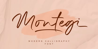 Montegi is a modern calligraphy font. it has a gentle and beautiful flow, and as a result it will elevate each of the designs you wish to create!. It’s the perfect font for wedding invitations, stationery, photography, social media posts, product packaging, greeting cards, and much more!
 - Setyaki by Aisyah,
$12.00 Setyaki is a Script handwritten font, carefully handcrafted to become a true favorite. Its casual charm makes it appear wonderfully down-to-earth, readable and, ultimately, incredibly versatile. Setyaki will look outstanding in any context, whether it’s being used on busy backgrounds or as a standalone headline!
 - Delninoys by Almarkha Type,
$23.00 Delninoys is a cute display font, carefully created to become a true favorite. Its casual charm makes it appear wonderfully down-to-earth, readable and, ultimately, incredibly versatile. Delninoys will look outstanding in any context, whether it’s being used on busy backgrounds or as a standalone headline!
 - Diagonal ND by Neufville Digital,
$29.60 Inspired by Barcelona’s Diagonal street, Antoni Morillas designed Diagonal ND in 1970. A sans that alternates straight and inclined lines, with a strong rhythm and its own personality. Its range of possible usages are very varied: signage, headlines, packaging, etc. Diagonal is a Trademark of BauerTypes SL
 - Homelike by Creativework Studio,
$12.00 Homelike is a bold display font, carefully handcrafted to become a true favorite. Its casual charm makes it appear wonderfully down-to-earth, readable and, ultimately, incredibly versatile. This font will look outstanding in any context, whether it’s being used on busy backgrounds or as a standalone.
 - Grota by Latinotype,
$26.00 Grota is a very expressive font, has a gestural character inspired by the hand lettering . Grota is grotesque, unicase and exceptional. It has six weights ranging from thin to black with their italics. It is ideal for logos, brands, magazines, headlines, books. etc. Photography by Matías Troncoso
 - Springloved by Almarkha Type,
$23.00 Springloved is a cute display font, carefully created to become a true favorite. Its casual charm makes it appear wonderfully down-to-earth, readable and, ultimately, incredibly versatile. Springloved will look outstanding in any context, whether it’s being used on busy backgrounds or as a standalone headline!
 - Danken by Etewut,
$30.00 DANKEN is an all caps display typeface that was created to mix font styles and create unlimited variety of effects. Now it has 25 font styles but it’s growing.
 - DB Fleuries by Illustration Ink,
$3.00DB Fleuries is a great set of filigree images you can use to accent your scrapbook pages, invitations, etc. Use it to add that subtle elegance to your designs. - Avocado by Justyna Sokolowska,
$15.00 Avocado is handwritten font. It's very suitable for the fashion industry and culinary. This font is crazy but readable, so it can be used for large amounts of text.