10,000 search results
(0.015 seconds)
- ITC Juice by ITC,
$40.99ITC Juice is the work of American designer David Sagorski and shows a clear influence of cartoon graphics of the 1960s and 70s. The typeface has a number of unique letter forms as well as an extensive set of alternate characters. The creative, humorous ITC Juice hides a subtle sophistication beneath its funky exterior. - ITC Bolt by ITC,
$29.99 - Sliced Juice - Unknown license

- Zud Juice - Personal use only

- Jungle Juice - Unknown license

- Zud Juice - Personal use only

- Zud Juice - Personal use only

- Fox Juice by Fox7,
$12.00 Fox Juice font is a bold, playful Display font that adds a captivating and energetic touch to your designs. Its main feature is its vibrant and expressive design, allowing you to create attention-grabbing headlines, t-shirt typography, banners, product labels, and more with its versatility and eye-catching presence.
 - Banana Juice by Almarkha Type,
$29.00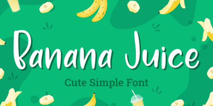 Banana Juice is a cute & playful font that will make your designs look modern, unique and fun. It’s perfect for labels, quotes, posters, DIY projects, branding, packaging, greeting cards, websites, photos, photography overlays, signs, window art, scrapbooking, tags and so much more!
 - Pinky Juice by Olivetype,
$18.00 Pinky Juice is the perfect way to add some fun and personality to your work. It's a bold, playful font that will make your work stand out. Plus, it's very cute! Thank You!
 - Funky Juice by Forberas Club,
$16.00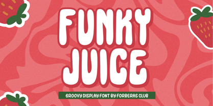 Introducing Funky Juice by Forberas Club Funky Juice is a Handwritten Script font that will make your designs look classic, Farmhouse, Boho, and Feminine. It is a great font for events, Wedding Project, fashion, apparel projects, signature, album covers, logos, branding, magazines, social media posts, advertisements, but it also works great for other projects. Add it to your fonts’ library, and it will enhance your creativity! Funky Juice is best for: - logos, branding, & Signatures. - Flyers, Album cover, Magazine, & Advertisements. - Website design , design blogs, & fashion. - Quote graphics for social media. - and also it works great for other projects. Whats included : - Character Set - Numerals and Punctuation (OpenType Standard) - Accents (Multilingual characters) If you have any questions, before or after purchase, please feel free to get in touch.
 - Mango Juice by Gassstype,
$23.00 Hello Everyone, introduce our new product Font Mango Juice is a Rough Brush Font.This is a Textured Natural Style and Authentic Brush style with a clear style and dramatic movement. This font Mango Juice is great for your next creative project such as logos, printed quotes, invitations, cards, product packaging, headers, Logotype, Letterhead, Poster, Design this font is great for your creative projects such as watermark on photography, and perfect for logos & branding, invitation,advertisements,product designs, stationery, wedding designs,label ,product packaging, special events or anything that need handwritting taste. That is has charming, authentic and relaxed characteristic more natural look to your text You can activate Alternates glyphs OpenType panel.
 - Carrot Juice by Hanoded,
$15.00 I like Carrot Juice a lot. I don’t drink it that often (and I should, really), but nothing beats a freshly squeezed glass of cold carrot juice!! Carrot Juice font is a lovely script font: handmade with love (and a rather cheap Chinese brush pen which I bought online). Carrot Juice will come in handy when you need that handmade look - cookbooks, websites and product packaging spring to mind. Comes with a abundant harvest of diacritics.
 - Newt Juice by Cool Fonts,
$24.00 Newt Juice is a funky hand drawn font comes in both Outline and Fill styles. Put them both together in your favorite application and you can get some really organic looks. Newt Juice is perfect for kid stuff or grungy graffiti. While it is an all caps font, the upper and lower case characters are position differently to create more randomness. Be the first on your block to juice the newt!
 - Biscuit Juice by PizzaDude.dk,
$20.00 A biscuit and a cup of coffee, a biscuit and a cup of tee ... both are obvious - but what about a biscuit and a glass of juice? I loved that combination as a kid (and I even crumbled the biscuit in the juice...yuck...I wouldn't do that today!!! Anyway, here you have a legible uppercase font with a nice handmade look. I've added 4 different versions of each letter, which makes the font look really nice and slightly jumpy. I even added two nice swashes to the N and K. Enjoy!
 - Apple Juice by Elemeno,
$25.00Apple Juice has a straightforward, childlike simplicity, but has been divided in the middle to create a bottom-heavy contrast. Kids welcome! - Juicy by Positype,
$22.00 Juicy is different… in a good way. An art deco-inspired, high-contrast, upright semi-script, layered typeface best describes the playful letterforms that make up Juicy Pro (semi-connected) and Juicy Simple (unconnected). Great care has been taken to provide a wide complement of options and intelligent letter combinations thanks to OpenType. And that’s right, Juicy *is* a layered semi-script typeface. Pro and Simple variants provide a full character set (yep, lowercase). Pro variants include a wide variety of Stylistic, Swash, and Titling Alternates to really allow the expressiveness of the typeface shine… and all characters are available in the layered font counterparts… no shortcuts were taken on the delivery of this typographic chimera.
 - LTC Bodoni Bold by Lanston Type Co.,
$24.95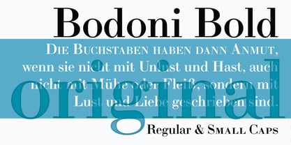
- LTC Swing Bold by Lanston Type Co.,
$24.95
- Bolded by We Make Font,
$16.00 Bolded is a new complete type family, designed and developed by creative professionals. Contains geometric and rounded features, optimized for both long texts and small screens and texts. The complete family offers seven weights divided between the basic, italic, condensed and condensed italic family. Created in 2022, Bolded has a modern and functional look, designed for the most diverse uses and projects. Bolded is a geometric rounded family that can meet the needs of the most varied professionals looking for a clean and elegant font family with a wide set of Latin characters.
 - Bolde by Figuree Studio,
$18.00 Bolde is a powerful sans serif font family with modern touches. A balance of hard lines and smooth curves makes them able to stand on their own dynamically Features: five all caps font, Numbers & Punctuation / Extensive Language Support Bolde works great in any branding, logos, magazines, film. The different styles give you the full range to explore a whole host of applications. Thanks for having a peek at Bolde. As always, if you have any questions just send me a message!
 - KR Cow Juice - Unknown license

- Fruit Juice JNL by Jeff Levine,
$29.00 A vintage New York neon sign for a juice stand advertising “Papaya” was the model and inspiration for Fruit Juice JNL, which is available in both regular and oblique versions.
 - ITC Berkeley Old Style by ITC,
$29.99 ITC Berkeley Old Style is based on a typeface designed by Frederic W. Goudy in 1938 called University of California Old Style. It was a private press type for the publishing house of that school. In 1958, about ten years after Goudy's death, Monotype re-issued the type under the name Californian, and it became a very successful face for book typography. Goudy himself said he designed this face to have the greatest legibility possible, and it is indeed free from the exuberances in some of his other faces. Tony Stan redrew the family for ITC for 1983, and it was named ITC Berkeley Old Style, Berkeley being the city where the University of California Press is located. Stan did a careful drawing of eight styles including italics. ITC Berkeley Old Style is a crisply beautiful tribute to a distinguished typeface, and it works well for books, magazines, and advertising display. Featured in: Best Fonts for Tattoos
 - Ajuice Script by Panatype Studio,
$9.00 Ajuice Script Font is a high contrast script font with a romantic theme with two font styles ( Regular & Round ) which is perfect for your designs that want a romantic style, modern vintage, elegant, soft, and carefully crafted for all graphic design needs. File Includes : OPENTYPE FEATURE Contextual Alternates Following Language Support : LATIN EXTENDED ( Western European, Central European, South Eastern European )
 - Juicy Advice by PizzaDude.dk,
$15.00 To tell you the truth, I don’t know what a juicy advice is - other than I guess it’s something positive and maybe even helpful. Well, what I do know is that this Juicy Advice is positive, helpful and playful. It’s a handmade comic font, with an outline version to compliment the Regular version. The outline version is also handmade, but not entirely sticking to the boundaries of the shapes of the Regular version. This leaves the outline somewhat off, but deliberately in order to keep the authentic feeling.
 - Juicy Fruit by Seemly Fonts,
$14.00 Juicy Fruit is a bold and paint-brushed display font. No matter the topic, this font will be an incredible asset to your fonts’ library, as it has the potential to elevate any creation.
 - ITC Eras by ITC,
$40.99 ITC Eras font is the work of French designers Albert Boton and Albert Hollenstein. It is a typical sans serif typeface distinguished by its unusual slight forward slant and subtle variations in stroke weight. ITC Eras is an open and airy typeface inspired by both Greek stone-cut lapidary letters as well as Roman capitals.
 - ITC Cerigo by ITC,
$29.99ITC Cerigo is the result of a challenge which designer Jean-Renaud Cuaz set for himself: to create a typeface with the grace of Renaissance calligraphy but different from the numerous Chancery scripts. He calls Cerigo a 'vertical italic' and based it on 15th century calligraphic forms. The weights are carefully designed to complement each other and are made more flexible by a number of italic swash capitals. The flexible ITC Cerigo is suitable for both text and display. - ITC Photoplay by ITC,
$29.99ITC Photoplay is another gem from Nick Curtis. Unearthed from the 1927 edition of Samuel Welo's Studio Handbook for Artists and Advertisers, the design's original suggested use was for title and caption cards for silent movies. A monoweight design that bridges the gap between turn-of-the-century decorative type and Art Deco, ITC Photoplay is both casual and stylish. And, yes, the cap S" is supposed to look that that. To expand this already handy typeface's versatility, a Black weight has been added to the original design. Curtis has also created an array of alternate characters, a couple of conjunctions, and a handful of "bishop's fingers" to help make your point. ITC Photoplay is eminently suitable for all those occasions when you need to say, "Unhand that fair damsel, you dastardly cad!", and really mean it." - ITC Gargoonies by ITC,
$29.99 - ITC Johnston by ITC,
$29.00ITC Johnston is the result of the combined talents of Dave Farey and Richard Dawson, based on the work of Edward Johnston. In developing ITC Johnston, says London type designer Dave Farey, he did “lots of research on not only the face but the man.” Edward Johnston was something of an eccentric, “famous for sitting in a deck chair and carrying toast in his pockets.” (The deck chair was his preferred furniture in his own living room; the toast was so that he’d always have sustenance near at hand.) Johnston was also almost single-handedly responsible, early in this century, for the revival in Britain of the Renaissance calligraphic tradition of the chancery italic. His book Writing & Illuminating, & Lettering (with its peculiar extraneous comma in the title) is a classic on its subject, and his influence on his contemporaries was tremendous. He is perhaps best remembered, however, for the alphabet that he designed in 1916 for the London Underground Railway (now London Transport), which was based on his original “block letter” model. Johnston’s letters were constructed very carefully, based on his study of historical writing techniques at the British Museum. His capital letters took their form from the best classical Roman inscriptions. “He had serious rules for his sans serif style,” says Farey, “particularly the height-to-weight ratio of 1:7 for the construction of line weight, and therefore horizontals and verticals were to be the same thickness. Johnston’s O’s and C’s and G’s and even his S’s were constructions of perfect circles. This was a bit of a problem as far as text sizes were concerned, or in reality sizes smaller than half an inch. It also precluded any other weight but medium ‘ any weight lighter or heavier than his 1:7 relationship.” Johnston was famously slow at any project he undertook, says Farey. “He did eventually, under protest, create a bolder weight, in capitals only ‘ which took twenty years to complete.” Farey and his colleague Richard Dawson have based ITC Johnston on Edward Johnston’s original block letters, expanding them into a three-weight type family. Johnston himself never called his Underground lettering a typeface, according to Farey. It was an alphabet meant for signage and other display purposes, designed to be legible at a glance rather than readable in passages of text. Farey and Dawson’s adaptation retains the sparkling starkness of Johnston’s letters while combining comfortably into text. Johnston’s block letter bears an obvious resemblance to Gill Sans, the highly successful type family developed by Monotype in the 1920s. The young Eric Gill had studied under Johnston at the London College of Printing, worked on the Underground project with him, and followed many of the same principles in developing his own sans serif typeface. The Johnston letters gave a characteristic look to London’s transport system after the First World War, but it was Gill Sans that became the emblematic letter form of British graphic design for decades. (Johnston’s sans serif continued in use in the Underground until the early ‘80s, when a revised and modernized version, with a tighter fit and a larger x-height, was designed by the London design firm Banks and Miles.) Farey and Dawson, working from their studio in London’s Clerkenwell, wanted to create a type family that was neither a museum piece nor a bastardization, and that would “provide an alternative of the same school” to the omnipresent Gill Sans. “These alphabets,” says Farey, referring to the Johnston letters, “have never been developed as contemporary styles.” He and Dawson not only devised three weights of ITC Johnston but gave it a full set of small capitals in each weight ‘ something that neither the original Johnston face nor the Gill faces have ‘ as well as old-style figures and several alternate characters. - ITC Atmosphere by ITC,
$29.00The Algerian designer Taouffik Semmad created the fonts in 1997. Taouffik Semmad grew up speaking Algerian-Arabic dialect and French, studied Russian, and is now living in Montreal. This could perhaps explain his current passion, to "find a universal writing", which he admits is a Utopian idea. Created with brush and Chinese ink, the characters of ITC Atmosphere came from Semmad's hand but only after they were fully formed in his mind's eye. - ITC Jamille by ITC,
$29.99Mark Jamra based the design for Jamille on the forms of the 18th century Modern Face fonts of Didot and Bodoni, but was also influenced by the work of artists like Adrian Frutiger, who reworked such fonts to adapt to the demands of modern technology. A very legible font, Jamille will give text a classic, elegant feel. - ITC Clearface by ITC,
$45.99 The Clearface types were originally designed by Morris Fuller Benton in 1907. Their forms expressed the Zeitgeist of the turn of the 20th century; typical and distinguishing characteristics are the forms of the a" and the "k." The ATF version did not include an accompanying Italic. In 1978, ITC's Victor Caruso was licensed by ATF to develop a new serif typeface and matching italic based on the forms of Clearface. The result was ITC Clearface, a serif typeface with marked stroke contrast and italic weights. The teardrop-formed endings of the lowercase a, c and f (also found in Caslon) define the character of the face. The type's design is also distinguished by its small -- almost slab -- serifs, a large x-height, and little stroke contrast. ITC Clearface, with its historical touch, is good for both texts and headlines, but its slightly condensed nature performs at its best when it is allowed its space.
 - ITC Ballerino by ITC,
$29.99Vienna designer Viktor Solt has a love affair with handwriting. “Usually” he says “when I start with a specific calligraphic style I take some historic specimens and try to integrate their main features into my own handwriting.” Although there are hints of various 18th-century calligraphic styles in Ballerino it was not based on any historical model. The swash ascenders and descenders on the lowercase are all slightly different; this and the rough texture of the edges gives Ballerino a distinctly hand-written feel. The swash caps are meant to be used only in conjunction with the lowercase not to be combined with each other. - ITC Newtext by ITC,
$40.99ITC Newtext was designed by Ray Baker, who created a well designed and legible typeface and built into it every design refinement which could optimize its usefulness. The expanded shapes are generous and legible and the economical vertical set results in more lines to the page. - ITC Mixage by ITC,
$29.99Mixage font is the work of Italian designer Aldo Novarese, who cleverly combined the character shapes and proportions like those of Syntax and Antique Olive with the grace and warmth of a calligraphic typeface. Mixage font is a good alternative to more traditional sans serif designs. - ITC Garamond by ITC,
$34.99 Drawn by Tony Stan, ITC Garamond was first released in 1975 in Book and Ultra weights only. These were intended as display faces to complement existing text designs from other foundries. (In fact, many of ITC’s interpretations of traditional typefaces began as display counterparts for existing text designs.) These first weights of ITC Garamond became so popular, however, that ITC released the Light and Bold weights and a suite of condensed faces in 1977. Now, the complete ITC Garamond family features sixteen members: four weights of roman and italic in normal width and four weights of roman and italic in companion condensed versions. The family resemblance is there, but ITC Garamond’s unique provenance gives it an unmistakable, one-of-a-kind appeal.
 - ITC Isadora by ITC,
$29.99This calligraphic typeface, designed by Kris Holmes in 1989, manages to look both confident and relaxed, while showing great intricacy and beauty upon closer inspection; it is named after the dancer Isadora Duncan.


Page 1 of 250Next page