10,000 search results
(0.168 seconds)
- Coma by Barnbrook Fonts,
$30.00 In its original form Coma was designed for use alongside Japanese typography. The uniform shape of Coma's letterforms allow it to be set horizontally or vertically with equal ease. With a striking profile, modular form and contemporary character, Coma can be used in myriad configurations. The name Coma refers to the perplexity of contemporary existence, to be assaulted by an endless stream of news and stimuli, and to feel paralysed and exhausted by it all.
 - Sphera by Lorenzo Vecchiotti,
$17.00 Sphera is the second font designed by Lorenzo Vecchiotti in 2022. It is composed entirely of circles or portions of a circle. Each capital letter touches the four sides of a square. It is a thin, elegant and geometric display font that is at its best in large sizes. 2 styles 185 glyphs for each style 14 ligatures Italian, english, french, spanish, german, danish Bigger images here: https://www.behance.net/gallery/162117209/Sphera-Display-Font
 - Better Smile by Heinzel Std,
$19.00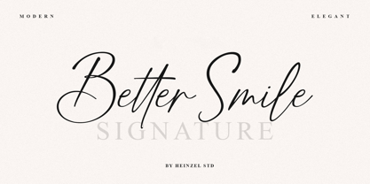 Better Smile Signature is a flowing handwritten font, described by an elegant touch, perfect for your favorite projects. It looks stunning on wedding invitations, thank you cards, quotes, greeting cards, logos, business cards and every other design which needs a handwritten touch. Fall in love with its incredibly distinct and timeless style and use it to create spectacular designs! Better Smile Features : Uppercase and Lowercase Numerical and Punctuation Ligatures PUA Encoded Multilingual Support
 - NOh Carbone by OhType!,
$32.00 NOh CARBONE is a serif typeface with more than 250 glyphs, including Capitals, Small Letters, Numbers & Special glyphs and Punctuation. Appropriate for medium and large formats, its high contrast, strong features & aggressive and unconventional diagonal endow it with great elegance and give it distinction over other types of the same style. This typeface is adapted to different topics and applications, is easily modifiable and capable of generating a clear and direct message.
 - Jenriv by Linh Nguyen,
$25.00 Inspired by designs of the early Renaissance, Jenriv brings out a sedate atmosphere and generous inner spaces. Starting with the idea of mixing straightforward strokes and curves, it results in kind masculine figures, but calm and humble. It reminds some archaic air but a simplified one. Jenriv embraces text flows, multiple languages, and various styles with standard OpenType features. It is well adapted to various applications, from medium body text to large headlines, or logotypes.
 - Lesthone by Nathatype,
$29.00 Lesthone is a display font that seamlessly merges vintage aesthetics with modern elegance. The rounded shapes of Lesthone contribute to its friendly looks. Each letter has its own personality, and this contributes to the font's handcrafted appeal. On the other hand, the most standout characteristic of Lesthone is its slightly rough texture that add a rustic charm. This font includes beautiful ornaments as a bonus. Lesthone fits in headlines, logos, branding materials, and many more.
 - Sabu by Larin Type Co,
$16.00 Sabu is multitasking, modern sans-serif font family, and a great solution for anyone your project. It includes upright and Italic style, each of them has weight weights from thin to extra bold. This is a multi-purpose one that is perfect for big and small text, it is constructed modern and easy to read. With it, you can create logos, banners, use in advertising, packaging, books covers and magazines, headings, descriptions and much more.
 - Bezura by Adam B. Ford,
$14.00 Bezura is a font designed with an emphasis on minimal nodes. All bezier curves in this font have reference points on 90° or 45°. All corners have a smooth curve to them. It would probably work great when used in vinyl-cutting applications on signage. While it has a very methodical construction, there is enough sway in the font to give it a loose feel for professional projects with an unprofessional feel.
 - Lazy Morning by Hanoded,
$15.00 I can’t remember when I had a true lazy morning.. I was a looong time ago, before I had children! Even now, when I’m down with the flu, I can’t stay in bed for too long - it really seems like a waste of time! Lazy Morning is a nice handwritten font. I made it with a Sharpie pen. It comes with all diacritics and double letter ligatures for you to play with.
 - Veritas by Altered Ego,
$45.00Veritas is a serif text family. It is a narrow-width typeface, with a taller x-height than Times Roman for added legibility, but maintains a similar character count in text. It is typeface designed for publication, newspaper (anywhere where narrow columns are necessary) and identity design. It is exquisitely spaced and kerned, even in European characters. The Digital Type Review states "...Veritas is one of the most important contributions ... from any independent foundry." - Vennesia by Andrey Font Design,
$10.00 Vennesia is a sweet handwritten font. Fall in love with its authentic feel and use it to create gorgeous social media posts, wedding invitations, beautiful stationary art and much more! It also features a wealth of special features including alternate glyphs and ligatures. This font is PUA encoded which means you can access all of the cute glyphs and swashes with ease! Whether you’re looking for fonts for Instagram or calligraphy scripts for DIY projects.
 - Qe Laurenty by Hishand Studio,
$15.00 The newly released Qe Laurenty sans serif font exudes an air of timeless sophistication and elegance. Its clean lines and precise geometry make it a truly classy choice for any design project. Qe Laurenty's refined curves and delicate letterforms add a touch of luxury to any typographic composition. This font's exquisite detailing and balanced proportions make it perfect for creating elegant branding materials. Complete with ligatures alternates regular italic icon kerning multilingual support
 - Blauhaus by Hanoded,
$15.00 Yes, you're right. Blauhaus should have been 'Blaues Haus', as that is the proper way of saying Blue House in German. But hey, Blauhaus sounds much better and in writing, it is quite similar to Bauhaus. Blauhaus is a stylish, rounded sans serif font, modeled after some early 20th century German typefaces. It is easy on the eye and it will certainly give your work a sophisticated punch. Comes with a classy collection of diacritics.
 - Magrit by Creativemedialab,
$20.00 Magrit is a bold serif display font, It has many alternates character with nice curve that you can arrange to create a nice logo lettering, or use it as a display face on a poster and add a few alterations to it to make a beautiful eye catching words. Magrit font is best for branding, logo lettering, headlines, product packaging, tshirt design, wedding theme, poster, book cover, wedding invitation, Christmas and many more
 - TE Cathrine by Tharwat Emara,
$49.00 This font may be conservative and classic, but also may be more playful and modern. It is good for theater or art posters and for modern music, web-pictures or vinyl covers. Of course it also will be good for coffee shops, cafe's, restaurants, magazine's headers, signs or gift/post cards and weddings. Try to use it in your beauty or travel blogs, you will see how many options you will have with stylish CATHRINE
 - Mozziano by Mostardesign,
$15.00 Created in 2010 by Olivier Gourvat, Mozziano is an elegant cross between geometric and round shapes. Its post-retro style opposes also fine and thick lines. This font can be used for very short texts however it is particularly effective for headlines in larger point sizes so that its details are emphasized. Mozziano best used in experimental designs. Mozziano contain an extensive character set that includes support for Central and Eastern European languages.
 - Pixel Promise by PizzaDude.dk,
$18.00 Pixel Promise is my wannabe pixel font. Yes, it is not a pixel font…but it is handmade and the “pixels” are deliberately off here and there. Nevertheless, when typing with Pixel Promise, you get that retro gaming feeling, and before you know it, you feel like you just want to insert another coin, press 1 or 2 players and complete that level! :) I have added 5 different versions of each letter and multilingual support
 - Taylor Demian Script by Get Studio,
$17.00 Introducing Taylor Demian Signature Font This new script font embodies the essence of a natural signature style. Designed to convey elegance and organic handwriting, it effortlessly exudes a sense of graceful flow. Meticulously crafted, this font can be seamlessly incorporated into various contexts. With its elegant signature style, natural impression, and clever ligature usage, this script font closely resembles authentic handwriting. It brings a personalized and aesthetically pleasing quality to your design projects.
 - Valdo by Larin Type Co,
$16.00 Valdo is an elegant and contrast serif font family, and a great fashionable solution for your project. It includes upright and Italic style, each of them has eight weights from thin to extrabold. This is a multi-purpose and classic font that is perfect for fashion project, it is contrasted, modern and easy to read. With it, you can create logos, banners, use in advertising, packaging, book covers and magazines, headings, descriptions and much more.
 - Prismatic Spirals by MMC-TypEngine,
$93.00 PRISMATIC SPIRALS FONT! The Prismatic Spirals Font is a decorative type-system and ‘Assembling Game’, itself. Settled in squared pieces modules or tiles, embedded by unprecedented Intertwined Prismatic Structures Design, or intricate interlaced bars that may seem quite “impossible” to shape. Although it originated from the ‘Penrose Square’, it may not look totally as an Impossible Figures Type of Optical Illusions. More an “improbable” Effect in its intertwined Design, that even static can seem like a source of Kinetical Sculptures, or drive eyes into a kind of hypnosis. Prismatic Spirals has two related families, its “bold” braided version Prismatic Interlaces and the Pro version. While the default is simpler or easier to use, as all piece’s spin in same way, PRO provides a more complex intricate Design which requires typing alternating caps. Instructions: Use the Map Font Reference PDF as a guide to learn the 'tiles' position on the keyboard, then easily type and compose puzzle designs with this font! All alphanumeric keys are intuitive or easy to induce, you may easily memorize it all! Plus, often also need to consult it! *Find the Prismatic Spirals Font Map Reference Interactive PDF Here! (!) Is recommended to Print it to have the Reference in handy or just open the PDF while composing a design with this typeface to also copy and paste, when consulting is required or when it may be difficult to access, depending on the keyboard script or language. As a Tiles Type-System, the line gap space value is 0, this means that tiles line gaps are invisibly grouted, so the user can compose designs, row by row, descending to each following row by clicking Enter, same as line break, while advances on assembling characters. Background History: The first sketches of my Prismatic Knots or Spirals Designs dates back then from 2010, while started developing hand-drawn Celtic Knots and Geometric Drawings in grid paper, while engage to Typography, Sacred Geometry and the “Impossible Figures” genre… I started doing modulation tests from 2013, until around 2018, I got to unravel it in square modules or tiles from the grid, then idealized it as fonts, along with other Type projects. This took 13 years to come out since the first sketches and 6 months in edition. During the production process some additional tiles or missing pieces were thought of and added to the basic set, which firstly had only the borders, corners, crossings, nets, Trivets connectors or T parts and ends, then added with nets and borders integrations. Usage Suggestions: This type-system enables the user to ornate and generate endless decorative patterns, borders, labyrinthine designs, Mosaics, motifs, etc. It can seem just like a puzzle, but a much greater tool instead for higher purposes as to compose Enigmas and use seriously. As like also to write Real Text by assembling the key characters or pieces, this way you can literarily reproduce any Pixel Design or font to its Prismatic Spirals correspondent form, as Kufic Arabic script and further languages and compose messages easily… This Typeface was made to be contemplated, applied, and manufactured on Infinite Decorative Designs as Pavements, Tapestry, Frames, Prints, Fabrics, Bookplates, Coloring Books, Cards, covers or architectonic frontispieces, storefronts, and Jewelry, for example. Usage Tips: Notice that the line-height must be fixed to 100% or 1,0. In some cases, as on Microsoft Word for example, the line-height default is set to 1,15. So you’ll need to change to 1,0 plus remove space after paragraph, in the same dropdown menu on Paragraph section. Considering Word files too, since the text used for mapping the Designs, won't make any literal orthographical sense, the user must select to ignore the Spellcheck underlined in red, by clicking over each misspelled error or in revision, so it can be better appreciated. Also unfolding environments as Adobe Software’s, the Designer will use the character menu to set body size and line gap to same value, as a calculator to fit a layout for example of 1,000 pts high with 9 tiles high, both body size and line gap will be 111.1111 pts. Further Tips: Whenever an architect picks this decorative system to design pavements floor or walls, a printed instruction version of the layout using the ‘map’ font may be helpful and required to the masons that will lay the tiles, to place the pieces and its directions in the right way. Regarding to export PNGs images in Software’s for layered Typesetting as Adobe Illustrator a final procedure may be required, once the designs are done and can be backup it, expanding and applying merge filter, will remove a few possible line glitches and be perfected. Technical Specifications: With 8 styles and 4 subfamilies with 2 complementary weights each (Regular and Bold) therefore, Original Contour, Filled, Decor, with reticle’s decorations and 2 Map fonts with key captions. *All fonts match perfectly when central pasted for layered typesetting. All fonts have 106 glyphs, in which 48 are different keys repeated twice in both caps and shift, plus few more that were repeated for facilitating. It was settled this way in order for exchanging with Prismatic Spirals Pro font which has 96 different keys or 2 versions of each. Concerning tiles manufacturing and Printed Products as stickers or Stencils, any of its repeated pieces was measured and just rotated in different directions in each key, so when sided by other pieces in any direction will fit perfectly without mispatching errors. Copyright Disclaimer: The Font Software’s are protected by Copyright and its licenses grant the user the right to design, apply contours, plus print and manufacture in flat 2D planes only. In case of the advent of the same structures and set of pieces built in 3D Solid form, Font licenses will not be valid or authorized for casting it. © 2023 André T. A. Corrêa “Dr. Andréground” & MMC-TypEngine.
 - Maus - Personal use only

- Paprika by W Type Foundry,
$15.00 Paprika is a cute script with a slight messy touch. It is inspired in the modern calligraphy trends, therefore, sometimes it can be seen as an elegant typeface or as an spontaneous font; it depends on the context in which it is being used. This is the first W script, making our catalogue wider and more eclectic, all thanks to our new team member Isabel La Rivera. Paprika includes capital swashes, contextual ligatures, alternatives letters, and extras, making this project perfectly suited for several areas of graphic design. Learn about upcoming releases, work in progress and get to know us better! On Instagram W Foundry On facebook W Foundry wtypefoundry.com
 - Naston by Sopheynoft,
$49.00 Naston Regular is the font of choice for those who seek an elegant and versatile typeface. With its timeless design, Naston Regular adds sophistication to a wide array of applications, be it formal invitations, business presentations, or creative projects. Its meticulously crafted letterforms prioritize readability while maintaining a unique and distinctive style, leaving a lasting impression on your audience. This font's broad language support and impeccable craftsmanship ensure a seamless reading experience, making it an excellent choice for anyone who values professionalism and aesthetics in their design projects. Choose Naston Regular to elevate your content and effectively convey your message with clarity and elegance.
 - Qubo by Hoftype,
$49.00 Qubo, a new forcefully drawn monoline face. Its clear graphics create its appeal and give it distinctive characteristics. The slightly squared round elements make for an open and elegant look; subtle details refer to humanistic models. Qubo is a neutral, cool and very versatile typeface. It works superbly both in print and on the web. Qubo is well-equipped for ambitious typography. The Qubo family consists of 14 styles, comes in OpenType format with extended language support for more than 40 languages. All weights contain ligatures, proportional lining figures, tabular lining figures, proportional old style figures, lining old style figures, matching currency symbols, fraction- and scientific numerals.
 - Vanio by Eko Bimantara,
$24.00 Vanio is a wedge serif font family that crafted with precision, focused on both aesthetic and legibility. The letterforms and other typographic elements are made in a way to achieve optical recognition and fit for various typesetting. Its have a strong serif and spacious width letterforms on the upright styles. Its shown a medium contrast and caligraphic strokes. Its have a moderate vertical heights either at the x-height, caps, ascender or descender. Vanio consist of 10 styles from regular to extrabold with each matching italics. Its contain more than 460 glyphs which support broad latin languages. Also contain several opentype features; Ligature, oldstyle figures, fraction, and other variation of figures.
 - Polynesiac by Poole,
$22.50Polynesiac was discovered deep in the jungle on a cave wall on Gilligan's Island. "I was looking for ancient pictographs, and I find this crap instead!" says designer Wesley Poole. "But, the more I looked at it, the more I appreciated its charms." Sort of tropical, but not strictly Polynesian, this sans serif face never stoops to caricature, and achieves instead, a mysterious new flavor of the South Pacific Islands. Fun as it is, there's a certain dignity to it. "Living in Hawaii you just absorb this stuff. This is a fun loving culture. I hope I captured that, along with some Island Aloha." - Diaria Sans Pro by Mint Type,
$- Diaria Sans Pro is a sans-serif counterpart of Diaria Pro. With its extensive 9 weights and corresponding italics, extensive language support, and various OpenType features it is meant to build visual heirarchies of any detail and complexity in editorial design. This modern sans-serif typeface designed as a universally legible medium for both titles and paragraph text. Its large x-height and static exteriors allow comfortable reading in printed narrow columns as well as in screen graphics. Some of the styles of Diaria Sans Pro can be found in Mint Type Editorial Bundle together with other fonts which make some great pairs. Check it out!
 - Homenko by Apostrof,
$35.00 Homenko was the only Ukrainian typeface for metal type casting developed in the last century. It has already become a 'classic'. Vasyl Homenko worked on it from 1964 to 1967. The typeface successfully combines the qualities of lineal humanist typefaces with the Ukrainian tradition of asymmetrical slab serif. The works on its digitization and further development has been in progress since 2000. The present version contains Latin Extended characters, Cyrillic with stressed alternates and several ornaments based on Vasyl Homenko's works. It works perfectly for books for children and is ideal for publications related to culture, history, literature and traditional art of Ukraine and other nations of Eastern Europe.
 - Quaint Vibe by Look Minus Today,
$12.00 Quaint Vibe is a unique display font created by Look Minus Today. It captures a distinct and charming vibe, blending vintage aesthetics with modern design elements. With its quirky and unconventional letterforms, Quaint Vibe adds a touch of whimsy and character to any project. Whether you're creating retro-inspired posters, playful logos, or eye-catching headlines, this font will evoke a sense of nostalgia and captivate your audience. With its extensive set of alternate characters and ligatures, Quaint Vibe offers endless creative possibilities, allowing you to craft truly unique and captivating designs. Embrace the charm of Quaint Vibe and infuse your projects with its one-of-a-kind appeal.
 - New Yorker Type by Wiescher Design,
$55.00 NewYorkerType was one of the first typefaces I tried my hand at in 1985. I meant it as a revival of the typeface used by the New Yorker magazine. I did not scan it in, I just looked at the type and redrew it completely by hand. So it is not just a copy, but rather a redesign. Only much later did I come to know, that there is a bundle of similar typefaces of that period. Rea Irvin's design for New-Yorker magazine was just one of them, but the best. Yours, sincerely honoring Rea Irvin a great type- and magazine-designer Gert Wiescher
 - Alto Adige by Fenotype,
$25.00 Named after Italy’s northernmost region, Alto Adige is a high-contrast display serif typeface. With its condensed width and bold contrast it is excellent for headlines, packaging, magazines, posters and advertising, among any other display use. Alto Adige has large x-height making it a steady choice for sturdy text blocks with tight leading. In large sizes, you can also try tighter tracking for maximum impact. Alto Adige comes with a set of OpenType features: Contextual Alternates and Standard Ligatures are automatically on for certain character pairs. In addition it has over 50 alternates for display capital initials, set in Swash, Stylistic and Titling Alternates.
 - Jerosta by Keristyper Studio,
$14.00 Jerosta is a modern Sans Serif font with a dynamic and elegant style. Its clean and geometric lines give it a contemporary look while its unique letterforms add a touch of sophistication. With its versatile design, Jerosta can be used for a wide range of applications, from branding to editorial design and beyond. Featured: Standard Uppercase & Lowercase Numeral & Punctuation Multilingual : ä ö ü Ä Ö Ü ß ¿ ¡ Alternate & Ligature PUA encoded We recommend programs that support the Open Type feature and the Glyphs panel such as Adobe applications or Corel Draw, so you can use all the variations of the glyphs. Hope you enjoy our fonts!
 - Stitch Cursive by Okaycat,
$26.50 Stitch Cursive is a cute cursive font, with the added distinction of looking hand sewn! The applications of this full-out cursive font are many. It is designed to be creative & free flowing, but I also wanted it to be at least somewhat proper. The stitch is the central element to this unique design. Use Stitch Cursive any time you want fancy, legible, and luxurious text. Works great for logo design and beautiful for titles. Go ahead and have fun with it. Stitch Cursive is extended, containing the full West European diacritics & a full set of ligatures, making it suitable for multilingual environments & publications.
 - Razan by Kasheda Type,
$25.00 "Razan" is a digital font that transcends the boundaries between handwritten charm and advanced technological design. It embodies the artistry of handwriting, capturing the essence of creativity and uniqueness. The font is characterized by smooth lines and flexible design, with soft endings that add an artistic touch to each character. With a range of weights, "Razan" allows users full control over the thickness of the font, enhancing its versatility in various designs. Whether used for large headlines or small text, it shines with seamless and comfortable readability. Its unique allure gives the impression of carefully handcrafted characters, contributing a special and individualized touch to any artistic project or design.
 - Patricia Gothic by Midwest Type,
$12.00 Patricia Gothic is a Midwestern take on the traditional American sans serif style. It has been designed as a legible workhorse typeface family with just the right amount of character to add liveliness to your text. A hybrid of the gothic style and contemporary geometrics, its design has also been influenced by everything from vernacular signage, antique hand-lettered ads, early 20th century posters, and type used on mason jars. Its thinner weights can appear elegant, refined, and modern. Its regular weights set nicely legible text. And the heavier weights, especially the small caps, evoke vintage poster lettering. Download the Patricia Gothic PDF specimen
 - Cynosure by Device,
$39.00Cynosure is a humanist sans with a subtle thick/thin stress. This gives it a clean, sharp elegance and precision that can be missing in some more familiar monoline sans faces. The wide range of weights and the matching reweighed italics make it a versatile solution where a consistent appearance across a broad range of applications is required. Its clear and inarguable design make it suitable for a wide variety of uses, from corporate to entertainment, text to headline, signage, logotypes, magazines and reports. The italics retain the design of the upright across all characters, again ensuring consistency. Includes tabular, lining and old-style numerals. - Redland by Factory738,
$15.00 Redland is a modern classic serif font that created for brand or logo design purpose. It teases your eyes with its curves yet still able to maintain its classy composure. The variety of weights provide a range of choices that will help you find the best typographic colour. The available stylistic Ligature and Alternate offer a perfect font for anything your creativity takes you. 5 Weights (Light, Regular, Semibold, Bold, Black) Basic Latin A-Z and a-z Numerals & Punctuation Stylistic Alternates & Ligatures Multilingual Support for ä ö ü Ä Ö Ü ... Free updates and feature additions Thanks for looking, and I hope you enjoy it.
 - WTF Cannibold by Wasabib Type Foundry,
$17.00 Cannibold is a Bold, modern, and square font is a typographic style that exudes confidence and contemporary flair. With its clean lines and strong presence, this font captivates the eye and demands attention. Each letter is meticulously crafted to create a striking visual impact, making it perfect for a wide range of design applications. The bold weight of this font adds a sense of strength and power to every character. It conveys a sense of assertiveness and stands out, even from a distance. The thickness of the strokes gives each letter a solid and substantial feel, making it an excellent choice for headlines, logos, and attention-grabbing text.
 - Sirichana Thai by Linotype,
$40.99Sirichana is a monolinear Thai typeface with Light and Bold weights. The modern design is characterized by its traditional proportions but with almost geometric construction. Originally released by Linotype for digital photocomposition, it is now in OpenType format. This makes it possible to dynamically and precisely position the various levels of superscript and subscript vowel signs and tonal marks. In addition to this, the complete Unicode page range for Thai is covered to ensure flawless conversion between other OpenType fonts using Unicode. The accompanying Latin design matches well in scale and texture and supports most Western European languages making it ideal for setting bilingual texts. - Berkmire AOE by Astigmatic,
$19.95 1970’s Techno-typography finds its rebirth in Berkmire AOE. From its beefy weight to its narrow and sometimes unusual counter cuts, Berkmire AOE started as a digitization of a film typeface called Belden by LetterGraphics. This bulky techno typeface was taken from its limited character set and fleshed out to include an expanded language glyph set. The Capital letterforms seem to push the edge of readability, while the lowercase falls more in line. The letterforms of Berkmire AOE are easy to convert to paths and extend various stems, making this revival something you can really let your imagination run wild with for your designs.
