10,000 search results
(0.08 seconds)
- Pedrita by PintassilgoPrints,
$24.00 Sometimes you want to go unnoticed, sometimes you don't. This font is definitely for the second option. Pedrita is a generous type, a bit bold, somewhat showy, quite authentic. When you need that extra-something, go with caps and turn on the stylish interlocking pairs: added eye-catchingness guaranteed. And let the good times roll!
 - Violet by Doffdog,
$19.00 Violet is a bold modern calligraphy font. Every single letters have been carefully crafted to make your text looks beautiful. This font is perfect for all your design projects like wedding logos, signatures, packaging design, stationary, modern websites and print projects. Violet comes with upper and lowercase characters, numbers, marks and punctuation. Enjoy Violet font!
 - Maltiner Display by Arterfak Project,
$28.00 Introducing Maltiner Display: A versatile, elegant, and sophisticated condensed serif font inspired by classic typography and newspaper headlines. Designed to excel in display settings, Maltiner Display prioritizes typographic excellence, offering a bold yet refined aesthetic. With unique letterforms and sharp edges, Maltiner Display provides ligatures and special characters, the perfect choice for luxury projects.
 - Callmounth by Allouse Studio,
$16.00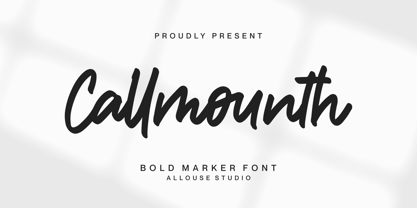 Proudly Present, Callmounth a Bold Marker Font Callmounth is perfect for any titles, logo, product packaging, branding project, megazine, social media, wedding, or just used to express words above the background. Callmounth also come with Multi-Lingual Support. Enjoy the font, feel free to comment or feedback, send me PM or email. Thank You!
 - Kohirug by Twinletter,
$15.00 Looking for a font that exudes style and elegance? Look beyond the KOHIRUG Blackletter font. This font evokes a strong, confident personality with striking details on each side of the lettering. Whether you’re creating a vintage-inspired project or want to add a bold classic look to your visuals, this font is a perfect choice.
 - East To West JNL by Jeff Levine,
$29.00 Sheet music for a song featured in "East to West", a film starring Mexican bombshell Dolores Del Rio, had the movie's name lettered in a bold sans style with early Art Deco influences. East to West JNL preserves not only the name, but all of the characteristics of this wonderful bit of typographic nostalgia.
 - Brolink by Sarid Ezra,
$13.00 Brolink is a wide bold sans based font with unique lowercase that will make your design looks sci-fi and modern. You can use this font for any purpose, especially to make logotype. You can mix and match the uppercase and lowercase to make your logo more readable. This font also comes with outline style!
 - Rough Cut NF by Nick's Fonts,
$10.00An old Art Nouveau typeface named "Daphne" provided the inspiration for this decidely different font. This version is upright, but the linocut treatment employed visually suggests the slight rightward slant of the original typeface. Bold, unusual and distinctive. Both versions of the font include 1252 Latin, 1250 CE (with localization for Romanian and Moldovan). - Throostle by Allouse Studio,
$16.00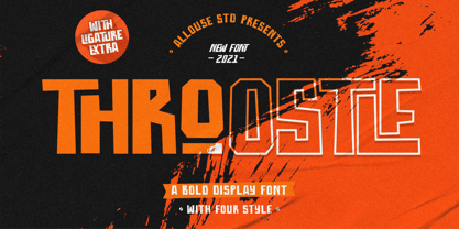 Proudly Presenting, Throostle a Bold Display Font Family. Throostle is perfect for any titles, logo, product packaging, branding project, megazine, social media, wedding, or just used to express words above the background. Throostle also come with Multi-Lingual Support. Enjoy the font, feel free to comment or feedback, send me PM or email. Thank You!
 - Radio Actor JNL by Jeff Levine,
$29.00 Bold and squared with rounded corners, the hand lettering found within the November, 1936 issue of Radio Mirror magazine really stands out. This stylized sans serif design, when used in poster displays or headline lettering, is attention-getting and drives the point home. Radio Actor JNL, is available in both regular and oblique versions.
 - P22 Sniplash by IHOF,
$24.95 Sniplash is a lively font inspired by cartoons and comics of the 1960s and '70s. Casual and organic, this font features curly lines and irregular weights in Regular, Light and Bold styles. This design defies serious analysis and offers a fun attitude for lighthearted design. Excellent for parties, retro packaging or any number of uses.
 - Mechaniclove by ahweproject,
$14.00 Mechaniclove is a gorgeous and bold handwritten font, crafted to give your headlines and logotype projects a retro touch. This font reads as strong, confident, and dynamic and can add tons of nostalgic character to your designs. This font is PUA encoded which means you can access all of the glyphs and swashes with ease!
 - LA QATRIE by Hishand Studio,
$15.00 Experience refined design with La Qatrie, a display font that boasts an elegant look and a touch of luxury, setting a new standard for sophistication in typography. Perfect for those needing a touch of elegance, classy, stylish, beautiful bold type, and modernity for their design. Complete with ligatures alternates regular hollow icon kerning multilingual support
 - Creamer by Creativework Studio,
$14.00 Creamer is a gorgeous and bold handwritten font, crafted to give your headlines and logotype projects a stylish touch. This font reads as strong, confident, and dynamic and can add tons of nostalgic character to your designs. Creamer is PUA encoded which means you can access all of the glyphs and swashes with ease.
 - Montageway by Allouse Studio,
$16.00 Proudly Presenting, Montageway A Bold Brush Script Font. Montageway is perfect for any titles, logo, product packaging, branding project, megazine, social media, wedding, or just used to express words above the background. Montageway also come with Multi-Lingual Support. Enjoy the font, feel free to comment or feedback, send me PM or email. Thank You!
 - Blackside by Din Studio,
$29.00 Blackside is a bold and authentic blackletter font. The font is suitable for any branding project like logo, t-shirt printing and many more. Outstanding in a wide range of contexts. Includes: Blackside (OTF) Featured : Alternates Accents (Multilingual characters) PUA encoded Numerals and Punctuation (OpenType Standard) Thanks for downloading premium font from Din Studio
 - Benoa by Creativemedialab,
$20.00 Benoa is a versatile font family for your design, consist of 6 weights from thin to black with dozens of alternates. Benoa works well with any style of design concept, from branding to a nice bold modern look! Benoa also available in Variable format, multilingual support, numbers, and currency symbols, and dozens of alternates.
 - Claudia Fiesta by Brenners Template,
$19.00Claudia Fiesta's sensitive and natural contrast appeals their styles more cultivated. The bold contrast between styles is minimized, but individual styles are displayed to stand out. And Uppercase's valiant Alternates will make your designs impressive. These stylistic alternates apply to all uppercase glyphs. You can choose according to your concepts to improve your design. - Bones Stone by Azetype,
$19.00 Presenting Bones Stone! A Bold Script Font with more than 9 Alternates and Extra. This font made with the perfect combination of each character. You can type by Mix & Match with an alternate version and extra swashes to get a unique combining. It looks original and can be used for all your project needs. Each glyph has its own uniqueness and when meeting with others will provide dynamic and pleasing proximity. This font can be used at any time and any project. You can see in the presentation picture above, Bones Stone looks Authentic on design projects. So, Bones Stone Font can't wait to give its touch to all your design projects such as quotes, poster design, personal branding, promotional materials, logotype, product packaging, etc. Besides that, Bones Stone also has some ligature that gives a surprise when you type certain characters combining. The ligatures are ff, tt, and ll. WHAT'S INCLUDED? 1. Bones Stone Basic • The first version comes with uppercase, lowercase, ligatures, numeral, punctuation, symbols, and Standard Latin Multilingual Support (Afrikaans, Albanian, Catalan, Danish, Dutch, English, French, German, Icelandic, Indonesian, Italian, Malay, Norwegian, Portuguese, Spanisch, Swedish, Zulu, and More). 2. Bones Stone Stylistic Alternate • The Second version comes with uppercase, lowercase, ligatures, numeral, punctuation, symbols, and Standard Latin Multilingual Support (Afrikaans, Albanian, Catalan, Danish, Dutch, English, French, German, Icelandic, Indonesian, Italian, Malay, Norwegian, Portuguese, Spanisch, Swedish, Zulu, and More). 3. Bones Stone Stylistic Set • It comes with 12 stylistic glyphs. Just access using Opentype Tools. 5. Bones Stone Swash • It comes with 47 underline swashes. Just type c_1 until c_47 to feature all. Enjoy the Font and Happy Creating! Thank You Azetype Studio
 - Jeles by Tour De Force,
$25.00 Inheriting the beauty and style of old type classics from this genre, Jeles is blended with very elegant modern approach featuring soft corners, round slab serifs and tasty ball terminals. Jeles is designed mostly for display use and it is highly recommended to get the whole family if you want to get the best result. It is designed in two styles Condensed and Normal. The Condensed version is developed in two weights each coming with corresponding italics. While the Normal styles are three ranging from Regular, Bold and Black. The total of 7 separate fonts inside the family are quite enough if you look for diversity and flexibility at one place. You could use the uprights for more serious and strong headlines while the Italics work perfectly for more fresh and live subheads. Of course editorial design is only one of the many directions where Jeles family could be used successfully as we all know typefaces with so visible contrast between thin and thick and combined with classic elegance, could be easily used in every design of cosmetic industry, fashion, food, jewelry, etc. Try to design a stylish boutique shop signboard and you will surely discover its beauty and potential. Easy-to-read, it is good for print design, revealing its authentic letterpress-like character as well as perfect for screen use note that the thin strokes and serifs are not that thin to vanish on a low resolution monitor. Professionally designed, they are solid enough yet very elegant and even gentle making Jeles a desired family design of attractive web banners, web sites, apps and e-books.
 - Belgato by Molly Suber Thorpe,
$9.00 Belgato is a vintage-inspired typeface with delicate details. It comes in six weights – plus italics! – for a total of 12 fonts, making it a highly versatile display face. The variable font version allows for ultimateweight and slant customization in print and web. Belgato has Latin, Greek, and Cyrillic alphabets, and supports dozens of languages, making it ideal for multilingual branding, publications, ads, social media, and more! I had so much fun designing this typeface, playing with classic serif letterforms to create an elegant, mid-century modern vibe. Belgato Light is fresh, airy, and delicate – perfect for feminine branding. By contrast, Belgato Black boasts fat curves with thin details, perfectly-suited to bold layouts and retro branding projects. Each Belgato font has 665 glyphs, encompassing: - the Latin alphabet (including hundreds of accented characters) - the Modern Greek alphabet - the Cyrillic alphabet (for Russian, Ukrainian, Bulgarian, and Serbo-Croatian) - discretionary ligatures - stylistic and alternate glyphs - numerals (lining and old style), small figures, and fractions - extensive punctuation, symbols, and diacritical markings Software: No special software is required to use Belgato fonts. You can even use these fonts with Canva! To access Belgato’s variable font features, ligatures, and stylistic alternates, it is best to use software that supports these functions (Adobe programs, Corel Draw, Sketch, etc). Languages: Belgato supports dozens of languages which use the Latin, Greek, and Cyrillic alphabets. Among the most common languages it supports are: English, Bulgarian, Catalan, Croatian, Czech, Danish, Dutch, Filipino, Finnish, Flemish, French, German, Modern Greek, Hungarian, Icelandic, Indonesian, Italian, Luxembourgish, Maltese, Norwegian, Polish, Portuguese, Russian, Serbo-Croatian, Spanish, Swedish, Swiss German, Turkish, and Ukrainian.
 - Kripke by Haiku Monkey,
$10.00 Kripke is a slab serif with rounded corners. It's readable and soft at small sizes, strong and friendly at large sizes. It's got a Greek and Cyrillic glyphs, as well as a large complement of accented characters. Try it on your designs!
 - Whitbury by Rachel White Art,
$16.00 Whitbury is a modern calligraphy script font with thin upstrokes and super heavy downstrokes. It has lots of fun ligatures! It's fun to use for quotes and headlines, and logos and branding projects. It's casual, playful, and full of eye grabbing attitude.
 - Serpentine by Image Club,
$29.99Dick Jensen (USA) designed Serpentine, is a contemporary-looking display font, for the Visual Graphics Corporation in 1972. With the rise of digital typesetting and desktop publishing, this typeface quickly became both popular and ubiquitous. This dynamic, wide, boxy design is identifiable via tiny triangular swellings at the stroke endings - what might be called semi-serifs. Serpentine is available in six different font styles: Light, Light Oblique, Medium, Medium Oblique, Bold, and Bold Oblique. Serpentine" is a greenish rock that sometimes resembles a serpent's skin, and is often used as a decorative stone in architecture. Though this font doesn't seem at all snaky or sinuous, it does have an architectural, stone-like solidity. The subtle, almost non-existent curves and semi-serifs keep it from being too stern or cold. Although the underlying strokes of each weight are similar, the six members of the Serpentine font family all present their own individual personalities. Serpentine Light lends itself well to text for onscreen displays, for instance, while the numbers from typeface's heavier weights are seen around the world on soccer jerseys! Additionally, the oblique styles convey a streamlined sense of speed, furthermore lending Serpentine well to sport and athletic applications (especially the faster, high-speed varieties). Because of its 1970s pedigree, Serpentine has come to be known as a genuine "retro" face. This makes the typeface even more appropriate for display usage, in applications such as logo design, magazine headlines, and party flyers. If you like Serpentine, check out the following similar fonts in the Linotype portfolio: Copperplate Gothic (similar serifs) Eurostile (similar width) Princetown (another "athletic" font) Insignia (similar "techno" feeling)" - Goneon by Ditatype,
$29.00 Goneon is a vibrant and eye-catching display font designed to bring the electrifying energy of neon lights to your designs. With its big, bold uppercase letterforms and mesmerizing neon style, this typeface captures the essence of a lively and dynamic atmosphere.. Each letter is meticulously crafted to emanate a radiant and electrifying glow, just like the vibrant neon signs that illuminate city streets at night. This neon style adds a touch of excitement and energy, instantly drawing the viewer's attention. Inspired by the pulsating rhythm of city nightlife, Goneon exudes a sense of modernity and vibrancy. The font captures the essence of an urban atmosphere, casting a dazzling neon glow that creates a lively and captivating visual impact. Each letter radiates with an unmistakable charm, bringing your designs to life with its electrifying vibes. Features: Alternates Multilingual Supports PUA Encoded Numerals and Punctuations Goneon perfect for headlines, banners, posters, and any design that requires a bold statement. The neon style adds an extra layer of excitement, making your text shine with a dynamic and eye-catching appeal. Whether you're working on advertising campaigns, event promotions, digital artwork, or any creative project that calls for a lively aesthetic, this font will instantly infuse your designs with an electrifying energy. It particularly shines in applications related to nightlife, entertainment, music, and urban-themed designs. Find out more ways to use this font by taking a look at the font preview. Thanks for purchasing our fonts. Hopefully, you have a great time using our font. Feel free to contact us anytime for further information or when you have trouble with the font. Thanks a lot and happy designing.
 - VLNL Melk by VetteLetters,
$29.99 At VetteLetters we like food but we also appreciate our drinks. Yes, of the non-alcoholic kind as well. Like milk. Contrary to what Arnold Schwartzenegger once said, Milk is not just for babies. It contains a whole lot of stuff that is genuinely good for you. Like proteins, carbohydrates, minerals (calcium a.o.) and many vitamins. One time visiting The Hague, Donald DBXL spotted a tile tableau on a brick wall, advertising a dairy factory called ‘De Sierkan’. Yellow sans serif letters on a bright blue background, dating back to the late 19th century, immediately grabbed DBXL’s attention. Especially because the tableau showed both regular and bold letters with some lovely peculiarities here and there. De Sierkan appeared to have been a milk factory solely operating in The Hague from 1879 until 1961. A number of these wall adverts are still to be seen in The Hague streets today. Photos were taken for later reference. Later is now, the lettering has been digitized, missing characters added, and VLNL Melk sees the light of day. VLNL Melk is an all-caps geometric display sans serif family of three weights, Regular, Bold and Black. The basic shape of the letters is a rectangle with rounded corners, leaving a sturdy no-nonsense look and feel. It has a distinct historic aura, but with both feet in this digital day and age. It can equally well be used for the logo of a hipster coffee place, as the cover of a historic novel. Actually, VLNL Melk kan be applied in a wide range of designs like logos, posters, flyers, book covers and magazine headlines.
 - Serpentine by Linotype,
$29.00Dick Jensen (USA) designed Serpentine, is a contemporary-looking display font, for the Visual Graphics Corporation in 1972. With the rise of digital typesetting and desktop publishing, this typeface quickly became both popular and ubiquitous. This dynamic, wide, boxy design is identifiable via tiny triangular swellings at the stroke endings - what might be called semi-serifs. Serpentine is available in six different font styles: Light, Light Oblique, Medium, Medium Oblique, Bold, and Bold Oblique. Serpentine" is a greenish rock that sometimes resembles a serpent's skin, and is often used as a decorative stone in architecture. Though this font doesn't seem at all snaky or sinuous, it does have an architectural, stone-like solidity. The subtle, almost non-existent curves and semi-serifs keep it from being too stern or cold. Although the underlying strokes of each weight are similar, the six members of the Serpentine font family all present their own individual personalities. Serpentine Light lends itself well to text for onscreen displays, for instance, while the numbers from typeface's heavier weights are seen around the world on soccer jerseys! Additionally, the oblique styles convey a streamlined sense of speed, furthermore lending Serpentine well to sport and athletic applications (especially the faster, high-speed varieties). Because of its 1970s pedigree, Serpentine has come to be known as a genuine "retro" face. This makes the typeface even more appropriate for display usage, in applications such as logo design, magazine headlines, and party flyers. If you like Serpentine, check out the following similar fonts in the Linotype portfolio: Copperplate Gothic (similar serifs) Eurostile (similar width) Princetown (another "athletic" font) Insignia (similar "techno" feeling)" - Mesopotamia by Teweka,
$15.00 Introducing New Mesopotamia Modern Signature, created with signature letters in mind. This font also has Swash, Ligature in it. You can use it as a logo, packaging, headline, poster, t-shirt, greeting card, wedding invitation, etc.
 - 2010 Outta Space by Morganismi,
$10.00 2010 OuttaSpace is a late space age font with geometric yet organic characters. Ideal for use in posters, cards, invitations etc. 2010 OuttaSpace Icons show you what it's all about in the universe. 2010 OuttaSpace supports West European languages.
 - Vectipede by Typodermic,
$11.95 Introducing Vectipede—a typeface that is bold, sharp, and confident. Its slab-serif style exudes an air of stability and dependability, making it perfect for any design that requires a sense of groundedness. But don’t let its strikingness fool you—Vectipede is also pragmatic. Its simple clarity of letterforms makes it easy to read, while its crisp angles and lines lend a touch of sophistication to any project. And if you’re looking for versatility, Vectipede has got you covered. With seven weights and italics, you can use it for anything from headlines to body text. Plus, it offers numeric ordinals and old-style numerals that can be accessed through OpenType features, making it the perfect choice for projects that require a touch of elegance. So whether you’re designing a poster, a brochure, or a website, Vectipede is the typeface you can count on. Simple, clear, and stylish—it’s the perfect choice for any design project that needs a touch of sophistication. Most Latin-based European writing systems are supported, including the following languages. Afaan Oromo, Afar, Afrikaans, Albanian, Alsatian, Aromanian, Aymara, Bashkir (Latin), Basque, Belarusian (Latin), Bemba, Bikol, Bosnian, Breton, Cape Verdean, Creole, Catalan, Cebuano, Chamorro, Chavacano, Chichewa, Crimean Tatar (Latin), Croatian, Czech, Danish, Dawan, Dholuo, Dutch, English, Estonian, Faroese, Fijian, Filipino, Finnish, French, Frisian, Friulian, Gagauz (Latin), Galician, Ganda, Genoese, German, Greenlandic, Guadeloupean Creole, Haitian Creole, Hawaiian, Hiligaynon, Hungarian, Icelandic, Ilocano, Indonesian, Irish, Italian, Jamaican, Kaqchikel, Karakalpak (Latin), Kashubian, Kikongo, Kinyarwanda, Kirundi, Kurdish (Latin), Latvian, Lithuanian, Lombard, Low Saxon, Luxembourgish, Maasai, Makhuwa, Malay, Maltese, Māori, Moldovan, Montenegrin, Ndebele, Neapolitan, Norwegian, Novial, Occitan, Ossetian (Latin), Papiamento, Piedmontese, Polish, Portuguese, Quechua, Rarotongan, Romanian, Romansh, Sami, Sango, Saramaccan, Sardinian, Scottish Gaelic, Serbian (Latin), Shona, Sicilian, Silesian, Slovak, Slovenian, Somali, Sorbian, Sotho, Spanish, Swahili, Swazi, Swedish, Tagalog, Tahitian, Tetum, Tongan, Tshiluba, Tsonga, Tswana, Tumbuka, Turkish, Turkmen (Latin), Tuvaluan, Uzbek (Latin), Venetian, Vepsian, Võro, Walloon, Waray-Waray, Wayuu, Welsh, Wolof, Xhosa, Yapese, Zapotec Zulu and Zuni.
 - Otome Mincyou by Norio Kanisawa,
$50.00 This font is I thought "I wanna try to make cute Mincyoutai.", and made it. I think it is cute font but may have a little nostalgia. It corresponds to Hiragana · Katakana · Alphabet · Numerals · Symbols · Kanji(chinese characters). You can also write vertically. You can use it easily, because it contains JIS first · second level, and IBM extended Kanji(about 6700chinese characters). Since it is little bold Mincyoutai, I think it is useful for headlines and text. About it's name, it is simple but has some childhood and romantic, I named this font "OtomeMincyou". I'm hope you like it. <「乙女みんちょう」紹介文> 「かわいい明朝体を作ってみたい!」と思い作ったフォントです。 かわいい中にもどこか懐かしさを持ったフォントになったかと思います。 ひらがな・カタカナ・アルファベット・数字・記号類・漢字に対応。縦書きもできます。 漢字はJIS第一水準・第二水準・IBM拡張漢字(約6700文字)に対応しているので、使いやすいかと思います。 ちょっと太めの明朝体なので、本文にも見出しにも使えると思います。 名称については、シンプルだけども夢見る少女のような幼さ・ロマンチックさを持っているなぁと思ったので「乙女みんちょう」と名付けました。 皆様のお役に立てれば幸いです。 <スタイルカテゴリー> 明朝体、装飾
 - Dual by North Type,
$- DUAL is a full width sans-serif typeface with an experimental side. Its straight lines and 90 degree angles give it a very geometric feel without hindering its legibility. It’s now available in 6 weights, ranging from 100 to 600. The idea behind DUAL has been brewing for quite some time, and though there has been many “experimental” released in the past, it does have its unique features. For starters, it is a fully usable and legible font in its original state. Also, its 251 alternate glyphs and 10 stylistic sets are, of course, its main attraction making DUAL a very versatile typeface for any user, from the casual designer to the hardcore artist. Finally, it has extensive additional language support for the Americas and parts of Europe. With its 563 glyphs, It’s actually two fonts in one, and thus the name DUAL. Enjoy!
 - Ruff N Ready by Typadelic,
$14.95 Ruff N Ready is a little bit rough around the edges and is ready for use on any project! This font has an innocent charm about it but is a bit of a non-conformist. Is it a serif font? Sans serif? A script font? It’s all of those and more! It’s legible enough to be used for body copy but holds its own in a headline or title. You’ll find a few unusual ligatures in the font and some fun alternates. I hope you enjoy using Ruff N Ready as much as I enjoyed designing it!
 - Quickjob by Nurf Designs,
$15.00 Quickjob is a strong display font. It comes in 6 styles and it’s the perfect font to make your designs standout. It will elevate a wide range of design projects to the highest level, be it branding, headings, wedding designs, invitations, signatures, logos, labels, and much more!
 - Paranoid - 100% free

- Hua by YXType,
$14.99 Hua type family is a sans-serif with very humanist details to represent the essence of nature. It features 14 weights from the very thin to the very bold, generously covering a wide range of the natural spectrum. Aiming to represent the soft and elegant side of nature, Hua features very unique italics that have their own take on the identity. The letterforms of the italic fonts are inspired by the lineage of both traditional calligraphic approaches for serifs and much simpler forms for sans-serifs. Hua provides very crisp performances on screens and its large x-height combined with fine-tuned proportions help it retain legibility very well on smaller sizes. Features: • Support for 200+ Latin languages • Double & single storie “a” & “g” • Unique italic letterforms • Low contrast with unique details • Small caps with symbols • Arbitrary and defined fractions • Support for superscript & subscript in normal & scientific alignments • Proportional lining, proportional old-style, tabular lining, tabular old-style
 - Masteria Script by Mans Greback,
$59.00 Masteria Script is a retro script typeface. An optimistic calligraphy lettering to bring you back to the golden age of hand-drawn advertisements, Masteria is a professional quality handwriting font family. Drawn and created by Mans Greback in 2022, it is perfect for a vintage restaurant headline or nostalgic logotype design. Use underscore _ to make a swash. Example: Mast_eria Use multiple underscores to make a longer swash. Example: Super___human (Download required.) Masteria Script is provided in six diverse styles, such as Thin, Bold, Black, Italic and combinations to compliment each other and maximise your options and design experience. The font is built with advanced OpenType functionality and has a guaranteed top-notch quality, containing stylistic and contextual alternates, ligatures and more features; all to give you full control and customizability. It has extensive lingual support, covering all Latin-based languages, from Northern Europe to South Africa, from America to South-East Asia. It contains all characters and symbols you'll ever need, including all punctuation and numbers.
 - Supertuba by Tipos Pereira,
$10.00 Supertuba is a :) geometric sans vernacular humanist :) display type family with 6 weights. There's literally dozens of ligatures in this font so It works very well for flyers, package, stickers and posters, also you can use it as a text font if you're looking for something slightly bold. Supertuba has multilingual support and useful open type features. Letter boards that used to be seen in churches, dive bars and butcher shops are the main inspiration for this typeface. The name Supertuba came from an old supermarket that no longer exists in the city of Indaiatuba , I just believe this name is super fun (at least in Portuguese) and wanted to keep it alive. I was in Indaiatuba when I get started designing this typeface so this is fair enough. Supertuba the third piece of a particular trilogy of fonts that Stubby and Stubby Rough take part, from the lazy vernacular drawing to an unusual geometry. Enjoy!
 - Megabeat by Invasi Studio,
$17.00 Megabeat Font is a new and exciting typeface that is inspired by the robotic and mecha poster movies of the past. The font references the science-fiction visual of the retro-futurism mindset, making it perfect for any project that requires a futuristic and technologically advanced design. This font is perfect for creating sci-fi movie posters, serials, technology-based branding, posters, logos, vintage illustrations, packaging, snacks, event and festival materials, album and cover artwork, books, toys, games, arcades, cards, automotive designs, and many more. The font features bold and chunky letterforms with sharp angles and mechanical elements, giving it a futuristic and robotic feel. The font is easy to read and legible, making it perfect for headlines, titles, and other design elements that need to be easily understood. The font is perfect for any project that requires a futuristic and technologically advanced design that is inspired by the iconic visual of retro-futurism.
 - Mirfak by Herofonts,
$25.00 Mirfak™ is a new take on a work from Adrian Frutiger made in 1964. In the first place, it was a specific alphabet made for only one book. Only lowercases, capitals, numbers and a few mathematical signs where created. Covering only English language, used only once and unknown by most, we considered this Slab Serif as an hidden gem that needed a modernization. Mirfak™ is a result of a project whose goal was to take a beautifully designed Slab Serif and update it so that its technical standards surpass the status quo, leaving us with a truly superior slab serif family. Entirely coded from scratch with Metafont™, this family is not only an update but an expansion of the original concept, covering now most used languages on earth. Modernized and unique, Mirfak’s 3 weights, light to bold, can give a full range of expression for interfaces and corporate design; in print, on screen and in multiple languages.
