10,000 search results
(0.039 seconds)
- Al Glamour Bouquet by Aluyeah Studio,
$125.00 Hello Aluyeaholics! Glamour Bouquet, a magnificent wadding handwritten font. It's was inspired by a royal wedding that just took place in our town. Uniting the two empires of the two major cities of our country. Coming with 140+ stunning and super easy to use alternates and ligatures. Super Easy to Use alternates - You can easily call alternates using special combination like a.2 k.3 b.4 t.h c.c etc. To get results like the preview just type g.7l.8amour.3 b.6ouquet.2
 - The Bouns by Flawlessandco,
$9.00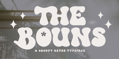 The Bouns is a Groovy Retro Font with fun and elegant style, so it's fitted for some retro project. There's some connected letters and some alternates that suitable for any graphic designs such as branding materials, t-shirt, print, business cards, logo, poster, t-shirt, photography, quotes .etc This font support for some multilingual. Also contains uppercase A-Z and lowercase a-z, alternate character, numbers 0-9, and some punctuation. If you need help, just write me! Thanks so much for checking out my shop!
 - Sunbathe by Java Pep,
$13.00 Introducing an elegant script font called Sunbathe, every shape of this font is made by the natural strike. To customize, Sunbathe comes with some features like alternate and ligature. It's perfect for branding, magazines, greeting card, wedding invitation, social media stories, etc. What you will get : - Opentype features - Multilingual, support 16 languages ( Afrikaans, Albanian, Catalan, Danish, Dutch, English, Estonian, Finnish, French, German, Icelandic, Italian, Norwegian, Portuguese, Spanisch, Swedish, Zulu ) If you have any questions or need technical support, don't hesitate to comment, message or contact java.indonesian@yahoo.com.
 - Rossena by Flawlessandco,
$9.00 Rossena is a modern retro serif font that features unique alternate and ligature characters, so it's fitted for some retro project. An Original typeface that suitable for any graphic designs such as branding materials, t-shirt, print, business cards, logo, poster, t-shirt, photography, quotes .etc This font support for some multilingual. Modern Sweet Retro that contains uppercase A-Z and lowercase a-z, alternate character, numbers 0-9, and some punctuation. If you need help, just write me! Thanks so much for checking out my shop!
 - Monsterian by Gassstype,
$23.00 Introducing of our new product Monsterian is a Handmade Moster Display Font with a natural style and dramatic movement. Best for horror poster,project that need horror vibes , designs look modern, unique and fun. It’s perfect for labels, quotes, posters, DIY projects, branding, packaging, greeting cards, websites, photos, photography overlays, signs, scrapbooking, tags and so much more! is perfect for homeware designs,branding projects, Logo design, Quotes product packaging, graffiti style with a fun theme very good for graffity poster, flyer, childrenbook, cartoon, comic etc.
 - Athina by Rillatype,
$17.00 Introducing our latest font, Athina! Athina is a display serif font that perfect for modern and minimalistic design. This font was carefully designed and we added the swash so this font has the ability to standout among the other! we made up to 6 stylistic character that you can choose to make your design more unique and bloom it's charm. This font is perfect for logom magazine, wdding invitation, fashion, make up, stationary, novel, etc. Features : uppercase & lowercase numbers and punctuation multilingual alternates PUA encoded Thank You!
 - Kaleko 105 Text by Talbot Type,
$19.50 Kaleko 105 Text is the text specific variation of stablemate, Kaleko 105 . With a shallower x-height and longer ascenders and descenders, its more traditional proportions make it more economical with space and better suited to continuous text. It's a well-balanced, versatile, modern sans, highly legible as a text font and with a clean, elegant look as a display font at larger sizes. The Kaleko 105 Text family comprises of four weights and includes old style non-aligning (lower case) numbers, both proportional and tabular as well as accented characters for Central European languages. It is closely related to Kaleko 205 Text , which offers variations in some characters, most notably a two-storey lower case a and g.
 - Death Markers by Figuree Studio,
$25.00 Everyone who lives will surely die Death Markers is a natural brush font, inspired by a vintage aesthetic sign painting. Made in combination with hand lettering, it comes with dramatic movement and it’s great for any next creative project that needs a retro vibe and horror touch. It comes with 2 styles: Clean and Drip effect. Ideal for logos, handwritten quotes, product packaging, header, poster, merchandise, social media & greeting cards. With your purchase you get: - All Caps - Numbers and Punctuation Marks - Support for MAC or PC - Simple installation for Adobe Illustrator, Corel Draw, Photoshop, or Procreate (New Updated) - Support Multilanguage I hope you make something cool with it. If you have any questions don't hesitate to ask!
 - Born Spirit by Dora Typefoundry,
$17.00 Introducing the Born Spirit font, it is a display typeface that demands attention with a bold vintage look. Sharp hooks and strong lines create a sense of toughness. It's great to tap into designers or product owners who need solutions to make their designs look more uniquely elegant. Features: Uppercase, numbers, punctuations; Multilingual support. PUA Encoded We highly recommend using a program that supports OpenType features and Glyphs panels like Adobe apps and Corel Draw, so you can see and access all Glyph variations. This type of family has become the work of true love, making it as easy and fun as possible.I really hope you enjoy it! Thank you Enjoy the font and go get creative :)
 - Hedone by Jehoo Creative,
$19.00 Blending minimalist and elegant styles makes Hedone typeface have a classy character. Hedone is a condensed sans typeface but in some glyphs it has a complete circle shape, and the ink trap on each glyph makes a strong elegant impression on Hedone typeface. it's perfect for a striking vintage and elegant minimalist theme design. Stunning details and versatile possibilities for this font make it an essential addition to any type magazines, posters, album covers, brochures, social media posts, web UI and so on. 4 weights with more than 475 glyphs each, have the Opentype Alternate feature, ligature, and discretionary ligature. Support Western Europe, Central / Eastern Europe, Baltic, Turkish, Romanian, Cyrillic making it very flexible when combined with other typefaces.
 - Gunydrops by Ahmad Jamaludin,
$17.00 Presenting for you, Gunydrops! Gunydrops - it's retro, bold, and playful, really ties together your piece to give it that retro feel. Perfect for make any project like header, quote, layout magazine and other. Even better if you use it on 60s and 70s design project Embracing the psychedelia era combine with groovy style, it came with vector extras and open type features such as stylistic alternates What's you get? Extras AI and EPS Unique letterforms Works on PC & Mac Simple Installations Accessible in Adobe Illustrator, Adobe Photoshop, Microsoft Word even work on Canva! PUA Encoded Characters Fully accessible without additional design software. Come and say hello over on Instagram! https://www.instagram.com/dharmas.studio/ Dharmas Studio
 - Kaleko 205 Text by Talbot Type,
$19.50 Kaleko 205 Text is the text specific variation of stablemate, Kaleko 205 . With a shallower x-height and longer ascenders and descenders, its more traditional proportions make it more economical with space and better suited to continuous text. It's a well-balanced, versatile, modern sans, highly legible as a text font and with a clean, elegant look as a display font at larger sizes. The Kaleko 205 Text family comprises of four weights and includes old style non-aligning (lower case) numbers, both proportional and tabular as well as accented characters for Central European languages. It is closely related to Kaleko 105 Text , which offers variations in some characters, most notably a single storey lower case a and g.
 - Bapalopa by Okaycat,
$24.50 Bapalopa is inspired by classic graffiti "blockbuster" letter forms. These letters are made to look as big and as wide as possible. Bapalopa's linework is kept very loose & relaxed, mostly smooth with some distressed edges. Viewed up-close, there is lots of texture from the individual pen strokes which gives Bapalopa it's cool freehand drawn look. Use "Bapalopa" and "Bapalopa Pa" together to create eye catching designs. To make it extra fun, a handful of the largely useless alternates, (like that dumb "currency" symbol) were replaced with big blocky hearts, stars, and arrows. Check it out! Bapalopa is extended, containing the full West European diacritics & a full set of ligatures, making it suitable for multilingual environments & publications.
 - Blank Notes by Pixesia Studio,
$13.00 Introducing Blank Notes - A Handwritten Marker Font Blank Notes is a bold and playful handwritten marker font. It's created with a natural and unique style and has beautiful and neat characters. This font is perfect for digital notes, logotype, quotes design, book cover, t-shirt design, magazine titles, food menu, poster, kids projectbranding, social media, crafty DIY projects or anything. Add it to your most creative ideas and notice how it makes them come alive! FEATURES - Swash - Ligatures - PUA Encoded - Uppercase and Lowercase letters - Numbering and Punctuations - Multilingual Support - Works on PC or Mac - Simple Installation - Support Adobe Illustrator, Adobe Photoshop, Adobe InDesign, also works on Microsoft Word Hope you Like it. Thanks.
 - Allotropic by The Flying Type,
$24.00 Allotropic is a pretty decorative face with a remarkable art nouveau flair. It loosely draws inspiration from a 1914 untitled alphabet by J.M. Bergling, a then "Modern Alphabet", and from its interpretation by Photo-Lettering, from the sixties. Allotropic comes in two styles, regular and bold, both with extended language coverage, as well as stylistic alternates and a couple of ornaments. It's decidedly a fab choice not only for vintage and retro designs (ça va sans dire!), but also for creative contemporary uses in print and on screen. Play it on book covers, packaging, branding, editorial, web, advertising, apparel, uses are endless. Just give Allotropic a go, let the inspiration flow, and keep on creating!
 - Savinder by Dora Typefoundry,
$17.00 SAVINDER - ALL CAPS Serif! Savinder is a modern and elegant, classy all-capital typeface with unique curves and cuts making it one of the most memorable fonts, perfect for a magazine brand or title. You can also use this font for logos, branding, and it's versatile for any project too! FEATURES: • Uppercase • Numbers & Punctuation • Characters with accents • Supports Languages This type of family has become a work of true love, making it as easy and enjoyable as possible. I really hope you enjoy it! I can't wait to see what you do with Savinder! Feel free to use the #Dora Typefoundry tag and the # Logo Font Savinder font to show what you've been up to!
 - Animo by Durotype,
$49.00 Animo stands out from the crowd. Animo is surprisingly legible for its outspoken personality. Many of Animo’s small details were crafted to enhance its legibility, while preserving its personality. Animo is suitable for both text and display use — for graphic design, corporate identity design, magazines, reports, editorials, web, advertising, signage, etc. Animo includes 32 fonts, 8 weights, 16 uprights, and matching italics. Animo provides nine numerical styles: lining and oldstyle figures (proportional and tabular), small cap figures, superiors, inferiors, numerators, and denominators. Animo provides small caps, arbitrary fractions, and extensive language support. Animo Alt provides a more usual shape for the ‘A’, ‘M’, ‘W’, and ‘w’. For more information about Animo, download the PDF Specimen Manual.
 - Burdigala Sans by Asgeir Pedersen,
$19.99 Burdigala is a clean-cut, modern yet classic typeface inspired by Didones and Aicher’s Rotis family. Burdigala Sans is especially well suited for on-screen usage such as in apps and pdf documents. It is also ideal for larger amounts of (printed) texts in brochures, magazines and books. It is slighty narrow in order to conserve space, but spacious enough to faciliate reading and overall clarity. Check out its sibling, the Burdigala Semi Serif version. The expanded versions, being wider and more open, works equally well in media intended both for print and on-screen reading, e.g. in Pdf-documents etc. Burdigala is the ancient Roman name of the city of Bordeaux France.
 - Train Of Thought by Pesic,
$29.00 Train of thought is a decorative font based on vintage and retro posters of the 19th and 20th centuries. Contains all Latin and Cyrillic glyphs. It is very modern, and it is intended for the use of creating logos and T-shirt designs as well as highlighting the essential elements on billboards, magazines, etc. Today's digital designers can use these stencil patterns to embellish text set in other alphabet stencils or by themselves to evoke the feeling of rustic Americana. Train of the thought is extremely detailed, and looks good in both small and large dimensions. It also contains a set of symbols, which you can use to further emphasize the essential elements.
 - CA Postal by Cape Arcona Type Foundry,
$39.00 CA Postal is a cute and clever little stamp-font. It was originally intended for a record-cover only, but when the artist wanted all lyrics printed in the booklet, it was time for a font. The initial inspiration was a moveable-stamp printing-set, which had a nice Futura-like style, being very pleasant to read, especially in small sizes. But of course it’s the loose and irregular outlines that give the font its special charms. CA Postal features two sets of characters and the "Contextual Alternates" feature will make sure that never two identical characters will stand next to each other, so that the stamp-look becomes even more authentic.
 - Neumatic Compressed by Arkitype,
$12.00 Neumatic compressed has a super compressed character set, increased cap height and tight kerning that combine to give you the ability to create large, beautiful and effective headlines and copy for your artwork. Neumatic Compressed packs punch when it comes to large copy lines and is perfect for posters, display copy, headlines in printed materials like magazines and books . The family comes in 8 weights from extra light to Black so it's versatile. Its extra light weight can give you some great height due to how narrow it is. Play around with the opentype Superscript with an underline or the Opentype stylistic sets which turns the default squared dots on i's, j's and punctuation to round dots.
 - Kamerik 205 Text by Talbot Type,
$19.50 Kamerik 205 Text is the text specific variation of stablemate, Kamerik 205. With a shallower x-height and longer ascenders and descenders, its more traditional proportions make it more economical with space and better suited to continuous text. It's a well-balanced, versatile, modern sans, highly legible as a text font and with a clean, elegant look as a display font at larger sizes. The Kamerik 205 Text family comprises of four weights and includes old style non-aligning (lower case) numbers, both proportional and tabular as well as accented characters for Central European languages. It is closely related to Kamerik 105 Text, which offers variations in some characters, most notably a single storey lower case a and g.
 - ArTarumianKhachatur by Tarumian,
$40.00 This is a font imitating the stage of outline construction of letters using drawing tools - compass and ruler. It is very geometric (with auxiliary lines, axes, centers of circles, tangents, and conjugation of circles), although the circles are somewhat compressed from four sides. The second style, which plays the role of Bold style, is a hatched version of the Regular style. The font has very small elements that appear in a sufficiently large size, so it is better to use it for large compositions, in particular, advertisements, posters, large headings, etc. The family is named "Khachatur" after the name of the father of designer Ruben Tarumian — architect Khachatur Hakobyan, his first master.
 - Banthani by Nurf Designs,
$25.00 Banthani is a dynamic bold script font. Inspired by its predecessor Raphtalia, it comes with a bold script style and is equipped with Opentype Features (Stylistic Alternate, Contextual Alternate, Ligature, etc.). You can get a different character in almost every glyph, you can choose it according to your design needs. We designed some characters to change “DYNAMICALLY” when they meet other characters, in order to create readability and harmony in each appearance. Banthani is very suitable for the needs of Logotype, Branding, Header and designs that require distinctive features. Works on PC & Mac Simple installations Accessible in the Adobe Illustrator, Adobe Photoshop, Adobe InDesign, even work on Microsoft Word. PUA Encoded Characters – Fully accessible without additional design software.
 - Acklebury by Studio Buchanan,
$32.00 Acklebury is a chunky, reverse contrast, slab-serif typeface available in two styles. It has heaps of personality, plenty of open type features, and a whole host of special characters and dingbats. Although it's drawn from historical sources, Acklebury is not a straight revival, rather more of an homage to the many, varied, extended lining figures of the late 1800's. Acklebury celebrates the once labelled 'hideous' combination of wide rounded forms and hard slab serifs. Only using modern type technology to fix the spacing and kerning issues that would of been impossible with metal or wooden type. Acklebury is not a French Clarendon, neither is it really an Italienne... but it is phat, wide and hella funky.
 - Plinc Banjo by House Industries,
$33.00 When it comes to poster design, the line between wild west and psychedelic can be surprisingly fine. Dave West combined both typographic genres to create his refreshing Banjo. Developed in the late 1960s for Photo-Lettering, Inc., this curvaceous high-contrast sort-of serif might have been born on the nineteenth-century frontier, but it was raised in the counterculture of the mid-twentieth century. Use it wherever the conventional and uncommon collide. Vectorized by Mitja Miklavčič in 2017. Like all good subversives, House Industries hides in plain sight while amplifying the look, feel and style of the world’s most interesting brands, products and people. Based in Delaware, visually influencing the world.
 - Ghostly Guffaws by Putracetol,
$22.00 Introducing Ghostly Guffaws, a Halloween Funny Theme Font that encapsulates the spooky yet playful spirit of Halloween. This unique display font, crafted with precision. Ghostly Guffaws is characterized by its all caps lettering, making it a perfect choice for bold and eye-catching headlines. With seven distinct variations tailored to fit the eerie theme, this font is versatile and adaptable. Whether you’re designing logos or branding materials, Ghostly Guffaws adds a touch of whimsy and horror that’s bound to captivate your audience. It’s not just limited to Halloween; use it for children’s themes, crafting projects, invitations cards, packaging designs, posters titles, business signage, greeting cards stickers books magazines or any design needing a dash of creepy charm.
 - Blingtastic Script by Seniors Studio,
$17.00 Blingtastic Script is a modern & clean calligraphy script. Its characters dance along the baseline while it still has an elegant touch. It can be used for various purposes such as logos, wedding invitations, headings, t-shirt, letterheads, signage, labels, news, posters, badges etc. OpenType features include stylistic alternates, ligatures and extensive language support. To enable the OpenType Stylistic alternates, you need a program that supports OpenType features such as Adobe Illustrator CS, Adobe Indesign & CorelDraw X6-X7, Microsoft Word 2010 or later versions. There are additional ways to access alternates/swashes, using Character Map (Windows), Nexus Font (Windows), Font Book (Mac) or a software program such as PopChar (for Windows and Mac).
 - Kamerik 105 Text by Talbot Type,
$19.50 Kamerik 105 Text is the text specific variation of stablemate, Kamerik 105. With a shallower x-height and longer ascenders and descenders, its more traditional proportions make it more economical with space and better suited to continuous text. It's a well-balanced, versatile, modern sans, highly legible as a text font and with a clean, elegant look as a display font at larger sizes. The Kamerik 105 Text family comprises of four weights and includes old style non-aligning (lower case) numbers, both proportional and tabular as well as accented characters for Central European languages. It is closely related to Kamerik 205 Text, which offers variations in some characters, most notably a two-storey lower case a and g.
 - PF Square Sans Pro by Parachute,
$79.00 Designer Panos Vassiliou created Square Sans Pro in his quest for a true square-like text typeface which could balance simplicity with vitality and enhance with its subtle power the identity of any product or service, without compromising its characteristics as a text typeface. The family consists of 12 fonts—from extrablack to thin—including true italics. It supports 19 special OpenType features like small caps, fractions, ordinals, etc. and offers multilingual support for all European languages including Greek and Cyrillic. Finally, every font in this family has been completed with 270 copyright-free symbols, some of which have been proposed by several international organizations for packaging, public areas, environment, transportation, computers, fabric care and urban life.
 - Granite Falls by Pen Culture,
$17.00 Introducing Granite Falls, a captivating modern font that effortlessly blends elegance with contemporary style. With its sleek lines and refined letterforms, this font brings a touch of sophistication to any project. The carefully crafted characters maintain a perfect balance between simplicity and uniqueness, making it ideal for a wide range of design applications. Whether it's branding, logos, headlines, or social media graphics, Granite Falls adds a modern and trendy flair. What will you get: Granite Falls SVG file I really hope you enjoy it – please do let me know what you think, comments & likes are always hugely welcomed and appreciated. More importantly, please don’t hesitate to drop me a message if you have any issues or queries. Thank you
 - Ah, the Capitular Moldurada font by Ouripedes Gallene, a font so distinctive that it makes Arial look like it's pretending to be Helvetica at a costume party. Imagine if letters decided to go to a ma...
- That Funky Love by Nicky Laatz,
$22.00 A fun all caps bubble font. It's fat, it's happy, and it's perfect for fun greeting cards, posters, quotes, and groovy lettering designs.
 - Xaver Grotesk by Xaver Design Studio,
$25.00 Xaver Grotesk Variable, a font that emerged in the creative landscape of 2023, stands as a testament to contemporary typographic innovation. This font is not just a mere collection of characters but a meticulously crafted expression of modernity and sophistication. Its genesis was driven by a desire to infuse the typographic realm with a fresh take on the classic grotesque style while embodying a technical allure that whispers of a slightly futuristic essence. At its core, Xaver Grotesk is a testament to the marriage of form and function. The deliberate choice of monospacing adds a unique rhythm and structure to the font, instilling it with a sense of order and balance. The low capital height introduces a distinctive visual characteristic, creating an unconventional yet captivating silhouette that stands out in various design contexts. One of the font's most striking features lies in its letter design. Each character is meticulously sculpted, bearing angular and horizontal traits that not only convey a sense of modernity but also evoke a hint of technological precision. These angular and horizontal elements work in tandem, shaping the font's overall personality and lending it a forward-thinking edge. The fusion of these elements—monospacing, low capital height, and angular/horizontal letter design—creates a harmonious interplay that sets Xaver Grotesk apart. It's not merely a collection of letters; it's an experience, a visual journey that captivates and engages the viewer. Whether used in digital interfaces, printed materials, or other design mediums, this font transcends its utilitarian purpose to become an artistic statement in itself.
 - John Sans by Storm Type Foundry,
$49.00 The idea of a brand-new grotesk is certainly rather foolish – there are already lots of these typefaces in the world and, quite simply, nothing is more beautiful than the original Gill. The sans-serif chapter of typography is now closed by hundreds of technically perfect imitations of Syntax and Frutiger, which are, however, for the most part based on the cool din-aesthetics. The only chance, when looking for inspiration, is to go very far... A grotesk does not afford such a variety as a serif typeface, it is dull and can soon tire the eye. This is why books are not set in sans serif faces. A grotesk is, however, always welcome for expressing different degrees of emphasis, for headings, marginal notes, captions, registers, in short for any service accompaniment of a book, including its titlings. We also often come across a text in which we want to distinguish the individual speaking or writing persons by the use of different typefaces. The condition is that such grotesk should blend in perfectly with the proportions, colour and above all with the expression of the basic, serif typeface. In the area of non-fiction typography, what we appreciate in sans-serif typefaces is that they are clamorous in inscriptions and economic in the setting. John Sans is to be a modest servant and at the same time an original loudspeaker; it wishes to inhabit libraries of educated persons and to shout from billboards. A year ago we completed the transcription of the typefaces of John Baskerville, whose heritage still stands out vividly in our memory. Baskerville cleverly incorporated certain constructional elements in the design of the individual letters of his typeface. These elements include above all the alternation of softand sharp stroke endings. The frequency of these endings in the text and their rhythm produce a balanced impression. The anchoring of the letters on the surface varies and they do not look monotonous when they are read. We attempted to use these tricks also in the creation of a sans-serif typeface. Except that, if we wished to create a genuine “Baroque grotesk”, all the decorativeness of the original would have to be repeated, which would result in a parody. On the contrary, to achieve a mere contrast with the soft Baskerville it is sufficient to choose any other hard grotesk and not to take a great deal of time over designing a new one. Between these two extremes, we chose a path starting with the construction of an almost monolinear skeleton, to which the elements of Baskerville were carefully attached. After many tests of the text, however, some of the flourishes had to be removed again. Anything that is superfluous or ornamental is against the substance of a grotesk typeface. The monolinear character can be impinged upon in those places where any consistency would become a burden. The fine shading and softening is for the benefit of both legibility and aesthetics. The more marked incisions of all crotches are a characteristic feature of this typeface, especially in the bold designs. The colour of the Text, Medium and Bold designs is commensurate with their serif counterparts. The White and X-Black designs already exceed the framework of book graphics and are suitable for use in advertisements and magazines. The original concept of the italics copying faithfully Baskerville’s morphology turned out to be a blind alley. This design would restrict the independent use of the grotesk typeface. We, therefore, began to model the new italics only after the completion of the upright designs. The features which these new italics and Baskerville have in common are the angle of the slope and the softened sloped strokes of the lower case letters. There are also certain reminiscences in the details (K, k). More complicated are the signs & and @, in the case of which regard is paid to distinguishing, in the design, the upright, sloped @ small caps forms. The one-storey lower-case g and the absence of a descender in the lower-case f contributes to the open and simple expression of the design. Also the inclusion of non-aligning figures in the basic designs and of aligning figures in small caps serves the purpose of harmonization of the sans-serif families with the serif families. Non-aligning figures link up better with lower-case letters in the text. If John Sans looks like many other modern typefaces, it is just as well. It certainly is not to the detriment of a Latin typeface as a means of communication, if different typographers in different places of the world arrive in different ways at a similar result.
 - Rockinstead by PintassilgoPrints,
$35.00 Rockinstead counts 1, 2, 3, 4, 5, 6, 7, 8... Eight variations per letter, plus alternates for numbers and even for punctuation marks! It is equipped with some clever OpenType programming to make substitutions on-the-fly: the Contextual Alternates feature, with the help of a very careful kerning table, takes care of cycling the alternates in an amazing random-like way, impressively mimicking a true handwritten text. The Discretionary Ligatures feature manages the substitution of handy cursive catchwords, adding that charming twist. To put it more bluntly, this font AUTOMATICALLY alters your typing so that it substitutes glyph variations while you do nothing but type away! No need to use PopChar here to do the substitutions manually, the font itself takes care of that for you. This typeface was originally painted on paper, drawing inspiration from Ralph Steadman’s seminal lettering style. On a first glance it may look quite wild - and it proudly is, indeed. But look again: it is stylishly wild, it is strong, unpredictable, full of attitude and good energy. This multifaceted font will certainly strike its way for free-spirited design applications. Just please be warned: it’s seriously addictive!
 - Electric Cable by Harald Geisler,
$39.00 ''Sometimes, you fall in love with someone, and, sometimes, you fall in love with something. I fell in love with the work of Harald Geisler. Harald and I met through our work on a couple of Kickstarter projects (Typographic Wall Calendar and The Montserrat Typeface). We sympathised immediately with each other, and that lead us to start a new project. The electricity we felt was captured in Electric Cable (that’s what we named it), a typeface designed in our own image and likeness. Electric cable is connected, and that power leads it to write unexpected things. It’s a letter for the flâneur: it carries within itself a high voltage that makes it lively. It has energy and spark. That’s exactly what we would like in a person. It is a display typeface, current and contemporary. It is based on the connection of two friends who felt the need to create a common language even without speaking the same language. In editorials use, your words will become strikingly beautiful. Electric Cable features geometric, humanistic qualities,and also some script, but ,above all, it has a sense of humor.’’ Julieta Ulanovsky (Usage tip: Use the “
 - Frozen Memory by Hanoded,
$15.00 Frozen Memory is a heavy-boned cartoon display font. Even though it was completely made by hand (using a roller ball pen and some quality paper), it has a clean look, crisp lines and generous curves. Frozen Memory comes in three distinct styles, helping you to create versatile designs. Frozen Memory urges you to eat more ice-cream, but just beware of that brain freeze!
 - Popty Ping by Hanoded,
$15.00 Popty Ping is Welsh slang for microwave oven. It literally means ‘oven that goes ping’. Popty Ping was sort of based on an older font of mine called Jambo. It is a very happy cartoon font, ideal for children’s book covers, ice cream packaging and microwave popcorn (preferably the non GM kind). Comes in two great styles and more diacritics than you can pop in an oven!
 - ComixHeavy - Unknown license

