10,000 search results
(0.04 seconds)
- ITC Ellipse Neo by Typorium,
$30.00 The Typorium presents a new optimized and enriched version of ITC Ellipse which first appeared in 1996 in the International Typeface Corporation typeface library. ITC Ellipse Neo design has been lightly modified. Three weights have been added (light, Medium, Extra Bold, including Italics) to the original Regular and Bold styles. ITC Ellipse Neo is both modern and classic. Modern in the unusual shape based on the geometric ellipse form. And classic in the structure of some letters like the lower cases c, e, g, o, s. These letters alone could come from a traditional typeface, but they fit perfectly with the atypical rest of the alphabet giving it a present-day and traditional mix. Furthermore, the ellipse shape fits naturally in the italic styles, giving the font an organic and fluid feeling. ITC Ellipse Neo offers OpenType features such as alternate characters for upper and lower case, and an extended accented character set to support many languages. Five weights have been created for each style to offer a wide range of graphic possibilities in a tidy digital footprint. Designer: Jean-Renaud Cuaz Publisher: Typorium MyFonts debut: December 15, 2020 Le Typorium présente une nouvelle version optimisée et enrichie d'ITC Ellipse qui est apparue pour la première fois en 1996 dans la bibliothèque de caractères de l'International Typeface Corporation. Le design de ITC Ellipse Neo a été légèrement modifié. Trois graisses ont été ajoutées (léger, moyen, extra gras, y compris les italiques) aux styles originaux Regular et Bold. ITC Ellipse Neo est à la fois moderne et classique. Moderne dans le dessin inhabituel basé sur la forme géométrique de l’ellipse. Et classique dans la structure de certaines lettres comme les minuscules c, e, g, o, s. Ces lettres pourraient provenir d'une police de caractères traditionnelle, mais elles s'intègrent parfaitement avec le reste de l'alphabet plus insolite en lui donnant un mélange de modernité et de tradition. De plus, la forme de l'ellipse s'intègre naturellement dans les styles italiques, donnant à la police une sensation organique et fluide. ITC Ellipse Neo offre des fonctionnalités OpenType telles que des caractères alternatifs pour les capitales et les bas de casse, et un jeu de caractères accentués étendu pour prendre en charge de nombreuses langues. Cinq graisses ont été créés pour chaque style afin d'offrir un large éventail de possibilités graphiques pour une empreinte numérique rigoureuse.
 - ITC Ellipse Script by Typorium,
$30.00 The Typorium presents a new optimized and enriched version of ITC Ellipse which first appeared in 1996 in the International Typeface Corporation typeface library. ITC Ellipse Script is a complementary typeface to ITC Ellipse Neo, designed a very legible handwriting style. ITC Ellipse Script is both modern and classic. Modern in the unusual shape based on the geometric ellipse form. And classic in the structure of some letters like the lower cases c, e, g, o, s. These letters alone could come from a traditional typeface, but they fit perfectly with the atypical rest of the alphabet giving it a present-day and traditional mix. Furthermore, the ellipse shape fits naturally in the italic styles, giving the font an organic and fluid feeling. ITC Ellipse Script offers OpenType features such as alternate characters for upper and lower case, and an extended accented character set to support many languages. Five weights have been created for each style to offer a wide range of graphic possibilities in a tidy digital footprint. Designer: Jean-Renaud Cuaz Publisher: Typorium MyFonts debut: Nov 1, 2020 Le Typorium présente une nouvelle version optimisée et enrichie d'ITC Ellipse qui est apparue pour la première fois en 1996 dans la bibliothèque de caractères de l'International Typeface Corporation. ITC Ellipse Script est une police complémentaire à ITC Ellipse Neo, conçue dans un style d'écriture très lisible. ITC Ellipse Script est à la fois moderne et classique. Moderne dans le dessin inhabituel basé sur la forme géométrique de l’ellipse. Et classique dans la structure de certaines lettres comme les minuscules c, e, g, o, s. Ces lettres pourraient provenir d'une police de caractères traditionnelle, mais elles s'intègrent parfaitement avec le reste de l'alphabet plus insolite en lui donnant un mélange de modernité et de tradition. De plus, la forme de l'ellipse s'intègre naturellement dans les styles italiques, donnant à la police une sensation organique et fluide. ITC Ellipse Script offre des fonctionnalités OpenType telles que des caractères alternatifs pour les capitales et les bas de casse, et un jeu de caractères accentués étendu pour prendre en charge de nombreuses langues. Cinq graisses ont été créés pour chaque style afin d'offrir un large éventail de possibilités graphiques pour une empreinte numérique rigoureuse.
 - ITC Digital Woodcuts by ITC,
$29.99ITC Digital Woodcuts font is the work of Timothy Donaldson. Although made on a computer, each character has the look of a block of wood with a character cut into it. The forms are made entirely of lines, typical of how the result would be if they were truly cut into wood. ITC Digital Woodcuts is a capital letter alphabet including both white letters on a black background and black letters on a whitish background which looks as though the bark of the piece of wood was chiseled away for the effect. Donaldson suggests alternating the black version with the white to create a three dimensional effect. - ITC Mister Chuckles by ITC,
$29.99Round, firm, and bursting at the seams with good humor, ITC Mister Chuckles is based on the premise that barrel shapes have pleasant associations. Think: beer-barrel polkas, a barrel of fun, or a barrel of laughs, and you'll get the idea. Designer Nick Curtis has combined sans serif sturdiness, a hint of 1930s deco and a handful of giggles in this remarkably versatile all-cap face. If the typographic occasion calls for mirth and merriment, invite Mister Chuckles to the party. You'll have more fun than a barrel of monkeys! - ITC Stone Serif by ITC,
$29.99 Sumner Stone worked together with Bob Ishi of Adobe to create the Stone family fonts, which appeared in 1987. Coincidentally, ishi is the Japanese word for stone, which precluded any squabbling about whose name the font would carry. The family consists of three types of fonts, a serif, a sans-serif and an informal style. The Stone fonts are very legible and make a modern, dynamic impression.
 - ITC Bodoni Six by ITC,
$40.99Giambattista Bodoni (1740-1813) was called the King of Printers; he was a prolific type designer, a masterful engraver of punches and the most widely admired printer of his time. His books and typefaces were created during the 45 years he was the director of the fine press and publishing house of the Duke of Parma in Italy. He produced the best of what are known as modern" style types, basing them on the finest writing of his time. Modern types represented the ultimate typographic development of the late eighteenth and early nineteenth centuries. They have characteristics quite different from the types that preceded them; such as extreme vertical stress, fine hairlines contrasted by bold main strokes, and very subtle, almost non-existent bracketing of sharply defined hairline serifs. Bodoni saw this style as beautiful and harmonious-the natural result of writing done with a well-cut pen, and the look was fashionable and admired. Other punchcutters, such as the Didot family (1689-1853) in France, and J. E. Walbaum (1768-1839) in Germany made their own versions of the modern faces. Even though some nineteenth century critics turned up their noses and called such types shattering and chilly, today the Bodoni moderns are seen in much the same light as they were in his own time. When used with care, the Bodoni types are both romantic and elegant, with a presence that adds tasteful sparkle to headlines and advertising. ITC Bodoni™ was designed by a team of four Americans, after studying Bodoni's steel punches at the Museo Bodoniana in Parma, Italy. They also referred to specimens from the "Manuale Tipografico," a monumental collection of Bodoni's work published by his widow in 1818. The designers sought to do a revival that reflected the subtleties of Bodoni's actual work. They produced three size-specific versions; ITC Bodoni Six for captions and footnotes, ITC Bodoni Twelve for text settings, and ITC Bodoni Seventytwo - a display design modeled on Bodoni's 72-point Papale design. ITC Bodoni includes regular, bold, italics, Old style Figures, small caps, and italic swash fonts. Sumner Stone created the ornaments based on those found in the "Manuale Tipografico." These lovely dingbats can be used as Bodoni did, to separate sections of text or simply accent a page layout or graphic design." - ITC Zapf Book by ITC,
$29.99 Zapf Book font is the work of German designer Hermann Zapf, a blend of the characteristics of Walbaum, Melior and the contrasting weights of Bodoni. It is a typical Zapf font, distinction without eccentricity and superb sensitivity and letterfit, and clearly demonstrates his concern that an alphabet work not just as a collection of single letters, but also have a sense of unity in itself.
 - ITC Jiggery Pokery by ITC,
$29.99ITC Jiggery Pokery is the work of British freelance designer Carol Kemp. ITC Jiggery Pokery evolved from lettering for a project which needed to be quirky, wacky and fun," says Kemp. "The name came to me as the letters appear to jig along - it just seemed to fit. 'Jiggery Pokery' is London Cockney slang which has a variety of meanings. It's used to describe behavior such as 'ducking and diving', trickery, juggling (especially of financial matters!), or 'hanky panky'. My grandparents were Cockneys, and my uncle would use colourful rhyming slang which I loved to hear as a child."" - ITC Talking Drum by ITC,
$29.99 - ITC Tempus Serif by ITC,
$29.99ITC Tempus is the work of British designer Phill Grimshaw. He claims that every calligrapher's aspiration is to draw perfect roman capitals with a pen, but admits that this is extremely difficult. For this typeface, Grimshaw used a fountain pen on cheap, porous paper and, of course, the ink bled. The resulting forms are classic but their rugged edges deviate from the perfection of roman type. And Tempus Sans is just Tempus with the serif surgically removed, yet the proportions of the characters work nicely," says Grimshaw. Because of its rough quality, the typeface works best in larger point sizes, yet maintains its characters even in smaller sizes. - ITC Grimshaw Hand by ITC,
$29.99 ITC Grimshaw Hand is based on the handwriting of its British designer, Phill Grimshaw. Warm and lively, this typeface has the look of spontaneous handwriting with a little extra panache. Note the jaunty k, the swooping f, the simply stylish s, and the absolutely zingy cap Q and R. Grimshaw designed this face in 1995, at a time when he was also playing the guitar and mandolin. Handwriting fonts give an air of intimacy to the graphic design of advertising pieces, packaging, invitations, greeting cards - and ITC Grimshaw Hand has the touch of sweet music in its enthusiastic strokes.
 - ITC Scram Gravy by ITC,
$29.99The 1928 logotype for Sertal Toiletries consisted of a stylized woman's head, a very snaky S, and five fine, fat deco caps spelling out the rest of the brand name. From these five clues, designer Nick Curtis divined the rules" of the typeface and drew a complete alphabet, including a lower case. The result: ITC Scram Gravy. The finished product could be described as Bodoni on steroids. Tight curls in characters like the 'm,' 'r' and 'y' soften the lower case and give the design a light-hearted flavor. ITC Scram Gravy takes its name from one of many running gags in the screwball comic strip "Smokey Stover," which had folks alternately splitting their sides and scratching their heads from 1935 to 1973. Those familiar with Bill Holman's strip will recall Smokey's car, the Foomobile, and one of his famous nonsense declarations: "No foo-ling, that scram gravy ain't wavy."" - ITC Bailey Quad by ITC,
$29.99 ITC Bailey Quad Bold was designed by Kevin Bailey in 1994. It is a semiserif typeface in the style of slab serif faces. The unusual placement of some serifs and unconventional forms of some characters give the font a modern feel. The overall look of Baily Quad Bold is robust and strong and the font is best used in headlines and short to middle length texts in point sizes of 12 and larger.
 - ITC True Grit by ITC,
$29.99ITC True Grit is the work of American designer Michael Stacey, a bold distinctive typeface. An enthusiastic collector of vintage graphic design, Stacey says that he is especially intrigued by lettering styles from the days when most display typography was done by hand. The style for ITC True Grit was taken from the 1930s and updated for digital imagine. Stacey say his goal was to retain the casual feel of handlettering yet impart the crisp finish of current precision typography." ITC True Grit is a hybrid design, a cross between German Blackletter and brush script with a hint of Jugendstil thrown in." - ITC Motter Sparta by ITC,
$29.99ITC Motter Sparta is the work of Austrian designer Othmar Motter and for its inspiration, he turned to car design. As we all know, trends in car design affect many other fields of design in a way that shapes tastes." At the end of the 1990s, Motter saw the trend moving away from soft lines and toward a tighter, tenser look: "In this latest trend, sharp clearly-defined edges meet broadly-drawn, dynamic curves and cut them off sharply." And so too is ITC Motter Sparta, with each character form distinct, which also creates a typeface instantly recognizable from a single character. "The sharp straight strokes, cut off almost at right angles, and the strong cross-stroke curves, ending in points, form a charged contrast to the vertical and horizontal straight strokes that give Motter sparta its taut framework."" - ITC Mona Lisa by ITC,
$29.99ITC Mona Lisa was designed by Pat Hickson, a stark and elegant typeface originally drawn in the 1930s by Albert Auspurg. The original drawings were long gone and the surviving metal type was already severely worn when Hickson studied Auspurg's design for his recreation. The result is a typeface which melds the flavor of the 1930s with current design standards. ITC Mona Lisa displays all the suave sophistication of Fred Astaire and Greta Garbo. - ITC Johann Sparkling by ITC,
$29.99ITC Johann Sparkling is the work of Austrian designer Viktor Solt, a perfect imitation of the handwriting of an educated person of the 18th century. ITC Johann Sparkling is intended to close the gap between highly formal copperplate scripts and the scribbled look of 'true' handwriting," says Solt. "I am not very interested in highly formal and perfect calligraphy, but rather in quick, personal-looking scripts. Usually I start with some historical samples in mind, but I do not try to copy these sources. Instead, I incorporate them into my own handwriting. It takes up to two weeks, and many sheet of paper, before the respective script becomes my own. Of course, this would not be an economic approach for individual lettering jobs, but I can conserve the custom script for future use by digitizing it." ITC Johann Sparkling should be used in fairly large point sizes and its capitals only as initials. - ITC Mendoza Roman by ITC,
$29.99 ITC Mendoza is a serif typeface with old style characteristics. A generous x-height and a lack of contrast between thick and thin strokes, gives the ITC Mendoza Roman font family good legibility and provides a sturdiness which enables the face to withstand low resolution output and less than ideal printing conditions. It is ideal for continuous text use, particularly in small point sizes.
 - ITC Golden Type by ITC,
$29.99 Canadian designer Anthony De Meester created the font in 1989. Vienna Extended is a light, elegant sans serif. Simplicity is the hallmark of Vienna and it can be used most effectively where a look of regal elegance is desired. Vienna is a trademark of International Typeface Corporation.
 - ITC Peter's Miro by ITC,
$29.99ITC Peter's Miro is the work of New York designer John Peter. It was inspired by the letters used by Joan Miro in his paintings. No one used letterforms more frequently in his work than Joan Miro," says Peter. For his typeface, however, "considerable liberty has been taken with his [Miro's] original letters and missing characters have been added." The letters are a simple script, irregularly and almost crudely written, but bursting with energy. To give designers free rein with their creativity, Peter designed two complete versions of the alphabet in both upper- and lowercase, Peter's Miro and Peter's Miro Too." - ITC Garamond Handtooled by ITC,
$34.99Claude Garamond (ca. 1480-1561) cut types for the Parisian scholar-printer Robert Estienne in the first part of the sixteenth century, basing his romans on the types cut by Francesco Griffo for Venetian printer Aldus Manutius in 1495. Garamond refined his romans in later versions, adding his own concepts as he developed his skills as a punchcutter. After his death in 1561, the Garamond punches made their way to the printing office of Christoph Plantin in Antwerp, where they were used by Plantin for many decades, and still exist in the Plantin-Moretus museum. Other Garamond punches went to the Frankfurt foundry of Egenolff-Berner, who issued a specimen in 1592 that became an important source of information about the Garamond types for later scholars and designers. In 1621, sixty years after Garamond's death, the French printer Jean Jannon (1580-1635) issued a specimen of typefaces that had some characteristics similar to the Garamond designs, though his letters were more asymmetrical and irregular in slope and axis. Jannon's types disappeared from use for about two hundred years, but were re-discovered in the French national printing office in 1825, when they were wrongly attributed to Claude Garamond. Their true origin was not to be revealed until the 1927 research of Beatrice Warde. In the early 1900s, Jannon's types were used to print a history of printing in France, which brought new attention to French typography and the Garamond" types. This sparked the beginning of modern revivals; some based on the mistaken model from Jannon's types, and others on the original Garamond types. Italics for Garamond fonts have sometimes been based on those cut by Robert Granjon (1513-1589), who worked for Plantin and whose types are also on the Egenolff-Berner specimen. Linotype has several versions of the Garamond typefaces. Though they vary in design and model of origin, they are all considered to be distinctive representations of French Renaissance style; easily recognizable by their elegance and readability. ITC Garamond? was designed in 1977 by Tony Stan. Loosely based on the forms of the original sixteenth-century Garamond, this version has a taller x-height and tighter letterspacing. These modern characteristics make it very suitable for advertising or packaging, and it also works well for manuals and handbooks. Legible and versatile, ITC Garamond? has eight regular weights from light to ultra, plus eight condensed weights. Ed Benguiat designed the four stylish handtooled weights in 1992." In 1993 Ed Benguiat has designed Handtooled versions. - ITC Pious Henry by ITC,
$29.99ITC Pious Henry is the work of South Carolina designer Eric Stevens, a typeface which for him evokes a feeling of the rural South. Maybe it's a naive quality that belongs on a 'Boiled Peanuts' sign," he says. The letters of ITC Pious Henry seem to dance across page or screen." - ITC Tot Spots by ITC,
$29.99The symbols in ITC TotSpots include everything from a child's life, except maybe the mess. In this font you'll find diaper pins, alphabet blocks, teddy bears, and even an inchworm-everything a digital baby would need. Polish-Canadian designer Victor Gad has specialized in editorial illustration, and also has extensive experience in poster design. These illustrations maintain his original sketchbook quality, despite being digital renderings. ITC TotSpots offers a clear, new style of symbols, which might be the perfect fit for your next project! - ITC New Baskerville by ITC,
$34.99 ITC New Baskerville is one of many contemporary type families based on the work of John Baskerville (1706-1775), a writing master and printer from Birmingham, England, whose types were cut by the punchcutter John Handy. Baskerville produced a masterpiece folio Bible for Cambridge University, and today, his types are considered to be fine representations of eighteenth-century rationalism and neoclassicism. ITC New Baskerville is a late 20th-century interpretation of Baskerville’s style, designed by John Quaranda. It makes an excellent and very readable text face; its sharp, high-contrast forms make it suitable for elegant advertising settings as well. ITC New Baskerville® font field guide including best practices, font pairings and alternatives.
 - ITC Viner Hand by ITC,
$29.99ITC Viner Hand is the work of British designer John Viner, and it is based on his own handwriting. The warmth and familiarity of this informal script will lend a relaxed and personal touch to any application. - ITC Vino Bianco by ITC,
$29.99ITC Vino Bianco was created by German designer Jochen Schuss. He drew his inspiration from the handwriting of the waiter in his favorite local pub, especially the form of the capital Q. Based on this one character Schuss developed the entire alphabet. The figures are sketchy and generous and look as though they were written on paper with a ball point pen. Vino Bianco is an alphabet of capital letters, each of which also has an alternative form, making it very flexible and true to the tendency of true handwriting. In spite of its fine strokes, the overall look is open and light due to the large amount of space each character occupies. The cheerful, carefree ITC Vino Bianco is best used for headlines and short texts. - Vital Formations - Unknown license

- Normalise Din by Mecanorma Collection,
$45.00 - Mortal Coil by Hanoded,
$15.00 I was playing around with an old brush I found in our kitchen: it had fallen under the stove and it had probably been hiding there for quite some time! I dusted it off, got my Chinese ink and set to work. The result is a scary-ish font. Mortal Coil comes with discretionary ligatures for double lower case letter combinations.
 - Zornale Title by Eurotypo,
$20.00 Zornale TITLE is a family of four fonts that can be combined with the rest of Zornale family (text and caption). These fonts have been designed with precise kerning and full OpenType features: Old-style figures, swashes, stylistic alternates, ligatures and case-sensitive forms.
 - Lost Format by T-26,
$19.00 - Mortal Claws by Krakenbox Studio,
$27.00 Corogh Gorge is a Blackletter Font. It has gothic, mysterious, brave, classic. It’s a great font for fashion, apparel projects, signature, album cover, logo, branding, magazine, social media, & advertisements, but also works great for other projects.
 - Pic Format by Device,
$29.00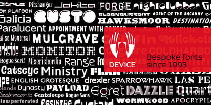
- OK Corral by FontMesa,
$20.00 OK Corral is a revival of a very old Italian font that you may have seen in the past under the original name of Italian Print. The Lined version of this font has never been known to have a lower case set of letters until now.
 - Black Mortal by Yoga Letter,
$30.00 "Black Mortal" is an elegant and unique block font. This font is perfect for logos, movie titles, business branding, stickers, book titles, banners, posters, Halloween, Black Friday, and more. Equipped with uppercase, lowercase, numerals, punctuation, and multilingual support
 - Shaircut Forman by Maulana Creative,
$14.00 Shaircut Forman handmade display font, fun character with a bit of ligatures. To give you an extra creative work. Shaircut Forman handmade display font support multilingual more than 100+ language. -Uppercase Many Thanks, Maulana Creative
 - Baroque Mortale by Letterhead Studio-YG,
$45.00 Letterhead Studio makes both fonts and design with own fonts. The studio is started in 1998 by Yuri Gordon, Valery Golyzhenkov and Olga Vassilkova. We work in graphic design, branding and type design. Our collection of Cyrillic fonts includes more than 330 faces, generally it is display fonts. Letterhead is one of leading developers of custom-made fonts, lettering and digital calligraphy in Russia. Among clients of studio are magazines like Rolling Stone, Esquire, GQ, Empire, Interni, Harpers Bazaar. Also we develop corporate fonts, more often for banks. Letterhead co-operated with Gazprombank, Rosbank, the Alpha-group, Trust, Menatep, Orgres-Nordea and others.
 - The Noerman by Create Big Supply,
$19.00 Discover The Noerman, an exciting graffiti font inspired by gemstone designs. With its vibrant and playful style, this font is perfect for creating eye-catching graffiti posters, Hip Hop music artwork, children's posters, flyers, children's books, cartoons, comics, and more. The Noerman unleashes your creativity with its unique blend of uppercase and lowercase characters. Express your urban artistry with the expressive and dynamic letterforms that make every word pop off the page. From bold tags to intricate graffiti pieces, this font brings an authentic street art vibe to your designs. Designed for versatility, The Noerman features a comprehensive character set that includes numbers, punctuation, and multilingual support. Break language barriers and reach a global audience with ease. The inclusion of ligatures adds extra flair and enhances the seamless flow of your typography. Unlock endless possibilities with PUA (Private Use Area) Encoding, providing access to special characters and glyphs. Let your imagination run wild as you create custom designs that leave a lasting impression.
 - Corvallis Sans by ITC,
$29.99 - Nirmala UI by Microsoft Corporation,
$49.00
