10,000 search results
(0.023 seconds)
- Nullomis by Kulturrrno,
$5.00 Nullomis is a modern display font inspired by Soviet Period, anti-utopia and Ancient Rome (I don't know why). It was originally planned to create an ultracondensed headliner, but now it’s a flexible font set with 49 styles or just one Variable Font with all capabilities. Best using for posters, headlines and tags. Extended latin glyph set 7 weights 3 widths Alternate crossbar heights or all of this and more in one Variable font
 - BlincType Letterpress Fontpak by Chank,
$99.00 Add some old fashioned charm to your designs with the distressed alphabets in the new BLINCtype Letterpress Fontpak, a brand new font collection containing 8 letterpress-inspired fonts from the creative minds at Blinc Publishing in St. Paul, MN. The BLINCtype Letterpress Fontpak contains a handy concise assortment of old-school display fonts. From the old Western "WANTED" poster look of Prospect Modern, to the no-nonsense all-caps classic Goshen and its lowercase companion Gideon, these fonts are inspired by wooden letterpress blocks and other archaic technologies. It's like having your own letterpress print studio! Except it's all instantly downloadable right now as easy-to-use fonts! Designers love working with the Cheltenham-esque Gomorrah and its grittier, grungier counterpart, Sodom. The bouncy Golgotha has a rough and tumble readiness that exudes a hand-made charm, while Hamilton Offset has a cryptic, experimental look and feel that gives the impression of double-vision. You also get the newest member of the Blinc font family, Player Piano, which was based on punch-cut stencil letters on an old player piano paper song roll. Purchase the BLINCtype Letterpress Fontpak today and you'll be able to download and start using these 8 great fonts right away! The BLINCtype Letterpress Fontpak contains the fonts: Gideon, Golgotha, Gomorrah, Goshen, Hamilton Offset, Player Piano, Prospect Modern and Sodom.
 - Perfora by In-House International,
$15.00 Perfora is the typographic antidote to our relentlessly anxious and uncertain times. On one hand, Perfora is heavy, monospaced and brick-like. It feels secure, permanent, reliable. On the other, Perfora is extra variable—stretching taller or growing wider as needed—so all your words can fit perfectly together. And this seeming contradiction is the sweet spot we’ve all been missing: sturdy but not rigid. Named for its punch-hole shaped counters and eyes, Perfora is a flexible powerhouse that’s easy to use, stack, and click into any shape. Use it to assemble everything from dynamic logos to posters and festival lineups, from seamlessly responsive titles to instantly recognizable product lines. Perfora features two uppercase styles—rounded and angular—punctuation, numbers, latin diacritics, and stylistic alternates for a subset of characters. It also includes 19 ornamental glyphs to compose with flair and add some rhythm to your copy. It’s available (and recommended) as a variable type (.ttf) for designers using compatible platforms. It’s also available in opentype format (.otf) as a set of 25 static fonts, spanning 5 widths and 5 heights. Perfora was created by In-House International, designed by Alexander Wright and developed by Rodrigo Fuenzalida.
 - Yoko by Thinkdust,
$10.00 Yoko is a straightforward font with a straightforward message, and an interesting finish. Yoko wants you to enjoy life, live to your fullest and be happy. Yoko understands that it doesn’t look easy, but it can be, and you can achieve it. Straight lines and perfect corners make Yoko’s messages come across simply and openly. There’s no fancy flourishes in what you say with this font, just a goal and a solution. That’s not to say it’s dull though, because the textured finish gives Yoko a depth that carries its own form of weight. The solid impact of the shapes and the rough texture of the finish make Yoko’s message stand out, whatever you choose to say with it.
 - Rahere Roman Display by ULGA Type,
$30.00 Rahere Roman Display is an elegant design with flared stems and subtle old style features, influenced by Berthold Wolpe’s wonderful Albertus font and (to a lesser extent) fonts based on Roman square capitals. It’s a classic design for the modern age, appealing to serious typographers, graphic designers and anyone looking for a beautiful, multipurpose font that also offers value for money. Originally conceived as a display companion for the Rahere Sans typeface family, Rahere Roman harmonizes perfectly with its sans counterpart: use it for headings, sub-headings or pull-out quotes. Want an eye-catching introduction? The small caps have been sized to optically align with the x-height of Rahere Sans or start a paragraph with a swash drop cap. There are also ornaments and devices on hand to spice things up. Of course, Rahere Roman Display works beautifully as a standalone font too. Although predominantly a display font, with a quick flick of its lowercase switch, Rahere Roman transforms effortlessly into a readable text font. Like a Swiss Army Knife, this is a hugely versatile font, capable of conveying different messages from classic and romantic to historical and modern. It’s suitable for a wide range of applications including: branding, posters, advertising, packaging, labels, signage, wedding stationery, museums, art galleries and book covers. Weighing in at well over 2,000 glyphs, Rahere Roman contains a myriad of alternative characters (mostly capitals) including two sets of small caps that allow certain letter combinations - such as RO, LA, LI, TY, etc. - to mimic ligatures. The advantage of this is that if letter spacing is increased or decreased, the letter combinations aren’t fixed and can move too, which helps the space between letters to remain even. However, for lovers of ligatures there is still a bucketload of goodies to play with, including the obligatory ‘OO’ ligature. If that’s not enough, the font also contains start & end swashes, alternative numerals, seven ampersands, ornaments and devices. .ss01 - Initial swash capitals .ss06 - Superior small capitals (aligned to the cap height) .ss07 - Small capitals (sitting on the baseline)
 - Reality Check by Hanoded,
$15.00 Reality Check is a family of two display fonts (plus their Italics). These fonts can be used together in a design, but work just as fine on their own. Reality Check comes with an alternative s - just in case you get bored with the ‘normal’ one.
 - M Young HK by Monotype HK,
$523.99 M Young is a humanistic script design characterised by its modern, lively and youngster-like style. M Young incorporates features of the writings of felt-tip writing pen, its entry and finial points of strokes are rounded, parallel without flare. Contrast is low and the text is visible and eye-catching. It is best suited for casual and lively text, illustrations, set upright (non-slanted), non-condensed.
 - M Young PRC by Monotype HK,
$523.99 M Young is a humanistic script design characterised by its modern, lively and youngster-like style. M Young incorporates features of the writings of felt-tip writing pen, its entry and finial points of strokes are rounded, parallel without flare. Contrast is low and the text is visible and eye-catching. It is best suited for casual and lively text, illustrations, set upright (non-slanted), non-condensed.
 - FS Emeric by Fontsmith,
$60.00 Right now! FS Emeric reconciles a pair of seemingly opposing approaches: the systematic but chilly functionalism of early modernist typography, trapped in time, and a warmer, more emotional, more optimistic spirit. What Fontsmith created was something that marries precision with expression, geometry with movement, functionality with humanity. FS Emeric has a sharp, kinetic edge that cuts across design disciplines – graphic, fashion, product, automotive. It’s about what’s happening right now. Contemporary, optimistic, distinctive – a classic working sans serif. Appetite Discussions with some of Fontsmith’s design studio clients had revealed an appetite for a new kind of typeface that could express mid-century modernist principles in a fresh, contemporary voice. As he crafted the letterforms that would form FS Emeric, Phil Garnham was guided by two central ideas. First, there was Jan Tschichold’s contention that a good letter is “one that expresses itself, speaking with the utmost distinctiveness and clarity”. Second was a belief that a font can be personally expressive without compromising its functionality. These provided the fuel that drove the project to its conclusion. Posters To mark the launch of FS Emeric, Fontsmith asked 11 eminent design studios from around the world – the likes of Pentagram, Studio Dumbar, Bibliotheque, Non-Format and Build – to create a limited edition A1 poster. Each poster celebrated a different weight of FS Emeric, and just 50 of each were screen-printed by Dan Mather onto 175gsm Colorplan stock. “We gave away a randomly selected poster every time two or more weights of the FS Emeric were purchased,” says Phil Garnham. “They’ve now become somewhat of a collector’s item in their own right.” Superfamily In the spirit of Univers, the original font superfamily, FS Emeric now comprises 22 Roman and italic typefaces overall, making it one of the most versatile and functional modern fonts across all kinds of media, as well as one of the most distinctive.
 - Sunwind by Wiescher Design,
$39.50 Sunwind is not really made to write long copy. It is a font for shopsigns and short sentences that need that hot, sunny and windy touch. And that is how I got around to designing it: I saw some letters on a shopsign in Cannes when driving into town. I shouted at my son Julius: "Quick take a picture of that sign, the blue one." That's what he did, only he used the macro setting, so I had a very small sign but lots of nice background. Anyway I got the basic idea! Then I made a lot of sketches and this is what came out. I added a smallcaps set and I also made some initials as a rough version, so they look like written with a brush on heavygrain paper. Swinging that brush is yours truly Gert Wiescher
 - Puck by Type.p,
$28.00 Puck is a Rounded Sans Serif font that comes in 20 styles from Thin to Black, including italics. Its design, which features rounded edges, open terminals, and extended width, along with generous negative space, ensures easy readability across different sizes. It's a versatile choice for various applications like print, banners, and branding. Plus, it maintains its adorable appeal on social media platforms like Instagram. Puck's design brings a blend of elegance and cuteness to any project.
 - Alchimia by Bordet Type,
$22.00 Alchimia is an all caps serif font with a strong focus on ligatures. It captures the medieval aesthetic of the ancient roman serif fonts and remixes it with a modern approach. Imbricated letters gives to the font a playful yet clean and eerie look. It is designed mainly to be used as a display typeface, and it's perfect for striking headlines or unique logo designs. FEATURES : — Total Glyph set: 724 — Uppercase — Base Latin — Diacritics — Numbers — Symbols — 579 contextual ligatures
 - Highest Praise by Adam Ladd,
$25.00 Highest Praise is a bold and expressive brush script. It has condensed proportions and subtle texture on the edges, giving it a blend of modern and vintage qualities. While stylish and distinct, the typeface is very readable, making it great for branding, packaging, quotes, invitations, headlines, etc. Features include swash characters and alternate “s” to give a different look, double-letter ligatures for certain combinations, and extras (swashes, lines) built into the font to add decoration.
 - Eskorte Latin by Rosetta,
$60.00 Eskorte is a diligently designed Latin type family with an uncomplicated, engaging poise that conveys a crisp, businesslike tone. Its precise range of styles looks to no-nonsense efficiency and ease of use by non-designers in the office and text-intensive professional environments. Eskorte supports over ninety languages in a full range of weights, with both upright and matching italics. The italics are lively, fluid forms that infuse their charms into text settings or take on their own personality in large, dominant headlines. In concert with the hardworking upright styles, the two fit smartly into a range of publications, from corporate to casual. All of the weights and styles offer an adept set of features like small caps, case-sensitive punctuation, and both tabular and proportional figures to make short work of any typographic task. Whether employed in enterprise reports, lifestyle publications, or identity work, Eskorte is ready for business.
 - Opal by Linotype,
$29.99 Opal Pro is a text family designed by Hannes von Döhren in 2008. It gives every text a noble character. The typeface has long ascenders that clearly rise above the capital letters and a low x-height. Opal’s letters sport inktraps at stroke junctions, which on one hand create a cutout feeling and on the other hand strengthens the image in larger point sizes. In total, the letterforms have clear emphasis on their verticals and horizontals; they do not fear the weight on their curves. In addition to the Italic and Bold, the Opal type family includes a Script face, whose letterforms include connections, similar to handwriting. On top of that, the typeface possesses swash letters for italic and script, small caps, many ligatures and borders & ornaments. With a little bit of care, designers will be able to create the finest of traditional, elegant work with this family.
 - Ammer Handwriting by Schriftlabor,
$18.99 Austrian Cartoonist Wolfgang Ammer lent his handwriting to this font, which was produced by Miriam Surányi. Wolfgang already uses the font in his daily routine: It facilitates corrections and translations of his cartoons for international newspapers. Rich in contextual alternates, Ammer contains about 1800 glyphs. Each character has multiple alternates. And a complex OpenType substitution feature makes sure that the same variant does not appear twice in a line. As a special gimmick, the font contains a Tic Tac Toe game: To activate it, type a # and turn on stylistic set 20. Then use digits 1–9 for setting the naughts and crosses on their places. The enclosed TT variant has a reduced glyph set and therefore a smaller file size, hence it is better suited for use on the web.
 - Guaruja Grotesk by Tipogra Fio,
$- Guaruja Grotesk is the first Tipogra Fio family for headlines & body copy. The grotesque form factor is much inspired in the Modernism movement from the mid of 20th Century but the Italic weight is a great cursive contrast aside the Roman ones so you can make very brutalist layouts or craft humanist projects, without losing the communication between all the family. Do not be afraid to type words with uppercase I and lowercase L because this last one has its own personality so do others glyphs like Italic lowercase G, Y and K and the straight corners in the Roman uppercase A, K, V, W, X, Y and Z. The same curves and corners are transferred to the numbers, symbols and so on. If your text is in a latin alphabet even though has lots of diacritcs, Guaruja may get it done! If you’re making a mathematical equation, it also can make it. If there’s a signaling project with lots of destinations, trust the arrows to help with together with the whole family.
 - Milligan by Greater Albion Typefounders,
$14.50 Milligan is named in honor of the late Spike Milligan, a wonderful comedian who (amongst many other things) wrote and start in the Goon Show. It's a jolly, boisterous display Roman which can bring a sense of liveliness and fun to any project where it's used.
 - ALS Gross Kunst by Art. Lebedev Studio,
$63.00 Gross Kunst is a humanist sans-serif with an open aperture, sharp outlines, and eye-catching details that make this full of character typeface very recognizable. The type family has three fonts based on wide pen strokes. Depending on its purpose the styles differ in expressiveness and the level of ornamentation. Regular style—low-contrast and neutral—is the most natural choice for body-text. The display face is more dynamic and gets higher contrast. It's very legible from a distance and would do its best on navigational and warning signage, plates, and such. Eloquent straight italics will adorn titles, announcements, and pages with ads. This typeface was acknowledged at the international type design competition Modern Cyrillic '99.
 - Dona by Harbor Type,
$30.00 🏆 Selected for Tipos Latinos 9. Dona is a non-boring sans serif. While very legible in text sizes, its friendly details really come to life on headlines, packaging and visual identities. To make it even more interesting, Dona Alt brings a different feeling with just a few different glyphs. The Dona type family comes in 5 weights, from Regular to Black, matching italics and an Alt version, totalling 20 fonts. If you need even more control, variable fonts are also available. Each font contains 528 glyphs and supports over 200 languages.
 - Geometrico Sans by FSdesign-Salmina,
$39.00 Are you looking for a modern typeface? Geometrico. Round without Compromises. Now 12 Italic Styles added. Even more futuristic than the classical Bauhaus typeface Futura, “Geometrico” is a geometric typeface based on round shapes as suggested by its name. Designed without compromises, neither in form nor in function: Geometrico is ideal for logotypes, headlines and other modern typographic purposes. Would Paul Renner be delighted? Or would he turn around in the grave? Make your own opinion. Try Geometrico for free. Download a free trial version of Geometrico with a reduced character set. Check it out!
 - Galle by Typophobia,
$25.00 Galle is a very distinctive and specific typeface. It has 356 glyphs that are coherent in their own way. We have two versions to use: regular and italic. It is a display font with very characteristic letters, each of which has been developed separately, but in such a way as to match the rest of the typeface. The inspiration taken to design the cut is Sri Lankan typography - a lot of squiggles and sharp edges, hence the name of one of the prettiest and atmospheric cities in Sri Lanka - Galle.
 - Percance Fatal - Personal use only

- Saxo Grammaticus by Jonas Stensgaard,
$8.00 Saxo Grammaticus is a beautiful and friendly family that works great with family themes, elegant & classy material and professional settings. It's so versatile you'll find yourself coming back to it over and over for your projects, and that's whether you're looking to create logos, quotes, poster designs, brochures, packaging, anything with big letters like headlines, wedding invitations, holiday cards, advertisements, signs and on and on and on... There is a total of 107 ligatures and 76 alternates! That's plenty of options for any designer wanting to give those big letters a little extra wham bam!
 - dearJoe 7 by JOEBOB graphics,
$39.00 The dearJoe series of fonts came to life around the year 1999, when I created dearJoe 1, which was a first (and half-assed) attempt to convert my own handwriting into a working font. Being able to type in my own hand had always been a childhood fantasy, and even though I only partly understood the software, a working font was generated and I decided to put it on the internet for people to use in their own personal projects. Which they did: at this moment the dearJoe 1 font has been downloaded millions of times and can be found on Vietnamese riksjas, Tasmanian gyms and chocolate stores on 5th Avenue for instance. The font is not something I am particularly proud of, but it started me of in building what's now the JOEBOB graphics foundry. Inbetween creating other fonts, the dearJoe series has become a theme I revisit every once in a while, trying to create an update on how my handwriting has evolved, along with my abilities in creating fonts that mimic actual handwriting. In the last decade or so I started implementing ligatures and alternate characters, which helped a lot in coming to a result that can almost pass for actual handwriting. The 2019 dearJoe 7 font is the latest addition to this font family. All characters were scanned from handwritten notes, cherrypicking the characters and letter-combinations I liked best. They were written with a Lamy M66 B pen and only minor adjustments were made to the original scans, leaving most little flaws and rough edges as they were for a convincing ball-point on paper result. The font comes with over 150 ligatures, making sure the font has a variated and credible overall look and feel.
 - Nossible by Gassstype,
$25.00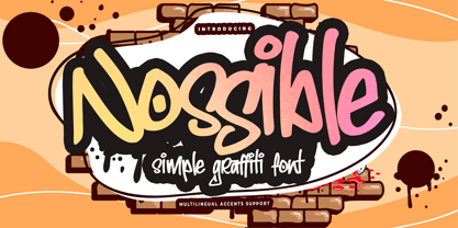 Introducing Nossible It's Simple Graffiti Font is a Natural Style and Authentic classy style, this font is great for your creative projects such as watermark on photography, and perfect for logos & branding, invitation,advertisements,product designs, stationery. It also features a wealth of special features including You can activate 11 Ligatures OpenType panel.
 - Mind Boogie by Bogstav,
$16.00 Get your feet on the dance floor, and make those funky moves that you do so well! Or, you could just use this handmade all-caps font and make your designs look like it is dancing! :) Yes, it's a handmade font - and I've added 6 different versions of each letter + multilingual support!
 - MPI Egyptian Ornamented by mpressInteractive,
$5.00 Egyptian Ornamented is a decorative font based on the shapes found in a French Clarendon. Serifs are chunky and bifurcated, and “spurs” have been added to the strokes. This font emits the feeling of Old West wanted posters, rodeo broadsides, etc. It was first introduced by William H. Page & Company in 1870.
 - Fictional Friend by Hanoded,
$15.00 No, I don’t have a fictional friend, nor an imaginary one. Never had! But that name popped up in my head and I used it for this font. Fictional Friend font is a handwritten ‘comic book’ font - sort of. It’s very legible, soft and rounded and comes with all the accents you want!
 - Chevron by Altered Ego,
$45.00For that tight fit, STF Chevron is perfect. An ultra-condensed display font, with a complete character set. The name? It's named after an oil company, but the shapes of the serifs reflect that as well. With some art deco overtones, try Chevron in places that you might want a simple art deco typeface. How should you use it? It's perfect for posters, packaging and advertising, CD covers and publications. Fully hinted and exquisitely kerned, Chevron will be one of your favorite faces for tall copy that need to get noticed. It's really ideal for calendars, when you want big numbers without losing space for writing in the date fields. License it today! - Astera by ParaType,
$25.00A set of astronomical signs (symbolic representation of the Sun, the Moon, planets and other celestial bodies as well as zodiacal constellations, phases of the Moon, etc), signs of Chinese Zodiac and several ornamental symbols. Designed by Andrey Belonogov. The typeface (under the name Astra) was awarded a Diploma of TypeArt’05 Design Contest. - Interind Diary by Aminmario Studio,
$20.00 Introducing The new "Interind Diary" script font. A fashionable and super-chilled new handwriting font script with sexy stylish. Interind Diary font was created to look as close to a natural handwritten script as possible by including over 134 ligatures, and lowercase alternates.Comes with two styles of Regular and Italic. Mix and match lowercase regular with several lowercase alternatives to get your new ligature. Perfect for any awesome projects that need hand writing taste. With built in Opentype features, this script comes to life as if you were writing it yourself. It's highly recommended to use it in opentype capable software - there are plenty out there nowadays as technology catches up with design ... Other than Photoshop, Illustrator and Indesign, many standard simple programs now come with Opentype capabilities - even the most basic ones such as Apple's Text Edit, Pages, Keynote, iBooks Author, etc. Even Word has found ways to incorporate it. Thanks for checking out this font. I hope you enjoy it! AminMario
 - Tall Skinny Condensed by Outside the Line,
$19.00 This is the tallest, skinniest, most condensed, non serif font I know of. I designed this because I felt a serious need for that one big, thin word to fit in a narrow space. It is great for ‘SALE!’ in a one column ad. Also is a life saver for several long words in a narrow space like Merry Christmas... If you need a full character set take a look at the new Ultra Condensed 3 font family. Ultra Condensed was based on Tall Skinny Condensed with some changes and a full character set. Ultra Condensed Lettered is a hand lettered version and Ultra Condensed Line is a lighter hand drawn version
 - Pomarosa by Andinistas,
$29.95 Pomarosa is a typographic family that consists of capital roman letters and twisted lower case letters set randomly. Each one of them is characterized by its multiple calibers and widths. Pomarosa was planned to accompany graphic works done with different techniques and materials such as hand made collages. The narrowness of its glyphs involve its audience with abstract imprecision. Its spirit was born between fabric snippets intervened with pencil and painting. Its three members work in group and also in words or phrases with a non-finished look. Regular Pomarosa and Standard Pomarosa have 260 glyphs each. Both of them simulate to have been done by a right-handed person that works with its left hand. Pomarosa dingbats has 26 illustrations useful for frames and textures.
 - Essonnes by James Todd,
$40.00 Made up of sixteen individual weights and spread over three different optical sizes, Essonnes is designed to bring utility back to the Didot genre. It’s a common belief among designers that Didones don’t work for text. This wasn’t true in 1819 and it isn’t true today. Like its forbearers, Essonnes is a truly optical family—not just a study in adjusting contrast. The text and display weights have been designed from the ground up for their intended roles. This means that everything from the height of the uppercase & lowercase letters have been specifically tuned for their intended purpose. Like many typefaces, Essonnes started after falling in love with a piece of history. In this case, it was the eccentric forms of Pierre Didot’s Type and the evolution of the High contrast Didone throughout the 19th century. It was out of curiosity and love for these forms that led to the first draft of what would become Essonnes back in 2011. These unique situations—screens, modern printing methods, the previous 200 years of typographic innovation since the original design, my own life experiences—have led to a typeface that, while based on history, is not stuck in it.
 - Carelia by My Creative Land,
$29.00 Carelia is a modern multilingual (including cyrillic) serif family with classic forms, enhanced by extended OpenType features. It is well suited for all sorts of design - starting from web, to editorial and branding. Its stylistic alternates, swashes and ligatures (more 1200 glyphs in each font) will make your design even more stylized and unique. Carelia comes in two styles Upright and Italic - each has it's own character but both share the same curves and style. Both fonts are fully unicode mapped - can be used in any application of your choice.
 - Kumba by AukimVisuel,
$9.00 Kumba is inspired by classic typography and brings its own unique style to any design project. This fantastic sans serif font is best suited for headlines of all sizes, as well as for blocks of text that have both maximum and minimum variations. Whether it’s for web, print, moving images or anything else – Kumba will look spectacular. It is a great sans serif font. Whether you’re looking for fonts for Instagram or calligraphy scripts for DIY projects, Kumba will turn any creative idea into a true piece of art!
 - Rindu Alam by Stringlabs Creative Studio,
$25.00 Rindu Alam is inspired by classic typography and brings its own unique style to any design project. This fantastic script font is best suited for headlines of all sizes, as well as for blocks of text that have both maximum and minimum variations. Whether it’s for web, print, moving images or anything else – Rindu Alam will look spectacular. This font is PUA encoded which means you can access all of the glyphs and swashes with ease! It also features a wealth of special features including alternate glyphs and ligatures.
 - Kettering 105 by Talbot Type,
$12.99 Kettering 105 is inspired by the classic, geometric slab-serifs such as Lubalin, but has shallower ascenders and descenders for a more compact look. It's a versatile, modern slab-serif, highly legible as a text font and with a clean, elegant look as a display font at larger sizes. It includes old style non-aligning (lower case) numbers, both proportional and tabular, as well as accented characters for Central European languages. The Kettering 105 family comprises of six weights and is closely related to Kettering 205, its more intensely Deco flavoured cousin.
 - Dudu by Borutta Group,
$10.00Dudu is a font which I made mainly for my own purposes. A lot of times in many projects I was looking for elegant vertical and modular typeface. There is a lot of fonts that overall look good but if You take a closer look, You can clearly see they have mistakes. That's why I made Dudu. Dudu is a font designed with a highest attention to the detail. Each Dudu glyph has the same modular construction. Dudu Font contains over 400 glyphs ready to use in various languages. I'm also working on a cyrillic version of a Dudu Font which soon is going to be published.
