10,000 search results
(0.04 seconds)
- Lucida Blackletter by Monotype,
$40.99Lucida is a family of fonts with one basic design, but offered in two variations. It has both serif and sans serif characters. Lucida is suitable for books/text, documentation/business reports, posters, advertisement, multimedia. - Yogyakarta by Letterafandi Studio,
$10.00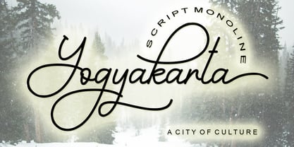 Yogyakarta is a handwritten script font, with an elegant and beautiful look. It looks stunning on invitations, thank you cards, quotes, greeting cards, logos, business cards and every other design which needs a handwritten touch.
 - Faerie Queen NF by Nick's Fonts,
$10.00Based on a typeface named "Titania" from a 1930s specimen book from the Fundición Richard Gans in Madrid, this exquisite design will add a touch of elegance and nostalgic charm to any project it graces. - Lucida Bright by Monotype,
$29.99Lucida is a family of fonts with one basic design, but offered in two variations. It has both serif and sans serif characters. Lucida is suitable for books/text, documentation/business reports, posters, advertisement, multimedia. - DinoTracks by Ingrimayne Type,
$9.00 DinoTracks is a novelty or letterbox font in which the letters are formed with dinosaur footprints. It is readable at small point sizes, but then one cannot see that the letters are made from footprints
 - Vendome by Linotype,
$40.99One of the most famous modern Old Face fonts, designer Francois Ganeua developed Vendome with the special features and extravagance typical of such forms. Strong and lively, such details give Vendome its unmistakeable, unique appearance. - Mercadillo by Monotype,
$16.99 Mercadillo is a casual script typeface based on the hand painted signs you can see in markets, shops and bars. Comes in 4 different weights (Black, Bold, Regular and Light) and it has OpenType features.
 - MGN Albiston by Morgana Studio,
$17.50 MGN Albiston is a condensed display typeface that we designed with a strong and sporty look. It is perfect for headlines, posters, and logos. The condensed form gives it a compact and powerful appearance, making it stand out in any design. The serif touches on certain parts of the letters give it a classic touch, adding complexity to its overall impression. This typeface is suitable for various design projects, such as sports branding, fashion, and entertainment. It has a versatile and dynamic look that can add a bold touch to any project. Give it a try and see how it can enhance your designs.
 - Sincerely by Canada Type,
$24.95Whether with pen on paper, or in digital, realistically connecting vertical handwriting is never an easy task to accomplish. After working with many handwriting fonts, and after intently dissecting so many different handwritings, one tends to expect such things to be quirky, disconnected, and almost never upright. In fact, in spite of vertical handwriting’s academically-sung virtues of rationality, efficiency, clarity and logic, very few people manage to deviate from the natural slant when writing. Even fewer manage to make the vertical handwriting connect and keep its natural flow. Calligraphy and upright cursive aside, it is almost impossible to make a vertical letters connect and maintain a real handwriting appearance. This is where the genius of this design comes in to bridge the gap between upright handwriting and calligraphy. Sincerely is based on one of the most fascinating handwriting designs to ever come out of Germany: Karlgeorg Hoefer’s 1968 Elegance for the Ludwig & Mayer foundry. It is a handwriting with the full meaning of the word, yet it possesses the rare, very commanding and appealing trait of being both vertical and connected while managing to remain realistic. It is the ultimate branding iron of handwriting fonts. When set and printed, Sincerely simply cannot be ignored. Ideal for humanity-asserting poster designs, lettering of short wording with plenty of space, poetry, notes, greeting cards, craft literature, book covers, history-related designs, and a whole range of other applications. - Liza Pro by Underware,
$50.00 Lettres d’amour! Flirting, fashionable, provocative, emotional, casual, moderate, extremely sensible & beautiful - Liza Pro covers it all. Liza Pro, Underware’s dear creation, is a live-script typeface. Thanks to its extremely intelligent OpenType architecture, she approaches human hand lettering as closely as technically possible. Liza Pro deeply analyzes the text. Out of a stock of 4000 hand crafted characters, Liza creates the most optimal combination. All of this works automatically. All you need to do is start typing your lettres d’amour, and Liza makes the text always look different. She gives your creative piece the impression par excellence. Erotique mais intelligent. She is as clever as we could imagine. She kept all folks at Underware busy for a couple of years. It all started one rainy night back in May 2004 but quickly changed into a fatal affair exceptionnelle. But now, 5 years later we are quite sure: this is something serious. Yes, we are talking about real love. L’amour pour la vie. Liza Pro has Underware’s world-dominating Latin Plus character set, supporting a total of 219 languages (Latin 1 + 2 and beyond). Liza Pro is a package of 4 fonts which work together. Liza Display Pro rocks the script lettering to the max. The build-in Out-of-ink feature, LetterSwapper and Protoshaper makes this font a realtime-digital-calligrapher. She’ll swash up your text drastically, giving long strokes, loops and swashes to letters if their context allows. Liza Text Pro has a more silent, moderate character - she’s well behaving sister of Liza Display Pro, designed to walk long pieces of text in a lively script style. Liza Caps Pro adds more possibilities and functionality to these two script fonts. It bridges the gap in case running script lettering doesn’t do the job, but it also works perfectly on its own. Every capital letter appears in various shapes to obtain the manual lettering feeling. Liza Ornaments Pro is for extra delicatesse et est plus charme. Four heart winning fonts, pour la langue l’amour!
 - Diaper Bag by Bellafonts,
$25.00 Diaper Bag is a ding bat font providing images related to baby: bottles, pacifiers, rattles, cribs, bassinets, safety pins, and some random things like umbrellas (for a baby shower), expecting moms, storks, baby feet, teddy bear, rubber duckey, booties, teething ring, etc. You can use these to make baby shower invites, baby announcements, and anything you can customize with your own design. Bellafonts' user license allows for commercial use so you can make products for re-sale, including services offering graphic design.
 - Holybuck by Sarid Ezra,
$15.00 Introducing, Holybuck, classic signature family! Holybuck is signature script with three style that contain stylistic alternate, swash and underline to create your own costumized signature or logo design. This font is also support multi language. Available in OTF and TTF. Also Support PUA. It's available in three weigh style! For another questions, please send a mail to saridezra@gmail.com. Thank You! To add the line in under the text, type underscore + number (from 1 to 5). Or copy Some_5thing in preview bellow..
 - Harmonique by Monotype,
$31.99 Harmonique is an incised serif typeface designed for both text and display purposes. It’s a type family of two styles that work in harmony together to add distinction and personality to your own typographic compositions. Harmonique’s low contrast forms have the appeal of a humanist sans serif typeface. Its subtly flared terminals evoke the craft and skill of a signwriter’s steady hand, creating an authentic and pleasing aesthetic. Harmonique Display is more calligraphic in its structure – as if drawn by a wide-nibbed pen. This style is accentuated by aggressively barbed serifs and chiselled arcs in its counters and bowls. These strong characteristics help to define a flamboyant, confident style that will provide impact and flair to your headlines, titles and identity designs. Practical features include 48 ligatures that will enhance titling possibilities with their all-capital pairings – these are accesssed by turning on Discretionary Ligatures and then selecting either Sylistic Set 1 or 2. There are also a number of alternate caps that will subtly enhance your titles and headlines – access these via Stylistc Sets 3 and 4. Small Caps are included too (along with their matching diacritics) – adding another layer of versatility to this typeface. Proportional Lining figures are available as an option if you prefer them to the default Old Style figures. There are 32 fonts altogether, with 8 weights in roman and italic from Light to Ultra in both text (low contrast) and display (high contrast) styles. Harmonique has an extensive character set (650+ glyphs) that covers every Latin European language. Key features: 8 weights across two styles in both roman and italic 48 Ligatures 11 Alternates Small Caps Full European character set (Latin only) 650+ glyphs per font.
 - FS Clerkenwell by Fontsmith,
$80.00 A creative context 2003. Fontsmith was sharing a small, cold, whitewashed studio space in Northburgh Street, Clerkenwell. But things were on the up following prestigious custom type commissions for The Post Office and E4. “Slab serifs were on the brink of another revival, we could feel it,” says Jason Smith. “All we wanted to do was have a play with these slabs, go as far as we could within what was acceptable and readable.” “It wasn’t initially clear what was happening,” recalls Phil Garnham. “We were becoming very influenced by our surroundings, outside the studio space. We absorbed the essence and the designer grime of where we were.” Process Jason began by drawing stems on-screen. “The key aspect of the font is the upward bend of the leading shoulder serif, the way it kind of ramps up and then plummets back down the stem. “The regular and light characters are quite narrow – great for text but the bold is quite wide and chunky – better for headlines. I think ‘y’ is quite different for a slab design. We call it the Fontsmith ‘y’.” Promotion Fontsmith were determined to get FS Clerkenwell noticed. To launch the font, Ian Whalley, a designer friend of Fontsmith, captured words heard on the streets of Clerkenwell, set them in the new font and crafted a small book of typographic conversations. It was a first for Fontsmith. “I think that’s part of why this font has been so successful,” says Phil. “It really does embody the spirit of the area, as a special place for design, arts and crafts. And designers love that.” Contemporary twist FS Clerkenwell, based on influences in and around this part of London with a rich tradition of printing and design, mixes tradition with creation. Old-fashioned values meet new-school trends. Its quirky, contemporary character lends an edge to headlines, logotypes and any large-size text.
 - Semilla by Sudtipos,
$79.00 I spend a lot of time following two obsessions: packaging and hand lettering. Alongside a few other minor obsessions, those two have been my major ones for so many years now, I've finally reached the point where I can actually claim them as “obsessions” without getting a dramatic reaction from the little voice in the back of my head. When you spend so much time researching and studying a subject, you become very focused, directionally and objectively. But of course some of the research material you run into turns out to be tangential to whatever your focus happens to be at the time, so you absorb what you can from it, then shelf it — like the celebrity bobblehead that amused you for a while, but is now an almost invisible ornament eating dust and feathers somewhere in your environment. And just like the bobblehead may fall off the shelf one day to remind you of its existence, some of my lettering research material unveiled itself in my head one day for no particular reason. Hand lettering is now mostly perceived as an American art. Someone with my historical knowledge about lettering may be snooty enough to go as far as pointing out the British origins of almost everything American, including lettering — but for the most part, the contemporary perspective associates great lettering with America. The same perspective also associates blackletter, gothics and sans serifs with Germany. So you can imagine my simultaneous surprise and impatience when, in my research for one of my American lettering-based fonts, I ran into a German lettering book from 1953, by an artist called Bentele. It was no use for me because it didn't propel my focus at that particular time, but a few months ago I was marveling at what we take for granted — the sky is blue, blackletter is German, lettering is American — and found myself flipping through the pages of that book again. The lettering in that book is upbeat and casual sign making stuff, but it has a slightly strange and youthful experimentation at its heart. I suppose I find it strange because it deviates a lot from the American stuff I'm used to working with for so long now. To make a long story short, what’s inside that German book served as the semilla, which is Spanish for seed, for the typeface you see all over these pages. With Semilla, my normal routine went out the window. My life for a while was all Bezier all the time. No special analog or digital brushes or pens were used in drawing these forms. They're the product of a true Bezier process, all starting with a point creating a curve to another point, which draws a curve to another point, and so on. It’s a very time-consuming process, but at the end I am satisfied that it can get to pretty much the same results easier and more traditional methods accomplish. And as usual with my fonts, the OpenType is plenty and a lot of fun. Experimenting with substitution and automation is still a great pleasure for me. It is the OpenType that always saves me from the seemingly endless work hours every type designer must inevitably have to face at one point in his career. The artful photos used in this booklet are by French photographer and designer Stéphane Giner. He is very deserving of your patronage, so please keep an eye out for his marvelous work. I hope you like Semilla and enjoy using it. I have a feeling that it marks a transition to a more curious and flexible period in my career, but only time will tell.
 - Thrifty by Typogama,
$19.00 Thrifty is a clean, contemporary typeface family created for branding and communication design. With a narrow form and clear letter forms, this family is both suited for display and title settings while equally remaining legible in smaller point sizes. Through it’s nine weights and accompanying italics plus a large glyph set that covers the majority of Latin based languages, Thrifty aims to offer a versatile and functional design. Thanks to the implementation of OpenType features, this family includes different sets of numerals, from tabular, hanging or scientific, it equally includes ligatures and free form fractions. Each weight equally offers a complete set of arrows and 99 different pictograms focused on themes of mobility and transport.
 - Linotype Syntax Lapidar Serif Text by Linotype,
$29.99Modeled on the writings chiseled in stone in the second century B.C., Syntax™ Lapidar is an energetic, spirited typeface designed by Hans Eduard Meier in 2000. Linotype Syntax Lapidar Text and Linotype Syntax Lapidar Serif Text have five weights each, with both cap and lowercase letterforms. Lapidar Display and Lapidar Serif Display also have five weights each, with mostly all cap letterforms and many alternates. It's a terrifically fun and inventive family, and if you look closely, you can see the resemblance to the more modern and restrained Syntax™ relatives. Great for menus, artist books, travelogues, or advertising - and if used very sparingly, it could add just the right element of lapidary significance to corporate documents. - Brolly Fight by Rachel White Art,
$16.00 Brolly Fight is a fun, slim line font with off-kilter lines. I had so much fun creating this one! It has a stick figure art deco feel. It's fun and playful, with lots of ligatures and alternates to play with. Mix and match lowercase and uppercase letters for a unique look. There are four alternate ampersands, and fun double letter ligatures, as well as playful ligatures for r, k + a, e, o, u combinations. That high lowercase o with an underscore has a twin lowercase a alternate you can access too! Mix and match capitals and lowercase (plus the ligatures & alternates) to create unique text designs. Now with a bold version!
 - Linotype Syntax Lapidar Serif Display by Linotype,
$29.99Modeled on the writings chiseled in stone in the second century B.C., Syntax™ Lapidar is an energetic, spirited typeface designed by Hans Eduard Meier in 2000. Linotype Syntax Lapidar Text and Linotype Syntax Lapidar Serif Text have five weights each, with both cap and lowercase letterforms. Lapidar Display and Lapidar Serif Display also have five weights each, with mostly all cap letterforms and many alternates. It's a terrifically fun and inventive family, and if you look closely, you can see the resemblance to the more modern and restrained Syntax™ relatives. Great for menus, artist books, travelogues, or advertising - and if used very sparingly, it could add just the right element of lapidary significance to corporate documents. - MFC Tryst Monogram by Monogram Fonts Co.,
$29.95 The inspiration source for Tryst Monogram is a showcard script (capitals only) from the 1912 A Show at Showcards book by Atkinson & Atkinson. What began as 26 referenced script letters became an over 800 character font in order to create its unique cameo effect! Tryst Monogram can create one, two, or three letter monograms as well as a unique two letter cameo monogram style - made by simply typing two lowercase letters in a row (using OpenType Ligatures). Add framing to a cameo monogram by adding a number 0-9 before the two letters. It's that easy! Download and view the Tryst Monogram Guidebook if you would like to learn a little more.
 - Linotype Syntax Lapidar Display by Linotype,
$29.99Modeled on the writings chiseled in stone in the second century B.C., Syntax™ Lapidar is an energetic, spirited typeface designed by Hans Eduard Meier in 2000. Linotype Syntax Lapidar Text and Linotype Syntax Lapidar Serif Text have five weights each, with both cap and lowercase letterforms. Lapidar Display and Lapidar Serif Display also have five weights each, with mostly all cap letterforms and many alternates. It's a terrifically fun and inventive family, and if you look closely, you can see the resemblance to the more modern and restrained Syntax™ relatives. Great for menus, artist books, travelogues, or advertising - and if used very sparingly, it could add just the right element of lapidary significance to corporate documents. - Arial Narrow OS by Monotype,
$54.99Arial was designed for Monotype in 1982 by Robin Nicholas and Patricia Saunders. A contemporary sans serif design, Arial contains more humanist characteristics than many of its predecessors and as such is more in tune with the mood of the last decades of the twentieth century. The overall treatment of curves is softer and fuller than in most industrial style sans serif faces. Terminal strokes are cut on the diagonal which helps to give the face a less mechanical appearance. Arial is an extremely versatile family of typefaces which can be used with equal success for text setting in reports, presentations, magazines etc, and for display use in newspapers, advertising and promotions. - Beautifully Delicious by My Creative Land,
$29.00 Beautifully Delicious is a new font family that combines an elegant extended sans serif fonts and a signature script. Both fonts create a harmonious union that can enhance your designs in the best possible way. The family is suitable for graphic design, quotes, branding, all sorts of social media ads, magazines, greeting cards, packaging etc. The script fonts contain more than 1000 glyphs and benefit from OpenType features such as ligatures (including triple-letter ones), swashes and contextual alternates, two sets of capital letters (tall and short) and underline symbols. Sans serif font also contain some stylistic alternates and presented in 4 weights: Thin, Regular, Bold and Black. Hope you enjoy using it!
 - Guthers by Omotu,
$16.00 Introducing Guthers, a monoline script font. It's perfect for logotype, headline, apparel, quotes, posters, and labels to create a vintage look. Whats Included? 1. Uppercase and lowercase characters 2. Supports international languages 3. Features: Uppercase, Lowercase, numeral & punctuation, multilanguage, stylistic alternates, and ligatures 4. Accessible in the Adobe Illustrator Glyphs panel, or under Stylistic Alternates in the Adobe Photoshop OpenType menu, Adobe InDesign, Corel Draw, even work on Microsoft Word. 5. OTF files PUA Encoded Characters - Fully accessible without additional design software. Thanks for looking, and I hope you enjoy it! Please don't hesitate to drop me a message if you have any issues or queries. Best Regads, Ibnu Utomo e-mail: ibnu.blawong2@gmail.com
 - Camica by Genesislab,
$10.00 Camica font with simple models of natural and comic, with a font, you can take advantage of the opportunity at any time one wonderful way to highlight the celebration of the feast of your best, because these fonts will be a driving force for purposes such as cover design, wedding invitations, party , graduation, birthday, gathering, etc. Use the format below. Font Camica if you want to use for your work this font can be used to easily and simply because there are a lot of features in it contains a complete set of letters lower and uppercase letters, assorted punctuation, numbers, and multilingual support. if you have a problem? Contact me: genesislabstudio@gmail.com
 - Arial for Ortho Clinical by Monotype,
$45.99Arial was designed for Monotype in 1982 by Robin Nicholas and Patricia Saunders. A contemporary sans serif design, Arial contains more humanist characteristics than many of its predecessors and as such is more in tune with the mood of the last decades of the twentieth century. The overall treatment of curves is softer and fuller than in most industrial style sans serif faces. Terminal strokes are cut on the diagonal which helps to give the face a less mechanical appearance. Arial is an extremely versatile family of typefaces which can be used with equal success for text setting in reports, presentations, magazines etc, and for display use in newspapers, advertising and promotions. - Algerian Rnd by FontMesa,
$29.00 It's finally here, Algerian Rnd is an all new version of our Algerian Mesa font with rounded soft corners and serifs. Imagine the impact Algerian Rnd will have on your product label and packaging. Algerian Rnd is a new timeless beauty that you'll find many uses for in your logos and advertising. Algerian Rnd is for every generation, put it to work in your next project, you're going to love this font. Algerian Rnd does include some alternate glyphs which you'll need an Opentype aware application to access the alternates in Algerian Rnd. Algerian Rnd is ideal for product logos, labels, packaging, t-shirt designs and other merch. Algerian Rnd is a trademark of FontMesa LLC
 - Arial Unicode by Monotype,
$208.99Arial was designed for Monotype in 1982 by Robin Nicholas and Patricia Saunders. A contemporary sans serif design, Arial contains more humanist characteristics than many of its predecessors and as such is more in tune with the mood of the last decades of the twentieth century. The overall treatment of curves is softer and fuller than in most industrial style sans serif faces. Terminal strokes are cut on the diagonal which helps to give the face a less mechanical appearance. Arial is an extremely versatile family of typefaces which can be used with equal success for text setting in reports, presentations, magazines etc, and for display use in newspapers, advertising and promotions. - Arial Paneuropean by Monotype,
$92.99Arial was designed for Monotype in 1982 by Robin Nicholas and Patricia Saunders. A contemporary sans serif design, Arial contains more humanist characteristics than many of its predecessors and as such is more in tune with the mood of the last decades of the twentieth century. The overall treatment of curves is softer and fuller than in most industrial style sans serif faces. Terminal strokes are cut on the diagonal which helps to give the face a less mechanical appearance. Arial is an extremely versatile family of typefaces which can be used with equal success for text setting in reports, presentations, magazines etc, and for display use in newspapers, advertising and promotions. - Waters Titling by Adobe,
$35.00Waters Titling is the work of lettering artist Julian Waters, a multiple master typeface of classical calligraphic roman capitals. This broad-tipped pen design is related to other historically-based titling alphabets but offers a wider range of weights and widths, making it extremely versatile for movie titles, book jackets, posters, banners, calendars, etc. Waters Titling is based on the timeless Roman monumental inscription forms of almost 2000 years ago, but also has a touch of contemporary vigor and flair. The design displays a strong calligraphic thick/thin stroke weight contrast and flowing, subtly bracketed serifs. In lighter weights, Waters Titling is elegant and delicate, while the bolder weights offer a more substantial sparkle. - Sunmori by Gassstype,
$22.00 Here comes a New font,Introducing SUNMORI It's Unique Display Font is a Textured Natural Style and classy style, this font is great for your creative projects such as watermark on photography, and perfect for logos & branding, invitation,advertisements,product designs, stationery, wedding designs,label ,product packaging, special events or anything that need handwritting taste. SUNMORI a natural Hand Drawn feel. This handmade font will make your design has a beautiful natural touch for each details. It is perfect for any design project as Invitation,logo, book cover, craft or any design purposes,photos, photography overlays, signs, window art, scrapbooking, tags and so much more! That is has charming, authentic and relaxed characteristic more natural look to your text.
 - Linotype Syntax Lapidar Text by Linotype,
$29.99Modeled on the writings chiseled in stone in the second century B.C., Syntax™ Lapidar is an energetic, spirited typeface designed by Hans Eduard Meier in 2000. Linotype Syntax Lapidar Text and Linotype Syntax Lapidar Serif Text have five weights each, with both cap and lowercase letterforms. Lapidar Display and Lapidar Serif Display also have five weights each, with mostly all cap letterforms and many alternates. It's a terrifically fun and inventive family, and if you look closely, you can see the resemblance to the more modern and restrained Syntax™ relatives. Great for menus, artist books, travelogues, or advertising - and if used very sparingly, it could add just the right element of lapidary significance to corporate documents. - Berringer by Hustle Supply Co,
$20.00 Introducing Berringer A Vintage Type Family Berringer is a vintage sans serif family including Textured, Rough & Clean versions as well as Oblique versions of each. Click on the "View All Glyphs Below" image to see every glyph included in each font file. Berringer includes western european characters. Berringer is a versatile sans serif typeface that gives a vintage aesthetic. With it's unique & distinct characteristics it sets itself apart, while also maintaining a strong timeless appeal overall. Rough & Textured versions allow Berringer to be a complete set without the need for 3rd party effects to create a printed look, eliminating a step in the process of finalising your piece. Thank you for checking this out! Jeremy
 - Sregs Serif Display by Propertype,
$18.00 Sregs Serif Display Family A Serif family inspired by popular 1960s-80s typography. Combined with modern nuances that are much in vogue in now days. Reflexive serifs with soft transitions make the letters easy to read and recognize. Its 7 weight with 2 style (Standard and Italic) variations provide several options that will help you find the ideal typographic feel for your project. Made for use in branding projects, large-scale printing such as billboards, signboards, titles, headlines, writing on short paragraphs, books title, page titles, taglines, websites, apps, logos, etc. Several Alternatives letters can be used to create a variety of design style or to make changed some letter in text.
 - Victory Speech by Comicraft,
$49.00 It's that time of year again, isn't it? And yes, we're speaking rhetorically, because our true intent is to rouse voters into action, claim a significant gain in support over our nearest rivals and lead the nation, perhaps The World, into a new era of prosperity, one in which our once proud nation can become great yet again! An era of Hope, a time of peace and an end to war! Because never, in the field of human conflict, have so many, given so much and gained so little so that the have nots can reward themselves and those that have and-and... Victory, and Hope, and Greatnessness! Related font: Victory Speech Lower
 - Tropical Thunder by Omotu,
$16.00 DETAILS Tropical Thunder! A monoline script font with 2 styles, clean and stamped. Tropical Thunder font is perfect for branding, logotype, apparel, T-shirt, Hoodie, product packaging, quotes, flyer, poster, etc. Whats Include? 1. Uppercase and lowercase characters 2. Supports international languages 3. Numerals, punctuations, titling, stylistic alternates, and ligarures 4. Accessible in the Adobe Illustrator Glyphs panel, or under Stylistic Alternates in the Adobe Photoshop OpenType menu, Adobe InDesign, Corel Draw, even work on Microsoft Word. Please message me if you're unsure of any language support. Thanks for looking, and I hope you enjoy it! Please don't hesitate to drop me a message if you have any issues or queries. Omotu
 - Lucky Lady by JVB Fonts,
$39.00 Lucky Lady was inspired by the old, classic art and craft of brush script lettering usually applied in ads of the WWII era and 1940s. The name of the font family refers to one of the most emblematic combat units of the US air force in WWII that were decisive in the victory of the allied forces. Lucky Lady can be mainly used in titles and display texts. It supports East Europe languages. It's highly recommend to use the combined shadow styles under the main regular basic style layer. Lucky Lady includes standard and discretionary ligatures, alternative style for uppercase, fractions, numerators and denominators, end and/or terminal forms and other OpenType features.
 - Marhaban Ramadhan by Omotu,
$18.00 Marhaban Ramadhan is an arabic style font. Comes with arabic character letters look. This font very usable for designing all kind of graphics design related to Islamic Contents. Marhaban Ramadhan font is suitable for branding, logotype, apparel, T-shirt, Hoodie, product packaging, quotes, flyer, poster, book cover, advertising, etc. Whats Include? 01. Opentype support 02. Multilingual support 03. PUA encoded 04. Features: uppercase, lowercase, numeral, punctuation, multilanguage, alternates, stylist set, and ligatures. 05. Accessible in the Adobe Illustrator Glyphs panel, or under Stylistic 06. Alternates in the Adobe Photoshop OpenType menu, Adobe InDesign, Corel Draw, even work on Microsoft Word Please message me if you’re unsure of any language support. Thanks for looking, and I hope you enjoy it!
 - Bobba Tea by Gassstype,
$23.00 Here comes a New font, Introducing Bobba Tea It's Fun Display Font is a Cute Craft style and Textured Natural Style , this font is great for your creative projects such as watermark on photography, and perfect for logos & branding, invitation,advertisements,product designs, stationery, wedding designs,label ,product packaging, special events or anything that need handwritting taste. Bobba Tea a natural funny Hand Drawn feel. It is perfect for any design project as Invitation,logo, book cover, craft or any design purposes,photos, photography overlays, signs, window art, scrapbooking, tags and so much more! Inspired by Food Logo style and combination with Cute Craft style. This font is PUA encoded which means you can access all of Alternates glyphs.
 - SF Old South Arabian by Sultan Fonts,
$9.99Historical Background Old South Arabian Script (OSA) was used before the Islamic era not only in the southwest corner of the Arabian Peninsula, but actually in the entire Peninsula. In addition, samples of OSA have been found as far as Uruk in Mesopotamia, Delos in Greece, and Giza in Egypt. Archaeological finds show that as far back as the 8th century BCE, OSA was used in trade, religious writing, and in civil records. Following the spread of Islam in Yemen, the decline of OSA began in the 7th century CE as it was gradually supplanted by Arabic script. OSA was typically known by the name of the then-dominant peoples in the Southern Peninsula. At various times, it was known as Sabaean, Qatabani, or Hadramite, among others. Although it was used for a variety of languages, OSA is most strongly associated with Sabaean. Many Peninsular languages borrowed OSA before introducing further changes of their own. Prime examples are the Thamudic, Safaitic, and Lihyanite scripts which eventually developed into independent scripts. The westward migration of the Sabaean people into the Horn of Africa introduced the South Arabian consonantal alphabet into the region. The transplanted script formed the roots of the Geez script of Ethiopia, which, in time and under presumably external influences, developed into a rich syllabary unlike any other Semitic script in history. Even a cursory examination of the letter forms of Modern Ethiopic writing reveal a striking similarity to South Arabian Script. OSA inscriptions typically reveal a dominant right-to-left directionality, although there are also many cases of alternating directions, known as boustrophedon writing. Figure 1 is a fine example of this style of writing. OSA inscriptions were discovered early in the 19th century. Soon thereafter, two orientalists, Gesenius and Rödiger, made great strides towards deciphering the script. Styles of Writing Old South Arabian inscriptions have survived primarily on stone, ceramic, and metallic surfaces. Hundreds of artifacts have been found and, to this day, continue to be discovered. Some of the best examples number of inscriptions on softer materials, such as wood and leather, have also been discovered. Although there is a significant difference between the styles of letters on the hard surfaces and those on the soft. Old South Arabian (Musnad) is composed of 29 letters , that is one letter more than the Arabic alphabet, which is between “S” and “Sh”, and names “Samekh”. Aspects of difference between Musnad and the present Arabic writing is that Musnad is written in separate letters, and the shape of the letters do not change according to its place in the word. However, some letters change according to the beginning of the writing. Musnad is either prominent, or deep. Prominent writings are for important writings and deep writings are for ordinary. The material on which the Musnad was written were stones, rocks, wood, and metal. In the course of its development the Musnad use appeared in the “Lehyanite’, “Thamudic”, “Safaitic”, pen to which many changes and amendments were made. And from it “Habashi’ writing was born. As regards his place among the Arabs of the Peninsula , when we look at the internet and its role in cultural dialogue , the Arabs of the Peninsula considered Musnad inscription which was indisputably their national writing until the dawn of Islam. It was used by people in all parts of Arabia in their homeland and abroad . It was their means of chronology and record of their glories and history.2- Features of Musnad Script: 1. It is written from right to left and vice versa. 2. Its letters are not joined. 3. Shape of letters are uniform despite their positions in the word. 4. Words are separated by vertical lines. 5. A letter is doubled in case of assertion. 6. No points and punctuations. 7. Easy to be learned by beginners. My OSA Musnad Font My design and technical work is only a treatment of the OSA Musnad as a symbol of writing. And it is possible to use in computer.. My design is not aimed at demonstrating the linguistic and intellectual structure of the Old South Arabian (Musnad). It is so simple that it could be easy to learn by learners and those who are interested in the OSA Musnad letters in computer. The basis of such importance is that it spares a lot of time and effort for researchers and students in this field. Formerly they used to write the Musnad texts either by handwriting or scan them , But now they can easily write its texts in OSA Musnad by using keyboard directly, so that they can change , amend and fulfill easily and accurately . So, we made use of speed, easiness and accuracy. And anyone interested in the South Arabian history in any part of the world can due to this design read and write OSA Musnad letters most easily. This design will also be used by historians and archeologists. , as well as specialist linguistics . The design also demonstrates the aesthetics of the Himyarit writing. About this font family Old South Arabian is An Arabic, Old South Arabian and Latin typeface for desktop applications ,for websites, and for digital ads. Old South Arabian font family contains two types: Old South Arabian and Old South Arabian serif. The font includes a design that supports Arabic, Old South Arabian and Latin languages. Old South Arabian typeface comes with many opentype features.