10,000 search results
(0.037 seconds)
- Orenji by Hanoded,
$15.00 Orenji is the Japanese word for Orange: it is a phonetic translation of the English word. I was actually looking for a certain shade of orange (the color), when I stumbled upon this fun word. I already toyed with the idea of creating a font loosely based on my son Sam's handwriting and I figured Orenji would be a good name for it. Orenji is a fun, cute and extravagant font. It has some uniquely shaped glyphs, comes with a giggle and a hug and more diacritics than you can throw a banana at.
 - Ragnar by Linotype,
$29.99Ragnar can be called a typeface for compact typography. It is loosely related to the Saga typeface in many ways, even including its name. During discussing on what Saga should be called, the name "Ragnarök" (Twilight of the Gods) was humorously suggested. "Ragnarök" would of course have been unsuitable, since it uses a letter with a diacritic sign, and in many computer systems, that is a deadly sin. But the shorter form, Ragnar, was kept in mind, and later used for this typeface. Additionally, Ragnar is a common male Scandinavian name. - Formular by Brownfox,
$44.99 If you were a grotesque in mid-20th-century Switzerland, you were expected to be serious and proper, if a little dull. Unlike its dogmatic Modernist predecessors, Formular is a hip Swiss sans serif of the new generation. Inspired by the utilitarian 19th-century grotesques, its precision and and versatility are combined with a slightly eccentric character. A child of its time, it scoffs at the ideology of ‟ideal” forms, yet it is every bit as functional for all its idiosyncrasies, as any self-respecting Swiss sans. Formular comes in five weights with corresponding italics and a monospace companion to the regular weight. Each weight includes special extra-light punctuation, lining tabular and old style figures, case-sensitive punctuation, and stylistic alternates.
 - Bulkr by Hackberry Font Foundry,
$24.95 Over the years, I've used Impact a lot. But, not because I liked it—rather because it was the only font I could find with the bulk I needed for a given title or whatever. I finally decided to make my own. It was originally built off Librum Sans Bold, but I quickly made a mask of Impact for the widths, bumped the x-height way up, made the horizontals much heavier, and on and on. You know how it is when you start designing. The result is a black sans with the bulk of Impact and much more interesting character shapes. I suspect I'll use it a lot. My hope is that you like it as much as I do. Have fun!
 - Device by Hanken Design Co.,
$45.00 Device™ display typeface is inspired by industrial type used for decals and signage. This typeface pairs nicely with geometric sans serifs like Cerebri Sans and HK Grotesk.
 - Rolide by Craft Supply Co,
$20.00 Introducing Rolide – Expanded Sans Serif Contemporary Charm Rolide – Expanded Sans Serif presents a unique blend of contemporary charm with its wide and boxy shape. Versatile Design Solution This font is your versatile design solution, ideal for titles and body text. Its non-bold style strikes a harmonious balance between subtlety and impact. Wide & Expanded Rolide’s wide and expanded characters add a touch of modernity to your projects. They stand out without overwhelming the content. Perfect for Titles and Body Text Whether for titles or body text, Rolide is the perfect choice. It maintains clarity and readability, making your content engaging. Elegance in Simplicity In the world of fonts, Rolide embodies elegance through simplicity. Its clean lines and non-bold form offer a contemporary feel. In Conclusion In conclusion, Rolide – Expanded Sans Serif is the font that marries wide, expanded, and non-bold characters to create a contemporary and versatile design solution. It ensures your titles and body text are engaging, clear, and subtly impactful, appealing to a broad range of readers.
 - Malistiona by Prioritype,
$15.00 Script font with a dazzling touch of love. I made this font with great pleasure. Given the alternative options and ligatures available, you can get a beautiful design feel. You can use this font for your design purposes such as craft designs, logos, quotes, wedding invitations, etc. See some of the previews above for reference. Features: -Uppercase -Lowercase -Numeral -Punctuation -Multilingual -Ligature -Alternate Note: To access the Opentype feature, it would be better if you use a program that supports it and is available with a glyph panel so you can see various alternative characters. Examples of programs such as Adobe Illustrator, Corel Draw or Inkscape. Thanks.
 - Million Boomer by Colllab Studio,
$15.00 Presenting Million Boomer! A Smooth Handwritten Font. This font made with the perfect combination of each character. You can combine with Extra to get a unique combination. It looks original and can be used for all your project needs. Each glyph has its own uniqueness and when meeting with others will provide dynamic and pleasing proximity. This font can be used at any time and in any project. You can see in the presentation picture above, Million Boomer looks stylish and unique on design projects. So, Million Boomer can't wait to give its touch to all your design projects such as quotes, poster design, personal branding, promotional materials, website, logotype, product packaging, etc. WHAT'S INCLUDED? 1. Million Boomer • It comes with uppercase, lowercase, ligatures, numeral, punctuation, symbols, alternate, and Standard Latin Multilingual Support (Afrikaans, Albanian, Catalan, Danish, Dutch, English, French, German, Icelandic, Indonesian, Italian, Malay, Norwegian, Portuguese, Spanisch, Swedish, Zulu, and More). 2. Extra Dingbat • Included 17 Dingbats. You can feature all with typing c_1 until c_17 A Million Thanks Colllab Studio
 - Just Moving by Colllab Studio,
$15.00 Presenting Just Moving! A Chic Handwritten Font with natural strokes. This font made with the perfect combination of each character. You can combine with Extra to get a unique combination. It looks original and can be used for all your project needs. Each glyph has its own uniqueness and when meeting with others will provide dynamic and pleasing proximity. This font can be used at any time and in any project. You can see in the presentation picture above, Just Moving looks unique and so flow style on design projects. So, Just Moving can't wait to give its touch to all your design projects such as quotes, poster design, personal branding, promotional materials, website, logotype, product packaging, etc. WHAT'S INCLUDED? Just Moving • It comes with uppercase, lowercase, ligatures, numeral, punctuation, symbols, Many Ligatures, Alternates, and Standard Latin Multilingual Support (Afrikaans, Albanian, Catalan, Danish, Dutch, English, French, German, Icelandic, Indonesian, Italian, Malay, Norwegian, Portuguese, Spanisch, Swedish, Zulu, and More). Extra Swashes • Included 10 Underline Swashes. You can feature all with typing c_1 until c_10 A Million Thanks Colllab Studio
 - Elixir by Fenotype,
$25.00 Elixir is a strong display pack of five styles and total eleven fonts. Elixir fonts are designed to act together but they also work just fine by themselves. Elixir Script is a monoline Script with plenty of OpenType features: Contextual Alternates helps to keep letter connections smooth whereas Swash, Stylistic or Titling Alternates can be used to add flavour to your words! Elixir Brush is a smooth brush script with Contextual Alternates, Swash and Titling Alternates. Elixir Sans is a sturdy all caps font with wider uppercase letters. Elixir Circus is a circus style version of Elixir Sans. Elixir Serif is a rounded slab serif. Elixir Print is a rugged version of Elixir with rough outlines and worn-out print texture.
 - Villages by Greentypestudio6789,
$14.00 Villages is a combination of serif and sans serif that produces a sans serif font with an elegant and modern look, comes in 3 weights with an italic style for each weight, and several alternative characters that you can use to suit your design needs. Use this font for craft projects, logos, posters, books, promotions, and any of your design needs that require a clean and elegant look! Opentype features : Stylistic Alternates Contextual Alternates Standart Ligatures Contextual Ligatures Discretionary Ligatures Small Capitals Ordinals Stylistic Set 1 Fraction Oldstyle Figures Superscript Subscript Multi Language Support Win and Max OS System We hope you enjoy this font, and don’t hesitate to leave a comment or message if you have problems or questions.
 - Ohanlon by Fontdation,
$18.00 Introducing our new release: Ohanlon. Ohanlon is a bold display sans with a subtle hint of reverse-contrast personality which will gives dramatic feel to your design. Packed with lots of stylistic alternate characters to let you play with various letter combinations. Go wild and experimental by combining the sans with the block or script-ish alternate letters to elevate your design game, or you can even go formal with the standard letters. Oh and also, the slanted/faux-italic version is available too. Suits best for logotype/branding, packaging design, and many other designs that need a direct punch to the face. Ohanlon is a versatile font, whether you'll go vintage or modern, this font will got your needs properly covered.
 - RF Rufo by Russian Fonts,
$29.00 Rufo — condensed geometric sans serif with the closed forms. Contains 12 fonts. 6 regular and 6 italic. From thin to black. A rich palette gives full freedom for creativity and bright decisions. Extensive area of use. The versatility of the sans serif typeface covers various aspects of graphic design. Web, printed materials, clothing, logos, posters, labels and much more. Rufo is pragmatic typeface. Can save space and will accommodate a large amount of information in a limited space. The font was designed so that condensed letters remains readable even in small sizes. Opentype: alternate numbers, oldstyle numbers, arrows, fractions and automatic fractions, case sensitive forms, superscript and subscript, numerators and denominators. Support: cyrillic, cyrillic extended, latin, latin extended (Western European, Central European, South-East).
 - Galdien by Craft Supply Co,
$20.00 Introducing Galdien – Modern Sans Serif Font A Contemporary Typeface Galdien – Modern Sans Serif Font is, without a doubt, a testament to contemporary design simplicity and elegance. It seamlessly blends modernity with readability. Clean and Versatile Furthermore, Galdien’s clean lines and uncluttered appearance make it an extraordinarily versatile choice for a wide range of design applications. Its simplicity ensures it doesn’t overpower your message, making it a font suitable for various projects. Readability at its Core At its core, Galdien prioritizes readability. Each character is thoughtfully crafted to ensure clarity in both print and digital formats. This font’s legibility is especially essential for conveying your message effectively and effortlessly. Ideal for Modern Branding Additionally, Galdien is perfectly suited for modern branding initiatives. Its clean and sleek aesthetic aligns seamlessly with contemporary brand identities, offering a cohesive and professional look that resonates with today’s audience. In Conclusion Galdien – Modern Sans Serif Font is your unwavering companion for modern design endeavors. Its simplicity, versatility, and readability, combined with its adaptability to various media, make it an excellent choice for diverse projects. With Galdien, your message is not only communicated with clarity and style but also imbued with a contemporary touch that captivates your audience and leaves a lasting impression.
 - Joe Mad by Comicraft,
$39.00 When Joe Madureira saw the custom font we'd created for Jim Lee, he called us up immediately and uttered the immortal words... "I Want One!" We were, of course, only too happy to oblige. Now, this very font, based upon Joe's own handwriting, is available. Think about it, where else can you get a World Famous Comic Book Artist like Joe Madureira to work for you for under a hundred bucks?
 - Leaders by Mans Greback,
$59.00 Leaders is a decorative blackletter typeface. Created by Måns Grebäck during 2020, this medieval style lettering can be used for modern contexts that require a touch of flourishing, as well as any middle age art or festive occation. OpenType functions such as ligatures and alternates are present in the typeface. It contains numbers and all symbols and punctuation you'll ever need. The font also has support for European, Latin-based languages.
 - Hopkins Angela by Letterhend,
$19.00 Say hi to Hopkins Angela, a casual handwritten font that will convey your messages with personal touch. It comes with underlines which you can access using the opentype feature. This font perfectly made to be applied especially in logo, and the other various formal forms such as invitations, labels, logos, magazines, books, greeting / wedding cards, packaging, fashion, make up, stationery, novels, labels or any type of advertising purpose.
 - Grenale #2 by insigne,
$24.00 Grenale #2 shapes the new standard of elegance within the Grenale family. Not your typical sans, this pure, geometric structure with its glamorous sensitivity draws much inspiration still from Grenale's didone sans and the haute couture influence. Independently attractive, though, the form abandons the original's high contrast for its own minimal stroke variation, achieving proper balance through its graceful strokes. Grenale's thin weights are simple but vibrant--elegant forms that naturally lend themselves to designer journals and high-end branding along with upscale applications. With added energy and power, the thicker weights give your work a firmer, statlier look. Grenale #2's upright versions are also matched by optically adjusted italics. While unique in appearance, any of #2's weight also provide a well-matched companion to its original counterpart. The fashionable typeface includes a multitude of alternates that may be accessed in any OpenType-enabled application. The stylish features include a large group of alternates, swashes, and meticulously refined details with ball terminals and alternate titling caps to accessorize the font. Also included are capital swash alternates, old style figures, and small caps. Peruse the PDF brochure to see these features in action. OpenType enabled applications such as the Adobe suite or Quark can take full advantage of the automatic replacing ligatures and alternates. This family also offers the glyphs to support a wide range of languages. It's time to think high-class. Graceful and assured, the carefully crafted forms of Grenale #2 step pleasantly onto each page with elegant charm. Include its range of alternate glyphs, and this chic font is a superb choice for bringing a far more refined look to your projects.
 - Schism One by Alias,
$55.00 Schism is a modulated sans-serif, originally developed from our Alias Didot typeface, as a serif-less version of the same design. It was expanded to three sub-families, with the thin stroke getting progressively heavier from Schism One to Schism Three. The different versions explore how this change in contrast between thick and thin strokes changes the character of the letterforms. The shape is maintained, but the emphasis shifts from rounded to angular, elegant to incised. Schism One has high contrast, and the same weight of thin stroke from Light to Black. Letter endings are at horizontal or vertical, giving a pinched, constricted shape for characters such as a, c, e and s. The h, m, n and u have a sharp connection between curve and vertical, and are high shouldered, giving a slightly square shape. The r and y have a thick stress at their horizontal endings, which makes them impactful and striking at bolder weights. Though derived from an elegant, classic form, Schism feels austere rather than flowery. It doesn’t have the flourishes of other modulated sans typefaces, its aesthetic more a kind of graphic-tinged utility. While in Schism Two and Three the thin stroke gets progressively heavier, the connections between vertical and curves — in a, b, n etc — remain cut to an incised point throughout. The effect is that Schism looks chiselled and textural across all weights. Forms maintain a clear, defined shape even in Bold and Black, and don’t have the bloated, wide and heavy appearance heavy weights can have. The change in the thickness of the thin stroke in different versions of the same weight of a typeface is called grading. This is often used when the types are to used in problematic print surfaces such as newsprint, or at small sizes — where thin strokes might bleed, and counters fill in and lose clarity, or detail might be lost or be too thin to register. The different gradings are incremental and can be quite subtle. In Schism it is extreme, and used as a design device, giving three connected but separate styles, from Sans-Didot to almost-Grotesk. The name Schism suggests the differences in shape and style in Schism One, Two and Three. Three styles with distinct differences, from the same start point.
 - Schism Three by Alias,
$55.00 Schism is a modulated sans-serif, originally developed from our Alias Didot typeface, as a serif-less version of the same design. It was expanded to three sub-families, with the thin stroke getting progressively heavier from Schism One to Schism Three. The different versions explore how this change in contrast between thick and thin strokes changes the character of the letterforms. The shape is maintained, but the emphasis shifts from rounded to angular, elegant to incised. Schism One has high contrast, and the same weight of thin stroke from Light to Black. Letter endings are at horizontal or vertical, giving a pinched, constricted shape for characters such as a, c, e and s. The h, m, n and u have a sharp connection between curve and vertical, and are high shouldered, giving a slightly square shape. The r and y have a thick stress at their horizontal endings, which makes them impactful and striking at bolder weights. Though derived from an elegant, classic form, Schism feels austere rather than flowery. It doesn’t have the flourishes of other modulated sans typefaces, its aesthetic more a kind of graphic-tinged utility. While in Schism Two and Three the thin stroke gets progressively heavier, the connections between vertical and curves — in a, b, n etc — remain cut to an incised point throughout. The effect is that Schism looks chiselled and textural across all weights. Forms maintain a clear, defined shape even in Bold and Black, and don’t have the bloated, wide and heavy appearance heavy weights can have. The change in the thickness of the thin stroke in different versions of the same weight of a typeface is called grading. This is often used when the types are to used in problematic print surfaces such as newsprint, or at small sizes — where thin strokes might bleed, and counters fill in and lose clarity, or detail might be lost or be too thin to register. The different gradings are incremental and can be quite subtle. In Schism it is extreme, and used as a design device, giving three connected but separate styles, from Sans-Didot to almost-Grotesk. The name Schism suggests the differences in shape and style in Schism One, Two and Three. Three styles with distinct differences, from the same start point.
 - Schism Two by Alias,
$55.00 Schism is a modulated sans-serif, originally developed from our Alias Didot typeface, as a serif-less version of the same design. It was expanded to three sub-families, with the thin stroke getting progressively heavier from Schism One to Schism Three. The different versions explore how this change in contrast between thick and thin strokes changes the character of the letterforms. The shape is maintained, but the emphasis shifts from rounded to angular, elegant to incised. Schism One has high contrast, and the same weight of thin stroke from Light to Black. Letter endings are at horizontal or vertical, giving a pinched, constricted shape for characters such as a, c, e and s. The h, m, n and u have a sharp connection between curve and vertical, and are high shouldered, giving a slightly square shape. The r and y have a thick stress at their horizontal endings, which makes them impactful and striking at bolder weights. Though derived from an elegant, classic form, Schism feels austere rather than flowery. It doesn’t have the flourishes of other modulated sans typefaces, its aesthetic more a kind of graphic-tinged utility. While in Schism Two and Three the thin stroke gets progressively heavier, the connections between vertical and curves — in a, b, n etc — remain cut to an incised point throughout. The effect is that Schism looks chiselled and textural across all weights. Forms maintain a clear, defined shape even in Bold and Black, and don’t have the bloated, wide and heavy appearance heavy weights can have. The change in the thickness of the thin stroke in different versions of the same weight of a typeface is called grading. This is often used when the types are to used in problematic print surfaces such as newsprint, or at small sizes — where thin strokes might bleed, and counters fill in and lose clarity, or detail might be lost or be too thin to register. The different gradings are incremental and can be quite subtle. In Schism it is extreme, and used as a design device, giving three connected but separate styles, from Sans-Didot to almost-Grotesk. The name Schism suggests the differences in shape and style in Schism One, Two and Three. Three styles with distinct differences, from the same start point.
 - Quirkley JNL by Jeff Levine,
$29.00When a type design job needs a bit of snap, yet needs to remain unconventional, think of Quirkley JNL. Its name speaks volumes - a bold, quirky sans serif - great for headlines and display work. - Yolissa by JprintStudio,
$14.00 Yolissa is an elegant and modern sans serif font with an undeniably clean feel. With its neat and beautiful arrangement of letters, this typeface will look outstanding in both formal and non-formal designs.
 - Keanu by Soares,
$25.99 Keanu is a display sans serif square typeface, with a strong visual impact. Defined by its dramatic squaring with curved strokes, this typeface is perfect for headings, signage systems, interface designs, branding and more.
 - Glandian by TM Type,
$12.00 Glandian is a romantic and sweet calligraphy typeface with characters that dance along the baseline. It has casual yet elegant features. It is perfect for wedding invitations, logo designs, social media, wedding greetings, etc. This font is PUA encoded, which means you can access all of the glyphs and swashes with ease.
 - Candywrap by Outerend,
$10.00 The design of the font, "Candywrap," was inspired by the various shapes of candies It gives soft and gentle, but optimistic and fun feel to your design. It offers round-shaped glyphs which can be uniquely used for your shop signs, logos, posters, menus, billboards, and many others! It's a caps only font.
 - Corporaet by Characters Font Foundry,
$25.00 CFF Corporaet is a corporate brand typeface that comes in 5 sans serif weights; Light, Regular, SemiBold, Bold & Black. Its character is warm, friendly, humane, clear and soft. The humanistic design style is rooted in the cursive style of handwriting, clearly visible in letters such as the e, f, g and y. The spurless letters round it off. Striking characters, such as the z, and small quirky details make it both a corporate and a friendly typeface. The proportions of each character are carefully constructed in such a way that they're balanced and create an even colour in text. That’s why it works extremely well with long body copy. Making it a hero for magazines and editorial design challenges. The Corporaet fonts can be applied in large sizes for print or web, bringing out the refined details that give the fonts its distinctive personality.
 - Cottsmic by Maulana Creative,
$15.00 Cottsmic Sans Serif Font is a contemporary sans serif font. With bold weight, unique and fun character with a bit of ligatures. To give you an extra creative work. Cottsmic Sans Serif support multilingual more than 100+ language. This font is good for logo design, Social media, Movie Titles, Books Titles, a short text even a long text letter and good for your secondary text font with script. Make a stunning work with Cottsmic Sans Serif Font. Cheers, Maulana Creative
 - Cushy by Jeff Kahn,
$- Cushy is a versatile san serif font that’s stuffed with numerous plush swashes and unique alternates. But it’s not limited to display use only. Cushy is well suited for text or display applications. Cushy’s large “x” height, square proportions, and generous even weight enhance its legibility in all point sizes. The font’s bold personality radiates friendliness and warmth. Clean classic proportions lend it authority and vigor. Cushy bends around corners and flows throughout. You won't find any sharp corners. The diagonal strokes possess a subtle arch and enhance its characteristics. Available in 8 styles with multiple weights: Thin, Light, Regular, Bold, including italics. Cushy includes stylistic sets, stylistic alternates, swashes, ligatures & discretionary ligatures, and foreign language diacritic glyph support. Cushy provides 40 distinctive swash options, 17 ligatures, and 13 alternates. Weights include Thin, Light, Regular, Bold, with italics. Cushy is suited for corporate ID, retail, magazines, books, brochures, websites, logotypes, etc.
 - Cendhany by Javatypestd,
$10.00 Introducing Cendhany is a hand lettered typeface. This font is made by handwriting naturally using a brush pen so it can produce good quality fonts. They work perfectly for you who needs a typeface for headline, logotype, apparel, invitation, branding, packaging, wedding, advertising, etc. This typeface comes in uppercase, lowercase, punctuation, symbols, numerals, alternate, ligatures, etc also supports multilingual.
 - Mongolia by Goodigital13,
$20.00 It can be used in different purposes: lettering and logotype, labels, t-shirts, product packaging, invitations, advertising, and any classic / vintage typography design projects. will be great for any projects including : branding, logo, stationery, business card, signage, flyer, brochure etc. Almost all industries will be match for this typeface: events, music video, makeup artist, travel, promotions, musician, magician etc
 - Blowfisher by Maulana Creative,
$11.00 Blowfisher is a signature script font it's thin monoline and clean stroke with fun character. It has Opentype features ligature rich to give you an extra creative work. Blowfisher signature support multilingual more than 100+ language. This font is good for logo design, Social media, Movie Titles, Books Titles, a short text even a long text letter and good for your secondary text font with sans or serif. Make a stunning work with Blowfisher signature font. Cheers, MaulanaCreative
 - Dexa Pro by Artegra,
$29.00 Dexa Pro was designed by Ceyhun Birinci in 2020 with an inspiration to create a contemporary super family with inspiration from classic sans serif families. It's a workhorse family consisting of 72 fonts in condensed, narrow, normal and expanded widths. Each width has 18 fonts in thin to black weights, along with their true italic counterparts. With more than 770 glyphs per font, It offers a ton of language support from all the Latin languages to Cyrillic.
 - Adorefunny by Maulana Creative,
$11.00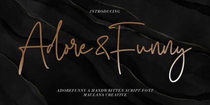 Adorefunny is a Handwritten script font it's monoline and clean stroke with fun character. It has Opentype features ligature rich to give you an extra creative work. Adorefunny support multilingual more than 100+ language. This font is good for logo design, Social media, Movie Titles, Books Titles, a short text even a long text letter and good for your secondary text font with sans or serif. Make a stunning work with Adorefunny Handwritten font. Cheers, MaulanaCreative
 - Mariné by TipoType,
$19.90 Mariné is a geometric sans but with the softness of humanistic strokes. It’s mild contrast and multiple different styles allow Mariné to work well as both a text and display font. It also includes an Up version and calligraphic features that add a touch of informality. Mariné is available in an extended family and is the close cousin of Amelia (available at MyFonts.com). All differences between Mariné and Amelia appear in the italic and Up versions.
 - Victory History by madeDeduk,
$15.00 Introducing Victory History is a Modern Sans, use this font for any branding, product packaging, invitation, quotes, t-shirt, label, poster, logo etc. Feature otf. and ttf. file Uppercase & Lowercase Number & Symbol International Glyphs Multilingual support Alternative Ligature Feel free to drop us a message any time and follow my shop for upcoming updates Shoot me on email at: dedukvic@gmail.com and find more previews on my Instagram here : https://www.instagram.com/acekelgondolayu/?hl=en Hope you enjoy it.
 - Qisharon by LetterMuzara,
$20.00 Qisharon is a contrast sans serif font, consisting of four styles (light, book, regular, bold) and including 5 writing systems such as Latin (supporting all European languages and Turkish), Cyrillic, Greek, Hebrew, and Arabic. It is based on classic calligraphic rules and respects the traditions of every script. There are plenty of ligatures, that will draw attention to your design. Qisharon with it's formal and elegant nature is a perfect fit for logos, visit cards and magazine headings.
 - Citrus Gothic by Adam Ladd,
$25.00 Citrus Gothic is a hand drawn, sans featuring solid, texture, inline, rough, shadow, and italic styles. It’s design leans on the classic, condensed gothic appearance but adds flair with the irregular details and curled terminals. An all-caps typeface that is functional and unique, making it great for branding, packaging, headlines, and other display uses. The uppercase and lowercase are each individually drawn so switch between them as you typeset for a more authentic, hand drawn appearance.
 - Amici by Greater Albion Typefounders,
$12.00 Amici means 'friends' and the Amici family was conceived as a big friendly Roman typeface for headings, posters, signs and anywhere else that an approachable easy-reading typeface is needed. It's the sort of thing you used to see in Magazine mastheads before everything went boringly sans serif. Three faces are offered within the family, Regular - solid and clear, Bold - with that bit more body and presence and italic - bringing in script elements to its design.
 - Sunnycyclops by Maulana Creative,
$12.00 Sunnycyclops is a Handwritten script font it's monoline and clean stroke with fun character. It has Opentype features ligature rich to give you an extra creative work. Sunnycyclops support multilingual more than 100+ language. This font is good for logo design, Social media, Movie Titles, Books Titles, a short text even a long text letter and good for your secondary text font with sans or serif. Make a stunning work with Sunnycyclops Handwritten font. Cheers, MaulanaCreative