10,000 search results
(0.024 seconds)
- Funroot by Alit Design,
$16.00 Presenting the 🎃 The FUNROOT Halloween Typeface 🦇 by alitdesign. The FUNROOT Halloween Typeface is designed for the needs of Halloween themed design concepts and events in October and November. FUNROOT Halloween Typeface has a horror character with a character shaped like a haunted tree root, making the Halloween horror-themed design concept even better and unique. The FUNROOT Halloween Typeface also gets a bonus character of 150 Halloween-themed illustrations that make creating designs even easier. Simply by downloading The FUNROOT Halloween Typeface, creating a Halloween themed design is very quick and easy. The FUNROOT Halloween Typeface is perfect for magazine cover designs, brochures, flyers. Instagram ads, Canva Design and so on with halloween and dark concepts. besides that this font is very easy to use both in design and non-design programs because everything changes and glyphs are supported by Unicode (PUA). The FUNROOT Halloween Typeface contains 561 + 150 bonus glyphs with many unique and interesting alternative options. Language Support : Latin, Basic, Western European, Central European, South European,Vietnamese. In order to use the beautiful swashes, you need a program that supports OpenType features such as Adobe Illustrator CS, Adobe Photoshop CC, Adobe Indesign and Corel Draw. but if your software doesn't have Glyphs panel, you can install additional swashes font files.
 - Rockwell by Monotype,
$40.99 Whether you call them slab serif, square serif, or Egyptian, you know them when you see them – sturdy, nearly monoweight designs with blunt, straight-edged serifs and a no-nonsense attitude. The Rockwell® Nova family is a fine example of this appealing and eminently usable type style. This is a design that is both robust and adaptable. Marked by the flat top-serifs on the cap A, unusual Q tail and high-legibility two-storied lowercase a, Rockwell has a bit of handmade charm that distinguishes it from the cool, more modern interpretations of the slab serif style. The family is excellent for branding, headlines and other display uses. The simple shapes and hearty serifs also make it a good choice for short blocks of textual content in both print and on-screen environments. The light and bold weights are perfect for setting blocks of text copy, while the extra bold and condensed designs bring authority to display copy. Throw in a little color, and you amp up Rockwell’s messaging power. The regular and italic designs perform handsomely, in the most modest of screen resolutions. With four weights of normal proportions, each with a complementary italic, and three condensed designs, two with italics, the family is a commanding and versatile graphic communicator. Rockwell’s large x-height, simple character shapes and open counters, make for an exceptionally legible design. It should not, however, be set so tight that its serifs touch, as this will erode legibility and impair readability. A benefit to Rockwell’s slab serifs, however, is that the design combines beautifully with both sans serif typefaces and a variety of serif designs. Rockwell OpenType® Pro fonts have an extended character set supporting Greek, Cyrillic, most Central European and many Eastern European languages, in addition to providing for the automatic insertion of ligatures and fractions. Looking for its perfect pairing? Look no further than ITC Berkeley Old Style, Between™, ITC Franklin Gothic®, Harmonia Sans™, Metro® Nova or Frutiger® Serif.
 - An Electronic Display LED LCD LED7 Seg 3 by Fortune Fonts Ltd.,
$15.00 * For when you need the most realistic looking electronic display. * See User Manuals Main advantages: - Spacing between characters does not change when entering a decimal point or colon between them. - Custom characters can be produced by selecting any combination of segments to be displayed. Low cost electronic displays have a fixed number of segments that can be turned on or off to represent different symbols. A digital watch would be the most common example. Fonts typically available for depicting electronic displays are often in the artistic style of these common LED or LCD displays. They provide the look-and-feel, but fall short when technical accuracy is required. Failure to represent an accurate and consistent representation of the real thing can be a cringe-worthy experience for the product design and marketing team, or even the hobbyist for that matter. To solve this problem, Fortune Fonts has released a range of fonts that accurately depict the displays typically found on low cost electronic devices: watches, answering machines, car stereos, alarm clocks, microwaves and toys. These fonts come with numbers, letters and symbols predefined. However, they also allow you to create your own segment combinations for the custom symbols you need. When producing manuals, marketing material and user interfaces, accuracy is an all-or-nothing concept. Instructions in the user manual describe how to turn these fonts into realistic displays according to your own design, in the manner of the images above. If you cannot see a license option for your specific application, such a license may be purchased from here. By purchasing &/or using &/or distributing the fonts the buyer user and distributor (including Monotype Imaging Inc. & Monotype Imaging Hong Kong) agree to (1) indemnify & hold harmless the foundry, for any consequential, incidental, punitive or other damages of any kind resulting from the use of the deliverables including, but not limited to, loss of revenues, profits, goodwill, savings, due to; including, but not limited to, failure of the deliverables to perform it’s described function, or the deliverable’s infringement of patents, copyrights, trademarks, design rights, contract claims, trade secrets, or other proprietary rights of the foundry, distributor, buyer or other parties (2) not use the fonts to assist in design of, or be incorporated into, non-software displays
 - An Electronic Display LED LCD LED7 Seg 2 by Fortune Fonts Ltd.,
$15.00 * For when you need the most realistic looking electronic display. * See User Manuals Main advantages: - Spacing between characters does not change when entering a decimal point or colon between them. - Custom characters can be produced by selecting any combination of segments to be displayed. Low cost electronic displays have a fixed number of segments that can be turned on or off to represent different symbols. A digital watch would be the most common example. Fonts typically available for depicting electronic displays are often in the artistic style of these common LED or LCD displays. They provide the look-and-feel, but fall short when technical accuracy is required. Failure to represent an accurate and consistent representation of the real thing can be a cringe-worthy experience for the product design and marketing team, or even the hobbyist for that matter. To solve this problem, Fortune Fonts has released a range of fonts that accurately depict the displays typically found on low cost electronic devices: watches, answering machines, car stereos, alarm clocks, microwaves and toys. These fonts come with numbers, letters and symbols predefined. However, they also allow you to create your own segment combinations for the custom symbols you need. When producing manuals, marketing material and user interfaces, accuracy is an all-or-nothing concept. Instructions in the user manual describe how to turn these fonts into realistic displays according to your own design, in the manner of the images above. If you cannot see a license option for your specific application, such a license may be purchased from here. By purchasing &/or using &/or distributing the fonts the buyer user and distributor (including Monotype Imaging Inc. & Monotype Imaging Hong Kong) agree to (1) indemnify & hold harmless the foundry, for any consequential, incidental, punitive or other damages of any kind resulting from the use of the deliverables including, but not limited to, loss of revenues, profits, goodwill, savings, due to; including, but not limited to, failure of the deliverables to perform it’s described function, or the deliverable’s infringement of patents, copyrights, trademarks, design rights, contract claims, trade secrets, or other proprietary rights of the foundry, distributor, buyer or other parties (2) not use the fonts to assist in design of, or be incorporated into, non-software displays
 - An Electronic Display LED LCD LED7 Seg Platz by Fortune Fonts Ltd.,
$15.00 * For when you need the most realistic looking electronic display. * See User Manuals Main advantages: - Spacing between characters does not change when entering a decimal point or colon between them. - Custom characters can be produced by selecting any combination of segments to be displayed. Low cost electronic displays have a fixed number of segments that can be turned on or off to represent different symbols. A digital watch would be the most common example. Fonts typically available for depicting electronic displays are often in the artistic style of these common LED or LCD displays. They provide the look-and-feel, but fall short when technical accuracy is required. Failure to represent an accurate and consistent representation of the real thing can be a cringe-worthy experience for the product design and marketing team, or even the hobbyist for that matter. To solve this problem, Fortune Fonts has released a range of fonts that accurately depict the displays typically found on low cost electronic devices: watches, answering machines, car stereos, alarm clocks, microwaves and toys. These fonts come with numbers, letters and symbols predefined. However, they also allow you to create your own segment combinations for the custom symbols you need. When producing manuals, marketing material and user interfaces, accuracy is an all-or-nothing concept. Instructions in the user manual describe how to turn these fonts into realistic displays according to your own design, in the manner of the images above. If you cannot see a license option for your specific application, such a license may be purchased from here. By purchasing &/or using &/or distributing the fonts the buyer user and distributor (including Monotype Imaging Inc. & Monotype Imaging Hong Kong) agree to (1) indemnify & hold harmless the foundry, for any consequential, incidental, punitive or other damages of any kind resulting from the use of the deliverables including, but not limited to, loss of revenues, profits, goodwill, savings, due to; including, but not limited to, failure of the deliverables to perform it’s described function, or the deliverable’s infringement of patents, copyrights, trademarks, design rights, contract claims, trade secrets, or other proprietary rights of the foundry, distributor, buyer or other parties (2) not use the fonts to assist in design of, or be incorporated into, non-software displays
 - An Electronic Display LED LCD LED7 Seg dots 2 by Fortune Fonts Ltd.,
$15.00 * For when you need the most realistic looking electronic display. * See User Manuals Main advantages: - Spacing between characters does not change when entering a decimal point or colon between them. - Custom characters can be produced by selecting any combination of segments to be displayed. Low cost electronic displays have a fixed number of segments that can be turned on or off to represent different symbols. A digital watch would be the most common example. Fonts typically available for depicting electronic displays are often in the artistic style of these common LED or LCD displays. They provide the look-and-feel, but fall short when technical accuracy is required. Failure to represent an accurate and consistent representation of the real thing can be a cringe-worthy experience for the product design and marketing team, or even the hobbyist for that matter. To solve this problem, Fortune Fonts has released a range of fonts that accurately depict the displays typically found on low cost electronic devices: watches, answering machines, car stereos, alarm clocks, microwaves and toys. These fonts come with numbers, letters and symbols predefined. However, they also allow you to create your own segment combinations for the custom symbols you need. When producing manuals, marketing material and user interfaces, accuracy is an all-or-nothing concept. Instructions in the user manual describe how to turn these fonts into realistic displays according to your own design, in the manner of the images above. If you cannot see a license option for your specific application, such a license may be purchased from here. By purchasing &/or using &/or distributing the fonts the buyer user and distributor (including Monotype Imaging Inc. & Monotype Imaging Hong Kong) agree to (1) indemnify & hold harmless the foundry, for any consequential, incidental, punitive or other damages of any kind resulting from the use of the deliverables including, but not limited to, loss of revenues, profits, goodwill, savings, due to; including, but not limited to, failure of the deliverables to perform it’s described function, or the deliverable’s infringement of patents, copyrights, trademarks, design rights, contract claims, trade secrets, or other proprietary rights of the foundry, distributor, buyer or other parties (2) not use the fonts to assist in design of, or be incorporated into, non-software displays
 - An Electronic Display LED LCD LED7 Seg dots1 by Fortune Fonts Ltd.,
$15.00 * For when you need the most realistic looking electronic display. * See User Manuals Main advantages: - Spacing between characters does not change when entering a decimal point or colon between them. - Custom characters can be produced by selecting any combination of segments to be displayed. Low cost electronic displays have a fixed number of segments that can be turned on or off to represent different symbols. A digital watch would be the most common example. Fonts typically available for depicting electronic displays are often in the artistic style of these common LED or LCD displays. They provide the look-and-feel, but fall short when technical accuracy is required. Failure to represent an accurate and consistent representation of the real thing can be a cringe-worthy experience for the product design and marketing team, or even the hobbyist for that matter. To solve this problem, Fortune Fonts has released a range of fonts that accurately depict the displays typically found on low cost electronic devices: watches, answering machines, car stereos, alarm clocks, microwaves and toys. These fonts come with numbers, letters and symbols predefined. However, they also allow you to create your own segment combinations for the custom symbols you need. When producing manuals, marketing material and user interfaces, accuracy is an all-or-nothing concept. Instructions in the user manual describe how to turn these fonts into realistic displays according to your own design, in the manner of the images above. If you cannot see a license option for your specific application, such a license may be purchased from here. By purchasing &/or using &/or distributing the fonts the buyer user and distributor (including Monotype Imaging Inc. & Monotype Imaging Hong Kong) agree to (1) indemnify & hold harmless the foundry, for any consequential, incidental, punitive or other damages of any kind resulting from the use of the deliverables including, but not limited to, loss of revenues, profits, goodwill, savings, due to; including, but not limited to, failure of the deliverables to perform it’s described function, or the deliverable’s infringement of patents, copyrights, trademarks, design rights, contract claims, trade secrets, or other proprietary rights of the foundry, distributor, buyer or other parties (2) not use the fonts to assist in design of, or be incorporated into, non-software displays.
 - An Electronic Display LED LCD LED14 Seg 1 by Fortune Fonts Ltd.,
$15.00 * For when you need the most realistic looking electronic display. * See User Manuals Main advantages: - Spacing between characters does not change when entering a decimal point or colon between them. - Custom characters can be produced by selecting any combination of segments to be displayed. Low cost electronic displays have a fixed number of segments that can be turned on or off to represent different symbols. A digital watch would be the most common example. Fonts typically available for depicting electronic displays are often in the artistic style of these common LED or LCD displays. They provide the look-and-feel, but fall short when technical accuracy is required. Failure to represent an accurate and consistent representation of the real thing can be a cringe-worthy experience for the product design and marketing team, or even the hobbyist for that matter. To solve this problem, Fortune Fonts has released a range of fonts that accurately depict the displays typically found on low cost electronic devices: watches, answering machines, car stereos, alarm clocks, microwaves and toys. These fonts come with numbers, letters and symbols predefined. However, they also allow you to create your own segment combinations for the custom symbols you need. When producing manuals, marketing material and user interfaces, accuracy is an all-or-nothing concept. Instructions in the user manual describe how to turn these fonts into realistic displays according to your own design, in the manner of the images above. If you cannot see a license option for your specific application, such a license may be purchased from here. By purchasing &/or using &/or distributing the fonts the buyer user and distributor (including Monotype Imaging Inc. & Monotype Imaging Hong Kong) agree to (1) indemnify & hold harmless the foundry, for any consequential, incidental, punitive or other damages of any kind resulting from the use of the deliverables including, but not limited to, loss of revenues, profits, goodwill, savings, due to; including, but not limited to, failure of the deliverables to perform it’s described function, or the deliverable’s infringement of patents, copyrights, trademarks, design rights, contract claims, trade secrets, or other proprietary rights of the foundry, distributor, buyer or other parties (2) not use the fonts to assist in design of, or be incorporated into, non-software displays
 - AF LED7Seg 1 by Fortune Fonts Ltd.,
$15.00 * For when you need the most realistic looking electronic display. * See User Manuals Main advantages: - Spacing between characters does not change when entering a decimal point or colon between them. - Custom characters can be produced by selecting any combination of segments to be displayed. Low cost electronic displays have a fixed number of segments that can be turned on or off to represent different symbols. A digital watch would be the most common example. Fonts typically available for depicting electronic displays are often in the artistic style of these common LED or LCD displays. They provide the look-and-feel, but fall short when technical accuracy is required. Failure to represent an accurate and consistent representation of the real thing can be a cringe-worthy experience for the product design and marketing team, or even the hobbyist for that matter. To solve this problem, Fortune Fonts has released a range of fonts that accurately depict the displays typically found on low cost electronic devices: watches, answering machines, car stereos, alarm clocks, microwaves and toys. These fonts come with numbers, letters and symbols predefined. However, they also allow you to create your own segment combinations for the custom symbols you need. When producing manuals, marketing material and user interfaces, accuracy is an all-or-nothing concept. Instructions in the user manual describe how to turn these fonts into realistic displays according to your own design, in the manner of the images above. If you cannot see a license option for your specific application, such a license may be purchased from here. By purchasing and/or using and/or distributing the font, the buyer, user and distributor (including Monotype Imaging Inc. & Monotype Imaging Hong Kong) agrees to (1) indemnify and hold harmless the font foundry and neither the font foundry nor distributor is responsible to the buyer or user or any other party for any consequential, incidental, special, punitive or other damages of any kind resulting from the use of the deliverables including, but not limited to, loss of revenues, profits, goodwill, savings or expected savings, due to; including, but not limited to, failure of the deliverables to perform it’s described function, or the deliverable’s infringement of patents, copyrights, trademarks, design rights, contract claims, trade secrets, or other proprietary rights of the foundry, distributor, buyer or other parties, (2) not use the fonts to assist in design of, or be incorporated into, non-software displays.
 - VTCTattooScriptTwo - Personal use only

- Gelato Sans by Stolat Studio,
$29.00 Gelato is the Italian word for ice cream, commonly used in English for ice cream made in an Italian style. Gelato Sans designed by Ania Wieluńska is a humanistic typeface with geometric construction. It is characterised by a lot of details, which gives it a friendly and warm character. Scalable and large x height, sharp cuts makes Gelato good choice for many purposes from textes to display usage. All family consist 18 styles with italics from hairline to black. Ania was awarded a TDC Beatrice Warde Scholarship for this type family.
 - Bebas Neue - 100% free

- Walken by Typodermic,
$11.95 You want a typeface that’s gonna command attention? You want a typeface that’s gonna make your message scream out, “Hey, look at me!”? Then you need Walken. This slab serif is built like a brick house, with sturdy letterforms and robust serifs that mean business. And don’t think you’re gonna get some plain vanilla lettering here. Oh no. Walken’s got some tricks up its sleeve. We’re talking custom letter pairs, baby. OpenType ligatures that’ll swap out some letter combinations and create a unique, unpredictable look. You’ll get a mix of stencil and non-stencil characters that’s gonna give your message a personality all its own. Now, if you’re not satisfied with just one tough look, Walken’s got you covered. We’ve got three, count ’em, three forceful options: Clean, Crisp, and Hard. So whether you’re aiming for a sleek, professional image or a rough-and-tumble vibe, we’ve got you covered. So what are you waiting for? You want a typeface that’s gonna make you stand out from the crowd? You want Walken. But be warned: this typeface means business. Most Latin-based European writing systems are supported, including the following languages. Afaan Oromo, Afar, Afrikaans, Albanian, Alsatian, Aromanian, Aymara, Bashkir (Latin), Basque, Belarusian (Latin), Bemba, Bikol, Bosnian, Breton, Cape Verdean, Creole, Catalan, Cebuano, Chamorro, Chavacano, Chichewa, Crimean Tatar (Latin), Croatian, Czech, Danish, Dawan, Dholuo, Dutch, English, Estonian, Faroese, Fijian, Filipino, Finnish, French, Frisian, Friulian, Gagauz (Latin), Galician, Ganda, Genoese, German, Greenlandic, Guadeloupean Creole, Haitian Creole, Hawaiian, Hiligaynon, Hungarian, Icelandic, Ilocano, Indonesian, Irish, Italian, Jamaican, Kaqchikel, Karakalpak (Latin), Kashubian, Kikongo, Kinyarwanda, Kirundi, Kurdish (Latin), Latvian, Lithuanian, Lombard, Low Saxon, Luxembourgish, Maasai, Makhuwa, Malay, Maltese, Māori, Moldovan, Montenegrin, Ndebele, Neapolitan, Norwegian, Novial, Occitan, Ossetian (Latin), Papiamento, Piedmontese, Polish, Portuguese, Quechua, Rarotongan, Romanian, Romansh, Sami, Sango, Saramaccan, Sardinian, Scottish Gaelic, Serbian (Latin), Shona, Sicilian, Silesian, Slovak, Slovenian, Somali, Sorbian, Sotho, Spanish, Swahili, Swazi, Swedish, Tagalog, Tahitian, Tetum, Tongan, Tshiluba, Tsonga, Tswana, Tumbuka, Turkish, Turkmen (Latin), Tuvaluan, Uzbek (Latin), Venetian, Vepsian, Võro, Walloon, Waray-Waray, Wayuu, Welsh, Wolof, Xhosa, Yapese, Zapotec Zulu and Zuni.
 - Larabiefont by Typodermic,
$11.95 Larabiefont isn’t your average typeface. It’s a beautiful blend of retro inspiration and modern design. The manual typewriter that inspired it may have been designed in the early 1970s, but this techno typeface has a contemporary feel that makes it perfect for today’s digital world. With its well-defined shapes and rounded edges, Larabiefont exudes a sophisticated personality that sets it apart from other typefaces. The uniform stem widths give it a sleek, streamlined look that’s perfect for technical designs. And with four widths, two weights, and italics, it’s incredibly versatile, whether you’re designing a logo, a website, or a print layout. So if you’re looking for a font that’s both retro and modern, sophisticated and streamlined, look no further than Larabiefont. It’s the perfect choice for any designer who wants to make a bold statement with their typography. Try it today and see the difference it can make in your designs! Most Latin-based European writing systems are supported, including the following languages. Afaan Oromo, Afar, Afrikaans, Albanian, Alsatian, Aromanian, Aymara, Bashkir (Latin), Basque, Belarusian (Latin), Bemba, Bikol, Bosnian, Breton, Cape Verdean, Creole, Catalan, Cebuano, Chamorro, Chavacano, Chichewa, Crimean Tatar (Latin), Croatian, Czech, Danish, Dawan, Dholuo, Dutch, English, Estonian, Faroese, Fijian, Filipino, Finnish, French, Frisian, Friulian, Gagauz (Latin), Galician, Ganda, Genoese, German, Greenlandic, Guadeloupean Creole, Haitian Creole, Hawaiian, Hiligaynon, Hungarian, Icelandic, Ilocano, Indonesian, Irish, Italian, Jamaican, Kaqchikel, Karakalpak (Latin), Kashubian, Kikongo, Kinyarwanda, Kirundi, Kurdish (Latin), Latvian, Lithuanian, Lombard, Low Saxon, Luxembourgish, Maasai, Makhuwa, Malay, Maltese, Māori, Moldovan, Montenegrin, Ndebele, Neapolitan, Norwegian, Novial, Occitan, Ossetian (Latin), Papiamento, Piedmontese, Polish, Portuguese, Quechua, Rarotongan, Romanian, Romansh, Sami, Sango, Saramaccan, Sardinian, Scottish Gaelic, Serbian (Latin), Shona, Sicilian, Silesian, Slovak, Slovenian, Somali, Sorbian, Sotho, Spanish, Swahili, Swazi, Swedish, Tagalog, Tahitian, Tetum, Tongan, Tshiluba, Tsonga, Tswana, Tumbuka, Turkish, Turkmen (Latin), Tuvaluan, Uzbek (Latin), Venetian, Vepsian, Võro, Walloon, Waray-Waray, Wayuu, Welsh, Wolof, Xhosa, Yapese, Zapotec Zulu and Zuni.
 - Conium by MKGD,
$13.00 I designed Conium to be a sister font to Nightshade. It was meant to have the appearance of the hemlock plant without being too derivative; it’s thin drooping stems conjure images of Hamlet’s mad Ophilia clutching sickly weeds while thinking them to be flowers. It also projects the appearance of an ice cold, wrought iron, cemetery gate. The sort that one might pass on a damp overcast day. A fitting compliment to an Edward Gorey illustration from top, right down to the frigid ground from which it sprang. Conium has a glyph count of 388 and supports the following languages Afrikaans, Albanian, Asu, Basque, Bemba, Bena, Bosnian, Catalan, Chiga, Colognian, Cornish, Croatian, Czech, Danish, Embu, English, Esperanto, Estonian, Faroese, Filipino, Finnish, French, Friulian, Galician, German, Gusii, Hungarian, Icelandic, Indonesian, Irish, Italian, Kabuverdianu, Kalaallisut, Kalenjin, Kamba, Kikuyu, Kinyarwanda, Latvian, Lithuanian, Low German, Lower Sorbian, Luo, Luxembourgish, Luyia, Machame, Makhuwa-Meetto, Makonde, Malagasy, Malay, Maltese, Manx, Meru, Morisyen, North Ndebele, Norwegian Bokmål, Norwegian Nynorsk, Nyankole, Oromo, Polish, Portuguese, Romanian, Romansh, Rombo, Rundi, Rwa, Samburu, Sango, Sangu, Scottish Gaelic, Sena, Shambala, Shona, Slovak, Slovenian, Soga, Somali, Spanish, Swahili, Swedish, Swiss German, Taita, Teso, Turkmen, Upper Sorbian, Vunjo, Walser, Zulu
 - Happy Tuesday by Scratch Design,
$10.00 Happy Tuesday it's a monoline script font with a signature style look. It's very recommended for you who want to make some designs with natural handwriting with signature style. Happy Tuesday is perfect for any occasion's design such as name card design, invitation design, wedding design, poster, packaging, book cover title, quote, label, landing page, birthday card, logos, social media post, etc. Just open your Opentype features ( Minimum Compatible with Adobe Photoshop CS 6 and Adobe Illustrator CS 6 ) while using the script font to use the ligatures and swashes. As you type, your text will look like a natural signature or handwriting. So, enjoy the Happy Tuesday and the happiness side of this font and make some cool stuff!
 - Leathery by Scratch Design,
$9.00 Introducing Leathery! It's a modern script font with a signature-style look and ballpoint texture effects. It's very recommended for you who want to make some designs with natural handwriting using a ballpoint. leathery will work for name card design, invitation design, wedding design, posters, packaging, book cover title, quote, social media post, etc. Features: Ligatures Numerals & Punctuation Swashes Accented characters Format File: OTF, Web Multiple Languages Supported How to use this font: Just open your Opentype features ( Minimum Compatible with Adobe Photoshop CS 6 and Adobe Illustrator CS 6 ) in Adobe Photoshop go to Window - Glyphs and all the alternates will appear while using the script font to use the ligatures and swashes. As you type, your text will look like a natural signature or handwriting.
 - Avenir Next by Linotype,
$97.99 Avenir Next Pro is a new take on a classic face—it’s the result of a project whose goal was to take a beautifully designed sans and update it so that its technical standards surpass the status quo, leaving us with a truly superior sans family. This family is not only an update though, in fact it is the expansion of the original concept that takes the Avenir Next design to the next level. In addition to the standard styles ranging from UltraLight to Heavy, this 32-font collection offers condensed faces that rival any other sans on the market in on and off—screen readability at any size alongside heavy weights that would make excellent display faces in their own right and have the ability to pair well with so many contemporary serif body types. Overall, the family’s design is clean, straightforward and works brilliantly for blocks of copy and headlines alike. Akira Kobayashi worked alongside Avenir’s esteemed creator Adrian Frutiger to bring Avenir Next Pro to life. It was Akira’s ability to bring his own finesse and ideas for expansion into the project while remaining true to Frutiger’s original intent, that makes this not just a modern typeface, but one ahead of its time. Complete your designs with these perfect pairings: Dante™, Joanna® Nova, Kairos™, Menhart™, Soho® and ITC New Veljovic®. Avenir Next Variables are font files which are featuring two axis, weight and width. They have a preset instance from UltraLight to Heavy and Condensed to Roman width. The preset instances are: Condensed UltraLight, Condensed UltraLight Italic, Condensed Thin, Condensed Thin Italic, Condensed Light, Condensed Light Italic, Condensed, Condensed Italic, Condensed Demi, Condensed Demi Italic, Condensed Medium, Condensed Medium Italic, Condensed Bold, Condensed Bold Italic, Condensed Heavy, Condensed Heavy Italic, UltraLight, UltraLight Italic, Thin, Thin Italic, Light, Light Italic, Regular, Italic, Demi, Demi Italic, Medium, Medium Italic, Bold, Bold Italic, Heavy, Heavy Italic. Featured in: Best Fonts for PowerPoints
 - Hive Mind by Okaycat,
$7.50This font has 2 styles in one keyboard layout! There is a solid style, and an outline style. The capital letters match the small-case. The capitals are all solid letters, while the small-case are the same, but an outline version. Same with your numbers, there is 2 styles (Outlined hollow numbers, or press shift and a number to get it's matching solid version). Common punctuation marks, brackets, etc., are included too, in both styles (There's even a hexagonal euro and dollar sign). To make these characters easier to find, repeats are spread throughout your alternate keys. The two styles can be used together, nicely complimenting each other. Hive Mind is NOT appropriate for important business presentations, lengthy novels, or anything you want to be an easy read. Use this font anywhere you want to create a funky look or need to be cryptic... Have fun with it! - Pickled Limes by Missy Meyer,
$15.00 It all started with the letter S. I drew it, I liked it, I based a font around it! This is Pickled Limes, a tall and narrow single-case font. It's built clean from the ground up, for ultra-sharp lines and corners, as well as super-smooth curves. The slightly flared ends and quirky character mix make this font a ton of fun to use on its own, but it will also pair well with tons of hand-written styles! I've branched out on this one; in addition to over 300 Extended Latin characters, I've also included Unicode's 256 Cyrillic and 121 Greek characters for even more language support. Add in the 90+ alternates, ligatures, and catchwords, and Pickled Limes clocks in at just over 1000 characters. I hope you enjoy using my tasty Pickled Limes for your branding project, logo, crafting work, or design project. Happy fonting, MyFonts fans! :)
 - Atlas by TOMO Fonts,
$20.00 Introducing TOMO Atlas, a typeface that redefines modern typography. This linear and geometric sans-serif family is a testament to contemporary minimalist design. Crafted for versatility and readability, Atlas excels in both digital and print media. Its clean, open characters are not only web-optimized but also print-friendly, ensuring legibility across various platforms. The neutral yet professional demeanor of Atlas makes it perfect for branding, heading, and text applications. It embodies the Swiss design ethos with its elegant, subtle, and distinctly modern appeal. Whether bold statements or casual contexts, Atlas remains adaptable and scalable, maintaining clarity at any size. Atlas legible and clean appearance, combined with its accessibility features, makes it an ideal choice for designers looking to create a sophisticated and contemporary visual language. It’s an epitome of modern type design, balancing style with functionality to meet the diverse needs of today’s typography enthusiasts.
 - Clever Science by Putracetol,
$16.00 Clever Science - 11 Quirky Education Theme Font is a delightful and versatile typeface designed with an education theme in mind. It features quirky, rounded characters with a playful and cheerful appeal at each endpoint. This font can be used either on its own or in combination with its various charming variations. With its 11 distinctive variations, including regular, lab, DNA, electric, tube, ruler, gear, microscope, and more, Clever Science brings a fun and educational atmosphere to your designs. It's perfectly suited for projects related to children, schools, education, cheerfulness, playfulness, and kindergarten themes. This font is an excellent choice for creating logos, crafting projects, invitations, children's activities, birthday cards, greeting cards, stickers, children's books, and kids' magazines. It seamlessly integrates into designs related to children and education. With its playful and educational theme, Clever Science helps you create engaging and charming visuals for young audiences and educational purposes.
 - Palmas by Viswell,
$19.00 Palmas is a striking display typeface that exudes a sense of boldness and vintage charm. Its thick and heavy letterforms make a statement, demanding attention from viewers. With its retro psychedelic style, Palmas is perfect for designs that require a touch of nostalgia or a hint of the 70s-90s era. The letters of Palmas are intricately crafted, with subtle curves and serifs that add character to each glyph. The font's weight gives it a commanding presence, making it ideal for headlines and titles. It's easy to imagine Palmas being used for album covers, movie posters, and other designs that require a bold and unique typeface. Despite its retro inspiration, Palmas remains versatile and adaptable. Its bold style works equally well in modern designs, lending a touch of personality and character to any project. Whether used in print or digital media, Palmas is sure to leave a lasting impression on viewers.
 - Father Christmas by Letterara,
$12.00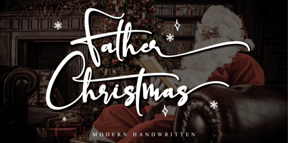 Father Christmas is a festive, fresh, rich, and elegant calligraphy font. It’s great for Christmas-themed greeting cards, branding materials, business cards, quotes, posters, apparel and more! This font is PUA encoded which means you can access all of the amazing glyphs and swashes with ease! It also features a wealth of special features including alternate glyphs and ligatures.
 - Blossom Riviera by Olivetype,
$18.00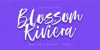 Blossom Riviera is the perfect brush script font for giving your projects a natural, handmade feel. With its cool, awesome texture, it's perfect for creating beautiful, unique logos and headlines. So what’s included : Standard Latin Numbers, symbols, punctuations and ligatures Multilingual Support. PUA Encoded and fully accessible without additional design software Simple Installations Works on PC & Mac Thank You!
 - Taurus Sense by Hatftype,
$17.00 Is a blackletter typeface font that is inspired by gothic and horror style because it's shape is very unique and is perfect for any project that you will use with this theme. Features : Symbol Number Multilingual support Uppercase & Lowercase Support in Mac and Windows OS Support in design application (photoshop, illustrator, and more) I really hope you enjoy it.
 - Hambut by Gatype,
$14.00 Hambut is a handwritten font that includes lots of cute dingbats to decorate your quotes, social media posts, greeting cards, etc. Make a combination of uppercase sans and lowercase scripts and design beautiful projects! Hair is available for various uses. You can use it for commercial projects, monetized social media posts, blogs, digital publications and branding.
 - Milkyway by RagamKata,
$14.00 Milkyway, a bubbly-bold font that is perfect for making your project looks even more fun! It’s rounded and curvy shape makes it more unique. Milkyway is very ideal for variety design projects, such as posters, Invitations, greeting cards, logo, and many more. Milkyway will jolly up you and your audiences! Get this font now to magnify your design!
 - Chancellor by PintassilgoPrints,
$24.00 Chancellor is a robust hand-drawn sans serif display typeface. Its sturdy letterforms takes inspiration from Plakatstil era posters, while bringing up also cool adornments to flourish your lettering designs. This all caps typeface has two versions for each letter, amplifying your composition choices. It's positively a great tool for a wide range of creative display uses.
 - Arcuata by Eko Bimantara,
$29.00 Arcuata is a serif font family inspired by 1400 classic roman typeface with soft characteristics. It's featured with some uncial letterforms as alternates, for example in 'a' and 'd' letter, it also has a set of decorative capital letters alternates and ligatures. Arcuata complete family contains 10 styles, consisting of 5 weights from Light to ExtraBold with matching italics.
 - Quaker Ladies by Putracetol,
$28.00 Quaker Ladies is a decorative classic font with tons of alternative glyphs and multilingual support. It's classic, vintage and elegant. Come with open type feature with a lot of alternates, its help you to make great lettering. Quaker Ladies best uses for heading headlines, cover, poster, logos, quotes, product packaging, merchandise, social media & greeting cards and many more.
 - Palm Shine by Jafar07,
$14.00 Palm Shine is a beautiful and versatile font with a retro serif design that can be used in many different ways. Its elegant lines and modern look will make your designs stand out while maintaining a classic, timeless feel. It's also extremely versatile - perfect for logos, boho and groovy designs, and even silhouette art and more.
 - Poniard by Hackberry Font Foundry,
$24.95 Cutlass was just for fun. Poniard is the working version. Sleek, slender, sharp, to the point! A bit of decorative fun. This is the first font used in teaching Fontographer in my new Practical Font Design Book. I thought I better release it for those who enjoyed the journey. It's just an 8-bit font for fun. Enjoy!
 - Nikaru by Twinletter,
$18.00 Nikaru is a retro-inspired display font designed in a simple and contemporary style that gives it a modern feel. This elegant typography is perfect for designing any project, especially editorial work, branding, product packaging, and promotional designs with bold and fun characters. It’s time to add some zest to your next project with this font.
 - Space Majestic by ahweproject,
$10.00 Space Majestic is a retro display font that is a perfect blend of boldness and uniqueness. Its bulky letters are slightly unbalanced, adding an extra layer of charm and personality. It’s perfect for designs that require a vintage touch with a modern twist. This font is PUA encoded which means you can access all glyphs and swashes effortlessly!
 - Arfindes Orthem by madeDeduk,
$12.00 Introducing Arfindes Orthem is a brush handwritten font and will be perfect for all your project design book, title branding, product packaging, invitation, quotes, label, poster, logo etc. Feature Uppercase & Lowercase Number & Symbol International Glyphs Multilingual support Alternative Ligature Feel free to drop us a message any time and follow my shop for upcoming updates Hope you enjoy it.
 - Brookvale Retro Condensed by Get Studio,
$25.00 Brookvale - Retro Condensed Font is a nostalgic typeface that channels the essence of the past with a contemporary twist. It's condensed letterforms and retro flair evoke a sense of vintage charm, making it an ideal choice for projects seeking a dash of retro coolness. Perfect for posters, branding, and designs that celebrate the enduring appeal of yesteryears.
 - Loventha by Arkrist Letter,
$14.00 Loventha font is the latest script written by Arkrist Letter studio. A font inspired by a very romantic thing. Designed with great care so as to produce very neat and elegant letter lines, it looks beautiful and romantic. Loventha is very suitable for greeting cards, t-shirt designs, logos, etc. Loventha is a masterpiece created with love!
 - The City Burn by Alien,
$40.00 The City Burn, formerly called "The city burn night after night and we spray-paint the walls", was especially designed for Mad Skills Mag issue#3 Urban Flavour. It needed to be street, and urban, so I made a stencil font. It’s used by Fox5 tv for the rant TV show, the website infected.com, Fried chillies TV, and others!
 - Headmista Script by Tebaltipis Studio,
$10.00 Headmista is a script typeface with personality. You can use it as a logo, badge, insignia, packaging, headline, poster, etc The alternative characters in this font were divided into several OpenType features such as Stylistic Alternates, Stylistic Sets, and Ligature. The OpenType features can be accessed by using OpenType program such as Adobe Illustrator, Adobe Photoshop, and Adobe InDesign.

