10,000 search results
(0.02 seconds)
- Luzern by Gumpita Rahayu,
$- Inspired by the most common grotesque heights and boxed sans serif typefaces, Luzern Typefaces was built with low-mid contrast sans serif and was designed in quite tall caps height and lower x-height which represents the flavor of the dynamic typefaces and is subtle for the display typefaces. The typefaces comes with five weights, from light to extra bold, plus matching italics in each weights. And Luzern Typefaces is loaded with OpenType features such as some stylistic alternates in uppercase, case-sensitive forms, fractions, and another numerals features such as super and subscript characters, tabular figures, numerator-denominator, etc. It’s highly usable for display text titles such as editorial magazine headline, websites heading, poster, advertising, logo, also it works well for medium body text. It comes with more 400+ glyph support including more latin european diacritics language.
 - Kristolit by Sasha Denisova Type Foundry,
$35.00 Kristolit is a Scotch Roman-inspired typeface with a technological twist. Version 1.0 features regular and italic styles with basic Latin and Cyrillic sets. It’s both elegant and robust: its ample curves contrast with the brutality of its lines, the verticality of its axis and stroke contrast. It is optimized type family for editorial use, branding projects and identities striking a balance between aesthetic experimentation, functionality, and legibility. The italic version adds a calligraphic touch while maintaining its tech-savvy and robust character.
 - Cerulean Love by Studio Indigo,
$15.00 Cerulean Love is a soft and clean sans serif font with a strong handwritten feeling. The letter shapes are based on letters written with a brush pen. Its rounded shapes, soft terminals and easy-to read letters adds a friendly look to it which makes it useful for many different kinds of purposes such as products for children, menus, posters, logos etc. It comes with dicritic letters for all European languages. It has quite tall uppercase letters and quite long ascenders and descenders.
 - Astroviz by Jehoo Creative,
$18.00 Astroviz is more than just a font it's a design statement. Its deep ink traps are the defining feature that sets it apart, making it an ideal choice for creating captivating and memorable headlines that demand attention and leave a lasting impression. While the ink traps are a prominent feature, Astroviz maintains an elegant and curvaceous design overall. Its letterforms are fluid and harmonious, with a balance of thick and thin strokes that give it a luxurious and sophisticated appearance.
 - Veljovic Script by Linotype,
$103.99ITC Veljovic Script was designed by Jovica Veljovic and displays an obvious calligraphic heritage. The designer was strongly influenced by German designer Hermann Zapf and Israeli designer Henri Friedlander. ITC Veljovic Script exhibits a crisp precision, as if the letters were cut in stone rather than drawn with pen and ink. - Valentiqu by HansCo,
$15.00 Valentiqu is a feminine modern handwritten font, carefully handcrafted to become a true favorite. Its casual charm makes it appear wonderfully down-to-earth, readable and, ultimately, incredibly versatile. Valentiqu will look outstanding in any context, whether it’s being used on busy backgrounds or as a standalone headline! Comes with a full uppercase, lowercase, numbers and punctuation + standard multilingual support. It’s great for branding, logo designs, lettering, logotype, craft, posters, packaging and much more. We recommend using Adobe Illustrator or Photoshop. Tutorial how to Install & use Alternate / Special Character : https://hanscostudio.com/tutorial/ Enjoy!
 - Exceptional by Studio&Story,
$16.00 Exceptional Is a super trendy Handwritten font, Elegant & modern with gentle brush texture , Exceptional comes with a complete set of lowercase and uppercase alternates(Uppercase letters can be used alone), It gives you the option to customize your text and to make it much more unique (It's very fun). And more great extra is the bonus Swash, this set come with 26 swashes, which allows you to add elegant & trendy finishing touches to your work. It's the perfect choice for personal branding projects, product packaging, social media, fashion, advertising and more!...
 - Kensmark by BoxTube Labs,
$15.00 "A kensmark is any feature or characteristic that makes someone or something instantly recognizable." Kensmark is a powerful and creative type family with a staggering 45 fonts. Thanks to a wide array of widths and weights it's incredibly versatile and flexible. It's perfect for logotypes, sports branding, posters, apparel design, magazine headlines, labels and so much more. This is by far our most comprehensive font project to date. We are very excited to finally have it released and look forward to see it in action. Caps only fonts.
 - Vonder Hills by Letterhend,
$17.00 Vonder Hills Layered Font Introducing, Vonder Hills . A layered typeface which is inspired by vintage lettering sign and art. While this font has a victorian touch, it still looks bold and solid. Very suitable for for headline, logotype, apparel, invitation, branding, packaging, advertising etc. It also comes in uppercase, lowercase, punctuations, symbols & numerals, stylistic set alternate, ligatures, etc also support multilingual and already PUA encoded. We highly recommend using a program that supports OpenType features and Glyphs panels like many of Adobe apps and Corel Draw, so you can see and access all Glyph variations.
 - Savant by Characters Font Foundry,
$25.00 I proudly present Savant, a friendly headline typeface with an attitude. It’s got a slab serif touch and is packed with lots of nice typo-gems. The italic is a perfect companion for the regular. But beside that, it's powerful enough to stand its own ground. Savant is a good mixture of the playful and the classic. You can use it for fashion, food, magazines, packaging, corporate design- and other projects with an attitude. So show me what you’ve got! Savant Regular only is completely free in 2012, so download your free copy today!
 - FairyTale by Comicraft,
$29.00 In its beauty, Comicraft's Fairytale font is without rival in the heavens, the earth, or the stuff of men's dreams! A wee thing it may be, but 'tis like a star pulled from the sky. Luminescent. Radiant. Perfect. Yes! PARADISE can be yours...from the pages of "Captain Stoneheart and the Truth Fairy," comes a font that might very well change your life forever... it's a dream, a myth, a neverending story, it's a FairyTale! Words by Joe Kelly & art by Chris Bachalo from Captain Stoneheart and the Truth Fairy
 - VanderHand by JOEBOB graphics,
$29.00 The 'VanderHand' font is a friendly and easy to use handwritten font. It is so loaded with ligatures it could easily pass for actual handwriting. The font was created with a felt-tip brush pen and so there are natural thick and thin parts in the characters. All writing was done upright with tightly fit characters. As a result this font has a unique 'instant logo' quality. But you should really try this out for yourself. O, and the font was written by Jeroen van der Ham. It's his handwriting. That's why it's called VanderHand.
 - Getih West by Twinletter,
$15.00 Getih West It’s a Halloween font, but there’s no need to fear. It’s not just for Halloween fans; You can use it to create cool designs and logos for everything from snowboarding gear to new products at work. Or, if you’re in a hurry, use it to make a fun invitation for your next party — because everyone loves an invitation that screams “Boo!” Of course with this font your various design projects will be perfect and amazing, get a beautiful title and start using our font for your special project.
 - Stray by Tour De Force,
$25.00 Stray might be the lonesome cowboy in this big odd world, but it's his just public façade. Stray is handsome player that works well with any team or in any environment. He doesn't have a horse, but he can be the one, he can carry any weight. OK, let's talk serious now: Stray is distinctive geometric sans serif family in 9 weights and matching Italics. By it's design, Stray flirts with humanistic typefaces in some elements, while on the other side, we can see vintage letter forms as well. It is well balanced typeface, fully legible in any (reasonable) size, with power to present versatile tasks and situations. Specific joining of letter stem and bowl is one of design characteristics of Stray, so it is not just another geometric sans family, it really differs in it's own details. Contains extended Latin character map support and Cyrillic (no localizations, sorry). As any serious working horse family, it is equipped with decent OpenType features like Small Caps (for basic Latin only), Fractions, Tabular Figures, Denominator, Numerator, Ordinals and Ligatures. It also comes with small interesting set of dingbats. This Stray is not homeless, he just looks for the proper job :-)
 - Dulce by Latinotype,
$49.00 Dulce is a swash typeface with an elegant and romantic touch. It is thin, but it becomes thick where two terminals meet and it also has swelling at terminals. Its wide range of ligatures makes it a versatile typeface, suitable for headlines and short phrases. You will see all of these ligatures on the screen, enabling “standard ligatures” and “discretionary ligatures” options. Ornaments are also included, which can be very useful for designing. Dulce is ideal for magazines, logotypes, advertising, etc. Use it for whatever you want and enjoy!
 - School Trip by Epiclinez,
$16.00 School Trip is a fun and cute handwritten font. It has a playful vibe and it’s easy to read. Get inspired by its simplistic charm and use it to brighten up any creative projects Features : Basic Latin A-Z, a-z, numbers, symbols, and punctuations School Trip is supporting 66 Languages: from Afrikaans Albanian Catalan Danish to Dutch English Spanish Swedish Zulu. Accented Characters : ÀÁÂÃÄÅÆÇÈÉÊËÌÍÎÏÑÒÓÔÕÖØŒŠÙÚÛÜŸÝŽàáâãäåæçèéêëìíîïñòóôõöøœšùúûüýÿžß Thank you
 - HF HySans by HyFont Studio,
$29.00 HySans has its roots in contemporary typefaces with humanist touches. HySans is designed to fit digital screen from desktop to portable devices. It is strongly legible from headline to body copy with a high x-height design which helps the lowercase feel as imposing as it’s all caps counterpart. HySans is available in Five weights with 3 packages. Generously use it everyday, for everything.
 - Nightcap JNL by Jeff Levine,
$29.00 It's not a new idea - combining two typefaces into one design, but when it works, it makes for an interesting novelty font. Nightcap JNL is a fun typeface that can be used by itself, or along with the two original fonts that comprise it (Parkitecture JNL and Typesetter Oblique JNL) to create some wonderful retro headlines. Nightcap JNL contains only the alphabet, numbers and basic punctuation.
 - The Story Begins & Ends by Comicraft,
$19.00 It is NOT the END, my friend. Beyond the Saga, beyond the Hype, Beyond the expectations of marketing executives and studio shareholders lie prequels AND sequels. It has been said that every journey has a first step as THE STORY BEGINS, and every Generation has a Legend, a Story, a Franchise and an inevitable descent into mindless exploitation where THE STORY ENDS. It's true, all of it!
 - Lakshmi by Océane Moutot,
$32.90 Lakshmi is an elegant and friendly script font. Inspired by brushed typography, it adds elegance, tension and typographic rigour to traditional script fonts. It's identified by its dynamic curves and the softness of its design. Lakshmi is ideal for display use, logotype, headline, packaging and advertising. Lakshmi is designed with extended language support, alternative characters as well as various ligatures and old-style numbers.
 - Dic Sans by CAST,
$70.00 DicSans is a square sans-serif typeface, inspired by Aldo Novarese’s Eurostile, it was meant as a sort of contemporary "open" Eurostile. It is a semi-custom font, designed and expanded according to costumers’ requests, since 2004 up to 2013. For this reason it has many glyph variants (up to three variants per lowercase glyphs and numbers, special smallcaps etc.) and wide language coverage.
 - Rhea by Dominik Krotscheck,
$7.00 Rhea is a family of condensed all-caps sans serif fonts. It is equipped with a bunch of accented characters. There are alternate letterforms for M & W, easily accessible via opentype features. Due to its nine styles, ranging from an elegant thin to a blatant fat, it gives you the opportunity to easily define a hierarchy between your headlines or the content on your poster, etc.
 - Satchell by Lemonthe,
$13.00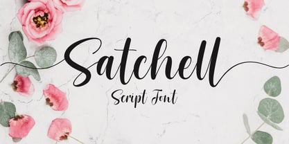 Satchell is a lovely and relaxed handwritten font. It is PUA encoded which means you can access all of the glyphs and swashes with ease! it has a gentle and beautiful flow, and as a result it will elevate each of the designs you wish to create!. It’s the perfect font for wedding invitations, stationery, photography, social media posts, product packaging, greeting cards, and much more!
 - Anthurea by Invasi Studio,
$19.00 Anthurea is a modern classy serif typeface. Featuring an elegant and classic all-caps style, this font reflects the elegance and style of the past. With its modern and minimal treatment, it makes a great starting point as well as an enhancement for your design. It is perfect for Logotype, printed quotes, invitations, cards, product packaging, headers, Letterhead, Apparel, Web design, magazines, books, etc.
 - Commander by Red Rooster Collection,
$45.00 Commander is a compressed serif font family and is an original creation of Steve Jackaman (ITF). It was designed in 1994 exclusively for the Red Rooster Collection. The family excels at display sizes and in headlines, and its masculine nature lends itself well to projects about sports, science fiction, and academia. Wherever Commander ends up in your project, it is guaranteed to draw attention!
 - Snacko by Eko Bimantara,
$22.00 Snacko is one dope display font. It’s got that casual vibe mixed with some 70s soft serif styles, and a playful italic angle that’ll make your designs move and groove! This font is perfect for titling, branding, logos, and all kinds of digital or printed materials. It’s fun and playful, so it’s perfect for designs that are targeted at a younger crowd or need a fresh and modern feel. Snacko’s funky, soft, and cool design makes it the bomb for all kinds of design fields, from advertising to packaging to social media graphics. It’s got a style that’s all its own and can make your designs pop and stand out from the crowd. This font only comes in one style, but don’t trip, it’s versatile and can be used in all kinds of ways. It’s approachable and friendly with a softness that’s off the hook, but also funky and expressive with a unique personality that can take your designs to the next level. Bottom line, Snacko is one creative and versatile font that’ll bring a playful and fun energy to all your designs. It’s got a unique style that’s perfect for any designer’s font collection, so don’t sleep on this one!
 - Tecna Dark Up Triangle BNF by Descarflex,
$30.00 The Tecn@ Dark&Light Triangle Background Nomenclature Font family is differentiated by the direction of the triangle tip in the 4 cardinal points. The family were designed to head, enumerate, indicate or highlight writings or design plans, for this reason, the characters are available only in capital letters and some signs or symbols that can serve such purposes. A triangle or empty character is included so that the user can use it overlaying any character of his choice or to be used alone. What is Lorem Ipsum? Lorem Ipsum is simply dummy text of the printing and typesetting industry. Lorem Ipsum has been the industry's standard dummy text ever since the 1500s, when an unknown printer took a galley of type and scrambled it to make a type specimen book. It has survived not only five centuries, but also the leap into electronic typesetting, remaining essentially unchanged. It was popularised in the 1960s with the release of Letraset sheets containing Lorem Ipsum passages, and more recently with desktop publishing software like Aldus PageMaker including versions of Lorem Ipsum. Why do we use it? It is a long established fact that a reader will be distracted by the readable content of a page when looking at its layout. The point of using Lorem Ipsum is that it has a more-or-less normal distribution of letters, as opposed to using 'Content here, content here', making it look like readable English. Many desktop publishing packages and web page editors now use Lorem Ipsum as their default model text, and a search for 'lorem ipsum' will uncover many web sites still in their infancy. Various versions have evolved over the years, sometimes by accident, sometimes on purpose (injected humour and the like). Where does it come from? Contrary to popular belief, Lorem Ipsum is not simply random text. It has roots in a piece of classical Latin literature from 45 BC, making it over 2000 years old. Richard McClintock, a Latin professor at Hampden-Sydney College in Virginia, looked up one of the more obscure Latin words, consectetur, from a Lorem Ipsum passage, and going through the cites of the word in classical literature, discovered the undoubtable source. Lorem Ipsum comes from sections 1.10.32 and 1.10.33 of "de Finibus Bonorum et Malorum" (The Extremes of Good and Evil) by Cicero, written in 45 BC. This book is a treatise on the theory of ethics, very popular during the Renaissance. The first line of Lorem Ipsum, "Lorem ipsum dolor sit amet..", comes from a line in section 1.10.32. The standard chunk of Lorem Ipsum used since the 1500s is reproduced below for those interested. Sections 1.10.32 and 1.10.33 from "de Finibus Bonorum et Malorum" by Cicero are also reproduced in their exact original form, accompanied by English versions from the 1914 translation by H. Rackham. Where can I get some? There are many variations of passages of Lorem Ipsum available, but the majority have suffered alteration in some form, by injected humour, or randomised words which don't look even slightly believable. If you are going to use a passage of Lorem Ipsum, you need to be sure there isn't anything embarrassing hidden in the middle of text. All the Lorem Ipsum generators on the Internet tend to repeat predefined chunks as necessary, making this the first true generator on the Internet. It uses a dictionary of over 200 Latin words, combined with a handful of model sentence structures, to generate Lorem Ipsum which looks reasonable. The generated Lorem Ipsum is therefore always free from repetition, injected humour, or non-characteristic words etc.
 - Abode - Unknown license

- Chalkboy by Typefactory,
$14.00 Chalkboy – Handwritten Chalk Font is a fun and casual display font suited for kids, playground, or school theme. Whether you’re using it for crafting, digital designing, presentations, or greeting card making, it’s perfect!
 - Hopeless Heart by PizzaDude.dk,
$22.00Hopeless Heart isn't really all that hopeless! With its jumpy baseline and the different sized serifs, it’s a font full of fun and games, suitable for your next wedding invitation or love letter. - Velourist by Fargun Studio,
$15.00 Velourist is a bold display type that’s absolutely perfect for editorial headlines with retro looks. It’s unique, bold, and slim figure make it a great fit for t-shirts, posters, and magazine covers.
 - Dungarees by Victory Type,
$-Dungarees is a font on caffeine... It's a normal sans-serif typeface gone wild: jagged in some places, smooth in others. It makes documents not only fun to read but really interesting too! - Deseada by Type-Ø-Tones,
$40.00 Deseada is a blurred roman face with a small x-height —actually a modified Caslon— that fits perfectly into retro environments. Use it as a parody, it's just a sort of Catalan custom.
 - Honey Bee by Atlantic Fonts,
$26.00 Honey Bee is sweet. It’s loopy, playful, and hand drawn with a lively set of double letter ligatures. Use it for baby announcements, party invitations, greeting cards, children’s books, packaging, or anything creative.
 - Hola by Cuda Wianki,
$35.00 Hola! This is our new handwritten font. It's casual, young and pretty, perfect for logotypes, magazines, writing notes and comments. Thanks to many ligatures and alternate characters it is varied handwriting font. Enjoy!
 - Phylactere by Cubo Fonts,
$29.00 This font draws its inspiration from handwriting, in order to maintain a certain dynamism and irregularity. It's a serifless font, with small capital characters, always readable at any dimension, despite a tight tracking.
 - Lamiar by Antipixel,
$15.00 Lamiar is a decorative, fun, san serif handwritten font. This rounded monoline font will add an fancy, weird and unique look to your work. It's recommended for display usage for its glyph quality.
 - Gruffly by Stripes Studio,
$19.00 Gruffly is a new font brushed very interesting, also provided some ligatures. It is perfect for projects for brands, logos, product packaging, posters, invitations, greeting cards, news, blogs, everything including personal charm etc.
 - MTF Sunny Days by Miss Tiina Fonts,
$9.00 Sunny Days is a fun, cartoon-like display font capable of taking any product out of the ordinary! Use it on bold and bright creations such as banners, posters, covers, titles, magazines, etc.
 - Compatil Fact by Linotype,
$50.99Compatil is the first comprehensive type system which enables all typographical elements to be used to full effect in order to reproduce the message conveyed by text information. Four different type styles with a total of 16 weights including italics have been merged into a unique typographical network. There are now no limits to the font user's creativity. The system is a product of technical innovation and constitutes a new design approach which meets the highest aesthetic standards. For almost two years, a team of experts from Linotype has been working with initiator Professor Olaf Leu under the direction of Silja Bilz, Erik Faulhaber and Reinhard Haus to create the Compatil type system. Despite the Internet and TV, it is essential today to be able to absorb information quickly by being able to read it with ease. A fact that is becoming increasingly important both on-screen and on paper. It is the role of the font to increase legibility and to ensure typographically perfect results for text design work. The new Compatil type system meets all these needs. The Compatil is a part of the Platinum Collection. The following four different styles are available: Compatil Exquisit, Compatil Fact, Compatil Letter and Compatil Text. Compatil is available in various font formats: 16 separate OT Pro fonts including the small caps and Adobe Central European character set for OpenType-supporting applications like Adobe InDesign, or as 32 separate OpenType Com fonts for office communication, with the following special features: 1. Optimized display capabilities for computer screens eXcellent Screen Fonts (XSF-quality). 2. An extended, international character set, which supports 48 different languages for Microsoft Office applications like MS Word or as 64 PostScript fonts, which can be used in non-OpenType-supporting applications like Quark XPress.
