10,000 search results
(0.091 seconds)
- Kyhota by Ingrimayne Type,
$14.95 The six typefaces of the Kyhota group all have an “Old West” look to them. KyhotaOne has very thick slab serifs compared to KyhotaTwo. KyhotaBarbed is more condensed than either and has little barbs on the verticals, something that was a feature of a number of nineteenth century typefaces in this style. KyhotaFezdaz is condensed, without barbs, and with the slab serifs replaced with a flare serif. KyhotaBigBottom and KyhotaBigTop play with the weighting of the serifs, with one (either top or bottom) very thin and the other very thick.
 - Larome by Gholib Tammami,
$17.00 Larome font is a serif font that possesses a truly unique style. This font is combined with lowercase characters that feature graceful curves, resulting in a distinctive and captivating style. Larome font is well-suited for display purposes and for branding products that exude an elegant, unique, and antique ambiance.
 - Benang Merah by San Studio,
$15.00 Benang Merah is designed by Zainul Faozi, the idea concept is from a thread, each letter is connected that is the uniqueness of this font. You can use this font for your poster design, heading, social media, lettering design, and more. This font can be paired well with serif fonts.
 - Shentholla by Liartgraphic,
$23.00 Meet our newest product, we call this product Shentholla font. Shentholla font are sans serif typeface font Whit a uniqe touch and assertive. Shentholla font is very nice to use on: fashion magazine, logos, ,and photography, landing page, fliyer, What’s includes - mutilngual support - alternate - ligature Thank you, salutations Ali Sifak Muftari
 - Girard by House Industries,
$33.00 Whatever the medium, Girard’s love for typography was the common thread that wove his work together. We are honored that the Girard family has entrusted us to celebrate and expand upon the legacy of this design icon with this collection of fonts. The Girard Slab family gracefully synthesizes illustrative sensibilities into a practical typographic framework. Slab’s three widths and four weights ensure versatility in a modern editorial setting while its gentle curves transcend the sterility of traditional typography to add an unprecedented warmth and personality. From boutique chocolate packaging to the titling sequence for an indie vegan superhero cartoon, Girard Script deftly adds a contemporary sophistication to text and display settings. Inspired by a workhorse lettering style that helped Alexander Girard implement thousands of design elements in his overhaul of the Braniff identity system, Girard Sky pulls its weight in any contemporary application. In Girard Sansusie, each character stands alone as an illustrative element while coming together with its counterparts as a whimsical yet functional typeface. FEATURES: The ligatures feature substitutes specially-drawn letter combinations that combine two, three or even four characters to create smoother transitions and simulate lettering sensibilities. Girard Slab’s three widths and four weights ensure versatility in a modern editorial setting while its gentle curves transcend the sterility of traditional typography to add an unprecedented warmth and personality. Copious alternate characters and “smart” OpenType programming allow Sansusie to escape the rigid confines of typography to come alive as if flowing from Girard’s sketchpad. This animation shows a sampling of the swash characters available in the font. GIRARD CREDITS: Typeface Design: Alexander Girard, Ben Kiel, Ken Barber, Laura Meseguer Typeface Production: Ben Kiel Typeface Direction: Christian Schwartz, Andy Cruz, Ken Barber Like all good subversives, House Industries hides in plain sight while amplifying the look, feel and style of the world’s most interesting brands, products and people. Based in Delaware, visually influencing the world.
 - Queen Sansson by Zamjump,
$11.00 Introducing "Queen Sansson" - a Serif font families with modern and nostalgic. This font is both modern and nostalgic and works great for logos, mastheads and pull quotes. Inclouded : - Queen Sansson regular - Queen Sansson italic - Queen Sansson Bold - Queen Sansson Bold Italic - Multilanguage
 - Gatlinburg by Deeezy,
$14.00 Trendy or modern style serif font for your fancy projects. Elegant and classic style on Gatlinburg font will be great for any branding project. Lot of alternates and ligatures will help you to create unique and original logo design or website header! Enjoy :)
 - Aesthico by Heinzel Std,
$16.00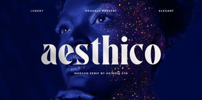 Aesthico is modern, elegant, fashion serif font inspired by a popular magazine logo. Aesthico is great for headlines, logos, covers, posters and other creative designs. This font is PUA encoded which means you can access all of the amazing glyphs with ease!
 - Grapevine by Deeezy,
$14.00 Trendy or modern style serif font for your fancy projects. Elegant and classic style on Grapevine font will be great for any branding project. Lot of alternates and ligatures will help you to create unique and original logo design or website header! Enjoy :)
 - Rigaster by Iwm Design,
$10.00 Rigaster is a font that encompasses four distinct styles, skillfully blending elements from classic serif fonts with those from modern typography. This fusion results in dynamic characteristics that lend themselves perfectly to contemporary designs as well as those with a retro aesthetic.
 - Luckenbach by Deeezy,
$14.00 Trendy, bold & modern style serif font for your fancy projects. Elegant, luxury and classic style on Luckenbach font will be great for any branding project. Lot of ligatures will help you to create unique and original logo design or website header! Enjoy :)
 - Mophend by Typebae,
$16.00 Mophend is a beautiful and elegant serif font crafted with joy and luxury. For those of you who are needing a touch of stylish, classy, chic and modernity for your designs, this font was created for you! Features: Multilingual Ligatures Alternates PUA encoded
 - Dunsmuir by Deeezy,
$14.00 Trendy, bold & modern style serif font for your fancy projects. Elegant and classic style on Dunsmuir font will be great for any branding project. Lot of alternates and ligatures will help you to create unique and original logo design or website header! Enjoy :)
 - Rugak by Nemelk aka Clément Petit,
$15.00 Rugak is a serif typeface created by Clément Petit. This font contains 186 characters (letters/numbers/punctuation). The particularity of Rugak font is to use a circle which the recurrent size on all the characters. More information (video + animation) on www.petitclement.net/rugak
 - Merchanto by Type Juice,
$19.00 Merchanto is a condensed sans serif display typeface made up of 8 fonts in a variety of styles and weights. Included are over 500 stylized alternate glyphs for creative control and customization. 8 fonts total Over 500 Alternates Multilingual Over 2300+ glyphs
 - Carltine by Muksal Creatives,
$10.00 Carltine is a unique and modern family of Sans serif fonts. Simply Conception has 18 families Regular and italic font, starting from the small thin to the largest black. This typeface is versatile and can be used successfully in magazines, posters, branding, websites.
 - Hudson NY Pro by Arkitype,
$15.00 It's here and it's a major upgrade to Hudson NY. Weight variations and alternate glyphs were some of the requests that were being received for Hudson NY and these have all been taken care of in the Pro Edition of Hudson NY. Hudson NY Pro still comes in Regular, Serif and Slab styles now with completely re-drawn glyphs, there are now six weights as well as italics for each style. Some of the additional features included in the Pro Edition is Small Caps, Stylistic Sets and Alternate Glyphs. Hudson NY is now loads more versatile, it is the perfect Display family for sports, beverage and entertainment. Press versions have been dropped in the Pro Edition as these were the lesser used and sluggish fonts of the original Hudson NY family so the focus was to create a cleaner family with more usability options. Each Hudson NY style now also includes a Variable font which saves you the hassle of installing multiple font files.
 - Anselm Sans by Storm Type Foundry,
$63.00One of the good practices of today’s type foundries is that they release their type families as systems including both serif and sans serif type. Usually, the sources of inspiration need to be well tried with time and practice, since production of a type family is such a laborious and complex process. From the beginning, it needs to be clear that the result will be suited for universal use. Such systems, complete with the broad, multi-lingual variations permitted by the OpenType format, have become the elementary, default instrument of visual communication. Non-Latin scripts are useful for a wide scope of academic publications, for packaging and corporate systems alike. And what about outdoor advertisement designated for markets in developing countries? Cyrillics and Greek have become an integral part of our OpenType font systems. Maybe you noticed that the sans serif cuts have richer variety of the light – black scale. This is due to the fact that sans serif families tend to be less susceptible to deformities in form, and thus they are able to retain their original character throughout the full range of weights. On the other hand, the nature of serifed, contrasted cuts does not permit such extremes without sacrificing their characteristic features. Both weights were drawn by hand, only the Medium cut has been interpolated. Anselm Ten is a unique family of four cuts, slightly strengthened and adjusted for the setting in sizes around 10 pt and smaller, as its name indicates. The ancestry of Anselm goes back to Jannon, a slightly modified Old Style Roman. I drew Serapion back in 1997, so its spirit is youthful, a bit frisky, and it is charmed by romantic, playful details. Anselm succeeds it after ten years of evolution, it is a sober, reliable laborer, immune to all eccentricities. The most significant difference between Sebastian/Serapion and Anselm is the raised x-height of lowercase, which makes it ideal for applications in extensive texts. Our goal was to create an all-round type family, equally suitable for poetry, magazines, books, posters, and information systems. - Gildeon by Sronstudio,
$25.00 "Gildeon" is a bold serif display typeface that commands attention with its powerful letterforms. Designed for impactful statements and strong visual presence, this font strikes the perfect balance between boldness and sophistication. Whether used for headlines, posters, or branding, "Gildeon" stands out with its commanding strokes and confident design, making it the ideal choice for projects that demand a bold and assertive typographic style. Features: - Uppercase & Lowercase - Numeral & Punctuation - PUA Encoded - Multilingual support - Simple Installation - Work both on Mac and Windows Thank you very much :)
 - Hupaisa by Melvastype,
$22.00 Hupaisa is a geometric sans serif with a casual hand-drawn feeling. It has six weights: thin, light, regular, medium, bold and black. Although Hupaisa is a display font, it is very legible also in small sizes. That makes Hupaisa very useful in design projects. You can use it on titles and body texts. Create interesting typography with a proper hierarchy. Hupaisa also includes many alternate characters, ligatures and swashes to give you options to play with. Use them to create interesting titles, wordmarks, quotes or logos.
 - Wintermint by Pink Broccoli,
$16.00 A funtastic and playful typestyle, Wintermint started as a digitization of a film typeface called Lori by LetterGraphics. This font is filled with bounce and liveliness taken from its original limited character set and fleshed out to a fully functional typeface. Flare serifs along with the occasional weird and wonderful curl gives this typeface a festive holiday vibe, but it could easily blend into a psychedelic design space, or just an all out wacky groove. Give it a spin, and see where Wintermint takes you.
 - Layla by Putracetol,
$24.00 Introducing "Layla," a stunning new display serif font that combines the luxury serif of the display cover with an elegant typeface style. With a lot of alternates character, you have a plethora of options to create unique and striking display lettering. Layla comes with open type features, including a vast selection of alternates and end swashes, allowing you to create stunning lettering designs. Additionally, Layla supports multi-language use, making it ideal for global designs. Layla is best used for various purposes, including Logotype, heading, cover, poster, logos, quotes, product packaging, header, merchandise, social media & greeting cards, and many more. Its versatility makes it a valuable addition to any designer's toolkit. In the zip package, you will receive Layla in otf, ttf, and woff formats, with features that include uppercase and lowercase letters, opentype alternates and ligatures, numbers, punctuation, symbols, and multilanguage support. To access Layla's alternate glyphs, you will need a program that supports OpenType features such as Adobe Illustrator CS, Adobe Photoshop CC, Adobe InDesign, and Corel Draw. Overall, Layla is an excellent font choice for anyone looking to add a touch of luxury and elegance to their designs. Its stunning design and high-quality features make it an ideal font for all your design needs, including print and digital media.
 - Verbindig by Lucywho,
$17.00 Verbindig is a modern serif style typeface. With over 45 joining ligatures and 3 different Styles it's easy to make a unique logo, headline or poster in seconds. Regular, Bold & Extreme Multilingual support Numerals & Punctuation Fun fact: Verbindig means connection in swiss german - yes I'm from Switzerland
 - Athan by Thinkdust,
$10.00 Athan is an uppercase geometric sans-serif typeface designed by Dani Montesinos in 2009. Inspired by one piece of lettering from the 1970s, Athan offers something a little different in terms of typography. With strong geometric forms, and highly distinctive characters, it's sure to catch your eye.
 - Antebas by Lafontype,
$35.00 Antebas is a sans serif family with a geometric touch. Available in 16 styles from Thin to Heavy and it's matching italics. OpenType features such as fractions, ordinal, superscript, subscript, numerators, denominators and tabular figures are available. besides Latin letters, Antebas also supports Cyrillic and Greek letters.
 - Musthyka by Raditya Type,
$15.00 Musthyka is a sans serif typeface in an elegant & modern style with special alternate ligatures and glyphs. Musthyka is ideal for headlines, headlines, logos, labels, packaging, postcards, presentations, magazines, invitations, etc. Features: Basic Latin alphabet A-Z Ligature & Alternatives Numbers, Punctuation, Currency, Symbols, Mathematical Symbols & Diacritics
 - Cream by Monotype,
$30.00 Cream is a retro soft serif typeface comprising 12 fonts. It can handle most typographic applications from branding to body copy with its range of weights and inherent legibility. Whatever you type will have a friendly message, but it really comes into its own when you start applying some of the additional ligatures and alternates that are built into this type family. You’ll soon be creating distinctive typographic compositions that are pleasing to the eye. There are 12 fonts altogether, ranging from Light to Black weights in both roman and italic. It has an extensive character set that covers all Latin European languages. Key features: 6 weights in Roman and Italic 75 Alternates 37 Ligatures Full European character set (Latin only) 730 glyphs per font.
 - Honesty by Océane Moutot,
$32.99 Honesty is sans serif font with flared stems. As such, it belongs to the incise genre which is historically inspired by the roman civilisation and letters carved in granite or marble. One of the major example of it is the Trajan’s Column in Rome which inspired a font called Trajan, designed by Carol Twombly in 1989. Honesty is also inspired by more brutal font such as the Albertus, designed in 1938 by Berthed Wolpe, and its shape is highly influence by the work of the hammer. Despite this brutality and urgency due to the carving technique, the design of Honesty bring softness to it thanks to its low contrast and smooth curves. Honesty’s design include 16 styles, from thin to black in roman and italic.
 - Herkules by Nandatype Studio,
$15.00 Herkules is a whimsical script font with a relaxed theme, with a series of hooking hooks for a beautiful style. Whatever the topic, this font will be a great asset to your font library, as it has the potential to enhance any creation. This font is PUA encoded which means you can access all the glyphs and sweeps easily!
 - Glomersa by Pixesia Studio,
$23.00 Introducing Glomersa - Modern Luxury Serif Font Glomersa is a modern aesthetic serif font inspired with an elegant and bold design. It brings more chances and possibilities to craft a design with an elegant, strong, and sophisticated vibe. Glomersa suits perfectly in the use of any fashion brand. Glomersa is better used for fashion product packaging, clothing labels, any masculine related brand, or any projects seeking for a touch of elegant, luxury, classic, bold and any sophisticated vibe. FEATURES - Stylistic Alternates - Ligatures - Uppercase and Lowercase letters - Numbering and Punctuations - Works on PC or Mac - Simple Installation - PUA Encoded Characters – Easily accessible without additional design software. - Support Adobe Illustrator, Adobe Photoshop, Adobe InDesign, also works on Microsoft Word - Multilingual Support for 68 languages including Afrikaans, Albanian, Basque, Catalan, Danish, Dutch, English, Estonian, Faroese, Filipino, Finnish, French, Galician, German, Icelandic, Indonesian, Irish, Italian, Malay, Norwegian Bokmål, Portuguese, Spanish, Swahili, Swedish, and Zulu Hope you Like it. Thank you for your purchase!
 - Helter Slab by Dora Typefoundry,
$15.00 NEW! Helter is a slab-serif font that gives off a clean and very elegant feel that has a strong and bold look. the slab is thick and does not regret the size of the width. The slab-serif helter is perfect for your upcoming project which is applied especially to various other formal forms such as invitations, labels, logos, magazines, books, greeting / wedding cards, packaging, fashion, make up, stationery, novels, home decor labels, book / cover titles, special events and many more. Features: • Full set of uppercase letters, • Numbers & Punctuation • Characters with accents • Supports Multiple Languages This type of family has become a work of true love, making it as easy and enjoyable as possible. I really hope you enjoy it! I can't wait to see what you do with Helter Slab! Feel free to use the #Dora Typefoundry tag and # Helter Slab font to show what you've done visit my Instagram : https://www.instagram.com/doratypefoundry/
 - Aptifer Slab by Linotype,
$39.00 Aptifer Sans and Aptifer Slab are two 21st century typeface families created by Mårten Thavenius. Each family has seven weights, in roman and italic respectively, making 28 font styles in total. A heritage from two design traditions can be seen in Aptifer. One is the robust American gothic typefaces, like M. F. Benton’s, from around 1900. This is combined with the openness and legibility that comes from the humanist tradition. The sans serif part of the family, Aptifer Sans, is designed without excessive details disturbing the reading. Its sibling Aptifer Slab with its wedge slab serifs is more eye-catching but still suited for text settings. The italics fit well into the text flow of the roman. They are a bit narrower than the roman and have cursive characteristics. Both Aptifer Sans and Aptifer Slab are highly legible typefaces and can be used both in print and on screen. Featured in: Best Fonts for PowerPoints
 - Monceau by URW Type Foundry,
$19.99 As a successor of Didots famous font, which marked the beginning of modern typography, the Monceau has inherited the spirit, elegance and sophistication of french style, although in a revamped design, typical for the first years of the 21st century. Liberated from its serifs and with soft and round small letters the Monceau approaches ornamental typography and thus perfectly lends itself to being enlarged: it’s a font that loves to be closely looked at. Its name, lent from the famous parc Monceau in Paris, evokes and reinvents in a modern graphical way all of the Parisian chic at the end of 18th and the beginning of the19th century (the time Didot was born), the French Revolution and Empire, the architecture of this business quarter and notably the arabesques of the monumental gates still present in our times.
 - Gik by Serebryakov,
$39.00 Gik is sans serif font family with modular aesthetic and the elegance of contemporary typography. Its compositional and plastic solution combines echoes of (de)constructivism, brutalism, de Stijl and other manifestations of 20th century antiquity + techniques characteristic of italics. But this does not make the font old-fashioned — on the contrary, it helps to understand how to use it. Gik is a product of the metamodernism era — it is on the border between modernist enthusiasm and postmodernist mockery, between simplicity and awareness, wholeness and cleavage, clarity and ambiguity — a kind of conceptual oxymoron. Looking at Gik, you could imagine it at Fashion Week, if there was one for typography. Gik has a message for both the designer and the viewer, it stimulates the imagination, it is the anthology of all fonts of the future.
 - Geodec N9 by Intellecta Design,
$16.90A modern grotesque sans serif - Gogo Latin by Bogusky 2,
$25.00Ultra Bold Condensed Latin Serif - Sainted Medium by Wooden Type Fonts,
$15.00 Slab serif display, medium weight
 - Gallatin Bold by Wooden Type Fonts,
$45.00 Slab serif in 3 weights
 - Pontoon by Phat Phonts,
$20.00Extended sans serif display face. - Janda Safe And Sound by Kimberly Geswein,
$5.00 Imperfectly hand-sketched sans serif.