10,000 search results
(0.05 seconds)
- Qanelas Soft by Radomir Tinkov,
$29.00 Qanelas Soft is a modern sans serif with a geometric touch, and a friendlier version of the original Qanelas font family. It comes in 20 weights, 10 uprights and its matching italics. Designed with powerful OpenType features in mind, each weight includes alternate characters, fractions, extended language support (+ Cyrillic), arrows, ligatures and more. Perfectly suited for graphic design and any display use. It could easily work for web, signage, or corporate use as well as for editorial design.
 - Noelia Script Pro by Vástago Studio,
$19.00 Noelia Script is a typeface inspired on the work of Doyald Young, Tommy Thompson, Matthew Carter and Giambattista Bodoni. This project is great to use in designs about sports, travel, and city postals, among others. This font has about 360 glyphs with stylistic alternates, old style numbers, serif caps, and a nice touch of classic penmanship. This is the result of a few months of work and that is it! Enjoy it! Thanks for buy it!
 - Remah Pro by Rosario Nocera,
$12.00 Originally created in 2014 but redesigned and improved in 2020, Remah Pro is an eclectic and versatile sans serif font family consisting of 5 weights, from extra light to extra bold with its respective condensed. When looking for something different, Remah Pro is certainly the best choice: the wavy shapes that defines it are intertwined with clean cuts and sharp edges, making it suitable for typographic experimentation and ideal for display work, logo design, posters and billboards.
 - MVB Fantabular by MVB,
$39.00MVB Fantabular proves that monospaced faces needn’t be formal or bland. Inspired by the letterforms of older typewriters, Akemi Aoki designed a playful family of three weights with italics. With every character the same width MVB Fantabular works wherever a monospaced font is needed, but the face is so loose and carefree it hides its fixed pitch construction well, allowing it to be used in other settings too. A sans serif version—MVB Fantabular Sans—is also available. - MVB Fantabular Sans by MVB,
$39.00MVB Fantabular proves that monospaced faces needn’t be formal or bland. Inspired by the letterforms of older typewriters, Akemi Aoki designed a playful family of three weights with italics. With every character the same width MVB Fantabular works wherever a monospaced font is needed, but the face is so loose and carefree it hides its fixed pitch construction well, allowing it to be used in other settings too. MVB Fantabular Sans is the sans serif version of MVB Fantabular. - Boulevard Sans by takoliko,
$16.00 Boulevard Sans typeface designed by Takoliko Studio. This Sans Serif font inspired by retro geometric style especially the radio and vhs era.The simplicity and geometric style is a timeless choice for your design. It comes with reguler and Bold, also oblique style for a different feel. Its bold characteristics makes it suitable for attention grabbing design projects such as headlines, posters, social media displays and editorials. And You can combine the family to make a larger design concept.
 - Konstanz by W Type Foundry,
$25.00 Konstanz is a sans serif font family inspired by the design of books and magazines for museums, art galleries, design biennials, architecture, and theater, among others. Its design focuses on a grotesque aesthetic but brings back certain shapes from Bauhaus and Futura. Konstanz includes 8 weights plus its matching italics, besides a stylistic set that increases its use possibilities. Konstanz ensures a graphic with a high impact and is ideal for designing editorial projects, posters, branding, and advertising.
 - Doric by Linotype,
$29.99Originally released by the Stephenson Blake foundry in England, Doric is modeled on one of the sans serifs of William Caslon IV, who was the first to interpret sans serif letterforms into a typeface (1816). Doric Bold has large, heavy capitals with uniform letter widths. It is often used for classified advertising in newspapers because these qualities coupled with a large x-height allow greater legibility at small point sizes. - Prelom by Tour De Force,
$25.00 Prelom is modern serif family inspired by retro designed typefaces. Comes in 5 Normal weights, 5 true Italics and 5 Condensed weights. With tall x-height, sharp serifs like fishing hooks, original Italics and distinctive character overall design, Prelom is ideal family for editorial use or branding. Beside extended Latin character set, Prelom contains Cyrillic characters as well. It is equipped with Initials, Ligatures, Fractions and Tabular Numbers as OpenType features.
 - Marat Sans by Ludwig Type,
$45.00 Marat Sans is a clean and lively sans serif typeface designed by Ludwig Übele. It is characterized by excellent legibility and suits a wide range of typography. The entire family contains 27 styles & weights and includes many OpenType features: various numerals, alternate glyphs, fractions, superiors and inferiors, language features, arrows, case sensitive forms and many more. Marat Sans is the perfect companion for Marat, a soft and elegant serif typeface.
 - Fields by Adam Ladd,
$25.00 Fields is a versatile, soft serif family blending casual, retro tones with modern vibes. Details like rounded serifs, teardrop terminals, and subtle tails make this typeface friendly and approachable. Drawing inspiration from familiar classics such as Cooper and Souvenir, Fields is a contemporary expression of this style. Fields exudes pleasant, plumper characters with its medium contrast, while the high contrast in the Fields Display family presents something more fashionable and sophisticated.
 - Conference by ITC,
$29.99Conference is a bold, playful sans serif, which was designed in 1978 by Martin Wait. Conference's letters are very curvaceous; many of them bulge lovingly outward from their centers. This typeface offers a different feeling than is available from most contemporary sans serif display faces; Conference is lively, without sacrificing readability. The type should be set in large, display sizes, where the eye can better appreciate its loving forms. - Cruz Cantera BT by Bitstream,
$50.99 Cruz Cantera is a crisp and stylish yet informal sans serif typeface created by NYC type designer Ray Cruz. It is a slightly condensed design. The vertical strokes have rounded terminals, and there are some characters with serifs. Notable characters include the upper and lowercase E. There are three weights and each works equally well alone, or together for both display and text. Original design by Ramon Cruz completed in 2002.
 - Lam Lagang 051 by Siwox Studios,
$23.00 LAM LAGANG 051 Is a sans serif contemporary with Mid-Century, Modern & Aesthetics style. Sans serif style combined with swash, some letters with shades of Blackletter complete with Ligatures and Alternative Letters to complete all your design explorations. It is suitable for use in any design style such as classic, retro, vintage and also perfect for modern or minimalist design styles. Features: Multilingual Alternates Ligatures Opentype Thank You
 - Vangba by Alit Design,
$12.00 Introducing Vangba Typeface The Vangba font is designed with a serif font concept that has a elegant stencil style. Irregular dynamic shapes but impressively regular and unique make the font "Vangba" different and steal attention. Serif typefaces such as "Vangba" are very easy to apply to any design, especially those with an retro, elegant and classic, besides that this font is very easy to use both in design and non-design programs because everything changes and glyphs are supported by Unicode (PUA). The "Vangba"contains 656 glyphs with many unique and interesting alternative options. In addition to the regular font, there is also an italic version of the Vangba font.
 - Gingersans by Sryga,
$22.00 Introducing Gingersans, the typeface that's basically a font party in 12 different weights! Imagine a font that's not just a font but a personality chameleon, smoothly transitioning from easygoing and polite in the regular weights to downright wild and fun in the bolds. It's like having multiple distinct characters living in one seamless universe. The design? Oh, it's calligraphy meets sans serif – the rebel child of fonts. The curves are having a party of their own; they go wild on the Black, get too cute on the Hairline, and throw in some artsy politeness on the Regulars. It's a typographic adventure that keeps the vibe consistent, whether you're going Hairline, Regular or Black. And here's the best part – Gingersans is not just a font; it's a variable font too, with a weight axis to cater to your every design mood swing. Get ready to fall in love with the font that's as versatile as your ever-changing design whims! 🎉✨ #Gingersans #TypefaceMagic
 - Paulette by Rosario Nocera,
$22.99 Paulette is a script typeface, the capital letters are completely unpublished, some of them have a smile-similar ornament (A,F,O,H,Q,B,C,P,G), whereas minuscule letters are inspired to Edwardian font script. The font is very versatile and is very suitable for typographic compositions with large letters and for medium and small ones. It includes a complete series of internationals letters, 342 glyphs and 6 new ligatures. Paulette is an elegant letter and it's available in two versions, regular and eroded.
 - LD Walt by Illustration Ink,
$3.00Know anybody named Walt? Ever seen his handwriting? Well, here it is (at least a similar style). You will enjoy using it for your theme park titles, invitations etc. (And it’s much cleaner and nicer-looking than any other version out there.) Font inspired from Walt Disney. - Plak by Linotype,
$40.99 Plak is a typeface originally created by famous German designer Paul Renner in 1930. Paul Renner is also the designer of the Futura typefaces. Like Futura, Plak is a sans serif design. But its unique qualities include its heaviness, and its un-geometric lowercase a.""
 - HARBER by bb-bureau,
$60.00 The name ‘HARBER’ comes from the first letters drawn. It is a sans serif family designed of dots on a grid, that gives it this round and rhythmic aesthetic. Only dots grow, approaching or moving away, changing the aspect of letters but keeping its characteristics.
 - Mr Eaves Modern by Emigre,
$59.00 Mr Eaves is the often requested and finally finished sans-serif companion to Mrs Eaves, one of Emigre’s classic typeface designs. Created by Zuzana Licko, this 2009 addition to the Emigre Type Library expands the versatility of the original Mrs Eaves with two complimentary families: Mr Eaves Sans and Mr Eaves Modern. Mr Eaves was based on the proportions of Mrs Eaves, but Licko took some liberty with its design. One of the main concerns was to avoid creating a typeface that looked like it simply had its serifs cut off. And while it matches Mrs Eaves in weight, color, and armature, Mr Eaves stands as its own typeface with many unique characteristics. The Sans version relates most directly to the original serif version, noticeably in the roman lower case letters a, e, and g, as well as in subtle details such as the angled lead in strokes, the counter forms of the b, d, p, and q, and the flared leg of the capital R, the tail of the Q. The distinctly loose-fitting letter spacing of Mrs Eaves was applied also to the Sans version. This, together with generous built-in line spacing due to a small x-height and extended ascenders and descenders, renders the same kind of lightness and airiness when setting text that is so characteristic of Mrs Eaves. Deviations from the original Mrs Eaves are evident in the overall decrease of contrast, as well as in details such as the flag and tail of the f and j, and the finial of the t, which were shortened to maintain a cleaner, sans serif look. And the lower case c had to be balanced out differently after it lost its top ball terminal. And with the loss of serifs, Mr Eaves set width is slightly narrower. Mr Eaves Italic also carries over many forms from its Mrs Eaves model, most notably the v, w, and z, which are unusually flamboyant for a sans italic design. It also utilizes lead in and terminal tails that are reminiscent of the serif italic. The biggest departure here is the width of the characters. The extra narrow gauge and delicate features seemed more appropriate for the Serif than the Sans. To allow for a comfortable fit, Mr Eaves Italic has a more robust design and wider character width. Meanwhile, the Modern family provides an overall less humanistic look, with simpler and more geometric-looking shapes, most noticeably in the squared-off terminals and symmetric lower case counters. This family has moved furthest from its roots, yet still contains some of Mrs Eaves’ DNA. The Modern Italic is free of tails, and overall the Modern exhibits more repetition of forms, projecting a cleaner look. This provides stronger differentiation from the serif version whenever a more contrasting look is desired. Each version (Sans and Modern) contains its own set of alternates providing unique options for applications such as headlines, word logos, letterheads, pull quotes, and other short text settings. Both the Sans and Modern come in six weights. The simpler forms of a sans-serif provide the opportunity of more weights than do serif letter forms, which are more complex in structure, making it difficult to accommodate additional weight without distortions. Regular and Bold match the original Mrs Eaves weights, while the Heavy provides an additional weight for extra emphasis.
 - Mr Eaves Sans by Emigre,
$59.00 Mr Eaves is the sans-serif companion to Mrs Eaves, one of Emigre’s classic typeface designs. Created by Zuzana Licko, this 2009 addition to the Emigre Type Library expands the versatility of the original Mrs Eaves with two complementary families: Mr Eaves Sans and Mr Eaves Modern. Mr Eaves was based on the proportions of Mrs Eaves, but Licko took some liberty with its design. One of the main concerns was to avoid creating a typeface that looked like it simply had its serifs cut off. And while it matches Mrs Eaves in weight, color, and armature, Mr Eaves stands as its own typeface with many unique characteristics. The Sans version relates most directly to the original serif version, noticeably in the roman lower case letters a, e, and g, as well as in subtle details such as the angled lead in strokes, the counter forms of the b, d, p, and q, and the flared leg of the capital R, the tail of the Q. The distinctly loose-fitting letter spacing of Mrs Eaves was applied also to the Sans version. This, together with generous built-in line spacing due to a small x-height and extended ascenders and descenders, renders the same kind of lightness and airiness when setting text that is so characteristic of Mrs Eaves. Deviations from the original Mrs Eaves are evident in the overall decrease of contrast, as well as in details such as the flag and tail of the f and j, and the finial of the t, which were shortened to maintain a cleaner, sans serif look. And the lower case c had to be balanced out differently after it lost its top ball terminal. And with the loss of serifs, Mr Eaves set width is slightly narrower. Mr Eaves Italic also carries over many forms from its Mrs Eaves model, most notably the v, w, and z, which are unusually flamboyant for a sans italic design. It also utilizes lead in and terminal tails that are reminiscent of the serif italic. The biggest departure here is the width of the characters. The extra narrow gauge and delicate features seemed more appropriate for the Serif than the Sans. To allow for a comfortable fit, Mr Eaves Italic has a more robust design and wider character width. Meanwhile, the Modern family provides an overall less humanistic look, with simpler and more geometric-looking shapes, most noticeably in the squared-off terminals and symmetric lower case counters. This family has moved furthest from its roots, yet still contains some of Mrs Eaves' DNA. The Modern Italic is free of tails, and overall the Modern exhibits more repetition of forms, projecting a cleaner look. This provides stronger differentiation from the serif version whenever a more contrasting look is desired. Each version (Sans and Modern) contains its own set of alternates providing unique options for applications such as headlines, word logos, letterheads, pull quotes, and other short text settings. Both the Sans and Modern come in three weights. The simpler forms of a sans-serif provide the opportunity of more weights than do serif letter forms, which are more complex in structure, making it difficult to accommodate additional weight without distortions. Regular and Bold match the original Mrs Eaves weights, while the Heavy provides an additional weight for extra emphasis.
 - Elsain by Maculinc,
$15.00 Elsain is a serif family font that is very unique on the edges with different angular styles, the spacing between these fonts is made very tight to deepen the character of this font. This font is great in layout design for quotes or body copy, best used as a display for headings, logos, branding, magazines, product packaging, invitations or anything else. Elsain Serif Family has many features such as Multilingual support, has 14 font families from thin to thick and also 2 variables. This font is also available in Cyrillic to complement many other languages. Not to forget it is also available in Greek form, and some other accessories. This completeness can be used in various letters from various countries such as English, Indonesian, Afrikaans, Basque, Breton, Catalan, Danish, Dutch, Finnish, French, Gaelic, German, Icelandic, Irish, Italian, Norwegian, Portuguese, Saami, Spanish, Swahili , SwedenCroatia, Czech, Estonian, Hungarian, Latvian, Lithuanian, Polish, Romanian, Serbian, Slovak, Slovenian, Turkish, Avar, Balkar, Belarusian, Bulgarian, Chechen, Erzya, Ingush, Lezgian, Macedonian, Moldavian, Ossetian, Russian, Serbian, Ukrainian, Greek and others. What do you get: Elsain Serif Regular and Italic Elsain Variable Regular and Variable Italic TTF. Accessible in Adobe Illustrator, Adobe Photoshop, and Adobe InDesign, it even works in Microsoft Word. Fully Encoded Characters are accessible without additional design software. Images used: All photos/images/vectors used in the preview are excluded, for illustration purposes only. Feel free to follow, like and share. thank you very much for checking my store!
 - Toma Sans by JAM Type Design,
$- Toma Sans is a sans serif type family of seven weights plus matching italics. Influenced by the geometric-style sans serif faces that were popular during the 1920s and 30s, the fonts are based on geometric forms that have been optically corrected for better legibility. Toma Sans has a functional look with a friendly open touch. While the ExtraLight and the black weights are great performers in display sizes the light, regular and medium weights are well suited to longer texts. The small x-height and the restrained forms lend it a distinctive elegance. The typeface has an extended character set to support most European languages.
 - Safran by Hubert Jocham Type,
$29.90 Besides all the display and script typefaces I design, my real passion is to design typefaces for copy. Safran is the first of my sans serif workhorse families available from Myfonts. Starting from a light version there are nine weights up to the strong ultrabold. All with italics. What was the inspiration for designing the font? I wanted to create a clear and elegant typeface with a wide variety of weights and proportions that are easy to use in corporate branding and magazines. What are its main characteristics and features? contemporary humanist legible sans serif Usage recommendations: corporate branding, magazines and other publications Elegant, clear and very legible.
 - Jet Jane by Ingrimayne Type,
$7.00 JetJane is a geometric sans-serif family. The family has two widths and each width has nine weights. Each of these 18 fonts comes with an accompanying italics version, giving the family a total of 36 members. JetJane, like other geometric sans faces, is plain, unadorned, and highly legible. It is derived from JetJaneMono, a monospaced sans-serif face. This development is unusual because one expects the monospaced variants to be created after the proportional variant, if a monospaced variant is even produced. This development history results in some distinctive differences between JetJane and two other geometric sans faces from IngrimayneType, AndrewAndreas and Yassitf.
 - Nata by MysticalType,
$10.00 Nata is a sans serif family with fourteen weights plus matching italics. It was designed by Candi Erwanto in 2019. This sans serif family is based and influenced by geometric styles that were popular during the 1920s and 30s and have been optically corrected for better readability. Nata has a functional look with a warm touch. While thin and black weights are great players in display size, lightweights, regular, and medium are suitable for longer texts. Small x-height and curbed shape provide a distinctive elegance. Nata is equipped for complex and professional typography. This OpenType font family has extended characters to support Central and Eastern European and Western European languages.
 - Geller Sans by Ludka Biniek,
$29.00 Geller Sans typeface have been developed based on his serif predecessor’s proportions. He’s quite handsome, quite organised. Looking at thin–extraheavy styles he has enough of charm to stand out in advertisement. In text styles you can relay on him. He’s able to meet demand of complex design tasks. Geller Sans has been fitted with wide range of OpenType features. As Geller Serif, he has bullets & dingbats, for easier entry-point making. Entire font family comes in 4 width (Regular, Narrow, Condensed, Compressed). Each width finds its best application in different typographic fractions what makes Geller Sans easy to apply in editorial graphic design. Who’d like to challenge him?
 - Cambria Math by Microsoft Corporation,
$49.00OpenType Layout features: smallcaps, stylistic alternates, localized forms, standard ligatures, uppercase-sensitive forms and spacing, oldstyle figures, lining figures, smallcap figures, arbitrary fractions, superscript, subscript. Cambria has been designed for on-screen reading and to look good when printed at small sizes. It has very even spacing and proportions. Diagonal and vertical hairlines and serifs are relatively strong, while horizontal serifs are small and intended to emphasize stroke endings rather than stand out themselves. This principle is most noticeable in the italics, where the lowercase characters are subdued in style, to be at their best as elements of word-images. This font is suitable for business documents, email, web design. - The Lastone by Black Studio,
$20.00 Introducing, The Lastone is a serif typeface crafted with elegance and luxury, exuding femininity and glamor but also a side of beauty with plenty of alternatives and ties to help you create endless variations for your creative needs. Its striking contrasts and subtle details, along with luxurious strokes and voluptuous curves, create a beautiful and powerful statement for any typographic composition, blending glamor with contemporary aesthetics. The Lastone elegant serifs really help you create unlimited variations for your creative needs in creating your project titles: such as fashion, magazines, logos, branding, photography, invitations, wedding invitations, quotes, blog headers, posters, advertisements, postcards, books, websites, etc. Feature • Full set of uppercase, lowercase • 111 Ligatures • 28 Alternatives • Numbers, symbols & punctuation • Characters with accents • Support Multiple Languages • PUA encoded WHAT IS INCLUDED • The Lastone – Regular • The Lastone – Italic This type of family has become the work of true love, making it as easy and fun as possible. I can't wait to see what you do with The Lastone! Feel free to use the #Black Studio tag and the #The Lastone font to show what you've been up to, I really hope you enjoy it! Thank you!
 - FS Silas Slab by Fontsmith,
$80.00 Slab-like sibling Why stop at sans? Rather than leave FS Silas Sans as an only child, the team wanted to extend the family, and create a complete system for brands and editorial. Unsure what the result would be, the team started experimenting with a slab serif version. ‘We didn’t know how it would turn out, but we really liked it and wanted to take it further. A fresh angle ‘We stuck with the angular theme of the sans by drawing angled slab serifs,’ says Phil Garnham, ‘as opposed to the square serifs that slab fonts usually have. That created an inner dynamism in words and sentences on the page, and a very distinctive, crafted character, like a Victorian soul in a contemporary body.’ These crafted touches include details such as the angled ascenders on the ‘i’ and ‘l’, while characters such as the ‘y’, with its abruptly-ending descender, add a mark of distinction. A perfect pair Silas Slab, like its sibling, offers a clear-cut range of five weights, from the elegant Thin to the monumental ExtraBold. Put it together with Silas Sans and you have the full complement, capable of performing the full range of tasks, above the line and below, in headlines, body copy and logotypes, B2B and B2C. Keep them together; they don’t like it when they’re apart.
 - Saint Pauline by Keristyper Studio,
$14.00 Saint Pauline is a modern minimalist serif font. Elegant Vintage aesthetic design inspired by the Art deco era. This font is good for logo design, Social media, Movie Titles, Books Titles, short text even long text letters, and good for your secondary text font with sans or serif. Featured: Standard Uppercase & Lowercase Numeral & Punctuation Multilingual : ä ö ü Ä Ö Ü ß ¿ ¡ Alternate & Ligature PUA encoded We recommend programs that support the OpenType feature and the Glyphs panel such as Adobe applications or Corel Draw. so you can use all the variations of the glyphs. Hope you enjoy our fonts!
 - Velko by Keristyper Studio,
$14.00 Volka is a modern sans serif font with clean and minimal lines with high contrast looks. This font is good for logo design, Social media, Movie Titles, Books Titles, short text even long text letters, and good for your secondary text font with script, sans or serif. **Featured:** * Standard Uppercase & Lowercase * Numeral & Punctuation * Multilingual : ä ö ü Ä Ö Ü ß ¿ ¡ * Alternate & Ligature * PUA encoded We recommend programs that support the OpenType feature and the Glyphs panel such as Adobe applications or Corel Draw. so you can use all the variations of the glyphs. Hope you enjoy our fonts!
 - Belkova by Keristyper Studio,
$14.00 Introducing Belkova serif font with simple, elegant, and authentically inspired by Modern Roman. This font is good for logo design, Social media, Movie Titles, Books Titles, short text even long text letters, and good for your secondary text font with the script, sans, or serif. Featured: Standard Uppercase & Lowercase Numeral & Punctuation Multilingual : ä ö ü Ä Ö Ü ß ¿ ¡ Alternate & Ligature PUA encoded We recommend programs that support the OpenType feature and the Glyphs panel such as Adobe applications or Corel Draw. so you can use all the variations of the glyphs. Hope you enjoy our fonts!
 - Buffalos by Gatra Std,
$10.00 Introducing a cute handwriting "BUFFALO'S" Thin Stronger Sans-Serif Font! If you are needing a touch of casual modern San-Serif for your designs, this font was created for you! What's Included: Uppercase and Lowercase Number and Punctuation Support Language This font works best in a program that supports OpenType features such as Adobe Indesign, Adobe Illustrator CC and CS, or Adobe Photoshop CC and CS also CorelDraw More Questions? Here are some (potential) answers! Do not to resell this font in any way. Multilingual Support is included for Western European Languages Have a Wonderful Day, Gatra Std
 - Oldash by Ilhamtaro,
$23.00 OLDASH is a bold, all-caps serif font, perfect for motorcycle and vintage-related designs. A fairly simple font with not much variation from the serifs of the past. With only a thick feature and the hook is a little fat. This font is also suitable for headlines or short texts not for paragraphs. This font is also suitable for modern designs. To enable the OpenType Stylistic alternates, you need a program that supports OpenType features such as Adobe Illustrator CS, Adobe Indesign & CorelDraw X6-X7. Guides to access all alternates glyphs : http://adobe.ly/1m1fn4Y Cheers!
 - Rutheroad by Keristyper Studio,
$14.00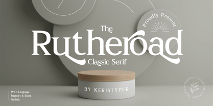 Rotheroad is an elegant classic serif font with a touch of minimalist modern style. This font is good for logo design, Social media, Movie Titles, Books Titles, short text even long text letters, and good for your secondary text font with sans or serif. Featured: Standard Uppercase & Lowercase Numeral & Punctuation Multilingual : ä ö ü Ä Ö Ü ß ¿ ¡ Alternate & Ligature PUA encoded We recommend programs that support the OpenType feature and the Glyphs panel such as Adobe applications or Corel Draw. so you can use all the variations of the glyphs. Hope you enjoy our fonts!
 - Quitos by Nathatype,
$29.00 Want to transport your audience to a world of wonder with your branding? Want your headings to spark happiness and engagement? Quintos-Serif Font A modern and elegant serif font that’ll make your audience swoon and enhance your branding projects, printed materials, and website design. This font was created to bring out modernity and style. Ideal for social media banners; posts, and ads, printed quotes, t-shirt designs, packaging, or even as a modern text overlay to any background image. Features: Stylistic Set Alternates Swashes PUA Encoded Numerals and Punctuation Thank you for downloading premium fonts from Nathatype
 - Narfest by Keristyper Studio,
$14.00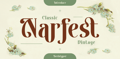 Narfest is a classic vintage serif font with an art nouveau style, in feminine and unique characteristics. This font is good for logo design, Social media, Movie Titles, Books Titles, short text even long text letters, and good for your secondary text font with script, sans, or serif. **Featured:** * Standard Uppercase & Lowercase * Numeral & Punctuation * Multilingual : ä ö ü Ä Ö Ü ß ¿ ¡ * Alternate & Ligature * PUA encoded We recommend programs that support the OpenType feature and the Glyphs panel such as Adobe applications or Corel Draw. so you can use all the variations of the glyphs. Hope you enjoy our fonts!
 - Elanrose by Keristyper Studio,
$14.00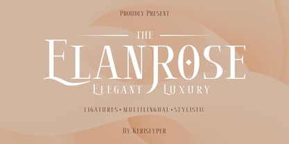 Introducing the modern-style serif font Elanrose with an elegant and luxurious feel in every shape. This font is good for logo design, Social media, Movie Titles, Books Titles, short text even long text letters, and good for your secondary text font with sans or serif. Featured: Standard Uppercase & Lowercase Numeral & Punctuation Multilingual : ä ö ü Ä Ö Ü ß ¿ ¡ Alternate & Ligature PUA encoded We recommend programs that support the OpenType feature and the Glyphs panel such as Adobe applications or Corel Draw. so you can use all the variations of the glyphs. Hope you enjoy our fonts!