10,000 search results (0.013 seconds)
  1. LTC Hadriano by Lanston Type Co., $24.95
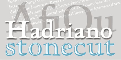
  2. LTC Jenson by Lanston Type Co., $24.95
    Jenson Oldstyle was designed by J. W. Phinney of the Dickinson Type Foundry in 1893. Jenson is based on the 'Golden Type' designed by William Morris in 1890 for his private press editions under the imprint of the Kelmscott Press. The original digital Lanston version of this face included a companion Oblique. This remastered set instead features a true italic based on the 1893 ATF italic version as well as a newly digitized Jenson Heavyface based on Phinney's design of 1899. Jenson Italic Pro features alternate lowercase forms based on ATFs then contemporary Cushing Oldstyle Italic.
  3. LTC Cloister by Lanston Type Co., $24.95
    Designed by Morris Fuller Benton 1913-15, this Oldstyle family was digitized by Jim Rimmer in the early 2000's. It is a roman face closely styled to that of Nicholas Jensen's with a companion italic in the style of Aldus Manutius. Benton considered Cloister the ideal typeface and it does indeed lend itself to many uses.
  4. LTC Broadway by Lanston Type Co., $24.95
    Originally designed by Morris Fuller Benton for ATF in 1927, Sol Hess added a lower case in 1929. Hess also drew Broadway Engraved in 1928 for Lanston Monotype. Broadway has become somewhat of a classic icon as an "Art Deco" typeface.
  5. LTC Metropolitan by Lanston Type Co., $24.95
  6. LTC Californian by Lanston Type Co., $24.95
    Frederic Goudy designed Californian as a private commission for the University of California at Berkeley in 1939. The first Commercial release was by Lanston Monotype in 1958.
  7. OTC Eugen by Ograda Type Company SRL, $29.00
    OTC Eugen is a geometric grotesque with industrial socialist aspect. It is a somewhat brute interpretation of the graphic environment and old era typography found around cities or in the country side in Romania. It works best as a display typeface used in big titles, in branding projects for clear wordmarks, or around the house where you can just go wild and make your own mark with the stencil version. Two styles: Display & Stencil. Various stylistic and contextual alternates, and a considerable amount of ligatures, arrows and more. Language support for: Basic Latin, Western, Central & Eastern European languages.
  8. LTC Kaatskill by Lanston Type Co., $24.95
    LTC Kaatskill was made specifically for use in an edition of Rip Van Winkle for the Limited Editions Club. "I feel that Kaatskill owes nothing in its design to any existing face, and the type therefore is as truly an American type as anything so hidebound by tradition as type can be."- F. Goudy This face was one of the first digital typefaces released by the Lanston Type Co. Ltd. Jim Rimmer took painstaking measures in his faithful revival. Goudy had never designed a specific Italic to accompany this face. The Italic completed by Rimmer is a variation on Deepdene Italic. The font set was re-mastered in 2006 by Colin Kahn.
  9. ATC Duel by Avondale Type Co., $20.00
    ATC Duel is a strong, extra heavy multi-width sans-serif display font with sharp edges and an extended horizontal span, inspired by the automotive industry. Font contains 500+ glyphs, full alphabet, ligatures, numberals, accents and punctuation. ATC Duel was released in 2016.
  10. BaselSans ITD by Isaco Type, $30.00
    BaselSans is a discrete, legible typeface, inspired by the international typographic style, with a humanistic touch. It is suitable for many uses, from small size texts to large titles.
  11. LTC Glamour by Lanston Type Co., $24.95
    Glamour was originally released by Lanston Monotype in 1948. It is based on Corvinus designed by Imre Reiner. P22 Designer Colin Kahn has added some unusual variants to this family illustrating that Glamour can be taken too far and have somewhat unglamorous results.
  12. LTC Figures by Lanston Type Co., $24.95
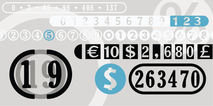
  13. ATC Abernathy by Avondale Type Co., $20.00
    ATC Abernathy, is a soft serif typeface based on retro package design. With a modern influence, it bridges the gap between old and new. Contains 330+ glyphs, full alphabet, ligatures, numerals, accents and punctuation. ATC Abernathy was released in 2018.
  14. ATC Timberline by Avondale Type Co., $20.00
    ATC Timberline, is an ultra wide-set sans-serif typeface. With its sharp points and extended curves, ATC Timberline feels just at home in mid-century modern as it does in forward-looking modern settings. Contains 370+ glyphs, full alphabet, ligatures, numberals, accents and punctuation. File type included in download is .otf. ATC Timberline was released in 2016.
  15. VTC Bloke by Vintage Type Company, $19.00
    VTC Bloke is a revival of Miller & Richard’s classic metal typeface, ‘Egyptian Expanded’, including the three-dimensional, ‘Open’ style that was later introduced to the family. The roots of this typeface stem from the UK, where William Miller and his son-in-law Richard had their initial foundry in Edinburgh, Scotland. In addition to the beautiful and timeless type designs, the foundry gained a reputation for offering super small type sizes, designed for Bibles, dictionaries, documents, etc. Slab Serifs (or Egyptian Serifs) started to gain popularity in the early 19th century. It’s around this time, due to emerging industrial technologies, and an ever-expanding advertising industry, that type designers started to really experiment with letterforms that could help their clients distinguish themselves from the competitor, and catch people's eyes. The size of posters and advertising space was getting bigger, and bigger, and so was the type. All original letterforms have been re-drawn and cleaned up, with some more modern glyphs and characters added in. VTC Bloke supports Adobe Latin 1 Language Support.
  16. LTC Francis by Lanston Type Co., $24.95
    Francis is a design previously offered by the Lanston Type Co. in the early 1990s. It is a revival of a 1955 Günther Gerhard Lange design, but with a heavier overall weight. Coming out of retirement, it has been fully reworked and refined with elegant curves and an expanded character set. This font works well at small sizes and larger display sizes for everything from wine labels to personal stationery. This type evokes the elegant sophistcation of the Jazz age and pairs well with a Martini and a fine selection of charcuterie.
  17. LTC Powell by Lanston Type Co., $24.95
  18. Mini Pics Mardi Gras by NicePrice Font Collection, $4.99
  19. Dirty Bubble Gum Grunge by TypoGraphicDesign, $15.00
    The cha­rac­ter of the rough, rugged and raw hand­made type­face has a very uni­que sticky atmosphere. Letters lovingly decorated with chewing gum. Warmth, love, handmade. For support of human warmth. CONCEPT/ CHARACTERISTICS Expe­ri­men­tal ana­log hand­writ­ten style. Hand­writ­ten in ink in a con­ven­tio­nal roll-on deodo­rant. The dirty, grimmy Grunge-Look and the sloppy, rough Handwritten-Look script cha­rac­ter, gives the type­face a high reco­gni­tion value and uni­quen­ess. The motto is hand­made, rough & experimental. APPLICATION AREA The rough, ink-like, hand­writ­ten look of the hand­made font „dirty deo hand ink“ would look good at logos, dis­play size for pos­ter, flyer, comics and gra­phic novel let­te­ring, head­lines in maga­zi­nes or web­sites, packa­ging, music covers or web­ban­ner etc. TECHNICAL SPECIFICATIONS Head­line Font | Dis­play Font | Raw Trash Script Font „dirty deo hand ink“ Open­Type Font with & 282 gly­phs & 1 style (regu­lar). Sym­bols and liga­tures (with accents & €)
  20. Gras Vibert Handtooled Capitals by Intellecta Design, $34.95
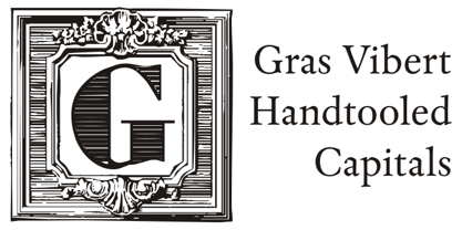
  21. EF Remember Irme R by Elsner+Flake, $35.00
  22. Icing by Great Lakes Lettering, $24.95
    Icing is a font based on a naive, illustrated handwriting that can be used on a daily basis. It is a delicate, handwritten front with a somewhat masculine feel which mimics the natural stroke of pointed pen calligraphy. Icing embodies a folksy feel that brings true character to any design. Purchase it together with its extended family Frosted in our Winter Mix Package!
  23. ITC Avant Garde Gothic¿ was designed by Herb Lubalin and Tom Carnase in 1970. They based it on Lubalin¿s logo for Avant Garde Magazine - an exciting construction of overlapping and tightly-set geometric capitals. ITC Avant Garde is a geometric sans serif; meaning the basic shapes are constructed from circles and straight lines, much like the work from the 1920s German Bauhaus movement. The early versions of ITC Avant Garde became well-known for their many unique alternates and ligatures that still conjure up the typographic aura of the 1970s. These fonts contain the basic alphabets (without the old unusual ligatures). Still strong and modern looking, ITC Avant Garde has become a solid staple in the repertoire of today's graphic designer. The large, open counters and tall x-heights seem friendly, and help to make this family work well for short texts and headlines. The condensed weights were drawn by Ed Benguiat in 1974, and the obliques were designed by Andr¿ G¿rtler, Erich Gschwind and Christian Mengelt in 1977. ITC Avant Garde¿ Mono is a monospaced version done by Ned Bunnel in 1983.
  24. ITC Out of the Fridge by ITC, $29.99
    ITC Out of the Fridge is the work of German designer Jochen Schuss. Its forms look as though they were scratched on rough paper with a pen. ITC Out of the Fridge is, in the designer's own words, fresh and cool", and works well where something modern yet "proper" is desired."
  25. GM Exp Shadow - Unknown license
  26. GM Exp Norm - Unknown license
  27. Ardour 3D GM - Personal use only
  28. GR onsoo Script by GORAE Font, $19.99
    The typeface of GR onsoo Script is the handwriting of artist 'onsoo'. This font is designed for use in the text or title of fairy tale books.
  29. GR Read Family by Garisman Studio, $20.00
    GR Read is a very cool font for headline designs with a bold and bold theme. With a strong display and clean nodes make text in the design become more character and great. Inspired by headline trends in a poster or magazine today. So that with a firm and a very modern style makes your design better! This font is formed from the headline display font of a very careful title. GR Read has about 350 flying machines. Suitable for all graphic design projects, prints, logos, posters, t-shirts, packaging, website, ticket and applies to several types of graphic design. Especially for the use of a title! Very suitable! GR Read is compatible with any software without pain, especially in headlines with GR Read pairing
  30. RM New Albion by Ray Meadows, $19.00
    A classic blackletter Which looks best at 16pt and above. Due to the modular nature of this design there may be a slight lack of smoothness to the curves at very large point sizes (around 100 pt and above).
  31. RM Squarial Ribbon by Ray Meadows, $19.00
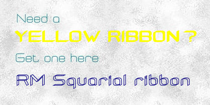
  32. In the arms of sleep - Unknown license
  33. VTC-KomikSkans-Two - Personal use only
  34. It's About Time - Unknown license
  35. VTC Bad DataTrip - Unknown license
  36. VTC Krinkle-Kut - Unknown license
  37. VTC Anglika Bent - Unknown license
  38. VTC Krinkle-Kut - Unknown license
  39. VTC Krinkle-Kut - Unknown license
  40. VTC Krinkle-Kut - Unknown license
Looking for more fonts? Check out our New, Sans, Script, Handwriting fonts or Categories
abstract fontscontact usprivacy policyweb font generator
Processing