10,000 search results
(0.035 seconds)
- Encorpada Pro by dooType,
$40.00After the successful release of Encorpada Black, now it’s time of Encorpada Pro type system. Now with seven weights and a lot of curves. Freely inspired by the didones shapes, Encorpada Pro now have a extended character set with more than 40 languages supported, Opentype Features and Amazing Swashes in Italic Version. Enjoy It. - Mercurio by Cubo Fonts,
$29.00 Mercurio is a sans serif type, inspired by scientific symbolism. It has a soft grey appearance suitable for text.
 - Yoriko by URW Type Foundry,
$19.99 Yoriko is a Latin display type from Frank Lüdicke. Its design was heavily influenced by Japanese brush stroke glyphs.
 - DR Krokodila by Dmitry Rastvortsev,
$30.00 Type DR Krokodila was awarded an Honor Diploma for Excellence in Type Design at the International Type Design Competition Modern Cyrillic 2009 (Moscow, 2009).
 - Ebony by TypeTogether,
$35.00 Some typefaces need time to ripen; Burian and Scaglione made the first sketches for Ebony back in 2008, but it took a few years of maturing in a drawer to be developed into a multi-functional type family. While keeping in tune with TypeTogether’s focus on complex typographic structures needed for magazine, newspapers and books —whether printed or digital—, Ebony goes far beyond editorial use and promises great performance in branding and advertising. The range of dark weights with taut and powerful curves can boost any headline, while the lighter styles create an approachable and clean feel in blocks of continuous text. Ebony does not fall short on aiding legibility either; letterforms have a distinct direction of ductus and features like the top serif on ‘l’ help making them clearly distinguishable from each other. It is a type family that cleverly seeks a balance between the openness and legibility of humanist sans serifs and the striking and more regularised character of grotesques. The letter-shapes feature generous counters and open terminals with crisp angles, and daringly grow both in colour and width as the fonts get bolder. Infused with this strength, Ebony also shows a quirky side in some of her shapes; the vertical fractions, the at-symbol, the old-style numbers, … The predominantly slanted style of the italics is broken up in some letterforms, such as ‘a e f l’, that are more in line with a classic cursive appearance. This, together with a forceful italic angle, ensure a change in texture within a block of text, despite sharing the same letter weight and width with the uprights. With 18 styles, tending towards the heavier part of the weight-spectrum, this face has a powerful quality!
 - Zag by Fontfabric,
$25.00 Zag is a custom sans font which is applicable for any type of graphic design - web, print, motion graphics etc and perfect for t-shirts and other items.
 - Reader by Fontfabric,
$30.00 Reader is a custom sans font which is applicable for any type of graphic design - web, print, motion graphics etc and perfect for t-shirts and other items.
 - Oval by Fontfabric,
$19.00 Oval is a custom sans font which is applicable for any type of graphic design - web, print, motion graphics etc and perfect for t-shirts and other items.
 - Carlino by Pío Pío,
$17.00 Carlino is named after the cutest dog on earth. Why? Because it’s the cutest font ever made. Especially intended for stationery use, it’s loaded with lots of alternates and ligatures, not only in the lowercase but in the uppercase. All of them are Open-Type programmed, so the possibilities of having something unique are endless. Following nowadays trend, Carlino is a multi-layered font: shades, holes and dots were made to work alone or all together with fantastic results! The way it works is so easy that It’s impossible not to enjoy it: Just type a word; then the same one set in another style and voilà! The font has also a lot of sweet ornaments to embellish your projects. Find inside: hearts, fleurons, party icons, flags, and the funniest animals. To accompany Carlino, there’s nothing better than Carlino Capitals. Its cute flavor makes everything more lovely. Have fun with Carlino and oh! don't forget to feed this little pug or it will bark all day long! Special thanks to Maximiliano Sproviero, whose advice helped me make this dream come true.
 - Cubevano by Lafontiva,
$19.00 Cubevano is a geometric, modular display typeface. It is the result of fascination with geometry, impossible objects and work of artists such as Oscar Reutersvärd. Family was created in 6 styles for any type of graphic design, such as logos, covers, posters, signs, shirts, etc. It looks best in large sizes. Cubevano typeface comes with uppercase and lowercase letters, numbers, currencies, punctations and multilingual support.
 - Poster by MP&A,
$22.00 Poster is the first type created by this team. Its an experiment. This geometric typeface is based on bold and clean rounded rectangles. It’s soft and friendly look lends itself to a number of applications. It´s a good choice for company logotypes, magazine headlines and, of course, posters applications. This font was designed to be used in large sizes, so you can appreciate the little details.
 - IMAN RG by LGF Fonts,
$10.00 This type of Richard Gans, has always seemed very striking, despite having the complexity of the sources extrusion, has its own personality, and readability unusual for this type of letters. Use it for composing posters, programs or logos was very common at the time. My father, Antonio Lage Parapar, typographer by profession, who composed the texts, which not only had it for profession, but he liked to do, always he spoke of sources and decorative elements of the type foundry Richard Gans, as well as other foundries, especially those that required the mender of them, exercised creator, many of these types they have already been recovered by professionals and companies with excellent results. I've been surrounded by these movable type, and the occasional catalog unfortunately lost. One of those guys that has always struck me visually speaking was the type IMAN Richard Gans, the typographer and more of German origin arrived in Spain, back in 1874, also a pioneer. This work to revive the type mentioned, as well as create non existing glyphs between documents and parts I've been finding, is and has been a personal pleasure all I want serve as a tribute to my father (of aopodo curiously "Richard"), the only sadness it has not been completed. Richard Gans, arrived in Spain in 1874 as a representative of several European factories. then liaised with journalistic and publishing companies, which led him knowledge required of the first sector art. In 1878 he created a center importer gadgets graphic arts and three years later he created his own type foundry. The first rotary newspaper ABC, very famous and the most advanced of the time, the brand manufactured Richard Gans.
 - Merrymakers JNL by Jeff Levine,
$29.00 A throwback design reminiscent of 1950s signage and print ads, Merrymakers JNL takes a previous release (Bluesman JNL) and places the letters and numbers inside parallelograms with ‘TV screen’ openings. Merrymakers JNL is available in both regular and oblique versions. The upper case A-Z characters have the taller side of the shape to the left, while the lower case a-z has the taller side to the right. To make a ‘fan fold’ or zig-zag message, simply alternate upper and lower cases as in this example: C-a-R D-e-A-l-E-r-S You can type spaces between words, but if you prefer blank connectors, use the following: Upper case solid black connector – left bracket key Lower case solid black connector – right bracket key Upper case ‘TV screen’ connector – left brace key Lower case ‘TV screen’ connector – right brace key There is a very limited set of punctuation available. The upper case ampersand, question mark, exclamation point, period, comma, single quote and double quote are all on their respective key positions, but to accommodate the lower case [smaller side] versions, those glyphs have been reassigned to other standard keyboard positions: Type @ to get & Type # to get ? Type $ to get ! Type ^ to get . Type * to get , Type - to get ’ Type = to get ” Additionally, to access the lower case [smaller side] versions of the numerals, type the following keys: Type % to get 0 Type ( to get 1 Type ) to get 2 Type + to get 3 Type / to get 4 Type : to get 5 Type ; to get 6 Type < to get 7 Type > to get 8 Type \ to get 9
 - Stat Display Pro by Jure Kožuh,
$45.00 www.Stat-Type.com Complementary Type Family Stat Text Pro Stat Display Pro is an information design sans serif type family legible in circumstances of low visibility. Its large character set with multiple weights is defined by optimal size ratio, distinctive letter shapes, wide aperture and balanced counters. Stat Display Pro remains legible in unfavorable circumstances of distance, size, movement and similar. It contains nearly 700 glyphs, including diacritics, ligatures, small caps, old–style figures, arrows and more. This enables it to achieve wide language support. It consists of four main (Light, Regular, Medium, Bold) and four secondary, negative weights (Light Negative, Regular Negative, Medium Negative, Bold Negative) which are accompanied by their corresponding obliques. Stat Display Pro type family has higher than average x height (72% of cap height) which is accompanied by matching ascender and descender size ratios. With its distinctive letter shape detail it minimizes the possibility of letter shape confusion, while optimizing legibility with wide aperture and balanced counters. Its main intended use is information design, where it, with its characteristics, meets the requirements of wayfinding, infographics, table setting and much, much more. The development of the type family was based on research in legibility to achieve highly legible letter shapes, while not diminishing their visual character. A detailed description of Stat Pro type family is available at Stat-Type.com where a DEMO font can be downloaded.
 - Zeviero by Putracetol,
$22.00 Zeviero - Stylish Serif Font. Introducing the new Zeviero !! Zeviero inspired by Elegant and Luxury typography. Zeviero is a Stylish & Beautiful serif typeface. Zeviero Font is a very versatile font. you can use this font to various design Zeviero is perfect for a professional touch which makes it to form unique & elegant typography designs. Zeviero is perfect for headings, flyer, greeting cards, product packaging, book cover, printed quotes, logotype, apparel design, album covers, etc. The alternative characters were divided into several Open Type features such as Swash, Stylistic Sets, Stylistic Alternates, Contextual Alternates, and Ligature. The Open Type features can be accessed by using Open Type savvy programs such as Adobe Illustrator, Adobe InDesign, Adobe Photoshop Corel Draw X version, And Microsoft Word. Zeviero is also support multi language.
 - Evereast by Nocturnal Workspace,
$9.00 Evereast Collection Display Font The beta version of the Evereast font has been published since 2020, and can be downloaded for free on the dafont website. At first this font was just a learning project from the 2nd type of font and because we saw the enthusiasm of the downloader, we developed it into 4 versions and 31 types of font files. WHAT YOU GET 4 versions. Evereast with style slab serif, western slab, soft edge, western edge 31 types of font files include Regular, Bold, Light, Hollows/Outlines, Rough, Italic, Stencil PUA Encode Characters, fully accessible without additional design software. Includes a range of multilingual characters. Evereast is suitable typeface for various purposes like logotype, signage, label, poster, dropcap, titles, letterhead, book cover and etc. Thank you!
 - Bankster by Pelavin Fonts,
$15.00 With it’s origins in a hand-lettered headline about money managers, Bankster is an alphabet meant to evoke the feelings of currency or financial documents. Multiple styles facilitate the perfectly registered layering of components in a variety of color combinations to enhance impact and provide an enriched dimensional experience. It not be for everyone but, it's a perfect solution for the designer who has no patience for boring type treatments.
 - Fango by Typo5,
$16.95A heavy one. For major impact use it only in caps, however typing randomly upper and lower case has interesting results too. Play with it please. - Lina sans Arabic by Zaza type,
$24.00 Lina sans is an Arabic typeface from Lina type family, it expresses modern vigor based on simplicity and clarity. It's Strong, Bold, legible, clear, simple, Modern. With a handful set of OpenType features and alternatives. Lina type family consists of Lina soft, Lina sans, Lina round. the design is inspired by the Kufic calligraphic style and influenced by the Naskh style. Lina sans was highly crafted in order to perform well both on screen and in print. The large x-height and open counters make it function well even on small font sizes. It has a wide range of use possibilities headlines, logotypes, branding, books, magazines, motion graphics, and use on the web and Tv. Lina sans consists of 7-weight versions from thin to bold.
 - Boardwalk Avenue by Fenotype,
$30.00 Boardwalk Avenue is an elegant type collection of three styles and two weights of each. It’s divided into Boardwalk Pen, Boardwalk Antiqua and Boardwalk Serif. Boardwalk Avenue’s core is a connected mono linear script that works fantastic when paired with either of the impressive serif styles. All the fonts work great on their own but try putting them all together for a complete display font setup for a project. Here’s a short introduction on what’s included: Boardwalk Avenue Pen is a connected Script. It’s great for headlines, quotes or in packaging. It has a casual hand drawn vibe to it but it’s clean and legible. It’s equipped with automatic Contextual Alternates that keep the connections smooth and versatile. For instance when you type double letter another of them will automatically change to add variation. Or if you type “i” for example, as a first letter after space or after capital letter the code will add starting point to the letter to keep the letterforms more balanced. If you need more ambitious letterforms you can try Swash or Titling Alternates -there’s alternates for every standard letter and seek for even more alternates from the glyph palette. Boardwalk Avenue Antiqua is a high contrast serif with strong character. It’s great for glamorous headlines or as a logotype. Boardwalk Avenue Serif is a low contrast serif with bulky character. It’s great for strong and sturdy headlines or as a logotype.
 - Caslon Graphique by ITC,
$29.99 The Englishman William Caslon punchcut many roman, italic, and non-Latin typefaces from 1720 until his death in 1766. At that time most types were being imported to England from Dutch sources, so Caslon was influenced by the characteristics of Dutch types. He did, however, achieve a level of craft that enabled his recognition as the first great English punchcutter. Caslon's roman became so popular that it was known as the script of kings, although on the other side of the political spectrum (and the ocean), the Americans used it for their Declaration of Independence in 1776. The original Caslon specimen sheets and punches have long provided a fertile source for the range of types bearing his name. Identifying characteristics of most Caslons include a cap A with a scooped-out apex; a cap C with two full serifs; and in the italic, a swashed lowercase v and w. Caslon's types have achieved legendary status among printers and typographers, and are considered safe, solid, and dependable. Caslon Antique was designed by Berne Nadall and brought out by the American type foundry Barnhart Bros & Spindler in 1896 to 1898. It doesn't bear any resemblance to Caslon, but has the quaint crudeness of what people imagine type looked like in the eighteenth century. Use Caslon Antique for that old-timey" effect in graphic designs. It looks best in large sizes for titles or initials. Caslon Black was designed by David Farey in the 1990s, and consists of one relatively narrow and very black weight. It is intended exclusively for titles or headlines. Caslon Black has a hint of the original Caslon lurking in the shadows of its shapes, but has taken on its own robust expression. Caslon Graphique was designed by Leslie Usherwood in the 1980s. The basic forms are close to the original Caslon, but this version has wide heavy forms with very high contrast between the hairline thin strokes and the fat main strokes. This precisely drawn and stylized Caslon has verve; it's ideal for headlines or initials in large sizes."
 - Barking Frenzy by PizzaDude.dk,
$18.00 Barking Frenzy may look as if it was cut out of paper or cardboard, but it's not! It was drawn with a rugged pen, leaving rough edges here and there. It's great for children's books and toys or maybe handcraft or other handcrafted activities. I've added 5 different versions of each lowercase letter and these appear randomly as you type. That way your text looks really natural and organic, because the letters rarely repeat themselves. Also the font has multilingual support!
 - Suddenly by Sarid Ezra,
$13.00 Suddenly classic signature family! Suddenly is signature script with three style that contain stylistic alternate, swash, etc to create your own customised signature or logo design. This font is also support multi language. It's available in three style! For another questions, please send a mail to saridezra@gmail.com. Thank You! PS: Type underscore + number (from 1 to 5). Or copy Some_5thing in preview bellow..
 - AshleyCapitaliSofia - Unknown license

- Loristta by Javatypestd,
$12.00 Introducing Loristta is Vintage Monoline Font. This font is created with a new monoline style that always follows the growing trends. This Monoline type font has a strong character for each letter, so it is suitable for the needs of any type of work. so immediately have this font so that your product looks more elegant and cool. They work perfectly for you who need a typeface for Fashion, headline, logotype, apparel, Marchandise, branding, packaging, advertising, etc. Loristta Font has several character letters in between Uppercase Lowercase Numeral and Punctuation Ligature Unique stylish set and Alternate Multilingual Support
 - Runic by Monotype,
$29.99 This 1935 design from Monotype is an extremely condensed display font that has a slight flavor of nineteenth-century wood type. Runic Condensed font is tall and lean with a huge x-height and hairline serifs. It is an ideal display type for eccentric pieces where space is at a premium.
 - HT Maison by Dharma Type,
$19.99 HT Mason is bold and hand painting font. This font is retrospective and decent, but it is also funny and cute. Holiday Type Project offers retro hand drawing scripts. Inspired by retro script on shopfront lettering, wall paint advertisements in Italy around 1950s. Check out the script fonts from Holiday Type!
 - QARVIC by Alit Design,
$12.00 Introducing QARVIC TYPEFACE, a simple and beautiful font made with persistence and passion. QARVIC has a unique character when compared with the others sans serif font, it has two types of letters (plain type and type grunge) and there also has an outline QARVIC icon characters. QARVIC typeface is suitable for simple logo design, website header, wedding design, badges, menu fonts for website, to design fashion and others that have a minimalist and simple concept. Thank you and enjoy :)
 - Parangon by ParaType,
$25.00 PT Parangon™ was designed in 1986-2002 by Anatoly Kudryavtsev and licensed by ParaType. This type family belonges to Neogrotesque subclass of closed Sans Serif. Letterforms of lower case is based on the tradition of 1710 Civil type and some modern Italic types. The family has a lot of weights and styles including Extra Condensed, Condensed, Regular, Extra Light, Light, Bold, Extra Bold. For advertising and display matter. Also it can be used for texts in advertising magazines.
 - Humeira by Arterfak Project,
$12.00 Humeira is a playfully font, inspired by handwriting lettering and doodle art movement. Designed with a manual brush and carefully vectorized with many alternates that you can apply to give handwritten looks! Humeira is perfect for headlines or body text. You have a regular and a bold weight that you can combine well. Humeira also has an Outline Shadow style with bolder contrast, funny and childish looks. Humeira font family is suitable for T-shirts, mugs, coffee cups, flyers, brochures, quotes, branding and more.
 - Lina Round by Zaza type,
$25.00 Lina round is an Arabic typeface from Lina type family, it has an expressive character with its round and friendly shapes. It's Round, legible, Clear, Flexible, Simple, Modern. With a handful set of OpenType features and alternatives. Lina type family consists of Lina soft, Lina sans, Lina round. the design is inspired by the Kufic calligraphic style and influenced by the Naskh style. Lina round was highly crafted in order to perform well both on screen and in print. The large x-height and open counters make it function well even on small font sizes. It has a wide range of use possibilities headlines, logotypes, branding, books, magazines, motion graphics, and use on the web and Tv. Lina round consists of 7-weight versions from thin to bold.
 - Vander Bly by Enfeeltype,
$16.00 Vander Bly is a modern font with a futuristic style that is very suitable for various circles. This font is designed in such a way for needs such as selling all products and services in the world, design, fashion and TV shows, etc. This font is perfect for needs like creating products, brochures, invitations and tickets. It has a wide range of applications and will suit any type of design.With it, you can create a unique brand that reflects your style and taste. It's a great option for any business because of its versatility, as well as its modern design and futuristic style. It includes various ligatures and fractions, and is perfect for creating all kinds of headlines and logos.
 - Basilia by Linotype,
$29.99 Among the countless typefaces available today, the Modern Face style is relatively underrepresented. During the 19th century and then later with the competition from the mechanized hot metal types and film setting, a number of attractive headline types appeared in this style. For text, however, the available types were limited to those based on tried and true classics like Walbaum, Didot and Bodoni, which were created between 1780 and 1830, as well as a few variations from the end of the 19th and beginning of the 20th centuries. The demand for new Modern text types remained nonexistant until the 1960s. Such was the situation when the Haas'sche Schriftgiesserei (Haas Type Foundry) commissioned me to come up with a concept and sketches of a new hot metal type. I was able to convince the director of the foundry that there was a niche to be filled with contemporary Modern typography. Another reason for the production of a new type was of a technical nature: the introduction of a new setting technique should not be limited to existing typefaces, but instead should lead to innovative text types suited to the demands of the new applications. André Gürtler, Basilia's designer: I began to work on the concept and initial designs of the new text type in 1968. I wanted to give the type a classical look, expressed above all in the strong stroke contrast between the robust verticals and fine horizontal strokes and serifs. This is one of the main characteristics of Modern typography.""This new typeface, Basilia, is distinguished by its soft, open appearance as well as a number of details which together mark a departure from historical models. For example, it has nothing of Bodoni's round letters and their angular, narrow spacing, and displays instead round forms with a much softer stroke in the curves. It was very important to me to avoid the Modern characteristic of stiff, vertical, grid-like strokes and to create instead a lighter, more transparent type. I retained the Modern style by using straight horizontal serifs at right angles to the strokes to still give the type its sense of rigidity." Three sketches for Basilia (normal, italic, and bold) were finished in 1973. Only the 9-point size was produced at first. In the following years, basic weights were made and adapted to filmsetting."
 - ALS Gross Kunst by Art. Lebedev Studio,
$63.00 Gross Kunst is a humanist sans-serif with an open aperture, sharp outlines, and eye-catching details that make this full of character typeface very recognizable. The type family has three fonts based on wide pen strokes. Depending on its purpose the styles differ in expressiveness and the level of ornamentation. Regular style—low-contrast and neutral—is the most natural choice for body-text. The display face is more dynamic and gets higher contrast. It's very legible from a distance and would do its best on navigational and warning signage, plates, and such. Eloquent straight italics will adorn titles, announcements, and pages with ads. This typeface was acknowledged at the international type design competition Modern Cyrillic '99.
 - Chilopod by Typodermic,
$11.95 Are you looking for a font that will transport you back to the golden age of video games? Look no further than Chilopod—the worm script typeface inspired by the classic arcade game, Centipede. With its bold, connected letters, Chilopod will bring a touch of retro gaming nostalgia to any project. But it’s not just a pretty face—this font also features OpenType ligatures, which allow common letter combinations to flow seamlessly into continuous lines. It’s the perfect blend of form and function. So whether you’re designing a poster for your next gaming tournament or just want to add some playful flair to your branding, Chilopod is the font for you. Try it out today and get ready to level up your design game! Most Latin-based European writing systems are supported, including the following languages. Afaan Oromo, Afar, Afrikaans, Albanian, Alsatian, Aromanian, Aymara, Bashkir (Latin), Basque, Belarusian (Latin), Bemba, Bikol, Bosnian, Breton, Cape Verdean, Creole, Catalan, Cebuano, Chamorro, Chavacano, Chichewa, Crimean Tatar (Latin), Croatian, Czech, Danish, Dawan, Dholuo, Dutch, English, Estonian, Faroese, Fijian, Filipino, Finnish, French, Frisian, Friulian, Gagauz (Latin), Galician, Ganda, Genoese, German, Greenlandic, Guadeloupean Creole, Haitian Creole, Hawaiian, Hiligaynon, Hungarian, Icelandic, Ilocano, Indonesian, Irish, Italian, Jamaican, Kaqchikel, Karakalpak (Latin), Kashubian, Kikongo, Kinyarwanda, Kirundi, Kurdish (Latin), Latvian, Lithuanian, Lombard, Low Saxon, Luxembourgish, Maasai, Makhuwa, Malay, Maltese, Māori, Moldovan, Montenegrin, Ndebele, Neapolitan, Norwegian, Novial, Occitan, Ossetian (Latin), Papiamento, Piedmontese, Polish, Portuguese, Quechua, Rarotongan, Romanian, Romansh, Sami, Sango, Saramaccan, Sardinian, Scottish Gaelic, Serbian (Latin), Shona, Sicilian, Silesian, Slovak, Slovenian, Somali, Sorbian, Sotho, Spanish, Swahili, Swazi, Swedish, Tagalog, Tahitian, Tetum, Tongan, Tshiluba, Tsonga, Tswana, Tumbuka, Turkish, Turkmen (Latin), Tuvaluan, Uzbek (Latin), Venetian, Vepsian, Võro, Walloon, Waray-Waray, Wayuu, Welsh, Wolof, Xhosa, Yapese, Zapotec Zulu and Zuni.
 - Quaker Ladies by Putracetol,
$28.00 Quaker Ladies is a decorative classic font with tons of alternative glyphs and multilingual support. It's classic, vintage and elegant. Come with open type feature with a lot of alternates, its help you to make great lettering. Quaker Ladies best uses for heading headlines, cover, poster, logos, quotes, product packaging, merchandise, social media & greeting cards and many more.
 - Roshmary by Putracetol,
$28.00 Roshmary is a Display sans serif font with beautiful ligatures, tons of alternative glyphs and multilingual support. It's bold clean and simple. Come with open type feature with a lot of alternates, its help you to make great lettering. Roshmary best uses for heading headlines, cover, poster, logos, quotes, product packaging, merchandise, social media & greeting cards and many more.
 - Alaska Script by Roland Hüse Design,
$15.00 Alaska Script is a fully cursive retro style, hand drawn script. It has contextual alternates for smooth connection of o-r, b-s etc. For best result please make sure you are using this font with softwares that supports open type features and you have these features turned on: * Contextual alternates and * Standard ligatures. Poster image credit: Patrik Banas
 - Code Pro by Fontfabric,
$29.00 Code Pro is a font family inspired by the original Sans Serif fonts like Avant Garde or Futura, but with a modern twist. It is clean, elegant and straight-to-the-point. Code font is applicable for any type of graphic design—web, print, motion graphics, etc.—and perfect for t-shirts and other items like posters and logos.
 - Bologna Script by Hrz Studio,
$16.00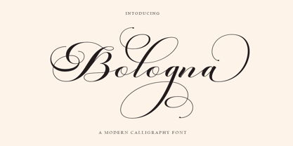 Welcome to the Bologna Script font is a modern, casual, and beautiful calligraphic typeface with a swash. It can be used for many purposes. such as titles, signatures, logos, wedding invitations, letterheads, nameplates, labels, newsletters, posters, badges, etc. Bologna Script Features Open type, including initial and terminal letters, alternatives, binders, and International support for most Western languages included.
