10,000 search results
(0.064 seconds)
- Alora by VP Creative Shop,
$14.00 Introducing Alora - serif typeface - 4 fonts Alora is elegant and fragile typeface loaded with 4 fonts and multilingual support. It's a very versatile font that works great in large and small sizes. Alora is perfect for branding projects, home-ware designs, product packaging, magazine headers - or simply as a stylish text overlay to any background image. FEATURES Uppercase, lowercase, numeral, punctuation & Symbol Regular Style 1 and 2 Italic Multilingual support No special software is required to type out the standard characters of the Typeface. Canva friendly Feel free to contact me if you have any questions! Mock ups and backgrounds used are not included. Thank you! Enjoy!
 - Cowboy Strong by Solidtype,
$12.00 Cowboy Strong is a gorgeous and simple handwritten script font; contemporary and fashionable, Cowboy Strong looks great for a large range of project types. This elegant font is legible and looks great as a headline or in body text. This font will perfect for many different project for blogging, social media, branding, wedding invites, cards etc. Cowboy Strong font including over 70 ligatures, uppercase and lowercase alternates. you need a program that supports OpenType features such as Adobe Illustrator CS, Adobe Photoshop CC, Adobe Indesign and Corel Draw X6/X7. and you can also access the alternate glyph via Font Book (Mac user) or Windows Character Map (Windows user).
 - Tweedle by VP Creative Shop,
$14.00 Introducing Tweedle - Display Typeface Tweedle is creative and elegant typeface loaded with 3 fonts and multilingual support. It's a very versatile font that works great in large and small sizes. This font is perfect for branding projects, home-ware designs, product packaging, magazine headers - or simply as a stylish text overlay to any background image. FEATURES Uppercase, lowercase, numeral, punctuation & Symbol Regular, alternate and italic versions Multilingual support No special software is required to type out the standard characters of the Typeface. Canva friendly Feel free to contact me if you have any questions! Mock ups and backgrounds used are not included. Thank you! Enjoy!
 - Jalopy JNL by Jeff Levine,
$29.00 History, as it's said, tends to repeat itself. The round-point pen lettering used in the 1920s logo and ads for Dodge Brothers cars (pre-General Motors) is an early predecessor to the techno type styles of the 1980s. Square in shape, with unique stylization to some letters, Jalopy JNL can cross the decades and be used for a 1920s period piece and still look fresh in an ad for computer parts. Rather than round out the inside lines of the characters to fully emulate the strokes of a lettering pen, the inside lines have straight intersections for the contemporary side of this font's design.
 - The Blue Highway D Type font, created by the talented Canadian typeface designer Ray Larabie, stands as an iconic example of clarity and functionality blended with unique aesthetics. Its inception wa...
- Reina Neue by Lián Types,
$29.00 Hey! See Reina Neue in action here! INTRODUCTION When I designed the first Reina¹ circa 2010, I was at the dawn of my career as a type designer. The S{o}TA, short for the Society of Typographic Aficionados, described it as complex display typeface incorporating hairline flourishes to a nicely heavy romantic letterform². And it was like that; that’s what I was pursuing at that time since I was very passionate about ornaments and accolades of Calligraphy. Why? I felt that Typography, in general, needed more of them. These subtle flourishes could breathe life into letters. Maybe, I thought it was the only way I could propose something new into the field of type. However, after some years, I came across a very interesting quote: –Beautiful things don’t ask for attention– Wow! What did this mean? How could something be attractive if it’s not actually showing it. Could this be applied to my work? Sure. I think every type-designer goes through this process (aka crisis) regarding his or her career. At the beginning we love everything. We are kind of blind, we only see the big picture of a project. And that’s not because we are lazy. We actually can’t see the small mistakes nor the subtleties that make something simpler beautiful. We are not able. But, the small subtleties… They are actually everything: With experience, one puts more attention into the details and learns that every single decision in type has to be first meticulously planned. Here I am now, introducing a new Reina, because I felt there was a lot of it that could be improved, also the novelty of Variable Fonts caught my attention and I had to take that to my type library. THE FONT A thing of beauty is a joy forever Now, a decade later, I’m presenting Reina Neue. This font is not just an update of its predecessor: –A thing of beauty is a joy forever– is the first line of the poem ‘Endymion’ by John Keats, and despite the meaning of “beauty” may vary from person to person, and even from time to time (as read in the last paragraph), with Reina I always wanted to bring joy to the eye. In 2010, and now, in 2020. I believe the font is today much better in every aspect. It was entirely re-designed: Its shapes and morphology in general are much more clean and pure. The range of uses for it is now wider: While the old Reina consisted in just one weight, Reina Neue was converted into a big family of many weights, even with italics, smallcaps and layered styles. The idea behind the font, this kind of enveloping atmosphere made out of flourishes, is still here in the new Reina. This time easier to get amazing results due to the big amount of available alternates per glyph and also more loyal from a systemic point of view. However, and as read in the introduction -Beautiful things don’t ask for attention-, if none of the flourishes are activated the font will look very attractive anyway. Reina Neue is ready to be used in book covers, magazines, wedding cards, dazzling posters, storefronts, clothing, perfumes, wine labels and logos of all kind. Like it happened with the previous Reina, I hope this new font satisfies every design project around the world if used, and can be a joy forever. SOME INSTRUCTIONS Before choosing the right style for your project, hear my advice: -Reina Neue Display was meant to be used at big sizes. If you plan to print the font smaller than 72pt, I suggest using Reina Neue, not Display. Otherwise, if the font will be BIG or used on a digital platform, Reina Neue Display should be your choice. For even smaller sizes, use Reina Neue Small. This style was tested and printed in 12pt with nice results. (Note for variable fonts: Print them in outlines) -Reina Italic is not a slanted version of the roman, and this means some flourishes are different between each other. The Italic version has other kind of swirls. More conservative, in general. -All the styles of Reina Capitals have Small Capitals inside. -Reina Capitals Shine should be used/paired ONLY with Reina Capitals Black. The engraved feeling can be achieved if Reina Capitals Black and Reina Capitals Shine are used as layers, with the same word. Variable fonts instructions: -For more playful versions, choose Reina Neue VF, Reina Neue Italic VF or Reina Neue Capitals VF: With them you can adjust between 3 axes: Weight (will change the weight of the font) – Optic Size (will thicken/lighten the thin strokes and open/close the tracking) – Accolades (will modify the weight of the active flourishes). SOME VIDEOS OF REINA NEUE VF https://youtu.be/8cImmT5bpQM https://youtu.be/1icWfPmKAkg https://youtu.be/YC9GkJDL1a8 NOTES 1. The original Reina, from a decade ago: https://www.myfonts.com/fonts/argentina-lian-types/reina/ 2. In 2011, Reina received an honourable mention by S{o}TA. “Great skill is shown in the detailing, and an excellent feel for the correct flow of curves and displacement of stroke weight.” https://www.typesociety.org/catalyst/2011/ Reina was featured in the “Most Popular Fonts of the year” in MyFonts in 2011 https://www.myfonts.com/newsletters/sp/201201.html In 2012, the font was also selected in Tipos Latinos, the most prestigious competition of type in Latinoamerica. https://www.tiposlatinos.com/bienales/quinta-bienal-tl2012/resultados Also, chose as a “Favorite font of the year” in Typographica. https://typographica.org/typeface-reviews/reina/
 - Theater Nouveau JNL by Jeff Levine,
$29.00 Sheet music from the 1911 stage production of the comic opera “The Enchantress” featured the hand lettered names of both the star and composer in a monoline Art Nouveau style. This sans serif type design is now available as Theater Nouveau JNL in both regular and oblique versions.
 - Dom LT by Linotype,
$29.99Dom Casual and Dom Diagonal are a set of informal script typefaces that look like brush writing. They were designed by Peter Dombrezian for American Type Founders in 1952 and were an immediate success. Use these typefaces to create a friendly, informal look in signs, advertising, and invitations. - Wood Clarendon JNL by Jeff Levine,
$29.00 Wood Clarendon JNL is based on Hamilton Clarendon Condensed (circa 1899) and is available in both regular and oblique versions. The design of this typeface retains many of the charming (but slight) design irregularities often found within pantograph-cut wood type from the 1800s through the early 1900s.
 - Weekend Plans JNL by Jeff Levine,
$29.00 A piece of vintage British sheet music from 1941 entitled “That Lovely Week-End” featured the song’s name in a bold Art Deco sans serif with rounded edges. This lettering design is now the digital type face Weekend Plans JNL, which is available in both regular and oblique versions.
 - Southwood by Timurtype,
$14.00 Introducing by Timur type Proudly Present, Southwood Southwood A Handwritten Script Font Southwood is perfect for product packaging, branding project, megazine, social media, wedding, or just used to express words above the background. Southwood also multilingual support. Embelish your designs with our original fonts.Enjoy the font,Thank you!
 - Girly Moods by Letterhend,
$19.00 Girly Moods is a cute handwritten script with a feminine touch. This font is perfect to be applied especially in logos and the other various formal forms such as invitations, labels, magazines, books, greeting/wedding cards, packaging, fashion, make up, stationery, novels, labels or any type of advertising purpose.
 - Dimetone by Timurtype,
$14.00 Proudly presented by Timur Type: Dimetone – A handwritten script font Dimetone is perfect for product packaging, branding projects, magazine, social media, wedding invitations, or just used to express words above the background. Dimetone has multilingual support. Embellish your designs with our original fonts. Enjoy the font, thank you!
 - Pacific Sans by Holland Fonts,
$30.00The Pacific Sans and the Pacific Serif originated from the Pacific Standard, a space effective type face, especially designed for poster lettering. The implementation of serif strokes in the Pacific Serif and the contrast in vertical and horizontal strokes in the Pacific Sans, gave these fonts a distinct elegance. - Blow Up by HVD Fonts,
$25.00 Type designer Hannes von Döhren created a display typeface called "Blow Up". A bubbly, sweet font with nice light effects. Perfect for use in big sizes on posters or flyers. You can use Blow Up Sans & Blow Up Bling together to influence the color of the light effects.
 - Pacific Serif by Holland Fonts,
$30.00The Pacific Sans and the Pacific Serif originated from the Pacific Standard, a space effective type face, especially designed for poster lettering. The implementation of serif strokes in the Pacific Serif and the contrast in vertical and horizontal strokes in the Pacific Sans, gave these fonts a distinct elegance. - Sprint by Linotype,
$29.99Sprint is a forward-leaning display face that was created by the noted Italian type designer Aldo Novarese. The font is a perfect match for 1970s era racecars, or 21st Century e-commerce start-ups. Get with the speed today, and try out Sprint in a headline or two. - Almarose by S&C Type,
$22.00 Almarose is a geometric sans serif OpenType font designed by Fanny Coulez and published by S&C Type. Functional with a little distinctive touch, Almarose comes with 9 weights with italics, from Thin to ExtraBlack, and was designed for all uses like texts, web or headlines. Merci beaucoup.
 - Red Mignolet by FadeLine Studio,
$15.00 Red Mignolet is a hand-drawn slab type brush font. This font adopts a bold, firm, natural and trendy style. Very suitable to meet your design and packaging product needs at this time, especially when the current trend is Branding on MUG or CUP with natural fonts like painted!
 - Khalitta by Yoga Letter,
$14.00 Khalitta is a modern calligraphy font. This font is very elegant and beautiful and is perfect for all types of your work. This font is perfect for weddings, branding and logos, for marketing your business, status updates on social media, and for capturing beautiful and romantic moments, and more.
 - Teen Years JNL by Jeff Levine,
$29.00 Teen Years JNL was inspired by the hand lettered name for the Joyce Records label (circa 1956) which first recorded the New York doo-wop group The Crests (of “16 Candles” fame). The type design is a block sans serif, and is available in both regular and oblique versions.
 - Blusty by Craft Supply Co,
$15.00 Blusty Font Duo is an handwritten script font based on the expression of real handwriting, lets you transform type into an exciting and beautiful piece of work. The irregular, hand-lettered look adds a real human touch to things and comes along with a lot of loving details.
 - Shelton by HVD Fonts,
$19.00 Shelton is a Typeface with an eroded, printed look. The letters seem to be from different alphabets to support the wood type feeling. Every letter has an alternate character. Shelton has wide language support and also contains arrows and other special glyphs available through the OpenType contextual alternates feature.
 - Red Dog Saloon by FontMesa,
$25.00Red Dog Saloon is an old classic western looking type font and one that never goes out of style. A fill font is included with this font, you will need an application that works in layers in order to use the fill fonts that come with FontMesa fonts. - Walbaum Fraktur by Linotype,
$67.99 Justus Erich Walbaum was a German punchcutter who worked in Weimar around 1800. He produced both serif and blackletter typefaces. Walbaum Fraktur" is based on his famous blackletter-style type (called Fraktur in German). Walbaum Fraktur is an excellent font for anything old-fashioned, Northern European, or typographically quirky."
 - Gastonila by Timurtype,
$14.00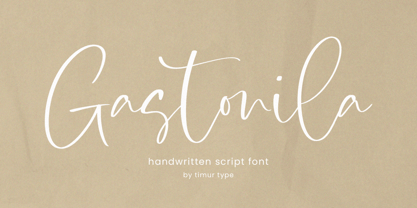 Introducing by Timur type Proudly Present, Gastonila Gastonila A Handwritten Script Font Gastonila is perfect for product packaging, branding project, megazine, social media, wedding, or just used to express words above the background. Gastonila also multilingual support. Embelish your designs with our original fonts.Enjoy the font,Thank you!
 - Kittendust by Timurtype,
$14.00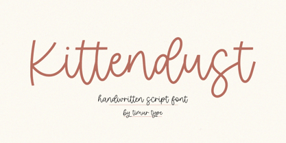 Introducing by Timur type Proudly Present, Kittendust Kittendust A Handwritten Script Font Kittendust is perfect for product packaging, branding project, megazine, social media, wedding, or just used to express words above the background. Kittendust also multilingual support. Embelish your designs with our original fonts.Enjoy the font,Thank you!
 - Fette Kanzlei by RMU,
$30.00 Fette Kanzlei is a beautiful mid-19th century blackletter font with a touch of calligraphy which has been brought back into life again. The long s can be reached by typing alt plus b or by activating the OT feature historical forms. This font also contains oldstyle numerals.
 - Evening Initials JNL by Jeff Levine,
$29.00 Evening Initials JNL are based on a few random examples of some unusual Art Deco initials found within the pages of an old Dover clip art book. A complete set of letters was redrawn from scratch and are offered for your creative endeavors as a digital type font.
 - Linndale Square NF by Nick's Fonts,
$10.00A typeface named, simply, Geometric, from the 1885 Cleveland Type Foundry specimen book, has been beefed up a bit and softened with round serifs to create this everything-old-is-new-again gem. Both versions of this font include the complete Latin 1252 and Central European 1250 character sets. - British Vehicle JNL by Jeff Levine,
$29.00 Auto license plates in the United Kingdom are made with a typeface originally designed by (and named for) Charles Wright and must meet strict criteria as to type height, weight and spacing. A bold sans serif design; British Vehicle JNL is available in both regular and oblique versions.
 - Rachee by Studio Sun,
$18.00 Rachee Display is a modern serif typeface. Inspired by late Renaissance-era type and intended for display font, perfect for logotype, logogram, title, caption, and more. Rachee comes with 6 weights with some opentype features (Linnning figure, full 'ff' ligature, luballin avantgarde ligature, stylistic set, fraction, and more).
 - Deco Elongated JNL by Jeff Levine,
$29.00 Tall and narrow in stature, elegant by design and Art Deco in style, Deco Elongated JNL is a wonderful type design for setting long lines of copy in less space. The retro elements of this font conjure up images of fine fashions, fancy nightclubs and big band music…
 - Belyard by Blankids,
$18.00 Introducing a new layered bold script font called Belyard .Belyard inspired by bold script logotype and retro font. Belyard came with open type features and multilingual accent good for logotype, poster, badge, book cover, tshirt design, packaging and any more. FEATURES : Uppercase Lowercase Number Punctuation Multilingual PUA Encode Opentype
 - Shadowland JNL by Jeff Levine,
$29.00 Shadowland JNL is a simple titling font with a limited character set. Comprised of just A-Z with basic punctuation, the design is based on a set of wood type of a more modern era. The outer lines are crisp and sharp, while the interior letters have rounded ends.
 - Sitting Pretty JNL by Jeff Levine,
$29.00 Sheet music for the 1923 tune "I'm Sitting Pretty (In A Pretty Little City)" had the main part of the title hand lettered in an Art Nouveau condensed Roman type design which became the inspiration for Sitting Pretty JNL. The typeface is available in both regular and oblique versions.
 - Magma II by Stone Type Foundry,
$49.00 Magma is a rare sans serif typeface family designed explicitly for use in both text and display applications. Starting with this design foundation, Sumner Stone refined the design and added a large suite of international characters to create Magma II, a type family with even more depth and versatility.
 - Rostel by Dieza Design,
$10.00 Rostel is great for headlines of all sizes, as well as for text blocks that come in both maximum and minimum variations. This font are applicable for any type of graphic design in web, print, motion graphics, and perfect for t-shirts and other items like posters and logos.
 - Varmint PB by Pink Broccoli,
$14.00 Varmint is an offbeat flair serif font inspired by the titling of the early 1970's "Yosemite Sam & Bugs Bunny" comics from Gold Key. Playing up a Capitals and Alt-Capitals character set, with just a few ligatures, this wonderful typeface is funky and fun to type with.
 - Social Club JNL by Jeff Levine,
$29.00 The movie poster for the 1934 comedy/crime drama “Jimmy the Gent” (starring James Cagney) featured the title hand lettered in an ultra-bold Art Deco sans serif style. This type design has been turned into Social Club JNL, and is available in both regular and oblique versions.