10,000 search results
(0.043 seconds)
- Pompano by Letterhend,
$17.00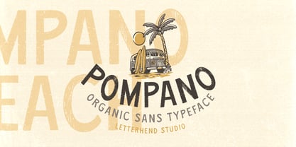 Pompano is an organic sans serif typeface which is purposely made for headline, display or logotype.This type of font perfectly made to be applied especially in logo, and the other various formal forms such as invitations, labels, logos, magazines, books, greeting / wedding cards, packaging, fashion, make up, stationery, novels, labels or any type of advertising purpose. Features : regular & stamp version uppercase & lowercase numbers and punctuation multilingual alternates & ligatures PUA encoded We highly recommend using a program that supports OpenType features and Glyphs panels like many of Adobe apps and Corel Draw, so you can see and access all Glyph variations.
 - Burnbear by Letterhend,
$16.00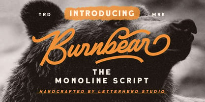 Blackbear is a monoline script with a casual and classic theme. This type of font perfectly made to be applied especially in logo, headline, signage and the other various formal forms such as invitations, labels, logos, magazines, books, greeting / wedding cards, packaging, fashion, make up, stationery, novels, labels or any type of advertising purpose. Features : uppercase & lowercase numbers and punctuation multilingual alternates / swashes and ligatures PUA encoded We highly recommend using a program that supports OpenType features and Glyphs panels like many of Adobe apps and Corel Draw, so you can see and access all Glyph variations.
 - Linotype Irish Text by Linotype,
$29.99Linotype Irish Text is part of the Take Type Library, chosen from the contestants of Linotype’s International Digital Type Design Contests of 1994 and 1997. German artist Torsten Weisheit designed this font based on Irish scripts of the 5th century. Characteristic of this style is the mixture of upper case letters in the mostly lower case alphabet and vice versa. The letters look as though written with a broad tipped pen and have triangular serifs, displaying a decorative tendency akin to that of Irish calligraphy. Linotype Irish Text is intended exclusivley for headlines in large point sizes. - Railyouth by Letterhend,
$19.00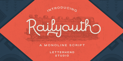 Railyouth is a bold monoline script with a touch of vintage look and feel. This type of font perfectly made to be applied especially in logo, headline, signage and the other various formal forms such as invitations, labels, logos, magazines, books, greeting / wedding cards, packaging, fashion, make up, stationery, novels, labels or any type of advertising purpose. Features : uppercase & lowercase numbers and punctuation multilingual alternates / swashes and ligatures PUA encoded We highly recommend using a program that supports OpenType features and Glyphs panels like many of Adobe apps and Corel Draw, so you can see and access all Glyph variations.
 - Saltburg by Letterhend,
$17.00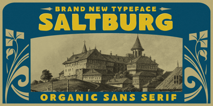 Introducing, Saltburg, an strong and bold sans serif with a touch of vintage look and feel. This type of font perfectly made to be applied especially in logo, headline, signage and the other various formal forms such as invitations, labels, logos, magazines, books, greeting / wedding cards, packaging, fashion, make up, stationery, novels, labels or any type of advertising purpose. Features : uppercase & lowercase numbers and punctuation multilingual alternates swashes and ligatures PUA encoded We highly recommend using a program that supports OpenType features and Glyphs panels like many of Adobe apps and Corel Draw, so you can see and access all Glyph variations.
 - Arinkoln by Letterhend,
$19.00 Arin Koln is a typeface with fun and playful looks. This type of font perfectly made to be applied especially in storybook children or child theme which is need a standout font, and the other various formal forms such as invitations, labels, logos, magazines, books, greeting / wedding cards, packaging, fashion, make up, stationery, novels, labels or any type of advertising purpose. Features : Solid version illustration numbers and punctuation multilingual ligatures PUA encoded We highly recommend using a program that supports OpenType features and Glyphs panels like many of Adobe apps and Corel Draw, so you can see and access all Glyph variations.
 - Cottage Stone by Letterhend,
$17.00 Cottage Stone is a bold serif font with classic and vintage looks. This type of font perfectly made which is need a standout font, and the other various formal forms such as invitations, labels, logos, magazines, books, greeting / wedding cards, packaging, fashion, make up, stationery, novels, labels or any type of advertising purpose. Features : 3 Styles : Regular, Inline & Extrude Lowercase & upercase Numbers and punctuation multilingual ligatures PUA encoded We highly recommend using a program that supports OpenType features and Glyphs panels like many of Adobe apps and Corel Draw, so you can see and access all Glyph variations.
 - Midfonde by Letterhend,
$19.00 Midfonde is a display typeface inspired by art deco style. This type of font perfectly made to be applied especially in logo, headline, signage and the other various formal forms such as invitations, labels, logos, magazines, books, greeting / wedding cards, packaging, fashion, make up, stationery, novels, labels or any type of advertising purpose. Features : uppercase & lowercase numbers and punctuation multilingual alternates / swashes and ligatures PUA encoded We highly recommend using a program that supports OpenType features and Glyphs panels like many of Adobe apps and Corel Draw, so you can see and access all Glyph variations.=
 - Moraline Script by Letterhend,
$19.00 Introducing, Moraline - a standout bold script with a touch of vintage look and feel. This type of font perfectly made to be applied especially in logo, headline, signage and the other various formal forms such as invitations, labels, logos, magazines, books, greeting / wedding cards, packaging, fashion, make up, stationery, novels, labels or any type of advertising purpose. Features : uppercase & lowercase numbers and punctuation multilingual alternates / swashes and ligatures PUA encoded We highly recommend using a program that supports OpenType features and Glyphs panels like many of Adobe apps and Corel Draw, so you can see and access all Glyph variations.
 - The Bardian by Letterhend,
$19.00 Introducing, Bardian - a bold monoline script with a touch of vintage look and feel. This type of font perfectly made to be applied especially in logo, headline, signage and the other various formal forms such as invitations, labels, logos, magazines, books, greeting / wedding cards, packaging, fashion, make up, stationery, novels, labels or any type of advertising purpose. Features : uppercase & lowercase numbers and punctuation multilingual alternates / swashes and ligatures PUA encoded We highly recommend using a program that supports OpenType features and Glyphs panels like many of Adobe apps and Corel Draw, so you can see and access all Glyph variations.
 - Taverius by Letterhend,
$12.00 Introducing, Taverius- a hand drawn with freestyle which is purposely made for headline, display or logotype, and signature. This type of font perfectly made to be applied especially in logo, and the other various formal forms such as invitations, labels, logos, magazines, books, greeting / wedding cards, packaging, fashion, make up, stationery, novels, labels or any type of advertising purpose. Features : uppercase & lowercase numbers and punctuation multilingual PUA encoded We highly recommend using a program that supports OpenType features and Glyphs panels like many of Adobe apps and Corel Draw, so you can see and access all Glyph variations.
 - Pistol Twelve JNL by Jeff Levine,
$29.00Pistol Twelve JNL is a novelty version of Jeff Levine's Twelve Oaks JNL wood type font, with the addition of random bullet holes in the upper case characters. The font design was suggested by fellow type designer Ray Larabie. Pistol Twelve JNL is a two-fold pun. Initially, this conveys the obvious fact that the design is a variation of Twelve Oaks JNL with bullet holes... but the name is also a play on an old, old joke. One person asks the other: "Would you care to join the Pistol Club? You drink 'til twelve and..." Well, you get the picture! - Hordelands by Letterhend,
$17.00 Hordeland is a display condensed typeface with a touch of vintage look and feel. This type of font perfectly made to be applied especially in logo, headline, signage and the other various formal forms such as invitations, labels, logos, magazines, books, greeting / wedding cards, packaging, fashion, make up, stationery, novels, labels or any type of advertising purpose. Features : uppercase & lowercase numbers and punctuation multilingual alternates / swashes and ligatures PUA encoded We highly recommend using a program that supports OpenType features and Glyphs panels like many of Adobe apps and Corel Draw, so you can see and access all Glyph variations.
 - Baverley Astone by Letterhend,
$19.00 Introducing, Baverley Astone Signature Script - an authentic hand writing with natural signature style. This type of font perfectly made to be applied especially in logo, and the other various formal forms such as invitations, labels, logos, magazines, books, greeting / wedding cards, packaging, fashion, make up, stationery, novels, labels or any type of advertising purpose. Features : uppercase & lowercase numbers and punctuation multilingual alternates and ligatures swashes PUA encoded We highly recommend using a program that supports OpenType features and Glyphs panels like many of Adobe apps and Corel Draw, so you can see and access all Glyph variations.
 - Black Rockets by Letterhend,
$19.00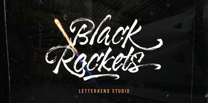 Introducing, Black Rocket- a hand drawn dry brush script which is purposely made for headline, display or logotype, and signature. This type of font perfectly made to be applied especially in logo, and the other various formal forms such as invitations, labels, logos, magazines, books, greeting / wedding cards, packaging, fashion, make up, stationery, novels, labels or any type of advertising purpose. Features : - uppercase & lowercase - numbers and punctuation - multilingual - alternates & ligatures - PUA encoded We highly recommend using a program that supports OpenType features and Glyphs panels like many of Adobe apps and Corel Draw, so you can see and access all Glyph variations.
 - Londers by Letterhend,
$19.00 Introducing, Londers - a standout bold script with a touch of vintage look and feel. This type of font perfectly made to be applied especially in logo, headline, signage and the other various formal forms such as invitations, labels, logos, magazines, books, greeting / wedding cards, packaging, fashion, make up, stationery, novels, labels or any type of advertising purpose. Features : Uppercase & lowercase numbers and punctuation multilingual alternates / swashes and ligatures PUA encoded We highly recommend using a program that supports OpenType features and Glyphs panels like many of Adobe apps and Corel Draw, so you can see and access all Glyph variations.
 - Super Giants by Letterhend,
$19.00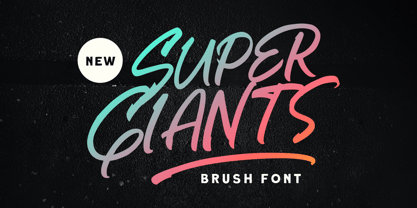 Introducing, Super Giants - a brush font with natural hand writing with modern and dynamic feel. This type of font perfectly made to be applied especially in logo, and the other various formal forms such as invitations, labels, logos, magazines, books, greeting / wedding cards, packaging, fashion, make up, stationery, novels, labels or any type of advertising purpose. Features : uppercase & lowercase numbers and punctuation multilingual alternates and ligatures swashes PUA encoded We highly recommend using a program that supports OpenType features and Glyphs panels like many of Adobe apps and Corel Draw, so you can see and access all Glyph variations.
 - Volgian by Letterhend,
$15.00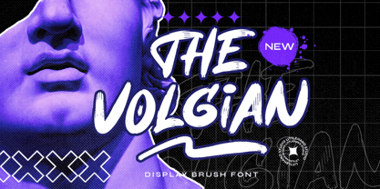 The Volgian is a brush font which is purposely made for headline, display or logotype. This type of font perfectly made to be applied especially in logo, and the other various formal forms such as invitations, labels, logos, magazines, books, greeting / wedding cards, packaging, fashion, make up, stationery, novels, labels or any type of advertising purpose. Features : uppercase & lowercase numbers and punctuation multilingual alternates & ligatures PUA encoded We highly recommend using a program that supports OpenType features and Glyphs panels like many of Adobe apps and Corel Draw, so you can see and access all Glyph variations.
 - Malliandra Script by Letterhend,
$19.00 Introducing, Malliandra Script - A beautiful modern calligraphy script based on manual hand writing. The natural flow with the swashes make this font looks even more prettier. This type of font perfectly made to be applied especially in wedding invitation, labels, logos, magazines, books, greeting / wedding cards, packaging, fashion, make up, stationery, novels, labels or any type of advertising purpose. Features : uppercase & lowercase numbers and punctuation multilingual swash and ligature alternates PUA encoded We highly recommend using a program that supports OpenType features and Glyphs panels like many of Adobe apps and Corel Draw, so you can see and access all Glyph variations.
 - Numbers With Rings by Typodermic,
$11.95 Numbers with Rings uses an OpenType system that allows you to generate numbers in rings up to 999999. You can even have ringed letters or letter/digit combinations. If your application supports OpenType ligatures, you can type letters or digits on your keyboard, and they’ll automatically squeeze into rings. First, select a ring which can hold the number of digits you want, then type the digits; the rest happens automatically. There’s also a filled ring which can be used to give your ring a colored background. For more details on how Numbers with Rings works, check the PDF guide .
 - Brandice by Letterhend,
$19.00 Introducing, Brandice- A blackletter typeface. This type of font perfectly made to be applied especially in logo, and the other various formal forms such as Logo, Clothing, Fashion, Headline, or any type of advertising purpose. Features : uppercase & lowercase numbers and punctuation stylistic alternate multilingual PUA encoded We highly recommend using a program that supports OpenType features and Glyphs panels like many of Adobe apps and Corel Draw, so you can see and access all Glyph variations. How to access opentype feature : letterhend.com/tutorials/using-opentype-feature-in-any-software/ Email us to letterhend@gmail.com if you need something! Happy Designing!
 - Mantaray by Letterhend,
$19.00 Introducing, Mantaray - a brush script which is purposely made for headline, display or logotype. This type of font perfectly made to be applied especially in logo, and the other various formal forms such as invitations, labels, logos, magazines, books, greeting / wedding cards, packaging, fashion, make up, stationery, novels, labels or any type of advertising purpose. Features : uppercase & lowercase numbers and punctuation multilingual alternates, swashes & ligatures PUA encoded We highly recommend using a program that supports OpenType features and Glyphs panels like many of Adobe apps and Corel Draw, so you can see and access all Glyph variations.
 - The Mallister by Letterhend,
$19.00 The Mallister is a script with a touch of vintage look and feel. This type of font perfectly made to be applied especially in logo, headline, signage and the other various formal forms such as invitations, labels, logos, magazines, books, greeting / wedding cards, packaging, fashion, make up, stationery, novels, labels or any type of advertising purpose. Features : uppercase & lowercase numbers and punctuation multilingual alternates / swashes and ligatures PUA encoded We highly recommend using a program that supports OpenType features and Glyphs panels like many of Adobe apps and Corel Draw, so you can see and access all Glyph variations.
 - Linotype Russisch Brot by Linotype,
$29.00Linotype Russisch Brot is part of the Take Type Library, chosen from the entries of the Linotype-sponsored International Digital Type Design Contests of 1994 and 1997. The inspiration of German designer Markus Remscheid is not hard to see for those who are familiar with the chocolate cookies in the form of letters which are called Russisches Brot. The font is available in six weights. The basic weight is perfectly legible and is good for both headlines and shorter texts and from there the weights become more and more nibbled away, leaving the basic form of the characters and a few crumbs. - Linotype Sketch by Linotype,
$29.99 Linotype Sketch is part of the Take Type Library, chosen from the contestants of Linotype’s International Digital Type Design Contests of 1994 and 1997. German designer Dieter Kurz gave his display font a calligraphic character. The forms lean slightly to the right and have a spontaneous and individual look. This light, cheerful font also displays a harmony among the forms and gives text a personal touch. Linotype Sketch combines well with modern text fonts which have the same narrow proportions. This font is well-suited for headlines and short and middle length texts with point size 12 or larger.
 - Backdown by Letterhend,
$19.00 Introducing, Backdown- a handwritten display typeface. This type of font perfectly made to be applied especially in logo, and the other various formal forms such as invitations, labels, logos, magazines, books, greeting / wedding cards, packaging, fashion, make up, stationery, novels, labels or any type of advertising purpose. Features : uppercase & lowercase numbers and punctuation multilingual alternates and ligatures PUA encoded We highly recommend using a program that supports OpenType features and Glyphs panels like many of Adobe apps and Corel Draw, so you can see and access all Glyph variations. How to access opentype feature : letterhend.com/tutorials/using-opentype-feature-in-any-software/
 - Linotype Not Painted by Linotype,
$29.99Linotype Not Painted is part of the Take Type Library, chosen from the contestants of Linotype’s International Digital Type Design Contests of 1994 and 1997. This fun font from German designer Robert Bucan grabs attention immediately. The forms are made up of multiple layers. The upper case’ alphabet forms, numerals and punctuation are two different styles of the same character, one over the other, and the lower case’ letters are composed of the lower case and upper case of the same letter superimposed. Linotype Not Painted is particularly good as a headline font in larger point sizes. - Cosmo Bones by Letterhend,
$16.00 Cosmo Bones is a reverse display font with fun and playful looks. This type of font perfectly made to be applied especially in storybook children or child theme which is need a standout font, and the other various formal forms such as invitations, labels, logos, magazines, books, greeting / wedding cards, packaging, fashion, make up, stationery, novels, labels or any type of advertising purpose. Features : regular & hand drawn numbers and punctuation multilingual PUA encoded We highly recommend using a program that supports OpenType features and Glyphs panels like many of Adobe apps and Corel Draw, so you can see and access all Glyph variations.
 - Jemmy Wonder by Letterhend,
$19.00 Jemmy Wonder is a display typeface with a touch of vintage look and feel. This type of font perfectly made to be applied especially in logo, headline, signage and the other various formal forms such as invitations, labels, logos, magazines, books, greeting / wedding cards, packaging, fashion, make up, stationery, novels, labels or any type of advertising purpose. Features : uppercase & lowercase numbers and punctuation multilingual alternates / swashes and ligatures PUA encoded We highly recommend using a program that supports OpenType features and Glyphs panels like many of Adobe apps and Corel Draw, so you can see and access all Glyph variations.
 - Mill Valley by Letterhend,
$19.00 Mill Valley is a monoline script with a casual and fun theme. This type of font perfectly made to be applied especially in logo, headline, signage and the other various formal forms such as invitations, labels, logos, magazines, books, greeting / wedding cards, packaging, fashion, make up, stationery, novels, labels or any type of advertising purpose. Features : uppercase & lowercase numbers and punctuation multilingual alternates / swashes and ligatures PUA encoded We highly recommend using a program that supports OpenType features and Glyphs panels like many of Adobe apps and Corel Draw, so you can see and access all Glyph variations.
 - Mountain Warrior by Letterhend,
$17.00 Mountain Warrior is a monoline script with a touch of retro look and feel. This type of font perfectly made to be applied especially in logo, headline, signage and the other various formal forms such as invitations, labels, logos, magazines, books, greeting / wedding cards, packaging, fashion, make up, stationery, novels, labels or any type of advertising purpose. Features : uppercase & lowercase regular & rough numbers and punctuation multilingual alternates / swashes and ligatures PUA encoded We highly recommend using a program that supports OpenType features and Glyphs panels like many of Adobe apps and Corel Draw, so you can see and access all Glyph variations.
 - Glitar by Oui Studio,
$17.00 Hello friends! The 'Glitar' font is coming, a modern retro of 70's vibes. Glitar is very inspired by the culture and music artwork from the 70's era. It's perfect for branding, logo, packaging, header, title, t-shirt design, etc. Glitar is great if you pair it with an illustration, it will make the design even more dope.
 - Oui Tobias by Oui Studio,
$12.00 Hello friends! The 'Tobias' font is coming, a dynamic and art nouveau feel. Tobias is very inspired by the art nouveau style with a slightly modern touch. It's perfect for branding, logo, packaging, header, title, t-shirt design, etc. Tobias is great if you pair it with an illustration, it will make the design even more dope. Happy creating :)
 - Coranto 2 by TypeTogether,
$49.00 Now available as Opentype font with extended character set, Coranto 2. It is originally based on Unger’s typeface Paradox, and arose from a desire to transfer the elegance and refinement of that type to newsprint. Coranto 2 has a larger x-height and in many places has been made more robust. Over the past 25 years newspaper production has seen spectacular improvements in paper and print quality, the introduction of colour printing, and vastly better register. Newspaper production still demands a lot of letter forms, but advanced printing brings out details better and makes typography more appealing to readers. For text type the newspaper is no longer an environment in which survival is the chief assignment. Today, newspapers are not merely a matter of cheap grey paper, thin ink and super-fast rotary printing, and type design no longer has to focus on surviving the mechanical technology and providing elementary legibility. Now there is also room to create an ambience, to give a paper a clearer identity of its own; there is scope for precision and refinement. One consequence of this is that newspaper designers can now look beyond the traditional group of newsfaces. Conversely, a newsface can be used outside the newspaper — not an uncommon occurrence. The update to this beautiful font family, Coranto 2, includes the addition of over 250 glyphs featuring full Latin A language support, new ligatures, 4 sets of numerals, arbitrary fractions and superiors/inferiors. Furthermore, kerning was added and fine tuned for better performance.
 - Resist Sans by Groteskly Yours,
$25.00 Resist Sans is a free-spirited neo-grotesque that embodies both the innate desire for revolt and a tendency towards uniformity. While Resist Sans preserves the neat, minimalist look which is associated with neo-grotesques, it also accentuates the tentativeness of each letter form. The name, too, hints at the rebellious character of the typeface. Resist Sans comes in 28 styles (14 uprights and matching obliques). Text vs Display Resist Sans comes in two versions: Display and Text, which serve different purposes but remain interchangeable and even complementary in some cases. Resist Text is equipped with deep ink traps and optical compensators, which really come into play at smaller sizes. The Display version is smoother and more consistent, so better for use in larger sizes and headlines. Styles/Weights Each of the two versions of Resist Sans comes in 7 weights (Thin to Black) and is equipped with matching Obliques, which brings the total number of styles to 28. Two trial styles (Text Light and Display Medium Oblique) can be downloaded free of charge. Each style contains 900+ glyphs, awesome OpenType features, and around 1500 kerning pairs. Language Support Resist Sans is truly multilingual. It supports most European and Latin-languages and features Extended Cyrillic, which gives access to such languages as Ukrainian, Bulgarian, Serbian, Russian, Macedonian and many more. Free Styles Two styles of Resist Sans can be downloaded for free on MyFonts. Type Specimen Resist Sans PDF Type Specimen can be downloaded here: Resist Sans PDF Type Specimen
 - Haunted House by HiH,
$8.00 Halloween lends itself to graphic images: witches, ghosts, bats, jack-o'lanterns and haunted houses. When we think of a haunted house, we generally think of a large, abandoned, derelict Victorian wood-frame house. The style is usually Second Empire or Queen Anne. There tends to be a lot of decoration. There is usually a porch or two with decorative spindle work. There is probably a tower, either square with a mansard roof such as one might see in Paris or round with a conical roof borrowed from a Loire Valley chateau. These houses were generally built in the United States between 1860 and 1900, products of the exuberance of a time before income tax. It took at least three servants to maintain such a house and was very expensive. Few can afford them today. That is why so many were converted to professional offices, multi-family dwellings or simply abandoned. HAUNTED HOUSE is our typographical contribution to Halloween. Based on our font PETRARKA ML, it features decorative capitol letters that utilize the silhouette of a Second Empire style house complete with a dead tree and a full moon. The font includes 8 ornaments suitable for flyers and party invitations. Revision 2.000 eliminates dual encoding, harmonizes metrics, adds new glyphs, and adds open type features. The zip package includes two versions of the font at no extra charge. There is an OTF version which is in Open PS (Post Script Type 1) format and a TTF version which is in Open TT (True Type)format. Use whichever works best for your applications.
 - Cisalpin by Linotype,
$29.99 The ideal typeface for cartography The Swiss designer/typographer Felix Arnold designed Cisalpin during the late 1990s, after he had challenged himself to create a contemporary typeface that could be used for cartographic uses. Arnold came to the subject of cartographic typefaces after analyzing many maps and atlases, and discovering that there was no standard typeface for these types of documents. Like any good cartographic type, Cisalpin is very legible at small sizes. While he was drawing this typeface on his computer, Arnold used a reduction glass to refine his design, making it work in these situations. Cisalpin is a linear sans serif face, with slight resemblance to renaissance serif types. The various weights are all clearly differentiated from one another. And because space is often a premium on maps, Cisalpin runs narrow. Words close in around themselves to help them become more identifiable. The letterforms in Cisalpin are durable, and can maintain their readability when placed over complex backgrounds. They have open interior forms, flattened curves, tall x-heights, and a capital height that almost reaches the tops of the ascenders. Cisalpin also has pronounced Italics, with a very clear angle of inclination. Each letterform in the family has been optimized so that they cannot be easily mistaken for another. This again helps minimize the misunderstandings that often occur because of illegibility. Although Cisalpin was developed for use in cartography, it may be used for countless other purposes; any font that can work well in small sizes on a map could be used almost anywhere else!
 - Elido by Kontour Type,
$50.00 Elido (Odile in reverse) is the sans counterpart to the Odile type. Together they form a sans/serif superfamily with a wide range of variations for editorial use. Elido follows Odile’s proportions and matches the weight and typographic color of its serif twin. Elido is a sans with classical proportions. A slight geometric hint and open counters convey an airy feel. Elido’s family structure and relations within echo the conceptual approach of Odile. The arched stroke low off the stem reveals a script characteristic most pronounced in the Elido Upright Italic. This particular interpretation is gradually diminished in the Italic and becomes even less emphasized in the Regular. Six balanced weights, from an elegant Light to a pronounced Black, are in tune with three display solutions and a set of beautiful Ornaments. These variants allow for a diverse and multifaceted typography for the discerning type user. Sans serif initials amount to a rare finding. The charming monolinear Elido Initials come in two flavors, elaborate and rational, designed to hold their own in editorial and headline sizes. This type design boasts an extensive character set, many OpenType features including roman and italic Small Caps, five sets of numerals, beautiful ligatures, and many more. OT stylistic variants (with accents) offer a one-story “a” for the roman weights, alternate “g” and “s” designs for the italics, and a variant glyph “s” for the Upright Italic. These distinct qualities with its versatile and sincere traits make Elido an excellent choice for text and display use.
 - Morgan Sans by Feliciano,
$50.00The Morgan Project can be considered a big type family with ‘many styles’ or a set of different types that match with each other. For me it’s one typeface with different versions with deliberate and visible differences according to the propose to which each version was created. The design started in 2000 as a display type with the design of the Morgan Tower, to which more two display versions were added; Morgan Poster and Morgan Big — all together the make our: FTF Morgan Display Kit 1. All three versions consist only in uppercase with alternate letters in the lowercase and a set of special ligatures. Morgan Tower has four variants that differ in width/weight, Morgan Poster has six variants (often called styles), three weights in upright and oblique and Morgan Big has twelve, six weights in upright and oblique. Lately, the FTF Morgan Tex Kit 1 was added. Apropriate versions to use in text setting. Both versions, FTF Morgan Sans and FTF Morgan Sans Condensed share the same structure and character mapping. Four variants each; regular, bold, oblique and bold oblique with a large character set including: small caps, lining and old style figures (here called Office figures) — both tabular —, small caps lining figures, mathematical symbols and fraction figures, and, a set of foreign characters expanding the possibilities of use for a wider range of languages. Characters are distributed in six different font layouts: Lining, Office, Expert, Caps, Figures & Pi. - Beaufort by Shinntype,
$59.00 Engaging the issue of scalability, Beaufort® is configured so that serifs render with great sharpness, independent of type size, limited only by device resolution. This scale of effect empowers the typographer with a design axis stretching from awesomely huge to preciously tiny, further enhanced by weights from Light to Heavy, small caps, and alternate figure styles. In style, Beaufort has a number of affinities. In particular, the bold romans recall a kind of “grotesque with small serifs” style popular with sign painters and package lettering artists in the early 20th century, and still going strong. In proportion, the basic Beaufort is in the vein of the classic oldstyle types that descend from Granjon , via the French Oldstyles, or Elzevirs, to Plantin and Times in the early twentieth century. Designed for optimum clarity, readibility, and word count, these types have a pronounced angle of stress in the lower case, which is quite large and fairly narrow in relation to the caps. None of the caps are exceptionally narrow, and both cases have an evenness of width that makes for a no-nonsense, orthodox appearance. The strength of the capitals distinguishes these types from those of another “optimizing” era, the 1970s and ’80s, when puny caps made for monotonous text. However, strong though they may be, Beaufort’s caps are not as obtrusive in text as those of Times or Plantin.