10,000 search results
(0.037 seconds)
- FF Harlem by FontFont,
$41.99 British type designer Neville Brody created this display FontFont in 1993. The family contains 4 weights and is ideally suited for advertising and packaging, music and nightlife, poster and billboards as well as software and gaming. FF Harlem provides advanced typographical support with features such as ligatures. It comes with proportional lining figures.
 - FF Pop by FontFont,
$41.99 British type designer Neville Brody created this display FontFont in 1992. The family contains 2 weights is ideally suited for logo, branding and creative industries and poster and billboards. FF Pop provides advanced typographical support with features such as ligatures, case-sensitive forms, and stylistic alternates. It comes with proportional lining figures.
 - Lidia by ParaType,
$25.00 The decorative title typeface was designed at Polygraphmash type design bureau in 1967 by Iraida Chepil. It is a decorative variant ('open', or 'engraved') of classical serif typefaces. For use in magazine headlines, title and display typography. The revised and completed digital version was designed for ParaType in 2005 by Victor Kharyk.
 - Stage Production JNL by Jeff Levine,
$29.00 A 1935 piece of sheet music entitled “(There’s A) Little Picture Playhouse in My Heart” had its movie-themed title hand lettered in a condensed Art Deco style with a few interesting character variations. The resulting digital type design is Stage Production JNL, which is available in both regular and oblique versions.
 - Nirvanium NB by No Bodoni,
$39.00 If John Baskerville had been born in Seattle in the 1960s his type would have looked like Nirvanium: a wide, extended body with chunky Dr. Martin serifs, an assertive inelegance and a sense of rebelliousness. It�s a display face, too big, too chunky and too rambunctious for text, but always friendly.
 - Lichtspielhaus by Typocalypse,
$19.00 Lichtspielhaus is an ultra condensed Lichtspiele spin-Off with 8 weights. It still transports you back to a time where neon lights and marquee letters decorated cinema facades. There are 8 styles: Hairline, Thin, Light, Regular, Medium, Bold, Black and Heavy. "Lichtspielhaus" is the first part of a new Type Noir Quadrilogy.
 - Alisking by Ditatype,
$29.00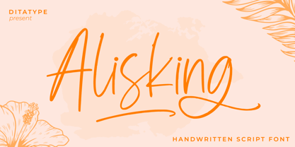 Alisking is a classy handwritten font. Made for any professional project branding. It is the best for logos, branding and quotes. Every letter has a unique and beautiful touch. Includes: Alisking (OTF) Features: Beautiful Ligatures Alternates Swashes Multilingual Support PUA Encoded Numerals and Punctuation Thank you for downloading premium fonts from Dita Type
 - FF Zan by FontFont,
$41.99 French type designer Albert Boton created this display FontFont in 2002. The font is ideally suited for advertising and packaging, music and nightlife as well as poster and billboards. FF Zan provides advanced typographical support with features such as ligatures, alternate characters, and case-sensitive forms. It comes with proportional lining figures.
 - Office Space JNL by Jeff Levine,
$29.00 Office Space JNL is based on “Condensed Edina” from the 1921 Miller & Richard type specimen book and is available in both regular and oblique versions. This spurred serif Art Nouveau monoline font is a milestone – marking the 1900th font design released by Jeff Levine Fonts since its inception in January of 2006.
 - Ashtanga by Hanoded,
$15.00 Ashtanga was named after a type of yoga. In Sanskrit it means "eight-limbed", which I find quite appropriate, give the amount of swirls and curls. The font is 'all-caps', but the upper and lower case glyphs differ completely. They are, of course, fully interchangeable. Ashtanga comes with multi language support.
 - Stinkley by Ditatype,
$29.00 Stinkley is a beautiful, romantic handwritten font, perfect for any design project that you wish to create. Stinkley is incredibly versatile, carefully handcrafted to become a true favorite. Use it to lift your projects to the highest level! Featured : Accents (Multilingual characters) PUA encoded Numerals and Punctuation (OpenType Standard) Full Support Dita Type
 - Barbary Pirates by OzType.,
$16.00 Imagine a hot summer day with a cool breeze, watching the sun set over the beach, ice cold lemonade in your hand and some of your favorite music playing in the background. A perfect postcard moment! Use Barbary Pirates to make awesome type designs for logos, posters, album covers, packaging, Instagram posts...
 - LP Harmonia by URW Type Foundry,
$35.99 LP Harmonia arose from its designer’s private life. As a type designer, Peter Langpeter was often asked by friends or relatives to write a greeting on a birthday card or create a good looking invitation. Over the years, he used ink and a soft feather to form his personal handwriting: LP Harmonia.
 - FF Bull by FontFont,
$30.99 British type designer John Critchley created this display FontFont in 1995. The family has 6 weights, and is ideally suited for festive occasions, film and tv as well as poster and billboards. FF Bull provides advanced typographical support with features such as ligatures and case-sensitive forms. It comes with proportional lining figures.
 - Dealyna by Ditatype,
$29.00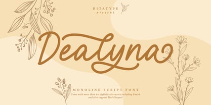 Dealyna is a modern monoline script font. With a classy and beautiful style, it brings a classy and chic typeface. Dealyna is best used for weddings, branding, logotype, and quotes. Includes: - Dealyna (OTF) Features: - Beautiful Alternates - PUA Encoded - Multilingual Support - Numerals and Punctuation Thank you for downloading premium fonts from Dita Type
 - FF Klunder Script by FontFont,
$30.99 Canadian type designer Barbara Klunder created this display FontFont in 1994. The family contains 2 weights: Regular and Bold and is ideally suited for festive occasions and poster and billboards. FF Klunder Script provides advanced typographical support with features such as ligatures and case-sensitive forms. It comes with proportional lining figures.
 - Florentin 2D by 2D Typo,
$36.00 Angular Old Style by Viktor Kharyk is usable as display font, for non-formal texts, especially poetry, for children books and virtual games about adventures, history, and pirates and includes some original ornament set. By stylistic it connects with Italian Renaissance, Czechian types of the first half of 20th century and cut technology.
 - FF Offline by FontFont,
$41.99 Dutch type designer Roelof Mulder created this display FontFont in 1996. The family has 5 weights, ranging from Light to Bold and is ideally suited for poster and billboards. FF Offline provides advanced typographical support with features such as ligatures and case-sensitive forms. It comes with proportional oldstyle and proportional lining figures.
 - FF Overdose by FontFont,
$41.99 Dutch type designer Donald Beekman created this display FontFont in 1999. The family contains 2 weights: Regular and Italic and is ideally suited for film and tv and music and nightlife. FF Overdose provides advanced typographical support with features such as ligatures and case-sensitive forms. It comes with proportional lining figures.
 - FF Matinee Gothic by FontFont,
$41.99 American type designer Jim Parkinson created this display FontFont in 1996. The font is ideally suited for advertising and packaging, festive occasions, film and tv as well as poster and billboards. FF Matinee Gothic provides advanced typographical support with features such as ligatures and stylistic alternates. It comes with proportional lining figures.
 - Dead Mementro by Letterhead Studio-VG,
$20.00 Dead Mementro typeface (ex Dead Metro) has simple and strong shapes. It is a little bit narrow sans serif typeface with brutal constructions of characters. The first edition of typeface — Dead Metro — was realised in 1998 as the part of Garbage Type Foundry project. Now Dead Mementro has more characters and styles.
 - FF Studio by FontFont,
$41.99 French type designer Albert Boton created this display FontFont in 2002. The font is ideally suited for advertising and packaging, music and nightlife as well as sports. FF Studio provides advanced typographical support with features such as ligatures, alternate characters, and case-sensitive forms. It comes with proportional lining and proportional oldstyle figures.
 - FF Imperial by FontFont,
$41.99 Dutch type designer Donald Beekman created this display FontFont in 2000. The family contains 4 weights and is ideally suited for logo, branding and creative industries, music and nightlife as well as poster and billboards. FF Imperial provides advanced typographical support with features such as ligatures. It comes with proportional lining figures.
 - Megiday by Ditatype,
$16.00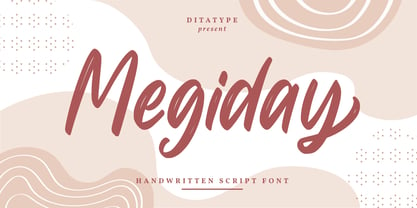 Megiday is a elegant handwritten font. Made for any professional project branding. It is the best for logos, branding and quotes. Every letter has a unique and beautiful touch. Includes: Megiday (OTF) Features: Beautiful Ligatures Stylistic Set Multilingual Support PUA Encoded Numerals and Punctuation Thank you for downloading premium fonts from Dita Type
 - FF Metamorph by FontFont,
$41.99 Austrian type designer Markus Hanzer created this display FontFont in 1994. The font is ideally suited for advertising and packaging, music and nightlife as well as poster and billboards. FF Metamorph provides advanced typographical support with features such as ligatures, alternate characters, and case-sensitive forms. It comes with proportional oldstyle figures.
 - Raven Hell by Creativemedialab,
$20.00 Raven Hell is a simple and modern gothic font. What's unique about Raven hell is that it can be sans or blackletter, depending on your choice of design theme. Raven Hell can be used in many types of modern designs ranging from product labels to tattoos, badges, logos, poster titles, and much more.
 - Sonderlina by Craft Supply Co,
$9.00 Sonderlina is a convenient and modern grotesk sans serif features low contrast details to cover small text purposes. It can be used to create almost all types of design projects like print materials. Just use your imagination and your project will become more alive and look great than ever with this typeface.
 - Kurtzberg by Nerfect,
$15.00Kurtzberg was created after the bold type on the splash pages of many of the classic comics of the 'fifties and 'sixties. Thick and chunky and filled with all those symbols basic comic book fonts rarely come with. Kurtzberg is always ready to swing into action when injustice rears its ugly face. - Compressed Wood JNL by Jeff Levine,
$29.00 Two word examples (“nice” and “bud”) from the J.G. Cooley & Co.’s Specimens of Wood Type catalog for the typeface ‘Roman Triple Extra Condensed Fifty Line’ offered only seven letters to work with. Despite this lack of characters, it inspired Compressed Wood JNL, which is available in both regular and oblique versions.
 - Pata Slab by In-House International,
$10.00 Pata Slab: the ultra-heavy optimism we all need in 2020 Pata Slab is the type equivalent of a catwalk stomp down a city sidewalk, a font that’s assertive, funky and more than a little sexy. Named after a colloquialism for ‘feet’, Pata features ultra-heavy slabs and contrasting hairline centers that rise from its chunky footprint. The resulting, retro-inspired vertiginous curves add instant attitude to any design. Developed in 2020, Pata is a type of its time.Pata is all upside, as it is a typeface with no descenders — one that elevates all characters to grow upward from the baseline (because, c’mon, we could all use something uplifting right now!) All uppercase characters were built to fit precisely inside a square, so they’re all the same width and height. The lowercase alphabet, eñes, cedillas, punctuation, numbers and symbols all follow the same height restrictions. Despite all that confinement, Pata sports standard-height terminals that connect seamlessly so there’s nearly endless options for modular ligatures. The upshot of all this meticulous awesomeness is that laying out, customizing and stacking text super simple. Pata Slab was created by In-House International, designed Alexander Wright in collaboration with Rodrigo Fuenzalida. It's available for Opentype format (.otf) compatible with Mac and PC.
 - Ladoga by ParaType,
$30.00 Ladoga — one of the most beautiful Russian designs from the soviet period. The type family was developed in Polygraphmash in 1968 by Anatoly Shchukin on the base of his own lettering for book covers and titles. It was one of the first attempts in Cyrillic typography to create text face in a style of renaissance antiqua. Stylization to broad pen calligraphy resembles early forms of Latin types that were based on handwritten humanistic minuscule. Unique in its character set digital version of Ladoga was designed by Viktor Kharik on the base of artworks of Shchukin for ParaType. The family consists of roman and italic styles in text and display versions. Character set includes characters of original shapes as well as more modern alternatives. Besides there are a set of additional characters, old style figures and small caps. The fonts cover all modern languages based on Latin and Cyrillic scripts, Greek alphabet (including polytonic extension), Hebrew and historical Cyrillic letters. Ladoga is gorgeous in display sizes and pretty readable in texts. It’s well suitable for fiction literature, historical books, art criticism, religious and philologist works. It will be extreme helpful for multilingual issues and for inclusions into body text historical passages in original orthography. The family was released in 2010.
 - Robur by Canada Type,
$24.95 It shouldn't be a surprise to anyone that these letter shapes are familiar. They have the unmistakable color and weight of Cooper Black, Oswald Cooper's most famous typeface from 1921. What should be a surprise is that these letters are actually from George Auriol's Robur Noir (or Robur Black), published in France circa 1909 by the Peignot foundry as a bolder, solid counterpart to its popular Auriol typeface (1901). This face precedes Cooper Black by a dozen of years and a whole Great War. Cooper Black has always been a bit of a strange typographical apparition to anyone who tried to explain its original purpose, instant popularity in the 1920s, and major revival in the late 1960s. BB&S and Oswald Cooper PR aside, it is quite evident that the majority of Cooper Black's forms did not evolve from Cooper Old Style, as its originators claimed. And the claim that it collected various Art Nouveau elements is of course too ambiguous to be questioned. But when compared with Robur Noir, the "elements" in question can hardly be debated. The chronology of this "machine age" ad face in metal is amusing and stands as somewhat of a general index of post-Great War global industrial competition: - 1901: Peignot releases Auriol, based on the handwriting of George Auriol (the "quintessential Art Nouveau designer," according to Steven Heller and Louise Fili), and it becomes very popular. - 1909-1912: Peignot releases the Robur family of faces. The eight styles released are Robur Noir and its italic, a condensed version called Robur Noir Allongée (Elongated) and its italic, an outline version called Clair De Lune and its condensed/elongated, a lined/striped version called Robur Tigre, and its condensed/elongated counterpart. - 1914 to 1918: World War One uses up economies on both sides of the Atlantic, claims Georges Peignot with a bullet to the forehead, and non-war industry stalls for 4 years. - 1921: BB&S releases Cooper Black with a lot of hype to hungry publishing, manufacturing and advertising industries. - 1924: Robert Middleton releases Ludlow Black. - 1924: The Stevens Shanks foundry, the British successor to the Figgins legacy, releases its own exact copies of Robur Noir and Robur Noir Allongée, alongside a lined version called Royal Lining. - 1925: Oswald Cooper releases his Cooper Black Condensed, with similar math to Robur Noir Allongée (20% reduction in width and vectical stroke). - 1925: Monotype releases Frederick Goudy's Goudy Heavy, an "answer to Cooper Black". Type historians gravely note it as the "teacher steals from his student" scandal. Goudy Heavy Condensed follows a few years later. - 1928: Linotype releases Chauncey Griffith's Pabst Extra Bold. The condensed counterpart is released in 1931. When type production technologies changed and it was time to retool the old faces for the Typositor age, Cooper Black was a frontrunning candidate, while Robur Noir was all but erased from history. This was mostly due to its commercial revival by flourishing and media-driven music and advertising industries. By the late 1960s variations and spinoffs of Cooper Black were in every typesetting catalog. In the early- to mid-1970s, VGC, wanting to capitalize on the Art Nouveau onslaught, published an uncredited exact copy of Robur Black under the name Skylark. But that also went with the dust of history and PR when digital tech came around, and Cooper Black was once again a prime retooling candidate. The "old fellows stole all of our best ideas" indeed. So almost a hundred years after its initial fizz, Robur is here in digital form, to reclaim its rightful position as the inspiration for, and the best alternative to, Cooper Black. Given that its forms date back to the turn of the century, a time when foundry output had a closer relationship to calligraphic and humanist craft, its shapes are truer to brush strokes and much more idiosyncratic than Cooper Black in their totality's construct. Robur and Robur Italic come in all popular font formats. Language support includes Western, Central and Eastern European character sets, as well as Baltic, Esperanto, Maltese, Turkish, and Celtic/Welsh languages. A range of complementary f-ligatures and a few alternates letters are included within the fonts.
 - Cub Reporter JNL by Jeff Levine,
$29.00 In the 1934 edition of the American Type Foundry’s “Book of American Type” is a selection of letterpress fonts which emulate typewriter faces. One design named “Bulletin Typewriter” served at the model for Cub Reporter JNL, and is available in both regular and oblique versions. The font has been monospaced in order to add a more traditional typewriter look to any project.
 - Love Distance by Letterhend,
$17.00 The Love Distance is a beautiful handwritten script with organic style. This type of font perfectly made to be applied especially in logo, and the other various formal forms such as invitations, labels, logos, magazines, books, greeting / wedding cards, packaging, fashion, make up, stationery, novels, labels or any type of advertising purpose. Features : Uppercase & lowercase Numbers and punctuation Alternates & Ligatures Multilingual PUA encoded
 - Junge Holiday Cuts NF by Nick's Fonts,
$10.00A charming series of 26 holiday “type warmers” based on the works of Carl S. Junge for the Barnhart Brothers & Spindler type foundry in the 1920s. Single-color cuts are in the uppercase positions, while 13 of the cuts suitable for two-color usage occupy the lowercase in adjacent pairs; e.g., a and b, c and d, and so on. - Conjur by chrismetcalfe,
$30.00This work is inspired by creatures that I have drawn for my six year old boy. The monsters can be found at chrismetcalfe.com. I wanted to take their hair/fur and translate the fun attitude to type. To be honest I think this font is used best as display type. However the fun attitude lends to many usages without structure. - Buffalo Western by Kustomtype,
$25.00 Frederick Cody, as known as Buffalo Bill, and his renowned travelling Western Circus are now celebrated through the creation of the Buffalo Circus and the Buffalo Western type fonts, both developed quite in the spirit of the stirring wood type fonts from the 19th century. All characters are fully hand traced and vectorized and provided with appealing glyphs and cool catchwords.
 - Chorneil Script by Letterhend,
$17.00 Chorneil Script is a casual script with organic style. This type of font perfectly made to be applied especially in logo, and the other various formal forms such as invitations, labels, logos, magazines, books, greeting / wedding cards, packaging, fashion, make up, stationery, novels, labels or any type of advertising purpose. Features : Uppercase & lowercase Numbers and punctuation Alternates & Ligatures Multilingual PUA encoded
 - Matita Connected by Trine Rask,
$12.00 Warning: works with contextual alternate-feature, which is not showing here. Matita Connected is part of a larger type family developed from 2005-2019 with handwriting in mind. A solid script face in two weights and a dotted instructional version. With alternative glyphs based on different writing habits. For teaching, teaching material or just typography. An unchildish handwritten type family for many purposes.
 - Belgian by FontMesa,
$25.00Belgian is a revival of an old type font from the Bruce Type Foundry of New York, Belgian was first designed as a caps-only font in the 1860s with the lowercase added in 1867. New to this classic font are the Black, Open, Inline and Distressed versions. Also new to Belgian is the addition of a Greek character set.