10,000 search results
(0.044 seconds)
- Timernis by Aga Silva,
$19.99 Timernis is humanist multilingual contrast sans serif available in eight weights from thin to black. All caps have this super elegant, classic proportions old school look and is based on 1940 stone engraving commemorative plaque. The engraving itself boasted sophisticated clean look and was a joy to look at. All caps: Would suit display usage such as: signage, titles, headers, engravings, high end packaging. Do try putting space between the letters in your selected word for suave and chic feel. Expanded round shapes are prevalent in lowercase, which is legible in small sizes and pleasant to the eye.
 - Obvia Narrow by Typefolio,
$29.00 'Obvia' appeared as a result of direct observation on typefaces classified as geometric and the plan to explore for the first time width axes Condensed, Narrow, Normal, Wide and Expanded. The idea behind 'Obvia's design was to create a distancing from geometrically pure shapes, in this case, square shapes. Then some details were added, such as subtle inktraps, concave endings of the stems and carefully drawn alternate characters, giving a 'geohumanist' tone to the font. This first family of 'Obvia' has 9 weights ranging from Thin to Black, delivering a strong typographic identity, from the paper to the pixel.
 - Kuoros VP by VP Creative Shop,
$20.00 Introducing Kuoros Serif typeface - 5 fonts Kuoros is classic, sophisticated typeface with 5 weights to enchant your next project. Very versatile fonts that works great in large and small sizes. Basic latin and advanced latin character sets are supported! Kuoros is perfect for branding projects, home-ware designs, product packaging, magazine headers - or simply as a stylish text overlay to any background image. Uppercase, lowercase, numeral, punctuation & Symbol Hairline Light Regular Bold Black Ligatures Multilingual support Feel free to contact me if you have any questions! Mock ups and backgrounds used are not included. Thank you! Enjoy!
 - BR Cobane by Brink,
$30.00 A modern neo-grotesque type family of 16 styles. BR Cobane is a fine balance of functionality and contemporary characteristics. Precisely drawn with a modern aesthetic in mind, Cobane has familiar qualities associated with the classic grotesques, but combines them with a stronger modern geometric flavour. BR Cobane is available in 16 finely crafted styles, with eight weights ranging from Thin to Black. The fonts also provide advanced typographic support with OpenType features such as case sensitive forms, icons, stylistic alternates, slashed zeros, and multiple figure sets. Also containing advanced language support as standard. For custom inquiries please contact: mail@brinktype.com
 - Lyra by Canada Type,
$39.95 Lyra is an Italian Renaissance script that might have developed if metal type had not broken the evolution of broad pen calligraphy. It lies in the area between the humanist bookhand and the chancery cursive, combining the fullness and articulation of the Roman letters with a moderate italic slant and condensation. A steep pen-angle allows use of a broader pen relative to the x-height, giving the letters more contrast with light verticals and heavy curves. Lyra embodies the Renaissance spirit of refining technical advances of the late middle ages with reintroduction of ancient classical principles. Based on the moving penstroke with constantly changing pen-angle, it brings the vitality of handwriting to the ordered legibility of type. Lyra is a formal italic, too slow for copying books. By eliminating the element of speed, digital technology opens up a new level of calligraphy, bringing it into the sphere of typography as would naturally have happened if metalworkers had not controlled the process. If classical Western traditions are respected, digital calligraphy has the potential to recapture the work of the past and restart its stalled evolution. There is of course no substitute for the charm of actual writing, with each letter made for its space; but the tradeoff is for the formal harmony of classical calligraphy as every curve resonates in tune with every other. This three-weight font family marks Philip Bouwsma's much-requested return from a three year hiatus. It also reminds us of his solid vision in regards to how calligraphy, typography and technology can interact to produce digital beauty and vesatility. Each of the three Lyra fonts contains almost three character sets in a single file. Aside from the usual wealth of alternates normally built into Bouwsma's work, Lyra offers two unique features for the user who appreciates the availability of handy solutions to subtle design space issues: At least three (and as many as six) length variations on ascending and descending forms, and 65 snap-on swashes which can be attached to either end of the majuscules or minuscules. The series also offers 24 dividers and ornaments built into each weight, and a stand-alone font containing 90 stars/snowflakes/flowers, symmetric contstructs for building frames or separators, masking, watermarking, or just good old psychedelia.
 - Formular by Brownfox,
$44.99 If you were a grotesque in mid-20th-century Switzerland, you were expected to be serious and proper, if a little dull. Unlike its dogmatic Modernist predecessors, Formular is a hip Swiss sans serif of the new generation. Inspired by the utilitarian 19th-century grotesques, its precision and and versatility are combined with a slightly eccentric character. A child of its time, it scoffs at the ideology of ‟ideal” forms, yet it is every bit as functional for all its idiosyncrasies, as any self-respecting Swiss sans. Formular comes in five weights with corresponding italics and a monospace companion to the regular weight. Each weight includes special extra-light punctuation, lining tabular and old style figures, case-sensitive punctuation, and stylistic alternates.
 - Cell by Type Minds,
$7.50 Cell is a sturdy, geometric typeface with many potential applications. Though it is best suited to display sizes, its construction is simple enough for use in smaller settings. Its octagonal, almost mechanical design is softened by rounded corners. The face is characterized by a single thick stroke in each letter, lending it a unique appearance. It also features an oblique counterpart with several italic-style glyphs. Both members of the family also include small capitals mapped to the Private Use Area. Cell was designed to be at once simple and unique. Its grid-based structure is enhanced by slight adjustments for optical consistency. Glyphs which are normally round instead have 45-degree angles at the corners, sticking to the grid system without losing legibility.
 - Magenos by Graphite,
$18.00 Magenos is a modern geometric sans serif family characterized by its simplicity and extensive functionality. With its open apertures, geometric architecture and low contrast strokes, it expresses a sincere tone with a modernistic, neutral, yet friendly personality. It has been designed to work well for a wide range of applications and is a reliable workhorse. Equally suitable for print and screen usage, it works well for both text and display at a wide range of point sizes. The addition of true italics gives the whole family a dynamic edge and flexibility. Magenos comes with many OpenType features including stylistic alternates, standard ligatures, oldstyle and lining (proportional and tabular) numerals, slashed zero and a variety of symbols, making it a perfect choice for contemporary and professional typography.
 - Modesta by OhType!,
$25.00 Modesta Sans is a Neo Grotesque sans serif typefamily of seven weights plus matching italics. Inspired by Didone serif fonts and the first Sans serif types from the late 19th century and early 20th century, It reduces many of the eccentricities in order to make them more suitable to modern tastes. Every weight has more than 220 characters and includes uppercase, lowercase, numbers, special characters and a powerful opentype features. Perfectly suited for graphic design, headlines, advertisements, and any display use. It could easily work for editorial design, corporate, web, signage and many other uses in print and digital media.
 - Syke by The Northern Block,
$- Syke is a versatile, sans serif type family that combines both humanist and geometric concepts. A companion to the monospaced type family Syke Mono, it blends narrowly rounded letter shapes with subtle square detailing, creating a design ideally suited for typographical work in digital applications. Syke has a distinctive character without being overwhelming, making it ideal for film titles, user interfaces and the web. Details include seven weights with true italics and two free weights, over 570 characters, five variations of numerals, ligatures, manually edited kerning and Opentype features. For a monospaced version of this type family, visit Syke Mono .
 - Taro by Dharma Type,
$19.99 Taro Why do designers make more and more geometric fonts? There are already many geometric sans in the world. Because It is a natural flow of design. It is true that we like geometric type instinctively. Taro was designed to archive a good balance between the following three things geometrically. 1. To be Natural, Flowing, Organic. 2. To be Neutral, Unbiased, Universal. 3. To be legible, distinguishable, readable. Consists of eight weights and their matching italics. Supporting almost all latin languages. All-caps text for one line or a few is as wonderful as normal mixed-case typesetting.
 - Rotundus by dayflash,
$35.99 Rotundus is an elegant sans serif typeface based on geometric shapes. Precise lines and accurate curves with sharp corners are the main characteristics of this fresh and modern font family. While unconventional letterforms give Rotundus its distinctive appearance, a tall x-height and a condensed width provide good legibility and nice readability even at smaller sizes. With its contemporary feel, Rotundus is suitable for almost any type of analogue and digital application. A rounded sibling of Rotundus is available as Rotundus Rounded. The Rotundus font family includes unique letterforms, exclusive ligatures and extensive OpenType features. Rotundus comes in six weights with matching italics.
 - Alexandar by JMA,
$20.00Born into a world of serif fonts, where beautiful styling and script-like italics abound, Alexandar has neither. His appearance is, dare we say it, Spartan. Alexandar’s styling is minimal, it is stark—with uniform strokes and a high x-height. Alexandar’s goal is to conquer the world of legibility—to be readable in even 4 point text. We think he has succeeded and we are prepared to proclaim him The World’s Most Legible Serif Font. Of course, you may not want your clients to be able to read the small print—in that case, Alexandar is not for you! - Human Sans by Ian Farnam,
$20.00 Human Sans is a humanist sans serif font created as an experiment. The goal, how much a simple substitution of a small set of characters could change a font's nature. In its base form, Human Sans is a humanist sans serif geared toward text. However, through stylistic sets, it can adopt a myriad of different visual styles. This includes geometric alternates, uncials alternates, contextual swash caps, and the high and low midlines, typically seen in Art Deco lettering. These features are combinable for whatever look you may need. Human Sans comes with a full set of diacritics, in 9 weights and corresponding Italics.
 - Knucklebones by Hanoded,
$15.00 Knucklebones is a game that is played with the knucklebones of sheep. I bought a set in Mongolia, which I stumbled upon when I was cleaning out the attic. Knucklebones font is a rough brush font, which comes in three styles: Knucklebones Regular, a slightly slanted version, Knucklebones Italic, a very slanted style and Knucklebones Upright, which looks like the name implies. Knucklebones is a very useful all caps typeface, which would look great on posters, product packaging and book covers - but don’t take my word for it: just grab this font and get creative with it!
 - Altruiste by ParaType,
$30.00 Altruiste is a decorative slab serif typeface with distinctive sharp features. It was inspired by the idea of duplicating elements, conveying typeface a unique look. It is austere, sophisticated typography marked by light shapes, yet of a strong nature. Altruiste is the perfect choice for a wide range of tasks such as creating logos, signboards, posters, invitation cards and more. The typeface is available in 5 weights, from hairline to regular with italics. Each style contains 600 extended Latin and Cyrillic characters. Altruiste was designed by Alexey Chekulaev in 2021, based on the light styles of the Postulat typeface.
 - Mohr by Latinotype,
$29.00 Mohr is a neutral, versatile and contemporary font based on some characteristics found in geometric sans-serif typefaces. Mohr’s features, together with its design characteristics, make it suitable for a wide range of applications, from display use to small text. The Mohr family comes in three versions: normal, alt and italic, each with 9 font weights, from Thin to Heavy, resulting in a total of 27 fonts. Mohr also includes initial and terminal swashes in most of the uppercase and lowercase characters. This gives the font a unique personality and provides a greater range of uses such as branding and packaging.
 - Sole Serif by CAST,
$45.00 Sole Serif is a newspaper face with features relating to book typography. Inspiration from Francesco Griffo’s romans was adapted to resist the rough usage typical of newspaper printing without any loss of quality. Sole Serif is available in an extensive range of cuts including extra bold and ultra thin. With its big x-height, short ascenders and a roundish and wide italic for text and titles, it has all the attributes of a newspaper face. Nonetheless, details like the inclined axis, calligraphic terminations, Renaissance proportions and a refined but slightly mannered design, all evoke the book rather than the daily paper.
 - Archimoto V01 by Owl king project,
$37.00 Archimoto V.01 Responded to the design of working drawing techniques in the world of architecture and letters on old stuff photography lens bodies, archimoto is designed with a more modern form, a little touch of detail in the corner area is so smooth that it aims to provide comfort to the eyes, by bringing 20 sizes including italic archimoto can be used more freely and can be adjusted more extensive exploration of its use. archimoto can be used as headlines and body text, the level of readability that looks comfortable makes the arrangement of letters more beautiful.
 - Tide Sans by Kyle Wayne Benson,
$6.00 Tide Sans’ fresh, carefree, look makes you almost forget that you’re staring at a monitor and not on the beach. When Tide Sans is not surfing, you’ll find it at community college parties, giving free henna tattoos, or tossing a Frisbee to the dachshund next door. The Tide Sans family includes beautiful italics and an equally affable condensed set. Tide Sans does the work for you by providing a ridiculously large stylistic alternates set, fine tuned small caps, and a whole beach of alternate (amper)sands to feel between your toes. Also check out its kid brother, Tide Sans Condensed.
 - Urbane Condensed by Device,
$39.00 Urbane Condensed is an addition to the popular Urbane series, a versatile all-purpose sans-serif family of six weights plus italics. Perfect for headlines and running text, it is clear, classic and authoritative. It explores the same idea-space as early geometric modernist sans such as Futura, Erbar, Spartan and Elegant Sans, with a single-story a, a contemporary high x-height and very slightly condensed bowls. Unusually for a geometric moderne sans, letter-widths are optically balanced, giving an even colour in setting. Includes a full international character set, lining, tabular and old-style numerals.
 - Urbane Rounded by Device,
$39.00 Urbane Rounded is a curved, friendly version of Urbane, a versatile all-purpose sans-serif family of six weights plus italics. It explores the same idea-space as early geometric modernist sans such as Futura, Erbar, Spartan and Elegant Sans, with a single-story a, a contemporary high x-height and very slightly condensed bowls. Perfect for headlines and running text, it is clear, classic and authoritative. Unusually for a geometric moderne sans, letter-widths are optically balanced, giving an even colour in setting. Includes a full international character set, lining, tabular and old-style numerals.
 - Wright by Latinotype,
$39.00 Wright is a sans-serif geometric typeface inspired by the lettering found on modernist building plans. An elegant small x-height, tall ascenders and wide capital letters make the font look great in titles and short paragraphs. Wright consists of 4 subfamilies, each in 6 weights plus italics—48 fonts in all. Its wide range of alternates and ligatures make it an ideal workhorse suitable for a variety of projects and give your designs a stylish appearance and unique look. As you would expect from Latinotype, this font comes with a standard set of 800 characters and supports over 200 Latin-based languages.
 - Westbourne Serif by Typetemp Studio,
$20.00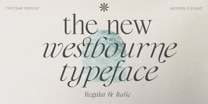 Westbourne Modern Serif Typeface is a stylish font It has both modern look. Comes with alternatives and ligatures, helps to create stunning logos, quotes, posts, blog posts. branding projects, magazine imagery, wedding invitations, and much more. WHAT'S YOU GET ? Westbourne Regular and Italic Unique Letterforms Works on PC & Mac Simple Installations Accessible in the Adobe Illustrator, Adobe Photoshop, Microsoft Word Fully accessible without additional design software. I really hope you'll get pleasure using Westbourne font and it will be perfect addition to your font collection! Contact me with an inbox message If you have any question. Thank you! Happy Creating.
 - Rotundus Rounded by dayflash,
$35.99 Rotundus Rounded is a rounded sibling of Rotundus, an elegant sans serif typeface based on geometric shapes. Precise lines and accurate curves with soft edges are the main characteristics of this fresh and modern font family. While unconventional letterforms give Rotundus Rounded its distinctive appearance, a tall x-height and a condensed width provide good legibility and nice readability even at smaller sizes. With its contemporary feel, Rotundus Rounded is suitable for almost any type of analogue and digital application. The Rotundus Rounded font family includes unique letterforms, exclusive ligatures and extensive OpenType features. Rotundus Rounded comes in six weights with matching italics.
 - Asking Ladies by Youngtype,
$18.00 New Asking Ladies Beautiful Modern Serif . This professional resource is also powerful because each font has its own magical design. Equipped with three versions Regular, Italic & Bold. You can use it for almost anything like blog headers, posters, wedding elements, t-shirts, clothing, book covers, business cards, greeting cards, branding, invitations and quotes, and so on. Feature: Uppercase Lowercase Number Accents (multilingual characters) How To Access Alternate Characters: https://www.youtube.com/watch?v=Go9vacoYmBw https://www.youtube.com/watch?v=XzwjMkbB-wQ https://www.youtube.com/watch?v=x1A_ilsBsGs https://www.youtube.com/watch?v=xFlMwARHusY https://www.youtube.com/watch?v=NVJlZQ3EZU0 Thanks for your purchase!
 - Lark by Shana Hu,
$20.00 Lark is a modern calligraphic sans inspired by a rich history of broad-edge and translation contrast calligraphy. By combining its sharp geometry with flared curves, Lark exhibits a nice warmth as a display face. Lark was initially conceived as a final project as part of the Type@Cooper West Extended Program's post-graduate certificate program in typeface design, so its journey has benefitted from routine feedback from experienced typeface designers. Comes in Bold, Medium, Regular, and Light weights for both roman and italic, and supports multiple languages including Danish, Dutch, English, French, German, Italian, Portuguese, Spanish, Swedish, and more.
 - Minor by Glen Jan,
$25.00 Minor is contemporary simple equable text grotesk in 6 weights with italics. It combines the best features of neo- and humanist sans types for legibility and easy reading. Clean design and balanced white spaces enables using Minor for long texts. Or in any other work as secondary invisible type in pair with display face. Using as primary type in large sizes it, static and non-emotional, will focus attention to text content. Minor family supports Latin Extended-A (Western, Central Europe, Baltic, Turkish) and Cyrillic Extended encoding languages. All styles contain basic OT-features and numeric forms for text typography.
 - Karol by Type-Ø-Tones,
$60.00 Karol was designed in 2011 as a project in the MA in Advanced Typography from EINA/UAB, in Barcelona. It was born as text typeface inspired by the work of East European type designers. Two years later, Karol is ready for public release, in a collection of eight styles (four weights and matching italics) with high readability, strength and character. A few days before its publication, we received the news that Karol had been awarded the Certificate of Typographic Excellence (Judges’ Choice) of the Type Directors Club. Please check the ‘Read me’ file located in the gallery for more specifications.
 - Miegha by Dora Typefoundry,
$18.00 Miegha is a serif typeface inspired by the beauty of classic serif and calligraphy styles, Both upright and italic fonts blend with modern appeal and unique binding, high contrast and light weight font perfect for feminine logo signs, fashion heads & editorial designs, branding projects , Apparel Branding, packaging, magazine titles, advertisements, T-shirts, postcards and more. Here's what's included: · Alternates & Ligatures · Numbers & punctuation · Characters with accents · Supports Multiple Languages · PUA Encoded This type of family has become the work of true love, making it as easy and fun as possible. I really hope you enjoy it! Thank You!
 - Niveau Grotesk by HVD Fonts,
$40.00 Niveau Grotesk—the companion of Niveau Serif —is a type family of six weights plus matching italics and small caps. It was designed by Hannes von Döhren in 2013. Influenced by classical nineteenth-century faces, the fonts are based on geometric forms. Because of its straight architecture, Niveau Grotesk has a “punch” in big sizes but is very legible in smaller sizes and longer texts—in print or on screen. Niveau Grotesk is equipped for complex, professional typography with alternate letters, arrows, fractions and an extended character set to support Central and Eastern European as well as Western European Languages.
 - Brown Hunter Vic by Alit Design,
$15.00 Brown Hunter Inspired by the design style of the 1830s, the elegant Victorian style design is full of charming sharp curves. Designs with a classic Victorian style from the cruel era, people always use it for redesigning needs or creating new designs. The Brown Hunter typeface is designed in an elegant Victorian style which contains many font characters which when combined will make an attractive design and of course very cool. Included in the download package are: Brown Hunter Vic, which is a classic Victorian serif style and contains swash and alternatives, there are two types of Brown Hunter Vic, the standard one and the hold one, which contains ornaments on the inside of the body. Brown Hunter Script is an elegant street writing style made with spontaneous and sharp brush strokes giving a bold impression. Brown Hunter Dis is a Serif display style font that is intended for subtitles in designs, besides this font has 13 families from thin to heavy. Brown Hunter Black is a font with a charming black letter style and is still comfortable to read when used for body text in a classic Victorian style. This font also has 13 families from thin to heavy so it can be used for headers or body text. Brown Hunter Ornament is a font made with a unique orament shape in the classic Victorian style, besides that there are also border frames, animal vectors, silhouette logos, flowers and many more. With 4 styles and 30 different fonts, the Brown Hunter typeface when combined will create a cool design and a Victorian concept. By collecting Brown Hunter Typeface you can easily create classic, Victorian and elegant themed designs. Brown Hunter is perfect for designing vodka labels, beer, pomade, logo tattoos, book covers, t-shirts and so on.
 - Hernández Niu by Latinotype,
$29.00 In the typedesign industry the terms ‘nova’, ‘neue’, ‘next’, ‘new’ are often used to refer to a typeface that has been modified in different ways: redesign, technical readjustments, greater number of characters, etc. At Latinotype we are now starting to use the word ‘niu’ to refer to these kinds of typefaces. Niu is an adaptation of the original word ‘new’, i.e., we have adapted this English word to the phonology and spelling of our own language but keeping the original meaning. Race mixing, diversity, change and adaptation are part of the essence of Latin American culture and, at Latinotype, we are all constantly expressing these elements in everything we do. Latin Power! Hernández Niu was designed by César Araya and Daniel Hernández. The font is based on the design of Hernández Bold: the thickest weight has been adapted to fit small text better. Five new styles have been added, ranging from neutral to more expressive fonts. Hernández Niu is a display slab serif font of thickened serifs, functional expressive ink-traps and true italics. Detailed forms and counterforms allow this typeface to be used in very large sizes. Hernández Niu is well-suited for publishing, small text and headlines. A wide variety of weights make the font a perfect choice for hierarchical type-setting, branding, logotypes, magazines, etc. This font consists of 6 weights, ranging from Extra Light to Heavy, each with matching true italics. Hernández Niu comes with a set of 397 characters, making it possible to use the font in 212 different languages.
 - Stempel Sans Print Neo by TypoGraphicDesign,
$9.00 The typeface Stempel Sans Print Neo is designed from 2022 for the font foundry Typo Graphic Design by Manuel Viergutz. The display font based on a original set of 29 old rubber stamps (6 cm height). Digitized via hand-stamped, a scanner and Glyphs app. 3 font-styles (Rough, Misprint, Black) with 321 glyphs incl. decorative extras like icons, arrows, dingbats, emojis, symbols, geometric shapes (type the word #LOVE for ♥︎or #SMILE for ☻ as OpenType-Feature dlig) and stylistic alternates (6 stylistic sets). For use in logos, magazines, posters, advertisement plus as webfont for decorative headlines. The font works best for display size. Have fun with this font & use the DEMO-FONT (with reduced glyph-set) FOR FREE! Font Specifications ■ Font Name: Stempel Sans Print Neo ■ Font Styles: 3 font styles (Rough, Misprint, Black) + DEMO (with reduced glyph-set) ■ Font Category: Display Script for headline size ■ Glyph Set: 321 glyphs (incl. decorative extras) ■ Language Support (36 languages): Asu Bemba Bena Chiga Cornish English German Gusii Indonesian Kalenjin Kinyarwanda Luo Luyia Machame Makhuwa-Meetto Makonde Morisyen North Ndebele Nyankole Oromo Rombo Rundi Rwa Samburu Sangu Shambala Shona Soga Somali Swahili Swiss German Taita Teso Uzbek (Latin) Vunjo Zulu ■ OpenType features (16): aalt calt case ccmp dlig liga lnum onum ss01 ss02 ss03 ss04 ss05 ss06 mark mkmk ■ Design Date: 2022 ■ Type Designer: Manuel Viergutz
 - Letterpress Studio by Fenotype,
$15.00 Letterpress Studio -Crafted Vintage Goods Letterpress Studio includes following • 7 fonts - a textured and clean version of each • Ornaments • Catchwords • 25 Logo Templates Letterpress Studios core is seven fonts - textured and clean version of each. Fonts are designed in same proportions and work great together. Here’s a short introduction to the fonts: • Letterpress Script -A connected script with lot’s of OpenType features • Letterpress Script Bold -Bold version of Letterpress Script • Letterpress Condensed -A condensed sans-serif typeface with swash uppercase characters on • Letterpress Gothic -A sans-serif typeface with swash uppercase characters • Letterpress Sans -An extended sans-serif typeface with swash uppercase characters • Letterpress Wood -A woodcut style serif typeface with swash uppercase characters • Letterpress Black -A black woodcut style serif typeface with swash uppercase characters • Letterpress Ornaments -A set of pictograms, ornaments, borders and badges (OTF, AI & PDF) • Letterpress Catchwords -A set of over 100 woodcut-style catchwords (OTF, AI & PDF) All fonts have West European, Central European, Baltic, Turkish and Romanian character sets. Fonts come in OTF format. TTF are also available but OpenType features won’t work with them. Letterpress Templates -25 templates (AI) Letterpress Templates is a set of 25 ready made compositions with font pairings, shapes, ornaments and ready made 2-4 color schemes for each. Templates can be used as such or as a starting point for your own project. Download Letterpress Templates here.
 - Kobern by The Northern Block,
$19.30 A strong, horizontal sans serif typeface. The letterforms distinct lateral emphasis combined with condensed proportions helps improve readability and use of space across layouts. Ideally suited for a wide range of modern applications, details include 9 weights with italics, 540 characters, 5 variations of numerals, manually edited kerning and Opentype features.
 - Shiva by Dharma Type,
$19.99 Shiva font family is a very narrow family for text and titling. Even though shiva has very thin strokes, the letterforms give a strong, impactful and dignified image. a, e, f, g & y in Roman and g & y Italic have their alternate glyphs that can be used with OpenType salt feature.
 - Antibes by Barmoor Foundry,
$15.00 Antibes is a casual italic face with print caps and cursive lowercase letters. Antibes works well with colorful, freeform illustration and travel-related material like illustrated travel brochures and callouts for maps. All-caps paragraphs are an easy read and letter-spaced all-cap treatments can be used for titling.
 - Cocomate by 4RM Font,
$35.00 Inspired by classic art, the cocomate font is the epitome of beauty and strong authenticity that is embodied in the art of typography. made with the characteristic variations of italic contrast and bold size in the letters. suitable for use in graphic designs such as logos, labels, packaging and others.
 - Ethem by Ixipcalli,
$32.00 Ethem is a semi-geometric typeface, ideal for posters and flyers. Provides three weights: light, regular, and bold without leaving out the italics of each. The Ethem font family provides six typefaces. If you need a strong, prominent or dominant typeface in your project, Ethem font is the ideal typeface.