10,000 search results
(0.038 seconds)
- Guaruja Neue by Tipogra Fio,
$- Get in touch with Tipogra Fio and get inspired by Guaruja Neue specimens. Guaruja Neue is a neo-grotesque typeface with additional industrial traits to it, such as open corners in diagonal glyphs and short curves. The semi-cursive italics shapes, more than an orthographic matter, give sea waves for the headlines and copies that Guaruja Neue will compose, since it is named after a city on the coast of São Paulo, Brazil. Stylistic alternates, ligatures, ordinals, arrows and emojis give extra personality for texts that cross millennial and modernist concepts, going from a comprehensive Latin script, including Vietnamese support, until a basic Cyrillic set. Brazilian music tells the graphic story of Guaruja Neue specimens, songs that speak about beaches and the city of Guarujá, as well as the inspiration of 50’s and 60’s modernist design and the music movement of Bossa Nova. This family is also an evolution of Guaruja Grotesk (2021), a typeface with four fonts —Regular, Italic, Bold and Bold Italic— developed as part of a design school project, that now in Neue gains professionalism, refinement and knowledge. Guaruja Grotesk took 18 months to make, and Neue took additional 12 months of redrawing and rethinking, as design as processes. Part of the project got feedback from the typeface designer Ulrike Raush, under the Alphabettes mentorship program. Overview and features: 8 weights and 8 italics; 2 free fonts: Guaruja Neue Regular and Guaruja Neue Italic; Extended Latin and basic Cyrillic; 800+ glyphs; Numbers: proportional, tabular, superscripts, subscripts, denominators, numerators and fractions; Greek for math; Case-Sensitive forms; Arrows; Standard and discretionary ligatures; SS01: one story a and SS02: two story g; Emojis and SS03: negative alternate emojis; Ligatures for English ordinals;
 - PF Nuyork Arabic by Parachute,
$79.00 Nuyork Arabic was designed to emphasize on the individual Arabic letter visual traditional characteristics. Including 5 weights, it was designed with both text and display applications in mind. This font is intended to produce virtually cursive texts without eliminating the clarity or look-and-feel of the individual Arabic letters. Offering glyphs for the full Extended Arabic Unicode Standards 6.1, including the latest Arabic Supplement and Extended-A Unicode blocks, Nuyork Arabic incorporates comprehensive support for Quranic texts and other Arabetic scripts, including African sub-Saharan scripts. Careful design considerations were given to make sure that composed Arabetic text is visually prominent and stands well next to Latin. To insure legibility in all sizes, vertical strokes are emphasized when possible, while utilizing multiple x-heights to give a traditional Arabic feel. The design of this font follows the general guidelines of the Mutamathil type style developed by the designer, a decade ago, to enrich and diversify user typographic options, and to address the Arabetic scripts challenges of literacy, education, economics, and technology. Based on this style, it uses one glyph for every basic Arabic Unicode character or letter, as defined by the latest Unicode Standards, and one additional final form glyph, for each freely-connecting letter in the traditional Arabic cursive text. Nuyork Arabic includes the required Lam-Alif ligatures in addition to all vowel diacritic ligatures. Soft-vowel diacritic marks (harakat) are selectively positioned, with most of them appearing on similar high and low levels to clearly distinguish them from the letters. Tatweel, or Kashidah, is a zero-width glyph. Arabetics Latte includes both Arabic and Arabic-Indic numerals. Available in Open Type format, the Nuyork Arabic font family includes regular, light, bold, extra bold, and black.
 - Aure Teddy by Aure Font Design,
$23.00 Aure Teddy emanates the trusting tenderness of a favorite teddy bear. The hand-penned look of these forms engages the reader with a subtext of comfort. Teddy is delightfully legible as a text font and works well where a more organic look is wanted. It brings an unassuming charm to text and titles and a welcome empathy to astrological expressions and chartwheels. Its engaging charcter serves well in labeling diagrams and personalizing nametags. Teddy is an original design developed by Aurora Isaac. After more than a decade in development, 2018 marks the first release of the CJ and KB glyphsets in regular, italic, bold, and bold-italic. The CJ glyphset is a full text font supporting a variety of European languages. A matching set of small-caps complements the extended lowercase and uppercase glyphsets. Supporting glyphs include standard ligatures, four variations of the ampersand, and check-mark and happy-face with their companions x-mark and grumpy-face. Numbers are available in lining, oldstyle, and small versions, with numerators and denominators for forming fractions. Companion glyphs include Roman numerals, specialized glyphs for indicating ordinals, and a variety of mathematical symbols and operators. The CJ glyphset also includes an extended set of glyphs for typesetting Western Astrology. These glyphs are also available separately in the KB glyphset: a symbol font re-coded to allow easy keyboard access for the most commonly used glyphs. Aure Teddy fills a unique niche, being a modestly decorative font as well as a competant text font. Like Aure Jane, Aure Teddy serves well paired with the decorative touches of Aure Brash and Aure Sable. Give Aure Teddy a trial run! You may discover a permanent place for this font family in your typographic palette. AureFontDesign.com
 - Gomoku by Typodermic,
$11.95 Introducing Gomoku—the chunkiest, sweetest, most playful paper cut-out typeface you’ll ever lay your eyes on! With its bold and thick slab serifs, this typeface is sure to make a statement and add a touch of whimsy to any design. Gomoku’s foreground font is the star of the show, featuring a thick and chunky design that demands attention. But why stop there? Gomoku’s optional background layer adds a whole new level of depth and texture to your typography, making it stand out from the crowd. Whether you’re designing posters, greeting cards, or social media graphics, Gomoku is the perfect font choice to add a quirky and playful touch to your project. So why settle for boring, basic fonts when you can have Gomoku’s delightful paper cut-out design? Get your hands on Gomoku today and start creating bold and beautiful designs that are sure to make a lasting impression. Most Latin-based European writing systems are supported, including the following languages. Afaan Oromo, Afar, Afrikaans, Albanian, Alsatian, Aromanian, Aymara, Bashkir (Latin), Basque, Belarusian (Latin), Bemba, Bikol, Bosnian, Breton, Cape Verdean, Creole, Catalan, Cebuano, Chamorro, Chavacano, Chichewa, Crimean Tatar (Latin), Croatian, Czech, Danish, Dawan, Dholuo, Dutch, English, Estonian, Faroese, Fijian, Filipino, Finnish, French, Frisian, Friulian, Gagauz (Latin), Galician, Ganda, Genoese, German, Greenlandic, Guadeloupean Creole, Haitian Creole, Hawaiian, Hiligaynon, Hungarian, Icelandic, Ilocano, Indonesian, Irish, Italian, Jamaican, Kaqchikel, Karakalpak (Latin), Kashubian, Kikongo, Kinyarwanda, Kirundi, Kurdish (Latin), Latvian, Lithuanian, Lombard, Low Saxon, Luxembourgish, Maasai, Makhuwa, Malay, Maltese, Māori, Moldovan, Montenegrin, Ndebele, Neapolitan, Norwegian, Novial, Occitan, Ossetian (Latin), Papiamento, Piedmontese, Polish, Portuguese, Quechua, Rarotongan, Romanian, Romansh, Sami, Sango, Saramaccan, Sardinian, Scottish Gaelic, Serbian (Latin), Shona, Sicilian, Silesian, Slovak, Slovenian, Somali, Sorbian, Sotho, Spanish, Swahili, Swazi, Swedish, Tagalog, Tahitian, Tetum, Tongan, Tshiluba, Tsonga, Tswana, Tumbuka, Turkish, Turkmen (Latin), Tuvaluan, Uzbek (Latin), Venetian, Vepsian, Võro, Walloon, Waray-Waray, Wayuu, Welsh, Wolof, Xhosa, Yapese, Zapotec Zulu and Zuni.
 - Zekton by Typodermic,
$11.95 Welcome to the world of Zekton. This typeface is not for the faint of heart. With its square letterforms and sharp edges, Zekton brings a brave, industrial look to your designs. The uniform line widths and smooth curves give this typeface a serious and professional feel, perfect for the world of consumer electronics. When you use the Zekton typeface, you’ll bring a fresh and modern AM/FM portable stereo fragrance to your designs. It’s like having a pocketful of transistors at your fingertips, ready to power up your creativity. And with a twinkle in its eye, Zekton promises to add a touch of excitement to every project. Zekton is available in seven weights, two widths, and italics for a total of 42 styles. This versatility makes it easy to find the perfect fit for your project. Whether you’re designing a sleek product brochure, a cutting-edge website, or a tech manual, Zekton has the style and range to help you stand out. So if you’re ready to take your designs to the next level, give Zekton a try. It’s the typeface that’s built to handle the toughest industrial challenges, and it’s ready to help you make a bold statement in the world of consumer electronics. Most Latin-based European, and some Cyrillic-based writing systems are supported, including the following languages. A Afaan Oromo, Afar, Afrikaans, Albanian, Alsatian, Aromanian, Aymara, Bashkir (Latin), Basque, Belarusian (Latin), Bemba, Bikol, Bosnian, Breton, Bulgarian, Cape Verdean, Creole, Catalan, Cebuano, Chamorro, Chavacano, Chichewa, Crimean Tatar (Latin), Croatian, Czech, Danish, Dawan, Dholuo, Dutch, English, Estonian, Faroese, Fijian, Filipino, Finnish, French, Frisian, Friulian, Gagauz (Latin), Galician, Ganda, Genoese, German, Greenlandic, Guadeloupean Creole, Haitian Creole, Hawaiian, Hiligaynon, Hungarian, Icelandic, Ilocano, Indonesian, Irish, Italian, Jamaican, Kaqchikel, Karakalpak (Latin), Kashubian, Kikongo, Kinyarwanda, Kirundi, Komi-Permyak, Kurdish (Latin), Latvian, Lithuanian, Lombard, Low Saxon, Luxembourgish, Maasai, Macedonian, Makhuwa, Malay, Maltese, Māori, Moldovan, Montenegrin, Ndebele, Neapolitan, Norwegian, Novial, Occitan, Ossetian, Ossetian (Latin), Papiamento, Piedmontese, Polish, Portuguese, Quechua, Rarotongan, Romanian, Romansh, Russian, Sami, Sango, Saramaccan, Sardinian, Scottish Gaelic, Serbian, Serbian (Latin), Shona, Sicilian, Silesian, Slovak, Slovenian, Somali, Sorbian, Sotho, Spanish, Swahili, Swazi, Swedish, Tagalog, Tahitian, Tetum, Tongan, Tshiluba, Tsonga, Tswana, Tumbuka, Turkish, Turkmen (Latin), Tuvaluan, Uzbek (Latin), Venetian, Vepsian, Võro, Walloon, Waray-Waray, Wayuu, Welsh, Wolof, Xhosa, Yapese, Zapotec Zulu and Zuni.
 - Vezus Serif Texture by Tour De Force,
$15.00 Vezus Serif Texture is as the name says itself, textured version of Vezus Serif font family and as that, it's compatible with Vezus Serif Black. It is adviced to be used as desktop font only.
 - Congratulatory Latin by Dmitriy Shchetinskiy,
$19.00 Congratulatory font consist of 36 calligraphic latin greetings letterings for different event. Letterings are original and handwritten. This font makes it possible to use high quality calligraphy in your projects - greeting cards, invitation cards etc.
 - Mooncake by RA Studio,
$10.00 He is round. He is funny. He is Mooncake font. It is perfect for eye-catching signs, posters, headers, product packaging, book cover, logotype, apparel design and etc. Display font Extended latin & cyrillic 600 glifs
 - Little Mess by Gleb Guralnyk,
$12.00 Hi! Introducing this handcrafted calligraphic script named "Little Mess". It's made with a calligraphic pen in a casual rough style. It has a multilingual support and several ligatures. Thank you and have a great day!
 - Congrats 36 by Dmitriy Shchetinskiy,
$19.00 Congrats36 font consist of 36 calligraphic greetings letterings. Letterings are original and handwritten. This font makes it possible to use high quality calligraphy in your projects - greeting cards, certificates, invitation cards, letters of commendation etc.
 - Oaklinn by Awanstudio,
$15.00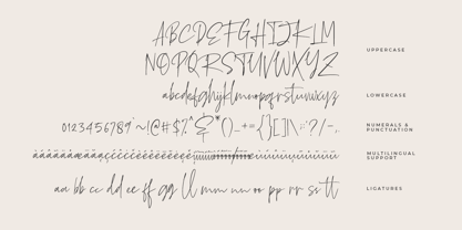 Oaklinn is a handwriting script font. It allows you to create stunning and easy hand-lettering in an instant. Ideal for the logo, quotes, product label/packaging, fashion, letter, advertising, poster, merchandise, greeting cards, etc
 - Circus Peanut by Elemeno,
$25.00With a rounded shape and a burlap texture, what else could we call this font? Circus Peanut is oblique and comes equipped with its own drop shadow. It's meant to be used at large sizes. - Chiara Script by Greater Albion Typefounders,
$14.95 Chiara Script has a very simple origin. It's a highly stylized interpretation of Greater Albion's chief designer's handwriting! It combines legibility and cursive characters in a distinctive blend and includes a range of OpenType features.
 - Kinver by Greater Albion Typefounders,
$15.00 Kinver owes it’s inspiration to the masthead of a 19th century handbill. It is designed to particularly complement our extensive ‘Imperial Granum’ typeface family. Bring the spirit of Victorian flair to your next design project!
 - Vigallse by Krakenbox Studio,
$17.00 Vigallse – Vintage Modern Serif Typeface. It has vintage, modern, classic & elegant. It’s a great font for fashion, apparel projects, signature, album cover, logo, branding, magazine, social media, & advertisements, but also works great for other projects.
 - Basely Bagel by RA Studio,
$12.00 He is round. He is funny. He is Bagel font. It is perfect for eye-catching signs, posters, headers, product packaging, book cover, logotype, apparel design and etc. Display font Extended latin & Cyrillic 605 glifs
 - Work In Progress by StereoType Fonts,
$39.00 Work In Progress is a smooth script font with a very specific style of connected curves. It brings a unique curly style with the possibility to create dynamic dancing words with it's ligatures and alternates.
 - Aubrielle by Awanstudio,
$13.99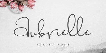 Introducing Aubrielle script font! It allows you to create stunning and easy hand-lettering in an instant. Ideal for the logo, quotes, wedding, product label/packaging, fashion, letter, advertising, invitation, poster, merchandise, greeting cards, etc.
 - Bartdeng by Doeltype,
$15.00 Bartdeng is a luxury Handwritten Font with a new stylish, a perfection style of the letters you want to use, modern handwriting with many alternatives. Now this is an OpenType! It's smart and in line with your wishes! You are welcome to use it, suitable for various purposes: logo, signatures, corporate symbol, wedding invitation, title, creative, t-shirt, business card, letterhead, nameplate, headings, label, poster, news, badge, letterhead, cutting, hot stamping, quotation, etc. Bartdeng Features 535 glyphs and alternative characters. Includes the initial letter to terminal, alternative, ligature and multiple language support. Programs that support OpenType features such as Adobe Photoshop CC, Adobe Illustrator CS, Adobe Indesign, Corel Draw, and Microsoft Office.
 - Lovely Kiss by Fidan Fonts,
$19.80 Lovely Kiss is a handwritten classy script font. It includes full set of uppercase and lowercase basic characters, multilingual symbols, numerals, punctuation and ligatures (check the previews in order to see them all). It's works perfectly for wedding stationery, elegant branding, book cover designs, packaging, album covers, handwritten quotes, greeting cards, social media posts, and many more. Latin-based Language Support (You can check your language typing characters in text box below). If you want to type with stylistic ligatures make sure you have them turned on (use a capable software like Photoshop, Illustrator, InDesign, Word, Pages etc). Note: If you don't use this font with these programs stylistic ligatures won't work. Happy creating!
 - Reivant by Groen Studio,
$20.00 Reivant is a script font, so this beautiful and unique script font is a model of modern calligraphy typography combined with calligraphy writing style. Reivant Grunge is a script font, so it's made with a different touch, namely it has a cracked texture and the style is the same as Reivant Regular. The Features of this fonts is: Contextual Alternates Standart ligatures Discretionary ligatures Swash Alternates Stylistic Alternates Stylistic sets Can be used for various purposes. such as headings, logos, wedding invitations, t-shirts, letterheads, signage, labels, news, posters, badges etc. To enable the OpenType Stylistic alternative, you need a program that supports OpenType features such as Adobe Illustrator CS, Adobe Indesign & CorelDraw X6-X
 - Anatomia by Doeltype,
$20.00 Hello All.... Introducing!! Anatomia is a beautiful script with a new lovely stylish, a perfection style of the letters you want to use, modern handwriting with many alternatives. Now this is an opentype! It's smart and in line with your wishes! You are welcome to use it, suitable for various purposes: logo, signatures, corporate symbol, wedding invitation, title, creative, t-shirt, business card, letterhead, nameplate, headings, label, poster, news, badge, letterhead, cutting, hot stamping, quotation, etc. Anatomia Features 567 glyphs and alternative characters. Includes the initial letter to terminal, alternative, ligature and multiple language support. Programs that support OpenType features such as Adobe Photoshop CC, Adobe Illustrator CS, Adobe Indesign, Corel Draw, and Microsoft Office.
 - Al Brachella Drumal by Aluyeah Studio,
$99.00 Brachella Drumal, a Graceful and Elegant Display Font Coming to you with 30+ stunning alternate and ligature to create a perfectly mystical, beautiful, classy, elegant design. Features: OpenType support Multilingual support (15 languages) PUA Encoded Super Easy to Use alternates - It's OpenType support but you can easily call alternates character using special combination like A.2 B.2 k.2 etc. so you don't need special software. To get results like the preview just type B.2r.2ach.2ella.2 D.2r.2umal.3 Thanks for checking out my font. I really hope you enjoy using it! If you have any questions I'd be more than happy to answer them, just send me a message!
 - HG Soei Kakupoptai by RICOH,
$199.00 HG創英角ポップ体は、水本恵子氏がデザインした「創英ポップ体1」を字母とする書体です。店頭広告用文字のスタイルを模して作られた書体で、楽しく、軽快な書体です。極太角ゴシックのイメージをベースに作られていますが、それをやや崩し、柔らかさも取り入れ、フリーハンドで書いたイメージを残しています。見やすくするため、ふところは可能な限り大きくなっています。店頭のPOP、チラシ、看板などに最適の書体です。 HG Soei Kakupoptai is a typeface with a "fresh pop" designed by Mr. Mizumoto Keiko. It is a typeface made by mimicing the style of letters for party-style, fun and light typefaces. It is made on the basis of the image of thickSoei Kakugothic, but it breaks it open, and incorporates softness, leaving the font looking freehand. To make it easy to see, the boldness has become as thick as possible. It is a typeface best suited for store-front fun, leaflets, signboards and so on.
 - Gearing by Heyfonts,
$15.00 Gearing is a typeface that is widely associated with the extreme music genre of death metal. It is characterized by its dark and aggressive appearance, evoking a sense of brutality and chaos. The font is typically designed with sharp edges, bold and angular letterforms, and intricate or distorted shapes. The death metal font typically features strong upper and lowercase letter variations, often with sharp, exaggerated serifs or thorn-like spikes. These embellishments contribute to its menacing and threatening aesthetic. The letters may also have broken or damaged elements, giving them a weathered or decayed look. Though death metal fonts come in various styles and variations, they often prioritize legibility and impact over ease of reading. This means that certain parts of the letters may be missing or disconnected, making them appear jagged or incomplete. Ligatures, which are unique letter combinations, are sometimes included in the font to add a sense of continuity or artwork to the overall design. In terms of color, death metal fonts are commonly depicted in monochromatic shades such as black, grey, or dark red to maintain their sinister appearance. The color contrast often enhances the sharpness and intensity of the font, making it more visually striking. Due to its association with the underground music scene, the death metal font has become an essential element in album covers, band logos, posters, and merchandise. It effectively conveys the aggressive and rebellious spirit of the genre, becoming instantly recognizable to fans and enthusiasts.
 - Technotyp by URW Type Foundry,
$39.99 The digital font Technotyp is based on the hot metal typeface created by the German typographer and type designer Herbert Thannhaeuser (1898-1963) for the former East German type foundry Typoart in Dresden. In the typography book ‘Der Schriftsetzer’ (Fachbuchverlag, Leipzig, 1952), by Paul Fritzsche, this absolutely beautiful slab serif design is presented in all its variations. Fritzsche remarked that – because of its rather condensed form and its relatively long ascenders – the 'Werkschrift' of the Technotyp (comparable with our 'Regular') seemed to be very well suited to serve as a text face, and recommended for this purpose that the face be cut for the composing machine. However, this never happened and the entire Technotyp family was made available for hand composition only. This is finally changing and being remedied for good now: URW++ proudly presents the new digital version of this really charming font family with its distinct flavor of the 1950s, adding it to the other digital renditions of Herbert Thannhaeuser fonts at URW++, namely Garamond No. 4 and Magna. The original Typoart family had an italic style for the light version only. The new digital version of Technotyp includes italic styles for the regular, medium and bold weights as well, enhancing the family to meet today’s standards and requirements for professional type setting. To further increase its usefulness, Cyrillic faces were created, too. True to the standard for all digital fonts at URW++, the character set for Technotyp covers all West- and East European languages.
 - Moon Cresta by Typodermic,
$11.95 Introducing Moon Cresta, a charming typeface with a soft design that’s sure to captivate your audience. The font draws inspiration from the timeless Goudy Sans, while embracing a modern and minimalist style. Moon Cresta’s smooth curves and effortless flow give it a welcoming and friendly vibe, perfect for any design project. Initially, Moon Cresta only came in one style—Regular, which boasts a bold weight that demands attention. However, as designers fell in love with its delicate charm, a lighter weight was later added. To avoid any confusion, the original bold style was still named Regular, and the newer weight became known as Light. So, now you can enjoy the gentle touch of Moon Cresta in two weights—Regular and Light. To take your design to the next level, Moon Cresta also includes discretionary f-ligatures and custom ligatures for KA and RA. Simply use your application’s Discretionary Ligatures feature to access them and enhance the uniqueness of your design. In short, Moon Cresta is the perfect font for those seeking a soft, organic design with a touch of modernity. So why not try it out and see how it can add a touch of warmth to your project? Most Latin-based European writing systems are supported, including the following languages. Afaan Oromo, Afar, Afrikaans, Albanian, Alsatian, Aromanian, Aymara, Bashkir (Latin), Basque, Belarusian (Latin), Bemba, Bikol, Bosnian, Breton, Cape Verdean, Creole, Catalan, Cebuano, Chamorro, Chavacano, Chichewa, Crimean Tatar (Latin), Croatian, Czech, Danish, Dawan, Dholuo, Dutch, English, Estonian, Faroese, Fijian, Filipino, Finnish, French, Frisian, Friulian, Gagauz (Latin), Galician, Ganda, Genoese, German, Greenlandic, Guadeloupean Creole, Haitian Creole, Hawaiian, Hiligaynon, Hungarian, Icelandic, Ilocano, Indonesian, Irish, Italian, Jamaican, Kaqchikel, Karakalpak (Latin), Kashubian, Kikongo, Kinyarwanda, Kirundi, Kurdish (Latin), Latvian, Lithuanian, Lombard, Low Saxon, Luxembourgish, Maasai, Makhuwa, Malay, Maltese, Māori, Moldovan, Montenegrin, Ndebele, Neapolitan, Norwegian, Novial, Occitan, Ossetian (Latin), Papiamento, Piedmontese, Polish, Portuguese, Quechua, Rarotongan, Romanian, Romansh, Sami, Sango, Saramaccan, Sardinian, Scottish Gaelic, Serbian (Latin), Shona, Sicilian, Silesian, Slovak, Slovenian, Somali, Sorbian, Sotho, Spanish, Swahili, Swazi, Swedish, Tagalog, Tahitian, Tetum, Tongan, Tshiluba, Tsonga, Tswana, Tumbuka, Turkish, Turkmen (Latin), Tuvaluan, Uzbek (Latin), Venetian, Vepsian, Võro, Walloon, Waray-Waray, Wayuu, Welsh, Wolof, Xhosa, Yapese, Zapotec Zulu and Zuni.
 - Midsole SC by Grype,
$16.00 Geometric/Technical style logotypes have been developed for car chrome labels since the early 1980’s, but automobile companies don't monopolize the style by any means. Shoe companies have a foothold in the geometric sans serif styles as well, and range from straightforward to full of techno styled play. Nonetheless, these logotypes all lack an expansive family which shows off all the logotypes are and what they "could" be and do. And that's where we come in. The Midsole SC Family finds its origin of inspiration in the CONVERSE shoe company logo, or an older version of their logo, and from there we expanded it into a 40 font family of weights, widths, and obliques. Midsole pays homage to the styling of the earlier logotype, including unicase variations to match the original look, while further evolving beyond the brand inspiration to yield a family that pulls on modern and historical styles. It adopts a sturdy yet approachable and recognizable style with its uniform stroke forms and curves, and goes on to include smallcaps, numerals, and a comprehensive range of weights, creating a straightforward, uncompromising collection of typefaces that lend a solid foundation and a broad range of expression for designers. Here’s what’s included with the Midsole SC Family bundle: 489 glyphs per style - including Capitals, SmallCaps, Numerals, Punctuation and an extensive character set that covers multilingual support of latin based languages. (see the 10th graphic for a preview of the characters included) Stylistic Alternates - alternate characters and unicase variants for a less standardized text look. 4 weights in the family: Light, Regular, Medium & Bold. 4 obliques in the family, one for each weight: Light, Regular, Medium & Bold. Here’s why the Midsole SC Family is for you: - You’re in need of stylish sans font family with a range of weights and obliques. - You’re love that older CONVERSE letter styling, and want to design anything within that genre. - You’re looking for an alternative to Eurostile & Handel Gothic. - You’re looking for a clean techno typeface for your rave poster designs. - You just like to collect quality fonts to add to your design arsenal.
 - ATF Garamond by ATF Collection,
$59.00 The Garamond family tree has many branches. There are probably more different typefaces bearing the name Garamond than the name of any other type designer. Not only did the punchcutter Claude Garamond set a standard for elegance and excellence in type founding in 16th-century Paris, but a successor, Jean Jannon, some eighty years later, cut typefaces inspired by Garamond that later came to bear Garamond’s name. Revivals of both designs have been popular and various over the course of the last 100 years. When ATF Garamond was designed in 1917, it was one of the first revivals of a truly classic typeface. Based on Jannon’s types, which had been preserved in the French Imprimerie Nationale as the “caractères de l’Université,” ATF Garamond brought distinctive elegance and liveliness to text type for books and display type for advertising. It was both the inspiration and the model for many of the later “Garamond” revivals, notably Linotype’s very popular Garamond No. 3. ATF Garamond was released ca. 1918, first in Roman and Italic, drawn by Morris Fuller Benton, the head of the American Type Founders design department. In 1922, Thomas M. Cleland designed a set of swash italics and ornaments for the typeface. The Bold and Bold Italic were released in 1920 and 1923, respectively. The new digital ATF Garamond expands upon this legacy, while bringing back some of the robustness of metal type and letterpress printing that is sometimes lost in digital adaptations. The graceful, almost lacy form of some of the letters is complemented by a solid, sturdy outline that holds up in text even at small sizes. The 18 fonts comprise three optical sizes (Subhead, Text, Micro) and three weights, including a new Medium weight that did not exist in metal. ATF Garamond also includes unusual alternates and swash characters from the original metal typeface. The character of ATF Garamond is lively, reflecting the spirit of the French Renaissance as interpreted in the 1920s. Its Roman has more verve than later old-style faces like Caslon, and its Italic is outright sprightly, yet remarkably readable.
 - Neuzon by Typodermic,
$11.95 Neuzon pays homage to the bygone era of antique metal typesetting with a retro design that brings an air of nostalgia and character to any project. This textured, inky typeface is a modern interpretation of the iconic Tempo Bold Extended typeface. One of the standout features of Neuzon is its unique custom letter pairings. These pairings help to break up the uniformity of repeating letters, adding a touch of artistry and originality to your designs. The result is a typeface that exudes rustic charm and a warm, authentic feel that is sure to leave a lasting impression on your audience. Designed with versatility in mind, Neuzon’s wide letterforms make it a great choice for a variety of design projects. It works particularly well as a headliner, instantly capturing attention and drawing the eye with its bold and engaging style. Whether you’re creating a vintage-themed poster or revamping your website, Neuzon’s distinctive personality is sure to leave a lasting impression. So why settle for bland, generic typefaces when you can bring your designs to life with the unique character and charm of Neuzon? Get your hands on this retro-inspired typeface today and take your designs to the next level. Most Latin-based European writing systems are supported, including the following languages. Afaan Oromo, Afar, Afrikaans, Albanian, Alsatian, Aromanian, Aymara, Bashkir (Latin), Basque, Belarusian (Latin), Bemba, Bikol, Bosnian, Breton, Cape Verdean, Creole, Catalan, Cebuano, Chamorro, Chavacano, Chichewa, Crimean Tatar (Latin), Croatian, Czech, Danish, Dawan, Dholuo, Dutch, English, Estonian, Faroese, Fijian, Filipino, Finnish, French, Frisian, Friulian, Gagauz (Latin), Galician, Ganda, Genoese, German, Greenlandic, Guadeloupean Creole, Haitian Creole, Hawaiian, Hiligaynon, Hungarian, Icelandic, Ilocano, Indonesian, Irish, Italian, Jamaican, Kaqchikel, Karakalpak (Latin), Kashubian, Kikongo, Kinyarwanda, Kirundi, Kurdish (Latin), Latvian, Lithuanian, Lombard, Low Saxon, Luxembourgish, Maasai, Makhuwa, Malay, Maltese, Māori, Moldovan, Montenegrin, Ndebele, Neapolitan, Norwegian, Novial, Occitan, Ossetian (Latin), Papiamento, Piedmontese, Polish, Portuguese, Quechua, Rarotongan, Romanian, Romansh, Sami, Sango, Saramaccan, Sardinian, Scottish Gaelic, Serbian (Latin), Shona, Sicilian, Silesian, Slovak, Slovenian, Somali, Sorbian, Sotho, Spanish, Swahili, Swazi, Swedish, Tagalog, Tahitian, Tetum, Tongan, Tshiluba, Tsonga, Tswana, Tumbuka, Turkish, Turkmen (Latin), Tuvaluan, Uzbek (Latin), Venetian, Vepsian, Võro, Walloon, Waray-Waray, Wayuu, Welsh, Wolof, Xhosa, Yapese, Zapotec Zulu and Zuni.
 - From the Internet by Typodermic,
$11.95 Introducing From the Internet, a sleek and pragmatic sans-serif typeface that exudes technical sophistication. The narrow and square shapes of this typeface create a compact and organized appearance, perfect for modern industrial design. With softened edges, the boxy letterforms have a sense of approachability that is sure to draw in any reader. From the Internet’s austere and uncomplicated style ensures that your message is delivered with clarity and precision. Its lack of intricate detail prevents any distractions, keeping the focus on the essential message. This typeface avoids clichés, ensuring that your designs are always fresh and unique, without any conspicuous sci-fi influences. This font’s versatility is enhanced by the “stylistic alternatives” feature available in OpenType-savvy applications, allowing for access to alternate versions of the “f” and “t” letters. From the Internet offers a range of styles, including Regular, Italic, Bold, and Bold Italic, each with its unique personality. Whether you’re looking to create sleek tech manuals or modern business presentations, From the Internet is the perfect typeface to convey your message with sophistication and style. Its pragmatic and precise style ensures that your designs will always be on-trend and highly readable, making it an excellent choice for any designer looking to create an impact. Most Latin-based European writing systems are supported, including the following languages. Afaan Oromo, Afar, Afrikaans, Albanian, Alsatian, Aromanian, Aymara, Bashkir (Latin), Basque, Belarusian (Latin), Bemba, Bikol, Bosnian, Breton, Cape Verdean, Creole, Catalan, Cebuano, Chamorro, Chavacano, Chichewa, Crimean Tatar (Latin), Croatian, Czech, Danish, Dawan, Dholuo, Dutch, English, Estonian, Faroese, Fijian, Filipino, Finnish, French, Frisian, Friulian, Gagauz (Latin), Galician, Ganda, Genoese, German, Greenlandic, Guadeloupean Creole, Haitian Creole, Hawaiian, Hiligaynon, Hungarian, Icelandic, Ilocano, Indonesian, Irish, Italian, Jamaican, Kaqchikel, Karakalpak (Latin), Kashubian, Kikongo, Kinyarwanda, Kirundi, Kurdish (Latin), Latvian, Lithuanian, Lombard, Low Saxon, Luxembourgish, Maasai, Makhuwa, Malay, Maltese, Māori, Moldovan, Montenegrin, Ndebele, Neapolitan, Norwegian, Novial, Occitan, Ossetian (Latin), Papiamento, Piedmontese, Polish, Portuguese, Quechua, Rarotongan, Romanian, Romansh, Sami, Sango, Saramaccan, Sardinian, Scottish Gaelic, Serbian (Latin), Shona, Sicilian, Silesian, Slovak, Slovenian, Somali, Sorbian, Sotho, Spanish, Swahili, Swazi, Swedish, Tagalog, Tahitian, Tetum, Tongan, Tshiluba, Tsonga, Tswana, Tumbuka, Turkish, Turkmen (Latin), Tuvaluan, Uzbek (Latin), Venetian, Vepsian, Võro, Walloon, Waray-Waray, Wayuu, Welsh, Wolof, Xhosa, Yapese, Zapotec Zulu and Zuni.
 - Midsole by Grype,
$16.00 Geometric/Technical style logotypes have been developed for car chrome labels since the early 1980’s, but automobile companies don't monopolize the style by any means. Shoe companies have a foothold in the geometric sans serif styles as well, and range from straightforward to full of techno styled play. Nonetheless, these logotypes all lack an expansive family which shows off all the logotypes are and what they "could" be and do. And that's where we come in. The Midsole Family finds its origin of inspiration in the CONVERSE shoe company logo, or an older version fo their logo, and from there expanded it into a 40 font family of weights, widths, and obliques. Midsole pays homage to the styling of the earlier logotype, including unicase variations to match the original look, while further evolving beyond the brand inspiration to yield a family that pulls on modern and historical styles. It adopts a sturdy yet approachable and recognizable style with its uniform stroke forms and curves, and goes on to include a lowercase, numerals, and a comprehensive range of weights, creating a straightforward, uncompromising collection of typefaces that lend a solid foundation and a broad range of expression for designers. Here’s what’s included with the Midsole Family bundle: 489 glyphs per style - including Capitals, Lowercase, Numerals, Punctuation and an extensive character set that covers multilingual support of latin based languages. (see the 10th graphic for a preview of the characters included) Stylistic Alternates - alternate characters and unicase variants for a less standardized text look. 4 weights in the family: Light, Regular, Medium & Bold. 4 obliques in the family, one for each weight: Light, Regular, Medium & Bold. Here’s why the Midsole Family is for you: - You’re in need of stylish sans font family with a range of weights and obliques. - You’re love that older CONVERSE letter styling, and want to design anything within that genre. - You’re looking for an alternative to Eurostile & Handel Gothic. - You’re looking for a clean techno typeface for your rave poster designs. - You just like to collect quality fonts to add to your design arsenal.
 - Ggx88 by Typodermic,
$11.95 Introducing GGX88—the Swiss inspired sans-serif typeface that is perfect for on-screen user interfaces. Designed with a minimalist approach, GGX88 offers a sleek and sophisticated look that is both familiar and unique. With seven weights and italics to choose from, GGX88 provides the flexibility you need to create a stunning design. Whether you are designing a website, app or presentation, GGX88 is the perfect choice for any project that requires a clean and modern aesthetic. Its simple yet striking design ensures that your message is conveyed clearly and effectively, while its minimalist look ensures that your content remains the center of attention. But GGX88 is not just a single typeface—we also offer GGX89, a display oriented version of the font that is perfect for headings, titles, and other larger text. With its bold and eye-catching design, GGX89 is the ideal choice for projects that require a more dynamic and attention-grabbing font. So why wait? Try GGX88 and GGX89 today and see the difference that a minimalist and Swiss inspired design can make to your project. With its clean lines and contemporary feel, GGX88 is the perfect typeface for anyone looking to make a bold statement. Most Latin-based European, and some Cyrillic-based writing systems are supported, including the following languages. A Afaan Oromo, Afar, Afrikaans, Albanian, Alsatian, Aromanian, Aymara, Bashkir (Latin), Basque, Belarusian (Latin), Bemba, Bikol, Bosnian, Breton, Bulgarian, Cape Verdean, Creole, Catalan, Cebuano, Chamorro, Chavacano, Chichewa, Crimean Tatar (Latin), Croatian, Czech, Danish, Dawan, Dholuo, Dutch, English, Estonian, Faroese, Fijian, Filipino, Finnish, French, Frisian, Friulian, Gagauz (Latin), Galician, Ganda, Genoese, German, Greenlandic, Guadeloupean Creole, Haitian Creole, Hawaiian, Hiligaynon, Hungarian, Icelandic, Ilocano, Indonesian, Irish, Italian, Jamaican, Kaqchikel, Karakalpak (Latin), Kashubian, Kikongo, Kinyarwanda, Kirundi, Komi-Permyak, Kurdish (Latin), Latvian, Lithuanian, Lombard, Low Saxon, Luxembourgish, Maasai, Macedonian, Makhuwa, Malay, Maltese, Māori, Moldovan, Montenegrin, Ndebele, Neapolitan, Norwegian, Novial, Occitan, Ossetian, Ossetian (Latin), Papiamento, Piedmontese, Polish, Portuguese, Quechua, Rarotongan, Romanian, Romansh, Russian, Sami, Sango, Saramaccan, Sardinian, Scottish Gaelic, Serbian, Serbian (Latin), Shona, Sicilian, Silesian, Slovak, Slovenian, Somali, Sorbian, Sotho, Spanish, Swahili, Swazi, Swedish, Tagalog, Tahitian, Tetum, Tongan, Tshiluba, Tsonga, Tswana, Tumbuka, Turkish, Turkmen (Latin), Tuvaluan, Uzbek (Latin), Venetian, Vepsian, Võro, Walloon, Waray-Waray, Wayuu, Welsh, Wolof, Xhosa, Yapese, Zapotec Zulu and Zuni.
 - Mister Mustard by AdultHumanMale,
$12.00 MisterMustard is a chubby art deco style font, not thin or elegant, but plump and jolly. The font is available in two styles regular and italic. While it was designed to be playful, this font has both an uppercase and a lower case, so it works for practically everything (maybe not a headstone or obituary). It’s loaded with extra foreign glyphs so it gives you plenty of options. Buy. Install. Enjoy.
 - Satsuma by Hanoded,
$20.00 Satsuma. It used to be only a Japanese orange, but now it's a typeface as well. A rather unusual typeface. Satsuma is rough around the edges, squarish and playful. It is handmade and comes with over 400 interlocking ligatures. If that ain't fun, I don't know what is! Of course, Satsuma comes with extensive language support AND accented ligatures! Due to the complexity of this font, it only comes as TTF.
 - Chilli Peppers by Letterara,
$12.00 Chilli Peppers is a stylish, quirky, and incredibly distinct script font. Its stand-out feel makes this font incredibly versatile, fitting a wide range of contexts. Whether you’re using it for crafting, digital designing, presentations, poster, logos, events, or greeting card making, it’s perfect! This font is PUA encoded which means you can access all of the awesome glyphs with ease! It also features a wealth of special features including ligatures.
 - Kroine by Craft Supply Co,
$20.00 Meet Kroine – Versatile Serif Typeface Kroine redefines versatility. It’s a serif that suits any display size. Subtle Elegance in Low Contrast Its low contrast strokes offer modern simplicity. Also, Kroine delivers a clean reading experience. The delicate serifs enhance legibility, perfect for extended text. Designed for Flexibility Kroine thrives in both small and large displays. Furthermore, its uniform thickness ensures consistency. Thus, it becomes an ideal choice for diverse design needs.
 - Prussak BC by Jujumisur’s Ficus,
$19.00 I wanted to do somewhat like Blackletter, but Blackletter is hard to read sometimes, so I tried to solve this problem and to do something unique. This font is able to be used with all European languages including ancient and reconstructed languages like Old Church Slavonic (it can be written by Cyrillic or Glagolitic script), Proto Slavic, Ancient Greek etc. It also includes IPA, so it can be used in education.
 - Rugfish by Darumo,
$15.00 Introducing Rugfish, a playful chunky font with a cheerful and slightly infantile mood. This eclectic font is specially designed for vivid and eye-catching headers and allows you to do some crazy tricks with it like multi-colored letters or filling with patterns. Perfect for logo/emblem design, package design, etc. Also, it works really well if you are designing any kind of product for kids. Have fun using it!
 - Bogeyman by Hanoded,
$15.00 I haven’t been sleeping well lately: I wake up every night around 5 and I don’t know why. Maybe it’s the Bogeyman! Wait… Bogeyman? Excellent name for a new font! Bogeyman is a handmade display font. It comes in two varieties: regular and eroded, both with their Italics. Use it for your posters, book covers and packaging, but you’ll have to promise not to scare your kids with it!