10,000 search results
(0.103 seconds)
- Affair by Sudtipos,
$99.00 Type designers are crazy people. Not crazy in the sense that they think we are Napoleon, but in the sense that the sky can be falling, wars tearing the world apart, disasters splitting the very ground we walk on, plagues circling continents to pick victims randomly, yet we will still perform our ever optimistic task of making some little spot of the world more appealing to the human eye. We ought to be proud of ourselves, I believe. Optimism is hard to come by these days. Regardless of our own personal reasons for doing what we do, the very thing we do is in itself an act of optimism and belief in the inherent beauty that exists within humanity. As recently as ten years ago, I wouldn't have been able to choose the amazing obscure profession I now have, wouldn't have been able to be humbled by the history that falls into my hands and slides in front of my eyes every day, wouldn't have been able to live and work across previously impenetrable cultural lines as I do now, and wouldn't have been able to raise my glass of Malbeck wine to toast every type designer who was before me, is with me, and will be after me. As recently as ten years ago, I wouldn't have been able to mean these words as I wrote them: It’s a small world. Yes, it is a small world, and a wonderfully complex one too. With so much information drowning our senses by the minute, it has become difficult to find clear meaning in almost anything. Something throughout the day is bound to make us feel even smaller in this small world. Most of us find comfort in a routine. Some of us find extended families. But in the end we are all Eleanor Rigbys, lonely on the inside and waiting for a miracle to come. If a miracle can make the world small, another one can perhaps give us meaning. And sometimes a miracle happens for a split second, then gets buried until a crazy type designer finds it. I was on my honeymoon in New York City when I first stumbled upon the letters that eventually started this Affair. A simple, content tourist walking down the streets formerly unknown to me except through pop music and film references. Browsing the shops of the city that made Bob Dylan, Lou Reed, and a thousand other artists. Trying to chase away the tourist mentality, wondering what it would be like to actually live in the city of a billion tiny lights. Tourists don't go to libraries in foreign cities. So I walked into one. Two hours later I wasn't in New York anymore. I wasn't anywhere substantial. I was the crazy type designer at the apex of insanity. La La Land, alphabet heaven, curves and twirls and loops and swashes, ribbons and bows and naked letters. I'm probably not the very first person on this planet to be seduced into starting an Affair while on his honeymoon, but it is something to tease my better half about once in a while. To this day I can't decide if I actually found the worn book, or if the book itself called for me. Its spine was nothing special, sitting on a shelf, tightly flanked by similar spines on either side. Yet it was the only one I picked off that shelf. And I looked at only one page in it before walking to the photocopier and cheating it with an Argentine coin, since I didn't have the American quarter it wanted. That was the beginning. I am now writing this after the Affair is over. And it was an Affair to remember, to pull a phrase. Right now, long after I have drawn and digitized and tested this alphabet, and long after I saw what some of this generation’s type designers saw in it, I have the luxury to speculate on what Affair really is, what made me begin and finish it, what cultural expressions it has, and so on. But in all honesty it wasn't like that. Much like in my Ministry Script experience, I was a driven man, a lover walking the ledge, an infatuated student following the instructions of his teacher while seeing her as a perfect angel. I am not exaggerating when I say that the letters themselves told me how to extend them. I was exploited by an alphabet, and it felt great. Unlike my experience with Ministry Script, where the objective was to push the technology to its limits, this Affair felt like the most natural and casual sequence of processions in the world – my hand following the grid, the grid following what my hand had already done – a circle of creation contained in one square computer cell, then doing it all over again. By contrast, it was the lousiest feeling in the world when I finally reached the conclusion that the Affair was done. What would I do now? Would any commitment I make from now on constitute a betrayal of these past precious months? I'm largely over all that now, of course. I like to think I'm a better man now because of the experience. Affair is an enormous, intricately calligraphic OpenType font based on a 9x9 photocopy of a page from a 1950s lettering book. In any calligraphic font, the global parameters for developing the characters are usually quite volatile and hard to pin down, but in this case it was particularly difficult because the photocopy was too gray and the letters were of different sizes, very intertwined and scan-impossible. So finishing the first few characters in order to establish the global rhythm was quite a long process, after which the work became a unique soothing, numbing routine by which I will always remember this Affair. The result of all the work, at least to the eyes of this crazy designer, is 1950s American lettering with a very Argentine wrapper. My Affair is infused with the spirit of filete, dulce de leche, yerba mate, and Carlos Gardel. Upon finishing the font I was fortunate enough that a few of my colleagues, great type designers and probably much saner than I am, agreed to show me how they envision my Affair in action. The beauty they showed me makes me feel small and yearn for the world to be even smaller now – at least small enough so that my international colleagues and I can meet and exchange stories over a good parrilla. These people, whose kindness is very deserving of my gratitude, and whose beautiful art is very deserving of your appreciation, are in no particular order: Corey Holms, Mariano Lopez Hiriart, Xavier Dupré, Alejandro Ros, Rebecca Alaccari, Laura Meseguer, Neil Summerour, Eduardo Manso, and the Doma group. You can see how they envisioned using Affair in the section of this booklet entitled A Foreign Affair. The rest of this booklet contains all the obligatory technical details that should come with a font this massive. I hope this Affair can bring you as much peace and satisfaction as it brought me, and I hope it can help your imagination soar like mine did when I was doing my duty for beauty.
 - Dulce by Latinotype,
$49.00 Dulce is a swash typeface with an elegant and romantic touch. It is thin, but it becomes thick where two terminals meet and it also has swelling at terminals. Its wide range of ligatures makes it a versatile typeface, suitable for headlines and short phrases. You will see all of these ligatures on the screen, enabling “standard ligatures” and “discretionary ligatures” options. Ornaments are also included, which can be very useful for designing. Dulce is ideal for magazines, logotypes, advertising, etc. Use it for whatever you want and enjoy!
 - School Trip by Epiclinez,
$16.00 School Trip is a fun and cute handwritten font. It has a playful vibe and it’s easy to read. Get inspired by its simplistic charm and use it to brighten up any creative projects Features : Basic Latin A-Z, a-z, numbers, symbols, and punctuations School Trip is supporting 66 Languages: from Afrikaans Albanian Catalan Danish to Dutch English Spanish Swedish Zulu. Accented Characters : ÀÁÂÃÄÅÆÇÈÉÊËÌÍÎÏÑÒÓÔÕÖØŒŠÙÚÛÜŸÝŽàáâãäåæçèéêëìíîïñòóôõöøœšùúûüýÿžß Thank you
 - HF HySans by HyFont Studio,
$29.00 HySans has its roots in contemporary typefaces with humanist touches. HySans is designed to fit digital screen from desktop to portable devices. It is strongly legible from headline to body copy with a high x-height design which helps the lowercase feel as imposing as it’s all caps counterpart. HySans is available in Five weights with 3 packages. Generously use it everyday, for everything.
 - Nightcap JNL by Jeff Levine,
$29.00 It's not a new idea - combining two typefaces into one design, but when it works, it makes for an interesting novelty font. Nightcap JNL is a fun typeface that can be used by itself, or along with the two original fonts that comprise it (Parkitecture JNL and Typesetter Oblique JNL) to create some wonderful retro headlines. Nightcap JNL contains only the alphabet, numbers and basic punctuation.
 - Lakshmi by Océane Moutot,
$32.90 Lakshmi is an elegant and friendly script font. Inspired by brushed typography, it adds elegance, tension and typographic rigour to traditional script fonts. It's identified by its dynamic curves and the softness of its design. Lakshmi is ideal for display use, logotype, headline, packaging and advertising. Lakshmi is designed with extended language support, alternative characters as well as various ligatures and old-style numbers.
 - Dic Sans by CAST,
$70.00 DicSans is a square sans-serif typeface, inspired by Aldo Novarese’s Eurostile, it was meant as a sort of contemporary "open" Eurostile. It is a semi-custom font, designed and expanded according to costumers’ requests, since 2004 up to 2013. For this reason it has many glyph variants (up to three variants per lowercase glyphs and numbers, special smallcaps etc.) and wide language coverage.
 - Rhea by Dominik Krotscheck,
$7.00 Rhea is a family of condensed all-caps sans serif fonts. It is equipped with a bunch of accented characters. There are alternate letterforms for M & W, easily accessible via opentype features. Due to its nine styles, ranging from an elegant thin to a blatant fat, it gives you the opportunity to easily define a hierarchy between your headlines or the content on your poster, etc.
 - Satchell by Lemonthe,
$13.00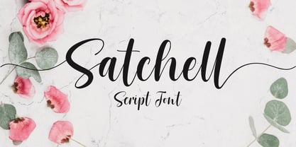 Satchell is a lovely and relaxed handwritten font. It is PUA encoded which means you can access all of the glyphs and swashes with ease! it has a gentle and beautiful flow, and as a result it will elevate each of the designs you wish to create!. It’s the perfect font for wedding invitations, stationery, photography, social media posts, product packaging, greeting cards, and much more!
 - Anthurea by Invasi Studio,
$19.00 Anthurea is a modern classy serif typeface. Featuring an elegant and classic all-caps style, this font reflects the elegance and style of the past. With its modern and minimal treatment, it makes a great starting point as well as an enhancement for your design. It is perfect for Logotype, printed quotes, invitations, cards, product packaging, headers, Letterhead, Apparel, Web design, magazines, books, etc.
 - Commander by Red Rooster Collection,
$45.00 Commander is a compressed serif font family and is an original creation of Steve Jackaman (ITF). It was designed in 1994 exclusively for the Red Rooster Collection. The family excels at display sizes and in headlines, and its masculine nature lends itself well to projects about sports, science fiction, and academia. Wherever Commander ends up in your project, it is guaranteed to draw attention!
 - Sassoon Infant by Sassoon-Williams,
$48.00 An upright typeface family developed to meet the demand for letters to produce pupil material for handwriting as well as for reading. Upright letters with extended ascenders and descenders are ideal on screen. They facilitate word recognition. The exit strokes link words together visually, and in handwriting they lead to spontaneous joins along the baseline leading logically to a joined-up hand. Teachers can print desk strips, charts of letter families and alphabet friezes, as well as consistent material across the curriculum. Together these typefaces provide a valuable resource for special needs teachers. When starting point and stroke direction has been learned, the arrow font (Tracker B) can be dropped and the simpler Tracker font used. Tracker B font, with its direction arrows helps pupils to start in the correct place. Motor movements can be refined by keeping inside the line. When starting and direction is no problem, the arrow can be dropped and the plain Tracker font used. When starting point and stroke direction have been learned, the arrow font (Dotted B) can be dropped and the simpler Dotted font used. Free to download resources How to access Stylistic Sets of alternative letters in these fonts Purchasers of this font package may use their Order Number to receive a free Copybook PDF by Rosemary Sassoon recommended for effective teaching
 - Niobium Pro by CheapProFonts,
$10.00 This font has been used for signage and wayfinding in the new Mbombela Stadium built for the FIFA World Cup 2010 - and it looks strangely appropriate there: the font has a certain hand-painted, relaxed charm so fitting of the south African culture. Interesting and bold choice of the architects. :) Anyway, the font has now been updated with our usual multilingual glyphset, and is ready to use around the world by soccer fans and typo fans alike. ALL fonts from CheapProFonts have very extensive language support: They contain some unusual diacritic letters (some of which are contained in the Latin Extended-B Unicode block) supporting: Cornish, Filipino (Tagalog), Guarani, Luxembourgian, Malagasy, Romanian, Ulithian and Welsh. They also contain all glyphs in the Latin Extended-A Unicode block (which among others cover the Central European and Baltic areas) supporting: Afrikaans, Belarusian (Lacinka), Bosnian, Catalan, Chichewa, Croatian, Czech, Dutch, Esperanto, Greenlandic, Hungarian, Kashubian, Kurdish (Kurmanji), Latvian, Lithuanian, Maltese, Maori, Polish, Saami (Inari), Saami (North), Serbian (latin), Slovak(ian), Slovene, Sorbian (Lower), Sorbian (Upper), Turkish and Turkmen. And they of course contain all the usual "western" glyphs supporting: Albanian, Basque, Breton, Chamorro, Danish, Estonian, Faroese, Finnish, French, Frisian, Galican, German, Icelandic, Indonesian, Irish (Gaelic), Italian, Northern Sotho, Norwegian, Occitan, Portuguese, Rhaeto-Romance, Sami (Lule), Sami (South), Scots (Gaelic), Spanish, Swedish, Tswana, Walloon and Yapese.
 - Snacko by Eko Bimantara,
$22.00 Snacko is one dope display font. It’s got that casual vibe mixed with some 70s soft serif styles, and a playful italic angle that’ll make your designs move and groove! This font is perfect for titling, branding, logos, and all kinds of digital or printed materials. It’s fun and playful, so it’s perfect for designs that are targeted at a younger crowd or need a fresh and modern feel. Snacko’s funky, soft, and cool design makes it the bomb for all kinds of design fields, from advertising to packaging to social media graphics. It’s got a style that’s all its own and can make your designs pop and stand out from the crowd. This font only comes in one style, but don’t trip, it’s versatile and can be used in all kinds of ways. It’s approachable and friendly with a softness that’s off the hook, but also funky and expressive with a unique personality that can take your designs to the next level. Bottom line, Snacko is one creative and versatile font that’ll bring a playful and fun energy to all your designs. It’s got a unique style that’s perfect for any designer’s font collection, so don’t sleep on this one!
 - Abode - Unknown license

- Chalkboy by Typefactory,
$14.00 Chalkboy – Handwritten Chalk Font is a fun and casual display font suited for kids, playground, or school theme. Whether you’re using it for crafting, digital designing, presentations, or greeting card making, it’s perfect!
 - Hopeless Heart by PizzaDude.dk,
$22.00Hopeless Heart isn't really all that hopeless! With its jumpy baseline and the different sized serifs, it’s a font full of fun and games, suitable for your next wedding invitation or love letter. - Velourist by Fargun Studio,
$15.00 Velourist is a bold display type that’s absolutely perfect for editorial headlines with retro looks. It’s unique, bold, and slim figure make it a great fit for t-shirts, posters, and magazine covers.
 - Dungarees by Victory Type,
$-Dungarees is a font on caffeine... It's a normal sans-serif typeface gone wild: jagged in some places, smooth in others. It makes documents not only fun to read but really interesting too! - Deseada by Type-Ø-Tones,
$40.00 Deseada is a blurred roman face with a small x-height —actually a modified Caslon— that fits perfectly into retro environments. Use it as a parody, it's just a sort of Catalan custom.
 - Honey Bee by Atlantic Fonts,
$26.00 Honey Bee is sweet. It’s loopy, playful, and hand drawn with a lively set of double letter ligatures. Use it for baby announcements, party invitations, greeting cards, children’s books, packaging, or anything creative.
 - Hola by Cuda Wianki,
$35.00 Hola! This is our new handwritten font. It's casual, young and pretty, perfect for logotypes, magazines, writing notes and comments. Thanks to many ligatures and alternate characters it is varied handwriting font. Enjoy!
 - Phylactere by Cubo Fonts,
$29.00 This font draws its inspiration from handwriting, in order to maintain a certain dynamism and irregularity. It's a serifless font, with small capital characters, always readable at any dimension, despite a tight tracking.
 - Lamiar by Antipixel,
$15.00 Lamiar is a decorative, fun, san serif handwritten font. This rounded monoline font will add an fancy, weird and unique look to your work. It's recommended for display usage for its glyph quality.
 - Gruffly by Stripes Studio,
$19.00 Gruffly is a new font brushed very interesting, also provided some ligatures. It is perfect for projects for brands, logos, product packaging, posters, invitations, greeting cards, news, blogs, everything including personal charm etc.
 - MTF Sunny Days by Miss Tiina Fonts,
$9.00 Sunny Days is a fun, cartoon-like display font capable of taking any product out of the ordinary! Use it on bold and bright creations such as banners, posters, covers, titles, magazines, etc.
 - Palmaton by Fikryal,
$15.00 Palmaton is a new modern & stylish handwritten font. It's perfect for logo, branding, invitation, tittle, wedding designs, social media posts, advertisements, product packaging, product designs, label, photography, watermark, special events, magazine, web design, etc. What's Included : Ligature Multilingual support If you have any questions please don't hesitate to contact me at : mfikryalif@fmail.com
 - Sortemun by Mandarin,
$15.00 Sortemun is a modernist display font based on heavy metal band graphics with a touch of horror movies from the 70/80’s. Bold, mysterious and vampiric it’s suitable for use in various projects such as rock/metal albums, scary games, horror movie titles, swag graphics, headlines, book covers, Halloween based parties etc.
 - When Suddenly by Comicraft,
$49.00 From completely OUT OF THE BLUE, here’s a font you'll need when, unexpectedly -- with a sense of immediate urgency -- your characters abruptly call out without warning and on the spur of the moment! When Suddenly ’s prompt! It’s abrupt! It responds in a flash! Now you can put all the words you need in your comic book in such a way that they'll come as a complete surprise to all your readers! When Suddenly is BOLD! It’s ITALIC! It’s anything but REGULAR!
 - VLNL Cleaver by VetteLetters,
$29.99 Chop chop! VLNL Cleaver is an important tool in the Vette Letters’ kitchen. It’s a butcher knife of a font. Razor sharp, ultra heavy and with pointy slanted serifs. At first glance it seems straight-lined, but a closer look revails that all straight lines are curved inward slightly, which enhances the sharp image even more. Cleaver was originally designed by DBXL for cutting meat - hell, it even hacks right through bone. It can easily splice a chicken in one slash or seperate ribs, just like that. You can also very well use it to chop up hard vegetables like pumpkin or squash on the chopping block. It gets better, the opposite blunt side can be deployed to crush ingredients like garlic, nuts or spices like black pepper. You could use a grinder, but with Cleaver it’s more fun, isn’t it? VLNL Cleaver is suitable to give a sharp edge to flyers, posters, logos (Heavy metal bands and other) or magazine headlines.
 - Evita by ITC,
$29.99Gérard Mariscalchi is a self-made designer. Born in Southern France of a Spanish mother and an Italian father, he has worked as a mechanic, salesman, pilot, college teacher – even a poet (with poetry being the worst-paying of these professions, he reports.) “Throughout all this, the backbone of my career has always been design,” Mariscalchi says. “I’ve been drawing since I was five, but it wasn’t until I was twenty-four that I learned that my hobby could also help me earn a living.” It was about this same time that Mariscalchi fell in love with type. He studied the designs of masters like Excoffon, Usherwood and Frutiger, as well as the work of calligraphers and type designers such as Plantin, Cochin and Dürer. With such an eclectic background, it’s no surprise that Mariscalchi’s typeface designs are inspired by many sources. Baylac and Evita reflect the style of the art nouveau and art deco periods, while Marnie was created as an homage to the great Lithuanian calligrapher Villu Toots. However, the touch of French elegance and distinction Mariscalchi brings to his work is all his own. Baylac Who says thirteen is an unlucky number? Three capitals and ten lowercase letters from a poster by L. Baylac, a relatively obscure Art Nouveau designer, served as the foundation for this typeface. The finished design has lush curves that give the face drama without diminishing its versatility. On the practical side, Baylac’s condensed proportions make it perfect for those situations where there’s a lot to say and not much room in which to say it Evita Mariscalchi based the design of Evita on hand lettering he found in a restaurant menu, and considers this typeface one of his most difficult design challenges. “The main problem was to render the big weight difference between the thin and the thick strokes without creating printing problems at small point sizes,” he says. Unlike most scripts, Evita is upright, with the design characteristics of a serif typeface. Mariscalchi named the face for a close friend. The end result is a charming design that is light, airy, and slightly sassy. Marnie Based on Art Nouveau calligraphic lettering, Marnie is elegant, inviting, and absolutely charming. Mariscalchi paid special attention to letter shapes and proportions to guarantee high levels of character legibility. He also kept weight transition in character strokes to modest levels, enabling the face to be used at relatively small sizes – an unusual asset for a formal script. Marnie’s capital letters are expansive designs with flowing swash strokes that wrap affectionately around adjoining lowercase letters. The design easily captures the spontaneous qualities of hand-rendered brush lettering. - Baylac by ITC,
$29.99Gérard Mariscalchi is a self-made designer. Born in Southern France of a Spanish mother and an Italian father, he has worked as a mechanic, salesman, pilot, college teacher – even a poet (with poetry being the worst-paying of these professions, he reports.) “Throughout all this, the backbone of my career has always been design,” Mariscalchi says. “I’ve been drawing since I was five, but it wasn’t until I was twenty-four that I learned that my hobby could also help me earn a living.” It was about this same time that Mariscalchi fell in love with type. He studied the designs of masters like Excoffon, Usherwood and Frutiger, as well as the work of calligraphers and type designers such as Plantin, Cochin and Dürer. With such an eclectic background, it’s no surprise that Mariscalchi’s typeface designs are inspired by many sources. Baylac and Evita reflect the style of the art nouveau and art deco periods, while Marnie was created as an homage to the great Lithuanian calligrapher Villu Toots. However, the touch of French elegance and distinction Mariscalchi brings to his work is all his own. Baylac Who says thirteen is an unlucky number? Three capitals and ten lowercase letters from a poster by L. Baylac, a relatively obscure Art Nouveau designer, served as the foundation for this typeface. The finished design has lush curves that give the face drama without diminishing its versatility. On the practical side, Baylac’s condensed proportions make it perfect for those situations where there’s a lot to say and not much room in which to say it Evita Mariscalchi based the design of Evita on hand lettering he found in a restaurant menu, and considers this typeface one of his most difficult design challenges. “The main problem was to render the big weight difference between the thin and the thick strokes without creating printing problems at small point sizes,” he says. Unlike most scripts, Evita is upright, with the design characteristics of a serif typeface. Mariscalchi named the face for a close friend. The end result is a charming design that is light, airy, and slightly sassy. Marnie Based on Art Nouveau calligraphic lettering, Marnie is elegant, inviting, and absolutely charming. Mariscalchi paid special attention to letter shapes and proportions to guarantee high levels of character legibility. He also kept weight transition in character strokes to modest levels, enabling the face to be used at relatively small sizes – an unusual asset for a formal script. Marnie’s capital letters are expansive designs with flowing swash strokes that wrap affectionately around adjoining lowercase letters. The design easily captures the spontaneous qualities of hand-rendered brush lettering. - Refinery by Kimmy Design,
$10.00 Refinery is the newest font in the Evanston Collection of square typefaces. With a similar capital structure to Tavern and Alehouse, Refinery includes both lowercase and small caps, making it an ideal typeface for paragraph text settings. It also comes in a wide array of weights and widths, with 85 font files in total. DESIGN Refinery has it’s roots in early 20th century signage and saloon typography, but has been modernized - even future-ized - to fit the 21st century digital landscape. The design was aimed at providing a type family that could work in many modern design fields, from sports, tech and military to gaming, HUD, virtual reality and augmented reality. ENGINEERING Essentially. Refinery is a simple mono-linear square design has been expertly refined into an easy-reading sans serif typeface. It was designed to be used in both display and text settings. From hairline to black in ultra-narrow or extended, the wide array of weight and width options makes it easy to find the right font for each text need. SPECS Refinery not only includes 85 font files, but each one include a wide array of Opentype Extras that allow even further customization. • Stylistic Alternatives: Letters A W Y have a styling variation that rounds the pointed apex into a square curve. The S and 2 variation straightens the spine, making all curves in the alphabet read as 90º angles. • Small Capitals: A shortened version of the capitals for alternate header settings. • Titling Alternatives: In this typeface, this feature turns on lifted small caps. Take the small capitals, raise them to level with capitals and underline at the baseline. When multiple lowercase or small capital letters are typed in a row, the underlines connect, creating unique ligatures. • Figures: There are different figure styles for different text needs. Options include, proportional lining, tabular lining (for math), old style and small capitals. • Discretionary Ligatures: A little funk to this otherwise serious typeface. Letters with a long baseline or cap height stem - F, L, T - get elongated to hug a small capital vowel. Other ligatures include Co. and No. • Catchwords: These are common words that bring emphasis to a design. In English these words include ‘and’ ‘as’ ‘by’ ‘in’ ‘of’ ‘the’ ‘to’ ‘when’, among others. Refinery also includes multilingual catchwords of ‘el’ ‘la’ ‘oder’ ‘go’ ‘para’ ‘pour’ ‘und’ ‘y’, among others. For the full list, please check out the specimen images. EXTRAS To round the typeface off, a set of over 150 ornaments, icons, arrows, patterns and line breaks is included to provide complimentary graphics. These can be found in the Ornaments labelled font, it is recommended to use the Glyphs panel to select which text glyph is needed.
 - Marnie by ITC,
$29.99Gérard Mariscalchi is a self-made designer. Born in Southern France of a Spanish mother and an Italian father, he has worked as a mechanic, salesman, pilot, college teacher – even a poet (with poetry being the worst-paying of these professions, he reports.) “Throughout all this, the backbone of my career has always been design,” Mariscalchi says. “I’ve been drawing since I was five, but it wasn’t until I was twenty-four that I learned that my hobby could also help me earn a living.” It was about this same time that Mariscalchi fell in love with type. He studied the designs of masters like Excoffon, Usherwood and Frutiger, as well as the work of calligraphers and type designers such as Plantin, Cochin and Dürer. With such an eclectic background, it’s no surprise that Mariscalchi’s typeface designs are inspired by many sources. Baylac and Evita reflect the style of the art nouveau and art deco periods, while Marnie was created as an homage to the great Lithuanian calligrapher Villu Toots. However, the touch of French elegance and distinction Mariscalchi brings to his work is all his own. Baylac Who says thirteen is an unlucky number? Three capitals and ten lowercase letters from a poster by L. Baylac, a relatively obscure Art Nouveau designer, served as the foundation for this typeface. The finished design has lush curves that give the face drama without diminishing its versatility. On the practical side, Baylac’s condensed proportions make it perfect for those situations where there’s a lot to say and not much room in which to say it Evita Mariscalchi based the design of Evita on hand lettering he found in a restaurant menu, and considers this typeface one of his most difficult design challenges. “The main problem was to render the big weight difference between the thin and the thick strokes without creating printing problems at small point sizes,” he says. Unlike most scripts, Evita is upright, with the design characteristics of a serif typeface. Mariscalchi named the face for a close friend. The end result is a charming design that is light, airy, and slightly sassy. Marnie Based on Art Nouveau calligraphic lettering, Marnie is elegant, inviting, and absolutely charming. Mariscalchi paid special attention to letter shapes and proportions to guarantee high levels of character legibility. He also kept weight transition in character strokes to modest levels, enabling the face to be used at relatively small sizes – an unusual asset for a formal script. Marnie’s capital letters are expansive designs with flowing swash strokes that wrap affectionately around adjoining lowercase letters. The design easily captures the spontaneous qualities of hand-rendered brush lettering. - Rapier by ITC,
$40.99 Rapier, designed by Martin Wait for ITC in 1989, is an impulsive, energetic script font with strong ties to the brush and advertisement typefaces of hte 1940s. The zestful capitals contrast with small, narrow lower case letters, lending the font its dynamism and liveliness. Desinger Wait reached the energetic, almost aggressive feel of Rapier with snappy base forms and especially with ascending strokes. For an optimal look it is advisable to set Rapier's forms near to one another, so that the ends of the strokes of one figure touch the beginning of the next. Rapier is best used for headlines and short texts.
 - Rufolo by Eurotypo,
$22.00 Rufolo is a family of fonts that can be considered both aesthetic and utilitarian. It has an apparent serif, barely hinted at, whose clear past reference is a beautiful epigraphic script on the marble plate placed at the southern entrance of the Roman amphitheatre, in Pompeii. Perhaps its origin dates back to Ugarit's cuneiform writing (as Morrison suggests as the origin of the serif in "Politics and Scripts") whose characteristic triangular-shaped incision footprint produces a powerful trait that not only gives character to the writing but also facilitates its support and visual compensation of sizes with neighboring signs. Other clear inspirational references have been Robert Hunter Middleton's Stellar (1929); Albertus (1932) by William A. Dwiggins; Optima (1952) by Hermann Zapf; And more recently RRollie (2016) by our foundry. Rufolo collects the attractive characteristic of the stroke endings but the proportions of its structure becomes much more regular, the capitals are in line with a constant square module, while the above references retain the proportions of the Roman Trajan. Some endings strokes have slightly baroque reminiscence with the intention of giving it greater plasticity and aesthetic enrichment, but absolutely controlled, taking special care of the aspects of readability and expressive neutrality. Rufolo Family comes in four weight: Light, Regular, Bold and Black, accompanied by its corresponding Italic versions.
 - Bruschetta by Canada Type,
$24.95The problem with scripts in general, and brush scripts in particular, is that the majority of them cannot be set in all-caps words or sentences. So as a rule of thumb most designers try to avoid brush scripts when they know they will be entering an all-cap zone. But here comes Bruschetta, so you won’t need to reduce your design options. Bruschetta is a great flowing brush script that can be attractively used in upper-lower, lower-lower, or upper-upper settings. Bruschetta also has so much variety in its design features – original, funny, natural, friendly, legible, and even somewhat psychedelic – it just may be the most versatile brush script ever made. Bruschetta also has an historical value as the revival of the Helmut Matheis’ Contact design from 1963. Why it hasn’t been digitized until this point is beyond us! So we digitized it from original specimen, expanded the character set to completion, and even added a few built-in alternates. Bruschetta’s versatility allows it to be used in a variety of applications. It is great for signage, posters, product labels, menus, book covers, and pretty much anywhere where a friendly bold brush type is needed. Get yourself a copy and show your friends and clients why the overused Choc and Cooper aren’t the last word in cool! - Brother XL&XS by TipoType,
$19.00 Brother XL & XS is an expansion of Brother 1816, one of the best sellers of 2016: myfonts.com/fonts/tipotype/brother-1816 We decided to add new widths to the type system, designing a condensed version (XS) that is perfect for narrow spaces without loosing legibility, and an expanded version (XL) with a lot of character for display uses but without abandoning funcionality. Both typefaces where created to adapt in diverse design languages being able to be “retro” or “modern” making it very flexible and working well in texts or titles, in print or screens. Brother XL & XS mixies Geometric shapes with Humanistic strokes at the same time. You can choose between a pure geometric or humanistic style, condensed or expanded, or even mix between XS, XL, or its alternate characters to create the feeling that you need for your projects. Its humanistic nature makes it easy to read, legible in small sizes; perfect for branding, editorial and signage. It has a total of 32 fonts, which are divided into 2 groups: XS (16 condensed weights) & XL (16 expanded weights). Each weight has +460 characters, +20 alternates, angular and straight edges, swashes, fractions, ordinals and much more.... Brother has also been specially designed for web (using hinting instructions), making it work in small and large sizes on different types of screen resolutions.
 - Sofia Pro by Mostardesign,
$25.00 Sofia Pro is a geometric sans font family who dares the modernism and the harmony of the curves. Created in 2009 and completely redesigned in 2012, it has become over time a popular alphabet and has received many accolades from graphic industry professionals. It has very rounded curves with very open terminals that makes this font family elegant, friendly and contemporary. Sofia Pro has been designed with a higher x-height than other fonts in its class to make tiny readability more obvious in any use situation. It will be ideal for use in small sizes such as business cards or mobile applications. This typeface is also equipped with powerful OpenType features to satisfy the most demanding professionals. It has solid features like case sensitivity, small, true capitals, full ligatures, tabular figures for tables, old style figures to elegantly insert numbers into your sentences, circled numbers, and more alternative characters to give personality to your projects. This typeface already has a powerful home kerning system called “Pro Kerning”. With all its specificities, Sofia Pro is a geometric sans that can meet the needs of professionals who want a family of clean geometric font; elegant with a wide character set for more than 130 languages of Western Europe, Europe Eastern, Central Europe, Greek and Cyrillic for international communication.
 - Engria by Eclectotype,
$40.00 Engria is a type family of four weights with corresponding italics that treads the fine line between sans and serif. There are serifs, of a sort, inspired by the brush. Not the marks made by a brush, but the actual splayed shape the bristles make when clamped together. Wedge-like chunks that resemble engraved forms, as the name Engria hints at. But it also has the appearance of a stressed, flared sans. This mixed approach lends a unique voice. Highly legible at text sizes, as indeed it is optimized for, Engria does however shine at display sizes thanks to its characteristic details – flared stems, angular counterforms, rugged ink traps and fluid curves. (I would recommend tracking it a little tighter at larger sizes.) Engria started life way back in 2014, and has been worked and reworked tirelessly to get to this finished product. My intent was to really push the idea of the white shapes being as important, if not more so, than the black. Engria is equipped for typographically demanding applications, boasting as it does an array of OpenType features, including small caps, automatic fractions, stylistic sets, various figure styles, arrows, case sensitive forms and more. It will make a very useful addition to your typographic arsenal, with a flare (ahem) for editorial work, but the individuality for packaging, branding, and logo work.
