10,000 search results
(0.659 seconds)
- Tropic Waters by KA Designs,
$12.00 Tropic Waters is a serif font with chic ligatures. Tropic Waters makes it easy to create stunning logos, advertisements, headlines, social media quotes, branding and more! This font has been carefully created to bring together timeless letterforms with modern ligatures. To take full advantage of this font, you will need to use a design program that supports opentype features - such as photoshop and illustrator. With opentype features enabled, the font will change and interlock as you type. You can easily access the diamond letters by typing in lowercase (a, e, i, o, u). Even without using the interlocking pairs, this font is a clean, chic serif that will bring a lot of interest to your designs!
 - Ronde Script by GroupType,
$19.00 Ronde Script (Ronde meaning "A kind of script in which the heavy strokes are nearly upright, giving the characters when taken together a round look.") is based on the original design named Parisian Ronde released in 1878 by the Chappelle Foundry in Paris. Other versions of this script include Inland French Script, French Script, French Plate, and Typo Upright. Different type foundries tied to the releases of this design include Mayeur (Paris), Stephenson Blake (London), Bernhardt Brothers & Spindler (Chicago), and ATF (Elizabeth, NJ). This style of script has been a very popular choice in designing wedding invitations and so many other formal announcements for over 130 years. Its very readable, formal and elegant with an antique or retro feel.
 - Alternate Gothic by Linotype,
$20.99 Alternate Gothic was designed by Morris Fuller Benton for American Typefounders Company in 1903. All three weights of Alternate Gothic are bold and narrow. In fact, this face is essentially a condensed version of Benton’s other well-known sans serif types, Franklin Gothic and News Gothic. In the early twentieth century, the modern concept of type “families” had not yet been formed — and though Benton designed these sans serifs to harmonize with each other, the foundry gave them different names. Robust, dark, and coolly competent, Alternate Gothic is a good choice when strong typographic statements must fit into tight spaces. As a modern usage, it is currently the font of YouTube’s homepage logo.
 - Harlean by Laura Worthington,
$35.00 Harlean is lively and exciting with eccentric letterforms that vary in axis, baseline, and height, a tribute to Harlean’s flexible-nib pen origins. Its curving strokes speak of free-spirited adventure and jazz-inflected, improvisational style. Harlean’s hand-lettered appearance is fashioned from the savvy use of contextual alternates. Easily customize your words with swashes and alternate forms to express your creativity, then complement your layout with ornaments, borders, and corner elements. See what’s included! http://bit.ly/2cjNavf *NOTE* Basic versions DO NOT include swashes, alternates or ornaments This font has been specially coded for access of all the swashes, alternates and ornaments without the need for professional design software! Info and instructions here: http://lauraworthingtontype.com/faqs/
 - Crescent Slim by Letterhend,
$19.00 Introducing, Crescent Slim, A sophisticated ligature serif from us. This typeface has been made carefully to make sure its premium quality and luxury feel. The ligatures makes this typeface unique and stands out rather than the regular serif font, very suitable for logo, headline, tittle, and the other various formal forms such as invitations, labels, logos, magazines, books, greeting / wedding cards, packaging, fashion, make up, stationery, novels, labels or any type of advertising purpose. Features : numbers and punctuation multilingual ligatures alternates PUA encoded We highly recommend using a program that supports OpenType features and Glyphs panels like many of Adobe apps and Corel Draw, so you can see and access all Glyph variations.
 - Pandora Emotion by Letterhend,
$14.00 Introducing, Pandora Emotion, A stylish serif with classy thin lines. This typeface has been made carefully to make sure its premium quality and luxury feel. The ligatures makes this typeface unique and stands out rather than the regular serif font, very suitable for logo, headline, tittle, and the other various formal forms such as invitations, labels, logos, magazines, books, greeting / wedding cards, packaging, fashion, make up, stationery, novels, labels or any type of advertising purpose. Features : Uppercase & lowercase Numbers and punctuation ALternates & Ligatures Multilingual PUA encoded We highly recommend using a program that supports OpenType features and Glyphs panels like many of Adobe apps and Corel Draw, so you can see and access all Glyph variations.
 - Caprizant by Laura Worthington,
$29.00 Caprizant is a lively, upright script based on letters inked with a pointed pen. For display settings, titles, and identity work, Caprizant shines with even more energy and elegance. Customize it using one of the 337 swashes, three sets of capitals, and 20 ornaments. Alternates of every letter create a fully connected or unconnected look, plus dozens of ligatures, and contextual alternates provide a convincingly human variation. See what’s included! http://bit.ly/1RGYIl1 *NOTE* Basic versions DO NOT include swashes, alternates or ornaments These fonts have been specially coded for access of all the swashes, alternates and ornaments without the need for professional design software! Info and instructions here: http://lauraworthingtontype.com/faqs/
 - Goodchild Pro by Shinntype,
$49.00 Goodchild Pro is a pragmatic text face, equipped for sophisticated academic typography. The face has a large x-height, as there is little point in adding to the stock of rangy “book” Jensons. Despite this departure from the archetype, in other respects Goodchild is true to the original letter forms in its tight fit, modulation of stroke contrast, and manipulation of x-height and serif size. Jenson’s tiny tittles and diamond-shaped periods have, however, been relinquished. The finish is not the antiquing that one often finds in Renaissance revivals. Here clean, decisive details provide a freshly minted, contemporary appearance, providing a smart impression should one wish to use the face at display size.
 - Monolith Pro by Gravitype,
$12.90 Monolith Pro is a futuristic heavy display that steals the show. This typeface is inspired by the popular Kubrick’s movie 2001: a space odyssey, from which the iconic monolith scene. The glyphs, in fact, have been designed to fill the rectangular shape, with the addition of minimal inlays to differentiate them consistently. While the uppercase is perfect for impactful headings and titles, the lowercase completes the main headline masterfully - but can also stand out alone due to its own distinguishable personality. The family includes 4 styles: regular, italic, outline and outline italic, to give more dynamism and sense of lightness when needed, in contrast with the heavy weight. Multilingual support is available.
 - Blinsithar by Hanzel Space,
$25.00 introduce our font "Blinsithar" font Happy! finally this font has been released in 2023, with full of new ideas having new character for each letter. It has beautiful curves that enhance the appearance of the font which is no less attractive. Complete with lowercase and uppercase letters, punctuation, swash and ligature. By creating this font, we hope to help your design type needs, to support your business and your business. This font is very suitable for use as branding, logos, slogans, websites, weddings, products and so on. Full Set of standard alphabet and punctuation Extra set of ending swashed lowercase Handwritten ligatures Thanks so much for checking out my shop! Happy creating! Cheers! Hanief - Hanzel Space
 - Nouveau Theme JNL by Jeff Levine,
$29.00 As long as there’s been movie theaters, those establishments became the perfect hideaway for couples who wanted to kiss, hug and snuggle without the watchful eyes of disapproving parents or the pesky attention of younger siblings. Such was evident in the [13 word] title of the 1919 composition “Take Your Girlie to the Movies (If You Can’t Make Love at Home)”. On the sheet music for this song, it is hand lettered in the Art Nouveau fashion of the time by a round nib pen, and made a perfect candidate to be redrawn as a digital typeface. The end result is Nouveau Theme JNL, which is available in both regular and oblique versions.
 - Congenial by Laura Worthington,
$19.00 I wanted to design my own sans-serif typeface for my web site to complement the rest of my type library; I designed Congenial as an understated, highly legible complement to my more decorative display faces. Of course, I’m never far from my calligraphic roots, so Congenial retains some hand-drawn elements, visible particularly in the heavier weights of this generous 10-face family. As befits its name, Congenial is a friendly and inviting face with a generous x-height and highly differentiated characters. See what’s included! http://bit.ly/1Agnkio These fonts have been specially coded for access of all the swashes, alternates and ornaments without the need for professional design software! Info and instructions here: http://lauraworthingtontype.com/faqs/
 - Ferryman by Floodfonts,
$49.00 Ferryman is a Blackletter typeface for the contemporary reader. Unfamiliar Blackletter characters have been replaced with adapted common Latin characters (Antiqua) or with letters from other historical scripts that are more legible to a modern audience. Ferryman is the antidote to the overused geometric and neogrotesk styles. An expressive display typeface with a strong character, it is perfectly suited for counterculture projects and progressive concepts e.g. in visual art, indie music, and alternative lifestyles. With nine weights and corresponding italics Ferryman offers a wide range of creative possibilities. Each style offers 590 glyphs supporting all Western-, Eastern- and Central-European languages and comes with four sets of numbers and various currency symbols.
 - Skater Squad by Din Studio,
$29.00 Hi, Everyone! Have you been looking for a graffiti font? Do you dream of creating headings that stand out and inspire creativity, imagination, and prominence style? Introducing Skater Squad- A Grafiti Font Skater Squad is a bold and angular with a distinct street vibe. This font can be used for a host of different content needs and projects. Create gorgeous printed quotes, standout packaging, or beautiful t-shirts! You can even use it to create amazing headings, logos, menus, and social media graphics. Our font always includes Multilingual Support to make your branding reach a global audience. Features: Alternates Standart Ligatures Multilingual Support PUA Encoded Numerals and Punctuation Thank you for downloading premium fonts from Din Studio
 - Toiban by Sealoung,
$20.00 Toiban is a classy modern sans serif font. Each Toiban glyph has been modernly drawn and designed for this expansive new edition, which maintains the Swiss mantra of clarity, simplicity and neutrality for the demands of contemporary design and branding. The larger View version is drawn to show off Toiban's subtlety and is spaced with the headline in mind, while the Text size focuses on readability, using strong strokes and comfortable loose spaces. The Toiban struggles to be legible at a small size because of its compactness and closed aperture. The Toiban Micro's design is simplified and exaggerated to maintain impression in small, loosely spaced type, providing excellent legibility at microscopic sizes and in low-resolution environments.
 - FS Koopman by Fontsmith,
$80.00 FS Koopman is a hard-working typeface. A crossbred workhorse that draws on inspiration from Swiss grotesks, American gothics and early British grotesques. It refuses to fit neatly into any of these categories, it’s neither one nor the other, but all of the above. It’s kinda Swiss meets American… (but with a slight Yorkshire twang).
 - Kwadrat by Malgorzata Bartosik,
$19.00 Kwadrat is a modern unusual typeface. Some of the letters have surprising shapes, so it can be used mainly for display purposes, but also as body text. It's available in 4 weights: Light, Regular, Medium, Bold and as a variable font. It's multilingual - contains Latin alphabet with Western, Central and South Eastern European diacritics. Enjoy!
 - Boogie by Linotype,
$40.99German graphic designer Ralf Weissmantel created Boogie in 2003. Boogie is an ironic reference to pop art, and to disco lettering from the 1960s and 70s. Its round forms and outlines evoke the flashing, pulsating lights and music of that era. Shipping with five different, width-compatible fonts, the Boogie typeface has four different components: an outlined letterform is the base element, and forms the first font. Three additional fonts may be layered over top of this base, surrounding the first font with up to three bubble-outlines. In graphics applications like Adobe PhotoShop or Illustrator, these elements can each be assigned different colors. There is also a fifth font, which contains the base outlined letterform pre-surrounded by three additional outlines of the same color. Boogie works best in large headline, display and signage applications, where its forms can be clearly seen and enjoyed. When different colored layers are applied, text set in Boogie will gyrate and jive across the page! Weissmantel has worked as an art director for various international advertising agencies, and has led Corporate Design projects for firms such as Grey and MetaDesign. His design work, honored internationally, has been included in the typography collection of the Museum for Art and Trade in Hamburg. He is currently teaching graphic design at the Düsseldorf University of Applied Sciences. Weissmantel has been an associate of the United Designers Network since August 2002. Boogie received an Honorable Mention in the 2003 International Type Design Contest, sponsored by Linotype GmbH. - Rockers Garage by Fikryal,
$18.00 Rockers Garage – Font is a display brush font. It’s perfect for logo, branding, title, social media posts, advertisements, product packaging, product designs, label, photography, watermark, special event, magazine, web designs, etc. If you have any questions please don’t hesitate to contact me. follow my Instagram: fkryall Thank you 🙂
 - Bertaji by Sulthan Studio,
$12.00 A handwritten font with an eccentric style that is also charming with a soft touch makes this font very, very sweet and adorable. It's perfect for any type of work you're working various purposes such as logos, wedding invitations, headings, t-shirts, letterheads, signage, labels, news, posters, badges etc.
 - Coconut Charcoal by Fikryal,
$18.00 Coconut Charcoal – Font is a display brush font. It’s perfect for logos, branding, title, social media posts, advertisements, product packaging, product designs, label, photography, watermark, special event, magazine, web designs, etc. If you have any questions please don’t hesitate to contact me. follow my Instagram: fkryall Thank you 🙂
 - Harley by Motokiwo,
$5.00 Harley is all caps Sans Family with three weight, thin, regular, bold, and stencil version for regular weight. The design anatomy is simple, only straight shapes with no curves and it's suitable for techno design, poster, headline, products design, print design, etc. Harley also support standard multilingual characters.
 - Chocolate Chipped by Vintage Type Company,
$9.00 VTC Chocolate Chipped is a modern and minimalist homage to exaggerated woodblock typefaces of the past. It's the perfect little font collection for loud and in-your-face messaging, with 3 different weights in standard and oblique flavours. Adobe Latin 1 & Basic Cyrillic language support are also included.
 - Cream Soup by Fikryal,
$15.00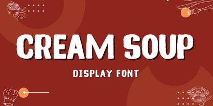 Cream Soup – Font is a display brush font. It’s perfect for logos, branding, title, social media posts, advertisements, product packaging, product designs, label, photography, watermark, special event, magazine, web designs, etc. If you have any questions please don’t hesitate to contact me. follow my Instagram: fkryall Thank you 🙂
 - Story Night by Fikryal,
$22.00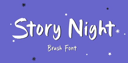 Story Night – Font is a display brush font. It’s perfect for logo, branding, title, social media posts, advertisements, product packaging, product designs, label, photography, watermark, special event, magazine, web designs, etc. If you have any questions please don’t hesitate to contact me. follow my Instagram: fkryall Thank you 🙂
 - Beatrise by Fikryal,
$15.00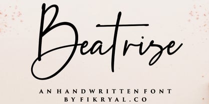 Beatrise is a new modern and stylish handwritten font. It's perfect for logos, branding, invitations, tittles, wedding designs, social media posts, advertisements, product packaging, product designs, labels, photography, watermarks, special events, magazines, web design, etc. If you have any questions please don't hesitate to contact me. :) Thank you
 - Mickstone Crush by Java Pep,
$17.00 Introducing Mickstone Crush script font that is equipped with tons of alternates characters starting of uppercase and lowercase. Mickstone Crush font it's perfect for logotype, branding identity, headline text, title, advertising, social media, and etc. Mickstone Crush font is available with multilingual support that is more than 30+ languages.
 - Sweet Boho by Sulthan Studio,
$12.00 Sweet boho is this amazing typeface handmade script font we created in freestyle for those of you who do work and crafts. It's perfect for any type of work you're working various purposes such as logos, wedding invitations, headings, t-shirts, letterheads, signage, labels, news, posters, badges etc.
 - Compatil Fact by Linotype,
$50.99Compatil is the first comprehensive type system which enables all typographical elements to be used to full effect in order to reproduce the message conveyed by text information. Four different type styles with a total of 16 weights including italics have been merged into a unique typographical network. There are now no limits to the font user's creativity. The system is a product of technical innovation and constitutes a new design approach which meets the highest aesthetic standards. For almost two years, a team of experts from Linotype has been working with initiator Professor Olaf Leu under the direction of Silja Bilz, Erik Faulhaber and Reinhard Haus to create the Compatil type system. Despite the Internet and TV, it is essential today to be able to absorb information quickly by being able to read it with ease. A fact that is becoming increasingly important both on-screen and on paper. It is the role of the font to increase legibility and to ensure typographically perfect results for text design work. The new Compatil type system meets all these needs. The Compatil is a part of the Platinum Collection. The following four different styles are available: Compatil Exquisit, Compatil Fact, Compatil Letter and Compatil Text. Compatil is available in various font formats: 16 separate OT Pro fonts including the small caps and Adobe Central European character set for OpenType-supporting applications like Adobe InDesign, or as 32 separate OpenType Com fonts for office communication, with the following special features: 1. Optimized display capabilities for computer screens eXcellent Screen Fonts (XSF-quality). 2. An extended, international character set, which supports 48 different languages for Microsoft Office applications like MS Word or as 64 PostScript fonts, which can be used in non-OpenType-supporting applications like Quark XPress. - Compatil Fact Paneuropean by Linotype,
$103.99Compatil is the first comprehensive type system which enables all typographical elements to be used to full effect in order to reproduce the message conveyed by text information. Four different type styles with a total of 16 weights including italics have been merged into a unique typographical network. There are now no limits to the font user's creativity. The system is a product of technical innovation and constitutes a new design approach which meets the highest aesthetic standards. For almost two years, a team of experts from Linotype has been working with initiator Professor Olaf Leu under the direction of Silja Bilz, Erik Faulhaber and Reinhard Haus to create the Compatil type system. Despite the Internet and TV, it is essential today to be able to absorb information quickly by being able to read it with ease. A fact that is becoming increasingly important both on-screen and on paper. It is the role of the font to increase legibility and to ensure typographically perfect results for text design work. The new Compatil type system meets all these needs. The Compatil is a part of the Platinum Collection. The following four different styles are available: Compatil Exquisit, Compatil Fact, Compatil Letter and Compatil Text. Compatil is available in various font formats: 16 separate OT Pro fonts including the small caps and Adobe Central European character set for OpenType-supporting applications like Adobe InDesign, or as 32 separate OpenType Com fonts for office communication, with the following special features: 1. Optimized display capabilities for computer screens eXcellent Screen Fonts (XSF-quality). 2. An extended, international character set, which supports 48 different languages for Microsoft Office applications like MS Word or as 64 PostScript fonts, which can be used in non-OpenType-supporting applications like Quark XPress. - Typist Slab Prop by VanderKeur,
$25.00 The Typist SlabSerif is part of a big family, the Typist Family. The family consists of a monospaced, a SlabSerif and a SansSerif version. The idea behind this family originated from the research into the design of typewriter typestyles, which is also the reason why the monospaced version was released first. Since it was decided from the start to make a SlabSerif and a SansSerif version of these monospaced fonts, it was also a logical consequence that the proportional variants also became available in these versions. The monospaced SansSerif fonts have been given the name 'Code' since they are designed to be used while writing code for a software program, for example. The proportional variants with each 6 weights of the Typist Slab Serif and Code (SansSerif) are now available. Although the name may seem a bit strange, it is a logical consequence from the monospaced variant. The SlabSerif variant therefore has Typist Slab Prop, written in full the Typist SlabSerif Proportional. After all, who wants to be bothered with long font names in their font menu. The entire Typist family is designed as a font for use in editorial and publishing publications. A lot of attention has been paid to the spacing and kerning of the fonts. Due to the many variants and weights, this font is versatile. Typist Font Family was designed by Nicolien van der Keur and published by vanderKeur design. Typist Slab Prop and Typist Code Prop contains each 6 styles (Thin, Light, Regular, Medium, SemiBold and Bold, each weight also designed as a true italic) and has family package options. The links to the monospaced version of The Typist are here: https://www.myfonts.com/collections/typist-slab-font-vanderkeur https://www.myfonts.com/collections/typist-code-font-vanderkeur
 - Compatil Letter by Linotype,
$50.99Compatil is the first comprehensive type system which enables all typographical elements to be used to full effect in order to reproduce the message conveyed by text information. Four different type styles with a total of 16 weights including italics have been merged into a unique typographical network. There are now no limits to the font user's creativity. The system is a product of technical innovation and constitutes a new design approach which meets the highest aesthetic standards. For almost two years, a team of experts from Linotype has been working with initiator Professor Olaf Leu under the direction of Silja Bilz, Erik Faulhaber and Reinhard Haus to create the Compatil type system. Despite the Internet and TV, it is essential today to be able to absorb information quickly by being able to read it with ease. A fact that is becoming increasingly important both on-screen and on paper. It is the role of the font to increase legibility and to ensure typographically perfect results for text design work. The new Compatil type system meets all these needs. The Compatil is a part of the Platinum Collection. The following four different styles are available: Compatil Exquisit, Compatil Fact, Compatil Letter and Compatil Text. Compatil is available in various font formats: 16 separate OT Pro fonts including the small caps and Adobe Central European character set for OpenType-supporting applications like Adobe InDesign, or as 32 separate OpenType Com fonts for office communication, with the following special features: 1. Optimized display capabilities for computer screens eXcellent Screen Fonts (XSF-quality). 2. An extended, international character set, which supports 48 different languages for Microsoft Office applications like MS Word or as 64 PostScript fonts, which can be used in non-OpenType-supporting applications like Quark XPress. - Erotique by Zetafonts,
$39.00 Designed by Cosimo Lorenzo Pancini and Mariachiara Fantini with the help of Solenn Bordeau, Erotique is an evolution of the original design by Zetafonts for Lovelace, that challenges its romantic curves with the glitchy and fluid aesthetic of trans-modern neo-brutalist typography. The seductive "evil serif" look of the Pheimester-like Oldstyle letter shapes is made edgier by the quirky connections and unexpected calligraphic twirls that marry digital distortions to traditional penmanship. Sensuous but sharp, Erotique speaks the language of teasing, and unrequited love, over-the-top and restrained like a show of Japanese Kinbaku, and beautifully heartbreaking like a friendzone valentine. Designed for display use, this high-contrast serif typeface is ready to take center stage in projects where a subtle elegance and an edgy, aggressive touch are required. For branding use it is paired by a Erotique Ornaments, a set of interlocking patterns based on the font letter-shapes, allowing for striking packaging, digital and ambient design. For editorial use it can add a sharp sensuality to logos and titles thanks to an impressive array of alternate glyphs, subtle ligatures and a set of whiplike fleurons, collected in the Erotique Flourishes pack. The typeface has been developed in the regular, medium and bold weight plus a monoline version, all of which have been paired with an Alternate version to give immediate access the more exotic alternate letterforms. With a character set of over five hundred glyphs, all the the weights of Erotique cover almost 200 languages using extended latin, and include advanced Open Type features as Stylistic Alternates, Standard and Discretionary Ligatures, Positional Numerals, Swash and Case Sensitive Forms. If you are a typeface lover, be warned: Erotique could be your fatal attraction!
 - Compatil Text by Linotype,
$50.99Compatil is the first comprehensive type system which enables all typographical elements to be used to full effect in order to reproduce the message conveyed by text information. Four different type styles with a total of 16 weights including italics have been merged into a unique typographical network. There are now no limits to the font user's creativity. The system is a product of technical innovation and constitutes a new design approach which meets the highest aesthetic standards. For almost two years, a team of experts from Linotype has been working with initiator Professor Olaf Leu under the direction of Silja Bilz, Erik Faulhaber and Reinhard Haus to create the Compatil type system. Despite the Internet and TV, it is essential today to be able to absorb information quickly by being able to read it with ease. A fact that is becoming increasingly important both on-screen and on paper. It is the role of the font to increase legibility and to ensure typographically perfect results for text design work. The new Compatil type system meets all these needs. The Compatil is a part of the Platinum Collection. The following four different styles are available: Compatil Exquisit, Compatil Fact, Compatil Letter and Compatil Text. Compatil is available in various font formats: 16 separate OT Pro fonts including the small caps and Adobe Central European character set for OpenType-supporting applications like Adobe InDesign, or as 32 separate OpenType Com fonts for office communication, with the following special features: 1. Optimized display capabilities for computer screens eXcellent Screen Fonts (XSF-quality). 2. An extended, international character set, which supports 48 different languages for Microsoft Office applications like MS Word or as 64 PostScript fonts, which can be used in non-OpenType-supporting applications like Quark XPress. - Typist Code Prop by VanderKeur,
$25.00 The Typist Code SansSerif is part of a big family, the Typist Family. The family consists of a monospaced, a Slab Serif and a SansSerif version. The idea behind this family originated from the research into the design of typewriter typestyles, which is also the reason why the monospaced version was released first. Since it was decided from the start to make a SlabSerif and a SansSerif version of these monospaced fonts, it was also a logical consequence that the proportional variants also became available in these versions. The monospaced SansSerif fonts have been given the name 'Code' since they are designed to be used while writing code for a software program, for example. The proportional variants with each 6 weights of the Typist Slab Serif and Code (SansSerif) are now available. Although the name may seem a bit strange, it is a logical consequence from the monospaced variant. The SansSerif variant therefore has Typist Code Prop, written in full the Typist Code Proportional. After all, who wants to be bothered with long font names in their font menu. The entire Typist family is designed as a font for use in editorial and publishing publications. A lot of attention has been paid to the spacing and kerning of the fonts. Due to the many variants and weights, this font is versatile. Typist Font Family was designed by Nicolien van der Keur and published by vanderKeur design. Typist Slab Prop and Typist Code Prop contains each 6 styles (Thin, Light, Regular, Medium, Semi-Bold and Bold, each weight also designed as a true italic) and has family package options. The links to the monospaced version of The Typist are here: https://www.myfonts.com/collections/typistslabfont-vanderkeur https://www.myfonts.com/collections/typist-code-font-vanderkeur
 - Kurkuma by Hanoded,
$15.00 Kurkuma (Turmeric in Dutch) is a spice I use in all of my curries. And I love curry! It's not more than fair to name a font after my favorite ingredient, so here you have it: Kurkuma. It is a unique and somewhat bizarre font with both an angelic and a diabolical side. I wouldn't set a whole text in it, but it does look great in headlines, posters and websites.
 - Swithin by Scriptorium,
$24.00Swithin is based on hand lettering from the titles in a Victorian fairy tale collection. It has a playful look which seems just right for the holiday season, with some rough, hand-drawn variations which make make it feel more unique. It's conceptually similar to our Candlemas and Summerisle fonts, but has its own special personality. It ought to be excellent for holiday cards and other seasonal uses. - Handy Snack by PizzaDude.dk,
$15.00 It's always handy with a good font that helps your design stand out. And if you have a delicious snack while designing, then everything should be in its place. This font is quite handy, and its litterally a designing snack! And it contains zero calories! :) Well, its a comic book kind of font, and comes in Regular, Black and Layer. Mix those 3 versions for great designing results!
 - Jubilee by Red Rooster Collection,
$45.00 Jubilee is a glyphic font family with moderate stress, slightly inclined serifs, and storied history. Its original design was created in 1934 by famous English type designer Eric Gill for the Stephenson Blake type foundry. The development name was “Gill Text,” but this was changed to “Cunard” once the famous steamship company showed interest in using the typeface. The company, however, never utilized it. Stephenson Blake changed the name to Jubilee in 1935 to commemorate George V and Queen Mary’s Silver Jubilee Wedding Anniversary announcement. After International TypeFounders, Inc. acquired the exclusive rights to the Stephenson Blake collection, Paul Hickson (P&P Hickson) and Steve Jackaman (ITF) revived the family exclusively for the Red Rooster Collection in 1994. A new, Medium weight was created to accompany the original Light and Bold weights. Jubilee has an inscribed, Renaissance feel, and performs well at all sizes. Its letterforms are sturdy, yet there is an undeniable delicacy to the face.
 - Genty by Flavortype,
$19.00 Meets Genty, A new carefully crafted Delightful Bold on a script typefaces. A Creation of combining on our last 2 fonts which is Budge and Glaw. It generates a lot more fun, more trendy and more vibrant. It’s Versatile, Fun, Cute and Beauty feel that you get in Genty Typefaces. Genty Created with a tons of opentype features!. beautiful swashes, contextual alternates, stylistic sets up to 15 alternates, ligatures, ascender & descender swashes, Uppercase swashes, swoosh under the letters and swoosh at final of the letters. Every glyphs for alternates are curated for the best and possible without eliminate characteristic of this fonts. Genty also comes with a Font Pair Sans Serif that complete the needs for your design. Our creation on the display to give you a reference what it looks like on your project. such as Branding, Header, Logotype, Poster, Magazine, Packaging, Food Menus, and etc. It shows that Genty clearly can accommodate various design style.