10,000 search results
(0.061 seconds)
- Languedoc by Hanoded,
$15.00 Languedoc is a former province of France. Most of its territory lies in what is now the Occitanie region. My family and I love camping there and I figured I’d name a font after it! Languedoc is a beautiful and useful typeface: it is a handmade serif that is a bit rough around the edges, but very legible and fun to use. Because of its legibility, you could use it for texts, product packaging, cook books and whatever else you fancy. Comes with a royal amount of diacritics.
 - Tiemann by Linotype,
$29.99Tiemann Antiqua was designed by Walter Tiemann in 1923 and appeared with the Klingspor font foundry. It is one of the modern book typefaces created in the first half of the 20th century, but differed from most in its Modern Face forms. It displays the same strong stroke contrast and flat serifs but its proportions have more in common with those of neorenaissance fonts. Tiemann Antiqua is an elegant, legible font suitable for books and longer texts, but also found in headlines, newspapers and magazines due to its classic yet unusual appearance. - Lerum by Larin Type Co,
$15.00 Lerum this is elegant stencil font. Classic serif, bold weight, stencil style, it all carries this font and with it in highlight the main thing, make a title or logo and much more. It can also be more expressive and playful, thanks to the many alternates that are harmoniously combined in this font and make it more attractive and expressive. Try to change the alternatives, ligatures and you will get a lot of options for your project that will make it unique. This font is easy to use and has OpenType features.
 - Jonathan by Supfonts,
$10.00 Hi everyone. This is my new signature style script. Any inscription will look like a natural stroke. This will give a unique look to your projects. Try my new font, it is lined with all the distances and it looks professional and at ease. It is ideal for signature or design, postcards and greetings, websites or blogs. Test it out below to see how it could look for your next project! Includes: Uppercase and lowercase Numbers and punctuation Foreign language support Ligatures Check out my blog: https://www.instagram.com/zloillev pinterest.com/dmitriychirkov7 Enjoy
 - Ludwigon by IbraCreative,
$17.00 Ludwigon is a contemporary serif typeface that seamlessly melds timeless elegance with a modern sensibility. With its gracefully elongated serifs and refined letterforms, Ludwigon exudes sophistication and readability, making it a versatile choice for a wide range of applications. Its clean lines and balanced proportions lend an air of classic refinement, while subtle design nuances, such as tapered stroke endings and graceful curves, infuse it with a touch of contemporary flair. Ludwigon strikes a harmonious balance between tradition and innovation, making it a compelling choice for projects seeking a timeless yet fresh typographic aesthetic.
 - Norando by Larin Type Co,
$16.00 Norando this is a modern and elegant serif font. It carries a bold weight and with it in highlight the main thing, make a title or logo and much more. It can also be more expressive and playful, thanks to the many alternatives and ligatures that are harmoniously combined in this font and make it more attractive and versatile. Try to change the alternatives, ligatures and you will get a lot of options for your project that will make it unique. This font is easy to use and has OpenType features.
 - Saphile by Craft Supply Co,
$20.00 Saphile – The Epitome of Elegant Sans Serif Elegance in Every Detail Saphile, an elegant sans serif font, stands out with its gracefully angled stem ends and terminals, coupled with high contrast, making it the perfect choice for luxurious designs. A Typeface of Luxury Saphile is more than just a font; it embodies luxury. Its sleek design and high contrast add an opulent touch to any project it graces. Tailored for Luxury Designs Designed with luxury in mind, Saphile elevates the visual appeal of high-end branding, premium packaging, and more.
 - Anargya by IbraCreative,
$17.00 Anargya is a timeless beauty classic serif typeface that exudes elegance and sophistication. Its meticulously crafted letterforms showcase a harmonious balance between thick and thin strokes, creating a sense of timeless grace and legibility. With a refined, high-contrast design, Anargya brings a touch of traditional charm to contemporary designs, making it a versatile choice for branding, editorial, and luxury aesthetics. Its gracefully tapered serifs and graceful curves imbue it with an air of sophistication and refinement, making it a perfect choice for projects that demand a timeless, classic typographic style.
 - Salda by Hurufatfont,
$19.00 Salda; It is a modern sans serif family that blends old and new generation sans serif fonts in the same body. It has a wide usage area with its light narrow structure, sharp and clean lines, humanist touches. It provides clean and smooth visuals in vertical screens, mobile applications and block texts. With two different x heights (xL-xS), the body offers richness in text and headings. It consists of a total of 40 styles. Ideal for all kinds of editorial design, packaging, corporate identity, brand, application, web and desktop.
 - Beatnik Barbie by Type Innovations,
$39.00 Beatnik Barbie is a unconventional font design inspired by Jack Kerouac and the ‘Beat Generation’. It is an original design by Alex Kaczun and it is a derivative work based on his original ‘Beatnik’ font. It has an informal style about it, and invokes a casual and friendly mood. Beatnik Barbie incorporates many alternate letter forms, which work like ligatures, so when you type, it automatically substitutes different letter forms for a truly custom hand-written look. Perfect for any application. Beatnik Barbie truly has the heart and soul of the beat mentality. Groovin' baby.
 - Digideco by astroluxtype,
$20.00 Retro-futuristic robot terminal type. The 1930s Moderne Streamline decade meets the digital domain in this weird font. Use it in an ad for Ford Tri-Motor Airplane or a story about an out of control 1980s computer monster. Which? Help it find its place- as it is lost in time. Digideco is a minimal font set that includes upper and lowercase letterforms which can be used at various sizes but, we consider it a headline/display font, best applied larger than 36 points in size. Shall we play a game?
 - Calcite by Adobe,
$35.00Calcite Pro is a contemporary sans serif italic typeface designed by Japanese type designer Akira Kobayashi. Although it derives its basic character from the italic scripts of the Italian Renaissance, Kobayashi has utilized a highly stylized and rational approach to create an inspired modern Adobe Originals adaptation. Calcite Pro's geometric form and almost crystalline texture evoke images of its mineral namesake. The dynamic appearance of this retro chancery script adds a strong graphic presence to modern typesetting, whether it is used on its own or in conjunction with more traditional typefaces. - Albert Einstein by Harald Geisler,
$29.00 Harald Geisler wants to make you as brilliant as Albert Einstein. Or at least let you write like him. Or at least write in his handwriting. — The Wall Street Journal Imagine you could write like Albert Einstein. The Albert Einstein font enables you to do exactly that. In an joined effort, creators Harald Geisler and Elizabeth Waterhouse, spend over 7 years on finalising the project. It was made possible with the help of the Albert Einstein Archive, the Albert Einstein Estate, and funding by a successful Kickstarter Campaign of 2, 334 backers. The outcome was worth the effort: a font unprecedented in aesthetic technique and a benchmark for handwriting fonts. To create a result that is true to the original, Harald Geisler developed a method to analyse the movement of the famous writer. Letter by letter, every glyph was digitally re-written to create a seamlessly working font. It is the only font that holds 5 variations for each lowercase and uppercase-letter, number, and punctuation sign. Each based on meticulous detail to the original samples of Albert Einstein’s handwriting. The OpenType contextual alternates feature dynamically arranges the letters automatically as you type to ensure that no repeated letter forms are placed next to each other. Stylistic variants can also be accessed through stylistic sets. The font has 10 fine-tuned weights ranging from extra-light to fine and extra bold to heavy. The result is a vivid handwritten text true to the original. A PDF documentation, showing step by step how the font was made and comparing numerous original samples, is included with the font and can be downloaded here. The work has been recognised internationally, by press, Einstein fans, and designers. Some quotes used in images: “The font is beautiful“ — Washington Post “If you could write like Einstein, would it help you to think like Einstein?” — The Times (London) “Finally, if your colleagues aren’t taking you seriously, then perhaps you could start sending e-mails in a new font that mimics the handwriting of Albert Einstein.” — Physics World “Geisler and Waterhouse are really asking deeper questions about the diminishing (or evolving) role of our flawed, variable penmanship as a conduit of thought in today’s pixel-perfect landscape.” — QUARTZ “Your writing will look imaginative — which is exactly what Einstein would've wanted." — Huffington Post Arts & Culture "Forget Myriad Pro, Helvetica or Futura. The only font you’ll ever need" — Gizmodo “Capture a piece of Einstein's genius in your own writing." — Mashable
 - Alt Gotisch by HiH,
$12.00 Alt-Gotisch Verzierte is a typeface of decorative initials that is Victorian in style and bears a close family resemblance to the many ornamental tuscans cut throughout the nineteenth century by British foundries. Instead of the bifurcated terminals of the archetypical tuscan (see Figgins Tuscan by HiH or Stereopticon by Dan X. Solo), these letters display what Nicolete Gray might call a “wedge and bite” design -- as if they started with the wedge serif of a latin form and someone came along and took a perfectly round bite out of the wedge. We need not dwell on the lack of teeth marks. The calligraphic curls and flourishes are often graceful, sometimes a bit contrived, but always complex. There is a busyness that marks the style of the period. If you ever see an old photograph of a well-appointed Victorian parlor, you will recognize that same quality of busyness. Overdone is a word that frequently comes to mind. Alt-Gotisch Verzierte means “adorned or decorated old gothic.” The typeface is attributed by Alexander Nesbitt to an unidentified German foundry of the nineteenth century (Decorative Alphabets and Initials, Dover, New York 1987, plate 92). The designer is unknown. Our font is supplied with a lower case that is similar to the upper case, but is 15% shorter and is simplified by the omission of the decorative vines. For the lower case, alternate letters A, E, & T; and ligatures LE, OT & LY have been supplied. In addition, a few small decorative vines were planted here and there for optional use. An accented upper case is not part of the original design and is not here supplied. This design is also seen under the name “Sentinel” -- as always, it is worthwhile to compare the completeness of the character set and the faithfulness of the rendering. We believe you will agree that we provide a balance of quality and value that is unmatched in the contemporary marketplace. Alt-Gotisch Einfach is a simplified version of Alt-Gotisch Verzierte. The vine-less lower case of the Verzierte font is the upper case in Einfach. For a lower case for Einfach, the letters were further simplified by stripping away the three-dimensional outline, down to the bare bones and bites, as it were. Einfach, in fact, means “simple” or “plain.” It is interesting to note that this bare bones & bite lower case bears (I have a special license to use two homonyms in the same sentence) a striking resemblance to the 15th & 16th century ornamental letters from Westminster Abbey shown in Plate 47 of Alexander Nesbitt’s Decorative Alphabets and Initials (Dover, New York 1987).
 - Campeno by Craft Supply Co,
$20.00 Geometric Precision Let’s step into the world of Campeno, a Geometric Sans Serif font that embodies precision and order. This font is the epitome of geometric perfection, making it an ideal choice for various editorial applications. Editorial Excellence Campeno’s geometric form is what sets it apart and makes it a top choice for editorial needs. Whether you’re working on magazines, long-form text, or other editorial projects, its geometric precision enhances readability and offers editorial excellence. Versatile Typography What makes Campeno even more exceptional is its versatility. It seamlessly adapts to diverse design contexts, ensuring that it can be used for a wide range of projects, from magazines to websites and beyond. Engaging Readability Beyond its geometric aesthetics, Campeno excels in providing engaging readability. It guides the reader through the content, focusing on the message while maintaining a visually appealing design. In Conclusion In summary, Campeno – Geometric Sans Serif is the font that brings precision and clarity to your editorial projects. Its geometric form ensures that your content is not only engaging but also visually appealing, catering to a broad readership while maintaining a high standard of clarity. Whether you’re working on magazines, websites, or other editorial endeavors, Campeno stands out as a font that combines aesthetics with functionality, offering editorial excellence for your projects.
 - Grufy by Stefani Letter,
$12.00 Grufy is an awesome bold and fun display font that will look stunning on any poster flyer or print. It will put a modern twist on any design project with its urban charm. Use this font for your designs and explore its endless possibilities.
 - Cat Paw by Beary,
$14.00 Cat Paw embodies fun, quirkiness and authenticity. It features gorgeous and fun characters that will brighten up your crafting projects. It will elevate a wide range of design projects to the highest level, be it branding, headings, invitations, signatures, logos, labels, and much more!
 - Bealiva Vintage by Mevstory Studio,
$15.00 Bealiva is one of my fonts based on a hand lettering project in 2020. It was very inspired from the famous retro typography designs in late 60's until 70's. It includes the extrude look, so you will not have to add it later.
 - Marisco by estudioCrop,
$19.90 Marisco is Portuguese for shellfish. The font arose from the forms of classic tattoo types, especially those of mid-twentieth-century sailors, but it also has something of a nineteenth-century poster type flavor to it. Its main application is display type and poster design.
 - Lodewijk Gothic NF by Nick's Fonts,
$10.00 The 1897 ATF specimen book featured the pattern for this font, originally called Elzevir Gothic. Its friendly letter-forms and large x-height make it surprisingly contemporary in its presentation. Both versions support the Latin 1252, Central European 1250, Turkish 1254 and Baltic 1257 codepages.
 - Lofita by Awan Senja,
$14.00 Lofita is a beauty lovely font. It looks stunning on wedding invitations, thank you cards, quotes, greeting cards, logos, business cards and every other design which needs a handwritten touch. Add it to your most creative ideas and notice how it makes them come alive!
 - Colosseum by Alan Meeks,
$45.00 Although a sans serif, Colosseum owes its style to the original Trajan Roman form. Borrowing some characteristics from Friz Quadrata, in its san serif form it is more adaptable to text usage whilst still having a modern and original look which works well in headlines.
 - Alexy by aRc,
$10.00 Alexy is a hand-drawing of a twisted ribbon resembling a limited set of characters. Its unusual design makes it great as a headliner or it can be used for any ribbon awareness projects. Not suitable for signage use -- All lines are very jagged.
 - HU Noodles by Heummdesign,
$15.00 HU Noodles is a latin alphabet font. This is a stencil-type font designed by drawing with one brush and following the stroke order. It is characterized by rounded strokes and a tight square shape. It is recommended to use it for characteristic titles.
 - Plak by Linotype,
$40.99 Plak is a typeface originally created by famous German designer Paul Renner in 1930. Paul Renner is also the designer of the Futura typefaces. Like Futura, Plak is a sans serif design. But its unique qualities include its heaviness, and its un-geometric lowercase a.""
 - Hermosa by sizimon,
$18.00 Beautifly is an elegant and flowing handwritten font. It features a varying baseline, smooth lines, gorgeous glyphs and stunning alternates. It maintains its classy calligraphic influences while feeling contemporary and fresh. Fall in love with this font and bring your projects to the highest levels!
 - Tehisa by Sealoung,
$10.00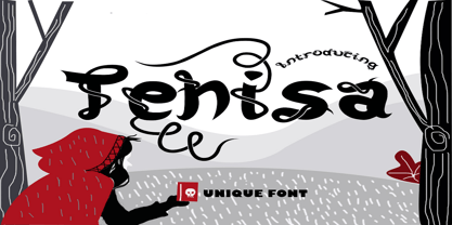 Tehisa is a lovely monoline font with a unique look. It features cute ligatures and alternates that will make your designs standout. It is perfectly suited for a wide variety of crafting projects, be it branding, signature, logos, social media posts and much more!
 - Melathy by Awan Senja,
$14.00 Melathy is a script calligraphy font. It looks stunning on wedding invitations, thank you cards, quotes, greeting cards, logos, business cards and every other design which needs a handwritten touch. Add it to your most creative ideas and notice how it makes them come alive!
 - CA Gothique Superfat by Cape Arcona Type Foundry,
$44.00 The name says it all. It is aesthetically located between American Gothics and European Grotesques and features small caps, a Central European character set and four number formats plus small caps numerals. This makes it not only a heartbreaking headline font, but also extremely versatile.
 - Amarissima by Vasava Fonts,
$30.00 Amarissima is a display font inspired in vintage Italian signs of baker shops. Regardless its crafty inspiration, the construction remains highly mechanical and structured. It has several OT features being the most iconic its contextual alternates that automatically create tails on every single word.
 - HARBER by bb-bureau,
$60.00 The name ‘HARBER’ comes from the first letters drawn. It is a sans serif family designed of dots on a grid, that gives it this round and rhythmic aesthetic. Only dots grow, approaching or moving away, changing the aspect of letters but keeping its characteristics.
 - Lievin by Mofr24,
$11.00 Lievin is an exceptional slab serif font that stands out for its simplicity, clean lines, and captivating elegance. What sets it apart is its unique ability to effortlessly adapt to diverse design needs, making it a versatile choice for any project. With an impressive range of 50 variable styles, ranging from delicate thin to bold and massive black, Lievin caters to a wide array of typographic demands. Its versatility makes it perfect for various applications such as posters, marketing materials, logotypes, headlines, books, magazines, and more. One of the defining features of Lievin is its impeccable balance of classic charm and contemporary appeal. Its sleek and refined aesthetic adds a touch of sophistication to any design. The font's exceptional legibility ensures that the message is conveyed with clarity and impact. Lievin pairs harmoniously with a range of typefaces, making it an ideal choice for combination and layering. It complements sans-serif fonts, such as Helvetica or Futura, creating a visually dynamic and engaging typographic composition. Beyond its visual appeal, Lievin boasts an extensive character set, providing support for multiple languages and typographic features. This allows designers to express their creativity and accommodate different linguistic requirements. The design concept of Lievin is rooted in the desire to create a timeless and versatile slab serif font that would seamlessly integrate into modern design practices. Its clean lines and balanced proportions ensure legibility across various media and sizes, while its elegant charm adds a touch of sophistication. Lievin is the result of a meticulous creative process aimed at delivering a font that captures attention and makes a lasting impression. It combines the best of traditional and contemporary design elements, offering a fresh take on slab serif typography. As a modern typeface, Lievin is an original creation, not based on any historical design or revival. It embodies a contemporary interpretation of slab serif fonts while incorporating functional aspects that cater to the needs of today's designers.
 - Gravesend Sans by Device,
$39.00 Smart, legible and elegant, Gravesend Sans is a based on the unique typeface used for the iconic grass-green signage for the Southern Railway. In existence from 1923 to 1948, when the network was nationalised, the Southern Railway linked London with the Channel ports, South West England, the South coast resorts and Kent. The same design was also used for the ‘hawkeye’ signs on the London, Midland and Scottish Railway, differentiated by black letters on a yellow background. Reference for each letter was taken from vintage ‘target’ station nameplates and other platform signage. The rarest letters were the Q, seen in Queens Road Battersea, the X, seen in East Brixton, and the Z, used in Maze Hill, site of an infamous train crash in 1958. Being hand-made, the letters often differ in width and thickness. There was no lower case. The Bluebell Railway, a heritage steam line, runs over part of the old Southern Railway network and uses a very similar type. The design of the numbers differed considerably, but here have been taken from the Device 112 Hours font Smokebox. As well identifying platforms, they were used on the front of the steam engine’s smokebox, hence the name, and stylistically are more in keeping with the letters than some of the squarer versions that can be seen in old photographs. William Caslon IV is credited with the first Latin sans-serif type, shown in a 1816 Caslon specimen book. ‘Two Lines English Egyptian’, as it was called, was caps-only, and there are several other correlations between that type design and this one. Includes a selection of authentic arrows and manicules, plus abbreviated ligatures such as ‘St.’ (Saint or Street) ‘Rd.’ (Road) and ‘Jn.’ (Junction). The Cameo version includes many graphic banner elements that can be freely combined.
 - Bobby Jones by Tom Chalky,
$19.00 Introducing The Loud & Proud Bobby Jones Font Collection Inside you'll find 16 quirky handcrafted fonts, oozing with personality, ripe and ready to take center stage within a variety of creative and fun design projects. If you're looking to grab eyeballs with an ad campaign, a logo design, apparel, printed stationery, and all that other good stuff, then worry not. Bobby has you covered. We all come with imperfections and Bobby is no exception! His outlines are slightly off, his corners are irregular, his straights aren't straight, but he's cool with it. In fact, he's too busy strutting his stuff. - What's Inside? Each of the fonts listed below boast multilingual glyph ranges and their own individually handcrafted outline style! (16 fonts in total!) - Bobby Jones - The original Bobby.J - Bobby Jones Soft - A rounded version of the above - Bobby Jones Condensed - The thinner and leaner sibling to Bobby Jones - Bobby Jones Condensed Soft - A rounded version of the above - Bobby Rough - A high-res textured version of the original - Bobby Rough Soft - A textured version of Bobby Jones Soft - Bobby Rough Condensed - A textured version of Bobby Jones Condensed - Bobby Rough Condensed Soft - A textured version of Bobby Jones Condensed Soft Designed a little over five years ago, the original Bobby Jones Font was my first ever product. This new and improved version has been entirely redesigned from bottom to top. Holding dearly to the punch that the original had, while adding a whole lot of extra power. I hope you enjoy the Bobby Jones Family as much as I do and have, and as always if you have any questions or comments, please do not hesitate to get in touch. I'd love to hear from you. (tom[at]tomchalky.com)
 - Cinque Donne by Debi Sementelli Type Foundry,
$44.99 Cinque Donne means “Five Women” in Italian. It was inspired by the five sisters in my family as well as a group of five high school friends I have known for 46 years, aka “The Club Girls”. The Pro version has 3370 glyphs with all the bells and whistles! Women are connectors, encouragers and supporters. Young, old, shy, extroverted, when you put us together, somehow we make a beautiful impact on each other’s lives. This is what Cinque Donne does in a visual way. Some letters are simple and prefer to sit quietly. Others are flourished and proud and like the limelight in the middle of a word. And then there are alternates that are flexible and work in any number of surprising places. Stylistic sets can add a vivacious feel while contextual alternates bring better understanding. Classic or contemporary, subdued or flamboyant, these letters represent the variety of women that make life interesting for us all. Within the varied glyphs, I hope you find characters that remind you of the special women in your life. Let Cinque Donne salute them on the page! The Cinque Donne Family includes: Cinque Donne, Cinque Donne Bold, Cinque Donne Swash and Cinque Donne Pro. Check out the Buying Choices tab to see special discounted combinations! Crafters: All of my fonts have been specially coded for PUA (Private Use Area) so you can access all of the swashes and alternates using Character Map (PC) or Character Viewer (Mac) or with any number of apps including PopChar. If you would like to purchase PopChar at a special discount email me and I will send you the link. Cinque Donne Pro and Cinque Donne Swash include Swash, Stylistic and Titling Alternates, Contextual Alternates, Standard and Discretionary Ligatures, Roman Numerals & Fractions.
 - Guhly by Ingo,
$35.00 A modern Sans Serif — prosaic, designed geometrically, beautiful in large sizes All the dimensions of the font are based on Factor 10. The general principle of construction leads to slim forms and nearly equally wide characters. So the font appears very solid but is actually difficult to decipher in longer texts. Along with the ”normal“ Guhly Regular there are also the two versions Guhly Light and Guhly Bold, whereas in each only the vertical strokes [Guhly Light] or horizontal [Guhly Bold] have been changed in strength. The result is a very individual decorative effect which slightly reflects old circus and western scripts. The lower case characters in the version Guhly Book are, therefore, optimized to be suitable for longer texts in smaller font sizes — because after all, sometimes you should read a bit more than just the headline… The design of a shampoo bottle stands behind the creation of this sans serif display font. Prominent, clearly constructed forms with circular arcs define its appearance. This is a font primarily designed for use with capital letters — for all sorts of advertising purposes, headlines and titles. But lower case letters also belong to a good functional font; so, of course, Guhly includes them and ligatures for the more ”critical“ letter combinations as well as stylistic alternates for the letters K (or k), V (v) and o. As a decorative “encore”, the Guhly family also contains the “normal” weight in two variants: on the one hand the Guhly Cutout – these are letters without counter, as if the letters were cut out and the internal surfaces fell out; and on the other hand the Guhly stencil – as the name suggests, a stencil font with the typical bars that give a stencil the necessary cohesion.
 - Clover Display by FoxType,
$10.00 Clover Display is a Unique Modern Elegant Typeface with Web-fonts which derived from Olive Font Family. It's a very versatile font that works great in large and small sizes. Clover Font would perfect for branding, logos, headlines, Captions. or simply as a stylish text overlay to any background image. Strong capitals and a smooth, open lowercase are effective in a variety of applications. It's shown a clean, minimalist, warmth, quirky, yet still purposed to be versatile and easy to read. 08 Weights with 16 Styles Included. Free updates and feature additions.
 - Bromwich by Greater Albion Typefounders,
$14.95 Bromwich is a piece of brand new Edwardian fun. In the spirit of railway travel posters and illustrated news journals, it's a wonderful font for poster design, or for book covers and other work with a period theme. Need something for a menu or placecards for a period themed function? Designing a book cover for a period novel? Bromwich is the face for you. It's offered in regular and alternate forms, with additional true small capital forms of both. Bring a bit of period flare to everything you do!
 - Dacttelyons by Sitintahitam,
$27.00 Dacttelyons is a blackletter typeface inspired by gothic era, and this typeface perfect for people looking for vintage with dark feel. Dacttelyons suitable for any graphic designs such as branding materials, t-shirt, print, logo, poster, packaging .etc ADDITIONAL INFORMATION For upgrading license please contact me. Upgraded licenses are required for apps, books, television, commercial exhibition, film, gaming, print on demand products, etc. simply email me to : hastohst@gmail.com We hope you enjoy the font, please feel free to comment if you have any thoughts or feedback. Thanks for purchasing and have fun! Cheers 🍻
 - Emperator by Latinotype,
$35.00 Marcelo's new typeface Emperator —based on his knowledge gained from instruction by master calligraphers— provides a fresh perspective on classic typefaces. Emperator comes in 3 variants that make your designs look elegant, legible and expressive. This font is perfectly suitable for a wide range of applications such as titles, wedding invitations, short text, logos, labels, book covers, posters, packaging, etc. Emperator's character set includes small caps (letters, figures and symbols), fractions, stylistic alternates, ligatures, mathematical symbols, etc.— more than 750 glyphs in all, supporting over 200 Latin-based languages.