10,000 search results
(0.041 seconds)
- DIN Next Cyrillic by Monotype,
$65.00DIN Next is a typeface family inspired by the classic industrial German engineering designs, DIN 1451 Engschrift and Mittelschrift. Akira Kobayashi began by revising these two faces-who names just mean ""condensed"" and ""regular"" before expanding them into a new family with seven weights (Light to Black). Each weight ships in three varieties: Regular, Italic, and Condensed, bringing the total number of fonts in the DIN Next family to 21. DIN Next is part of Linotype's Platinum Collection. Linotype has been supplying its customers with the two DIN 1451 fonts since 1980. Recently, they have become more popular than ever, with designers regularly asking for additional weights. The abbreviation ""DIN"" stands for ""Deutsches Institut für Normung e.V."", which is the German Institute for Industrial Standardization. In 1936 the German Standard Committee settled upon DIN 1451 as the standard font for the areas of technology, traffic, administration and business. The design was to be used on German street signs and house numbers. The committee wanted a sans serif, thinking it would be more legible, straightforward, and easy to reproduce. They did not intend for the design to be used for advertisements and other artistically oriented purposes. Nevertheless, because DIN 1451 was seen all over Germany on signs for town names and traffic directions, it became familiar enough to make its way onto the palettes of graphic designers and advertising art directors. The digital version of DIN 1451 would go on to be adopted and used by designers in other countries as well, solidifying its worldwide design reputation. There are many subtle differences in DIN Next's letters when compared with DIN 1451 original. These were added by Kobayashi to make the new family even more versatile in 21st-century media. For instance, although DIN 1451's corners are all pointed angles, DIN Next has rounded them all slightly. Even this softening is a nod to part of DIN 1451's past, however. Many of the signs that use DIN 1451 are cut with routers, which cannot make perfect corners; their rounded heads cut rounded corners best. Linotype's DIN 1451 Engschrift and Mittelschrift are certified by the German DIN Institute for use on official signage projects. Since DIN Next is a new design, these applications within Germany are not possible with it. However, DIN Next may be used for any other project, and it may be used for industrial signage in any other country! DIN Next has been tailored especially for graphic designers, but its industrial heritage makes it surprisingly functional in just about any application. The DIN Next family has been extended with seven Arabic weights and five Devanagari weights. The display of the Devanagari fonts on the website does not show all features of the font and therefore not all language features may be displayed correctly. - DIN Next Paneuropean by Monotype,
$92.99DIN Next is a typeface family inspired by the classic industrial German engineering designs, DIN 1451 Engschrift and Mittelschrift. Akira Kobayashi began by revising these two faces-who names just mean ""condensed"" and ""regular"" before expanding them into a new family with seven weights (Light to Black). Each weight ships in three varieties: Regular, Italic, and Condensed, bringing the total number of fonts in the DIN Next family to 21. DIN Next is part of Linotype's Platinum Collection. Linotype has been supplying its customers with the two DIN 1451 fonts since 1980. Recently, they have become more popular than ever, with designers regularly asking for additional weights. The abbreviation ""DIN"" stands for ""Deutsches Institut für Normung e.V."", which is the German Institute for Industrial Standardization. In 1936 the German Standard Committee settled upon DIN 1451 as the standard font for the areas of technology, traffic, administration and business. The design was to be used on German street signs and house numbers. The committee wanted a sans serif, thinking it would be more legible, straightforward, and easy to reproduce. They did not intend for the design to be used for advertisements and other artistically oriented purposes. Nevertheless, because DIN 1451 was seen all over Germany on signs for town names and traffic directions, it became familiar enough to make its way onto the palettes of graphic designers and advertising art directors. The digital version of DIN 1451 would go on to be adopted and used by designers in other countries as well, solidifying its worldwide design reputation. There are many subtle differences in DIN Next's letters when compared with DIN 1451 original. These were added by Kobayashi to make the new family even more versatile in 21st-century media. For instance, although DIN 1451's corners are all pointed angles, DIN Next has rounded them all slightly. Even this softening is a nod to part of DIN 1451's past, however. Many of the signs that use DIN 1451 are cut with routers, which cannot make perfect corners; their rounded heads cut rounded corners best. Linotype's DIN 1451 Engschrift and Mittelschrift are certified by the German DIN Institute for use on official signage projects. Since DIN Next is a new design, these applications within Germany are not possible with it. However, DIN Next may be used for any other project, and it may be used for industrial signage in any other country! DIN Next has been tailored especially for graphic designers, but its industrial heritage makes it surprisingly functional in just about any application. The DIN Next family has been extended with seven Arabic weights and five Devanagari weights. The display of the Devanagari fonts on the website does not show all features of the font and therefore not all language features may be displayed correctly. - TE Thuluth Golden 2 by Tharwat Emara,
$85.00 Amazing Font of THARWAT which is similar to calligraphy of THULUTH of a real calligrapher. I added many glyphs to get this feature and it becomes easier to a graphic designer to write with Arabic THULUTH font without real calligrapher. Golden2 is beautiful in Headlines of Arabic books and photos. Thuluth font (THARWAT EMARA THULUTH GOLDEN 2) distinguished by its beautiful artistic structures and ready-made sentences to help you design the designer designs and paintings easily. It also retains the beauty of its original Arabic calligraphy. This font can be used in titles of books, magazines and Quranic verses. Also for printing on clothes, Najaf and antiques. It is the first font that you can write complete sentences and Ayat of Quran with beautiful artistic structure like those written by the calligrapher. It also simulates the handwriting and no need to calligraphy it when you have this font.
 - Malebu by Macrotipo,
$39.00 Malebu is a sans serif font that was created based on grotesque and humanist models with certain geometric features. It is clear, simple, gentle and friendly, and can be used in text sizes. It is easy to read in long texts, magazines, books and the like. The rounded shape makes it friendly and fluent. A short x-height is functional and adds economy without losing consistency.
 - Cursed Parade by Senekaligrafika,
$12.00 "Cursed Parade" Has hard strokes and a signature styles that speak to instant scared sensations,it was inspired by horror and thriller movie “IT”. "Cursed Parade" will help you to create special and touching typographical design for your horror and dark projects, for branding, labeling, clothing, movie title, album cover, logos and many more. It is really universal and modern font. The owner of endless possibilities!
 - Loncherita by Fabio Godoy,
$29.95 Loncherita is a typeface created by Fabio Eduardo Godoy Angel and has 5 files: Fill, Fill Outline, Shadow 1, Shadow 2 and dingbats variables. Its purpose is to serve as a childish fantasy modular typography useful in logo design and merchandising. It is also recommended to compose expressive titles that need the option in which letters can be colored by layers. In that sense Loncherita is a typeface with logic italic vertical logical and its amount of contrast between thick and thin strokes is monoline, its antlers are mullets and rounded ends. It is also important to note that ii has 26 Dingbats designed to be point of attention and illustrate countless children and playful issues.
 - Stevie Sans by Typefolio,
$29.00 Some years ago I had my first contact with a grotesque typeface, when handling a sample catalog of typographic specimens from the age of phototypesetting. The style eventually settled in my memory waiting for the work of time. Behind its apparent neutrality, there is a complex balance game, that almost leads to the basic principles of design which deliver such power to the grotesque style. Stevie Sans is the answer to the action of time. A bridge that allows the designer to go into the past, while being in the present and looking towards the future. It is what it’s expected from a grotesque designed in the 21st century. With 7 roman styles ranging from thin to black, support to many languages and essential opentype features, Stevie Sans is the ideal choice for your project.
 - Shaky Kane by Comicraft,
$39.00 He sees you! He can see everything YOU do! He wears X-Ray Spex! He glows in the dark! Top Pop Cult Comic Artist Shaky Kane pushes at the limits of taste, dragging a scalpel down the veil of your illusions to make you see the world as it really is, as HE sees it. You've wondered at his work in the pages of ELEPHANTMEN! THE BULLETPROOF COFFIN! CAP'N DINOSAUR! THAT'S BECAUSE YOU'RE A ROBOT! MONSTER TRUCK and DEADLINE! You've worn the HATEFUL DEAD t-shirt and drawn blood with the SHAKY KANE FAN CLUB pins. Now Shaky Kane isn't just a disaffected punk rock way of looking at the world, it's a font too. A little Shaky, a little Stirred, best served with a purple eyeball spiked on a cocktail stick.
 - M Banquet P PRC by Monotype HK,
$523.99 M Banquet is a humanistic script written by a Chinese restaurant owner, which the name ‘Banquet’ comes from. It is a calligraphic style that always being seen in traditional Chinese banquet menu. Incorporated a feeling of masculinity, fill with strength and energy and attracts eyeballs of customers. It was written with a thin ball pen in a unique, personal and expressive writing style, such that it is realistic, natural and masculine. Contrast of strokes is low and the text is visible and eye-catching. Its light to medium stems (豎) make it suitable for small text to subheading with little conglutination. All strokes are irregular, inconsistent, irregularly oriented and tightly coupled. Spatial distribution, positioning, size and relative proportion of radicals fully reflect a natural and personal style. It is one of the few proportional-width font in a full scale. It is best suited for casual lively atmosphere, illustrations, set upright (non-slanted), non-condensed.
 - M Banquet P HK by Monotype HK,
$523.99 M Banquet is a humanistic script written by a Chinese restaurant owner, which the name ‘Banquet’ comes from. It is a calligraphic style that always being seen in traditional Chinese banquet menu. Incorporated a feeling of masculinity, fill with strength and energy and attracts eyeballs of customers. It was written with a thin ball pen in a unique, personal and expressive writing style, such that it is realistic, natural and masculine. Contrast of strokes is low and the text is visible and eye-catching. Its light to medium stems (豎) make it suitable for small text to subheading with little conglutination. All strokes are irregular, inconsistent, irregularly oriented and tightly coupled. Spatial distribution, positioning, size and relative proportion of radicals fully reflect a natural and personal style. It is one of the few proportional-width font in a full scale. It is best suited for casual lively atmosphere, illustrations, set upright (non-slanted), non-condensed.
 - Grafinc by PosterType,
$18.00 Grafinc is fat, black and robust. It is a geometric-based display typeface that comes in two cuts: ExtraBlack and Rounded. Grafinc can be used for all types of media – print, web, broadcasting or games. Despite its robust appearance and display character, Grafinc is very friendly typeface. It appears to be very legible in smaller sizes, too. The cuts include some very fine ligatures, making its appearance very rhythmic and smooth. Available in OpenType and western languages.
 - Arlo Sans by S6 Foundry,
$20.00 Arlo is a geometric sans serif typefac containing purposeful subtle design touches, details, and deviations from conformity. The width of the counters and comfortable, breathable apertures means that Arlo Sans has excellent legibility and contrast throughout weights and sizes. Mastered for optimal readability, Arlo Sans is a versatile typefamily, designed with robust, reliable forms; it contains its contemporary personality. The family includes over 20 stylistic glyphic alternatives making it stunningly versatile with its modern details and classic styles.
 - Oille Moon by skillyas studio,
$15.00 Oille Moon is a sophisticated and elegant typeface that blends classic serifs with modern refinement. With its timeless beauty and versatile design. Oille Moon is perfect for adding a touch of distinction to your typography projects, from editorial design to branding and more. Its carefully crafted letterforms, tapered serifs, and balanced spacing make it a refined choice for those seeking a touch of elegance in their designs. Elevate your typography with Oille Moon and let its timeless appeal shine.
 - Lazar by Discourse Type,
$5.00 Lazar takes its inspiration from the designs of early Russian designers like El Lissitzky. Designed initially as a custom font for a trainers collecting website it was expanded into a full family including a stencil, rounded and distressed styles. Lazar has a fresh and vibrant feel and is very flexible with its alternates lowercase characters, small caps and discretionary ligatures. It works well on posters, flyers and magazine. Mix all four styles to achieve unique typographic designs.
 - Kanyon by Hurufatfont,
$19.00 Kanyon is a family of typefaces created from basic geometric forms based on the equal width system. Its clean and neutral structure and 3 different widths provide ease of use in different design channels. With its rich OpenType features, multi-language support and small capital characters, it has a wider usage area than its counterparts. Ideal for packaging, labels, routing designs, mobile applications, brand designs, logos, all kinds of presentation and editorial designs, indoor and outdoor printing works.
 - Enjoying Typeface by Putracetol,
$24.00 The Enjoying Typeface - Modern Display Font is a bold and contemporary font with a unique twist, offering two distinctive versions for added versatility. Its bold and playful characters make it an excellent choice for logos, quotes, posters, titles, headlines, magazines, business branding, product names, stickers, and invitation cards. With its thick, distinctive design, this font is sure to stand out and leave a lasting impression, making it quickly recognizable and perfect for a wide range of creative projects.
 - Hero fire by Alit Design,
$23.00 Hero Fire is a dynamic and bold typeface that embodies the essence of a powerful superhero. The characters are meticulously crafted with strong serifs, exuding strength and resilience. The design seamlessly blends classic typography with iconic superhero elements, making it a distinctive and impactful choice for display purposes. Illustrations: The typeface is adorned with illustrations inspired by the superhero universe. Each character is meticulously detailed, featuring elements such as: Fire: Flame motifs gracefully intertwine with certain characters, adding a touch of intensity and energy. Swords: Sharp and sleek sword illustrations are incorporated into select characters, symbolizing heroism and the strength to overcome challenges. Skulls: Subtle skull designs enhance the edginess of the typeface, capturing the essence of a fearless and bold superhero. Shields: Protective shields are cleverly integrated into specific characters, emphasizing the font's ability to safeguard and endure. Wings: Majestic wing illustrations accompany certain characters, representing the freedom and soaring spirit of a superhero. Characteristics: Bold and Strong: Hero Fire commands attention with its bold and robust characters, making it perfect for headlines and attention-grabbing text. Serif Display: The typeface features classic serifs that add a touch of sophistication, making it suitable for both modern and traditional designs. Versatile Usage: Hero Fire is designed for versatility, lending itself well to various design applications such as posters, comic books, branding, and more. Usage Recommendations: Hero Fire is particularly well-suited for projects that require a strong and impactful display font. Its superhero-themed illustrations make it a perfect choice for comic book titles, movie posters, gaming graphics, and any design where a bold and dynamic aesthetic is desired. Embrace the power of Hero Fire to infuse your designs with a heroic and captivating spirit!
 - MB NOIR by Ben Burford Fonts,
$30.00 MB NOIR is a 4 weight with italics font family that visually has different layers of style, at first glance its a modern clean geometry based face with some nice retro touches, it also has hints of the vintage about it, with a nod to the art deco style, with alternates and ligatures it gives a lot of scope for its uses and works very well at large and small sizes.
 - HS Elham by Hiba Studio,
$59.00 HS Elham is a modern Kufi font with a new idea with round shapes. It is a decorative font with mathematical proportions. It is based on Hasan Elham font with a new idea for connecting letters one another. It also includes new shapes for many letters. It may be considered a new modification version of Hasan Elham. It is useful for titles and graphic projects and supports Arabic, Persian and Urdu.
 - Christmas Valentine by Mvmet,
$16.00 Christmas Valentine is a lovely comic display font. You can use it for anything ranging from t-shirts, book designs, and greeting cards to stickers and posters, or anything that needs a casual touch. If you want to use it for Christmas or Valentine themed designs, it will be your perfect font to pick. Fall in love with its incredibly versatile style, and use it to create lovely designs!
 - Groovy Christmas by Mvmet,
$16.00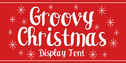 Groovy Christmas is a playful script display font. You can use it for anything ranging from t-shirts, book designs, and greeting cards to stickers and posters, or anything that needs a casual touch. If you want to use it for Christmas or Valentine themed designs, it will be your perfect font to pick. Fall in love with its incredibly versatile style, and use it to create lovely designs!
 - Yefimov Sans by ParaType,
$30.00 Yefimov Sans is a sans companion for Yefimov Serif . It is one of the last original faces by Vladimir Yefimov. It has contemporary design, squarish shapes of the round letters and legible proportions. Thanks to open aperture, it works well in small point sizes, and its distinctive letterforms make it good also for display purposes. The typeface was completed by Maria Selezeneva and Alexandra Korolkova. Released by ParaType in 2015.
 - Pusekatt by Hanoded,
$15.00 Pusekatt means Pussycat in Norwegian. It was finished on a rather gloomy monday, which reminded me of Norway and I just like cats. There you have it: the naming of fonts explained. It ain't rocket science for sure! There is nothing gloomy about Pusekatt font: it is a very lively, happy and useful poster face. It comes with extensive language support, one alternative (yes, one) and a lot of feline grace.
 - Comic Adore by Mvmet,
$16.00 Comic Adore is a fun script display font. You can use it for anything ranging from t-shirts, book designs, and greeting cards to stickers and posters, or anything that needs a casual touch. If you want to use it for Christmas or Valentine themed designs, it will be your perfect font to pick. Fall in love with its incredibly versatile style, and use it to create lovely designs!
 - Sugar Holiday by Mvmet,
$16.00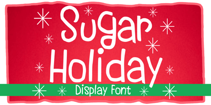 Sugar Holiday is a fun skinny font that you can use it for anything ranging from t-shirts, book designs, and greeting cards to stickers and posters, or anything that needs a casual touch. If you want to use it for Christmas or Valentine themed designs, it will be your perfect font to pick. Fall in love with its incredibly versatile style, and use it to create lovely designs!
 - Cadenza by Studio K,
$45.00 Cadenza is a bold condensed display font that combines flair with functionality, elegance with utility. Its weight and readability make it ideal for newspaper and magazine headlines, titling and signage.
 - Picaflor Handmade by RodrigoTypo,
$29.00 Picaflor Handmade is a fun handmade version with 8 styles and weights, it contains Light Regular and Bold and its 3D versions plus dingbats, perfect for fun or informal titles!
 - Zayne by HandletterYean,
$12.00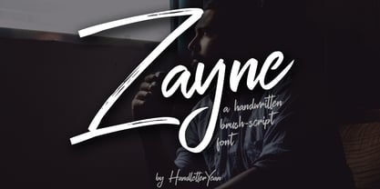 Zayne is a fresh, urban and unique handwritten script font that includes ligatures and swashes. With its funky, elegant, and handmade feel, it will add uniqueness to your creative designs.
 - Noisetoy by Christie,
$10.00Noisetoy is an up-to-date font that can be used widely and successfully, as it is a simple, clear, minimal and funky and it clearly depicts 21st Century design. - Sandwell by AEN Creative Studio,
$12.00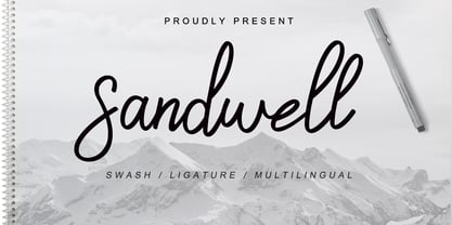 Sandwell is a great font for your project. It's made with simple, casual and elegant taste, and comes with a natural touch, swashes, and ligatures. Sandwell is perfect for logos, wedding invitations, posters, social media posts, signatures and much more!
 - Altwien by XTOPH,
$32.00 Altwien is a blackletter display font. Inspired by the old street-signs of Vienna and Salzburg. It’s a clear and simplistic looking condensed typeface. Put Altwien into a contemporary, fresh or modern context and get a completely new and unique style.
 - Classic Horror by Mvmet,
$12.00 Classic Horror is a fun and comical horror display font inspired by vintage spooky cartoon. Not only can be used for Halloween theme needs, you can use it too for other things for daily needs. Use it on t-shirts and clothing, book designs, greeting cards, stickers, posters, banners, or anything that needs a fun touch. Try it to create fabulous designs and feel the fun and cool vibes with it!
 - Mothman Legend by Mvmet,
$9.00 Mothman Legend is a grunge spooky font, inspired by 90s horror movies. It will be perfect for your horror and Halloween-themed needs! You can use it for anything ranging from t-shirts and clothing, to your book designs, Halloween party needs, greeting cards, stickers, posters, banners, or anything that needs a cool touch. Try it to create fabulous designs and feel the gothic and Halloween vibes with it!
 - Thawed by Larin Type Co,
$13.00 Thawed This is a display font of a narrow specialization, its letters seem to have melted and flowed, but at the same time it retains the shape of the letters and is well read. It is perfect for branding, logos, labels, short display inscriptions and advertising materials from flyers to billboards. This font includes drops of style, they make it possible to make the font more voluminous and give detail.
 - Tiny Drips by Mvmet,
$12.00 Tiny Drips is a very cool ink dripping display font. You can use it for your graffiti street art style and Halloween themed needs! You can use it for anything ranging from t-shirts and clothing, for your book designs, magazine, greeting cards, stickers, posters, banners, or anything that needs a cool touch. Try it to create fabulous designs and feel the fun and good vibes with it!
 - Halloween Carve by Mvmet,
$10.00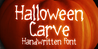 Halloween Carve is a must have cool skinny display font. You can use it for your horror and Halloween themed needs! You can use it for anything ranging from t-shirts and clothing, for your scary book designs, Halloween party needs, greeting cards, stickers, posters, banners, or anything that needs a horror touch. Try it to create fabulous designs and feel the horror and Halloween vibes with it!
 - Saitama by Khurasan,
$9.00 Saitama is a new calligraphy handwritten typeface, elegant and vintage feel character set. Saitama includes a full set capital and lowercase letters, as well as multi-lingual support, currency figures, numerals, punctuation & some extra glyphs. Thank you for checking and i hope you enjoy it. Always put your heart into it and don’t worry to try. I hope you have as much fun using it as i did making it. Khurasan
 - Hasan Alquds U by Hiba Studio,
$59.00 Hasan Alquds U is an Arabic display typeface. It is useful for titles and graphic projects where a contemporary, streamlined look is desired. The font is based on the simple lines of Kufi calligraphy, and the uniform slope of its strokes gives it a structured, geometric feel. It supports Arabic, Persian and Urdu languages. Hasan Alquds is the first released typeface of collaboration between Hasan Abu Afash and Mamoun Sakkal.
 - Energetica by Balpirick,
$15.00 Energetica is a Modern Handwritten Font. Energetica is a delicate, elegant and flowing handwritten font. It has beautiful and well balanced characters and as a result, it matches a wide pool of designs. Add it to your most creative ideas and notice how it makes them come alive! Energetica also multilingual support. Enjoy the font, feel free to comment or feedback, send me PM or email. Thank you!
 - Blauth by Latinotype,
$29.00 Blauth—a versatile and contemporary sans serif typeface—comes in 8 weights, ranging from Thin to Black, with matching italics and contains a set of alternate characters. Its small x-height gives it an elegant feel that reminds us of classic typefaces. Blauth is well-suited to continuous text and its uppercase set is ideal for high-impact headlines while its softened corners give your designs a warm and contemporary look.