2,737 search results
(0.072 seconds)
- Italian Didot by BA Graphics,
$45.00 Exquisite design, delicate but yet strong enough to make a statement just right for that special occasion.
 - Stalions by Runsell Type,
$16.00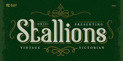 Stalions font is perfect for many of your projects like logos & branding, photography, invitations, watermarks, advertisements, product designs, stationery, wedding designs, labels, product packaging, special events and much more.
 - Digot by Fontsphere,
$16.00 DIGOT is a pixel-style, grid-based, geometric, display typeface. The idea for this font was born while combining lettering and illustrations in a geometric and pixel art style. What was needed was a font built with attention to detail for an interesting and unconventional creation of text and geometric images. The font is designed so that its modules lie on a grid and have their own rhythm and geometric order. So that it gives great editing possibilities and allows you to maintain a unique look. Optimal kerning is important here. The spacing between and within characters is well thought and designed to respect these rules (e.g. full pixel increments). Digot typeface offers a lot of creative possibilities in many types of graphic design and digital art. Posters, t-shirts, apparel printing, as well as website design, brand identity, and much more. The font contains a large range of characters, numbers, punctuation. Although it is an all-caps font, the T character is in two options. Digot includes support for a wide range of languages, e.g. Cyrillic, etc. Enjoy!
 - Didot LP by LetterPerfect,
$39.00 Didot LP is a very elegant rendition of the 18th-century French typeface -- Didot. This design took the earlier Italian neo-classical model (Bodoni) to a new level of refinement, with fully rationalized shapes and delicate hairlines. Didot LP accentuates these qualities, providing a classical text face with a clear and modern voice. The companion face -- Didot LP Display -- optimizes the proportions, spacing and hairlines for use at very large sizes.
 - Circus Didot by ParaType,
$25.00 Circus Didot typeface presents a rework of a typical neoclassical serif type in a constructivist style. Analyzing the shapes of characters author placed basic geometric figures — triangles, rectangles, circles… above the contours of letters. Resulting constructions staying recognizable letters at the same time bore a resemblance to pictures of Russian avant-garde artists from 20th century. This discovery has brought an idea to design a typeface where the tendency of a modern serif type to rationalism and geometry is realized in maximum possible extent. The prototypes for the project were taken from the works of Didot, lettering experiments of Russian constructivists and art deco artworks. The technique of juggling with shapes and overall grotesque approach to the design explains the selection of the name for the font.
 - Fashion Didot by BA Graphics,
$45.00 Exquisite design, delicate but yet strong enough to make a statement. Just right for that special occasion.
 - Firmin Didot by URW Type Foundry,
$35.00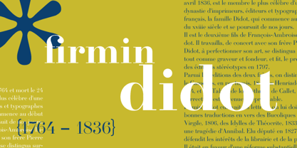
- Linotype Didot by Linotype,
$29.00 Linotype Didot™ was drawn by Adrian Frutiger in 1991, and is based on the fonts cut by Firmin Didot between 1799 and 1811. Frutiger also studied the Didot types in a book printed by the Didots in 1818, "La Henriade" by Voltaire. This beautifully drawn family is the right choice for elegant book and magazine designs, as well as advertising with a classic touch.
 - Didot Headline by Canada Type,
$24.95 In spite of its name, this font family embodies the ultimate classic modern advertising typeface, rather than concern itself with revivalism or Didone authenticity. Naturally the spirit of the original Didot faces still exists in this family, but over twelve years of work on it have made it more fitting to the luxurious expression of our day and age, rather than nineteenth century Europe. Upscale and stylish, Didot Headline is an essential tool for any designer involved in magazines, books, tasteful music, or overall luxury packaging that requires clean and large classic typography with an unmistakable modern spin. We recommend the use of Didot Headline between 12 and 48 points. For larger display use, check out its sister family, Didot Display.
 - Didot Display by Canada Type,
$24.95 In spite of its name, this font family embodies the ultimate classic modern advertising typeface, rather than concern itself with revivalism or Didone authenticity. Naturally the spirit of the original Didot faces still exists in this family, but over twelve years of work on it have made it more fitting to the luxurious expression of our day and age, rather than nineteenth century Europe. Upscale and stylish, Didot Display is an essential tool for any designer involved in magazines, books, tasteful music, or overall luxury packaging that requires clean and large classic typography with an unmistakable modern spin. We recommend the use of Didot Display at 48 points and over. For 12-48 pt. use, check out its sister family, Didot Headline.
 - Ritalin - Unknown license

- Ritalin - Unknown license

- Italienne by Linotype,
$29.99Inspired by the large American wood type of the Wild West, Richard Yeend created Italienne Std in 2002. Italienne Std is both very condensed and very decorative. It sports heavy, band like serifs, reminiscent of other italienne-style fonts, like Westside. Italienne-style fonts rose in popularity during the early 19th Century, when designers were first beginning to experiment with extreme contrast within letterforms, and across lines of text. Interestingly enough, letterforms with similar designs were just as common during the 1970s as during the 1870s, so you may use Italienne Std for applications ranging from country music concerts to disco parties. Italienne Std is part of the Take Type 5 collection from Liinotype GmbH." - Italiko by Luca Bolognese,
$11.00 Italiko is a calligraphic font. The letters have been hand-drawn individually to extract the common strokes. The strokes have then been re-composed to give the font a more unified appearance. It comes in Black, Bold, Regular, and Thin. The Thin version is different as the extreme contrast in the font makes the thinner lines disappear. It is likely best used as a display font. There are ligatures for the combination of letters that can be written more quickly by using a single stroke and letters that are slightly different from the ‘Italic canon.’ You can select which one to use in your application (i.e., Word) using combinations of italic/bold: No selection -> Regular Bold -> Bold Italic -> Thin Bold Italic -> Black If you end up using the font, get in touch at https://github.com/lucabol/Italiko. Feel free to suggest improvements or let me know if you encounter problems.
 - Station by Kimmy Design,
$15.00 Station is a bold headline typeface inspired by old Train Station type and graphics. It can be used in a modern and retro way, and its different patterns and styles give a unique look to any design.
 - Cralione by Jamalodin,
$16.00 Cralione Script Now Comes with updated neater glyphs, more stable kerning size, new punctuation & numbers. Cralione is a beautiful modern calligraphy script font that is suitable for branding, invitations, greeting cards, posters, name card, quotes, blog header, logo, fashion, apparel, letter, stationery and other projects. To access all OpenType Stylistic alternates, you need a program that supports OpenType features such as Adobe Illustrator, Adobe Photoshop, CorelDraw and Microsoft word.
 - Stallone by Suza Studio,
$19.00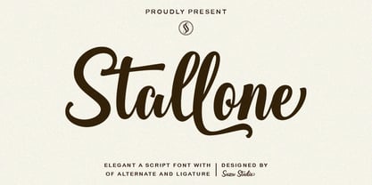 Stallone is a stunning Elegant Script font with a classic retro style, regular artistic swirls, coming together to create a distinctive, high-quality and exclusive typeface that will bring vintage charm to your designs. This font is created with advanced OpenType functionality and has the best quality guarantee, contains stylistic and contextual alternatives, ligatures and other features; all to give you complete control and customization capabilities. It contains all the characters and symbols you need, including all punctuation and numbers.
 - Qualion by ROHH,
$39.00 Qualion™ is a modern geometric grotesk typeface with humanist and calligraphic inspirations. The base of design is a minimal geometric sans serif with subtle humanist touches. Letter shapes are crafted with the highest care for beautiful proportions and excellent legibility. Qualion™ is a sibling of Qualion Round™ & Qualion Text™ - type family adjusted to fit paragraph text and small sizes best (narrower width, greater contrast, larger ink traps and tapering, adjusted spacing and kerning & even more calligraphic, elegant true italics). This versatile sans serif is not only well suited to clean, minimal projects and text paragraphs, but it has lots of features making it perfect for branding, logo design and all kinds of display use. All fonts are packed with alternates, swashes, terminal forms and ligatures, which make Qualion™ a very original ornamental type great for posters and packaging design. Qualion™ family consists of 10 weights with corresponding oblique and true italic styles, that give total of 30 styles. Both Oblique and Italic styles were hand drawn to get sharp and fine letter shapes. It has extended language support, as well as broad number of OpenType features, such as small caps, case sensitive forms, standard and discretionary ligatures, swashes, terminal forms, stylistic sets, contextual alternates, lining, oldstyle, tabular and small cap figures, slashed zero, fractions, superscript and subscript, ordinals, currencies and symbols.
 - HiH Firmin Didot by HiH,
$10.00 Before Bodoni, there was Didot. With the publication by Francois Ambroise Didot of Paris in 1784 of his prospectus for Tasso’s La Gerusalemme Liberata, the rococo typographical style of Fournier de Jeune was replaced with a spartan, neo-classical style that John Baskerville pioneered. The typeface Didot used for this work was of Didot’s own creation and is considered by both G. Dowding and P. Meggs to be the first modern face. Three years later, Bodoni of Parma is using a very similar face. Just as Bodoni’s typeface evolved over time, so did that of the Didot family. The eldest son of Francois Ambroise Didot, Pierre, ran the printing office; and Firmin ran the typefoundry. Pierre used the flattened, wove paper, again pioneered by Baskerville, to permit a more accurate impression and allow the use of more delicate letterforms. Firmin took full advantage of the improved paper by further refining the typeface introduced by his father. The printing of Racine’s Oeuvres in 1801 (seen in our gallery image #2) shows the symbiotic results of their efforts, especially in the marked increase in the sharpness of the serifs when compared to their owns works of only six years earlier. It has been suggested that one reason Bodoni achieved greater popularity than Didot is the thinner hairlines of Didot were more fragile when cast in metal type and thus more expensive for printers to use than Bodoni. This ceased to be a problem with the advent of phototypesetting, opening the door for a renewed interest in the work of the Didot family and especially that of Firmin Didot. Although further refinements in the Didot typeface were to come (notably the lower case ‘g’ shown in 1819), we have chosen 1801 as the nominal basis for our presentation of HiH Firmin Didot. We like the thick-thin circumflex that replaced the evenly-stroked version of 1795, possible only with the flatter wove paper. We like the unusual coat-hanger cedilla. We like the organic, leaf-like tail of the ‘Q.’ We like the strange, little number ‘2’ and the wonderfully assertive ‘4.’ And we like the distinctive and delightful awkwardness of the double-v (w). Please note that we have provided alternative versions of the upper and lower case w that are slightly more conventional than the original designs. Personally, I find the moderns (often called Didones) hard on the eyes in extended blocks of text. That does not stop me from enjoying their cold, crisp clarity. They represent the Age of Reason and the power of man’s intellect, while reflecting also its limitations. In the title pages set by Bodoni, Bulmer and Didot, I see the spare beauty of a winter landscape. That appeals to a New Englander like myself. Another aspect that appeals to me is setting a page in HiH Firmin Didot and watching people try to figure out what typeface it is. It looks a lot like Bodoni, but it isn't!
 - Linotype Didot eText by Linotype,
$50.99 A clear and enjoyable reading experience hinges on the legibility of text copy, especially when reading on screen. This is why Monotype has developed the eText collection of fonts specifically tailored for the text-heavy display environments of e-readers, tablets, mobile devices, and the Web.
 - Italian Breakfast by Roland Hüse Design,
$12.00 Italian Breakfast is a handwritten, fun and happy modern calligraphy script font designed with iPad. Carefully crafted, clean vectors in Glyphs App. You can create beautiful hand-made typography with its bouncy, organic flow. Contains all Wester and Central European accented characters, currencies: Thai Baht, Euro, Dollar and Yen. For additional accents and/or customisation please feel free to message me here or email contact@rolandhuse.com Italian Breakfast is perfect for all your creative projects wether it be indie logos, printed quotes, invitations, greeting cards, Instagram posts, products, packaging, blog headers etc. Happy creating and good luck with your work!
 - Italian VP by VP Creative Shop,
$10.00 ntroducing Italian Slab Serif Typeface - 24 fonts Italian is long, clean typeface with 24 fonts to enchant your next project. Added and 8 compositions and 15 elements in 4 premade colors. Very versatile fonts that works great in large and small sizes. Italian is perfect for branding projects, home-ware designs, product packaging, magazine headers - or simply as a stylish text overlay to any background image. Uppercase numeral, punctuation & Symbol Light Regular Medium Bold 3 styles Italics Multilingual support Feel free to contact me if you have any questions! Mock ups and backgrounds used are not included. Thank you! Enjoy!
 - Italian Gothic by Celebrity Fontz,
$24.99The Italian Gothic font is a full set of decorative initials inspired by 16th-century Italian Calligrapher Giovanni Battista Palatino, containing beautiful loops, flourshes, and parallel calligraphic strokes. This lovely calligraphic font includes one set of A-Z ornamental initials conveniently assigned to both the upper- and lower-case alphabet characters, as well as many foreign language accented characters. It is ideal for starting off the beginning of paragraphs in artistic publications, storybooks, fairy tales, religious publications, and any written work conveying the calligraphic style of the 1500s. - Italian Horskey by Mindtype Co.,
$22.00 Italian Horskey is new fashionable handwriting font and super cool with sexy style. And also the Capital letters with contemporary and sophisticated accents. Italian Horskey offers beautiful typographic harmony for a diversity of design projects, including logos & branding, wedding designs, signature, social media posts, advertisements & product designs.
 - Italian Garamond by Bitstream,
$29.99 - Italian Typewriter by Flanker,
$20.00 Italian Typewriter was designed by Leonardo Di Lena studying some Italian typewriters of the thirties and forties. Italian Typewriter is a monospaced font that can be used for any work that requires an old-fashioned look or an old-tech look.
 - Italia by ITC,
$29.00Italia is the work of Colin Brignall, a refreshingly different serif typeface. At first glance, Italia might seem comparable to any other square serif typeface, but it has a distinctive pattern all its own. Italia can be used as either a display or text typeface and will give any text a unique look. - Italix by Punch,
$45.00 Italix is an easygoing font family with mainly 4 script styles (Fineliner, Brushpen, Marker & Fatstick) and 7 supportive AllCaps fonts. Each script has its own unique personality, and come with optional ink splatters. These are attached to several ligatures, so don’t forget to activate the “OpenType Features” and the “World Ready Composer” in the application settings. The cool thing about Italix is that you can have a lot of creative fun with it, and its multiple features. Brushpen has a more classic look, Fineliner is a bit quirky, Marker is the chill one, and Fatstick is a total badass!
 - Malion by Din Studio,
$29.00 Malion font is a modern and clean display font. The design of typeface will make your design more beautiful and inspiring. This font will suitable for any project, like branding, print template, logo and etc. Features: Accents (Multilingual characters) 64 Alternates PUA encoded Numerals and Punctuation (OpenType Standard)
 - Povetarac Didone by Tour De Force,
$25.00 Povetarac Didone font family is part of Povetarac Superfamily together with Povetarac Sans and Povetarac Display. Available in 6 weights with matching italics, Povetarac Didone relays on lively uppercase proportions that took inspiration from vintage typefaces. It is well balanced family, elegant and fully recognizable. One of its characteristics are straight and wide terminals without usual serifs for this kind of typefaces. Playful and harmonic italics are one more uniqueness of Povetarac Didone. They were gently crafted to fulfil they role not just for editorial use, but as display typeface as well. Comes with Fractions and extended Latin character map.
 - Price Didone by Eclectotype,
$25.00 PUBLIC SERVICE ANNOUNCEMENT: Price Didone has inspired a full alphabetic font - Mastadoni, so if you're after more than numerals, head over there! Price Didone is a font with a singular purpose: The setting of elegant, stylish price tags. As such it is non-alphabetic, featuring instead numerals, a large array of currency symbols, and a smattering of typographic niceties such as quotes, brackets, pilcrow, daggers and a very curvaceous ampersand. Certain currency symbols that are not independent glyphs (Q, Ft, kr etc.) are included as their constituent letters, some of which also have automatic ligatures for that little something extra. There are currency symbols included which have not (yet) been accepted to unicode, such as the Russian Ruble and Bitcoin symbols. For ease of access, these can be typed using the standard ligatures feature. See features below for the full list. Features: Automatic Fractions - with fractions feature engaged, arbitrary fractions are a doddle. Stylistic Sets: SS01 - an alternate look for 4 SS02 - a double stroked dollar symbol SS03- the # sign becomes a stylish numero Stylistic Alternates - for software that doesn't support stylistic sets, the above three features are grouped into the one SALT feature. Standard Ligatures - certain typed combinations automatically change to different glyphs: B|| = Bitcoin symbol P- = Russian Ruble RM = Malaysian Rimgit symbol Rp = Indonesian Rupiah Rs = Rupees Ft = Hungarian Forint kr = Kroner symbol % off;%off;%ff = Special percent off ligature Discretionary Ligatures - this feature sets decimal prices like $5.95 with the numerals after the period smaller and raised from the baseline, underlined by a nice swoosh. It also shrinks the dollar, sterling, and Euro symbols for a more authentic look. While intended for one sole purpose, Price Didone could nevertheless be quite versatile. Quote marks and typographic symbols can be used for decoration. Everybody loves a nice ampersand and this is one I'm really proud of. Or you might just want some pretty numbers for your house, or sports jersey, or just to stand out a little from the rest of your text. Whatever use you may have in mind, go for it. And do let me know if your currency symbol isn't included, and I'll quickly add it to the glyph set in future versions.
 - Heimat Didone by Atlas Font Foundry,
$50.00 Heimat Didone is the high contrast serif typeface family within the Heimat Collection, also containing Heimat Display, Heimat Sans, Heimat Mono and Heimat Stencil. Heimat Didone is a neo-classical typeface family designed for contemporary typography, especially for use in headlines and on posters, but also for reading purposes. It combines an idiosyncratic appearance with the feeling of a grid-based letter construction of the late 20s. Since the design might be too extreme for some applications, Heimat Didone’s character set provides two alphabets, the regular one plus an alternate design that comes across as less suspenseful. Heimat Didone [872 glyphs] comes in 72 styles and contains 6 optical weights, extra sets of alternate glyphs, many ligatures, lining figures [proportionally spaced and monospaced], hanging figures [proportionally spaced and monospaced], positive and negative circled figures for upper and lower case, superior and inferior, fractions, extensive language support and many more OpenType features.
 - Digot 03 by Fontsphere,
$16.00 DIGOT 03 is an innovative two-font family that blends minimalism and geometric precision to create a visually striking and modern design. These fonts are perfect for those seeking a clean and contemporary look for their projects. --- Usage Recommendations DIGOT 03 is a font that thrives in environments where simplicity and clarity are valued. It works exceptionally well in both digital and print formats. Consider using DIGOT 03 in the following situations: Web Design: DIGOT 03 can add a touch of modernity to website designs, providing a clean and contemporary experience for users. Poster Design: Whether creating event posters or advertising material, DIGOT's bold and eye-catching letterforms make it a perfect choice for grabbing attention. Logo Design: This font, despite its very experimental approach, can help establish a strong and memorable brand identity. Its simplicity allows the logo to be easily recognizable and versatile across various marketing channels. Iconography: As DIGOT 03 is built upon geometric principles, it excels in creating visually appealing icons and symbols that follow the same minimalist style. --- DIGOT 03 is the perfect font for designers and creatives who appreciate simplicity and have a keen eye for detail. With its unique minimalist geometric style, DIGOT offers endless possibilities for creating clean and impactful designs.
 - Cabrito Didone by insigne,
$- A graceful kid if ever you’ve seen one, Cabrito Didone joins the Cabrito family of fonts--a family designed to provide young infants with clear recognition of letter forms. The original letters were released as part of the children’s book about fonts, The Clothes Letters Wear. Now, this latest addition brings a new Didone flavor to the table. But don’t judge the book by its cover. While Didones can be stodgy in the way they deliver a sense of luxury, this stubborn goat of a Didone bucks the stodgy stereotypes with its high-contrast, carefree, flowing fun, taking a more calligraphic direction than most. Cabrito Didone joins structure and handwriting to create a flowing balance of both characteristics. It’s a unique combination of functional and friendly. Its 42 well-designed fonts give you plenty of easy-going, highly readable options to work with as you craft your design. The typeface has unique serifs that give the sense of ink pooling slightly at the points, drawn with a sharp nib. Cabrito Didone supports OpenType features and is packaged with upright obliques, alternates, ligatures, old-fashioned figures, and compact caps. Preview any and all of these features in the interactive PDF manual. The family member font also includes glyphs for 72 languages; over 600 glyphs per font await. Cabrito Didone is an excellent choice for websites as well as flyers and packaging. Like Cabrito, which is currently used by a number of visible brands, Cabrito Didone is also a great option for defining your brand. Grab a taste of the Cabrito Didone flavor--and those of the other Cabrito members: Sans, Semi and Inverto.
 - Digot 02 by Fontsphere,
$16.00 Digot 02 is a pixel-style, grid-based, display typeface. This is another version of Digot typeface. Compared to Digot, it is characterized by a more slender form, the letters are taller and narrower, which makes the font lighter. The font is characterized by its simplicity, attention to detail, and original form. You can use it in a wide variety of projects. It gives many possibilities for creating graphics.
 - Belda Didone by insigne,
$25.00 Belda Didone: the elegant strokes of Belda, now with higher contrast. A sleek Didone fusing graceful motion with an elegant typeface, this family offers new versatility. Belda Didone is a refined gem of a font that provides an unmatched level of luxury. Belda Didone is the child of Belda, offering new opportunities for a brave new world. The high contrast strokes reference the delicate shapes, curves, and sharp serifs of the original. The design of Belda Didone represents a unique balance of harmony and elegance. The architecture is robust and elegant. Belda’s forms have an intense luster and sparkle that captivates the reader’s eye. Belda Didone has plenty of OpenType alternates, including small capitals, titling, and a wealth of weights and widths. This font has the potential to serve as both text and titling. It’s an excellent choice for book jackets, advertising, packaging, and other luxury applications.
 - Mandrel Didone by insigne,
$24.00 A new family has sprung from the world of insigne. Mandrel Didone is his name. The face is well-liked by those with whom it seeks an audience because of its courtly demeanor and exquisite look. Mandrel Didone conducts itself beautifully in front of each set of eyes with a confident attitude, never wavering or tripping in its polished step. But, despite it’s gentility, this exquisite family is not weak in the face of adversity. Mandrel Didone is a powerful and conspicuous typeface that has towering x-heights, great contrast, confident bends, and sharp serifs. It is well-crafted for high-impact resistance. It uses its sharp serif ends deftly, cutting through opponents' clumsy clutter in the battle for the reader's attention. This noble family consists of nine weights and their matching italics, ranging from Thin to Black. Mandrel Didone also comes with a plethora of OpenType options to let you embellish your text. The family's 500 glyphs and support for more than 70 languages are accompanied with ligatures, old-style figures, and stylistic sets. Raise your glass in honor of the new Mandrel Didone! This champion, with its powerful serifs and great contrast, is ready to take on your challenge in many tests to come.
 - Pauline Didone by insigne,
$22.00 An Art Deco, script inspired typeface for 'modern' times, Pauline Didone is a full type family with a unique and flavorful design. It has a sense of femininity and naïveté that comes from its predecessor, Pauline. It's a typeface useful for short bits of copy, logotypes and interesting titling. This typeface family of 10 different fonts includes 5 weights and their italics and a wide range of OpenType alternates. The original Pauline was inspired by and has a strong influence from retro scripts. The typeface is geometric, formed with deliberate contrasting brush strokes and a ostentatious flair. Pauline Didone's high contrast strokes give it a very interesting look that is up to date with latest design trends and very useful for today's design environment. Pauline Didone pairs nicely with the original sans-serif Pauline. The typeface family also includes a full array of alternate forms, including over 150 alternate characters. These alternates can be accessed by activating OpenType features and style sets. Note: In order to use these OpenType features, you will need a program with advanced typography capabilities such as the Adobe Suite or Quark. These alternates also include a group of ball terminals that can be accessed under the swash alternates. Pauline Didone is the latest in a trusted line of typefaces from insigne. Why settle for the ordinary when you can choose Pauline Didone to lend its unique look to your art work?
 - Senlot Didone by insigne,
$35.00 Senlot Didone enchants with this fresh and cutting-edge sequel. It’s a modern interpretation of Senlot that says glamor and seduction. The typeface adds to the original high contrast sans serif with it’s modern high contrast shape, and features a new beauty with the distinctive sinuosity of contrasting forms. Senlot Didone is the sleek, serifed, high contrast follow-up to Senlot, and it's low contrast sequel, Senlot Sans. A serif typeface suitable for text and display work joined in 2019. Senlot Didone includes a wide range of OpenType features, including titling capitals, superscripts and subscripts, and oldstyle figures. Senlot Didone is composed of 3 widths: Condensed, Normal, and Extended, with 9 weights and their italics for a total of 54 fonts with more than 800 glyphs. Senlot Didone is a great display typeface for logos, branding, packaging, and advertising. With its broad palate of options, the font covers over 72 Latin-based languages. Dress your text in any of nine separate styles from Thin to Bold. With Senlot Didone, there's no need to compromise on another font with fewer features. Simple, elegant, and versatile, Senlot Didone now makes perfect more possible. Take the show by storm with this high contrast serif. The seductive figure of Senlot Didone is here to entice your viewer.
 - Lust Didone by Positype,
$49.00 Lust Didone’s character set was expanded as well during the redraw and update, the Italics were separated and reimagined anew from the universal italics in the original offering. Lust Didone also includes the new Fine optical size with complementing Italics for each size as well. And, yes, more swashes. The Lust Collection is the culmination of 5 years of exploration and development, and I am very excited to share it with everyone. When the original Lust was first conceived in 2010 and released a year and half later, I had planned for a Script and a Sans to accompany it. The Script was released about a year later, but I paused the Sans. The primary reason was the amount of feedback and requests I was receiving for alternate versions, expansions, and ‘hey, have you considered making?’ and so on. I listen to my customers and what they are needing… and besides, I was stalling with the Sans. Like Optima and other earlier high-contrast sans, they are difficult to deliver responsibly without suffering from ill-conceived excess or timidity. The new Lust Collection aggregates all of that past customer feedback and distills it into 6 separate families, each adhering to the original Lust precept of exercises in indulgence and each based in large part on the original 2010 exemplars produced for Lust. I just hate that it took so long to deliver, but better right, than rushed, I imagine.


Page 1 of 69Next page