5,058 search results
(0.024 seconds)
- FranciscoLucas Briosa - Unknown license

- FranciscoLucas Llana - Unknown license

- Babble by Comicraft,
$19.00 Babble go gaga? Babble a liddle baba aba dittle boo-boo? Babble gotta Owie? Babble wanna see dada go bonk? See dada go WAAHHH?! Babble wanna bockle? Babble wanna see mama? Babble wanna have milky milky num-nums? Ahhh... Babble id soooooooo cuuuuuute! Dada and Mama love Babble. Big Hug, babble!
 - Charpentier Sans Pro by Ingo,
$41.00 A humanistic sans serif The first version of this font was created in 1994 within the framework of the bid placed by the city of Graz to become the location for the Winter Olympics in 2006. Appropriately, its original name was ”Olympia.“ The font is intended to embody classic ideals as well as to meet modern demands. The proportions of Charpentier Sans are directly derived from Roman capitals and the humanistic book-face. The contrast between strokes and thin strokes is based on medieval uncial script. And thus, a modern serif sans was created emphasizing thick and thin strokes together. Thanks to its traditional form language, Charpentier Sans is very legible, adapts to various forms of content and expresses a kind of calmness and certainty. Details resulting from writing with the quill guarantee that the font doesn’t appear too rough and unemotional. Even the tiny, pointed mini serifs contribute to the unmistakable appearance of the font. They create an exciting contrast to the soft flowing forms of the letters and are, to a great extent, conducive to the legibility. Consequently Charpentier Sans always appears with an extremely sharp and clear outline. Charpentier Sans Italique has an even more distinct ductus derived from writing. Especially the rounded forms from a, e, f, g and y reflect the handwritten humanistic cursive. Charpentier Sans is comprised of many ligatures, including discretional ones, plus proportional medieval and capital figures for the normal type as well as disproportional tabular figures with a consistent width. Above and beyond the ”normal“ Latin typeface system, small caps are available as an especially elegant form of distinction.
 - JulesLove - Unknown license

- 2 Prong Tree - Unknown license

- Isabelle Pro by Canada Type,
$39.95 Isabelle is the closest thing to a metal type revival Jim Rimmer ever did. The original metal face was designed and cut in late 1930s Germany, but its propspects were cut short by the arrival of the war. This was one of Jim's favourite faces, most likely because of the refined art deco elements that reminded him of his youthful enthusiasm about everything press-related, and the face's intricately thought balance between calligraphy and typography. Not to mention one of the most beautiful italics ever made. Jim's early 2000s digitization included mathematical corrections to the original metal cut, as well as some functional improvements for digital use. In 2013, during the remastering of the entire Rimmer collection, Isabelle underwent a considerable rethinking/expansion and was rechristened Isabelle Pro. The new revisions include small caps, ligatures, seven types of figures, automatic fractions, extended Latin language support, stylistic alternates that include lowercase serif angle options in the roman and looped ascenders/descenders in the italic, and plenty of extra OpenType features like caps-to-small-caps substitution, case-sensitive positioning, ordinals, and extended class-based kerning. Now each of the Isabelle Pro fonts includes over 680 glyphs. 20% of this font's revenues will be donated to the Canada Type Scholarship Fund, supporting higher typography education in Canada.
 - DearJoe 6 by JOEBOB graphics,
$29.00 The dearJoe series of fonts had it’s origin somewhere around 1999, the year I created dearJoe 1, which was a first (and half-assed) attempt at converting my own handwriting into a working font. Being able to type in my own handwriting had always been a childhood fantasy, and even though I only partly understood the software, a working font was generated and I decided to put it on the internet for people to use. And that’s what they did: at this moment the dearJoe 1 font has been downloaded millions of times and can be found on just about anything, ranging from Vietnamese riksjas, a Tasmanian gym to a fancy chocolate store on 5th Avenue. The font is not something I am particularly proud of, but it started me of in building what later became the JOEBOB graphics font foundry. Inbetween creating other fonts, the dearJoe series has become a theme I revisit every once in a while, trying to create an update on how my handwriting evolved, along with my abilities in creating fonts that mimic actual handwriting. In the last decade or so I started implementing ligatures and alternate characters, which helped a lot in making something that can almost pass for actual handwriting.
 - Baka Expert by Positype,
$25.00 Why Baka Expert? There’s actually a simple answer. The original Baka was done as an experiment of sorts. I wanted to quickly capture a rough, frenetic handwriting style that broke normal conventions. Commercially, it was successful, received some accolades ... but I wasn’t completely satisfied, so I went back to the master art and the lettering explorations and produced Baka Too. This addressed some of the line items I wanted to refine in Baka. I liked it. Each font has been out for a few years now, and I have seen them in use. I’m very critical of my work, and I could still see things—modulations of strokes, angle of the nib, ink swell, and so on—that I wanted to change, refine, and reorder. For me, it is typographic indulgence, but I wanted to take this handwriting ‘font’ and turn it into a robust ‘typeface.’ So I did just that and a bit more by adding back more of my initial flourish concepts; attaining tighter, consistent control of the modulation; optimizing points; adding titling options; and expanding the character language set. Baka and Baka Too had to exist to produce this entirely new re-envisioning of an old friend ... and they all play well together :)
 - Poultry Sign by Ingrimayne Type,
$5.95 While searching through microfilm of an old, 1932 newspaper, I stumbled on the word "Poultry" written with trapezoidal letters. I did not recall seeing lettering like this and it inspired me to design a typeface that could produce a similar result. Poultry Sign has two widths each with three weights giving the family six styles. It is monoline, monospaced, and all caps. The letters on the lower-case keys reverse the trapezoid of those on the upper-case keys. The designer's expectation is that the most common use for this typeface will alternate upper-case and lower-case keys, and to make this effect easy, included in the font is a contextual alternatives (calt) OpenType feature that automatically produces this result if your word processor supports this feature. To get text with all letters with big bottoms or all letters with with big tops, this feature must be turned off. The spacing of the letters is identical within each width so the styles can be layered to produce bi-colored or tri-colored letters. There is a second set of numbers that can be accessed with an OpenType stylistic alternative. Also accessible with OpenType stylistic alternatives are variations of letters T, N, L, Y, and V.
 - VLNL Tp Kurier by VetteLetters,
$35.00 VetteLetters is proud to bring you the TpKurier-family. It is cooked up by our German chef Martin Lorenz currently living in lovely Barcelona! Chef Lorenz about the TpKurier recipe: “TpKurier is the second redesign we did of Courier. The first redesign in 2000, although based on a five-unit grid, was drawn completely by hand. Six years later we designed another grid version of Courier, and the TpKurier family was born. This version is completely constructed up till its last detail. We didn't want to correct ‘mistakes’ deriving from the use of the grid, but instead make them visible (see “S”). TpKurier is based on a very simple grid, composed a proportion of four units high by two units wide. A series of other links between them make it possible to form a font from this grid. We felt it was important to consistently work within these limitations so that any unexpected asperities would help provide the font with its character. Even though it is a rough constructed typeface it was important to us to design real italic lower case letters and not just a sloped roman (see “a”, “g” or “s”). The first family published contained a serif and sans-serif version of the TpKurier, with italic and bold.”
 - Caslon Black by ITC,
$29.99The Englishman William Caslon punchcut many roman, italic, and non-Latin typefaces from 1720 until his death in 1766. At that time most types were being imported to England from Dutch sources, so Caslon was influenced by the characteristics of Dutch types. He did, however, achieve a level of craft that enabled his recognition as the first great English punchcutter. Caslon's roman became so popular that it was known as the script of kings, although on the other side of the political spectrum (and the ocean), the Americans used it for their Declaration of Independence in 1776. The original Caslon specimen sheets and punches have long provided a fertile source for the range of types bearing his name. Identifying characteristics of most Caslons include a cap A with a scooped-out apex; a cap C with two full serifs; and in the italic, a swashed lowercase v and w. Caslon's types have achieved legendary status among printers and typographers, and are considered safe, solid, and dependable. A few of the many interpretations from the early twentieth century were true to the source, as well as strong enough to last into the digital era. Caslon Black was designed by Dave Farey in the ITC library. - Mayence by Isaco Type,
$39.00 Mayence is the French name of Mainz, German city where Johannes Gutenberg was born. It's a manuscript font inspired in the author's calligraphy, with an angular structure, marked by a certain impulsiveness. Besides being a continuous-line font, Mayence explores some deviations and imperfections in the calligraphy practice, as accumulations of paint and anomalies in the thickness variation, characteristics which gives it more naturality. Its main difference is the set of over 430 ligatures (Premium version), based on the research and selection of important character sequences, rather frequent in several languages. For this, a study was done about the diphthongs, triphthongs and di-tri-tetra-pentagraphs more common in languages such as English, Spanish, French, German, Italian, Portuguese, Dutch, Hungarian, Croatian, among others. Ligatures with up to 2 characters are enabled by default and with more than 2 characters are enabled by the Discretionary Ligatures option. Mayence also contains several ligatures based on common words in English and Spanish, exclusive ligatures with numbers and another standard, discretionary, historic and Unicode ligatures. It has 9 different ampersands (&), which can be chosen by the user according to the application context. When you enable the Titling Alternates (in OpenType-savvy programs), these 9 ampersand styles are converted to their forms of seal, with different purposes of use. To enrich your graphic applications, Mayence brings the Ornaments Version, for construction of impressive lines, borders, textures and the geometric shapes that you want, according to your creativity! To see the features available in each version, open or download the User Guide pdf, in the Gallery section. All text fonts are available in OpenType PS format and have extended character set to support CE, Baltic, Turkish, as well as Western European languages and additional Celtic characters.
 - NT Gagarin by Novo Typo,
$26.00 Anna Gagarin is the loving matriarch of the Gagarin Family. Her life was full of love and passion. She had several affairs with Futurist and Contstructivist artist in the beginning of the 20th century. She was in love with the Russian poet Vladimir Majakovski (born on July 19th, 1893 and died in Moscow on the April 14th, 1930). She gave birth to his son Boris. She called him 'a cloud with trousers'. After this love story, Anna Gagarin met the designer and artist Gustav Klucis in Italy. His radical and political ideas were much too childish for her. After a period of love and passion Anna gave birth to his son. At that time they were in Italy, which explains his italic forms. After her return to Moscow in the beginning of the 1920's Anna was introduced by Alexander Rodchenko. They were heavenly in love but Ilja Stepanova was very jealous on her husband. Anna once said that 'Alexander fills mine construction with love...' That phrase can be an explanation for the term Constructuvism as an art movement. Alexander was the great love of Anna. She gave birth to their love-baby Dimitri Gagarin. That night Alexander designed his most famous poster. A decade before that Anna told it was 'a time for a change'. In a local bar in Sint Petersburg she met Gregory Rasputin. At that time Rasputin was a well known person and a respected member of the Sint Petersburg upper class.His diabolic character influenced Anna and after several months she gave birth to their son Kurt. He inherited the main characteristics of his father. The Gagarin Family wants to give love and wants be loved...
 - HT Pizzeria by Dharma Type,
$19.99 Ht Pizzeria is strong looking script for eye-catching part. Holiday Type Project offers retro hand drawing scripts. Inspired by retro script on shopfront lettering, wall paint advertisements in Italy around 1950s. Check out the script fonts from Holiday Type!
 - Sweynheym Pannartz by Proportional Lime,
$19.99 The font SweynheymPannartz is strongly modeled after an example Conrad Sweynheym and Arnold Pannartz used in their early printing venture in Subiaco, Italy which began around 1465. Their efforts were supported by Pope Sixtus the IV after they enthusiastically printed more books than they could sell. They not only brought printing to Italy, but also developed the first Roman style type. This font has over 600 defined glyphs to cope with modern needs, and also the ability to use several abbreviations common to that period. It also has an alternate minuscule “k” more modern in appearance for those that find the original too unusual.
 - Ongunkan Lepontic Script by Runic World Tamgacı,
$45.00 Lepontic is an ancient Alpine Celtic language that was spoken in parts of Rhaetia and Cisalpine Gaul (now Northern Italy) between 550 and 100 BC. Lepontic is attested in inscriptions found in an area centered on Lugano, Switzerland, and including the Lake Como and Lake Maggiore areas of Italy. While some recent scholarship (e.g. Eska 1998) has tended to consider Lepontic simply as an early outlying form of Gaulish and closely akin to other, later attestations of Gaulish in Italy (Cisalpine Gaulish), some scholars (notably Lejeune 1971) continue to view it as a distinct Continental Celtic language. In this latter view, the earlier inscriptions found within a 50 km radius of Lugano are considered Lepontic, while the later ones, to the immediate south of this area, are considered Cisalpine Gaulish. Lepontic was assimilated first by Gaulish, with the settlement of Gallic tribes north of the River Po, and then by Latin, after the Roman Republic gained control over Gallia Cisalpina during the late 2nd and 1st century BC
 - Beroga Fettig - 100% free

- Beroga - Unknown license

- Elb-Tunnel - 100% free

- Just One by Supersemarletter,
$11.00 Just one is a fun and friendly handwritten font. Its casual charm makes it look very simple, easy to read and, ultimately, very versatile. This font will look amazing in any context, whether it’s used on a DIY, outdoor project or as a main title!. Honestly it works perfectly for headlines, logos, posters, packaging, T-shirts and much more. Font Features : • Regular version • Character set A-Z in uppercase and lowercase • Numerals & Punctuation • Accented Characters • Multiple Languages Supported Recommended to use in Adobe Illustrator or Adobe Photoshop with opentype feature. If you have questions, just send me a message and I'm glad to help.
 - Marker by Mix Fonts,
$13.00 Mix Marker is a playful and unique handwritten label font that adds a touch of human flair to your projects. Imagine writing your name on a mailing label with a marker – that’s the fun, casual look and feel of this special font. Each character was handdrawn with a basic everyday marker, and then carefully digitized, cleaned up, and converted into a font. Mix Marker is perfect for adding a handmade touch to DIY themed projects, or for giving your digital designs a handlettered feel. So why wait? Make what’s digital seem handwritten with Mix Marker. Mix Marker includes the dollowing characters: ABCDEFGHIJKLMNOPQRSTUVWXYZ abcdefghijklmnopqrstuvwxyz 0123456789 !@$#%^&*()`~• +=[]:;'”,.\|/?{}<>“”‘’-–—_…°¡¿₱¢€£¥ ÁÀÂÄÃÅĂĀĄÆĆČÇÐÉÈÊËĖĒĘÍÌÎÏĪĮŁŃÑÓÒÔÖÕØŌŐŒŚŠȘȚÚÙÛÜŰŪŲÝŸŹŽŻÞ áàâäãåăāąæćčçðéèêëėēęíìîïīįłńñóòôöõøōőœśšșțúùûüűūųýÿźžżþß
 - Power Grotesk by Power Type,
$15.00 Power Grotesk is a sans serif typeface with details that give typography that has its own characteristics from the thinnest to the thickest that is slightly widened. The goal is to create a typeface with legibility and good contrast between black and white so that it is suitable for different sizes. The typeface has a special feature that aids in reading and reproducing, trapping the right-sized ink for the text to work. The geometric shapes and structures reflect the inspiration and influence of medieval typography. Power Grotesk moves between the vast historical material that makes up modern typography, combining contemporary details with classic styles.
 - Hyperloopa2104 by Andrew Tomson,
$10.00 Hello, friends! I recently bought myself an old game console, the SEGA Mega Drive 2. For a long time I couldn't understand why, when I was a kid, it seemed incredible to play it. Nowadays there are a lot of games with stunning graphics and realism, but still there is something warm and light in old games. Maybe it's just a memory of a carefree childhood. After playing it, I decided to create this font so that everyone could do something in the style of old games that an army of designers and programmers hadn't worked on yet. Good luck and love to you!
 - Carnaby Street by Mysterylab,
$19.00 Carnaby Street is a vintage style bold font that pairs strong rectangular framing with softer rounded elements. It has a cool, funky, and groovy vibe, while still retaining a strong sense of linearity and geometry. This lettering style conjures up the retro vibes of the 1960s swinging London scene, or the psychedelic poster art of posters and handbills for the Fillmore Auditorium and Avalon Ballroom in San Francisco in the mid to late '60s. It represents a new take on a classic array of hand lettered stylings that have their roots both in the Art Nouveau Movement and the hippie counterculture movement of the 1960s and early 1970s.
 - F2F Poison Flowers by Linotype,
$29.99The techno sound of the 1990s, a personal computer, font creation software, and some inspiration all came together to inspire the F2F (Face2Face) font series. Alessio Leonardi and his friends had the demand to create new unusual typefaces, which would be used in the leading German techno magazine of the day, Frontpage. Even typeset as small as 6-points, in nearly undecipherable layouts, it was a pleasure for the kids to read and try to decrypt the messages. F2F Poison Flowers is a psychedelic trip back in time to the era of peace and love. Who would have ever thought that grunge or techno could be so groovy? - Bomberboy by Din Studio,
$25.00 Hi, Everyone! Want a font to make your branding bold? Looking for a statement font that exudes prominence, style, and adventure? Then we’ve got the font for you! Introducing Bomberboy - A Grafiti Font Bomberboy is offered in two versions: solid and shadow. Use this cool, colourful graffiti font to breathe a street life vibe into your projects. This font is perfect for logos, printed quotes, cards, packaging, website or social media branding, and many more! Our font always includes Multilingual Support to make your branding reach a global audience. Features: Alternates Standart Ligatures Multilingual Support PUA Encoded Numerals and Punctuation Thank you for downloading premium fonts from Din Studio
 - Moochie by Brothergrounds Studio,
$9.99 Moochie is a Playful Display Font that will make your designs look modern, unique and fun . It’s perfect for labels, quotes, posters, DIY projects, branding, packaging, greeting cards, websites, photos, photography overlays, signs, window art, scrapbooking, tags and so much more! What's Included : + Moochie standard glyphs + Moochie alternate glyphs + Works on PC & Mac + Simple installations\ \ Accessible in the Adobe Illustrator, Adobe Photoshop, Adobe InDesign, even work on Microsoft Word. PUA Encoded Characters - Fully accessible without additional design software. Fonts include multilingual support + Image used : All photographs/pictures/vector used in the preview are not included, they are intended for illustration purpose only. Thank You
 - Dreamworld by Hanoded,
$10.00 The last couple of years felt like I was living in a bad dream: I witnessed crazy leaders, climate change and now Covid. I usually name my fonts after things that affect me and this one is not different. Dreamworld is a font I made with a cheap marker pen I liberated from my kids’ pencil box (I will put it back, pinky promise…). It is a bit rough, but also very easy to read and distinctive enough to make your work stand out. Of course it comes with extensive language support (let me mention Vietnamese again…) and two sets of alternate glyphs, that cycle as you type.
 - Little Ribbon by IKIIKOWRK,
$17.00 Introducing Little Ribbon - Cutie Type, created by ikiiko. Little Ribbon is a beautiful handwritten typeface with bold shapes combining simple lines. This letter is suitable if you want to show a cheerful impression or playful design with solid color. This typeface is perfect for an kids stuff like ads, poster, flyer, or email blast. And also good for packaging product, food & beverages, quotes, or simply as a stylish text overlay to any background image. What's included? Uppercase & Lowercase Number & Punctuation Stylistic & Swashes Multilingual Support Get also a good offer & FREEBIE at our site : www.ikiiko.com Enjoy our font and if you have any questions, you can contact us by email : ikiikowrk@gmail.com
 - 52-Kfx by ILOTT-TYPE,
$49.00 Where most fonts are available in varying weights, 52-Kfx is a family consisting of 3 heights; High, Mid and Low. These offer the typographer a full palette, Low is readable for setting copy while at the opposite end High is better suited for display—names, headlines and logotypes. 52-Kfx has a sophisticated and elegant period feel with clean, modern lines that remain relevant for contemporary application. Exaggerated ascenders and descenders of the lowercase and a tall cap-height give it a lofty stature while the low x-height keeps characters grounded. The spacing and lyrical rhythm are perfectly in sync and epitomized by the fluidity seen in the ligatures.
 - Duskey by Craft Supply Co,
$19.00 Introducing Duskey Font Family + Extras. Duskey includes 4 Fonts styles. It can be used to create almost all types of design projects and printing materials. Just use your imagination and some graphic design sets in Extras and your project will become more alive and will look greater than ever with one of the Duskey Font. You want to make a greeting card or a package design, or even a brand identity, craft design, any DIY project, book title, wedding font, pop vintage design, retro design or any purpose to make your art / design project look pretty and trendy? Feel free to play with all style of this font!
 - F2F Madame Butterfly by Linotype,
$29.99The techno sound of the 1990s, a personal computer, font creation software, and some inspiration all came together to inspire the F2F (Face2Face) font series. Alessio Leonardi and his friends had the demand to create new unusual typefaces, which would be used in the leading German techno magazine of the day, Frontpage. Even typeset as small as 6-points, in nearly undecipherable layouts, it was a pleasure for the kids to read and try to decrypt the messages. F2F Madame Butterfly is a font with a heavy, or dark, appearance. The darkness is brought about by the overlapping bits of glyph forms that make up each letter in the typeface. - Ala Kazam by Scholtz Fonts,
$22.00 Ala Kazam is a new take on Calligraphic fonts. It has all the drama and pen-like quality of the calligraphy genre, but presents as a casual, quirky, magical font. Ala Kazam evokes many moods - it's fun, it's sophisticated, it's fashionable, it's contemporary romance. It's perfect for a host of uses - branding, packaging, kids stuff, fashion, wedding stationery, greeting cards. Vigorous and readable, Ala Kazam has all the features usually included in a fully professional font. Language support includes all European character sets, Greek symbols and all punctuation. Ala Kazam makes use of OpenType features to avoid the mechanical look caused by two identical characters side by side.
 - Piggy Bank by Missy Meyer,
$12.00 PIGGY BANK is a casual handwriting font, smoothed and cleaned for cutting and crafting, but also sharp and crisp for print projects! It contains two uppercase sets of letters, so you can mix and match for a hand-written look. It's useful for everything from kids' designs to branding, from book covers to product packaging! The PIGGY BANK family contains two weights - regular and bold - so you have options that will be easy to read no matter how large or small your design will be. Plus, it has my usual 500+ glyphs, including tons of punctuation and over 300 accented characters for language support!
 - Streetbomber by Din Studio,
$29.00 Hi, Everyone! Want to make your branding bold with graffiti font? Then we’ve got the font for you! Introducing Streetbomber- A Grafiti Font Streetbomber is an urban font that echoes the classic tag lettering style. Use this cool and artistic graffiti font to breathe a street life vibe into your projects. This font is perfect for logos, printed quotes, cards, packaging, website or social media branding, and many more! Streetbomber includes multilingual options to make your branding reach a global audience. Includes: Streetbomber (OTF) Features: Alternates Standart Ligatures Stylistic Set Multilingual Support PUA Encoded Numerals and Punctuation Thank you for downloading premium fonts from Din Studio
 - Sweet Monday by Letterayu Studio,
$19.00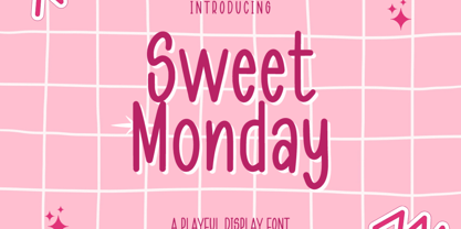 Sweet Monday is a Playful Display font that will make your designs look unique and fun. It's perfect for labels, quotes, posters, DIY projects, branding, packaging, greeting cards, websites, photos, photography overlays, signs, window art, scrapbooking, tags and so much more! What's Included : + Standard glyphs + Web Font + Multilingual Accent + Works on PC & Mac + Simple installations Accessible in the Adobe Illustrator, Adobe Photoshop, Adobe InDesign, even work on Microsoft Word. PUA Encoded Characters - Fully accessible without additional design software. Fonts include multilingual support + Image used : All photographs/pictures/vector used in the preview are not included, they are intended for illustration purpose only. Thank You
 - Book Worm by me55enjah,
$14.00 Introducing Book Worm! A simple, fun and easy-to-read typeface. Base on hand lettering with paintbrush, this typeface inspired by kids storybook. This typeface add more fun in reading a book with this easy-to-read & playful characters. Including simple ligatures, number & punctuation, this typeface can be use for quotes, title, and also body text. This font just fills you with joy when you design with it. It's so fun and cutesy it is ideal for all child like designs and especially for birthday invites! We love this happy-go-lucky typeface and can't wait to see what you do with Book Worm!
 - Exec Corners by Wiescher Design,
$35.00 I created the »EXEC« sans font during the years 2018 to mid 2020. The »EXEC«-Corners-family is a very special, unusual design. »EXEC«-Corners has 7 weights, ranging from Thin to Bold (plus 7 italics). This exceptional font is suited for editorial, book text, advertising and packaging, logo, branding, small text as well as web and screen design. »EXEC«-Corners has advanced typographical support including ligatures, small caps, alternate characters, case-sensitive forms, fractions, super- and subscript characters. »EXEC«-Corners comes with a range of figures—oldstyle and lining figures, each in tabular and proportional widths. »EXEC«-Corners supports Basic-, Western-, and Central-European Latin-based languages including Turkish.
 - Refita by Hanzel Space,
$25.00 Refita, is a wedge serif font that is sure to stand out! A little bit retro and a bit modern, Refita. is great for logos, editorial or web design. The unique sharp serifs mixed with thin strokes give off a bold mid century architectural vibe. This modern serif typeface features serifs. Perfect for gorgeous logos & titles, The Refita will pair beautifully with many fonts and work well with whatever project you're working on. Uppercase Lowercase Numbers & Punctuation That's it! If you have any questions at all , feel free to pop me a private message , I'm always more than happy to help you along :) Happy creating! Hanief Studio


