10,000 search results
(0.068 seconds)
- Antic Mosaic by Gleb Guralnyk,
$14.00 Hello, Introducing a vintage font "Antic Mosaic". It's a decorative typeface made of hundreds of mosaic tiles. Five included font variations will help to create different color combinations. Antic Mosaic supports most of the west european languages and also includes ukrainian cyrillic characters (check out the screenshot with all available glyphs).
 - Mouncella by Muksal Creatives,
$10.00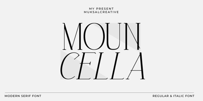 Mouncella Modern serif Font typeface with beautiful alternate, special glyphs, ornament and multilingual support. It's a very versatile font that works great in large and small sizes. Perfect for editorial projects, Logo design, Clothing Branding, product packaging, magazine headers, or simply as a stylish text overlay to any background image.
 - Rosegar by Muksal Creatives,
$15.00 Rosegar Modern sans serif typeface with beautiful alternete, special glyphs, ornament and multilingual support. It's a very versatile font that works great in large and small sizes. Perfect for editorial projects, Logo design, Clothing Branding, product packaging, magazine headers, or simply as a stylish text overlay to any background image.
 - Magioline by Muksal Creatives,
$10.00 Magioline Modern serif Font typeface with beautiful alternate, special glyphs, ornament and multilingual support. It's a very versatile font that works great in large and small sizes. Perfect for editorial projects, Logo design, Clothing Branding, product packaging, magazine headers, or simply as a stylish text overlay to any background image.
 - Kassi by Almarena,
$29.00 Kassi™ is a condensed typeface inspired by the scientific and mathematical world. It's available in 2 styles: The CLASSIC version, simple and readable with a touch of originality and the DISPLAY version, more elegant and contrasting. Kassi™ is compatible with 93 languages and contains +450 glyphs including several alternatives.
 - Perfect Moment by Muksal Creatives,
$10.00 Perfect Moment Modern serif Font typeface with beautiful alternate, special glyphs, ornament and multilingual support. It's a very versatile font that works great in large and small sizes. Perfect for editorial projects, Logo design, Clothing Branding, product packaging, magazine headers, or simply as a stylish text overlay to any background image.
 - Street Punks by Wing's Art Studio,
$10.00 Street Punks: Graffiti Inspired Marker Pen and Paint Brush Font A hand-drawn font inspired by graffiti and skate culture that comes in two pen and paint styles. Plus a shed-load of alternatives for designs that come straight off the pen (or brush). What happens when you combine graffiti, skate culture and 80s movies? You get Street Punks; a gritty, no-nonsense design that's equally at home on a ripped t-shirt or opening a horror movie (with ninjas!) Choose the slick look of marker pens or the textured roughness of paint brushes. Mix them up, play around and have fun. It's up to you! Street Punks comes with a complete set of alternatives and underlines with each style, so you’ll never have to repeat an E or an I; the tale-tell signs that give away other hand-made fonts. It also features all-caps uppercase and lowercase characters, along with numerals, punctuation and language support. It's a font that gives you tools to create some truly unique designs with just a little bit of work. The perfect choice for t-shirts, posters, stickers, movie titles, YouTubers and more! Street Punks: Marker and Paint Marker Regular Marker Alternative Marker Underlines* Paint Regular Paint Alternative Paint Underlines* *Underlines are assigned to keys: ABCDEFGHIJKLMNOP Find more from The Video Store Collection at Wingsart Studio
 - Brokson by Andrey Sharonov,
$25.00 This font pair was crafted by hand under inspiration of old-fashioned typography on different vintage labels, packages, sighs and others. It’s will be a godsend for those who want to add vintage mood to design project. Collection includes Script, Serif and it’s variations like Regular, Rough and Aged. This pair perfectly cooperating with each other. Brokson can be used in different purposes: lettering and logotype, labels, t-shirts, product packaging, advertising and many others. In addition to the basic set, Brokson Script has beautiful alternatives of Uppercase characters, variations of the end for Lowercase and some ligatures. Also, there are two types of end-swashes and eight lengths of each style. Brokson Serif was designed as a secondary and additional font after Script, but in the process of their use I realized it also look great as a priority. Quick combinations for Opentype features: Uppercase Alternates - just add for example «2, 3, or 4» after Uppercase; End-letter - just add «2» at the end of the word; End-swashes (tails) - just add _1, _2, _3… or /1, /2, /3…up to 8, where number is length of tail. This combinations works only with activated Standard Ligatures option in Opentype panel (Adobe Illustrator / Photoshop). Multilingual Support Danish, Dutch, English, Estonian, Faroese, Finnish, French, German, Hungarian, Icelandic, Italian, Norwegian, Polish, Portuguese, Slovene, Spanish, Swedish, Turkish.
 - Trevor by TypeTogether,
$36.80 Teo Tuominen’s Trevor took its first breath as a revival of an 18th century antiqua, but culminated in an entirely new and good-natured family. Trevor is an affable slab serif in nature: both heavy and kind. Known for their familiarity and their dark colour, the terminals of slab serifs put additional weight along the line to maintain an inky presence. Their clunky forms reveal slight immaturity and arouse the reader’s sympathy for the subject at hand. Trevor connects with others by consciously riding the line between being personal and commanding. One goal with Trevor was to pair the robust nature of a low contrast slab serif with more sophisticated elements, such as the ball terminals. So wherever one looks in Trevor, rounded corners rule the day, softening the overall appearance by mimicking ink spread made by old metal type. The easygoing look is tempered by very few inktraps and sharp corners, mostly to the inside of characters and in acute angles. Whatever Trevor is paired with, it has an altruistic outlook in that it sees the best in others. It’s the neighbourly type family — the neighbour you actually want. Trevor’s almost monolinear weight and high x-height give it a typewriter look in the extralight and light weights, but the whole family was made to work with many other font styles, design work, and information structures. It certainly finds its home in packaging and advertising, its sturdy verticality and narrowness fit the needs of headlines and intro text, and its seven weights are primed for plays and involved text needing many layers of distinction. The black weight is treated like a separate display style with altered ball terminals and serifs to capitalise on the added heft. Trevor’s seven roman weights cover the Latin A Extended glyph set to bring its kindly and commanding outlook to your projects. Along with alternate version of the ‘R’ in the black weight, its OpenType features include both tabular and proportional lining and oldstyle figures, ligatures, and fractions. The complete Trevor family, along with our entire catalogue, has been optimised for today’s varied screen uses.
 - Blippo by Bitstream,
$29.99Another variant of Bayer’s Universal Alphabet, resembling ITC Bauhaus in design, ITC Ronda in proportion and fit, prepared by FotoStar in the mid 1970s. - Malden Sans by Monotype,
$49.00 Malden Sans is a mischievous grotesque sans serif with charming details that gives designers a solid typographic voice. It was created by Michele Patanè with regular and condensed widths, as a utilitarian typeface family for print and digital environments. It was originally designed as part of a type system for cinema magazines, and embodies the devil-may care attitude of the silver screen. Designer Michele Patanè looked back to an earlier era of typography to create the typeface, embracing unusual details, rather than ironing them out. “There is a very naive way of using typography in the 30s and 40s, something not as clean as how it’s used in the late 50s and 60s when everything passed through a rationalisation of the typographic palette,” he explains. “In film magazines you can still see a bit of roughness, and I like that.” This is a design that’s desperate to be used in editorial environments, and has been created to stand up to lower quality paper. It would be equally at home on posters, packaging, and even in digital environments where designers are looking for something more expressive than another geometric sans serif. Malden Sans includes a Normal and Condensed range, with 7 weights in the normal and 6 in the Condensed, both including italics.
 - Totoey by MKGD,
$13.00 Most of my fonts tend to skew more to the darker side in terms of themes and uses. So, as a challenge, I took it upon myself to design a font through the eyes of my wife. Josephine, having a sunny and carefree disposition, gave this font her blessing as being certifiably fun and cheerful. The name of the font comes from the Cantonese translation for "peach" (tow); and saying it twice (toto) is just a cuter way of putting it. Sort of like "Peachy". It's been my nickname for Josephine for as long as I can remember. Totoey has a glyph count of 390 and supports the following languages; Supported Languages: Afrikaans, Albanian, Asu, Basque, Bemba, Bena, Bosnian, Catalan, Chiga, Colognian, Cornish, Croatian, Czech, Danish, Embu, English, Esperanto, Estonian, Faroese, Filipino, Finnish, French, Friulian, Galician, German, Gusii, Hungarian, Icelandic, Indonesian, Irish, Italian, Kabuverdianu, Kalaallisut, Kalenjin, Kamba, Kikuyu, Kinyarwanda, Latvian, Lithuanian, Low German, Lower Sorbian, Luo, Luxembourgish, Luyia, Machame, Makhuwa-Meetto, Makonde, Malagasy, Malay, Maltese, Manx, Meru, Morisyen, North Ndebele, Norwegian Bokmål, Norwegian Nynorsk, Nyankole, Oromo, Polish, Portuguese, Romanian, Romansh, Rombo, Rundi, Rwa, Samburu, Sango, Sangu, Scottish Gaelic, Sena, Shambala, Shona, Slovak, Slovenian, Soga, Somali, Spanish, Swahili, Swedish, Swiss German, Taita, Teso, Turkmen, Upper Sorbian, Vunjo, Walser, Zulu
 - Pata Slab by In-House International,
$10.00 Pata Slab: the ultra-heavy optimism we all need in 2020 Pata Slab is the type equivalent of a catwalk stomp down a city sidewalk, a font that’s assertive, funky and more than a little sexy. Named after a colloquialism for ‘feet’, Pata features ultra-heavy slabs and contrasting hairline centers that rise from its chunky footprint. The resulting, retro-inspired vertiginous curves add instant attitude to any design. Developed in 2020, Pata is a type of its time.Pata is all upside, as it is a typeface with no descenders — one that elevates all characters to grow upward from the baseline (because, c’mon, we could all use something uplifting right now!) All uppercase characters were built to fit precisely inside a square, so they’re all the same width and height. The lowercase alphabet, eñes, cedillas, punctuation, numbers and symbols all follow the same height restrictions. Despite all that confinement, Pata sports standard-height terminals that connect seamlessly so there’s nearly endless options for modular ligatures. The upshot of all this meticulous awesomeness is that laying out, customizing and stacking text super simple. Pata Slab was created by In-House International, designed Alexander Wright in collaboration with Rodrigo Fuenzalida. It's available for Opentype format (.otf) compatible with Mac and PC.
 - Anuschka by Anomali Creative,
$10.00 Introducing **ANUSCHKA** - Faux Cyrillic Display Font Faux Cyrillic, pseudo-Cyrillic, pseudo-Russian or faux Russian typography is the use of Cyrillic letters in Latin text, usually to evoke the Soviet Union or Russia, though it may be used in other contexts as well. It is a common Western trope used in book covers, film titles, comic book lettering, artwork for computer games, or product packaging which are set in or wish to evoke Eastern Europe, the Soviet Union, or Russia. A typeface designed to emulate Cyrillic is classed as an ethnic typeface. **ANUSCHKA** came with that protest and propaganda vibe. It's contain a complete Simple Latin Glyphs, with extra ligatures, D-Ligature, Stylistic set for the main character to make it stencil look and distressed look. --- This font can be used with all software that can read standard fonts. Check out my instagram: https://www.instagram.com/anomalicreatype/ Thanks so much for checking out my shop! All the best, **Krisna Teja** Anomali Creatype #typeface #Stencil #FauxCyrillic #Cyrillic #Military #Protest #Poster #vintage #Extreme #design #Vintage #graphic #calligraphy #Retro #typography #propaganda #Poster #blackletter #retrostyle #illustration #Russian #socialist #character #set #uppercase #decorative #black #classic #Uppercase #handmade #capital #bold #number #modern #tattoo #english #art #label #logo #middle #typographic #antique #sign #letterhead #fashion #filmtitles #russia #comicbooklettering #videogames #computergames
 - Amys Hand by Kustomtype,
$15.00 "The Amy Winehouse Script" unveils a unique window into the artistic and personal world of the iconic British singer and songwriter, Amy Winehouse. Renowned for her soulful voice and heartfelt lyrics, Amy's handwriting, a lesser-known facet of her life, offers a captivating story. Amy's script mirrors her artistic and unconventional spirit, marked by artistic flourishes and cursive elegance, echoing her expressive personality. Her cursive style, chosen for its fluidity, mirrors her singing, creating a deep connection between her music and script. Her individualistic script is characterized by varied letter sizes and shapes, reflecting her nonconformist nature and her desire to stand out. It can be messy, much like her turbulent life, representing her emotional journey, marked by highs and lows. Amy's handwriting evolved with her emotional state, sometimes appearing chaotic during difficult times. It's important to note the limited public samples, making it challenging to draw definitive conclusions. "The Amy Winehouse Script" invites you to explore uncharted territories of her life and artistry, offering fresh insights into her unspoken expressions and enduring intrigue. In every line, you can hear the music of her words and the story of her script, reminding us how art transcends boundaries, leaving an indelible mark.
 - Schorel by insigne,
$29.00 Schorel commands the room and sets the audience at ease. This new Scotch Roman typeface from insigne is a confident personality with a tasteful amount of contrast. Cool, sharp, balanced, and contemporary, Schorel not only delivers well in longer texts, but can use its mass to meet the needs of subheadlines, callouts, and other similar projects. Scotch typefaces initially come from Scottish foundries, popular in the United States in the late 18th century. This beautiful genre of type grew in popularity through the Victorian era and most of the 20th century to make regular appearance in books, magazines, newspapers, and advertisements. Schorel itself, with its moderate contrast and organic design, features short ascenders and descenders and calligraphic italics. The design features a few ball terminals, but mostly touts its bracket serifs, which come to a sharp point. The typeface, ideal for medium to large sizes, is useful for both headlines and text, carefully created for both print and screen. This OpenType font supports most Latin-based languages. Schorel has nine weights and a true italic, and many special features such as small caps, fractions, old-style figures, and numerous extras complete each font. It’s every bit a delight to your reader’s eye.
 - Ladoga by ParaType,
$30.00 Ladoga — one of the most beautiful Russian designs from the soviet period. The type family was developed in Polygraphmash in 1968 by Anatoly Shchukin on the base of his own lettering for book covers and titles. It was one of the first attempts in Cyrillic typography to create text face in a style of renaissance antiqua. Stylization to broad pen calligraphy resembles early forms of Latin types that were based on handwritten humanistic minuscule. Unique in its character set digital version of Ladoga was designed by Viktor Kharik on the base of artworks of Shchukin for ParaType. The family consists of roman and italic styles in text and display versions. Character set includes characters of original shapes as well as more modern alternatives. Besides there are a set of additional characters, old style figures and small caps. The fonts cover all modern languages based on Latin and Cyrillic scripts, Greek alphabet (including polytonic extension), Hebrew and historical Cyrillic letters. Ladoga is gorgeous in display sizes and pretty readable in texts. It’s well suitable for fiction literature, historical books, art criticism, religious and philologist works. It will be extreme helpful for multilingual issues and for inclusions into body text historical passages in original orthography. The family was released in 2010.
 - Artifex Regina by Adorae Types,
$29.00 Created for designs that require a handcrafted and handwritten look with a majestic touch. Artifex Regina is a blend of fantasy, wizardry, and charming delight. What's even better? IT'S VARIABLE! Designed to be a fun variable font, it allows Artifex Regina to be used as an animated typography adding a hint of magic through styles & transitions. Need a brighter inline? Need a softer shade? We got you! As an extra feature, you might want to try and play with its sliders and navigate throughout its 2 axes plus a swirly style handler to get a fully customized style! FEATURES: · Alternates: With an easy access at hand and through various stylistic sets that may contain many or a few alternates, leaving the choice to the designer for the right combination of sets and alternate characters. This includes a set of swirly ends available for static fonts as well as an axis for the variable font. · Contextual alternates: a few characters that provide some variety when used together. · Ligatures: Common used connectors with a playful twist. · Swashes: Accesible through OpenType Swashes feature there's a set of initial, final and middle swashes with passionate, elegant, and expressive strokes. Also, through stylistic sets, there's a set of monoline swashes for a cleaner look or limited spaces.
 - Webdings Windows compatible by Microsoft Corporation,Webdings™ is a symbol font designed in 1997 as a response to the need of Web designers for a fast and easy method of incorporating graphics in their pages. Webdings contains a wide variety of Web-related images of the kind found in common use across the Web, as well as some more unusual drawings. User Interface icons suitable for creating page navigation elements are also included. Webdings is ideal for enriching the appearance of a Web page. Because it is a font, it can be installed on the user's system, (or embedded in the document itself) is fully scaleable and quick to render. It's a perfect way of including graphics on your site without making users wait for lots of graphic files to download. Each Webding has been fine-tuned to ensure high quality and clarity on the screen, regardless of the complexity of the individual symbol. Character Set: Picture/Symbol This version of Webdings is the licensable equivalent to the font versions coming preinstalled with Microsoft Windows® since version 8. It is identical regarding font name, language coverage and other font behaviour and is perfect for document exchange with machines that are not running the Windows® operating system.
- Peridot Devanagari by Foundry5,
$9.00 Mesmerised by the sparkling greenish-yellow mineral called Olivine hidden within the black basalt of Lanzarote's lava fields, we named the gem of our library after this natural beauty. Peridot is not just another typeface – it's a multifaceted sans serif type system crafted with passion and precision by Foundry5. Painstakingly developed through long hours and a keen focus on every minute detail, this typeface boasts a high-quality 10 weight family with matching italics in 6 widths, and the highly versatile variable format. Brimming with character, Peridot invites you to experiment with its various stylistic variants, allowing you to tailor the typographic tone to fit your creative vision perfectly. The diverse range of widths and styles in Peridot offers a dynamic typographic toolbox, ready to inspire and captivate even the most innovative designers. Peridot Devanagari supports Devanagari and Latin and covers over 330 languages. It includes all required localised variants, tabular numerals and currencies, fractions, clever discretionary ligatures and many more features. Peridot performs in varied environments – from branding, display, corporate use, editorial, advertising, poster, web, screen usage etc. Think of any other use case as well, and Peridot will perform. Peridot Devanagari comprises 20 static fonts, family package, and variable support. It is the gem you ought to have in your collection.
 - Kadeworth by Typodermic,
$11.95 Introducing Kadeworth—the bold, contemporary typeface that commands attention. With its daring, rounded design, Kadeworth is a true standout in the world of graphic design. Its compact, space-saving letters pack a powerful punch, making it the perfect choice for headlines and bold statements. But don’t be fooled by its sleek exterior—Kadeworth also has a soft side. Its smooth letterforms have a warm, inviting quality that will draw your audience in and keep them engaged. Whether you’re creating a cutting-edge tech brand or a stylish lifestyle blog, Kadeworth will bring your message to life with its unique blend of strength and softness. With its hi-tech voice, Kadeworth is perfect for modern designs that demand attention. It’s versatile enough to work in a variety of settings, from edgy editorial layouts to sleek corporate branding. So why settle for a dull, lifeless typeface when you can elevate your designs with Kadeworth’s bold, rounded charm? Try it out today and see the difference for yourself. Most Latin-based European writing systems are supported, including the following languages. Afaan Oromo, Afar, Afrikaans, Albanian, Alsatian, Aromanian, Aymara, Bashkir (Latin), Basque, Belarusian (Latin), Bemba, Bikol, Bosnian, Breton, Cape Verdean, Creole, Catalan, Cebuano, Chamorro, Chavacano, Chichewa, Crimean Tatar (Latin), Croatian, Czech, Danish, Dawan, Dholuo, Dutch, English, Estonian, Faroese, Fijian, Filipino, Finnish, French, Frisian, Friulian, Gagauz (Latin), Galician, Ganda, Genoese, German, Greenlandic, Guadeloupean Creole, Haitian Creole, Hawaiian, Hiligaynon, Hungarian, Icelandic, Ilocano, Indonesian, Irish, Italian, Jamaican, Kaqchikel, Karakalpak (Latin), Kashubian, Kikongo, Kinyarwanda, Kirundi, Kurdish (Latin), Latvian, Lithuanian, Lombard, Low Saxon, Luxembourgish, Maasai, Makhuwa, Malay, Maltese, Māori, Moldovan, Montenegrin, Ndebele, Neapolitan, Norwegian, Novial, Occitan, Ossetian (Latin), Papiamento, Piedmontese, Polish, Portuguese, Quechua, Rarotongan, Romanian, Romansh, Sami, Sango, Saramaccan, Sardinian, Scottish Gaelic, Serbian (Latin), Shona, Sicilian, Silesian, Slovak, Slovenian, Somali, Sorbian, Sotho, Spanish, Swahili, Swazi, Swedish, Tagalog, Tahitian, Tetum, Tongan, Tshiluba, Tsonga, Tswana, Tumbuka, Turkish, Turkmen (Latin), Tuvaluan, Uzbek (Latin), Venetian, Vepsian, Võro, Walloon, Waray-Waray, Wayuu, Welsh, Wolof, Xhosa, Yapese, Zapotec Zulu and Zuni.
 - FS Joey Paneuropean by Fontsmith,
$90.00Kangaroo FS Joey was the offspring of a project with Rudd Studio to develop a logotype for an online streaming TV service, in 2008. While under wraps, the secret project was code-named Kangaroo. The logotype led to a second project, to design a corporate typeface for the service. It was the first big project Fernando Mello had worked on with Jason Smith. “Like any designer who just joined a team, I was very excited about it, drawing and sketching lots of ideas. I remember Jason and I experimenting with lots of possibilities, for both the logo and the typeface.” Online As the font for a Spotify-style, internet-based service, FS Joey needed to be highly legible on-screen, including at very small sizes. There had to be a range of weights, and they’d have to work well in print, too. It was also important that it felt corporate, not too quirky, while still having a strong character of its own. Quirkiest “We designed three weights specifically for use on the Web,” says Jason Smith. “There was the usual fight between me and my team. I wanted at least one identifiable letter that was a quirk. As always I went straight for the lowercase ‘g’, and it was drawn numerous times with lots of variation. I got the quirkiest one accepted by the client.” But, later in 2009, the Competition Commission blocked Project Kangaroo, and Fontsmith were left with a couple of weights of an as yet unused font. From Kangaroo, Joey was born. A favourite “Straight away, people started to notice the typeface,” says Jason. “I can take the credit for pushing the art direction and standing up for the quirks. But it was Fernando who was the key to pulling it all together and adding his own distinct flavour. Now it’s one of my favourite designs in our library.” Fresh and friendly, geometric and energetic, Joey is available in five weights, all with italics, all finely-tuned for both screen and print. - FS Joey by Fontsmith,
$80.00 Kangaroo FS Joey was the offspring of a project with Rudd Studio to develop a logotype for an online streaming TV service, in 2008. While under wraps, the secret project was code-named Kangaroo. The logotype led to a second project, to design a corporate typeface for the service. It was the first big project Fernando Mello had worked on with Jason Smith. “Like any designer who just joined a team, I was very excited about it, drawing and sketching lots of ideas. I remember Jason and I experimenting with lots of possibilities, for both the logo and the typeface.” Online As the font for a Spotify-style, internet-based service, FS Joey needed to be highly legible on-screen, including at very small sizes. There had to be a range of weights, and they’d have to work well in print, too. It was also important that it felt corporate, not too quirky, while still having a strong character of its own. Quirkiest “We designed three weights specifically for use on the Web,” says Jason Smith. “There was the usual fight between me and my team. I wanted at least one identifiable letter that was a quirk. As always I went straight for the lowercase ‘g’, and it was drawn numerous times with lots of variation. I got the quirkiest one accepted by the client.” But, later in 2009, the Competition Commission blocked Project Kangaroo, and Fontsmith were left with a couple of weights of an as yet unused font. From Kangaroo, Joey was born. A favourite “Straight away, people started to notice the typeface,” says Jason. “I can take the credit for pushing the art direction and standing up for the quirks. But it was Fernando who was the key to pulling it all together and adding his own distinct flavour. Now it’s one of my favourite designs in our library.” Fresh and friendly, geometric and energetic, Joey is available in five weights, all with italics, all finely-tuned for both screen and print.
 - Calevor by DM Studio,
$15.00 The Calevor Elegant Font is a sophisticated and refined typeface that embodies timeless beauty and a touch of class. With its graceful letterforms and stylish design, this font adds an air of elegance and professionalism to your branding, invitations, editorials, and various design projects. Features: Elegant and Timeless Style: The Calevor Elegant Font exudes a timeless and sophisticated aesthetic. Its graceful letterforms, balanced proportions, and stylish design create an atmosphere of refined elegance, making it perfect for projects that demand a touch of class and sophistication. Refined Design: The font's design is characterized by its clean lines and harmonious curves. It's meticulously crafted to ensure every detail reflects the epitome of elegance, making it suitable for projects that require a polished and professional look. Versatile Application: This font is versatile and well-suited for a wide range of design projects where an elegant and timeless typeface is needed. Use it in branding, invitations, editorial design, luxury packaging, and more to add an element of sophistication and class to your designs. Uppercase and Lowercase Letters: The font includes both uppercase and lowercase letters, providing flexibility and creative freedom in your designs. Mix and match the cases to create visually appealing and balanced typography. Punctuation and Symbols: In addition to the alphabet, the Calevor Elegant Font includes a comprehensive set of punctuation marks, numerals, and common symbols. This ensures consistency and ease of use when incorporating the font into your design projects. Easy to Use: Installing and utilizing the Calevor Elegant Font is hassle-free. It is compatible with both Windows and Mac operating systems and seamlessly integrates into popular design software such as Adobe Photoshop, Illustrator, and InDesign. This ensures a smooth and efficient design workflow. Elevate your designs with the timeless elegance of the Calevor Elegant Font. Let its graceful letterforms and refined design add an air of sophistication and professionalism to your branding, invitations, and various design projects. Embrace the classic beauty of this font and create designs that exude elegance and style.
 - Superclarendon by Typodermic,
$11.95 Introducing Superclarendon, a typeface that’s as bold and powerful as its mid-19th Century inspiration. Its chunky slab serifs and subtly squared letterforms give it a timeless appeal that’s sure to make your designs stand out. But Superclarendon isn’t just a nod to the past—it’s a contemporary take on the classic Clarendon that retains all of its booming voice. Superclarendon’s austere curls and sturdy terminals give it a solid construction that’s sure to make an impact. Its squarish, superelliptical curves give it a modern feel that’s perfect for today’s designs. Whether you’re creating a poster, a brochure, or a website, Superclarendon is the typeface that will make your message loud and clear. And with four weights, italics, and old-style (lowercase) numerals, Superclarendon gives you all the tools you need to create stunning designs. So if you’re looking for a typeface that’s as powerful as it is versatile, look no further than Superclarendon. Most Latin-based European writing systems are supported, including the following languages. Afaan Oromo, Afar, Afrikaans, Albanian, Alsatian, Aromanian, Aymara, Bashkir (Latin), Basque, Belarusian (Latin), Bemba, Bikol, Bosnian, Breton, Cape Verdean, Creole, Catalan, Cebuano, Chamorro, Chavacano, Chichewa, Crimean Tatar (Latin), Croatian, Czech, Danish, Dawan, Dholuo, Dutch, English, Estonian, Faroese, Fijian, Filipino, Finnish, French, Frisian, Friulian, Gagauz (Latin), Galician, Ganda, Genoese, German, Greenlandic, Guadeloupean Creole, Haitian Creole, Hawaiian, Hiligaynon, Hungarian, Icelandic, Ilocano, Indonesian, Irish, Italian, Jamaican, Kaqchikel, Karakalpak (Latin), Kashubian, Kikongo, Kinyarwanda, Kirundi, Kurdish (Latin), Latvian, Lithuanian, Lombard, Low Saxon, Luxembourgish, Maasai, Makhuwa, Malay, Maltese, Māori, Moldovan, Montenegrin, Ndebele, Neapolitan, Norwegian, Novial, Occitan, Ossetian (Latin), Papiamento, Piedmontese, Polish, Portuguese, Quechua, Rarotongan, Romanian, Romansh, Sami, Sango, Saramaccan, Sardinian, Scottish Gaelic, Serbian (Latin), Shona, Sicilian, Silesian, Slovak, Slovenian, Somali, Sorbian, Sotho, Spanish, Swahili, Swazi, Swedish, Tagalog, Tahitian, Tetum, Tongan, Tshiluba, Tsonga, Tswana, Tumbuka, Turkish, Turkmen (Latin), Tuvaluan, Uzbek (Latin), Venetian, Vepsian, Vietnamese, Võro, Walloon, Waray-Waray, Wayuu, Welsh, Wolof, Xhosa, Yapese, Zapotec Zulu and Zuni.
 - Malibu by ITC,
$29.99Malibu was designed for ITC by Alan Meeks in 1992 and is a font with distinctive calligraphic roots. Pronounced stroke contrast and a marked leaning to the right give the font its energetic, lively image. The letters look almost as though cut from paper, their outer contours angular and pointed against a background. Flowing and demure, Malibu works well for both short texts and headlines. For best results, the lower case letters should be set close together. - LT White Fang - Personal use only

- ABTS Day Of The Dead by Albatross,
$19.95 ABTS day of the dead is a highly detailed and meticulously designed symbol font. It’s design is inspired by the Day of the Dead celebration, honoring the deceased. I think The Day of the Dead is one of the greatest reasons anyone should celebrate life, so I decided to make a font honoring that tradition. I'm not even sure If I got all of it right, (traditional symbols and such) but it was a joy to create. There are 2 fonts. The first is the Skulls. This includes uppercase and lowercase A-Z, a-z. There you will find the decorated skulls, blank skulls, and negatives. The second font is the symbols. If you wish to design your own Day of the Dead skull, you should purchase the symbols, as they are designed specifically for adorning the blanks. Purchasing both fonts will give you a discount. Please note, the symbol font will show up in your application of choice as “ABTS Day of the Dead Bold.” This is to avoid software problems with naming the font itself "Symbols." Skulls are awesome!!!
 - Belanga by Gatype,
$10.00 Balanga is a smooth, elegant and flowing handwritten font. It has a beautifully balanced character, goes well with many designs. Balanga features varied baselines, smooth lines, beautiful glyphs, and stunning alternatives. Hand-drawn design elements allow you to create many beautiful typographic designs in an instant such as branding, web and editorial designs, prints, crafts, quotes, It's great for logo types, wedding invitations, romantic cards, labels, packaging, name spelling and other . Add to your most creative ideas and see how they make it happen! Balanga includes OpenType style alternatives, ligatures, and International support for most Western Languages. To enable the OpenType Stylistic alternative, you need a supporting program such as Adobe Illustrator CS, Adobe Indesign & CorelDraw X6-X7, Microsoft Word 2010 or a later version. Balanga is coded with PUA Unicode, which allows full access to all additional characters without having to design special software. Mac users can use Font Book , and Windows users can use Character Map to view and copy any additional characters to paste into your favorite text editor/application.
 - Storefront Pro by Sudtipos,
$79.00 Storefront is what the prolific and talented American sign painters of the 1920s and 1930s would have created if they had access to the advanced lettering and type technologies we have today. Rooted in an incomplete Alf Becker alphabet sample, Storefront is my usual overdose on alternates and swashes, my eternal attempt at giving typesetting that ever-elusive handmade impression. Though the main shapes, especially the majuscules, are almost a standard recitation of the natural evolution of nineteenth century scripts, the additional variants available within the font provide a leap in time to what sign makers and packagers are doing today. I can honestly say that Storefront’s influences are probably less historic and more in line with my recent travels and frequent supermarket visits. It’s difficult to avoid current visual culture when you're constantly bombarded with it. Not that I try. I certainly welcome the overflow. I'm probably addicted to it by now. With a very cool aesthetic, plenty of alternates and swashes, extended Latin language support, Storefront is over a thousand glyphs for your branding, packaging, and sign making pleasure.
 - Sitcom by GroupType,
$19.00 If there was an American Typeface Hall of Fame, Bank Gothic, designed by the great Morris Fuller Benton would hold a place of special distinction considering this design has survived so many trends in typographic fashion since being introduced in 1930. It's just as desirable today as it was over eighty years ago; arguably more. Today, Bank Gothic is a very popular choice as a titling face for science fiction books, posters and countless television and movie titles. It is also a popular typeface for use in computer games and digital graphics. GroupType’s 2010 revival of this American classic is true to the design, the period, and Benton’s aesthetic. GroupType worked with some of the most talented and experienced type designers that were historically grounded and sensitive to this design project. Fortunately, Mr. Benton has left us a large selection of other great typefaces for insight and guidance. GroupType’s new revival includes the original three weights in regular and condensed style but also a new small cap and lowercase in each font necessary for 21st century typography.
 - Sinoreta by Mans Greback,
$69.00 Sinoreta is a classic serif font with a bold retro style that adds sophistication and elegance to any design. The decorative alternates add a touch of uniqueness, making Sinoreta perfect for projects that require a bold and proper typographic presence. Whether it's branding, logos, headlines, or editorial designs, Sinoreta will bring a timeless and tasteful touch to your work. This font is designed by Mans Greback in 2023 and combines traditional serif style with modern design elements. Choose Sinoreta for a retro, elegant and versatile font that will make your designs stand out. The Sinoreta family consists of four high-quality fonts: Regular, Italic, Bold and Bold Italic The font is built with advanced OpenType functionality and has a guaranteed top-notch quality, containing stylistic and contextual alternates, ligatures and more features; all to give you full control and customizability. It has extensive lingual support, covering all Latin-based languages, from Northern Europe to South Africa, from America to South-East Asia. It contains all characters and symbols you'll ever need, including all punctuation and numbers.
 - Music Sheets by Aah Yes,
$3.50 Music Sheets is a font that will produce blank music manuscript sheets, giving the main Clefs, Time Signatures, Stafflines, Guitar Tab, plus other useful symbols - in fact all you need to make simple manuscript of your own design, so you can put in the notation yourself. You can use it with ordinary Word Processors or top-end graphics programs equally easily. Using it is extremely simple - for instance into the text-box below type TBA for Treble Bass Alto Clefs, or 234567 for the basic Time Signatures from 2/4 up to 7/4, or L for the Lines. Essentially it’s a cut-down and slightly modified version of our Blank Manuscript font, (which is fairly comprehensive for more advanced scoresheets but obviously a bit more complex) and uses a similar intuitive method for inputting characters. There’s plenty of examples provided, plus a short guide explaining the character layout, which is extremely easy. Download the zip to get the guide and examples, and only install one version - either OTF or TTF, but not both.
 - Chinook by Unio Creative Solutions,
$9.00 Chinook has been designed as an homage to the iconic chunky look of the Italian movie titling from the 70s and 80s. Despite its vintage flair, our sturdy display font is perfectly adaptable for any contemporary context with its balanced and soft text typesetting. This project is obviously influenced by the everlasting classic "Cooper Black", but includes more modern letter shapes, with rounded serifs and a fluffy overall appearance. Chinook, includes a customized italic set, features an extended charset covering several languages based on the Latin Alphabet, and sports a complete set of Open type features. It's equipped with swashes, alternates as well as discretionary ligatures, old-style figures, subscript and superscript numerals, and even more special glyphs. The heavy appearance makes this font ideal for high-impact design, such as headlines, titling, branding, and logotype. Specifications: - Files included: Chinook, including Italic - Multi-language support (Central, Eastern, Western European languages) - OpenType Features (Superscript and Subscript Numerals, Fractions, Oldstyle figures, Stylistic Alternates, Discretionary Ligatures, Swashes) Thanks for viewing, Unio.
 - Sequel Geo by OGJ Type Design,
$35.00 Sequel Geo is a geometric/neo-grotesque hybrid superfamily, influenced by formalized sans-serif typefaces from Germany and Swiss modernist type design—particularly Max Bill’s greek-styled lettering. 8 subfamilies and 120 individual fonts allow for a wide range of typographic expressions. Sequel Geo’s hallmark features, such as the circular “G” and punctuation, simple “t”, and two-story “a” turning one-story in bolder weights, persist throughout all styles. But it’s the formal and functional differences between subfamilies that let you really fine-tune your layouts. The three optical sizes of the core collection, “Body Text”, “Headline”, and “Display”, boast optimized spacing for the intended use. “Extended” packs some extra punch with 18 display-oriented styles. Finally, 48 “Graphic” styles in 4 subfamilies push to the Geometric side, replacing horizontal and vertical stroke endings with angular ones, simplifying letterforms. Sequel Geo is a journey through time and space. From 1920s Germany to 1950s Switzerland. All the while, its archetypal shapes are neutral yet confident, its appearance is classic.
 - Futura PT by ParaType,
$30.00 Futura is a classic geometric sans serif, one of the crucial typefaces of the 20th century. It remains relevant today and is widely used in logos, headings, web and print. Futura was designed by Paul Renner for Bauersche Gießerei (Bauer) in 1927. The typeface is based on simple geometric forms and is close in the aesthetics to 1920s-30s constructivism and the Bauhaus. Futura PT is the most complete Cyrillic version of Futura. It’s a type system of 25 styles: 16 regular and 9 narrow, from Thin to Extrabold. Futura PT has linear and old style figures, subscripts and fractions. The typeface supports more than 100 languages: Western and Central European Latin and the Cyrillic-extended. The Cyrillic version of Futura was designed by Vladimir Yefimov in 1991–1995. He partially redesigned the typeface in 2007, making it a wholesome consistent system, and Isabella Chaeva added new styles. The typeface was released under the name Futura PT. Isabella Chaeva returned to work on Futura in 2022. The typeface has three new styles, old style figures and extended Cyrillic support.
 - Lotter by Kaer,
$19.00 Lotter blackletter with Drop caps One fine day I found a vintage book, it called “A treatise by the Dominican friar-writer Marcus von Weida on the Brotherhood of the Holy Rosary”. It was printed in 1515 by Melchior Lotter in Leipzig. The text was illustrated by hand-colored engravings on religious and liturgical themes and beautiful initials I like. Lotter was the last name of a family of German printers, intimately connected with the Reformation. An innovation by the elder Lotter was his use of Roman types for Latin, reserving the Gothic types for German. I'm happy to present to you my new font family. Lotter font family has Drop cap and Regular styles. It's all you need to precisely imitate medieval style text. Use Drop cap style as a decorative element at the beginning of a paragraph or section, other part of the paragraph should be in Regular style. You’ll get: * Drop cap & Regular styles * Uppercase and lowercase * Multilingual support * Numbers * Symbols * Punctuation * Ligatures Please feel free to request any help you need: kaer.pro@gmail.com Best, Roman.
 - Lavinia by Eurotypo,
$55.00 Lavinia is the new hand lettered script font, full of fun calligraphy with 962 characters and a host of specials features that will allow you to add more personality and originality to your work. Lavinia is a seamlessly connecting alphabet. Using OpenType contextual, stylistics alternatives, swatches each lowercase has the minimum ten versions and each capital letter two variants. Also, Lavinia comes with a custom set of standard and discretionary ligatures, lots of goodies ornaments and flourishes, catchwords, tails, words with stylistics alternates, special double letters ligatures. This lovely font has an extended character set to support Central and Eastern as well as Western European languages. Mix and match them for a custom look! You can quickly change the appearance of your design. It’s like getting a lot of fonts for one! Lavinia is perfect for logos, advertising, announcement, invites, thank you’s and correspondence, for packaging, and to create all yours fun and moderns designs you want. There are plenty of options to allow you to create something unique and special. Test it, you will not regret! Have fun with it!
 - Ragnala by Amelia Studio,
$12.00 Ragnala is a smooth, elegant and flowing handwritten font. It has a beautifully balanced character, goes well with many designs. Ragnala features varied baselines, smooth lines, beautiful glyphs, and stunning alternatives. Hand-drawn design elements allow you to create many beautiful typographic designs in an instant such as branding, web and editorial designs, prints, crafts, quotes, It's great for logo types, wedding invitations, romantic cards, labels, packaging, name spelling and other . Add to your most creative ideas and see how they make it happen! Ragnala includes OpenType style alternatives, ligatures, and International support for most Western Languages. To enable the OpenType Stylistic alternative, you need a supporting program such as Adobe Illustrator CS, Adobe Indesign & CorelDraw X6-X7, Microsoft Word 2010 or a later version. Ragnala is coded with PUA Unicode, which allows full access to all additional characters without having to design special software. Mac users can use Font Book , and Windows users can use Character Map to view and copy any additional characters to paste into your favorite text editor/application.
 - Glyphic Neue by Typeco,
$29.00Glyphic Neue was inspired by the Op Art style of lettering in the United States that ran rampant in many photo type houses in the 1960's and 1970's. The Glyphic Series from the Franklin Photolettering group was an influence and spring board for this family of fonts, hence it's name. But Glyphic Neue departs from its unicase Franklin influence in several ways. Firstly the designer created both upper and lower case forms. The lowercase has been designed with barley protruding ascenders and descenders and with an x-height equivalent to the cap height, so that upper and lower can be exchanged indiscriminately for a quirky effect. Some of the letters take a cue from the original Glyphic series but many have been redesigned entirely to fit the designers vision. The italic forms differ enough from the upright version making it almost an entirely different display alphabet. Glyphic Neue is a versatile family of 6 fonts -- 3 widths, each with an accompanying italic that look equally at home when used on a party flier or a sports team visual identity.
