10,000 search results
(0.035 seconds)
- Wheaton by Typodermic,
$11.95 Introducing Wheaton, the bold and striking headline typeface that brings together the best of retro and techno aesthetics. With its softened letterforms and classic electronic vibe, Wheaton will transport your message into the future while invoking a sense of nostalgia for the past. At first glance, Wheaton’s design may seem like a throwback to the 1980s, with its clean lines and futuristic curves. But upon closer inspection, you’ll notice the subtle details that give it a contemporary edge. Its softened edges and fluid curves evoke a sense of modernity and sophistication, while its retro digital gloss adds a touch of nostalgia to your message. But Wheaton isn’t just about looks. Its scientific elegance and industrial wonder make it the perfect typeface for conveying a sense of technological progress and innovation. Whether you’re designing a website, creating an advertisement, or crafting a presentation, Wheaton is the perfect choice for making a bold statement. In the world of graphic design, standing out is key. With Wheaton, you can be sure that your message will be noticed and remembered. Its unique blend of retro and techno aesthetics gives it a distinct personality that will set your work apart from the rest. So why settle for a boring, generic typeface when you can have Wheaton? Let its futuristic assurance and industrial wonder take your message to the next level, and discover a new world of creative possibilities. Most Latin-based European writing systems are supported, including the following languages. Afaan Oromo, Afar, Afrikaans, Albanian, Alsatian, Aromanian, Aymara, Bashkir (Latin), Basque, Belarusian (Latin), Bemba, Bikol, Bosnian, Breton, Cape Verdean, Creole, Catalan, Cebuano, Chamorro, Chavacano, Chichewa, Crimean Tatar (Latin), Croatian, Czech, Danish, Dawan, Dholuo, Dutch, English, Estonian, Faroese, Fijian, Filipino, Finnish, French, Frisian, Friulian, Gagauz (Latin), Galician, Ganda, Genoese, German, Greenlandic, Guadeloupean Creole, Haitian Creole, Hawaiian, Hiligaynon, Hungarian, Icelandic, Ilocano, Indonesian, Irish, Italian, Jamaican, Kaqchikel, Karakalpak (Latin), Kashubian, Kikongo, Kinyarwanda, Kirundi, Kurdish (Latin), Latvian, Lithuanian, Lombard, Low Saxon, Luxembourgish, Maasai, Makhuwa, Malay, Maltese, Māori, Moldovan, Montenegrin, Ndebele, Neapolitan, Norwegian, Novial, Occitan, Ossetian (Latin), Papiamento, Piedmontese, Polish, Portuguese, Quechua, Rarotongan, Romanian, Romansh, Sami, Sango, Saramaccan, Sardinian, Scottish Gaelic, Serbian (Latin), Shona, Sicilian, Silesian, Slovak, Slovenian, Somali, Sorbian, Sotho, Spanish, Swahili, Swazi, Swedish, Tagalog, Tahitian, Tetum, Tongan, Tshiluba, Tsonga, Tswana, Tumbuka, Turkish, Turkmen (Latin), Tuvaluan, Uzbek (Latin), Venetian, Vepsian, Võro, Walloon, Waray-Waray, Wayuu, Welsh, Wolof, Xhosa, Yapese, Zapotec Zulu and Zuni.
 - Ayres Mono by Ayres,
$5.00 The Ayres Mono font is a clear and geometric mono-spaced font. It is easily legible and has Regular and Bold variants. It has keyboard friendly characters for drawing curved boxes and tables from the 'curly brackets' characters. These can be laid out in the text with the even spacing. It also features easy to use simple maths and music symbols. Some punctuation marks are made half-spaced along with a half-space key for more layout options. It supports many languages including English, French, Spanish, Italian, Portuguese, German, Dutch, Norwegian, Icelandic, Welsh, Finnish, Polish, Danish, Swedish, Hungarian, and Mauri. It includes symbols such as a tick, card suits and smiley face. The geometric layout is ideal for guitar tablature and text art.
 - Chlorine Serif by Victory Type,
$12.50The Chlorines are two unique fonts, for they look as if they have been corroded with some sort of caustic material. Could it have been chlorine? Who knows? Both fonts have a modern appeal to them and fancy up any document. And when you can pick both of 'em up for only $45 how can you resist that corrosive, yet clean appeal? Chlorine Serif is a unique font, for it looks as if it has been cleanly corroded with some sort of caustic material. Could it have been chlorine? Who knows? This font has a modern appeal to them and fancy up any document. And when you can pick it up for only $25 how can you resist that corrosive, yet clean appeal? - Morning Cookie by Bogstav,
$17.00 Yet again, a font inspired by my work as a kindergarten teacher! The other day, I had a conversation with some of the kids, about what they ate for breakfast. Some had oatmeal, some bread and others yogurt. But this kid - he insisted that every morning, his mother would serve him cookies, “morning cookies”. It sounded too good to be true, and when I asked his mother, it turned out that “cookies” were actually bread, but to make it sound more appetising, they called it cookies! The letters are rounded and in some way quite naive, but still clear and legible. With an extreme ascender and descender, the font stands out with its oddities. I’ve added 3 different versions of each lowercase letter!
 - Chlorine Sans by Victory Type,
$12.50The Chlorines are two unique fonts, for they look as if they have been corroded with some sort of caustic material. Could it have been chlorine? Who knows? Both fonts have a modern appeal to them and fancy up any document. And when you can pick both of 'em up for only $45 how can you resist that corrosive, yet clean appeal? Chlorine Sans is a unique font, for it looks as if it has been cleanly corroded with some sort of caustic material. Could it have been chlorine? Who knows? This font has a modern appeal to them and fancy up any document. And when you can pick it up for only $25 how can you resist that corrosive, yet clean appeal? - Deliscript by Alphabet Soup,
$29.00 Although initially inspired by the neon sign in front of Canter’s Delicatessen in Los Angeles, the design of Deliscript Upright and Deliscript Slant soon took on a life of its own–and its own distinctive look. Like its sibling Metroscript, Deliscript has many features that expand its usability such as the the variable length tails which can be accessed in 6 different styles, and the never before seen crossbars which can be extended outward in either direction from the lower case “t”. Throw in the special “WordLogos”, tons of ligatures and foreign accented characters, and you have a recipe for typesetting that approaches the look of hand-lettering. For a better understanding of its unique features please download The Deliscript User Manual—available in the Gallery section.
 - Stencil Moonlight by Linotype,
$29.00Latvian designer and educator Gustav Grinbergs created Stencil Moonlight as an attempt to slightly lighten up the stencil type scene. Intended as a lively, semi-formal face, its shapes are smooth and compact. It leaves a very heavy feeling on the page, as its letters display a very fat bold design. Stencil Moonlight is available is two separate font styles, Regular and Small Caps. When used together, the Stencil Moonlight family can create the perfect combination for your next display need. Stencil Moonlight works best in larger sizes, where it is clear that its forms stem from an experiment with stencil design. Grinbergs recommends the face for application in package design, advertising, poster design, and perhaps even for the subtitling of foreign films! - Bill Hiffith Handwritten by Colllab Studio,
$19.00 "Hi there, thank you for passing by. Colllab Studio is here. We crafted best collection of typefaces in a variety of styles to keep you covered for any project that comes your way! Bill Hiffith is an Organic Script, a gorgeous font that can be used for making multiple things. it includes smooth brush stroke, simple and soft. Its elegant taste is one of the most gorgeous fonts. This typography is reflected in this exquisite font family. The type is clean and simple yet fun and stylish. It is beautiful, better for headlines style design or logo design. Or you can have it on your website’s body style. Grab it now, Bill Hiffith could elevate your elegance brand design. A Million Thanks Colllab Studio www.colllabstudio.com
 - Palm Sunday by Putracetol,
$22.00 Palm Sunday - Quirky Easter Day Theme Font is a unique typeface designed to capture the playful spirit of Easter and Palm Sunday. This font is characterized by its quirky, chaotic, and variable thick-thin letterforms, which add an element of fun and intrigue to your designs. It can be used effectively either on its own or in combination with its ten charming variations. With ten distinctive variations inspired by Easter day, including eggs, bunnies, carrots, bunny ears, and flowers, Palm Sunday is the ideal choice for projects related to Easter, Pascha, and the joyous celebrations associated with the holiday. It perfectly suits children's themes, crafting projects, and any design that seeks to evoke a sense of fun, playfulness, and a vibrant, colorful aesthetic.
 - Aeronaut by FaceType,
$39.00 A Neogothic typeface that radiates trendy ease and allows bicolor compositions. The decorative elements of Aeronaut, the swashes we call parachutes and the squiggly arrows of the upper-case characters soften the font’s Gothic appearance. It’s the reason why we labeled it a “Neogothic typeface that radiates trendy ease.” Make it as modern as you like it to be. · Aeronaut-Base combined with Aeronaut-Parachute allows bicolor compositions. Simply place them on top of each other to create playful, two-colored headlines. Aeronaut-Balloon is similar to Aeronaut-Parachute but offers even longer swashes. AeronautPlain is similar to Aeronaut-Base but works as a complete font on its own (as it contains all punctuation). We abandoned the swashes of the upper-case characters to keep the font pure and straight. · The glyphs of Aeronaut are derived from Textualis also known as Textura or Gothic Bookhand. Textualis represented the most calligraphic form of blackletter types and is today regarded as quintessentially Gothic. Aeronaut has been inspired by Kirchengotische Schrift, a font that can be found in a German font book from 1879 entitled Vorlegeblätter für Firmenschreiber. As its name suggests, it was designed for religious publications. · View other fonts from Georg Herold-Wildfellner: Sofa Serif | Sofa Sans | Mila Script Pro | Pinto | Supernett | Mr Moustache | Aeronaut | Ivory | Weingut · Language Report for Aeronaut / 175 languages supported: Abenaki, Afaan Oromo, Afar, Afrikaans, Albanian, Alsatian, Amis, Anuta, Aragonese, Aranese, Aromanian, Arrernte, Arvanitic, Asturian, Aymara, Basque, Bikol, Bislama, Bosnian, Breton, Cape Verdean, Catalan, Cebuano, Chamorro, Chavacano, Chickasaw, Cimbrian, Cofan, Corsican, Croatian, Czech, Danish, Dawan, Delaware, Dholuo, Drehu, Dutch, English, Estonian, Faroese, Fijian, Filipino, Finnish, Folkspraak, French, Frisian, Friulian, Galician, Genoese, German, Gooniyandi, Greenlandic, Guadeloupean, Gwichin, Haitian Creole, Han, Hiligaynon, Hopi, Hungarian, Icelandic, Ido, Ilocano, Indonesian, Interglossa, Interlingua, Irish, Istroromanian, Italian, Jamaican, Javanese, Jerriais, Kala Lagaw Ya, Kapampangan, Kaqchikel, Karelian, Kashubian, Kikongo, Kinyarwanda, Kiribati, Kirundi, Klingon, Ladin, Latin, Latino Sine, Lojban, Lombard, Low Saxon, Luxembourgish, Makhuwa, Malay, Manx, Marquesan, Meglenoromanian, Meriam Mir, Mohawk, Moldovan, Montagnais, Montenegrin, Murrinhpatha, Nagamese Creole, Ndebele, Neapolitan, Ngiyambaa, Norwegian, Novial, Occidental, Occitan, Oshiwambo, Ossetian, Palauan, Papiamento, Piedmontese, Polish, Portuguese, Potawatomi, Qeqchi, Quechua, Rarotongan, Romanian, Romansh, Rotokas, Sami Lule, Sami Southern, Samoan, Sango, Saramaccan, Sardinian, Scottish Gaelic, Serbian, Seri, Seychellois, Shawnee, Shona, Sicilian, Silesian, Slovak, Slovenian, Slovio, Somali, Sorbian Lower, Sorbian Upper, Sotho Northern, Sotho Southern, Spanish, Sranan, Sundanese, Swahili, Swazi, Swedish, Tagalog, Tetum, Tok Pisin, Tokelauan, Tshiluba, Tsonga, Tswana, Tumbuka, Tzotzil, Uzbek, Venetian, Vepsian, Volapuk, Voro, Walloon, Waraywaray, Warlpiri, Wayuu, Wikmungkan, Wiradjuri, Xhosa, Yapese, Yindjibarndi, Zapotec, Zulu, Zuni
 - Pratfall by Jeff Levine,
$29.00 For 138 years, the Milton Bradley Company (of Springfield, Massachusetts) has been the leading producer of board games, toys and educational/instructional materials. The company was acquired by Hasbro in 1984. It was merged with the also-acquired Parker Brothers in 1991 and became Hasbro Games until both brand ID's were dropped in 2009. “The Moving Picture Game” was a 1920s-era board game created by Howard R. Garis (credited as ‘the author of the Uncle Wiggily game’) and capitalized on the still-new motion picture industry. On top of the storage box is the game’s name – hand lettered in a free-flowing Art Nouveau sans serif that more closely resembles the titles found within animated cartoons or in the ‘bubble letters’ a school child doodles on notebook paper. Recreated as a digital typeface, Pratfall JNL (named after the slips, trips and falls taken by silent era film comedians) is available in both regular and oblique versions.
 - Nor Tidal by IbraCreative,
$17.00 Nor Tidal – A Modern Serif Font Nor Tidal is a contemporary serif font that seamlessly merges timeless elegance with a sleek, modern aesthetic. Designed to exude sophistication and readability, Nor Tidal strikes a perfect balance between tradition and innovation. Its well-defined serifs lend a touch of classic refinement, while subtle tweaks and clean lines bring a distinctly contemporary flair. The font’s versatile nature makes it suitable for a wide range of applications, from editorial design to branding, offering a timeless yet fresh typographic solution that captivates with its graceful curves and crisp, professional demeanor. Nor Tidal is perfect for branding projects, logo, wedding designs, social media posts, advertisements, product packaging, product designs, label, photography, watermark, invitation, stationery, game, fashion and any projects. Fonts include multilingual support for; Afrikaans, Albanian, Czech, Danish, Dutch, English, Estonian, Finnish, French, German, Hungarian, Italian, Latvian, Lithuanian, Norwegian, Polish, Portuguese, Slovak, Slovenian, Spanish, Swedish.
 - Barney Script by Mans Greback,
$59.00 Barney Script is a cool baseball typeface. A sporty calligraphy, this retro lettering will be your go-to style for a fresh team logotype or a vintage headline. Drawn and created by Mans Greback in 2022, it has a competitive style and a bold personality. The Barney Script family consists of three professional styles: Regular, Bold and Rounded, complimenting each other for greater design opportunities. Use underscore _ to make a swash. Example: Letter_ Use multiple underscores to make longer swashes. Example: Football____ The font is built with advanced OpenType functionality and has a guaranteed top-notch quality, containing stylistic and contextual alternates, ligatures and more features; all to give you full control and customizability. It has extensive lingual support, covering all Latin-based languages, from Northern Europe to South Africa, from America to South-East Asia. It contains all characters and symbols you'll ever need, including all punctuation and numbers.
 - Qarkine by Hishand Studio,
$15.00 Experience the unparalleled beauty and refinement of Qarkine the font that sets the standard for elegance and class in typography. With its sleek and stylish design, Qarkine strikes the perfect balance between classic and contemporary, making it a versatile choice for a wide range of design projects. The font's effortlessly elegant and polished look is perfect for upscale branding and marketing materials, adding a touch of glamour and luxury to any project. Qarkine's refined lettering has a timeless aesthetic that will never go out of style, making it a wise investment for designers who want to stay ahead of the curve. Whether you're looking to create a high-end fashion brand, a luxury lifestyle magazine, or simply want to add a touch of exclusivity to your designs, Qarkine is the perfect font for the job. Complete with ligatures alternates regular italic icon kerning multilingual support
 - Dez Boulder by Dezcom,
$39.00 A Bold Display Family in Three Personalities: ego, id, and alter. Dez Boulder works like a character actor, presenting the author’s lines but not with the deadpan delivery of a news reporter. Boulder develops the role, adding meaning through facial expression, gesture, and body language. The Dez Boulder family of display faces acts in a supporting role to give meaning to message and context to content. It is a very bold face, not understated. Each of its three personalities (and their sub-personalities) have a different timbre to speak the nuance of your message in a bold voice. Dez Boulder averages more than 800 glyphs per style with uppercase, lowercase, small caps, proportional lining figures, small cap figures, superiors, inferiors, fractions, stylistic sets, alternates, ordinals, case specific punctuation, and more. It has a full range of diacritics and covers all European languages using the Latin script.
 - Hanstoc Script by Mans Greback,
$69.00 Hanstoc Script is a formal calligraphy typeface. A sporty cursive, this retro lettering works as a cool team logotype or a vintage headline. Drawn and created by Mans Greback in 2022, it has a fresh style and a bold personality. Use underscore _ to make a swash. Example: Baseball_ Use multiple underscores to make different lengths. Example: Beauty____ The Hanstoc Script family consists of four professional styles: Regular, Bold, Italic, Italic Bold; complimenting each other for greater design opportunities. The font is built with advanced OpenType functionality and has a guaranteed top-notch quality, containing stylistic and contextual alternates, ligatures and more features; all to give you full control and customizability. It has extensive lingual support, covering all Latin-based languages, from Northern Europe to South Africa, from America to South-East Asia. It contains all characters and symbols you'll ever need, including all punctuation and numbers.
 - Geometrica by PeGGO Fonts,
$24.00 Behance presentation https://www.behance.net/gallery/51305239/Geometrica Geometrica is a low contrast rounded geometric Sans with a mid 19th/early 20th century simplicity air yet modern and minimalist. The font was inspired by the idea of creating a typeface with uppercase/lowercase characters and small caps having the same proportion. The result is a font with a moderate width, generous x-height, and short ascenders and descenders, giving it a compact and clean look. Geometrica comes in 10 weights plus italics—each variant with 589 glyphs—and contains a number of OpenType features that allow you to create very ‘good looking’ designs. Geometrica provides a wide range of choices for any design project and it is especially recommended for UI/UX and app design, branding and corporate design, in 2017 it was selected as one of the 10 best Sans of the year by FontShop.
 - Bestowens by Letterara,
$12.00 Bestowens is the perfect handwritten font: Elegant, Sweet, innocent, light and charming, this one-of-a-kind typeface will add a unique charm to any design project! Bestowens was created to look as close to a natural handwritten script as possible by including 44 ligatures. With built in OpenType features, this script comes to life as if you are writing it yourself. You can see it in the pictures shown. A wide range of swashes (a-z) and alternates (A-Z, a-z) are included so that you can give your logo or name a custom, hand-calligraphy look. This font is available in 10 Styles in 1 typefaces: Thin, Light, Regular, Semi Bold, Bold, Thin Italic, Light Italic, Italic, Semi Bold Italic, Bold Italic and most importantly, Bestowens is perfect for you! don't wait anymore, put it in your shopping basket :) and follow me, because there will be many promos!
 - Closing Time by Putracetol,
$16.00 Closing Time - Display Retro Font takes you on a nostalgic journey to the charming days of classic design. This font is the epitome of retro and classic aesthetics, with its distinctive features and timeless appeal. The font boasts a perfect blend of retro and classic elements, achieved by slightly curving the font's edges inward. It offers two distinct versions: a clean variant for a polished look and a textured one for added character. Moreover, it provides alternative characters to infuse a touch of uniqueness and creativity into your designs. Closing Time - Display Retro Font is the ideal choice for logos, invitations, packaging, posters, titles, businesses, greeting cards, magazines, and any design projects that seek to capture the essence of retro and classic themes. Embrace the nostalgia and timeless charm of Closing Time - Display Retro Font, and let your designs tell a story of a bygone era.
 - Kerney Script by Mans Greback,
$59.00 Kerney Script is a cool baseball typeface. A sporty calligraphy, this retro lettering will be your go-to style for a fresh team logotype or a vintage headline. Drawn and created by Mans Greback in 2022, it has a competitive style and a bold personality. The Kerney Script family consists of three professional styles: Regular, Bold and Rounded, complimenting each other for greater design opportunities. Use underscore _ to make a swash. Example: Letter_ Use multiple underscores to make longer swashes. Example: Football____ The font is built with advanced OpenType functionality and has a guaranteed top-notch quality, containing stylistic and contextual alternates, ligatures and more features; all to give you full control and customizability. It has extensive lingual support, covering all Latin-based languages, from Northern Europe to South Africa, from America to South-East Asia. It contains all characters and symbols you'll ever need, including all punctuation and numbers.
 - Aire by Lián Types,
$37.00 Aire is what Sproviero would call a < big display family >. We recommend seeing its user’s guide. After his success with Reina, Sproviero comes out with this big family of 7 members: Each of them loaded with lots of sophisticated ligatures, alternates and the entire cyrillic alphabet. The overall impression that the font gives is lightness and delicateness; that’s the reason the designer chose to call it Aire, or Air, in English. "Aire was somehow having a rest from my fat face Reina [...] It started as a really thin style of Reina, but it rapidly migrated from it and grew up alone. And how it grew..." The inspiration came from his own past creations: “The heavy strokes of Reina were shouting for a more delicate thing. Something more feminine. More fragile. Something which had a lot of elegance and fresh air inside”. Aire responds to this: Sproviero found that many of the typefaces of nowadays which are used for headlines (best known as display fonts) have almost always just one, maybe two weight styles. This was his opportunity to try something new. Aire makes it easier for the user to generate different levels/layers of communication thanks to its variety of styles. With this font you can solve entire decorative pieces of design with just one font, and that was the aim of it. Aire was designed to be playful yet formal: While none of its alternates are activated it can be useful for short to medium length texts; and when the user chooses to make use of its open-type decorative glyphs, it can be useful for headlines with dazzling results. On March of 2012, Aire was chosen to be part of the most important exhibition of typography in Latinoamerica: Tipos Latinos 2012. TECHNICAL Aire is a family with many members. In total, the user can choose between almost 6,000 (!) glyphs (1,000 per style). Each member has variants inside, which are open-type programmed: The user decides which glyph to alternate, equalizing the amount of decoration wanted. Every decorative glyph has its weight adjusted to the style it belongs to. Exclusively for decoration, Aire Fleurons Pro is an open-type programmed set of ornaments. And last but not least, remember Aire is delicate. What’s my point? It is not recommended to activate all the alternates at the same time. It is typo-scientifically proved: A maximum of 3 or 4 alternates per word would be more than enough.
 - Farao by Storm Type Foundry,
$21.00Originally designed in 1998 as a 3-font family, updated in 2016 by new italics, small caps and many OpenType functions, resulting in a set of highly visible poster typefaces. If a text is set in a good Egyptienne, we can observe a kind of sparkle in the lines. Slab-serifs are cheerful typefaces, possibly due to the fact that they developed simultaneously with Grotesque typefaces. The design principle originating from the first half of the 19th century does not have such firm and long-established roots as for example, the Venetian Roman typefaces, hence it’s much more prone to a “decline”. We know of Egyptiennes with uneven color, with letters falling backwards (this often happens in the case of “S”), and especially with slightly bizarre modeling of details. In the course of time, however, it was realized that such things could be quite pleasant and tempting. After a century and a half, we find that such Egyptiennes could refresh uniform computer typography. The forms of many twisted letters resemble the gestures of a juggler: others, rectangularly static ones, reflect the profile of a rail or a steel girder – things which, in their times, were new and were observed by the first creators of Egyptiennes. These typefaces are ideal for circus posters and programs for theatre performances, just as for printing on cement sacks. - Anna Clara by Trial by Cupcakes,
$29.00 Anna Clara can be dressed up or down, as fancy as you wanna be. On its own, it’s an organic script, with the fine hairlines, thick swells, and slightly undulating baseline found in modern casual calligraphy. Add swashes, and Anna Clara becomes a bit more playful and festive. Each capital letter has a flourished alternate—great for displays or headings, or to add emphasis to a particular section of text. For OpenType-aware software users, Anna Clara also features ten pairs of swashes that can be added to the beginning or end of any lowercase letter, for a custom flourished look. Illustrator and InDesign users can access extra swashes and banners by using the glyph panel. Photoshop users: These characters can be accessed via the “Ornaments” feature in your OpenType panel - try non-numeric punctuation marks and accents for swashes. For banners, type catchwords followed by an asterisk. “Asterisk asterisk” will produce a blank banner that you can use to create your own. Included catchwords are “and”, “at”, “by”, “for”, “from”, “of”, “the”, “to”, “with”, "l'", “le”, “la”, “el”, “et”, and “y”. Roman numerals can be used in the “Ornaments” feature by typing their respective keyboard characters “I”, “II”, “III”, etc. - followed by an asterisk. An ampersand (&) followed by one or two asterisks produces two special “and” characters.
 - Reyhan by Plantype,
$30.00 Reyhan is a low contrast typeface that looks legible and clean in small sizes. On large sizes, it wraps the space around. Finely drawn negative spaces, neat and minimal shapes define Reyhan. Simple and clean lines give the typeface a solid and finished look. Reyhan is pure and powerful with well designed proportions. Different alternatives such as square dots, alternate /a /l /y /R /1 /6 /9, coverage of 94 Latin languages, various Opentype features, and 18 styles expand the usage area of Reyhan, making it a versatile workhorse. With high-quality spacing, Reyhan looks good on all sizes, making it not only a valuable tool for graphic designers but also a total typeface solution for every person who communicates with type. Reyhan is a typeface designed to adapt requirements of modern and traditional communication. For more information please visit www.plantype.co
 - The Lucky by Masinong Studio,
$12.00 The Lucky combines a retro and hand-lettering style. I'm made it with a personal touch in every single curve. I hope this can inspiration to your work. It pairs perfectly with other fonts and contains a handy set of bonus swashes. It is ideal for logos, handwritten quotes, product packaging, headers, posters, merchandise, social media and greeting cards. Features: Basic Latin A-Z and a-z Numbers Symbols Stylistic Set Ligature PUA Encode Multilanguage Support To enable the OpenType Stylistic alternates, you need a program that supports OpenType features such as Adobe Illustrator CS, Adobe Indesign & CorelDraw X6-X7. There are additional ways to access alternates, using Character Map (Windows), Nexus Font (Windows), Font Book (Mac) or a software program such as PopChar (for Windows and Mac). If you have any question, don't hesitate to contact me by email masinong.studio@gmail.com :)
 - Lolotte by Nantia.co,
$22.00 The Lolotte Multilingual Signature Font is a signature decorative font with which you can achieve a handwritten-type lettering feeling. Lolotte Multilingual Signature Font is a multilingual lettering font with Greek (of course), extended Latin characters and diacritics. This signature style is perfect for your modern graphic design projects. This font has a really nice flow so you can use it in a large body of text if you want to give it a handwritten vibe. It can also be used on social media content, for branding or packaging applications. Also, Lolotte Multilingual Signature Font is the ideal typeface for branding and packaging. Additionally, you can use Lolotte Multilingual Signature Font on wedding invitation designs. Especially if you are looking for a font for Instagram quote posts or any other social media content, this typeface is for you!
 - Masonic Lodge by Eclectotype,
$20.00 As part of the day job I had to trace an old hand drawn logo of a Masonic Lodge from a very poor scan. When I finally got to the end of it I had almost a whole alphabet and I really liked the hand drawn uneven quality, so I made up the rest of the letters and set about making it into a font. I roughened up all the edges for an even older look, added a host of OpenType features and hey presto, Masonic Lodge was born. There are two versions of each letter and number which automatically alternate when contextual alternates are set, more alternates for O and o characters, a good amount of interlock style L and T ligatures (uppercase) and a square & compass ornament. Use it for pub signs, secret society meetings, monster movie titles and pub menus.
 - Mister Arigato by Colllab Studio,
$19.00 "Hi there, thank you for passing by. Colllab Studio here. We crafted best collection of typefaces in a variety of styles to keep you covered for any project that comes your way! Mister Arigato is a modern, unique calligraphy font inspired by traditional Japanese and Korean brush lettering. It gives you that little extra something you always been looking for. We do more than just type, we help you show how much you care in your most precious brand. This font is a great option for any project that involves sending letters as a decorative piece of artwork (attach it to a mug, or place on a greetings card), or for use for branding purposes(headline, logo, etc.). Though it is not double-width, the letters easily tailor to any word-spacing. A Million Thanks www.colllabstudio.com
 - Good Romance by Good Java Studio,
$20.00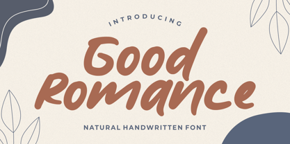 Good Romance - Natural Handwritten font is a natural & modern handwritten font. I'ts Perfect for logo, invitation, stationery, wedding designs, social media posts, advertisements, product packaging, product designs, label, photography, watermark, special events or anything.
 - Clear Sans by Positype,
$29.00 Clear Sans™ is a… wait for it… rational geometric sans serif. It is intended to fill a niche… to provide an alternative to the somewhat based-on-vernacular signage, somewhat geometric sans. I hear the word vernacular thrown around too much and too loosely. If a typeface is based in the vernacular, based on hand-painted or hand-crafted signage, then it should be based on the movements of the hand, retain that warmth and not on a pretty geometric model. For me, clean, geometric and precise doesn't have to be cold and expressionless. The original skeleton was hand-painted in 2008 to help determine and inform my decisions going forward. The typeface was completed shortly afterwards at the behest of an old friend for their identity. As usual, I expanded it, but considered retiring it since there were so many things similar out there. Years later, I had a chance to rediscover it and came to the conclusion that it could be improved, expanded in a logical and useful way, and introduced. I would be lying if I didn't admit that the rise of webfonts and embedded type in applications influenced many of the decisions I made about reworking Clear Sans™. Completely new Text and Screen fonts were developed that utitlize larger x-heights, space-saving widths, logical (and simplified) weight offerings… to name a few alterations. Even the pricing of each variant was considered to produce a more reasonable and simple solution for the developer, designer, professional and novice. Clear Sans™ is a departure from my previous sans serifs, but the influences of Aaux Next, Akagi Pro and Halogen are evident. Enjoy a light-hearted mini-site devoted to Clear Sans™
 - Clear Sans Text by Positype,
$25.00 Clear Sans™ is a… wait for it… rational geometric sans serif. It is intended to fill a niche… to provide an alternative to the somewhat based-on-vernacular signage, somewhat geometric sans. I hear the word vernacular thrown around too much and too loosely. If a typeface is based in the vernacular, based on hand-painted or hand-crafted signage, then it should be based on the movements of the hand, retain that warmth and not on a pretty geometric model. For me, clean, geometric and precise doesn't have to be cold and expressionless. The original skeleton was hand-painted in 2008 to help determine and inform my decisions going forward. The typeface was completed shortly afterwards at the behest of an old friend for their identity. As usual, I expanded it, but considered retiring it since there were so many things similar out there. Years later, I had a chance to rediscover it and came to the conclusion that it could be improved, expanded in a logical and useful way, and introduced. I would be lying if I didn't admit that the rise of webfonts and embedded type in applications influenced many of the decisions I made about reworking Clear Sans™. Completely new Text and Screen fonts were developed that utitlize larger x-heights, space-saving widths, logical (and simplified) weight offerings… to name a few alterations. Even the pricing of each variant was considered to produce a more reasonable and simple solution for the developer, designer, professional and novice. Clear Sans™ is a departure from my previous sans serifs, but the influences of Aaux Next, Akagi Pro and Halogen are evident. Enjoy a light-hearted mini-site devoted to Clear Sans™
 - Mirantz by insigne,
$32.00 Y’all ready for this? Now starting for Insigne: the new serif Mirantz. This rookie all-star plays a precise game every game, cutting at all the right angles to leave your reader impressed and ready to see more. You can always count on Mirantz to lead with solid mechanics and a clean style, but don’t be surprised when the face keeps it real with a little individual flare and creativity. This personal touch is nothing short of elegance in every appearance. So what makes us love this rookie above the other great players in the field? Contrast, for one. Mirantz brings more contrast to the game than most serifs out there. The serifs on this face have a crisp, sharp wedge that naturally draws the reader’s eye. You can’t help but fall in love with its clean, natural style. Mirantz also features a tall x-height and regular proportions that can play a number of positions on the page and still stay strong through the last half of the copy or even the final period. Mirantz is a solid powerhouse player, containing a complete set of small capitals and nine weights from thin to bold. It can play well both down low and up top with its subscripts and superscripts and can move your reader’s eye easily across the copy with its titling capitals, condensed and extended variants, and open style figures. With its options covering more than 72 Latin-based languages, look for this newcomer to have international success in the near future. It you haven’t set your draft picks for this next round of projects, think hard before passing up Mirantz. A capable serif like this one is a guaranteed asset to any team of fonts. Production assistance from Lucas Azevedo.
 - Clear Sans Screen by Positype,
$21.00 Clear Sans™ is a… wait for it… rational geometric sans serif. It is intended to fill a niche… to provide an alternative to the somewhat based-on-vernacular signage, somewhat geometric sans. I hear the word vernacular thrown around too much and too loosely. If a typeface is based in the vernacular, based on hand-painted or hand-crafted signage, then it should be based on the movements of the hand, retain that warmth and not on a pretty geometric model. For me, clean, geometric and precise doesn't have to be cold and expressionless. The original skeleton was hand-painted in 2008 to help determine and inform my decisions going forward. The typeface was completed shortly afterwards at the behest of an old friend for their identity. As usual, I expanded it, but considered retiring it since there were so many things similar out there. Years later, I had a chance to rediscover it and came to the conclusion that it could be improved, expanded in a logical and useful way, and introduced. I would be lying if I didn't admit that the rise of webfonts and embedded type in applications influenced many of the decisions I made about reworking Clear Sans™. Completely new Text and Screen fonts were developed that utitlize larger x-heights, space-saving widths, logical (and simplified) weight offerings… to name a few alterations. Even the pricing of each variant was considered to produce a more reasonable and simple solution for the developer, designer, professional and novice. Clear Sans™ is a departure from my previous sans serifs, but the influences of Aaux Next, Akagi Pro and Halogen are evident. Enjoy a light-hearted mini-site devoted to Clear Sans™
 - Balmecia by IbraCreative,
$17.00 Balmecia – A Tall Display Serif Typeface Balmecia is a distinguished tall display serif typeface that exudes a timeless elegance and sophistication. With its tall and slender letterforms, Balmecia commands attention and lends a touch of grace to any design it graces. The carefully crafted serifs add a classic flair, while the generous letter spacing ensures optimal legibility even in larger sizes. Balmecia’s vertical proportions create a sense of stateliness, making it an ideal choice for headings, titles, and other display applications where a touch of refinement is desired. This typeface seamlessly blends tradition with a modern aesthetic, offering a unique personality that captures the essence of both vintage and contemporary design sensibilities. Balmecia is perfect for branding projects, logo, wedding designs, social media posts, advertisements, product packaging, product designs, label, photography, watermark, invitation, stationery, game, fashion and any projects. Fonts include multilingual support for; Afrikaans, Albanian, Czech, Danish, Dutch, English, Estonian, Finnish, French, German, Hungarian, Italian, Latvian, Lithuanian, Norwegian, Polish, Portuguese, Slovak, Slovenian, Spanish, Swedish. **Uppercase
 - Jano Sans Pro by Craceltype,
$39.00 Jano Sans™ Pro is a neo humanist sans serif that was initially created to be used as a text and display typeface in brand communication. The result is a type family with a relatable character and a collaborative profile. Designed with elegant forms, low contrast and a geometric feel, Jano Sans™ Pro is a highly legible typeface suited for any text application and typographic reproduction. Jano Sans™ Pro has 18 styles and its a workhorse type system. It covers 290+ languages, including Extended Latin, Cyrillic and Greek writing systems. With over 1800 glyphs per style, its Opentype features include alternative shapes, small caps, standard and discretionary ligatures, localized forms in Latin and Cyrillic, case sensitive forms, numerators and denominators, proportional and tabular figures, slashed zero, fractions and more. The techie personality and the huge set of features and glyphs makes Jano Sans™ Pro an excellent choice for a wide range of applications, such as branding, editorial, web and broadcast.
 - Locked Puzzle by Linecreative,
$16.00 Introducing "Locked Puzzle," a captivating and bold font designed to elevate your creative endeavors with a playful twist. This unique typeface defies the conventional sharp angles, opting instead for a smooth and curvaceous form that seamlessly interlocks, embodying the essence of a puzzle waiting to be solved. Locked Puzzle's characters are imbued with a sense of whimsy and charm, making it a perfect choice for titles, posters, murals, and various works of art that demand attention. The absence of corners in this font contributes to its fluidity and friendly demeanor, creating a visual experience that is both engaging and approachable. What sets Locked Puzzle apart is its ingenious interlocking ligatures. These ligatures provide a dynamic and cohesive flow between letters, adding an element of surprise and coherence to your text. Whether used in digital or print media, PuzzleLock transforms ordinary words into visual puzzles, sparking curiosity and leaving a lasting impression on your audience. **Uppercase
 - Strenght To Strenght by Ronny Studio,
$19.00 Strenght To Strenght is distinctive handwriting and encapsulates the essence of street style. It gives every design project an urban vibe with its rugged and raw characteristics. This font is the perfect choice for people looking for a strong and influential typeface inspired by the rebellious spirit of street culture and graffiti. This font is designed to be versatile, making it suitable for a wide range of creative projects. Whether you're working on a skateboard deck design, a streetwear stuff, or a poster for an underground event, this font will infuse your work with urban attitude and a raw, handcrafted feel. The uppercase characters in Thrasher Head are bold and impactful, while the lowercase letters exhibit a slightly more refined style, providing a balanced mix of legibility and street-inspired aesthetics. This typeface is perfect for an poster event, movie title, streetwear stuff, magazine layout, fashion brand, quotes, or simply as a stylish text overlay to any background image.
 - Majora Pro by Latinotype,
$29.00 Majora Pro is a slab serif typeface which derives its name from a Portuguese historical toy manufacturer. The font comes in 8 styles, ranging from a delicate Thin to a robust Black, with matching italics and an upright version of stencil fonts, resulting in a total of 24 weights. Majora Pro is well-suited to a wide range of design projects which include packaging, editorial design, screen use, etc. Its humanistic features and moderate contrast between thick and thin strokes make it also suitable for long block of texts while having a high degree of legibility. The font includes a set of alternate glyphs which help give your compositions a different and unique look. The Stencil version was specially designed for use in signage, packaging, titles and headings. Majora Pro contains an extensive set of 750 characters (including small caps, different figure styles, etc.) that support over 200 Latin-based languages. Majora is the previous version of Majora Pro.
 - Garduja by IbraCreative,
$17.00 Garduja, a stylish slim serif font, effortlessly blends sophistication with modern aesthetics, creating a typographic masterpiece that captivates the eye. Its slender and refined letterforms exude a timeless elegance, while subtle serifs add a touch of classic charm. Garduja strikes the perfect balance between readability and artistic flair, making it an ideal choice for projects that demand a polished and contemporary design. The font’s graceful curves and precise detailing contribute to its overall sleek appearance, ensuring a distinctive and memorable presence in both print and digital applications. With Garduja, every character embodies a harmonious fusion of tradition and innovation, offering a visually striking and versatile option for designers seeking a tastefully sleek serif typeface. Garduja is perfect for branding projects, logo, wedding designs, social media posts, advertisements, product packaging, product designs, label, photography, watermark, invitation, stationery, game, fashion and any projects. Fonts include multilingual support for; Afrikaans, Albanian, Czech, Danish, Dutch, English, Estonian, Finnish, French, German, Hungarian, Italian, Latvian, Lithuanian, Norwegian, Polish, Portuguese, Slovak, Slovenian, Spanish, Swedish.
 - Baldwin by Pen Culture,
$15.00 Introducing Baldwin, a modern retro serif font that seamlessly blends contemporary design with vintage flair. With its clean lines and classic letterforms, Baldwin exudes a timeless elegance that is perfect for a wide range of design projects. Whether you're creating branding materials, editorial layouts, or web designs, this versatile font will add a touch of sophistication to your work. Featuring a distinctive, slightly geometric serif style, Baldwin offers a fresh take on traditional serifs. Its balanced proportions and subtle detailing create a harmonious look that is both refined and approachable. Available in a variety of weights and styles, this font is designed to adapt to any design setting, from headlines to body copy. I really hope you enjoy it – please do let me know what you think, comments & likes are always hugely welcomed and appreciated. More importantly, please don’t hesitate to drop me a message if you have any issues or queries. Thank you