10,000 search results
(0.04 seconds)
- PF DIN Text by Parachute,
$79.00 The purpose of the original DIN 1451 standard was to lay down a style of lettering which is timeless and easily legible. Unfortunately, these early letters lacked elegance and were not properly designed for typographic applications. Ever since its first publication in the 1930’s, several type foundries adopted the original designs for digital photocomposition. By early 2000, it became apparent that the existing DIN-based fonts did not fulfil the ever-increasing demand for a diverse set of weights and additional support for non-Latin languages. Parachute® was set out to fill this gap by introducing the PF DIN series which has become ever since the most comprehensive and sophisticated set of DIN typefaces. It was based on the original standards but was specifically designed to fit typographic requirements. Its letterforms divert from the stiff geometric structure of the original and introduce instead elements which are familiar, softer and easier to read. The first set of fonts was completed in 2002 as a group of 3 families which included condensed and compressed versions. With its vast array of weights, the extended language support, but most of all its meticulous and elaborate design, it has proved itself valuable to numerous design agencies around the world. Ever since its first release, it has been used in diverse editorials, packaging, branding and advertising campaigns as well as a great number of websites. It was quoted by Publish magazine as being “an overkill series for complex corporate identity projects”. The whole PF DIN Text type system (with normal, condensed and compressed styles) includes 45 weights from Hairline to Extra Black including true-italics. Additionally, every font in the Pro series is powered by 270 very useful symbols for packaging, environmental graphics, signage, transportation, computing, fabric care. There are 2 versions to choose from: The PRO version is the most powerful. All weights support Latin, Cyrillic, Greek, Central/Eastern European, Romanian, Baltic and Turkish, with 20 advanced opentype features including small caps. The standard STD version is more economic. All weights support Latin, Central/Eastern European, Romanian, Baltic and Turkish, with 18 advanced opentype features including small caps. In 2010 Parachute® released 4 new families DIN Monospace, DIN Stencil, DIN Text Arabic and DIN Text Universal. All these are complemented by the popular DIN Display version. Altogether the Parachute DIN series is a set of 8 superfamilies with a total of 96 weights.
 - TE HAFS2 Tharwat Emara by Tharwat Emara,
$39.00 Introducing "Te Hafs tharwat Emara" - An Exquisite Arabic Font for the Holy Quran Unveil the beauty and elegance of Arabic calligraphy with "Te Hafs tharwat Emara," a meticulously crafted font designed specifically for typing the Holy Quran. This magnificent typeface pays homage to the rich cultural heritage of Arabic script while embracing modern design elements, resulting in a captivating blend of tradition and innovation. With its unique and enchanting aesthetic, "Te Hafs tharwat Emara" captures the essence of Islamic art and typography, making it an ideal choice for any project related to the Holy Quran. Whether you're designing Quranic verses, Islamic manuscripts, or educational materials, this font will elevate your work to new heights and leave a lasting impression on your audience. The essence of "Te Hafs tharwat Emara" lies in its harmonious balance of form and function. Every letter has been meticulously crafted to ensure legibility and clarity, even at smaller sizes. The thoughtful spacing and meticulous attention to detail make this font a delight to read, enhancing the overall reading experience of the Holy Quran. One of the standout features of "Te Hafs tharwat Emara" is its ornate and intricate calligraphic strokes. Each character is a masterpiece in itself, reflecting the skill and expertise of traditional Arabic calligraphers. The fluidity of the strokes and the subtle curves create a sense of rhythm and grace, evoking a sense of reverence and spirituality. The versatility of "Te Hafs tharwat Emara" allows it to adapt effortlessly to various design contexts. Whether you're working on printed materials, digital platforms, or even signage, this font will maintain its beauty and legibility, ensuring your message is conveyed with utmost clarity and impact. To further enhance its usability, "Te Hafs tharwat Emara" includes a comprehensive set of Arabic ligatures, diacritical marks, and punctuation, enabling you to accurately represent the intricacies of the Arabic language. These thoughtful additions ensure that your typography remains authentic and faithful to the traditions of Arabic script. When it comes to font selection, readability is of utmost importance. "Te Hafs tharwat Emara" has been meticulously optimized for digital and print environments, ensuring exceptional legibility in both mediums. Each character has been carefully tested and refined to guarantee optimal reading comfort, making this font an excellent choice for long passages of text. Moreover, "Te Hafs tharwat Emara" supports a wide range of OpenType features, granting you creative control over your typography. From alternate character forms to contextual alternates, swashes, and ligatures, this font offers a plethora of options to customize and elevate your design. With such flexibility at your fingertips, your creativity knows no bounds. Beyond its technical prowess, "Te Hafs tharwat Emara" is a font with a story. It symbolizes a rich cultural heritage, embodying the devotion and reverence associated with the Holy Quran. Its elegant curves and intricate details evoke a sense of spirituality, making it a perfect choice for projects aimed at preserving and celebrating Islamic traditions. In conclusion, "Te Hafs tharwat Emara" is more than just a font; it is a celebration of Arabic calligraphy, Islamic art, and the beauty of the Holy Quran. With its exquisite design, unparalleled legibility, and versatile application, this font is an invaluable asset for any project related to Islamic typography. Embrace the artistry of "Te Hafs tharwat Emara" and elevate your designs to new heights of beauty and elegance.
 - TE HAFS1 Tharwat Emara1 by Tharwat Emara,
$39.00 Introducing "Te Hafs1 tharwat Emara1" - An Exquisite Arabic Font for the Holy Quran Unveil the beauty and elegance of Arabic calligraphy with "Te Hafs1 tharwat Emara1," a meticulously crafted font designed specifically for typing the Holy Quran. This magnificent typeface pays homage to the rich cultural heritage of Arabic script while embracing modern design elements, resulting in a captivating blend of tradition and innovation. With its unique and enchanting aesthetic, "Te Hafs1 tharwat Emara1" captures the essence of Islamic art and typography, making it an ideal choice for any project related to the Holy Quran. Whether you're designing Quranic verses, Islamic manuscripts, or educational materials, this font will elevate your work to new heights and leave a lasting impression on your audience. The essence of "Te Hafs1 tharwat Emara1" lies in its harmonious balance of form and function. Every letter has been meticulously crafted to ensure legibility and clarity, even at smaller sizes. The thoughtful spacing and meticulous attention to detail make this font a delight to read, enhancing the overall reading experience of the Holy Quran. One of the standout features of "Te Hafs1 tharwat Emara1" is its ornate and intricate calligraphic strokes. Each character is a masterpiece in itself, reflecting the skill and expertise of traditional Arabic calligraphers. The fluidity of the strokes and the subtle curves create a sense of rhythm and grace, evoking a sense of reverence and spirituality. The versatility of "Te Hafs1 tharwat Emara1" allows it to adapt effortlessly to various design contexts. Whether you're working on printed materials, digital platforms, or even signage, this font will maintain its beauty and legibility, ensuring your message is conveyed with utmost clarity and impact. To further enhance its usability, "Te Hafs1 tharwat Emara1" includes a comprehensive set of Arabic ligatures, diacritical marks, and punctuation, enabling you to accurately represent the intricacies of the Arabic language. These thoughtful additions ensure that your typography remains authentic and faithful to the traditions of Arabic script. When it comes to font selection, readability is of utmost importance. "Te Hafs1 tharwat Emara1" has been meticulously optimized for digital and print environments, ensuring exceptional legibility in both mediums. Each character has been carefully tested and refined to guarantee optimal reading comfort, making this font an excellent choice for long passages of text. Moreover, "Te Hafs1 tharwat Emara1" supports a wide range of OpenType features, granting you creative control over your typography. From alternate character forms to contextual alternates, swashes, and ligatures, this font offers a plethora of options to customize and elevate your design. With such flexibility at your fingertips, your creativity knows no bounds. Beyond its technical prowess, "Te Hafs1 tharwat Emara1" is a font with a story. It symbolizes a rich cultural heritage, embodying the devotion and reverence associated with the Holy Quran. Its elegant curves and intricate details evoke a sense of spirituality, making it a perfect choice for projects aimed at preserving and celebrating Islamic traditions. In conclusion, "Te Hafs1 tharwat Emara1" is more than just a font; it is a celebration of Arabic calligraphy, Islamic art, and the beauty of the Holy Quran. With its exquisite design, unparalleled legibility, and versatile application, this font is an invaluable asset for any project related to Islamic typography. Embrace the artistry of "Te Hafs1 tharwat Emara1" and elevate your designs to new heights of beauty and elegance.
 - Hamasa by Arendxstudio,
$15.00 Hamasa is a very cute font with lots of variation in it that make the atmosphere happy .
 - Habibi by Habibi Shaikh,
$99.00 Its Indian language Hindi/Marathi mixed with English alphabets for exp. A mixed with Hindi type (A)
 - Leona by Autographis,
$39.50 Leona is a handwritten script, that has been tweaked here and there to make it more smooth.
 - Madang Lovers by Ardian Nuvianto,
$19.00 Madang Lovers is a lovely script font with a cute feel. Get inspired by its nostalgic charm!
 - Peanutz by Matthias Luh,
$18.00 A cool font which is a bit like a comic font. It makes me remind of graffiti.
 - Forberas by Forberas Club,
$16.00 Forberas Club is usable for anything. But will be better if you use it for memorable moment.
 - Elephant Bells by BA Graphics,
$45.00 This 60's 70's design has a great nostalgic look. It appears to flourish within itself.
 - Jilly Bean by PizzaDude.dk,
$20.00Jilly Bean is what happens when art deco meets pizzadude... Or is it the other way around? - Gothic Ritual by Geo Dim Creations,
$9.99 Gothic Ritual is inspired by well known franchise Diablo that made its initial release back in 1996.
 - Flavour by Hubert Jocham Type,
$29.90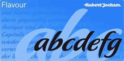 Flavour is an elegant brush script headline typeface. It is ideal for food packaging and product branding.
 - LD Astoria by Illustration Ink,
$3.00This stylish font has that ornamental curly look. It would be excellent for the formal scrapbook layout. - Tzoba MF by Masterfont,
$59.00 Inspired by old manuscript serif font, this low contrast font makes it high legible for long texts.
 - Betico's Hand by Corradine Fonts,
$14.95 Betico’s Hand is based in Elberto Roman’s handwriting. It could be used even in a formal project.
 - Matthew's Scribblings by Matthias Luh,
$15.00 It's handwritten. Really. I scribbled on a transparency, made photos and finally made a font of it.
 - Pixo by Cubo Fonts,
$29.00Pixo is a Brazilian graffiti seen in Sao Paulo. Pixo draws its inspiration from that original style. - Prehysteric JNL by Jeff Levine,
$29.00Prehysteric JNL is the right font for cave dwellers, forest denizens or Cro-Magnon artists. It rocks! - Brenda Valentine by Letterara,
$12.00 Brenda Valentine is a cute handwritten font. It will add a romantic touch to any crafting project.
 - Began by Atlantic Fonts,
$26.00 Began is square and round, athletic and unapologetic. It may be just what you are looking for.
 - Soul by VisualizeUnited Fonts,
$65.00 Soul, is a display typeface in lower characters. It is suggested for posters, product labels and titles.
 - Merside by Putracetol,
$28.00 Merside - Premium Serif Font Merside - Premium Serif Font is a stunning typeface that exudes sophistication and elegance. The font's clean and crisp lines make it a versatile choice for various design projects, from high-end branding to classic book covers and posters. The font was crafted with the utmost care and attention to detail, resulting in a timeless typeface that will elevate any design. Merside - Premium Serif Font is the perfect choice for designers who want to convey a sense of luxury and exclusivity in their work. The font's classic serif style adds a touch of refinement, while the clean lines give it a modern twist. Whether you are designing a logo for a luxury brand, creating marketing materials for a high-end fashion label, or designing a product packaging, Merside will add a touch of elegance and sophistication to your project. One of the standout features of Merside - Premium Serif Font is its OpenType features, which include alternates and ligatures. These features give designers more creative freedom, allowing them to customize the font and create unique and eye-catching designs. The font also includes uppercase and lowercase letters, as well as number, punctuation, and symbol glyphs. Additionally, Merside supports multiple languages, making it an excellent choice for global brands. The font is compatible with a wide range of design software and platforms. You can easily install and use Merside - Premium Serif Font on your computer or device, making it a convenient and accessible choice for designers. If you are looking for a premium serif font that will make your design stand out, Merside - Premium Serif Font is an excellent choice. With its elegant and refined style, it is perfect for creating luxury branding, elegant design, and high-end fashion. This font will give your project a timeless and classic look that will never go out of style. In summary, Merside - Premium Serif Font is a stunning and versatile font that is perfect for designers who want to create high-end and sophisticated designs. With its classic serif style, OpenType features, and multilanguage support, it is a font that will elevate any design project.
 - Courage by Positype,
$35.00 High-contrast? High impact? Have Courage? Eye-catching and (extra, extra) bold, Courage balances ultra-high stroke weight, delicate details, and unique letterforms with a self-indulgent passion that will make you feel a little guilty using it. Honestly, use it large and don’t try to force it into a small space, because these fearless letterforms need room to move. Flavored with both upright and italic styles, each font includes an indulgent level of alternates, swashes and titling options, visual elements and more. A backstory with a different name Years ago, I was commissioned to take my Lust typeface and produce something unique to use for large format graphics for an event…cool. It needed to be hyper-contrast with a lot of over-the-top details. With a tight turnaround, I looked for primers within my development catalogue to help me, and settled on some early work on a typeface I had drawn called Hedonist. I used those sketches and its conventions to retrofit and build out Lust Hedonist (only to see the project go bust on the client’s end). I intended to go back shortly after the Lust Hedonist release to finalize a retail version of the OG Hedonist, but I never could settle on the look of the 'g' or the numerals, got distracted with other projects, and never picked it back up… until last year. After randomly doodling a fat, flat ‘g’ with an extremely tilted counter axis, I knew immediately how it could be used and that (re)set things in motion. Only problem was, in the process of refining the letterforms I began truly dissecting the pieces, rediscovering all of the recklessness within Hedonist, and decided on fundamentally rewriting the approach to the typeface… literally flaying it to the bone. I’m much, much happier with this finished typeface now, but the name no longer fit the moniker given to the first, adolescent approach—there’s far more audacity and cleverness in these letterforms, tenacious in their resolution now. As a result, the name Courage fit the mettle of this typeface so much more, so I kept it.
 - Doris by Fontsphere,
$16.00 Introducing DORIS: A Sweet Handwritten Font Family. DORIS is a stunning new font designed to add a touch of sweetness and charm to your designs. It was originally created for a series of children's books, then it was expanded with additional glyphs and additional thicknesses were added.. --- Key Features:. Handwritten Charm: DORIS captures the beauty and warmth of handwritten lettering, bringing a personal and intimate feel to your designs. Its imperfect lines and organic shapes radiate authenticity and evoke a sense of genuine connection. . Versatile Usage: Whether you're designing coloring books, creating beautiful illustrations, making invitations, or crafting nicely-made quotes, DORIS adapts beautifully to various applications, providing endless creative possibilities. . Feminine and Playful: With its soft curves and whimsical strokes, DORIS exudes a feminine and playful essence. It is a font that effortlessly brings a touch of joy to any design, making it perfect for creating illustrations, invitations, and other projects aimed at capturing a sense of happiness. . Multiple Thickness Options: The availability of five different thicknesses in the DORIS font family allows you to choose the perfect stroke weight for each project. Whether you need a delicate touch or a bold statement, DORIS has you covered. . --- Usage Recommendations:. Children's Books and Illustrations: DORIS is an excellent choice for children's books, illustrations, or any other project targeting a young audience. Its playful and friendly aesthetics will capture the hearts of kids and adults alike. . Invitations and Greeting Cards: Create stunning invitations and charming greeting cards with DORIS. Its sweet and friendly style sets the right tone for special events, celebrations, or heartfelt messages. . Nicely-Made Quotes: Give your quotes a personal and endearing touch with DORIS. Whether it's motivational quotes, lovely sayings, or inspiring messages, DORIS will add warmth and authenticity to every word. . Personal Branding: Incorporate DORIS into your personal branding materials, such as business cards, logos, or website headers, to showcase your unique personality and create a lasting impression. . --- Let DORIS bring a touch of sweetness and handwritten charm to your designs. With its delightful handwritten style, multiple thickness options, and endless usage possibilities, DORIS is the perfect companion for creating projects that are full of happiness and joy.
 - FF Kaytek Slab by FontFont,
$50.99 Kaytek™ Slab is a fresh take on the correspondence typefaces of the 90s - which were originally designed for the demands of office environments. Just like its predecessors, this text typeface is robust and hard-working - meaning it works well in challenging design or printing environments - but it’s not without personality. Look closer at the lowercase g and a, especially in the italic, and you can see some unexpected elements of subversiveness within the design. This blend of sturdiness and quirkiness means it’s just as relevant for information-heavy projects, such as annual reports, as it is in more expressive environments. Although first and foremost designed for text, Kaytek Slab’s details shine through in its heavier weights and larger sizes, meaning it also has display potential. Every style of the typeface takes up exactly the same amount of space, thanks to the way Radek Łukasiewicz created the design. He based the entire typeface on a single, master set of proportions. This means designers can switch between styles without the text being reflowed, making it particularly useful in magazines, where space might be limited, and also on the internet, where hover links appear in a different style. As well as its roots in the office, Kaytek Slab draws on a little bit more 90s nostalgia. It’s named for the first and only Polish walkman, and embodies the same solid, no-nonsense shapes that made the analogue technology of the era so charming. Kaytek Slab is robust and solid. Kaytek Slab comes in 12 weights, from Thin to Black Italic, and offers multi-language support. Kaytek Sans, Kaytek Headline and Kaytek Rounded, are also available.
 - Taca by Rúben R Dias,
$42.00 Taca is a typeface built around a shape that Portuguese designer Rúben R Dias calls a “squircle” — neither square nor circle. We usually associate the rounded, convex box with the television screens of the 1960s and Aldo Novarese’s classic typeface, Eurostile. But whereas Eurostile is cold and machined, Taca is warm and rugged, as if it was molded from clay or carved from stone. Taca’s organic nature is also derived from another unique feature: rounded crotches at the right angles where perpendicular strokes meet. This subtle finish, along with blunt stroke endings, softens the otherwise rigid skeleton. With such a strong conceptual vision, Taca could be relegated to the bin of experimental designs, severely limited in their application. But that fate is usually born of a less experienced maker. As a teacher, designer, and letterpress printer, Dias is a type user, keenly aware of the functional requirements of good type. Taca is therefore not a slave to its concept, but a working font family, effective in various sizes and environments. Its lettershapes break away from the base shape whenever it makes sense for legibility, while still maintaining the flavor of the design as a whole. That said, a set of squircle-shaped alternates give the user the flexibility to get more stylized if the situation calls for it. Fitting to its functional aims, Taca has many of the features one expects of a proper text font: upper and lowercase figures, case-sensitive punctuation, and Extended Latin language support. The simplicity, openness, and squareness of Taca’s forms also make it an ideal design for the pixel grid of screen displays.
 - Cairoli Now by Italiantype,
$39.00 Cairoli was originally cast by Italian foundry Nebiolo in 1928, as a license of a design by Wagner & Schmidt, known as Neue moderne Grotesk. Its solid grotesque design (later developed as Aurora by Weber and Akzidenz-Grotesk by Haas) was extremely successful: it anticipated the versatility of sans serif superfamilies thanks to its range of weights and widths, while still retaining some eccentricities from end-of the century lead and wood type. In 2020 the Italiantype team directed by Cosimo Lorenzo Pancini and Mario De Libero decided to produce a revival of Cairoli, extending the original weight and width range and developing both a faithful Classic version and a Now variant. The Cairoli Classic family keeps the original low x-height range, very display-oriented, and normalizes the design while emphasizing the original peculiarities like the hook cuts in curved letters, the high-waisted uppercase R and the squared ovals of the letterforms. Cairoli Now is developed with an higher x-height, more suited for text and digital use, and adds to the original design deeper ink-traps and round punctuation, while slightly correcting the curves for a more contemporary look. Born as an exercise in subtlety and love for lost letterforms, Cairoli stands, like its lead ancestor from a century ago, at the crossroads between artsy craftsmanship and industrial needs. Its deviations from the norm are small enough to give it personality without affecting readability, and the expanded weight and width range make it into a workhorse superfamily with open type features (alternates, stylistic sets, positional numbers) and coverage of over two hundred languages using the latin extended alphabet.
 - Baystar Script by Mans Greback,
$59.00 Baystar Script is a high-quality script typeface. Drawn and created by Mans Greback in 2021, this calligraphic font has power, style and stamina. The type’s organic, handwritten lettering is well suited for a variety of applications: from happy, playful designs, to super sleek web graphics and vivid logotypes. It has velocity like a mustang, a brilliant look and–with its hundreds of alternates–is truly dynamic. It flows with quick turns, marking out brush strokes and connecting tails, like a genuine, hand-painted writing should. Write multiple underscores to make swashes of different lengths. Example: Corvette_______ Baystar Script is legible and professional while retaining the personality that is valued in handwriting. Drawn in accordance with the latest trends in design, but is inspired by retro logotype lettering such as Chevrolet Chevelle and Camaro. A modern calligraphy, fast as a sport race car or sharp as a stingray, the letters are characterized by thorny edges and tall ascenders. It comes in three weights; Light, Medium and Bold, making it useful in any size and context. The font is built with advanced OpenType auto-functionality and guaranteed top-notch quality, containing stylistic and contextual alternates, ligatures and more automatic and manual features; all to give you full control and customizability. It has extensive lingual support, covering all Latin-based languages, from North Europa to South Africa, from America to South-East Asia, as well as Cyrillic (Russian, Serbian, Bulgarian) and the Greek alphabet. It contains all characters and symbols you'll ever need, including all punctuation and numbers. Let this font help you to transform your professional work into an energetic piece of handmade art!
 - Aero Flux by Ferry Ardana Putra,
$19.00 Introducing "Aero Flux", the cyber mecha font that will take your designs to the next level. This font is designed with a perfect blend of modern and squared feel, giving it a unique and futuristic aesthetic that is perfect for a wide range of applications. The bold and sleek design of Aero Flux makes it an ideal choice for logos, headlines, and branding materials. It's all-caps design with punctuation, numerals, and foreign support allows for flexibility in creating unique and engaging visual designs. Aero Flux's squared feel makes it perfect for projects that require a strong and sturdy look, such as designing video game or movie titles, product packaging, or creating futuristic posters. This font's bold, industrial look is perfect for capturing the essence of the mecha genre, with its sharp angles and futuristic design. The squared feel of Aero Flux adds a sense of strength and solidity to your designs, making it the perfect choice for projects that require a bold, commanding look. Moreover, Aero Flux's industrial, mecha-modern design makes it the perfect font for creating digital interfaces and user interfaces (UIs), especially those that require a futuristic or high-tech feel. In summary, Aero Flux is a highly versatile font that is perfect for a wide range of applications, from logos and branding to digital interfaces and futuristic posters. With its modern, squared feel and unique design, Aero Flux is the perfect font to add a touch of futurism to your projects and captivate your audience. Aero Flux features: A full set of uppercase Numbers and punctuation Multilingual language support PUA Encoded Characters OpenType Features Cyber Mecha Style +246 Total Glyphs
 - Baskerville Neo by Storm Type Foundry,
$69.00 One of the most widely used typefaces in the world is actually a legacy of 18th century aesthetics, representing the spirit of late Baroque design, architecture, fashion and society. It has been created and printed for millions of readers around the world for more than two and a half centuries. It influenced many modern typographers. It shaped culture, education, entertainment and science, but also the development of typography itself. As a calligrapher and technical innovator, Baskerville invented new design, papermaking and printing methods, and his typography is very natural and legible to this day. Graphic design today calls for clean and minimalistic solutions, where the use of historical typefaces can achieve a vivid contrast with contemporary elements on the page or screen. Baskerville is undoubtedly the best choice for any kind of publishing house. In keeping with the original inventor’s spirit of excellence, we hereby offer its most advanced digital version. This is not a precise remake of rare Baskerville prints or a restoration of the original punches cut by John Handy, but rather our ideal essence of transitional typography. The old masters were limited by the technology of the time, but today we can dare to have very fine lines, unlimited ligatures, size variations and sophisticated OpenType functions. Drawing, programming, proofing and testing took us many years of development and brought thousands of new letters and dozens of language options. We are convinced that your readers will enjoy this font mainly for reading extensive works, but also for creating corporate identity, orientation systems and cultural posters. Baskerville is perfectly modern in its antiquity, striking in its modesty and timeless in its transiency.
 - Cairoli Classic by Italiantype,
$39.00 Cairoli was originally cast by Italian foundry Nebiolo in 1928, as a license of a design by Wagner & Schmidt, known as Neue moderne Grotesk. Its solid grotesque design (later developed as Aurora by Weber and Akzidenz-Grotesk by Haas) was extremely successful: it anticipated the versatility of sans serif superfamilies thanks to its range of weights and widths, while still retaining some eccentricities from end-of the century lead and wood type. In 2020 the Italiantype team directed by Cosimo Lorenzo Pancini and Mario De Libero decided to produce a revival of Cairoli, extending the original weight and width range and developing both a faithful Classic version and a Now variant. The Cairoli Classic family keeps the original low x-height range, very display-oriented, and normalizes the design while emphasizing the original peculiarities like the hook cuts in curved letters, the high-waisted uppercase R and the squared ovals of the letterforms. Cairoli Now is developed with an higher x-height, more suited for text and digital use, and adds to the original design deeper ink-traps and round punctuation, while slightly correcting the curves for a more contemporary look. Born as an exercise in subtlety and love for lost letterforms, Cairoli stands, like its lead ancestor from a century ago, at the crossroads between artsy craftsmanship and industrial needs. Its deviations from the norm are small enough to give it personality without affecting readability, and the expanded weight and width range make it into a workhorse superfamily with open type features (alternates, stylistic sets, positional numbers) and coverage of over two hundred languages using the latin extended alphabet.
 - Halogen by Positype,
$29.00 Who doesn't want or need an expansive contemporary extended sans that has a sense of style and swagger… what if it had a lowercase, small caps and various numeral options… how could you say no? This was the foundational argument I made for myself when I drew the initial alphabet on my birthday last year (something I do each year, draw a new font, kind of a fun OCD thing). I wanted to see a wide, utilitarian sans that had more to it than just a basic character set and didn't resemble standard geometric models. As I continued sketching, the letterforms were being influenced more by my 'lettering tendencies' than the normal mechanical trappings of drawing flat, wide letters. The letters have retained aspects of letters created by hand — stresses, modulation, naturally ending terminals. Truncation and quick clipping of strokes became antithetical to the letterforms I drew, so I continued this once I brought the design into the computer. I kept it precise and dependable, but made every attempt to keep a conscientiously crafted typeface and not let it devolve into a grid-based drone. As such, it works just as well looking back in time as much as it does assuming a lead role in a sci-fi movie. Halogen does deliver and opts not to take a short cut and provide an anemic offering of glyphs — a modern typeface offered today must provide more than just the basics and this one does — lowercase, smallcaps, old style numerals, tabular forms, stylistic and titling alternates, fractions, case-sensitive features, and even an alternate uppercase ordinal set is included. So go make cool print and digital things with it, now.
 - Borek by Alphabet Design,
$20.00Borek is a geometric monoline sans-serif display font. It works well in both display and text applications. - Peloponeso by Intellecta Design,
$9.00Note: The Frame style is no longer available due its complexity and the resulting memory and performance issues. - Cove by FontMesa,
$20.00 Cove is a very modern wide type design sure to jazz up what ever you use it on.
 - Fridha by Intellecta Design,
$27.90Note: The Shadow style is no longer available due its complexity and the resulting memory and performance issues. - Feosa by Intellecta Design,
$14.95Note: The Lined style is no longer available due its complexity and the resulting memory and performance issues. - Porcupine by Intellecta Design,
$9.00Note: The Shadow style is no longer available due its complexity and the resulting memory and performance issues. - LHF Cafe Corina by Letterhead Fonts,
$39.00 Enjoy this one-of-a-kind custom creation from Chuck Davis. Beautiful curves make it a must have.