10,000 search results
(0.044 seconds)
- Fd Vienna by Fortunes Co,
$9.00 Vienna is Modern Serif is a font style that blends traditional and modern design elements to create a distinct, stylish look. This typeface is characterized by serifs, or small lines added to the end of a stroke, that give it a classic and sophisticated feel. The font is often used in high-end fashion magazines and advertisements to evoke a sense of luxury and elegance. Fashion serif typeface is versatile and can be used for various purposes, from headings and titles to body text. Overall, this typeface is a perfect choice for designers looking to create a high-end, fashionable aesthetic.
 - Origen by Alex Camacho Studio,
$35.00 Origen is a typeface inspired by the illuminated manuscripts whereby the text is accompanied by a decorative capital letter at the start of the text. The family is formed by three different weights (light, regular, bold) and an additional decorative set of capital letters. Each of the four styles has characters to write in all Latin-based languages. It is an Open Type font. The Origen family is a hybrid between Textura and Rotunda fonts, characterized by a dynamic calligraphic flow. Origen is also playful as it can be use in editorial, advertising and packaging designs to capture viewers' attention through refined details.
 - Siller by Twinletter,
$14.00 Siller is a playful display typeface that is appropriate for a range of game applications. It is created in a relaxed, fun, and beautiful manner. This typeface is appropriate for both official and informal projects, and it is appropriate for all designs for children and adults. This typeface is appropriate for a broad range of creative applications, including game covers, titles, book covers, outdoor events, posters, banners, promotional materials, movie titles, YouTube covers and thumbnails, children’s games, cartoon projects, title, and text. . What are you waiting for? Go ahead and use this font in your amazing creations right now!
 - Vandalismo 26 by CostaType,
$10.00 The type “Vandalismo 26” is a tribute to the calligraphy style that 'screams' over the front of the buildings in the center of São Paulo/Brazil. This underground calligraphy, known as "pichação" or "pixo”, is a movement that expresses disagreement and rejection against the system. For some critics, this “vandalism” is considered to be the most disruptive and conceptual contemporary art today. It is a type to be used in headlines. Vandalismo 26 is a mix of the chaotic pixo style representing the nonconformity of a generation. It is a protest to the system in a typographic format.
 - Good Song by Ocha Puyaber,
$10.00 Good Song is a cursive font based on the USA's teaching script. It can be written in Carolinian, Sioux, Oʼodham, Southern Athabaskan, Hawaiian, and Samoan from USA. It can also be written in Dutch, Maltese, Aymara, Mapuche, Rapa Nui, and other languages. This font family is cute. The style is wide and rounded. It has wide and open loops. The strokes are drawn with a round cap tool, with no contrast. It is cursive and connected. The form is upright. It is easy to read in the USA. Part H has capitals with High starts. Part L has capitals with low starts.
 - Ballasticus by Shapovalov Fonts,
$15.00 Ballasticus is a controversial bold grotesque for logos, big headlines, posters, signage, gyms, and bodybuilders. The outer contour of the beech is rounded, while the inner space is square. The font contains two barbell icons that can be immediately inserted into your company logo. The character of Ballasticus is honest, stable, open, grounded like a weight. Ballasticus contains extended Latin, Cyrillic, ligatures, barbell and peace sign, as well as alternatives for some letters, the total number of glyphs is more than 700. It contains OpenType functions: liga, numr, dnom, calt, ss01. The font is also case sensitive, has fractions, currency signs, and arrows.
 - Ds Hand by CozyFonts,
$25.00 Ds Hand Font Family is a handwritten font designed by Tom Nikosey, based on Danielle Nikosey’s printing style. Tom is an American Graphic Designer specializing in Typographic Design and Illustration. Ds Hand is available in Regular & Bold weights CozyFonts Foundry is Tom's intro into the world of font design. Ds Hand Family is a tribute and gift to his daughter. Ds Hand, at first glance, gives a hand drawn aesthetic feel but on closer inspection, when set as text, this font gives off a cool, organized, legibly organic read. Also available in Bold. This is the 5th Hand Drawn Font Family from CozyFonts!
 - Kaikoura by Hanoded,
$15.00 Kaikoura is a small town on the east coast of the South Island of New Zealand. It is a very pleasant, laid-back place where the mountains meet the sea. Kaikoura is also the best place in the world to spot sperm whales. Kaikoura font is quite similar in appearance: it is laid-back and beautiful, has sharp peaks and generous curves. I am still trying to find out how to add whale watching to this description… Kaikoura is an all caps font with a lower case alternative for the o and y. It comes with an ocean of diacritics.
 - Virtue Serif by Jehoo Creative,
$19.00 Virtue Serif is a variation of the Virtue Script which is more friendly to use as the body of your design without losing its unique and authentic features while still being a workhorse in display use. The rugged and spacious look is armed with a stylish set that is easy to control due to the simple design of the nodes. with a full range of weights from thin to black, it also includes multilingual support this typeface is truly complete. Used for logo design needs, posters, magazines, mockups, web ui, branding, Cover art and more Virtue Serif font family is ready for that.
 - Maduki by Hanoded,
$15.00 This time the font's name is meaningless. Maduki doesn't mean 'cool' in Swahili, nor does it mean 'cup cake' in Sranantongo. It is just a nice name. Maduki is a playful font, created with one of my 2 year old son's marker pens (the 'no stain, wash-out' variety), a couple of cups of coffee and a whole bunch of 'speculaas' cookies. Now you're wondering what speculaas is, right? I'll tell you later - in a couple of fonts... Anyway, there's not much meaningful to say about Maduki font. It is nice, it is cute and it comes with alternates!
 - Patzcuaro by Storm Type Foundry,
$28.00Patzcuaro is a summer resort by a lake of the same name. It is situated 370 km west of Ciudad de Mexico and a visitor from Europe, on seeing it, will be reminded of the Austrian Rust or the South Bohemian Trebon. The town's colonial architecture is protected as a historical monument, the reddish-brown tint of the footings of the buildings, their white facades and even the type of lettering with red initials is prescribed - and these regulations are also complied with as far as cars are concerned. This colour scheme is splendid in combination with the rich gamut of greys of the stone window jambs, vaults, lintels and pillars. Joking apart, even the local petrol station is 16th-century in appearance. Patzcuaro Regular is a cosy, welcoming type face which is good for use on labels. - Maestrale by Catharsis Fonts,
$25.00 Maestrale is a paradigm-breaking new take on calligraphy, built around a compact, serif-style core and outrageously long, flamboyant extenders. At large sizes, its confident, charismatic lettershapes are ideally suited for branding and decorative uses, whereas longer texts at smaller sizes naturally weave themselves into a flowing texture. The font comprises 1299 glyphs, including many stylistic alternates, ligatures, small capitals, and initial, terminal, and linking forms, and offers extensive OpenType programming to support them. The calligraphic form of Maestrale is complemented by a matching text font (Maestrale Text) with short extenders, available in three cuts (a serif-style Roman, an upright Cursive, and a tilted Italic). Maestrale is all about the lowercase; its capitals are deliberately understated so as not to steal the limelight. In fact, the font works very well when set exclusively in lowercase. Maestrale�s small capitals are fitted into the core space of the lowercase, allowing them to be freely interspersed with lowercase characters. Alternately, an OpenType feature is available to replace a and e in small-caps text with their lowercase equivalents for a fresh unicase look. Since alternates and ligatures play such an important role, Maestrale offers three different modes of use. The most straightforward approach is simply to start typing using Maestrale Pro � the extensive OpenType programming will ensure that collisions between extenders are avoided and attractive ligatures are substituted for common glyph combinations. A more interactive approach is provided by the font Maestrale Manual, which allows the user to manually select alternate forms and ligatures even in typographically unsavvy applications, such as PowerPoint (as long as standard ligatures are supported). Stylistic alternates are simply represented as ligatures of their base forms with one or more instances of the rarely-used by easily-accessed characters "~" (ASCII tilde) and "`" (spacing grave accent); linking forms are built with �_� (underscore), multi-character ligatures with "|" (pipe), and initial and terminal forms with the �less than� and �greater than� characters. For instance, the Maestrale wordmark in the posters above was simply typeset with the string (`ma`est|r_a```l```e)| in Maestrale Manual (The parentheses represent �less than� and �greater than� characters here.) Feel free to type this string into the test line below and see what happens! Make sure Standard Ligatures are enabled. An instruction sheet listing all alternate forms and their accessibility is available from the Gallery tab on this page. The third mode of usage is aimed at professional designers, who make use of sophisticated software with extensive OpenType support. These power users are advised to use the font Maestrale Pro again, where all glyphs are accessible as stylistic alternates. Maestrale Text is a less extravagant but more versatile variation on the design of Maestrale, replacing Maestrale�s swashes with efficiently compact extenders. It is intended to serve as a perfectly matching text companion to Maestrale calligraphy, but constitutes a full-fledged typeface in its own right. It is equally at home at display sizes as it is in pull quotes, titles, and high-impact blocks of text. Maestrale Text comes in three complementary faces: A serif-style Roman, an upright Cursive, and a tilted Italic. Maestrale is the Italian word for �masterful�. It is also the traditional Italian name for the northwesterly mediterranean wind, better known by its French name, Mistral. Acknowledgements: I am grateful to the helpful souls on the Typophile forums for extensive feedback and encouragement on Maestrale, and to the TypeDrawers forum for feedback on Maestrale Text. This font is dedicated to Simone.
 - Piel Script by Sudtipos,
$89.00 Over the past couple of years I received quite a number of unusual and surprising requests to modify my type designs to suit projects of personal nature, but none top the ones that asked me to typeset and modify tattoos using Burgues Script or Adios. At first the whole idea was amusing to me, kind of like an inside joke. I had worked in corporate branding for a few years before becoming a type designer, and suddenly I was being asked to get involved in personal branding, as literally “personal” and “branding” as the expression can get. After a few such requests I began pondering the whole thing from a professional perspective. It was typography, after all, no matter how unusual the method or medium. A very personal kind of typography, too. The messages being typeset were commemorating friends, family, births, deaths, loves, principles, and things that influenced people in a deep and direct way, so much so that they chose to etch that influence on their bodies and wear it forever. And when you decide to wear something forever, style is of the essence. After digging into the tattooing scene, I have a whole new respect for tattoo artists. Wielding that machine is not easy, and driving pigment into people’s skin is an enormous responsibility. Not to mention that they're some of the very few who still use a crafty, hands-on process that is all but obsolete in other ornamentation methods. Some artists go the extra mile and take the time to develop their own lettering for tattooing purposes, and some are inventive enough to create letters based on the tattoo’s concept. But they are not the norm. Generally speaking, most tattoo artists use generic type designs to typeset words. Even the popular blackletter designs have become quite generic over the past few decades. I still cringe when I see something like Bank Script embedded into people’s skin, turning them into breathing, walking shareholder invitations or government bonds. There’s been quite a few attempts at making fonts out of whatever original tattoo designer typefaces can be found out there - wavy pseudo-comical letters, or rough thick brush scripts, but as far as I could tell a stylish skin script was never attempted in the digital age. And that’s why I decided to design Piel Script. Piel is Spanish for skin. In a way, Piel Script is a removed cousin of Burgues Script. Although the initial sketches were infused with some 1930s showcard lettering ideas (particularly those of B. Boley, whose amazing work was shown in Sign of the Times magazine), most of the important decisions about letter shapes and connectivity were reached by observing whatever strengths and weaknesses can be seen in tattoos using Burgues. Tattoos using Adios also provided some minor input. In retrospect, I suppose Affair exercised some influence as well, albeit in a minor way. I guess what I'm trying to say is there is as much of me in Piel Script as there is in any of the other major scripts I designed, even though the driving vision for it is entirely different from anything else I have ever done. I hope you like Piel Script. If you decide it to use it on your skin, I'll be very flattered. If you decide to use it on your skateboard or book cover, I'll be just as happy. Scripts can't get any more personal than this. Piel Script received the Letter2 award, where they selected the best 53 typefaces of the last decade, organised by ATypI.
 - Tricky D by URW Type Foundry,
$39.99 Tricky is a modern and dynamic design which is enhanced and supplemented by Tricky Tracky following soon.
 - Goygoy by Ali Güzel,
$14.00 It is a font that combines futurism and elegance. It is specially designed for logo font creation.
 - Elegance Monoline by Corradine Fonts,
$29.00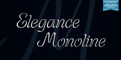 Elegance Monoline is ideal for invitations, greeting cards, logotypes, or anywhere a touch of elegance is desired.
 - Jilly Bean by PizzaDude.dk,
$20.00Jilly Bean is what happens when art deco meets pizzadude... Or is it the other way around? - Flavour by Hubert Jocham Type,
$29.90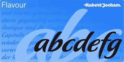 Flavour is an elegant brush script headline typeface. It is ideal for food packaging and product branding.
 - Soul by VisualizeUnited Fonts,
$65.00 Soul, is a display typeface in lower characters. It is suggested for posters, product labels and titles.
 - Vienna Extended by ITC,
$29.00Vienna is the work of Dutch graphic designer Anthony De Meester, a light, elegant sans serif. Simplicity is the hallmark of Vienna and it can be used most effectively where a look of regal elegance is desired. - MPI Old Style by mpressInteractive,
$5.00 Old Style is an example of classic roman type design. It has little contrast in stroke weight, small rounded serifs, open characters, and is very easy to read. It is based on wood type of unknown origin.
 - Song Sheet JNL by Jeff Levine,
$29.00 Sheet music for the 1930s song "Josephine" had its title hand lettered in a simple, bold sans design that is recreated in Song Sheet JNL. This bold sans is perfect for titling wherever strong emphasis is necessary.
 - Ken Aroque by Beewest Studio,
$90.00 Ken Aroque Font is Engraved Bold Decorative Font that ornamental. This Font is Best as tittle of the novel, Poster, Theater, Logo and also tatoo. This font is bold , strong , classic and luxurious in the same time.
 - Arrogant by Ametype,
$5.00 ARROGANT is a geometric monospace, which in use is supposed to resemble an unknown (sci-fi) script. The letters was made in geometric style consist of repetitive modules. Font is available in 8 styles and variable version.
 - Alestha Butterfly by Yoga Letter,
$18.00 "Alestha Butterfly" is a beautiful handwriting font. This font is equipped with capital letters, lowercase, numerals, punctuation, numerals, multilingual support, alternates, swashes, titling, and ligatures. It is suitable for weddings, engagements, Christmas, Valentine's Day, invitations, and others.
 - Watten by Muksal Creatives,
$12.00 Watten is a script with Handwritten Style. It is made with digital brush pen strokes that making this font look authentic. This font is perfect for fashion brands, wedding invitations, business cards, logos, signatures, calligraphy and more.
 - Retch by Hanoded,
$15.00 Retch - what's in a name? Retch is a unique typeface, heaving with character. It is scary and grotesque and is made to look like letters scratched onto a metal surface. Retch spits out most Latin based languages.
 - Summer Squash by Yoga Letter,
$15.00 "Summer Squash" is a display font with a floral pattern. This font is equipped with uppercase, lowercase, numerals, punctuation, and multilingual support. It is very suitable for summer, vacation, holidays, camping, natural moments, Father's Day, and others.
 - Office Manager JNL by Jeff Levine,
$29.00 “Stillson” is an Art Nouveau-influenced font found within the pages of the 1881 Barnhart Bros. & Spindler type specimen book. The digital revival is called Office Manager JNL, and is available in both regular and oblique versions.
 - Kallio Brush by Fenotype,
$19.00 Kallio is a Bold Brush Script with roots in American sign painting culture. Kallio is Finnish and means rock or cliff. Kallio is equipped with Contextual Alternates for smooth connections and Swash Alternates for every standard letter.
 - Christmas Shadow by Yoga Letter,
$18.00 "Christmas Shadow" is a beautiful handwritten font with a love shape. This font is equipped with uppercase, lowercase, numerals, punctuation, and multilingual support. It is suitable for weddings, engagements, invitations, back to school, autumn, Christmas, and others.
 - Natalia MLG by LGF Fonts,
$15.00 Natalia font, is an original type by Manuel Lage, inspired by the Doric column bases. Its heavy appearance is lightened by the erosion of the serif pieces. It is a typeface with a rigid and compact stroke.
 - Carambola by Hanoded,
$15.00 Carambola is a beautiful art deco typeface based on several posters from the 1920's. It is an elegant and stylish font with generous curves and sharp ends. Carambola is multilingual and comes in all caps only.
 - Naomi by Autographis,
$39.50 Naomi is a rough script with extremely long ascenders and descenders that make it elegant despite the roughness. The script is based on my script Nana but it cannot be mixed because Nana is not rough-edged.
 - KG Neatly Printed by Kimberly Geswein,
$5.00 This neat, handwritten font is intended for educators who create teaching resources for children. It is highly legible for new readers and is thin enough to be used for the body of text on student-read documents.
 - MPI Bodoni Ultra by mpressInteractive,
$5.00 Old Style is an example of classic roman type design. It has little contrast in stroke weight, small rounded serifs, open characters, and is very easy to read. It is based on wood type of unknown origin.
 - Panther Fighter by Yoga Letter,
$17.00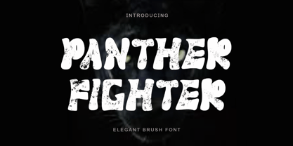 "Panther Fighter" is a modern and elegant brush font. This font is equipped with uppercase, lowercase, numerals, punctuations and multilingual support. It is suitable for logos, movie titles, Halloween, Christmas, business branding, ornaments, mock ups and others.
 - Paksa by Jipatype,
$17.00 Paksa is a decorative sans-serif typeface. The name of this typeface is derived from the Thai word that means “bird.” It is suitable for use in text headlines, sub-headlines, packaging, posters, and other print media.
 - Barbie Doll by Yoga Letter,
$18.00 "Barbie Doll" is a cute and lovely handwritten font. This font is equipped with uppercase, lowercase, numerals, punctuation, ligatures, and multilingual support. It is suitable for promotion, social media, business branding, Barbie, weddings, engagements, birthdays, and others.
 - Deathstroke by Letterhend,
$18.00 Death Stroke is a organic slab serif typeface which is purposely made for headline, display or logotype. It comes with illustration & logo extras. This type of font perfectly made to be applied especially in logo, and the other various formal forms such as invitations, labels, logos, magazines, books, greeting / wedding cards, packaging, fashion, make up, stationery, novels, labels or any type of advertising purpose. Features : Uppercase & lowercase Numbers and punctuation Illustration extras Alternates & ligatures Multilingual PUA encoded We highly recommend using a program that supports OpenType features and Glyphs panels like many of Adobe apps and Corel Draw, so you can see and access all Glyph variations. PLEASE READ THIS: To use alternate charactter/swash you have to use opentype. For accessing opentype feature, kindly check this link letterhend.com/tutorials/using-opentype-feature-in-any-software/ Email us to letterhend@gmail.com if you need something! Happy Designing!