2,922 search results
(0.021 seconds)
- Altemus Kitchen by Altemus Creative,
$11.00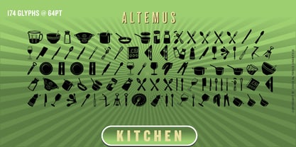 A collection of 174 kitchen and serving equipment icons and designs.
 - Charlie's Angles - Unknown license

- Surfing Ashtray by PizzaDude.dk,
$20.00 Inspired by old surfer movie posters from the 60'ies. Surfing Ashtray consists of straight lines only - ironically the direct opposite of the ocean waves that was a part of the inspiration of this font! Hit the waves with extra ligatures for double letters, swashes and alternate letters.
 - Apocalypso by Barnbrook Fonts,
$30.00 Apocalypso is a pictogram font for the end of the world. The name Apocalypso is a portmanteau of the words apocalypse (end of the world) and calypso (joyful improvised music), with a meaning analogous to the idiom ‘fiddling while Rome burns’. The Apocalypso family is more of an art project than a practical font and contains a series of crosses and pictograms. The crosses add decorative detailing to typographic layouts, whilst the pictograms can be deployed to express the forthcoming apocalypse. Apocalypso was originally published in 1997, a few years before the turn of the millennium. It is both a document of the ideas of the time and a scarily prophetic vision of a possible world that has now largely come to pass.
 - Docklands by Hemphill Type,
$22.00 An authentic collection of engineered fonts, constructed in East London. Docklands is a handmade font family inspired by the creation of the London docks in the early 18th century. The rough edged sign written style is evocative of the era when iron works and boatbuilding wharfs lined the River Thames.
 - Subasmet by Subtitude,
$15.00 The font Subasmet is a package of funky horoscope and other icons. Enjoy!
 - Chilada by Image Club,
$29.99Chilada is an outrageous display family by designer Patricia Lillie for Image Club. Across four versions, the decorate treatment inside Chilada's letters becomes more intense. Chilada characters exude an energy of their own. Their design could be described as a cross between Bank Gothic and Neuland, with a spoonful of funk mixed in. Big and chunky, Chilada's forms are made up of straight lines only. There are no curved elements. The resulting design is angular and cuts a good figure on the page. Of the Chilada family's four members, the basic font is named Chilada Uno. Uno is Spanish for one!" The forms of Chilada Uno's letter are solid black-or whatever color you choose to set them in! Chilada Dos, Tres, and Quatro each offer their own decorative treatments: Chilada Dos's letters sport a zigzag inline, Chilada Tres is decorated or an ornamented leaving leaves more black from the letters than white, while Chilada Quatro's level of decoration is just crazy. Its letters are made up more more from white space than from black marks. Chilada Quatro is almost an outline font!" - Guinevere Pro by Canada Type,
$29.95 Guinevere Pro is a typeface designed by Icelandic art director Sigurdur Armannsson. It started in 2001 as simple hand-drawn sketches of a few letters built from modules, then became an experiment with four goals: - Construct an original alphabet from a specific set of predetermined modules. - See how certain letter forms built without said modules would behave within the totality of the module-constructed alphabet. - See if certain letters would actually enforce their own shapes to be drawn a certain way within the totality of the typeface. Likewise, see if the totality of the alphabet demands that individual letters be drawn in a specific way, and if so, how much room for variation would there be? - See how all of the above reacts/changes to implementing the alphabet across different weights. The experiment was finessed and re-worked over many years of technology changes, and Guinevere Pro is the final outcome, ten years later. The Guinevere Pro set is four cross-platform Open Type fonts, with built-in small caps, alternates, ligatures, and support for a wide range of Latin-based languages.
 - Zierde Grotesk by Lewis McGuffie Type,
$35.00 Zierde is a take on early advertising, small-copy grotesks of the late 19th/early 20th century, and is largely inspired by Miller & Richard’s own range of Grotesques. More importantly, Zierde is accompanied by a large set of ornaments (+200) which hark back to the look-and-feel of the early-modernist arts and crafts movement. The ornaments in, and presentation of, Zierde owe much credit to J.G Schelter & Giesecke’s 1913 type specimen book ‘Die Zierde’. The strong functional uppercase sans-serifs alongside luscious, beautiful patterns in ‘Die Zierde’ make for beautiful combinations. This early-modernist use of grotesk alongside ornament looks bizarre in the eyes of us used to seeing sans-serifs in more formal, sterile settings. The face itself retains some historical flourishes such as the eccentric leaning angle of the italics, the long cross-bar on the ‘G’, the gammy-leg of the ‘R’, a strange ampersand and some irregular terminals across the weights. Zierde is display face meant for headlines, titles, short-copy, labels and logos. It comes in caps and small caps, Latin and Cyrillic.
 - Space Deco JNL by Jeff Levine,
$29.00 Hand lettering used on the packaging of a space-themed rubber stamp toy set is the basis for Space Deco JNL. Blending the classic thick-and-thin line weights of the Art Deco style with sharply angled cross strokes evoked a sense of movement and "future" in this unique lettering design.
 - Cry Uncial - Unknown license

- Ranchstyle by Ampersand Type Foundry,
$29.00 Based off of research into Nevada cattle branding irons of the 19th century, Ranchstyle takes the vernacular from rancher’s brands of the old west, digitizes it, and brings it into the contemporary world as a vivacious spunky typeface. The letterforms mimic bent metal and have the fluidity that follows such a material.
 - Doodlebirds by Greater Albion Typefounders,
$5.95 Here's a bit of fun! Need a dingbat with character? Let these birds strut their hand-drawn way across your work.
 - Archipelago - Unknown license

- Eclectic Web by Altered Ego,
$45.00STF Eclectic Web is the ultimate web design dingbat tool - with 80 icons designed for creating e-commerce, navigation, and interface designs. Use it as a starting point in your favorite vector program, or use the icons as is - they are optimized for sizes down to 20 point and anti-alias beautifully in all of the major applications (any smaller than that and you're on your own…) Shopping carts, directional arrows, buttons galore! It's like a pinata in font format, surprises for everyone! This font includes: a new button, order, buy, and close buttons, home, security, email, search, and a host of other icons and images to make designing your next website a breeze!. Most of the icons are shown Available in Mac and PC formats, in TrueType and Postscript formats. License it today! - Aguadija by Christian Gamba Pardo,
$12.90 This font contains plant icons from the taxonomic category Orchidaceae, inspired by the multiple specimens that can be found in Colombia that has the largest number of orchids in the world, more specifically in the specimens that have been exposed on the José Celestino Mutis botanical garden. These icons are characterized by having an organic outline; representing flowers, roots, leaves, bulbs and different supports or pots. The vast majority of icons have perfect bilateral symmetry because this is one of the differential characteristics of orchids (compared to other flowers), if they are divided by a central-vertical axis, their right and left sides are practically identical. “Aguadija” can be used in projects related to nature or similar topics, some icons (specifically the digits) are intended to form decorative ribbons or borders.
 - Altemus Toolkit by Altemus Creative,
$11.00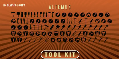 Each style is a collection of 174 home improvement and construction equipment icons and designs.
 - Architype Stedelijk by The Foundry,
$99.00 Architype Crouwel is a collection of typefaces created in collaboration with Wim Crouwel, following his agreement with The Foundry, to recreate his experimental alphabets as digital fonts. Crouwel's most recognized work was for the Van Abbe and Stedelijk museums (1954 –72) where he established his reputation for radical, grid-based design. Stedelijk first appeared in the seminal Vormgevers poster, commissioned by the Stedelijk Museum, Amsterdam in 1968. Crouwel created a rigid grid system across the poster of 57 vertical by 41 horizontal lines, also forming the basis for the construction of the letterforms. Although all hand drawn, the resulting typeface had a machine-made appearance. This striking black and white poster with its visible grid became one of Crouwel's most iconic designs. Architype Stedelijk now re-creates these letterforms as a single alphabet typeface in a digital font.
 - Stina by profonts,
$41.99 profonts Stina is an cursive font based on cross stitch pattern. It can be used in (very) tall letters but it also keeps legible in smaller sizes. Because of its joined letter pairs and ligatures it keeps the flow of a "handwritten" cursive font. So, you ever felt like stitching? - Start today.
 - XXII Daemon by Doubletwo Studios,
$25.99 The Daemon is the cheap alternative for you to easy create a logo for your band or whatever. It comes with a basic characterset and a little bunch of symbols and signs often used in the extreme music sector – classical stuff from Death- and Blackmetal like pentagrams and crosses, drips, roots and branches.
 - Hypotermia by Arendxstudio,
$18.00 Hypotermia is very stylistic so you can easily create a logo for your band or whatever. It comes with basic characters and a group of symbols and signs that are often used in the extreme music sector - classic items from Death- and Blackmetal such as pentagrams and crosses, droplets, roots and branches.
 - Sylar by The Northern Block,
$16.70 A linear modern typeface suited for branding & advertising projects. The variations in weight give great contrast when used across body copy & headlines.
 - Coldharbour Gothic by Device,
$39.00 Reminicent of mid-19th century antique type and Victorian cast-iron signage, Coldharbour Gothic lovingly preserves all the eroded and rusted textures in digital form. Characters have been selected to have cleaner and rougher counterparts - by flipping between cases, the user can customise the result and achieve the degree of decay or preservation they desire.
 - EB Neon by Erik Bertell,
$9.95 Neon is a connected monoline script font with iconic qualities suitable to headlines, mastheads and logotypes.
 - Novaletra Serif CF by Connary Fagen,
$35.00 Legibility. Flexibility. Personality. No need to pick two; Novaletra Serif CF has it all. Liven up body text, captions, and headlines with Novaletra’s smooth, low-contrast design set across seven weights with italics. Versatile and easy to read at any size, Novaletra includes useful features like wide language support across Latin and Cyrillic scripts, international currency symbols, fractions, tabular numbers, and more. Includes lifetime updates, technical support and feature additions.
 - Christmas Doodles Too by Outside the Line,
$19.00 Christmas Doodles Too is the follow up font to Christmas Doodles. More Christmas icons including a tree, fun new ornaments, a dove, gifts, pine trees, a church, drinks, sleigh, tree lights, drum, horn, Santa hat, holly, snowflakes, stockings, candy, and mistletoe. This font works well with Holiday Doodles and Holiday Doodles Too which also have Christmas icons in them.
 - Decavision by Swedish Columbia,
$1.99Decavision is a display font and is applicable for any type of graphic design, web & print, t-shirts, posters and logos. It’s not intended for text use or at small sizes. A font inspired by Division Of Laura Lee’s icon which was created by Shelby Cinca. The icon itself is inspired by early floppy disc copy-protection and Japanese fighting robot decals. Håkan Johansson picked up where the icon left off and created a corresponding font-family. The font focuses on simple shapes and the copy-protection tab detail to create a pleasing futurist display font. - Print Damosel JNL by Jeff Levine,
$29.00 Kevin Curtis runs a site called Damosel's Printer's Blocks, specializing in rare an unusual examples from the years when letterpress was the main source of printed material. He graciously provided the source material for Print Damosel JNL. The collected images represent a varied cross-section of ornamentation, embellishments, attention getters, decorations and whimsical illustrations.
 - Ames' Shaded by Greater Albion Typefounders,
$16.00 Ames’ Shaded is one of three display typefaces designed to complement the Ames’ Roman and Ames’ Text typeface families. Ames’ Shaded has that semi-industrial feel that somehow is evoked by diagonal cross-hatching. Delightful for use on its own of with the families mentioned. A delightful introduction to the Ames’ ‘Super’ typeface family.
 - Brushwork by Celebrity Fontz,
$24.99 Brushwork is a free-flowing brush font that combines a modern aesthetic with a very unique style. Some have suggested that Brushwork looks like a cross between Roman and Japanese characters but most agree it evokes total freedom of expression. Includes a full set of accented characters to accommodate most of the Romance languages.
 - Upperclass by Enrich Design,
$24.95Upperclass was a font I created back in 1995. I had a brainstorm about the uppercase letter “A”. I noticed that the cross bar for the letter A is always toward the bottom, what if I moved it toward the top. The result is a unique font, a great addition to your font collection. - ShirlyUJest by Ingrimayne Type,
$9.95 The letters of ShirlyUJest have serifs that have gone wild, crossing over themselves, giving them the look of overgrown vegetation. It is weird and bizarre and out of control; the name says it all. It is caps-only with the lower-case keys containing the glyphs identical to those on the upper-case keys.
 - SL Che by Sudtipos,
$29.00SL Che is a homage to Ernesto Guevara de la Serna, “El Che”, who lived between 1928 and 1967. El Che turned into an universal icon through a memorable photograph which was reproduced and multiplied to the infinite. It was that way he became a synonymous of resistance, revolution and change for lots of generations. That "Che" comes back today by the hand of the genial Jorge Alderete, who designed heroic, laughing and cool variations of that popular first icon. SL Che unfolds like a fan of thousands of "Che", in a development plenty of metaphors. SL Che abridges a sum of original iconographic illustrations in True Type format, which masterly synthesizes the most important themes of the grand genius of the literature. SL Che takes part of the "Icons of Icons" Gallery, developed by SinergiaLab for Sudtipos - DF Daantje by Dutchfonts,
$16.00The DF-Daantje is an icon font based on a brisk black creature: our Fell Terrier ‘Daantje’. - Pismo Clambake NF by Nick's Fonts,
$10.00This stylish stout script was originally issued in the 1930s under the name “Fulgor” by the spanish foundry Fundición Gans. Cursory research suggests that Saks-Fifth Avenue found it suitably snooty to use extensively in its newspaper ads of that period. Perhaps somewhat ironically, this version takes its name from one of comedian W. C. Fields' many odd aliases. - Bodoni Egyptian Mono by Shinntype,
$39.00 As an ironic gloss on the unsophisticated “typewriter” genre, the Bodoni Egyptian Mono typeface channels the classic dignity of early 19th century letter forms, presenting a quite proper family of OpenType fonts, with a copious range of OpenType features—small caps, fractions, superior and inferior figures, alternate old style figures—rendered throughout five weights in both roman and italic.
 - Martian Hull Markings - Unknown license

- Great Western by FontMesa,
$22.00 Great Western is an engraved roman font that reminds you of the old railroad days when steam locomotives made their way across the countryside.
 - Uptown Line JNL by Jeff Levine,
$29.00 Ask any typical New Yorker about subway directions and they'll tell you to take the "uptown line", "downtown line" or "cross-town line". Uptown Line JNL is yet another variation of the Art Deco monoline style of lettering prevalent during the 1930s and 1940s, and is based on titling from vintage sheet music for a Johann Strauss classical piece.
 - Dance and Sing JNL by Jeff Levine,
$29.00 A 1932 fan magazine from Spain entitled “Films Selectos” (“Select Films”) had those words hand lettered in a decorative Art Deco type style that was a cross between the “Futura Black” style of stencil influenced display lettering and “Fiesta” lettering. This hybrid design is now available digitally as Dance and Sing JNL in both regular and oblique versions.


