10,000 search results
(0.022 seconds)
- No Entry JNL by Jeff Levine,
$29.00 The hand lettered titles and credits from the 1958 war film “The Young Lions” command your attention with a bold block slab serif type style. This design has been digitally recreated as No Entry JNL, which is available in both regular and oblique versions.
 - The Meez by TipografiaRamis,
$19.00 The Meez is a geometric, extremely extended sans-serif typeface strictly intended for use as a display font. The family consists of three styles: Light, Regular and Bold. In each weight, all letterforms retain the same width, which make it ideal for titling use.
 - Horror Metal by Letterara,
$14.00 Horror Metal is a brush font with a bold weight font that’s perfect for any horror or metal designs! As its name suggests, Horror Metal is not a font for the faint-hearted. In fact, using this metal-style display font requires courage and bravery.
 - Liong by Dikas Studio,
$15.00 Liong is a bold & retro slab serif typeface inspired by western typography signane, they have a contrast weight bar and slab with fun and fancy character. Liong comes with 4 style regular, italic, slab & slabitalic, perfect for logos, badges, typography and any retro design needs.
 - Cross Boxed by Namara Creative Studio,
$14.00 Bold modern sport font with rounded corners in consistent angles. A strong and unique style instantly adds power of movement to your creative projects. It's perfect for logotypes, headlines, game covers, sports events, posters, magazine covers, branding, product design, labels, and other suitable projects.
 - Ganbate Script by Balevgraph Studio,
$12.00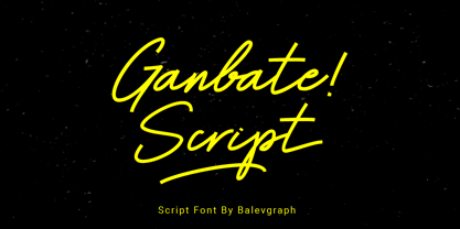 Gilbert Script is a bold and modern script font. Be intrigued by its ravishing style and use it to create beautiful wedding invitations, beautiful stationary art, engaging social media posts and more! What's Included? Uppercase & Lowercase Numbers & Punctuation Ligature, Alternate & Swashes Multilingual Support PUA Encoded
 - Drum Rhythm JNL by Jeff Levine,
$29.00 An ad in the May 3, 1928 issue of “The Film Daily” for the movie “Drums of Love” featured extra bold, sans serif hand lettering in an Art Deco style. This is now available as Drum Rhythm JNL in both regular and oblique versions.
 - Stationer JNL by Jeff Levine,
$29.00 The 1938 sheet music for the official Coast Guard Marching Song "Semper Paratus" "(Always Ready)" offered up a hand lettered title in a bold block style with rounded corners and an inline. This is now available as Stationer JNL, in both regular and oblique versions.
 - Standard Poster by ParaType,
$25.00 Designed at Polygraphmash type design bureau in 1986. Based on "English" bold styles of the Ossip Lehmann type foundry (St.-Petersburg), of mid-19th century. The digital version was developed at ParaType in 1992 by Vladimir Yefimov. For use in advertising and display typography.
 - Revelio by ArimaType,
$14.00 Revelio is a cool, bold, retro-styled display font. This font is PUA encoded which means you can access all of the beautiful glyphs and swashes with ease! Add it confidently to your favorite creations and let yourself be amazed by the outcome generated.
 - Lino Stamp by Letters&Numbers,
$23.00 Lino Stamp is a geometrical, sans-serif typeface inspired by Futura Bold Condensed. To produce it, letters were carved into linoleum, inked and impressed on paper – giving a worn and distressed finish. Lino Stamp works particularly well for headings, short paragraphs and scrapbook-style designs.
 - FT Graphitum by Foxys Forest Foundry,
$9.00 This is a powerful graphic rough sans-serif typeface with four different styles. Two linear, one with an aged texture and one basic, for your experiments. It makes a bold impression, feels like a strong simple typeface. Looks great in short inscriptions, headlines, posters.
 - Stencil Octoid JNL by Jeff Levine,
$29.00 Stencil Octoid JNL was inspired by a set of twelve inch tall stencil letters and numbers made by Duro Art Industries in Chicago. The bold type style with angled rather than rounded corners gives the font a strong feel of industry or military usage.
 - Charlingstone by Teweka,
$15.00 Charlingstone is a Modern Calligraphy font with a unique alternative. This font is perfect for, wedding stationery, logos, modern websites, and more. Charlingstone has a total of 237 glyphs, this font also has ligature and language support. Charlingstone is made in a bold, upright style.
 - TF Silence by Teenage Foundry,
$19.00 TF Silence - The awesome bold display font is back for your design projects. There are 2 styles available (Regular & Outline). Suitable to be applied to clothing designs, posters, logos etc. Features: Uppercase, Lowercase, Numeral, Punctuation & Multilingual. For any questions please contact me 🙂 Thanks!
 - Peanut Gallery NF by Nick's Fonts,
$10.00Every type library needs a generic, comicbook-style “POW!” font, and this one is ours. Breezy, bouncy and bold, it’s the perfect choice for rock-em, sock-em headlines. Both versions of the font include 1252 Latin, 1250 CE (with localization for Romanian and Moldovan). - Blox by Superfried,
$32.50 Blox is a bold, retro, experimental display typeface designed by Superfried. With a simple geometric structure, tight spacing and cuts, Blox is very distinct with high impact. Available in two styles, vertical or horizontal, Blox has been featured on the Behance curated typographic gallery TypographyServed.com.
 - Qosydu by Twinletter,
$15.00 Create an elegant and exotic feel with our Arabic-style font, Qosydu. Bold fonts and extended spacing give your designs a middle eastern feel, make all your projects elegant with this font. Qosydu is the perfect choice for Arabic-themed packaging, advertising, or invitations.
 - Multiverse by Tamas Greguricz,
$24.99 Multiverse is a display typeface designed to combine retro and futuristic styles into one package. Its geometric characters intertwine in unique ways that can support a high-tech context, but its curves and boldness echo the sci-fi of the 70's and 80's.
 - Mercearia Antique by PintassilgoPrints,
$12.00 Mercearia is a bold typestyle font, based on a 1944 Brazilian book about alphabets and letterings styles. Combining squarish letterforms and soft edges with a handcrafted feel, Mercearia is best suited for display sizes and works like a charm from 18pt and up. Try it!
 - Mousony by Sakha Design,
$12.00 Mousony is a bold, vintage styled and thick lettered slab serif font. It will elevate a wide range of crafting ideas, from cards, to branding, labels and much more. Add it confidently to your favorite creations and let yourself be amazed by the outcome generated.
 - Hiladous by ahweproject,
$10.00 Hiladous is a bold and retro-styled handwritten font. This font reads as strong, confident, and dynamic, and can add tons of nostalgic character to your designs. This font is PUA encoded, which means you can access all of the glyphs and swashes with ease!
 - Binder by Grype,
$16.00 Our Binder Family is a revival and expansion of Binder-Style, a typeface designed by Joseph Binder and released by D. Stempel AG in 1959. It originally was a single weight. In later film type adaptations, a bold style, and an outline with drop shadow style were made available. However, this typeface never really had a true sense of family or larger language compatible character set. The original Binder-style typeface found revived popularity with its super condensed style when it appeared on the movie poster for "Silence of the Lambs". It was always a disappointment to me how this typestyle had never gained more traction in use. And so, many years later, we decided to revive the original typestyle, and expand it with a range of weights and obliques to pair with those weights. We've moved most of the unusual lowercase forms to a Stylistic Alternates feature, along with unicast alternates for the Capitals. The family includes a full standard character set with expansive international support of latin based languages, and 4 weights jumping from Thin to Bold, along with 4 accompanying obliques. This family is ready for you to eat it up with a nice glass of Chianti. Here's what's included with the Binder Family: 538 glyphs per style - including Capitals, Lowercase, Numerals, Punctuation and an extensive character set that covers multilingual support of latin based languages. 4 weights: Thin, Light, Regular, & Bold. Accompanying Obliques with each weight/width style. TTF formatted fonts have been hinted for optimal performance. Here's why the Binder Family is for you: You're in need of a stylish condensed font with a variety of weights and obliques for your designs You're a fan of the typographic works of Joseph Binder, but wish there was more to them You love the style of Agency and Bank Gothic, but want something uber-narrow You are desperate to recreate the movie poster from Silence of the Lambs You just like to collect quality fonts to add to your design arsenal
 - Charbroiled by Typodermic,
$11.95 Picture this: the smell of freshly-grilled shiitake mushroom burgers wafting through the air, the sound of sizzling plant-based steaks on the grill, and a cold drink in your hand. It’s barbecue season, and you want your message to sizzle just as much as your food. Enter Charbroiled, the scorched and antiqued typeface that will take your design to the next level. Inspired by the classic American Italic from 1902, Charbroiled has a rustic and natural design that will add panache to any message. But Charbroiled isn’t just any old font. Custom letter pairings are automatically swapped to achieve a more genuine look, giving your design that extra edge. With its bold and distinctive style, Charbroiled will make your message stand out in any setting. So fire up the grill, crack open a cold one, and let Charbroiled do the talking. Whether it’s for a barbecue invitation, a restaurant menu, or a summer sale flyer, Charbroiled will give your message the perfect touch of authenticity and style. Get your message across with Charbroiled, and make your design sizzle! Most Latin-based European writing systems are supported, including the following languages. Afaan Oromo, Afar, Afrikaans, Albanian, Alsatian, Aromanian, Aymara, Bashkir (Latin), Basque, Belarusian (Latin), Bemba, Bikol, Bosnian, Breton, Cape Verdean, Creole, Catalan, Cebuano, Chamorro, Chavacano, Chichewa, Crimean Tatar (Latin), Croatian, Czech, Danish, Dawan, Dholuo, Dutch, English, Estonian, Faroese, Fijian, Filipino, Finnish, French, Frisian, Friulian, Gagauz (Latin), Galician, Ganda, Genoese, German, Greenlandic, Guadeloupean Creole, Haitian Creole, Hawaiian, Hiligaynon, Hungarian, Icelandic, Ilocano, Indonesian, Irish, Italian, Jamaican, Kaqchikel, Karakalpak (Latin), Kashubian, Kikongo, Kinyarwanda, Kirundi, Kurdish (Latin), Latvian, Lithuanian, Lombard, Low Saxon, Luxembourgish, Maasai, Makhuwa, Malay, Maltese, Māori, Moldovan, Montenegrin, Ndebele, Neapolitan, Norwegian, Novial, Occitan, Ossetian (Latin), Papiamento, Piedmontese, Polish, Portuguese, Quechua, Rarotongan, Romanian, Romansh, Sami, Sango, Saramaccan, Sardinian, Scottish Gaelic, Serbian (Latin), Shona, Sicilian, Silesian, Slovak, Slovenian, Somali, Sorbian, Sotho, Spanish, Swahili, Swazi, Swedish, Tagalog, Tahitian, Tetum, Tongan, Tshiluba, Tsonga, Tswana, Tumbuka, Turkish, Turkmen (Latin), Tuvaluan, Uzbek (Latin), Venetian, Vepsian, Võro, Walloon, Waray-Waray, Wayuu, Welsh, Wolof, Xhosa, Yapese, Zapotec Zulu and Zuni.
 - League of Ages - Personal use only

- DuerersMinuskeln - 100% free

- Flaemische Kanzleischrift - Personal use only

- ZentenarZier - Unknown license

- TrixieExtra - Unknown license

- Halau Spooky by Vintage Voyage Design Supply,
$12.00 Introducing you a cartoon font family straight for your Halloween or other horror events. A wide range of variations completely satisfy the most sophisticated font gourmet. From Thin to Bold horror sans styles and a fancy horror script. Also, 62 Halloween graphic elements come as a Graphic Style! Each font has Normal and Roughen Styles. All sans serif's come as filled, inlined and inline separately. 33 typefaces total. • Halau Script has two uppercase letters sets and a lot of alternates included swashes. Halau Sans also has few alternate symbols and pair of ligatures (fj, fi). Trick or treat, folks. Enjoy!
 - Circe Slab by ParaType,
$40.00 Circe Slab is a slab version of the popular geometric sans serif Circe . It contains variations in weight and contrast, including three regular styles that range from non-contrasting geometric to almost typical book serif contrast ones. In addition, all text styles have narrowed versions. The character set of the font includes small caps, minuscule figures and a wide variety of alternative capitals and small caps. Regular styles of Circe Slab are suitable for long texts and the light and bold ones for headlines. The font was designed by Alexandra Korolkova with the assistance of Olexa Volochay and released by Paratype in 2018.
 - Vista Morgan Sans by VistaType,
$9.00 Morgan Sans is a minimal and Modern font family. Made for text display purposes, Morgan brings a modern and Strong appearance to your design projects with a bold style, making this font appropriate as the primary text/header text on a website or layout design. The Morgan family includes 18 fonts in a variety of weights and styles. 18 fonts total 2 font styles Upper / lowercase glyphs Multilingual Webfonts included Free updates and feature additions If you have any questions about licensing, need help with a typeface, or would like to request a new feature, contact us at hello@vistatype.com. Thank you!
 - Hammer and Tongs by Komet & Flicker,
$10.00 Hammer & Tongs works great for all kinds of branding projects, advertising, websites, packaging, and posters – essentially anywhere you need bold, strong communication. Inspired by the lettering found on military vehicles, this font works great for headlines and is effective for short blocks of body copy. H&T also has a strong retro industrial/athletic vibe and works well for modern-vintage style designs. This font is available in two styles: a Hard version with sharp, crisp edges and a Soft version with rounded corners. Both styles include a complete set of numbers, punctuation marks, and extended characters.
 - Limitless by SG Type,
$6.00 Say hello to “Limitless” – A versatile, modern, condensed font family, perfect for creating powerful, beautiful text. This all caps typeface contains 10 individual styles, making "Limitless" super versatile and fun to experiment with. Limitless includes 10 all caps weights: Limitless ExtraLight – Nearly weightless and very delicate Limitless Light – Beautiful and elegant Limitless Regular – A great midground between lights and bolds Limitless Bold – Big, bold and beautiful Limitless ExtraBold – Visually strong and authoritative 5x Limitless Italic (ExtraLight Italic, Light Italic, Regular Italic, Bold Italic, ExtraBold Italic) With its many weights and limitless possibilities, this typeface looks amazing in magazines, on posters, logos, for branding and headlines.
 - Vendetta by Emigre,
$69.00 The famous roman type cut in Venice by Nicolas Jenson, and used in 1470 for his printing of the tract, De Evangelica Praeparatione, Eusebius, has usually been declared the seminal and definitive representative of a class of types known as Venetian Old Style. The Jenson type is thought to have been the primary model for types that immediately followed. Subsequent 15th-century Venetian Old Style types, cut by other punchcutters in Venice and elsewhere in Italy, are also worthy of study, but have been largely neglected by 20th-century type designers. There were many versions of Venetian Old Style types produced in the final quarter of the quattrocento. The exact number is unknown, but numerous printed examples survive, though the actual types, matrices, and punches are long gone. All these types are not, however, conspicuously Jensonian in character. Each shows a liberal amount of individuality, inconsistency, and eccentricity. My fascination with these historical types began in the 1970s and eventually led to the production of my first text typeface, Iowan Old Style (Bitstream, 1991). Sometime in the early 1990s, I started doodling letters for another Venetian typeface. The letters were pieced together from sections of circles and squares. The n, a standard lowercase control character in a text typeface, came first. Its most unusual feature was its head serif, a bisected quadrant of a circle. My aim was to see if its sharp beak would work with blunt, rectangular, foot serifs. Next, I wanted to see if I could construct a set of capital letters by following a similar design system. Rectangular serifs, or what we today call "slab serifs," were common in early roman printing types, particularly text types cut in Italy before 1500. Slab serifs are evident on both lowercase and uppercase characters in roman types of the Incunabula period, but they are seen mainly at the feet of the lowercase letters. The head serifs on lowercase letters of early roman types were usually angled. They were not arched, like mine. Oddly, there seems to be no actual historical precedent for my approach. Another characteristic of my arched serif is that the side opposite the arch is flat, not concave. Arched, concave serifs were used extensively in early italic types, a genre which first appeared more than a quarter century after roman types. Their forms followed humanistic cursive writing, common in Italy since before movable type was used there. Initially, italic characters were all lowercase, set with upright capitals (a practice I much admire and would like to see revived). Sloped italic capitals were not introduced until the middle of the sixteenth century, and they have very little to do with the evolution of humanist scripts. In contrast to the cursive writing on which italic types were based, formal book hands used by humanist scholars to transcribe classical texts served as a source of inspiration for the lowercase letters of the first roman types cut in Italy. While book hands were not as informal as cursive scripts, they still had features which could be said to be more calligraphic than geometric in detail. Over time, though, the copied vestiges of calligraphy virtually disappeared from roman fonts, and type became more rational. This profound change in the way type developed was also due in part to popular interest in the classical inscriptions of Roman antiquity. Imperial Roman letters, or majuscules, became models for the capital letters in nearly all early roman printing types. So it was, that the first letters in my typeface arose from pondering how shapes of lowercase letters and capital letters relate to one another in terms of classical ideals and geometric proportions, two pinnacles in a range of artistic notions which emerged during the Italian Renaissance. Indeed, such ideas are interesting to explore, but in the field of type design they often lead to dead ends. It is generally acknowledged, for instance, that pure geometry, as a strict approach to type design, has limitations. No roman alphabet, based solely on the circle and square, has ever been ideal for continuous reading. This much, I knew from the start. In the course of developing my typeface for text, innumerable compromises were made. Even though the finished letterforms retain a measure of geometric structure, they were modified again and again to improve their performance en masse. Each modification caused further deviation from my original scheme, and gave every font a slightly different direction. In the lower case letters especially, I made countless variations, and diverged significantly from my original plan. For example, not all the arcs remained radial, and they were designed to vary from font to font. Such variety added to the individuality of each style. The counters of many letters are described by intersecting arcs or angled facets, and the bowls are not round. In the capitals, angular bracketing was used practically everywhere stems and serifs meet, accentuating the terseness of the characters. As a result of all my tinkering, the entire family took on a kind of rich, familiar, coarseness - akin to roman types of the late 1400s. In his book, Printing Types D. B. Updike wrote: "Almost all Italian roman fonts in the last half of the fifteenth century had an air of "security" and generous ease extremely agreeable to the eye. Indeed, there is nothing better than fine Italian roman type in the whole history of typography." It does seem a shame that only in the 20th century have revivals of these beautiful types found acceptance in the English language. For four centuries (circa 1500 - circa 1900) Venetian Old Style faces were definitely not in favor in any living language. Recently, though, reinterpretations of early Italian printing types have been returning with a vengeance. The name Vendetta, which as an Italian sound I like, struck me as being a word that could be taken to signifiy a comeback of types designed in the Venetian style. In closing, I should add that a large measure of Vendetta's overall character comes from a synthesis of ideas, old and new. Hallmarks of roman type design from the Incunabula period are blended with contemporary concerns for the optimal display of letterforms on computer screens. Vendetta is thus not a historical revival. It is instead an indirect but personal digital homage to the roman types of punchcutters whose work was influenced by the example Jenson set in 1470. John Downer.
 - Serling Galleria by Mans Greback,
$39.00 Serling Galleria is a classy, classic serif font that exudes an air of fine art and high-end creativity. With its clear, legible letterforms and modernist inventiveness, Serling Galleria brings a touch of strict creativity to your designs, making them stand out in sophistication. This versatile font family is perfect for projects that require a refined, elegant aesthetic. With its variable font feature, you have the flexibility to fine-tune the font to your specific needs and create a truly bespoke typographical experience, or use the pre-defined font styles: Thin, Thin Italic, Extra Light, Extra Light Italic, Light, Light Italic, Regular, Regular Italic, Medium, Medium Italic, SemiBold, SemiBold Italic, Bold, Bold Italic, Extra Bold, Extra Bold Italic, Black, Black Italic The diverse styles in the Serling Galleria font family provide unmatched versatility, allowing you to adapt your typography to various design contexts and moods seamlessly. With this array of weights and styles at your fingertips, you can effortlessly create a visual hierarchy, emphasize key elements, and establish a cohesive, engaging design language across your creative projects. Also includes a variable font! Only one font file, but the file contains multiple styles. Use the sliders in Illustrator, Photoshop or InDesign to manually set any weight and width. This gives you not only the predefined styles, but instead more than a thousand ways to customize the type to the exact look your project requires. Built with advanced OpenType functionality, Serling Galleria ensures top-notch quality and provides you with full control and customizability. It includes stylistic and contextual alternates, ligatures, and other features to make your designs truly unique and tailored to your needs. Serling Galleria offers extensive lingual support, covering all Latin-based languages, from Northern Europe to South Africa, from America to South-East Asia. It contains all the characters and symbols you'll ever need, including all punctuation and numbers.
 - CF Nixt by CozyFonts,
$20.00 The Nixt Font Family is a new font with currently seven styles. As an alternative to Helvetica, Arial, Gill Sans, Futura, & Gotham, Nixt has a similar design aesthetic to those aforementioned in that its design, structure, and feel crosses decades of appeal. From Mid-Century, through the stark '60s, decades of succeeding modern architecture through the turn of the 21st Century, Nixt's glyphs are timeless, clear, ultra-legible in all styles and weights. Best use in Advertising, Branding, Signage, Architecture, Fashion, Posters, Headlines, and By-Lines, Print & Digital, and of course Labels. There are currently, at first release, 7 Styles: Extra Light, Light, Regular, Italic, Book, Bold, & Extra Bold. There are more in process and will be added when completed. The inspiration behind the Nixt Fonts is the Bauhaus, Mid Century Industrial Design, Art Deco through Moderne Era Architecture, American Pottery and American Design of The Twentieth Century.
 - Barney Script by Mans Greback,
$59.00 Barney Script is a cool baseball typeface. A sporty calligraphy, this retro lettering will be your go-to style for a fresh team logotype or a vintage headline. Drawn and created by Mans Greback in 2022, it has a competitive style and a bold personality. The Barney Script family consists of three professional styles: Regular, Bold and Rounded, complimenting each other for greater design opportunities. Use underscore _ to make a swash. Example: Letter_ Use multiple underscores to make longer swashes. Example: Football____ The font is built with advanced OpenType functionality and has a guaranteed top-notch quality, containing stylistic and contextual alternates, ligatures and more features; all to give you full control and customizability. It has extensive lingual support, covering all Latin-based languages, from Northern Europe to South Africa, from America to South-East Asia. It contains all characters and symbols you'll ever need, including all punctuation and numbers.
 - Kerney Script by Mans Greback,
$59.00 Kerney Script is a cool baseball typeface. A sporty calligraphy, this retro lettering will be your go-to style for a fresh team logotype or a vintage headline. Drawn and created by Mans Greback in 2022, it has a competitive style and a bold personality. The Kerney Script family consists of three professional styles: Regular, Bold and Rounded, complimenting each other for greater design opportunities. Use underscore _ to make a swash. Example: Letter_ Use multiple underscores to make longer swashes. Example: Football____ The font is built with advanced OpenType functionality and has a guaranteed top-notch quality, containing stylistic and contextual alternates, ligatures and more features; all to give you full control and customizability. It has extensive lingual support, covering all Latin-based languages, from Northern Europe to South Africa, from America to South-East Asia. It contains all characters and symbols you'll ever need, including all punctuation and numbers.
 - Nassq Pro by Omartype,
$15.00 This is a decorative Arabic font designed specifically for titles and headlines. It comes in five weights ranging from light to extra bold, providing options for different styles of titles and highlighting. The bold style and gently curved terminals make the font readable from a distance and suitable for applications where large font sizes are needed. The rounded yet authentic Arabic letters give the font an aesthetically pleasing appearance with a calligraphic and stylish vibe suitable for a variety of modern purposes. While maintaining the integrity of the Arabic script, the added flares and a touch of handmade imperfection makes this font perfect for use in magazines, blogs, websites, signage, invitations, stationery and other graphic design projects.


