10,000 search results
(0.047 seconds)
- VTC-BadEnglischOne - Personal use only

- !Limberjack - Unknown license

- Corsham by Greater Albion Typefounders,
$14.00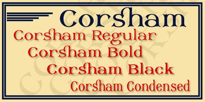 Corsham was inspired by traditional stonemason's engraved lettering designs. Designed to be used alone, or in combination with our Corton family, it has wonderfully lively air, with distinctive lively serifs and beautifully swashed downstrokes. Four faces are offered-regular bold and black weights as well as a condensed form. All faces include a range of Opentype features, including ligatures and old-style numerals. The Corsham faces merge 'olde-worlde' charm with fun character, yet remaining clear and legible for text use.
 - Stellar by Monotype,
$29.99Robert Hunter Middleton drew the original design of Stellar for the Ludlow Typograph Company in Chicago. Work began in the late 1920s, when Middleton was asked to create a sans serif type family to compete with European imports of Futura and Kabel. Stellar was Middleton's attempt to raise the ante. Where Futura and Kabel were geometric in design and monotone in weight, Stellar was based on roman character proportions and stroke weighs were stressed. In the late 1990s, Dave Farey took on the task of reviving the Stellar design. While Ludlow cut Stellar in a full range of point sizes, the family was limited to just a roman and bold design. Farey's revival is twice as large a family. It ranges from a very light called Stellar Nova to a very bold called Zeta In between are Lyra and Epsilon. - Walk Da Walk Two - Personal use only

- Backstabber - Unknown license

- Broxa by BRtype,
$19.00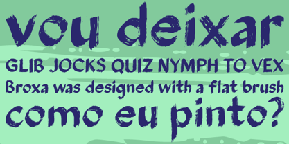 Broxa was designed with a flat brush and inspired by Roman Sans Serif Alphabet
 - BottleKaps by Type Innovations,
$39.00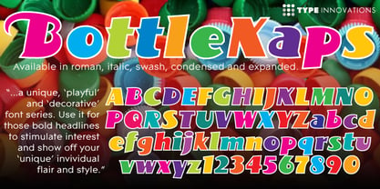 Alex Kaczun, originally designed BottleKaps for Linotype-Hell, in 1992, as a QuickDraw GX multi-master font series. A few new GX applications, like 'Unicorn', where able to utilize these unique fonts. The GX application allowed the user to adjust weight and proportions, on the fly, including glyph substitution for small capitals, old style figures, swash and alternate endings. The technology was never successfully deployed by Apple, so the individual fonts, 21 styles and variations in all, where sold in the Linotype Font Library as separate Truetype fonts up until 1998. Unfortunately, the fonts collected dust for many years thereafter, but now have been reworked and rejuvenated by Alex in OpenType format for both Mac and PC. 'BottleKaps' is a 'unique', 'playful' and 'decorative' font series. Use it for those bold headlines to stimulate interest and show off your 'unique' individual style.
 - 1475 Bastarde Manual by GLC,
$38.00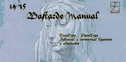 This script font was inspired by the type called “Bastarde Flamande”, a much appreciated one in the Duke of Burgundy’s court at the end of 1400s for handwritten books. A book titled Histoire Romaine (Roman history), from Roman author Tite Live, translated in French by Pierre Bersuire, circa 1475, was our main source for drawing the lower case characters and many of the upper case. Each character was written by hand with a quill pen on rough paper so as to look like the originals as much as possible. This font includes “long s”, naturally, as typically medieval , also a few ligatures, final and initial characters but there aren't any abbreviations because the text was written in French rather than Latin. Instructions for use are enclosed in the file and identify how to keyboard these special characters. This font can be used for web-site titles, posters, fliers, ancient looking texts, greeting cards, indeed for many types of presentations as it is a very decorative, elegant and luxurious font. Large type size shows this font at its best.
 - Tow by Suomi,
$30.00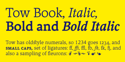 A headline font family, with old style numerals, ligatures and small caps.
 - Plinc Flourish by House Industries,
$33.00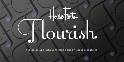 Flourish breaks the mold of traditional typography. Part italic, part roman, this iconoclastic font is all style. William Millstein casts the contours of formal pen strokes in a taut upright framework to create a typeface that nods back to its origins while looking defiantly forward. The neat and light semi-serif flaunts crisp geometric touches without conceding warmth or personality. A sophisticated design solution that isn’t stuck up, Millstein Flourish makes invitations, identities, and editorial settings thrive. Originally offered by Photo-Lettering in the early 1940s, Millstein Flourish was digitally updated by Jeremy Mickel in 2011. Like all good subversives, House Industries hides in plain sight while amplifying the look, feel and style of the world’s most interesting brands, products and people. Based in Delaware, visually influencing the world.
 - Black Jacky by IbeyDesign,
$19.00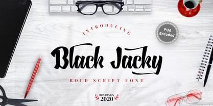 Black Jacky Bold Script Font is versatile script font that has a wide spectrum of applications ranging from greeting cards to headlines and is guaranteed to add a romantic feel to your next project.
 - Antiqva by Ultramarin,
$40.00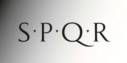 An alphabet based on classic Roman letterforms. As a model for our typography since ancient times, Roman stone inscription remains the starting point for all Latin letterforms. Working with these classical letters is an eternal dance for the graphic artist. The constant drawing and refinement of detail. A typographical relationship for ever.
 - Eurocine by Monotype,
$31.99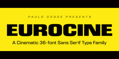 Eurocine is an expansive display typeface – a square sans serif that’s perfect for titling, headlines, logotype and branding. This 36-font family is packed with features to make it supremely versatile. This typeface attempts to capture the mood of movie credits from European Cinema in the 1970s, with a focus on Giallo films in particular. In terms of style, Eurocine sits somewhere between Walter Baum and Konrad Friedrich Bauer’s Folio, and Aldo Novarese’s Eurostile. With Eurocine you get a more versatile typeface by way of its small caps and additional stylistic sets giving you extended caps, extended small caps, and petite caps, as well as upper and lowercase unicase. Creating typographic masterpieces of your own will be so much easier! Key features: • 6 Weights in Roman and Oblique • 3 Widths – Narrow, Regular, Wide • Extended Caps • Small Caps • Extended Small Caps • Petite Caps • Unicase • Old Style Figures • European Language Support (Latin) • 1,200 glyphs per font.
 - Peoni Pro by Emily Lime,
$89.00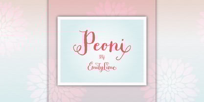 Peoni is sweet and quirky… and distinctly different. Her hand-lettered glyphs have retained their original textured appearance for an even more authentic custom-lettering feel. With over 1200 glyphs, Peoni is robust and full of open-type features. She’s designed to select the most ideal characters as you type. But feel free to make changes via your open-type panel, glyphs panel or character map. Have fun with it! There are plenty of options to allow you to create something truly unique and special. Peoni’s Open-Type features include: Stylistic Sets*, including 6 different Caps Styles Contextual Alternates Standard Ligatures Discretionary Ligatures Swashes Contextual Swashes Tabular Numbers Proportional Old Style Numbers Extras- Stylized words (i.e. and, the, from, etc), Roman Numerals (I, V and X), Ordinals (1st, 2nd, 3rd) *Stylistic Sets (ss01-ss18) & alternate glyphs aren't accessible with all programs. If your design software doesn't support open-type, you may need to use your computer’s character map to access other characters.
 - Arcade Fire - Unknown license

- Humanist 521 by ParaType,
$30.00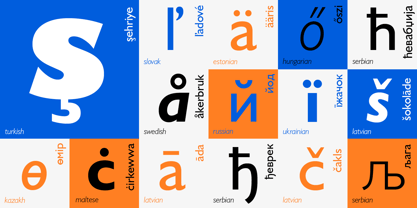 Humanist 521 is a Bitstream digitized version of Gill Sans typeface. The font was designed by Eric Gill and released by Monotype circa 1928-1930. Gill’s design is based on the typeface of Edward Johnston, the innovative British letterer and teacher, designed in 1916 for the signage of the London Underground. However, it has more classical proportions close to those of old style serifs, and thus is more suitable for text setting. With distinct roots in handwritten scripts, Gill’s typeface is classified as a humanist sans serif and is very legible and readable in text and display work. Having been released more than 80 years ago, it’s still very popular and in fact is an icon of British typographic style. The Cyrillic version of Ultra Bold weight was designed by Tagir Safaev in 1997. Six text styles and Extra Bold style in Cyrillic were designed later by Vladimir Yefimov and Isabella Chaeva. The Cyrillic version, in addition to the original Bitstream implementation of Humanist 521, has an alternative numeral 1 with the traditional shape and a set of old-style figures. Rereleased by ParaType in 2013.
 - WIP Grand Ma by WIP Fonts,
$49.00WIP Grand Ma depicts the handwriting of an old woman, representing the kindness and reliability that we appreciate of our grandma. The (lower case) characters are joined as it is usual in German speaking countries. Originally designed in 1995 the font has been extended by a lot of new characters such as accented characters, punctuation, symbols and currency symbols. - Garota Sans - Personal use only

- Risuali by Deeezy,
$14.00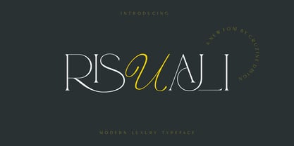 Trendy, elegant, luxury & modern style serif font for your fancy projects. Elegant, artistic and romantic style on Risuali font will be great for any branding project. Lot of alternates and ligatures will help you to create unique and original logo design or website header! Enjoy :) -Multilingual support -Lot of alternate characters -Lot of ligatures -Great for modern branding projects!
 - Sulawesi by Morganismi,
$12.00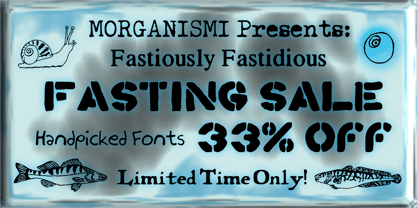 Sulawesi is an adventurous font imitating old map style. The family contains a text typeface, and a picture font with fish, sea creatures, monsters, old sail ships and stuff.
 - Kiss Me by Motokiwo,
$18.00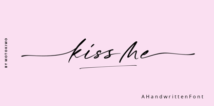 Kiss Me script font is beautiful, a well designed for pretty girls. It’s handwritten font with a chic ballpoint strokes style that very suitable for romantic and passionate typography projects such as wedding, fashion logo, branding, or a signature text.
 - Ormond JNL by Jeff Levine,
$29.00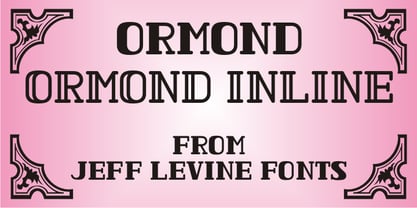 Ormond JNL and Ormond Inline JNL are two Deco-inspired Roman typefaces with rounded serifs.
 - Eingraviert by Intellecta Design,
$29.90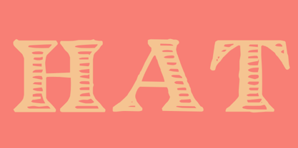 Eingraviert is based on old books capitals, with a wood type engraving style
 - Is Not A Brazilian Font by Intellecta Design,
$17.95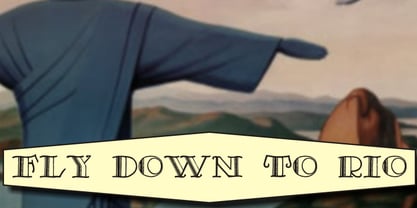 an art deco font based on brazilian Rio's lettering old publish lettering style
 - Regent Pro by Storm Type Foundry,
$39.00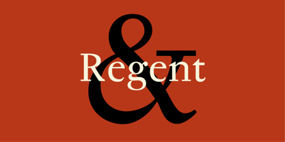 This modernized rustic Baroque Roman face paraphrases freely its model from the first half of the 18th century. The shape of the letters has been cleared from all unevenness and softness, but has retained its lively expression. It is deliberately rather cooler than the reverently digitized Baroque Roman type faces, since it was necessary to adjust it with regard to the visual experience of the contemporary reader. In addition, it has bold designs and aligning figures, which also considerably extends the range of its application. It is an entirely reliable text type face for the most demanding extensive works. Thanks to its calm expression and excellent legibility it is widely used when printing series of professional literature.
 - Candida by Linotype,
$50.99Candida roman was designed by Jakob Erbar and appeared after his death with the typeface foundry Ludwig & Mayer in Frankfurt am Main in 1936. Due to the original designer’s death, the italic was designed by Walter Höhnisch shortly thereafter. In 1945 the roman was reworked, the breadth of the figures was reduced and the strokes made heavier. The bold weight followed in 1951. Later the typeface was expanded with further weights, which have for the most part fallen out of use. Three weights can still be found in catalogues, available as early as 1937 for the Linotype machine. Candida is a modest text font which retains its legibility even in smaller point sizes. - Sprout by The Northern Block,
$25.99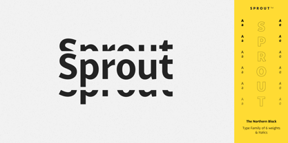 Sprout is a low-contrast sans serif, slightly condensed for economy of space, and complete with 6 weights in Roman and Italic. It has open apertures and a generous x-height for clarity of reading. It also comes with a weight balanced italic, which can be used for differentiation or as a standalone typeface in itself. The defining feature of the family is the taut curve, where the inner counter pushes out toward the outer contour, creating a feeling of tension in the curve. In the italic this shape language is pushed further, with a playful looped g and cursive form of the f. Sprout also comes with Old Style figures. Its range of weights makes for a versatile family suitable for branding, on-screen publishing and long-form reading.
 - Monotype Sabon by Monotype,
$34.99Sabon was designed by Jan Tschichold and released in 1967. Sabon was created in response to the specific needs of a group of German printers who wanted a typeface that would be identical in form when produced by three different metal-casting technologies. Named after Jacques Sabon, a sixteenth century typefounder whose widow married another typefounder, Konrad Berner, who is credited with issuing the first typefounder's specimen sheet. Several types on the sheet were attributed to Claude Garamond, and one of these served Tschichold as the source for Sabon roman. The italic was based on another face on Berner's sheet, cut by Robert Granjon. Tschichold's skillful adaptation of these old style faces has produced an elegant and workmanlike book face. The Sabon font family is a popular choice for setting text. - Rare Bird Specimen III by Rare Bird Font Foundry,
$100.00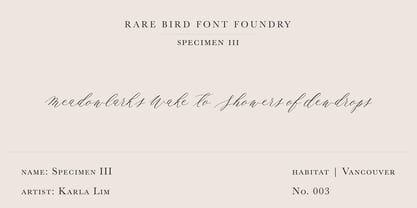 RARE BIRD SPECIMEN III Rare Bird Specimen III is a graceful hand by Karla Lim of Written Word Calligraphy. This all lowercase font feels both modern and feminine. While uppercase letters are still lowercase in shape, they are larger and read as caps. OBSERVATIONS Specimen III has a dancer-like form; supple and lithe. Willowy letters are nimble and lissome, content alone or paired with a stronger, more masculine specimen. DEFINING CHARACTERISTICS Opentype programming, formal title and preposition word art, 7 alternate lowercase t cross-strokes, Roman numerals, old-style numerals, seamlessly semi-connecting calligraphic letters, realistic double-letter ligatures, in and out-stroked letters at the beginning and end of words where appropriate, basic Latin encoding. POTENTIAL SIGHTINGS Bridal + baby shower stationery, logo design, gourmet food packaging, clothing labels.
 - Core Mellow by S-Core,
$20.00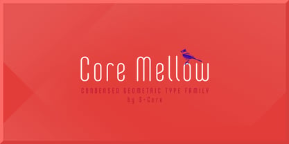 Core Mellow is a condensed geometric sans-serif typeface family that can be used in various applications especially for short texts. The letterforms in roman style are mild, minimal, simple, and clean in appearance. The Core Mellow Family consists of 3 widths (Compressed, Condensed, Normal), 7 weights (Thin, Extra Light, Light, Regular, Medium, Bold, Extra Bold) and Italic for each format. The Core Mellow provides a wide range of character sets to support Cyrillic, Central and Eastern European characters and advanced typographical support with features such as proportional Figures, tabular Figures, numerators, denominators, superscript, scientific Inferiors, subscript, fractions, standard ligatures, discretionary ligatures and stylistic alternates. Core Mellow looks smooth in any layout with its sleek rounded lines, use it for your magazines, brochures, web pages, screens, and so on.
 - Solaris by Ultramarin,
$40.00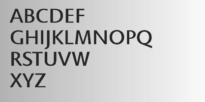 Solaris is a sans serif or a grotesque as we still call it where I come from. (it is an old term which means strange compared with Roman which was the normal font) The face is an open sans, which means that the round signs take the air into the form, minuscule d is drawn kind of backwards like in Gill Sans, which sets off on minuskel a. Here is the Regular version, with a slightly difference between stems and hairlines.
 - Possum Saltare NF by Nick's Fonts,
$10.00Lewis F. Day, in his Alphabets Old and New, presented these letters as examples of rustic Roman lettering of the first through third centuries, AD. An uppercase-only typeface, most of the lowercase positions are occupied by letterform variants. It should be noted that the name does not refer to a savory dish made from a nocturnal American marsupial; it’s Latin for “I can dance”. Both versions of the font include 1252 Latin, 1250 CE (with localization for Romanian and Moldovan). - Mezalia Sans by Arrière-garde,
$9.00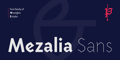 Mezalia Sans is a logical continuation of the Mezalia family. Its shapes are based on medieval calligraphic style: the Bastarda. This time the evolution is taken a step further, as these classic shapes are merged with the straightforwardness of a modern sans-serif. This results in an original, strong yet very much usable typeface, that can hold its own in a wide range of applications. Mezalia Sans has two distinct styles: straight and cursive (true italic if you will, although the word is not really correct here), which come in ten weights, from thin to black. This wide range ensures that whether you are looking for delicate or bold strokes (or a combination of both) you will be satisfied. Every style also contains a set of small caps (with matching punctuation). Old-style, proportional and tabular numerals are included too, along with ligatures, symbols and language support in Adobe Latin 3 range.
 - Natom Pro by Mostardesign,
$25.00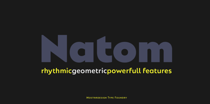 A family of fonts with rhythm. Natom Pro is a modern and geometric font family adapted to the professional requirements of graphic designers, web designers and mobile application developers. Comprised of 19 styles including 8 styles designed especially for the design of headlines, Natom Pro is a very versatile family of fonts that can be used in many projects such as editorial design, branding or corporate identity creation, design of posters or logos, the creation of websites or the development of mobile applications. This font, with a resolutely contemporary aspect, also hides a unique typographic design since it has 2 distinct styles (Title and Roman) which have 2 different typographic rhythms in order to graphically differentiate the appearance of titles, subtitles and long paragraphs. With this design of rhythmically differentiated glyphs according to the styles, the headlines have a very graphic aspect while the long texts have a more classic aspect in order to keep optimal readability in all scenarios. Its architecture is also very modern since it was designed and drawn with particular attention to the geometry of the forms with clear and open endings cut at 90 degrees. The number of styles has also been simplified with the most used thicknesses (Extra Light, Light, Regular, Medium, Bold and Black) in order to speed up your graphic design process. For the more experienced designers, Natom Pro is also available in a variable version. Natom Pro is also equipped with powerful OpenType features like case sensitivity, true small caps, full ligature set, tabular figures for tables, « old styles figures » to elegantly insert figures into your sentences, numbers circled or even alternative characters to satisfy the most demanding professionals.
 - Rome Ionic by 38-lineart,
$17.00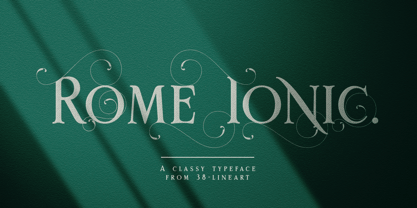 Rome Ionic is a serif display font inspired by architectural features in ancient Roman building columns. The Ionic columns are taller and slender compared to 'Doric and Corinthian' columns. On the Ionic Capitol column, there is a geometric spiral like a paper roll. We used those elements in this roman style font. The base of this font is serif shaped, more slender and towering, and equipped with 8-18 stylistic set alternates. This is the development of the basic shape on which we added spiral ornaments to the left and right. This serif font's characteristic is soft and simple, not sharp and complicated like Doric and Corinthian. The composition of the softness of the basic and alternate fonts does not reduce the splendor of this font. We complemented this font with support for the Latin extend as an analogy to the Roman region. Rome Ionic is perfect for 'impressive luxury and power' designs. With this font, your branding will show the robustness and refute the splendor of other products.
 - Isis by ITC,
$29.00Isis is the work of type designer Michael Gills, an all capital, classical looking display roman typeface with an open engraved effect. It can be used alone or in combination with most established classical roman typefaces. Isis is ideal for a wide range of headline applications and gives text a look of quality and excellence. - Racon by Ahmet Altun,
$17.00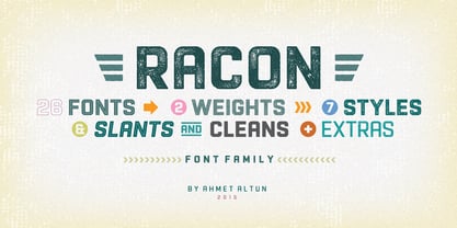 Racon Font Family comes in two weights as regular and bold with seven styles. You can create unique and great designs with its classy, legible, elegant look and most preferred texture and clean styles. You can enrich your designs by using Racon Fonts with its clean and old styled extra figures. You can reach the keyboard codes of the extras as a pdf file from the "Gallery". It would be a perfect choice for designing posters, affiches, logos, invitation cards, t-shirt and magazine prints, eye-pleasing typographic designs and more. Enjoy!
 - Mariage by Linotype,
$40.99Morris Fuller Benton, the principal designer of the American Type Founders, designed Mariage in 1901. Mariage, which has been sold under a plethora of different names during the last century, is a blackletter typeface belonging to the Old English category. The term blackletter refers to typefaces that stem out of the historical printing traditions of northern Europe. These letters, called gebrochene Schriften, or "broken type" in German, are normally elaborately bent and distorted. Their forms often print large amounts of ink upon the page, creating text that leaves a heavy, black impression. The Old English style is a subset of blackletter type that dates back to 1498, when Wynken de Worde introduced textura style printing to England. Continental printers had been printing with textura style letters since Gutenberg's invention of the printing press fifty years earlier. Italian printers stopped using them around 1470. For northern Europeans, texturas remained the most popular form of typeface design until the invention of the fraktur style in Nuremberg. Mariage is heavily classicized sort of Old English type. During the Victorian era, designers admired the Middle Ages for its chivalric, community-based values and its pre-industrial lifestyle. Yet they also found the basic medieval textura letterform too difficult to read by present standards. They desired to modernize this old style. Today, this sort of update is often referred to not as "modernization" but as classicism. Benton's design for ATF builds upon earlier Victorian classicist interpretations of Old English/textura letters. For an example of what these Victorian designs looked like, check out the popular 1990 revival of the genre, Old English . Old English style types often appear drastically different from other blackletters. For contrast, compare Mariage to a classical German fraktur design, Fette Fraktur , a schwabacher style face, or the popular early 20th Century calligraphic gothic from Linotype, Wilhelm Klingspor Gotisch . Especially in the United States, classicist Old English typefaces are thought to espouse tradition and journalistic integrity. These features, together with the inherent, complex beauty of Mariage's forms, make this typeface a perfect choice for certificates, awards, and newsletter mastheads. - Celebration by RMU,
$35.00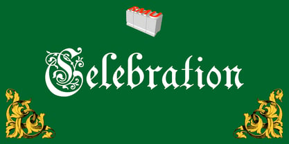 A blackletter font of decorative style and of obscure origin which was rescued for all devotees of these old hot-metal letters. This font contains a bunch of useful ligatures, and by typing 'N', 'o' and period and activating the OT feature Ordinals you get an old-style number sign.


