10,000 search results
(0.068 seconds)
- Beatrix Antiqua by Zetafonts,
$39.00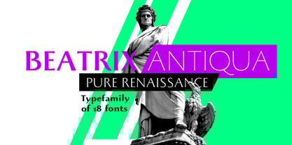 Beatrix Antiqua is a humanist sans-serif typeface designed by Francesco Canovaro. Beatrix Antiqua is part of the Beatrix Family that takes its inspiration from the classic Roman monumental capital model: its capitals are directly derived from the stone carvings in Florence Santa Croce Cathedral - where the serifs are often removed while keeping the variable width strokes. So, even if it’s basically a sans-serif, Beatrix keeps a subtle swelling at the terminals suggesting a glyphic serif - in the same vein as Herman Zapf classic Optima typeface. In the lowercase design, Beatrix references early humanist typefaces, keeping small calligraphic details (as the prolongation of the e nose) that are especially visible in the italics. While Beatrix Antiqua, the companion typeface to Florentia , slightly exaggerates its antique stylistical features, Florentia tries to mix those influence with a more robust & digital age ready design, featuring bigger X-height and an extended character set that covers over forty languages using the latin alphabet, as well as Greek and Russian Cyrillic.
 - 1565 Venetian by GLC,
$20.00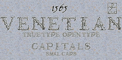 This set of initial decorated letters is an entirely original creation, drawn inspired by Italian renaissance engraver Vespasiano Amphiareo's paterns published in Venice circa 1568. It contains two roman alphabets : the first of large Initials, the second of small caps. Both containing thorn, eth, L & l slash, O & o slash. It can be used as variously as web-site titles, posters and flyers design, publishing texts looking like ancient ones, or greeting cards, all various sorts of presentations, as a very decorative, elegant and luxurious additional font... This font is conceived for enlargements remaining very smart and fine. The original height of the initials is at least about one inch equivalent to about four lines of characters, small caps may have the same height than the caps of the font used with, but cover two lines is better. This font may be used with all GLC blackletter fonts, but preferably with "1543 Humane Jenson", "1557 Italic", "1742 Civilite", "1776 Independence" without any fear for doing anachronism.
 - Hebrewish by JAB,
$18.00I decided to create Hebrewish because the only Hebrew Latino font I have ever seen didn't really live-up to my expectations. Each Roman letter and Arabic numeral in this font is based directly on one or more of the Hebrew characters. Originally I was tempted to create an upper case only - since there is no lower case in Hebrew that I know of. But, as this would have limited it's usefulness, I changed my mind and added a lower case also. Nevertheless, those who want to create very Hebrew looking text, need only use the upper case. I've also added some typical Judaic symbols for the artistic minded, e.g. David's star *, the Menorah ^(Jewish candelabrum) and brackets{ } based on this, as well as brackets [] which, used together, produce a 'Ten commandments' stone-tablet symbol(use this [~] for another version). In short, you can either have some fun with this font or use it for serious work - the choice is yours. - Di Barros by Di Barros,
$5.00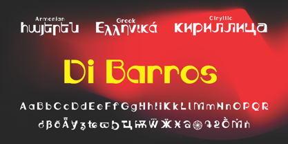 I'm Roberto Teixeira, a Brazilian graphic designer. After looking for a form quite different from the existing types, created in 2019, Di Barros Fonts Family is composed by Di Barros Regular...for while. This,form covers the following, according to the Windows character map: Basic Latin, Latin Supplement 1, Extended Latin A, Extended Latin B, Additional Latin, Cyrillic, Greek, Greek Extended, Armenian and several other special types, such as currency symbols, numbers, fractions, Roman numerals, arrows, symbol of electricity, hearts and vector images, of own authorship and more. Di Barros, with a good length, serves several languages. I think Di Barros applies to fine environments, such as jewelry stores, fashion stores, cultural events and others, where a beautiful and non-aggressive look is required. But there is no better application than the one chosen for its inspiration and creativity. Di Barros Fonts Family was made for you. Thank you for using it.
 - Roijer by PeGGO Fonts,
$39.00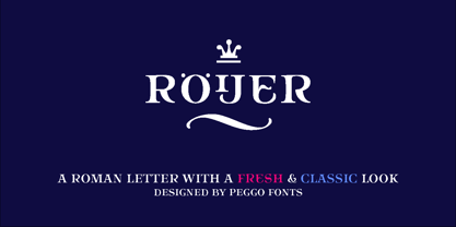 “Röijer” was born from a branding exercise done with “high care”, graphically developed thanks to the valuable help of designers Marcela Aguilera & Pedro Gonzalez, each letterform and every type design process was worked as a typographic jewel, as a strong bond between classical and fresh concepts (with a Lombardic and Art Nouveau touch). Röijer puts a dual capital model in your hands; a classic Roman and a fresh contemporary alternative, on each letter: the first located in a lowercase box looks formal and sober, while the uppercase box shows a glamorous and more daring look, ideal to being use at specific moments only. Röijer combine elegance and audacity in a very magistral way. It has 2 variants with 541 glyphs each one; a normal and a volumetric one, all with an ornaments set and a decorative objects set. Ideas that be useful not only for branding design but also for titling, headline composition, label design, fashion and luxury stuff.
 - Gotto by Attype Studio,
$18.00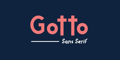 Gotto, the playful Sans-serif font with an italic twist and multilingual support. Perfect for logos that want to stand out from the crowd. Let Gotto bring some fun and personality to your next design project! Features : - Gotto Family Font - Multilingual support, US Roman, Latin 1 Support --- This Font Support Language: Afrikaans, Albanian,Asu, Basque, Bemba, Bena, Breton, Catalan, Chiga, Cornish, Danish, Dutch, English, Estonian, Faroese, Filipino, Finnish, French, Friulian, Galician, German, Gusii, Indonesian, Irish, Italian, Kabuverdianu, Kalenjin, Kinyarwanda, Luo, Luxembourgish, Luyia, Machame, Makhuwa-Meetto, Makonde, Malagasy, ManxMorisyen, North Ndebele, Norwegian Bokmål, Norwegian Nynorsk, Nyankole, Oromo, Portuguese, Quechua, Romansh, Rombo, Rundi, Rwa, Samburu, Sango, Sangu, Scottish Gaelic, Sena, Shambala, Shona, Soga, Somali, Spanish, Swahili, Swedish, Swiss German, Taita, Teso, Uzbek (Latin), Volapük, Vunjo, Zulu, Thank you for purchasing premium fonts from Attype Studio. Follow and explore our work on Pinterest & Instagram. If you have any question, don’t hesitate to contact us. Hope you enjoy with our font! Attype Studio
 - Scala Sans Pro by Martin Majoor,
$49.00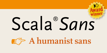 The award-winning Scala family (1990-1993) is a worldwide bestseller and has established itself as a ‘classic’ among digital fonts. It was one of the first serious digital text fonts to support small caps, ligatures and different set of numbers. In fact Scala and Scala Sans (1990-1993) are two workhorse-like typefaces sharing a common form principle: the skeletons of both Scala and Scala Sans are identical, therefore they can be combined perfectly. Where many of the modern sans serifs (like Helvetica and Univers) have rather ‘closed’ letter shapes, the same elements in Scala Sans are much more ‘open’. This greatly improves legibility, especially in the smaller point sizes. The italic of Scala Sans is not a slanted version of the roman, but rather a ‘real’ italic. Another part of Scala is very popular among its users: Scala Hands, containing more than one hundred decorative hands and pointers, is included in the Scala fonts and is a free bonus.
 - Axion STN by Type Innovations,
$39.00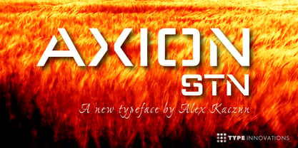 Axion STN is an original design by Alex Kaczun and is a stencil interpretation of his Axion RX-14 font. It is but one of several alternate designs based on his original Axion family of fonts. The wide gap within this stencil treatment works well with and compliments the spacing in the font, creating a tension within this modern grotesque and adding a class of destinction and interest. This display font is not intended for text use. It was designed specifically for display headlines, logotype, branding and similar applications. The entire font has an original look which is strong, dynamic, machine generated and can be widely used in publications and advertising. Axion STN is a futuristic, techno-looking and expressive typeface with an appearance of machined parts with sharp and rounded edges. This attractive display comes in roman with lower case and lining figures. The large Pro font character set supports most Central European and many Eastern European languages.
 - Bodoni Classic Cyrillic by Wiescher Design,
$55.00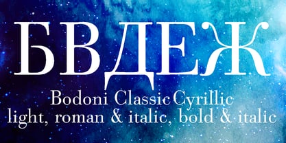 One day shortly after Christmas 2004, the art-director of Vogue Moscow called me. Would I maybe make a Cyrillic version of my Bodoni Classic Text typeface? Well, since I had been thinking about doing it since a long time, this was the perfect reason to finally do it. It was not an easy venture, since I do not have the faintest idea of Russian but, together with those nice people in Russia and a fellow helpful type designer in Kiev, I managed. I did an enormous amount of kerning, thanks to the help of the Moscow Vogue office. Here the fonts are now for all of you: five text cuts, plus one standard roman cut that has no Cyrillic letters but an extra set of medieval numbers. At Vogue they are happy with the fonts, even though I did not quite adhere to Bodoni's originals in this case. Nastarowje (or whatever you say in Russia), Gert Wiescher
 - Orchidea Pro by Mint Type,
$40.00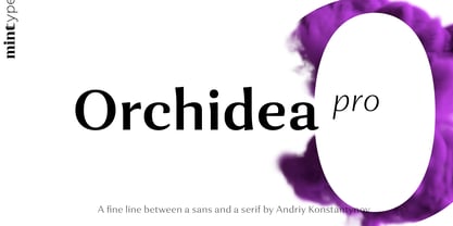 Orchidea Pro is a typeface balancing on the verge of sans and serif. Called a stressed sans or a serifless serif, it does not feature any serifs, but resembles a serif typeface by build, and features unilateral nibs that speed up the reading and create a particular distinction in the form. Such solution results in a contemporary-looking yet elegant type, virtually unique in texture, that exists in the same stylistic space as flared serif families. Orchidea Pro will fit particularly well for use in magazines of any theme, as well as in branding for beauty-related products. The typeface comes in 8 weights + corresponding real italics, each supporting numerous Latin-based languages as well as major Cyrillic languages. It is packed with OpenType features like ligatures, small caps, 5 sets of digits, 4 stylistic sets in romans and 1 in italics, superiors and inferiors, fractions, ordinals, respective punctuation varieties including all-cap punctuation, as well as language-specific alternates.
 - Infusion by Andinistas,
$39.00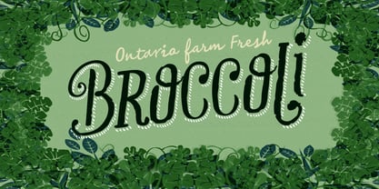 Infusion is a type family designed by CFCG & Fabio Godoy for andinistas.net. The creative process of Infusion evolved throughout a myriad of experiments supported by my font gluten This is why its expressivity comes from the addition and subtraction of its parts by mixing and combining, resulting in a great variety and new versatility of uppercase, lowercase, multiple and different numbers to be applied at the beginning, middle or end of the word. Infusion is used to write sentences in craft contexts that require organic graphic design, with meticulous imperfect look. Infusion offers typographic solutions out of the limits, or out of borders that divide the mechanics of the drawn by hand. Infusion has 6 decorative and legible fonts to write casual messages with organic, friendly and natural personality. Infusion “Script, Mix, Roman, Shadow, Extras, Dingbats” contain unconventional visually appealing ideas to work independently or in group in the design of logos, packaging, presentations, headlines or editorials.
 - Railyard Stencil JNL by Jeff Levine,
$29.00Railyard Stencil JNL is a stencil variant of Decal JNL that was set aside for a long time in a forgotten work folder. It's broad strokes and sharp serifs emulate the vintage look of old railway cars and other earlier forms of transportation. - Scripty by Turtle Arts,
$20.00Scripty is a hand drawn, calligraphy longhand handwritten font. With careful spacing, the letters can be used together to create words that look like theyπve been written with an old≠fashioned fountain pen, or used alone as embellishment to more plebean text. - Life Cinema Screen by Andrey Ukhanev,
$-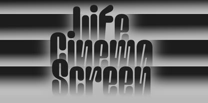 This font was inspired by an old photographic film package I found. Over time, the vertical slits in the letters have become more complex and acquired slanted sections. The font is suitable for accidences: headlines, posters... maybe you can suggest something interesting ;)
 - Syntax by Linotype,
$29.99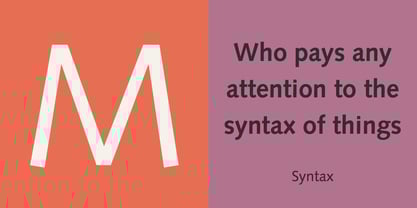 Syntax was developed by Hans Eduard Meier in 1968 and presented by the font foundry D. Stempel AG. Its figures are based on Old Face characters but have a distinctive, modern design. The inclination to the right lends the font a dynamic feel.
 - Square Dance by Solotype,
$19.95Animated types like this one have been around for fifty or more years. They certainly add a sense of liveliness to a headline. This one trades upon the "wrong way weights" of the old French Clarendon. Think of it as Barnum with Bounce. - Eingrantch Mono by Harmnessless Type,
$30.00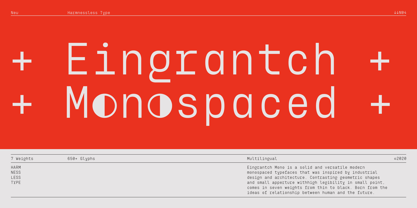 Eingrantch Monospaced is a monospaced sans serif based typeface, inspired by an old Continental typewriter in sans serif version. Available in 7 weights from thin to black. Well suited for modern logotypes, branding, editorial design as well as web and screen design.
 - Classroom JNL by Jeff Levine,
$29.00A set of old die-cut cardboard letters and numbers used by teachers directly on bulletin boards or for tracing was the inspiration for Classroom JNL. In turn, these letters take their cue from typefaces such as Franklin and earlier wood type designs. - Fleurons Two by Wiescher Design,
$39.50Fleurons are embellishments and here is my second round. I again looked at some old ones and made some new, more modern ones. These go very well with my scripts Nadine and Ellida! Yours once more in a beautiful mood, Gert Wiescher - Ventana by Hanoded,
$15.00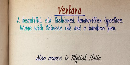 Ventana (Spanish for window) is an old-fashioned handwritten typeface. It was created using Chinese ink and a bamboo pen. The result is a rather classy, stylish font. Ventana is highly legible and comes with all the diacritics you'd probably ever want.
 - Plumero Script by Sudtipos,
$39.00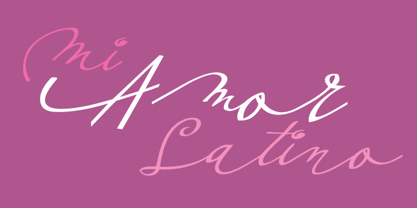 Plumero is the wild, playful side of calligraphy. The disciplined elegance of old lettering is replaced with the fresh, joyful swashes of youth. Attractive and care-free, Plumero catches the eye and leaves its viewer with an indelible impression of its unmistakable signature.
 - Fleurons V by Wiescher Design,
$39.50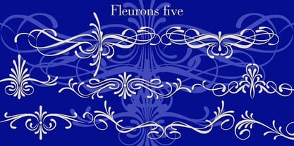 Fleurons are embellishments and here is my fifth set. I again found some nice old ones and made them completely new. These very elaborate ones go extremely well together with my scripts Nadine and Ellida!!! Yours in an elaborate mood, Gert Wiescher
 - Compliment by profonts,
$39.99Compliment is a script design which is obviously based on H. Matheis' typeface designed for Ludwig & Mayer in 1965.Ralph M. Unger redrew and digitized this font in 2004. His work is based on artwork taken from old East German font catalogues. - Theater Bar JNL by Jeff Levine,
$29.00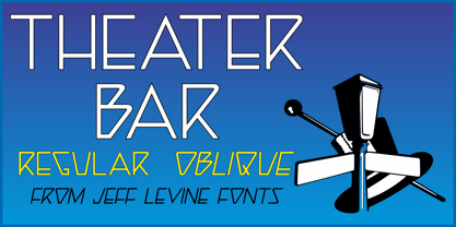 The name and design inspiration for Theater Bar JNL comes from an image of an old bar with an overhead neon sign in very stylized sans serif lettering (most likely from the 1940s) and is available in both regular and oblique versions.
 - Maisonneuve by Beware of the moose,
$17.99 Maisonneuve is named after the fracture I had in 2019. During the period of revalidation this font was born passed on circles and rectangles. A modern – almost modular – font with old school figures and lots of symbols and good readability and legibility.
 - Brandold by Krisp Designs,
$18.00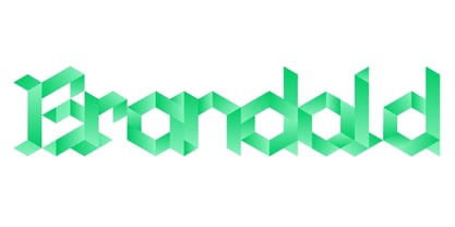 Brandold is based on the repetition of one shape, the equilateral triangle. Using these triangles as pixels I built a medieval-like font that looks new, but follows an old aesthetic. I chose to make this font because I hadn’t seen anything similar.
 - Tinderbox by Device,
$29.00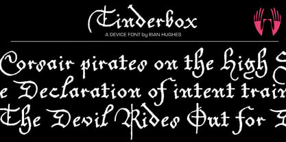 16th and 17th century formal handwriting forms the basis for Tinderbox, an antique script. Preserving the rough impression of a quill pen on parchment, Tinderbox evokes old manuscripts, ecclesiastical texts, gothic inscriptions, faded tattoos and horror literature; spooky calligraphy for the digital age.
 - Headlock by Hanoded,
$15.00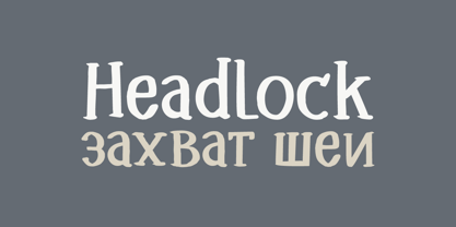 Headlock is a handmade serif. My 6 year old son just had his first real Judo exam and the one thing he excels at is the headlock. Headlock comes with double letter ligatures and all the diacritics you need, plus basic Cyrillic!
 - Valuable Time by Bogstav,
$14.00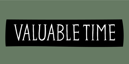 Sometimes you need a slim, elegant good old fashioned serif font. And, voila! Here you are - Valuable Time fits all those needs. I didn't spend much time cleaning up the letters, so they stand out just the way they are: organic and handmade!
 - Message Of The Birds by chicken,
$14.00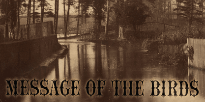 A handful of these spiky, sprightly letters made up the twittering title page of 'Message Of The Birds', a song by one Flora Warner, found in stacks of crumbling scores on an old upright piano in the basement of a favorite London bookstore.
 - Zorro by Solotype,
$19.95A reasonably accurate rendering of an old favorite font from Victorian times. Quite readable in lowercase, and very eye-catching in all-caps. We got the proof for this in London many years ago, but neglected to learn the name. Zorro sounds good. - Meal Ticket JNL by Jeff Levine,
$29.00Meal Ticket JNL follows the same basic letter shapes as Jeff Levine's Flatbush Beanery JNL, but with a much lighter look and feel. This is another perfect typeface for recreating the sign lettering and menus of old-time diners, drive-ins and restaurants. - Ornata A by Wiescher Design,
$39.50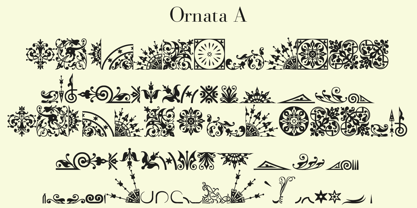 Ornata A is the first of a series of old ornaments that I am trying to save from oblivion. I am not just scanning these, I am completely redesigning the ornaments from scratch, thereby eliminating imperfections. Your digitizing type-designer, Gert Wiescher
 - ST Titan by ShimanovTypes,
$20.00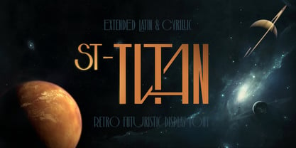 ST Titan is a retro futuristic display font with vintage vibes, inspirated by old sci-fi book's headers and posters. It's good for social media, headlines, large-format print, branding, posters, fashion designs and websites. Extended Latin and Cyrillic support. 30+ languages
 - Scribe by Wiescher Design,
$49.50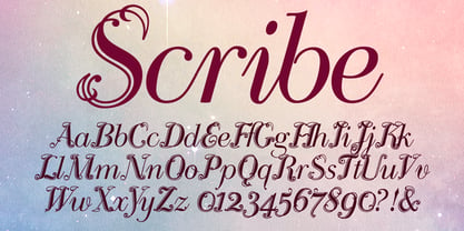 Scribe is an elaborate typeface somewhere in between Bodoni and an English script. It has interwoven capitals and joining lowercase letters. I have tried to make something new that has this old, settled touch. I think I like it. Yours sincerely, Gert Wiescher
 - Poultry And Fish JNL by Jeff Levine,
$29.00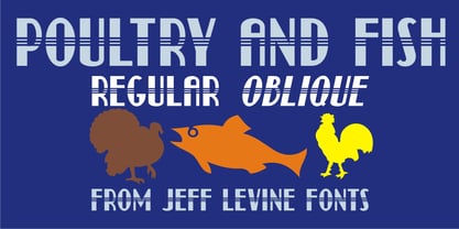 The image of an old enamel sign advertising poultry inspired Poultry and Fish JNL, which is available in both regular and oblique versions. Horizontal cut-through lines within the Art Deco-era hand lettering adds to the uniqueness of this type design.
 - Shay Man by Fonts of Chaos,
$10.00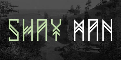 Shay Man is a font design for poster and title tag line. The font is only uppercase in two weights. Shay man is a typicaly straight angular font taking inspiration from the old post brutal design. Use it for making awesome artworks. Enjoy.
 - Albion's White Christmas by Greater Albion Typefounders,
$14.00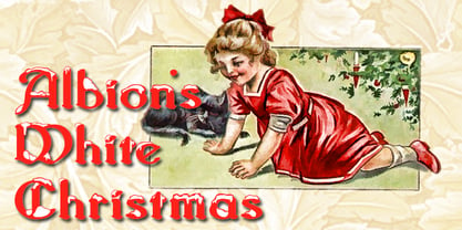 “Albion’s White Christmas” can only be described as a snowy blackletter. In the tradition of old childrens' comics, yuletide magazine mastheads and vintage Christmas cards, it is a snow draped blackletter ideal for the winter holidays and letting in the spirit of Christmas.
 - Trade Printer JNL by Jeff Levine,
$29.00Trade Printer JNL is another font design inspired by an old rubber stamp sign printing set. In this case, the lettering has a classic "wood type" look, reminiscent of the letterheads, billheads and fliers made by local printers of the 1880s-1920s. - Metrolite by Jonahfonts,
$39.00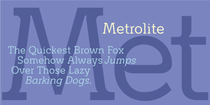 A slab font in 6 styles.