33 search results
(0.005 seconds)
- Intro by Fontfabric,
$47.00 Let us introduce you the official big update of Intro type family with essential upgrades to this contemporary sans serif. The weight distributions completely revised has brought 8 new weights and matching italics resulting in 72-fonts family with 22 fonts extra. Intro’s refined playfulness is further emphasized with additions of multiple ingredients, such as carefully adjusted Oblique alternatives next to the existing upright alternatives. All these styles are now available as a Condensed version. On top of that, there are 3 inline fonts. The glyph case was expanded to cover Extended Latin and Cyrillic with adequate language localization. The OpenType features rewritten and improved now allow case-sensitive forms and contextual alternates, and plenty of stylistic alternates. The standard numerals set includes as well tabular figures and symbols, superiors and inferiors, numerators and denominators, plus fractions.
 - Cintra by Graviton,
$12.00 Cintra font family has been designed for Graviton Font Foundry by Pablo Balcells in 2014. It is a sans serif, bold, geometric typeface with subtle rounded angles, which provides a soft, pleasent appearence. Cintra consists of 8 styles.
 - Sintra by T-26,
$29.00 - Mono Iltra by PizzaDude.dk,
$20.00 A wrecked, monospaced font containing ligatures for both double letters and numbers, alternate letters and unique accented characters! You will need to use OpenType supporting applications to use the autoligatures.
 - FF Infra by FontFont,
$50.99 FF Infra™ is a fresh take on the robust sans serif typefaces of the early 20th century. Drawn by Gabriel Richter, it’s a friendly, inviting – and multi-talented family. Whether long blocks of editorial text, or snackable copy in web pages and blog posts, FF Infra’s 20 typefaces are easy on the eyes in both print and digital environments. The design also performs as well at petite sizes, as it does at supersized display settings. Pair FF Infra with an old style or Didone serif design and you’ll have powerful and distinctive typographic pages! FF Infra is available in 10 weights, ranging from a delicate light to a commanding black, each with an italic companion. OpenType® Pro fonts of FF infra have an extended character set supporting most Central European and many Eastern European languages, in addition to providing for the automatic insertion of ligatures and fractions. Each font also contains four sets of figures and a bevy of arrows that are ideal for wayfinding and similar info-graphic projects. A generous lowercase x-height, open counters and subtle graduations between family weights, make for a family that is at home in a wide range of sizes, and comfortable in everything from large signage, content for mobile apps, product manuals and full-scale branding projects. In addition, to provide design diversity, Richter drew alternate designs for the a, G and ß. Richter first became interested in fonts and the art of creating typefaces while studying communication design at Düsseldorf University of Applied Sciences. His first designs were experimental, but these lead a position at FontShop International in 2013, where he developed his typeface design skills. A strong background in font production, hinting and font marketing were also part of his FontShop experience. Richter worked as freelance graphic and type designer until he founded übertype in 2017. He also invests back into the type community through the type design courses he teaches at his alma mater. FF Infra is Richter’s first commercial design for Monotype. We’re sure that you’ll find it as versatile and powerful as we do.
 - Intro Rust by Fontfabric,
$25.00 Intro Rust is one of the biggest packages on the market, including 214 fonts. The font family is a rough version of the famous Intro. Intro Rust includes 4 sub-families - Intro Rust, Intro Script, Intro Head and Intro Goodies. It can be used to create almost all types of design projects like print materials and web design. Just use your imagination and your project will become more alive and vivid than ever with one of the Intro Rust fonts. You want to make a greeting card or a package design, or even a brand identity? Feel free to play with all the patterns and shapes, scripts or those cool fonts with the dots and that will lead you to your next successful project.
 - Intro Script by Fontfabric,
$19.00 Intro Script carries with it ideas of resurgence, renewal and unconditional freedom. An updated and expanded version of the Intro Rust sub-family, itself developed from the popular Intro type system, Script comes with 8 different weights and a whole slew of goodies and additional features for you to tinker with. These consist of 3 supplementary fonts with ready-made words, patterns and even banners, so you can put the spark back into your project. The set includes a large number of ligatures and contextual alternates, including both lower and upper case versions, as well as positional variations. The latter allow for symbols to connect at different joints, and help you dodge unnecessary voids, resulting in an efficient work process and a more natural flow. With its broad language support and wide range of OpenType features, Intro Script’s friendly, hand-crafted appearance makes it a suitable and flexible choice for any design. Features: • An updated and polished version of the famous multifaceted bundle • 8 refined monoline styles; • Extended language support; • Supplementary goodies - words, patterns, banners; • Additional ligatures and contextual alternates; • Stylistic positional variations;
 - ITC Intro by ITC,
$29.99 - Cintra Slab by Graviton,
$12.00 Cintra Slab font family has been designed for Graviton Font Foundry by Pablo Balcells in 2014. It is a slab serif, bold, geometric typeface with subtle rounded angles, which provides a soft, pleasant appearance. Cintra Slab consists of 8 styles.
 - AF Nitro Intro by ACME Collection,
$44.00 - Linotype Aspect by Linotype,
$29.99The letters in the Linotype Aspect Family fonts seem to be experiments in the handcrafting of letters with just a few basic geometric forms. For instance, the bowls of the letters C, D, and G in Linotype Aspect Intro are all made up of narrow half circles. Features like this make Linotype Aspect Intro perfectly suited for headlines and short passages of text. Its quirkiness is sure to lend a smile to the faces of your readers. For shorter headlines with larger point sizes, try setting your text in Linotype Aspect Regular, the second member of the Linotype Aspect family. Linotype Aspect Regular uses the same basic letterforms as Linotype Aspect Intro, but reverses them out in white, and places them over bulbous black shapes. The Linotype Aspect family was developed by German designs Hans-Jürgen Ellenberger in 1999. - Victory Script by CozyFonts,
$25.00 Victory Script is the sixth font family created by American Graphic Designer Tom Nikosey. Tom specializes in Lettering, Typographic Design, Illustration for Branding and Trademarks. CozyFonts Foundry is Tom's intro into the world of font design. Aladdin Family is the first font, Skratchbook Family is the second & Noodlerz Family is the third, Toms Finger Family is the fourth, Posterface Family is the fifth & Introducing Victory Script Family as the sixth with 2 fonts: Victory Script & Victory Script Aged. Please visit www.TomNikosey.com or Google Tom Nikosey for more info on his illustrious career. CozyFonts is Tom's intro into the world of font design.
 - Anivers by exljbris,
$- Anivers is robust and rigid, forgiving, flexible and elegant ... and also suitable for a broad use: from a stationery to a poster headline. From an intro in a magazine to a base for a logo. This OpenType font family comes in regular, italic, bold and small caps and offers supports CE languages and even esperanto.
 - Quickstep Sans by Holland Fonts,
$30.00A 'quick' font, originally made for the 25th anniversary of SSP Printing Co. in Amsterdam. First used for an intro spread in Wired Magazine (#3.05, May 1995): "The problem with computers is that they don't have enough Africa in them. What's pissing me off is that they use so little of my body" (Brian Eno). - PiS Konzert by PiS,
$36.00 PiS Konzert is a bulky quirky all caps headline sans, inspired by letters found on a hand drawn polish poster from the 1960s. Its slightly shaky mid-century style makes it perfect for concert posters, movie intros or any other applications that need to evoke that bold, loud and still a little classy feeling of staggering inebriatedly through a murky jazz club.
 - Diamond by Monotype,
$29.99The Diamond Negative and Diamond Positive fonts feature sans serif capitals and figures in a diamond shaped background, in positive and negative form. Diamond Negative and Diamond Positive are useful in labelling, on invitations and certificates and for short headlines and intros in advertising. Diamond Bodoni features condensed Bodoni-style capitals and figures reversed on to a diamond shaped background. - Aeda Rift by ZP Fonts,
$20.00 Aeda Rift is a high-contrast display typeface characterized by its sharp serifs and graceful contours, mirroring the elegance and hostility of the desert landscape. Consisting of nearly 400 glyphs, this font includes a full upper and lower case Latin-based alphabet, punctuation, symbols, diacritics, and ligatures—all together supporting over 82 languages. Perfect for headlines, pull quotes, and intro decks, Aeda Rift is carefully kerned and primed for creativity.
 - Harlonia by Meutuwah,
$20.00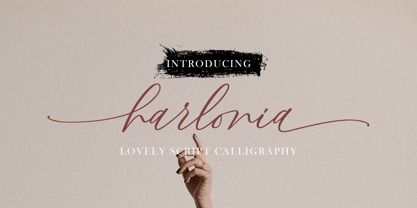 INTRO Harlonia Script, is a modern calligraphy font, with characters dance along the baseline and elegant touch. With almost 375 glyphs. Opentype features with stylistic alternates, ligatures and multiple language support. Can be used for various purposes such as logos, wedding invitation, letterhead, signage,news, t-shirt, heading lable, posters, badges etc. Thank you very much for purchasing and please let me know if you have any questions?
 - Bebedot by Holland Fonts,
$30.00Bebedot originated from doodles and scrabbles in notebooks; irregular forms very well might contain a style for an alphabet. Once used for an intro spread in Wired magazine (#6.04, April 1998): "To keep up you need the right answers. To get ahead you need the right questions". The name was inspired by a women clothing poster at the San Francisco bus stands. The dot is for the com that never came. - Quickstep by Holland Fonts,
$30.00The Quickstep Bold, a 'quick' font, originally made for the 25th anniversary of SSP Printing Co. in Amsterdam. First used for an intro spread of a Brian Eno quote in Wired Magazine (#3.05, May 1995): "The problem with computers is that they don't have enough Africa in them. What's pissing me off is that they use so little of my body". For a less outspoken expression, the Quickstep Sans was developed later. - Uranus by Supremat,
$12.00 Uranus is a futuristic font inspired by space and extraterrestrial civilizations. The proportions of the letters are wide, the elements of the letters have organic curves, reminiscent of the design of streamlined spaceships. What gives the font a special character is the excessive contrast between the upper element and the crossbar in letters such as A, B, E, F, K, P, R. In these letters, there is a barely noticeable intra-letter gap in the form of a line. Due to this contrast and rounded elements in these letters, a negative space of a triangular shape also turned out. Particular attention should be paid to the broad language support for the font. The font has support for Latin, extended Cyrillic, and Korean (2780 base syllables). Total glyphs: 3562. Uranus is well-suited for large typography, logos, and any other design related to futurism and space.
 - Slenderz by CozyFonts,
$25.00 Slenderz is a handwritten font designed by Tom Nikosey, an American Graphic Designer specializing in Typographic Design and Illustration. Slenderz is available in Light, Medium & Bold weights. CozyFonts Foundry is Tom's intro into the world of font design. Slenderz is a casual, handwritten font that gives a reserved yet firm and legible personality to any headline or copy. Each of the 3 weights has it’s own personality yet like 3 brothers they represent the and belong to the same family. Intermixing Light & Bold or Medium & Bold won’t ruin the flow but will enhance it. Slenderz is the 9th font family from CozyFonts Foundry.
 - Speener by CozyFonts,
$20.00 Speener is a handwritten font designed by Tom Nikosey, an American Graphic Designer specializing in Typographic Design and Illustration. Speener is based on his son Spencer’s printing style. “I love the way Spence prints. There’s a loose control in a vertical stroke that has his personality built into it. I wanted to create a font to see how it would look & feel and it looks and feels right to me”. Speener is a nickname. CozyFonts Foundry is Tom's intro into the world of font design. Speener is a casual, handwritten font and the seventh font for CozyFonts Foundry.
 - Ds Hand by CozyFonts,
$25.00 Ds Hand Font Family is a handwritten font designed by Tom Nikosey, based on Danielle Nikosey’s printing style. Tom is an American Graphic Designer specializing in Typographic Design and Illustration. Ds Hand is available in Regular & Bold weights CozyFonts Foundry is Tom's intro into the world of font design. Ds Hand Family is a tribute and gift to his daughter. Ds Hand, at first glance, gives a hand drawn aesthetic feel but on closer inspection, when set as text, this font gives off a cool, organized, legibly organic read. Also available in Bold. This is the 5th Hand Drawn Font Family from CozyFonts!
 - Geiger by WyldType,
$14.99 Geiger is a geometric typeface inspired by type found in the intros of Commodore 64 games, its attention to the grid and its limited set of building blocks. The design of Geiger respects these criteria to create a sturdy alphabet without diagonals, and loosen its grip on the classic limitations to produce a complete character set worthy of today`s high-resolution displays with a retro touch. The properties of classic computing platforms, like their limited memory and low-resolution displays, required that the designers and programmers of the time devise and use certain techniques to produce interesting visual results. These platforms offered limited sets of default building blocks from which to build more complex graphics and type, and some skilled coders would work around these limitations to produce the unexpected. One of the areas that saw experimental digital type flourish is the Commodore 64 intro scene. The Geiger family includes four styles (regular, oblique, bold and bold oblique), all include common ligatures (fi, ff, ffi, fj, fl, jj, tt, Th, TT) and a few stylistic alternates (K, L). A particular attention was paid to the pattern created by the vertical stem and negative spaces of tightly set text, especially for Geiger Bold. Geiger produces good results at a size of 30pt or more, but we suggest using it at higher display sizes.
 - Pisonest by Meutuwah,
$20.00 INTRO Pisonest is perfect for modern projects, headings, blogs, logos, brandings, invitations and more! Programs that support in this font is a Microsoft Office Adobe Photo Shop, Adobe Illustrator, Adobe Indesign, and Corel Draw, badges etc. Languages supported. Breton, Catalan, Czech, Danish, Estonian,French, German, Hungarian, Icelandic, Italian, Romanian, Scottish Gaelic, Slovak, Latvian, Lithuanian, Norwegian, English, Finnish, Polish, Portuguese, Slovenian, Spanish, Swedish, Turkish, Welsh. Basically, all European languages that are based on latin alphabet. To enable the OpenType Stylistic alternates, you need a program that supports OpenType features such as Adobe Illustrator CS/CC, Adobe Indesign CS/CC, Adobe Photoshop CS/CC, CorelDraw X6-X7 & Microsoft Office. THANK YOU SO MUCH.
 - Wacamóler Caps - Personal use only

- Double Back by Comicraft,
$19.00 Great Scott, Marty! This font is your density, charged up to 1.21 gigawatts through the Power of Love! Originally created by Comicraft for the official BACK TO THE FUTURE fan club, Remastered DOUBLEBACK has been rebuilt from the ground up, with a new vertical “Curve” weight, six new “Parallel” weights, stylistic alternate letters AMNUWY, and language support for Western & Central Europe and Vietnamese. And if that weren't enough, we've traveled into the future and brought back Solid & Open Variable Fonts which provide precise control of Time and Warp! We cannot be held responsible for any ruptures in the space-time continuum due to use of these fonts. SPECIAL INTRO SALE: from October 21 through November 12, get DoubleBack at half price and we will donate $20.15 of each sale to the Michael J. Fox Foundation for Parkinson's Research. We love ya, Mike.
 - Kapture by Stiggy & Sands,
$39.00 There are script typefaces that embody sensuality, and our Kapture typeface is now amongst that collection. From its thin weighting to its effortlessly flowing strokes, and a visual rhythm between quick and slow movements, Kapture truly captures a romance in letterforms. Stylistic Alternates offer a change-up set of Capitals, while the Contextual Alternates feature plays with intro and final lowercase letterforms to visually mix things up a bit. Elegant, fashionable, sophisticated, sensual, and celebratory all at once. Kapture is a typestyle that finds itself at home in any design where a refined yet modern script is required. Kapture is loaded with features to give you plenty of customization options: - Stylistic Alternates for a collection of alternate Capitals - Contextual Alternates for alternate starting and ending lowercase letters - 110 Ligatures to make typesetting more dynamic - Ornaments to place before and after words or phrases for even more flair - A Full set of Inferiors and Superiors for Limitless Fractions - Proportional and Oldstyle numeral sets
 - Linotype Rezident by Linotype,
$29.99Flyers, Intros from James Bond films and PlayStation games as well as the typeface Senator from Zuzane Licko inspired the Dutch designer Paul van der Laan to create his font Linotype Rezident. To its design, van der Laan says, I was designing a business card for a friend and I had a certain mood in mind for the typography. I tried to capture this mood in a couple of sketches, drew a few characters directly onscreen and just expanded them into a typeface." And so began Linotype Rezident, with its cool, technical and constructivist appearance which brings to mind computers and virtual reality. And the name? " The name of the font comes from the game Resident Evil. One of the main characters in the game is called Leon and the typeface was initially drawn for a friend of mine called Leon. It also refers to the city of The Hague - where I live and got my education - since it's often called 'de residentie'", where the queen and parliament of The Netherlands are seated." - Archiva by CozyFonts,
$25.00 Archiva Regular - Archiva Italic - Archiva Bold - Archiva Bold Rounded - Archiva Wide Rounded - Archiva Dropline - Archiva Stencil - Archiva Worn - Archiva Outline is the eighth font family created by American Graphic Designer Tom Nikosey. Tom specializes in lettering, typographic design & illustration for branding and trademarks. New from CozyFonts Foundry. Archiva was designed to maximize limited horizontal space reserved for text, type, or headlines, titles and label wording. The Archiva Family is perfect for Labels, headlines, ads and especially signage. The 9 members of the Archiva Font Family maintain a consistency and likeness to each other in form and dynamics but yet each member of the family has it’s own individual personality. Archiva derived from the word archival or place where records are kept. Archiva is the Greek word for Archive. The x-height and organized glyph consistency enables the user to keep files organized and clean much like an archive. Caps and numbers work extremely well together also. There are over 300 glyphs contained in each of the 9 variations of Archiva© by CozyFonts and they work in over 70 Languages. Please visit my website or Google Tom Nikosey for more info on his illustrious career. CozyFonts is Tom's intro into the world of font design.
 - Trevor by TypeTogether,
$36.80 Teo Tuominen’s Trevor took its first breath as a revival of an 18th century antiqua, but culminated in an entirely new and good-natured family. Trevor is an affable slab serif in nature: both heavy and kind. Known for their familiarity and their dark colour, the terminals of slab serifs put additional weight along the line to maintain an inky presence. Their clunky forms reveal slight immaturity and arouse the reader’s sympathy for the subject at hand. Trevor connects with others by consciously riding the line between being personal and commanding. One goal with Trevor was to pair the robust nature of a low contrast slab serif with more sophisticated elements, such as the ball terminals. So wherever one looks in Trevor, rounded corners rule the day, softening the overall appearance by mimicking ink spread made by old metal type. The easygoing look is tempered by very few inktraps and sharp corners, mostly to the inside of characters and in acute angles. Whatever Trevor is paired with, it has an altruistic outlook in that it sees the best in others. It’s the neighbourly type family — the neighbour you actually want. Trevor’s almost monolinear weight and high x-height give it a typewriter look in the extralight and light weights, but the whole family was made to work with many other font styles, design work, and information structures. It certainly finds its home in packaging and advertising, its sturdy verticality and narrowness fit the needs of headlines and intro text, and its seven weights are primed for plays and involved text needing many layers of distinction. The black weight is treated like a separate display style with altered ball terminals and serifs to capitalise on the added heft. Trevor’s seven roman weights cover the Latin A Extended glyph set to bring its kindly and commanding outlook to your projects. Along with alternate version of the ‘R’ in the black weight, its OpenType features include both tabular and proportional lining and oldstyle figures, ligatures, and fractions. The complete Trevor family, along with our entire catalogue, has been optimised for today’s varied screen uses.
 - Blank Manuscript by Aah Yes,
$14.95Blank Manuscript allows you to produce sophisticated musical scoresheets even on basic Word Processors - anything from simple plain staves to complex full-page orchestral scores of your own design, to write in the notation yourself. The basic stuff is really easy and straightforward, but there's some quite advanced things you can do as well. So Copy and Save these Instructions. • The main stuff is simple and tends to follow the initial letter. Treble, Bass and Alto clefs are on upper case T B A (there are more clefs, below). The 5 Lines for the clefs are on L or l. • A small v will give a small vertical line (like a bar line) and a Big U will give a Big Upright - these can start or end a line or piece. • Time Signatures - type the following letters: Think of W for Waltz and it's easy to remember that 3/4 time is on W. Then from that they go up or down together like this: V=2/4 W=3/4 X=4/4 Y=5/4 Z=6/4 Compound Times are on H I J K like this: H=3/8 I=6/8 J=9/8 K=12/8 Common Time and Cut Common symbols can be found on semi-colon and colon respectively (all begin with Co- ). 2/2 3/2 are on lower case a and b, 7/4 and 7/8 are on lower case c and d, 5/8 is on small k (think POL-k-A) • Flat signs are on the numbers. Flat signs on LINES 1 to 5 are on numbers 1 to 5. Flat signs on SPACES 1 to 5 are on numbers 6 to 0 (space 1 being above line 1, space 5 being above the top line of the stave). Sharp signs are on the letters BELOW the long-row numbers. Which is q w e r t for the sharp signs on Lines 1 to 5, and y u i o p for sharp signs on spaces 1 to 5. Doing it this way means it works the same for all clefs, whether Treble, Bass, Alto, Tenor or any other. Sharp and Flat Signs always go in this order, depending on how many sharps or flats your key signature requires: Treble Clef Sharps t i p r u o e Flats 3 9 7 4 2 8 6 Bass Clef Sharps r u o e t i w Flats 2 8 6 3 1 7 = Alto Clef Sharps o e t i w r u Flats 7 4 2 8 6 3 1 • Guitar Chord Boxes are on G and g (G for Guitar) Upper Case G has a thick line across the top Lower case g has an open top, for chords up the fretboard TAB symbols are available: Six-string Tablature is on s & S for Six. Four-string Tablature is on f & F for Four. (Lower case has the "TAB" symbol on it, Upper Case has just the lines to continue.) Five-string tablature, is on lower case "j" (as in BAN-j-O) and of course L or l will continue the 5 lines. •RARE CLEF SIGNS including Tenor Clef, are on various punctuation marks, i.e. dollar, percent, circumflex, ampersand & asterisk, above the numbers 4 to 8. NOTE: The important symbols were kept on the letter and number keys, which are fairly standard all over, but some of the less important symbols are on various punctuation keys, which in different countries are not the same as on my keyboard. If it comes out wrong on your system, all I can say is it's right on the systems we've tried, and they'll be in here somewhere, probably on a different key. CLOSING THE ENDS OF THE LINES and BAR-LINES is done with the 3 varieties of brackets - brackets, brace and parentheses - Left/Right for the Left/Right end of the line. Parentheses L/R () which are above 9, 0 give a clef with a small vertical upright (the same as a bar line). Brace L/R and Brackets L/R (both on the 2 keys to the right of P on my keyboard) will close off a staff line with tall upright bars. Brace gives a double upright - one thick, one thin. Brackets give a single tall upright. A Big Upright is on Big U, (Big U for Big Upright) and a small vertical line is on small v (small v for small vertical). The Big Upright is the maximum height, and the small vertical is exactly the same height as a stave. And there's a tall upright Bar, on Bar (which is to the left of z on my keyboard, with Shift,) which is the same height as the bar on upper case U but twice as broad. • There's a staff intended for writing melodies, which is a little bit higher up than an ordinary treble clef giving a space underneath to put lyrics in - on m and M for Melody line. Lower case has the Treble Clef on, Upper case M has just the higher-up staff lines with no clef. (Use mMMMMMMM etc.) However this clef will be in the wrong place to put in sharp and flat signs, key signatures and so on, so if you use this clef you'll have to write the sharps, flats and key signature yourself. There's also a clef that's smaller (less tall) than the ordinary clef, but with the same horizontal spacing so it will align with other standard-sized clefs - on slash (a plain clef) and backslash (with a Treble Clef). • There are some large brackets for enclosing groups of staves, such as you'd use on large orchestral scores, on Upper Case N O P Q R, which can aid clarity. N and O on the left, Q and R on the right. P is a Perpendicular line to be used on both sides to increase the height of the enclosure, in this way but with the staff lines in between: N Q P P P P P P O R OTHERS —————————————— • Repeat marks are on comma (left) and period/full stop (right). • Hyphen is left as a sort of hyphen - it's a thin line like a single staff line, with the same horizontal spacing as ordinary staff lines - in case you want to draw a line across for a Percussion Instrument, or a Title or Lyric Line. • Space is a Space, but with HALF the width or horizontal spacing as ordinary staff lines, so 2 space symbols will be the same width as a clef symbol or line. • Grave (to the left of 1 on the long row, or hold down Alt and type 0096 then let go) gives a staff line that is one eighth the width of an ordinary staff line. • If you want manuscript in a clef and key which requires a flat or sharp sign in the space underneath the 5 lines, they’re on = equals and + plus . SYMBOLS • Many of these symbols will only be useful if you have worked out in advance which bars will need them, but they are here in case you've done that and wish to include them. • Symbols for p and f (piano and forte) are on 'less than' and 'greater than' < > (above comma and full stop) and m for mezzo is on Question, next to them. They can be combined to make mp, mf, ff, pp, etc. These signs -- and other signs and symbols like Pedal Sign, Coda Sign and so on -- can be found on various punctuation mark keys, including above 1, 2, 3 in the long row, and others around the keyboard. There's a sort of logic to their layout, but in different countries the keys are likely to give different results to what is stated here, so it's probably best to just try the punctuation and see if there's any you might want to use. (But on my keyboard a Coda sign is on circumflex - because of the visual similarity. Pedal sign is on underscore. A "Sign" symbol is on exclamation mark.) They were only included in case you really need them to be printed rather than handwritten. • However, a Copyright symbol is deemed necessary, and also included are a "Registered" symbol and a TradeMark symbol. They are found in the conventional places, and can be accessed by holding down ALT and typing 0169, 0174 or 0153 respectively in the numberpad section and letting go. • Staff lines with arco and pizz. above are on capital C and D respectively ---C for ar-C-o. • An empty circle above a staff line (to indicate sections by writing letters A, B, C or 1,2,3 inside for rehearsal marks) is on n. The actual signs for an A, B, C and D in a circle above the staff line can be produced by holding down ALT and typing 0188, 0189, 0190 and 0191 respectively and letting go. • The word "Page", for indicating page numbers, is on the numbersign key. • The two quotes keys, (quote single and quote double) have symbols representing "Tempo is", and "play as triplets", respectively. • INSTRUMENT NAMES There's a whole lot of Instrument Names built in (over a hundred) which can be printed out above the clef, and you do it like this. Hold down Alt and type in the given number in the numberpad section, then let go. For Piccolo it's 0130, for Flute it's 0131, Cornet is on 0154, Violin is on 0193, and the numbers go up to over 0250, it's a fairly complete set. There's also a blank which is used to align un-named clefs on 0096. Put them at the very beginning of the line for the best results. Here they are: WOODWIND Piccolo 0130 Flute 0131 Oboe 0132 Clarinet 0133 Eng Horn 0134 Bassoon 0135 Soprano Sax 0137 Alto Sax 0138 Tenor Sax 0139 Baritone Sax 0140 Saxophone 0142 Contrabassoon 0145 Recorder 0146 Alto Flute 0147 Bass Flute 0148 Oboe d'Amore 0149 Cor anglais 0152 Pipes 0241 Whistle 0242 BRASS Cornet 0154 Trumpet 0155 Flugelhorn 0156 Trombone 0158 Euphonium 0159 Tuba 0161 French Horn 0162 Horn 0163 Tenor Trombone 0164 Bass Trombone 0165 Alto Trombone 0166 Piccolo Cornet 0167 Piccolo Trumpet 0168 Bass Trumpet 0170 Bass Tuba 0171 Brass 0172 VOICES Vocal 0175 Melody 0176 Solo 0177 Harmony 0178 Soprano 0179 Alto 0180 Tenor 0181 Baritone 0182 Treble 0183 Bass 0197 (see also PLUCKED STRINGS) Descant 0184 Mezzo Soprano 0185 Contralto 0186 Counter Tenor 0187 Lead 0206 BOWED STRINGS Strings 0192 Violin 0193 Viola 0194 Cello 0195 Contrabass 0196 Bass 0197 Double Bass 0198 Violoncello 0199 Violin 1 0200 Violin 2 0201 Fiddle 0252 PLUCKED STRINGS Harp 0202 Guitar 0203 Ac. Gtr 0204 El. Gtr 0205 Lead 0206 Bass 0197 Ac. Bass 0207 El. Bass 0208 Slide Gtr 0209 Mandolin 0210 Banjo 0211 Ukelele 0212 Zither 0213 Sitar 0214 Lute 0215 Pedal Steel 0216 Nylon Gtr. 0238 Koto 0239 Fretless 0244 KEYBOARDS + ORGAN Piano 0217 El. Piano 0218 Organ 0219 El. Organ 0220 Harpsichord 0221 Celesta 0222 Accordion 0223 Clavinet 0224 Harmonium 0225 Synth 0226 Synth Bass 0227 Keyboards 0228 Sampler 0249 PERCUSSION and TUNED PERCUSSION Percussion 0229 Drums 0230 Vibes 0231 Marimba 0232 Glockenspiel 0233 Xylophone 0234 Bass marimba 0235 Tubular Bells 0236 Steel Drums 0237 Kalimba 0240 OTHERS Harmonica 0246 Mouth Organ 0247 FX 0251 Intro 0243 Verse 0245 Refrain 0248 Chorus 0250 un-named 0096 (this is a small spacer stave for aligning clefs without a name) ALSO copyright 0169 registered 0174 TradeMark 0153 Rehearsal marks 0188-0191 (giving A, B, C, D in a circle, an empty circle is on n ) Clef signs for Treble Bass Alto without any staff lines 0253-0255 An Alphabetic List of all signs: a 2/2 time b 3/2 time c 7/4 time d 7/8 time e sharp sign, centre line f Tab sign for 4-string tab g Guitar Chord Box, no nut h half-width stave I sharp sign, third space up j Tab sign for 5-string tab k 5/8 time l Lines - 5 horizontal lines for a stave m Melody Clef - a standard clef but placed higher up, with Treble sign n Stave with an empty circle above o sharp sign, fourth space up p sharp sign, space above stave q sharp sign, bottom line r sharp sign, fourth line up s Tab sign for 6-string tab t sharp sign, top line (fifth line up) u sharp sign, second space up v vertical line (bar-line) w sharp sign, second line up x Fretboard, four strings y sharp sign, first space up z Fretboard, five strings A Alto Clef B Bass Clef C “arco” above stave D “pizz.” above stave E Double Vertical Lines F Four Horizontal lines (for 4-string tab) G Guitar Chord Box with nut H 3/8 time I 6/8 time J 9/8 time K 12/8 time L Lines - 5 horizontal lines for a stave M Melody Clef - a standard clef but placed higher up, plain N Bounding Line for grouping clefs - top left O Bounding Line for grouping clefs - bottom left P Bounding Line for grouping clefs - Perpendicular Q Bounding Line for grouping clefs - top right R Bounding Line for grouping clefs - bottom right S Six Horizontal lines (for 6-string tab) T Treble Clef U tall, thin Upright line V 2/4 time W 3 / 4 time X 4/4 time Y 5/4 time Z 6/4 time 1 flat sign, first line up (the lowest line) 2 flat sign, second line up 3 flat sign, third line up 4 flat sign, fourth line up 5 flat sign, fifth line up (the top line) 6 flat sign, first space up (the lowest space) 7 flat sign, second space up 8 flat sign, third space up 9 flat sign, fourth space up 0 flat sign, space above stave
