10,000 search results
(0.214 seconds)
- Gaia by Outras Fontes,
$21.95 Gaia is the first dingbat series made by Ricardo Esteves Gomes. Each glyph in this font was designed to be used as single forms or as graphic pattens. When repeated several times, they create some interesting optical effects. Their organic shapes gives a nice feeling of nature. I hope this can be useful for your artworks.
 - Millano Script by MJB Letters,
$17.00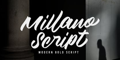 Millano Script is a bold script font, with a strong and masculine style that is equipped with some unique ligatures and alternates so that it can provide an interesting look Works on PC & Mac Simple installations Accessible in the Adobe Illustrator, Adobe Photoshop, Adobe InDesign, even work on Microsoft Word. PUA Encoded Characters – Fully accessible without additional design software
 - Hiroshige by URW Type Foundry,
$35.99 Hiroshige was designed in 1986 by Cynthia Hollandsworth (now Batty) of AlphaOmega Typography, Inc. The typeface was originally commissioned for a book of woodblock prints by the great nineteenth-century Japanese artist Ando Hiroshige, whose work influenced many Impressionist artists. The typeface has a gentle calligraphic flair that creates an interesting page of text as well as elegant headlines.
 - Bantero by Viaction Type.Co,
$18.00 Bantero Typeface is a display font with a vintage theme and a victorian style. It’s perfect for vintage-themed projects. The font pack includes a bonus of 6 vintage ornaments which are very easy to edit. Font features include: Bantero File Multilingual Support. Punctuation & Symbol. Get this cool & interesting font collection right away at an affordable price.
 - Girlstory Script by Alterspieler,
$18.00 Girlstory is a font that inspired the story of a woman who tries hard for her children, never giving up in order to achieve and keep happiness together. This font has simple and interesting style characters for various design needs at this time, you can use it for embroidery, screen printing, business cards, cutting, branding, etc.
 - Polanix by Outerend,
$25.00 This unique geometric design will make your projects stand out from the crowd! If you're looking for a futuristic but with an edgy twist, "Polanix" could be the one. The interesting deformation of its variable version also works great with animation, game design and film/TV credits & titles as well as interface, app and web designs.
 - Night Rumble by Gassstype,
$27.00 Introducing Night Rumble is a Strong Textured Typeface that is written casually and quickly. That is why Night Rumble has charming, authentic and relaxed characteristic more natural look to your text with a more natural look to your text. design more interesting. Night Rumble is perfect for homeware designs,branding projects, Logo design, Quotes product packaging.
 - Antique Ornaments JNL by Jeff Levine,
$29.00Antique Ornaments JNL collects twenty-six vintage printers' ornaments from the 1800s into one convenient digital font file. - Essential Pragmata Pro by FSD,
$23.37 Essential version of PragmataPro™. It contents a selection of glyphs useful for programming in English language only.
 - ALS Direct by Art. Lebedev Studio,
$63.00 ALS Direct is an open and dynamic typeface with clear-cut letterforms that make it instantly readable. It lends text a neutral, yet agreeable and modern feel. Direct has nine font styles convenient for the purposes of navigation signage. Regular-style letterforms are rather wide, because direction signs are likely to appear before readers at an angle, so the type needs to withstand perspective distortions. And as signs and boards may vary in size, Direct was developed to include several width variations. Condensed fonts can be used where horizontal space is limited, allowing you to keep proper height and readability of the characters. A signage typeface must be easily readable from some distance away and have simple letterfoms with clear-cut features to quickly identify characters. Designing a type for a potentially wide range of purposes calls for a universal approach. If not destined to be used for navigation in a particular building, it shouldn’t incorporate any peculiar elements to agree with certain design or architecture. All of the above determined our choice of a sans serif with large apertures and definite features allowing readers to instantly recognize letters. Descenders are made compact not to interfere with the line below. And the low contrast between thick and thin strokes renders all elements equally perceptible. The x-height is significant, close to the cap height, which inhances readability of the lowercase type. There are two reasons why directions must not be set in all caps. Firstly, lowercase letters are more diverse and include ascenders and descenders identifying some of the letters in the line. And secondly, having learned to read, people recognize word shapes rather than individual letters, which makes lowercase text more readable. With Direct being a signage typeface, first to be developed were its width variations, and different weight styles and italics were added later. Another thing to be kept in mind was that signs often use dark background colors, and black type on a white background appears smaller than white type on a black background. Direct is the first Cyrillic typeface created for navigation purposes. Before that, designers could use the Cyrillic version of Frutiger (Freeset) developed by Adrian Frutiger for the Paris Charles de Gaulle International Airport, and a number of other, mostly body copy, neutral sans serif types. However, signs and boards were dominated by Arial, which Direct would be glad to replace offering elegance and lucidity of form instead of type bluntess. Direct was designed as a signage typeface, but its neutral style and clear-cut letterforms suggest various other ways of application.
 - Linotype Textra by Linotype,
$40.99Linotype Textra is a clever twist on the sans serif genre, designed by Jochen Schuss and Jörg Herz in 2002. Schuss says this about Linotype Textra: "Two in one! The same Linotype Textra, which is so neutral and practical for long text passages turns into an eye-catching headline type when used in larger point sizes. The trick? It's all in the details. The type's clear, robust forms give it a high degree of legibility when used in smaller point sizes for texts. When used in larger sizes, the angular, slightly irregular forms that give the type its strong character become apparent. Hence the name Linotype Textra: pure text with a little something extra!" With 15 weights, the Linotype Textra family provides graphic designers with a good basis for almost any type of work. The five regular weights have matching true italics and old style figures, and the five small cap weights include tabular figures. - Lamar Pen by Three Islands Press,
$39.00 Mirabeau Buonaparte Lamar had an exotic name for a historic Texan, but he left his mark beginning in 1836, the year of Texas independence and the first year that pioneers other than mountain men made their way West. Lamar went on to become the young republic’s first elected vice-president (to President Houston) and second president -- and to author a number of interesting letters in his elegant, stylish hand. (Mirabeau B. Lamar grew up a well-to-do southerner from Georgia, and his penmanship shows it.) One of the most interesting aspects of designing old handwriting fonts, to me, is pausing to reflect on the actual moment that the letter-writer is sitting at his or her desk or table, pen in hand, putting thoughts to words -- 150 to 200 years ago. Has a complete character set, and plenty more.
 - Flight Feather by moriztype,
$10.00 Flight Feather is a font that has a modern and elegant design. This font has smooth and firm lines, as well as balanced and proportional letter proportions. Each letter in this font has interesting details and a beautiful appearance, making it suitable for classy and elegant designs. View of the Flight Feather font with supple and smooth lines. This font has a light and alluring impression, but still strong and firm, so it is suitable for graphic designs, posters or brochures that require an elegant and professional impression. The combination of thin and thick lines in the Flight Feather font provides an interesting visual effect and helps make words or sentences stand out and impress. With its uniqueness, the Flight Feather font can be the right choice to strengthen the message you want to convey in visual design.
 - Northstream Wind by Monotype,
$-Northstream is a Neo-Grotesque in motion. The typeface was inspired by an attempted photograph of an interesting shop sign that was interrupted by a passing truck. The resulting effect was a blur of movement and designer, Hendrik Weber, wanted to capture that feeling within the typeface. The result is a whirlwind of a design and the shadow behind the letterforms creates a very interesting effect. This typeface is meant for graphic designers to enjoy and play around with, and it is best suited for display text and large sizes such in posters and billboards. Northstream was designed as part of the Font Marathon that was run at the Monotype London office in November 2016. This version is available for free and because of the short time frame is supporting a Basic Latin character set and a few alternates. - Exhibitionist by 38-lineart,
$16.00 Related to typography and art, we define exhibitionist as an innovative work that is able to invite attention. An Exhibitionist must have a strong character, dare to appear as it is, natural, simple and modern-minded. That is what is represented in this font, a handwriting with a natural rhythm and reflects the lifestyle of urban society. We want to give a definition of exhibitionist in a positive typography frame. This font is very simple, too much glyph will make you confused, we make a lot of glyphs but we've filtered out only selected glyphs, so all you do is activate the ligature on your software and feel the interesting handwriting rhythm. We are sure with this font, you will look more stunning and attract the interest of visitors to look more closely at your brand
 - Playtoy - Unknown license

- Arsis by URW Type Foundry,
$35.99 Arsis Regular Font was designed by Gerry Powell in 1937. It is a Serif (Antiqua) Modern Style font. Arsis Regular font attributes include roman serif, Didone, elegant, formal, modern style, feminine.
 - Bright Gesture DEMO - Personal use only

- widznipp 1 - Unknown license

- widzeniea bold - Unknown license

- Hansa - Unknown license

- Swenson - Unknown license

- Flefixx by Sun Young Oh,
$54.00 Flefixx is a typeface designed to support a project "Flefixx", an idiosyncratic visual language and typeface system that unfolds narratives based on common combinations of letters. In this visual language, just as individual letters come together like puzzle pieces to form different meanings or words based on combinations, the typeface is also constructed from fragmentary elements, each playing a distinct role as if they are individual pieces. The intentional exposure of the intersections of these fragments emphasizes the typeface's creation through interconnected elements. Furthermore, diacritics and dots are strategically positioned as ornaments, enhancing their presence within the gaps between letters. This concept aligns with the theme of composition and connectivity among fragments, allowing strong rhythmic patterns to emerge as letters and symbols blend in a paragraph. Additionally, the prominent and bold punctuation marks serve to provide pauses and clarity within sentences that incorporate both letters and the visual language. They contribute to articulating sentence structure amidst the dynamic flow of sentences with combined characters and visuals.
 - Linotype Laika by Linotype,
$29.99Linotype Laika is part of the Take Type Library, chosen from the entries of the Linotype-sponsored International Digital Type Design Contests of 1994 and 1997. This fun font was created by Dutch designer Mark van Wageningen, who based its forms on those of a sans serif font but gave them wavy, irregular contours. They look almost as though they lie just under the surface of a pool and the movement of the water gives them their undulating appearance. The dynamic Linotype Laika is especially good for headlines in larger point sizes or shorter texts in point sizes of 14 or larger. - "Distant Galaxy Condensed" is a distinctive typeface designed and released by ShyFoundry, a known creator of unique and varied fonts. This particular font is a condensed variant of the "Distant Galax...
- Foretelling Script by Letterhend,
$17.00 Introducing, Foretelling Script. A condensed script typeface. A fun, playful and casual script made by natural hand writing. This type of font perfectly made to be applied especially in logo, and the other various formal forms such as invitations, labels, logos, magazines, books, greeting / wedding cards, packaging, fashion, make up, stationery, novels, labels or any type of advertising purpose. Available in 3 styles : Reguler, Rough and Stamps Features : uppercase & lowercase numbers and punctuation multilingual swashes and ligatures alternates PUA encoded We highly recommend using a program that supports OpenType features and Glyphs panels like many of Adobe apps and Corel Draw, so you can see and access all Glyph variations. How to access opentype feature : letterhend.com/tutorials/using-opentype-feature-in-any-software/ Email us to letterhend@gmail.com if you need something! Happy Designing!
 - Amaboxi by Scholtz Fonts,
$19.00In Amaboxi the upper-case letters are all placed upon a background inspired by the cardboard boxes that many people in Africa use to carry their possessions. The box takes its shape from the character and conversely, the character is influenced by the shape of the box. All characters except the six "fractions" are included in Amaboxi. It includes all upper and lower case letters as well as all numerals, punctuation, accented and special characters. All characters have been letter-spaced and kerned in terms of the box (not the character). This improves legibility, however, the inter-character spacing has been minimized so that there is often a very slight overlap between the boxes of adjacent characters. This generates an exciting and variable "white space" around the characters. - Nuit by Eurotypo,
$28.00 Nuit, a delightfully handwritten family font with strong character designed by Carine de Wandeleer. Its slight bounce and intentional irregularity, gives your words a wonderful flow. The fatness and thinness of their strokes give an impressive harmony. This new font family includes Regular, Italic, Bold and Bold Italic. It has OpenType features such as Stylistics alternates, Swashes, Ligatures, up to four Stylistic sets by letter, initial and terminal forms in upper and lower, ornaments that allow you to mix and match pairs of letters and a Central European language support to fit your design. This OpenType features may only be accessible via OpenType-aware applications, or the Character Map to view and copy any of the extra characters to paste into your favorite text editor/app. This will help your creativity and make it easier to make expressive and elegant your typographic work. Also with Nuit it is possible to write all in capitals. Nuit looks lovely on wedding invitations, greeting cards, logos, posters, labels, t-shirt design, logos, business-cards and is perfect for using in ink or watercolor based designs, fashion, magazines, food packaging and menus, book covers and whatever your imagination holds! Nuit was made to make your project more beautiful and attractive.
 - PF Bulletin Sans Pro by Parachute,
$79.00 This is a grotesque typeface which was derived from an older more simple version designed back in 2000. Bulletin Sans Pro is distinguished by its selective deep cuts which give this typeface a robust and contemporary look. These cuts become more apparent at larger sizes while they create a more subtle effect at smaller sizes. For intense titles try the black version. When space and legibility for long texts are critical, use the lighter versions. The family consists of 10 fonts—from black to light—including true italics. It supports 20 special OpenType features like small caps, fractions, ordinals, etc. and offers multilingual support for all European languages including Greek and Cyrillic. Finally, every font in this family has been completed with 270 copyright-free symbols, some of which have been proposed by several international organizations for packaging, public areas, environment, transportation, computers, fabric care and urban lifestyle.
 - Gill Sans MT by Monotype,
$45.99 Gill Sans is a humanistic sans serif family that, while is considered by many to be quintessentially British in tone and concept, has been used in virtually every country and in nearly every application imaginable. Gill Sans has reached this level of near-ubiquity for one simple—and very good—reason: it is an exceptionally distinctive design with a potential range of use that is almost limitless. This toolkit family includes a wide range of styles including the standards such as Light—which is open and elegant—and a Regular that, with its flat-bottomed d, flat-topped p and q and triangular-topped t, has a more compact and muscular appearance. Its Bold styles tend to echo the softer, more open style of the light while the extra bold and ultra bold have their own vivid personalities, but each of them would make for an eye-catching headline. Take into account the family’s many weights, including condensed and extra condensed designs, and extended language support and you have yourself a tool you’ll be thrilled to return to, time and again. Gill Sans was designed by Eric Gill: a versatile, brilliant, and prolifically successful designer of the early part of the last century. One of the main reasons for the enduring success of his namesake design is that it is based on Roman character shapes and proportions, making it unlike virtually any other sans serif out there. Gill also worked his own warmth and humanity into his design, resulting in a typeface in which each weight retains a distinct personality of its own. Pair with serif fonts like Gill's own Joanna; or more modern offerings like Frutiger® Serif, Malabar™, Syntax® Serif, FF Scala®, or DIN Next™ Slab.
 - Gimcrack by Bogstav,
$15.00 Gimcrack is "showy but cheap or badly made" - that's what a search on the internet says. Well, that description fits this font quite well - although it was deliberately made that way!
 - Ninfa Serif by dooType,
$22.00 Using the genetic inheritance of semi-serif typeface Ninfa, designed in 2008, Ninfa Serif has 10 styles and designed to fulfill all needs in the design of text - books and magazines.
 - United States - Unknown license

- Farm Wave by Authentype,
$11.00 Farm Wave Regular & italic - beauty font design include regular & italic font Image used : All photographs/pictures/logo/vector used in the preview are not included, they are intended for illustration purpose only.
 - TT Tricks by TypeType,
$35.00 TT Tricks useful links: Specimen | Graphic presentation | Customization options TT Tricks is a modern serif font family whose design refers us to the style of transitional serifs. The distinctive features of TT Tricks are the relatively low contrast of strokes, the slightly squarish shapes of round characters and the emphasized businesslike nature. The original idea of TT Tricks is based on the graduation project of student Sofia Yasenkova, who chose to create a daily planner font as her final project. This led to many stylistic decisions, for example, the large and asymmetrical serifs, low contrast strokes, and the presence of interesting details. In the process of working on TT Tricks, we have significantly revised the initial idea and expanded the areas of possible font application, while maintaining the original spirit of the project. Despite the large number of display details, the typeface looks great in a small point size, and also when it is used in large text arrays. TT Tricks features an original stylistic set which, when turned on, adds features of typical pointed-pen serifs to some of the lowercase characters. In addition, TT Tricks has small capitals for Latin and Cyrillic alphabets, as well as several interesting ligatures. The TT Tricks font family consists of two font subfamilies, these are the main version and the version with the original stencil cutting. Each subfamily consists of 12 fonts: Light, Regular, DemiBold, Bold, ExtraBold, Black + True Italics. Following a good tradition, TT Tricks supports a large number of OpenType features: ordn, case, c2sc, smcp, frac, sinf, sups, numr, dnom, onum, tnum, pnum, dlig, liga, calt, salt (ss01).
 - Rylan by Jen Wagner Co.,
$17.00 Rylan is the classic serif I've been looking for in my design work – clean lines, modern serifs, and just a touch of vintage. It looks gorgeous in logo work as well as web headings and printed materials! Rylan Serif includes: • Upper & lowercase letters • Numbers & punctuation • Foreign language accents & characters for the international designer Rylan Grotesque includes: • Upper & lowercase letters • Numbers & punctuation • Foreign language accents & characters for the international designer
 - Zentral by Wilton Foundry,
$29.00 My goal in designing Zentral was to create a distinctive sculptural font intentionally in Regular and Italic only. I believe Zentral Regular and Italic has the latitude and flexibility needed in most type scenarios without having to resort to multiple weights. Zentral Regular upper/lowercase provides a very pleasant contrast and can be varied by using Zentral Regular capitals. Zentral Italic is ideal for creating emphasis of words, quotes or phrases. This combination provides maximum impact and readability. Zentral is a contemporary font ideal for branding, packaging, advertising, editorial in print and e-print applications.
 - Stanley Union by Ironbird Creative,
$15.00 Stanley Union is a font bundle consisting of serif, sans serif, extended sans and dingbats which is organic and hand-drawn and comes with regular and stamp styles. This typefaces is perfect for people looking for vintage aesthetic and organic feel. What Will You Get : Stanley Union Serif Regular & Stamp Stanley Union Sans Regular & Stamp Stanley Union Extended Sans Regular & Stamp Stanley Union Dingbats We hope you enjoy the font, please feel free to comment if you have any thoughts or feedback. Thanks for purchasing and have fun!
 - Rhein by BeJota,
$21.00 Rhein is named after the German river that runs through the western border valley. Rhein is a sans-serif typeface family for titles, editorials and graphic design pieces with high impact needs. Rhein was not only conceived as a font design with rounded corners, but its intersection points have been also smoothed. In addition, the wide range of 8 weights that vary from Thin to Black allow relatively long continuous reading (Regular, Medium, Semibold), and short reading designs (Black, Bold, Thin). On the other hand, the "Inline" variant is extremely provocative to fit into any branding project. To add dynamism and to expand the typeface range of use, it was designed as a family of alternatives. Together, the 18 styles of "Rhein" provide a range of options that adjust to the needs and current design and advertising trends.
 - The Malgecito font by Dirt2 is a playful and whimsically designed typeface that embodies an artistic and slightly edgy vibe. Crafted with an evident flair for creativity, this font interweaves the bo...


