10,000 search results
(0.051 seconds)
- Linotype Dummy by Linotype,
$29.00Linotype Dummy is a part of the Take Type Library, chosen from the contestants of Linotype’s International Digital Type Design Contests of 1994 and 1997. The Canadian artist Tad Biernot based the design of his font on optical illusions like those of M. C. Escher. The reader cannot always exactly decide if a character is twisting toward or away or both. Linotype Dummy is available in black and outline weights and is suited exclusively to short headlines in large point sizes. - Duffy Script by Shinntype,
$39.00 An interpretation of the lettering of contemporary illustrator Amanda Duffy. Each font contains four glyphs for each character (including all numbers, punctuation, and symbols), which OpenType coding sets in “random” order for a subtle, natural effect. Use a curved path to further accentuate the bounced quality of the letters. Try out different combinations of glyphs by inserting the cursor in front of your headline and hitting the space bar repeatedly: each time,the text will be represented by a different sequence of glyphs.
 - Khanza Script by Suamzu Art,
$12.00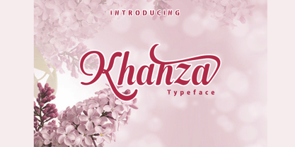 Khanza is a script font that is connected with clear style and dramatic movements. Khanza comes with uppercase, lowercase letters, numbers, punctuation, and so many variations on each character including alternative opentypes, common binders, and also additional cuts to allow you to customize your design. Perfect for use for Logotype, Letterhead, Posters, Clothing Designs, Labels and others. khanza font will help all the design projects that you are working on Khaza script features: Uppercase & lowercase Alternates & swashes Ligatures Standart international characters Punctuation & symbols
 - Linotype Inky Script by Linotype,
$29.99Linotype Inky Script is part of the Take Type Library, chosen from contestants of Linotype’s International Digital Type Design Contests of 1994 and 1997. This fun fon was designed by the German artist Thomas Schnaeble as a handwriting font with little stroke contrast. The lower case letters are broad with a low x-height. Texts presented in Inky Script have a light, personal touch. Linotype Inky Script is well-suited to headlines as well as short to middle length texts. - Never by Graphicxell,
$19.00 inspired by the famous minimalist logo perfect for the purposes of designing templates, brochures, videos, advertising branding, logos, invitation, layout design, elegant crafting, beauty design and other What's Included : + Standard glyphs + International Accent + Works on PC & Mac + Simple installations Accessible in the Adobe Illustrator, Adobe Photoshop, Corel Draw. PUA Encoded Characters - Fully accessible without additional design software. Fonts include multilingual support Image used : All photographs/pictures/vector used in the preview are not included, they are intended for illustration purpose only. Thank You
 - Balder by Linotype,
$29.99Linotype Balder is a part of the Take Type Library, winners of Linotype’s International Digital Type Design Contest. Designed by Lutz Baar, Balder is reminiscent of advertisement and poster typefaces of the 1950s and 1960s. It is composed of only capital letters, making it perfect for initials and headlines. Balder looks as though it were written with a broad tipped pen. Its light serifs at the tops of the characters and the slant of some of the strokes give Balder a dynamic feel. - Cyberhype by Alphabet Agency,
$15.00 Alphabet Agency proudly presents Cyberhype, a bold sans serif display font with a glitched look. Cyberhype works great when used in many music genres involving dance music, synth-pop, house music, dubstep, techno, electronic dance music. The font also is great for use in themes such as gaming, e sports, AI (artificial intelligence), hacking, technology, digital, cyber-security, cyber technology, robotics and cutting edge science. The font contains over 128 characters including all capital letters, numbers, punctuation and Latin international characters.
 - Blue Goblet Ornaments by insigne,
$21.99 Blue Goblet Ornaments are the ornament complement to Blue Goblet, a fun and whimsical brush script. These lively and cheerful ornaments can be resized and rotated easily without any loss of quality and can easily be converted to outlines and modified. Combine them to form unique compositions or insert them into text to add some excitement to your designs. Please see the sample .pdf to see all 48 ornaments in action. Blue Goblet Ornaments is a collaboration between insigne Design and Portland Studios.
 - Macklany by madeDeduk,
$16.00 Macklany is a display sans, come with single weight, legible and expressive shapes. A lot of stylish alternates characters will makes this font suitable for your any project design. Feature Uppercase & Lowercase Number & Symbol International Glyphs Multilingual support Alternative ligature Feel free to drop us a message any time and follow my shop for upcoming updates Shoot me on email at: dedukvic@gmail.com and find more previews on my Instagram here : https://www.instagram.com/acekelgondolayu/?hl=en Hope you enjoy it.
 - Boldina by DSType,
$19.00Boldina consists of 18 fonts with a lot of personality. This is a font to be mixed. That’s its purpose and that’s why it's designed as one single weight in so many different styles. My intent was to give designers a chance to use the same typeface in many different ways, putting together sans and serif, lots of italics and even Greek, Cyrillic and CE characters. The Ligatures and the Script versions give a more poetic and more accurate feeling to the text. - Vault by Graphicxell,
$19.00 inspired by the famous minimalist logo perfect for the purposes of designing templates, brochures, videos, advertising branding, logos, invitation, layout design, elegant crafting, beauty design and other What's Included : + Standard glyphs + International Accent + Works on PC & Mac + Simple installations Accessible in the Adobe Illustrator, Adobe Photoshop, Corel Draw. PUA Encoded Characters - Fully accessible without additional design software. Fonts include multilingual support Image used : All photographs/pictures/vector used in the preview are not included, they are intended for illustration purpose only. Thank You
 - Linotype Cethubala by Linotype,
$29.99Linotype Cethubala is part of the Take Type Library, chosen from contestants of Linotype’s International Digital Type Design Contests of 1994 and 1997. Designed by the Portuguese artist Patricia Carvalho, it is a playful and unusual font. Its roots lie in the characters of runes and old alphabets and the font is, in the words of the designer, ’an attempt to interpret and carry the knowledge of the magic world.’ Linotype Cethubala is intended exclusively for headlines in large point sizes. - Claiborne by madeDeduk,
$15.00 Hello I'm really excited to introduce Claiborne script, with a solid & a rough style. Claiborne script is perfect for poster design, book covers, merchandising, fashion campaigns, newsletters, branding, advertising, magazines, greeting cards, album covers, and quote designs and more. What's included? - Claiborne Solid.otf - Claiborne Rough.otf Feature - UPPERCASE - lowercase - Number & Symbol - International Glyphs - Alternative lowercase - Ligature - Swash If you need anything else just shoot me an email at: dedukvic@gmail.com Find more previews on my Instagram here : https://www.instagram.com/acekelgondolayu/?hl=en
 - LTC Holiday Ornaments by Lanston Type Co.,
$24.95 Assembled for those less commercialized holidays, LTC Holiday Ornaments features over 80 printers' ornaments from Lanston Monotype and other historical foundries such as BBS and ATF. Holidays include Easter, Valentine's Day, St. Patrick's Day, April Fool's Day, Thanksgiving and 4th of July. There¹s even a pirate to represent international "Talk Like a Pirate" day. LTC Holiday Ornaments joins the Lanston Collection alongside the popular LTC Halloween and Christmas Ornaments. LTC Holiday Ornaments contains additional Halloween and Christmas ornaments as well.
 - Linotype Bariton Paneuropean by Linotype,
$92.99Linotype Bariton is part of the Take Type Library, chosen from contestants of Linotype's International Digital Type Design Contests of 1994 and 1997. Designer Alexei Chekulayev designed his font in one weight to mirror the Zeitgeist of the early 1930s. The characters of this extremely bold font are based on the form of a rectangle though its rounded edges soften its look a bit. Linotype Bariton should be used only in larger point sizes in headlines which should really catch the eye. - Accord Alternate by Soneri Type,
$48.00 The main difference between Accord Alt and Accord is in the way curved strokes join with vertical stems in letters such as “bpn”. The Italics are designed at an italic angle of 10 degrees. All the letter forms have been kept similar while designing italic instead changing the form e.g. 'a' remains same double story in italic also instead changing it to single story. The intention is to keep it simple and neutral which helps communicate the corporate sense of professionalism.
 - Foobar Pro by CheapProFonts is a versatile and elegantly designed font that finds its origins in a creative pursuit towards balancing functionality with style. This font family embodies a modern aest...
- Levato by Linotype,
$29.99 Levato, the first font designed by Felix Bonge, is an Antiqua that is full of character and is refined but by no means sterile. This typeface provides for a wide range of options for creating individual designs. It was not really Felix Bonge's intention to create a whole font family when, as a second year student, he began several exercises in contrast and proportion as part of the typeface design course of Professor Veljovi? at Hamburg University of Applied Sciences. However, these initial studies developed into a project that Bonge persisted with over the following years while working towards his degree. He continually had new insights and ideas that he was able to exploit for his font. Of particular importance, he claims, was a calligraphy seminar, which prompted him to completely rework his concept. It took him several years before his extensive font Levato™ was ready. Although the forms of Levato are ultimately derived from Renaissance Antiqua, Bonge has slightly increased the relative contrast in his version. This gives the font a graceful appearance that is further emphasized by the reduced x-height and the associated prominence of the ascenders. And, in addition, the relatively fine serifs, which are almost linear at their ends, infuse Levato with a hint of classical Antiqua á la Bodoni. At the same time, Bonge cleverly compensates for the sterilising tendency of this font form. Soft and rounded serif attachments and rounded line apexes offset the severe nature of the font and provide it with an aura of vivacity. This effect is promoted by the calligraphic-like foot of the lowercase h, n and m and the not quite horizontal bars of the uppercase E and F. Overall, Bonge has succeeded in creating a refined and yet very dynamic typeface. Levato is available in five weights; Light, Regular, Medium, Bold and Black, in each case with the corresponding italic versions. Bonge treats Levato Italic as a genuine cursive typeface. Its letters are thus slightly narrower than the analogous upright letters and their forms are considerably more curvilinear. All the versions of Levato boast an enormous range of characters to meet all possible requirements. In addition to four sets of minuscule and majuscule numerals for tabular and proportional typesetting, there are also small caps, numerous ligatures, ornamental characters and even swash variants of letters. With their generous, sweeping curves, the swash variants (available as OpenType versions) can be used for striking titling effects or as initials.
 - ITC Garamond Handtooled by ITC,
$34.99Claude Garamond (ca. 1480-1561) cut types for the Parisian scholar-printer Robert Estienne in the first part of the sixteenth century, basing his romans on the types cut by Francesco Griffo for Venetian printer Aldus Manutius in 1495. Garamond refined his romans in later versions, adding his own concepts as he developed his skills as a punchcutter. After his death in 1561, the Garamond punches made their way to the printing office of Christoph Plantin in Antwerp, where they were used by Plantin for many decades, and still exist in the Plantin-Moretus museum. Other Garamond punches went to the Frankfurt foundry of Egenolff-Berner, who issued a specimen in 1592 that became an important source of information about the Garamond types for later scholars and designers. In 1621, sixty years after Garamond's death, the French printer Jean Jannon (1580-1635) issued a specimen of typefaces that had some characteristics similar to the Garamond designs, though his letters were more asymmetrical and irregular in slope and axis. Jannon's types disappeared from use for about two hundred years, but were re-discovered in the French national printing office in 1825, when they were wrongly attributed to Claude Garamond. Their true origin was not to be revealed until the 1927 research of Beatrice Warde. In the early 1900s, Jannon's types were used to print a history of printing in France, which brought new attention to French typography and the Garamond" types. This sparked the beginning of modern revivals; some based on the mistaken model from Jannon's types, and others on the original Garamond types. Italics for Garamond fonts have sometimes been based on those cut by Robert Granjon (1513-1589), who worked for Plantin and whose types are also on the Egenolff-Berner specimen. Linotype has several versions of the Garamond typefaces. Though they vary in design and model of origin, they are all considered to be distinctive representations of French Renaissance style; easily recognizable by their elegance and readability. ITC Garamond? was designed in 1977 by Tony Stan. Loosely based on the forms of the original sixteenth-century Garamond, this version has a taller x-height and tighter letterspacing. These modern characteristics make it very suitable for advertising or packaging, and it also works well for manuals and handbooks. Legible and versatile, ITC Garamond? has eight regular weights from light to ultra, plus eight condensed weights. Ed Benguiat designed the four stylish handtooled weights in 1992." In 1993 Ed Benguiat has designed Handtooled versions. - The font "Face Your Fears" by David Kerkhoff is a compelling and evocative typeface that delves into the darker, edgier side of typography. Its design is characterized by an unsettling juxtaposition ...
- Anha Queen VMF - Personal use only

- Grafipaint - 100% free

- AnjaliOldLipi - 100% free

- Negatori - Unknown license

- dearJoe 2 - Unknown license

- Steelplate Textura - Personal use only

- Gizmo - Unknown license

- Groovy Syndrome by Haksen,
$18.00 Groovy Syndrome is perfect for shirts, retro designs, procreate, stickers, logos, branding, greeting cards, Cricut projects, posters, magazines, social media, prints and more! There are three fonts included - Regular, Outline and Extrude. You can use these three fonts to create your own retro quotes and words! Hope You enjoy it. All the Best, Haksen
 - Thick or Melted by Sipanji21,
$10.00 Thick or Melted is a spectacular decorative font with a thick and bubble graffiti style. there are 2 types fonts, regular style and dripping style. It will elevate a wide range of design projects to the highest level, be it branding, headings, wedding designs, invitations, signatures, logotype, wall art illustration, apparel, labels, and much more!
 - Stencil Label JNL by Jeff Levine,
$29.00 In the 1943 Three Stooges comedy short “Higher than a Kite”, Curly reaches into a box with the label “hand grenades” painted on its side and pulls out one of the devices. The bold, squared stencil hand lettering on that prop inspired Stencil Label JNL, which is available in both regular and oblique versions.
 - TV Western JNL by Jeff Levine,
$29.00 In the 1889 Franklin Type Foundry specimen book is a type face called “Armenian”. With lighter weight horizontal slab serifs than more traditional Western fonts, it could be pictured as being used as copy on wanted posters or town notices. This is now available as TV Western JNL in both regular and oblique versions.
 - Street Air by Sipanji21,
$10.00 Street Air is a unique display font with a graffiti-like appearance, with three style font, Regular, outline, and Shadow style. Use this font for any crafting project, apparel design, logotype, advertising, wall decoration, and pretty much anything that requires a personalized look. Take your designs to the next level with this stunning font!
 - FF Layout by FontFont,
$41.99 German type designer Gerd Wippich created this script FontFont in 1996. The family has 7 weights, ranging from Regular to Bold (including italics) and is ideally suited for festive occasions and editorial and publishing. FF Layout provides advanced typographical support with features such as ligatures and case-sensitive forms. It comes with tabular lining figures.
 - Berose by Surotype,
$21.00 Berose is a luxurious typeface with high contrast. Comes in two styles regular and oblique with some alternative characters. With its elegant and dynamic character, Berose is perfect for romantic nuances such as wedding invitations, Covers, Movie title, Logotype, Poster, Quotes, Signage or something else. To Access Alternate Characters, Software that Supports Opentype is required.
 - Movie Drama JNL by Jeff Levine,
$29.00 The Nov. 26, 1921 issue of “The Moving Picture World” carried an ad for the dramatic film “For Your Daughter’s Sake” (originally tilted “The Common Sin” and produced in 1920). Hand lettered in an Art Nouveau sans serif style, the ad copy inspired Movie Drama JNL, which is available in both regular and oblique versions.
 - Formal Notice JNL by Jeff Levine,
$29.00 Samuel Welo’s “Studio Handbook for Artists and Advertisers” was a popular book of inspiration for sign painters, graphic artists and designers from the 1920s through the 1960s. Many digital revivals of Welo’s hand lettered typography have been made available. Formal Notice JNL is one such revival, and is available in both regular and oblique versions.
 - Dear Pony by Eko Bimantara,
$16.00 DearPony is a sweet, warm, quirky, yet classy serif and signature script font duo. This charming combination offer a unique and elegant look that make it useful for various creative project. The serif's contain 240 glyphs with eight weight; Regular, Medium, Bold and Oblique with each matching oblique. It's contain language standard latin multilingual support.
 - Buckboard by Aerotype,
$49.00 The Buckboard family uses the OpenType ligature feature to substitute a unique pair of distressed characters when any upper or lower case letter is keyed twice in a row. The Buckboard Shadow font can be overlapped with Buckboard Regular to color the drop shadow separately. All fonts also support Eastern European Latin and Baltic languages.
 - French Stencil Moderne JNL by Jeff Levine,
$29.00 French Stencil Moderne JNL is modeled from an alphabet found in the 1930s publication "100 Alphabets Publicitaires" by M. Moullet, and is available in both regular and oblique versions. Strongly resembling the stencil motif of Futura Black, this French stencil alphabet has enough variations to give it a unique design flavor all its own.
 - Summer of 76 by Darumo,
$15.00 Introducing Summer of '76, a nostalgic multi-line font inspired by the 70's aesthetic. Perfect for big eye-catching headers. Сan be used for text blocks also. Includes two styles: solid and multi-line (regular). This font could be the perfect solution if you want to give a lovely retro touch to your designs.


