10,000 search results
(0.183 seconds)
- Bologna Script by Hrz Studio,
$16.00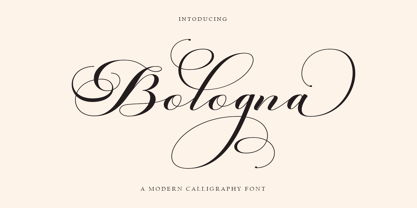 Welcome to the Bologna Script font is a modern, casual, and beautiful calligraphic typeface with a swash. It can be used for many purposes. such as titles, signatures, logos, wedding invitations, letterheads, nameplates, labels, newsletters, posters, badges, etc. Bologna Script Features Open type, including initial and terminal letters, alternatives, binders, and International support for most Western languages included.
 - PF Diplomat Serif by Parachute,
$45.00 Diplomat Serif is a modern serif typeface with Didone characteristics, quite useful for intense editorial jobs. Its open character shapes, low contrast and discreet serifs enhance legibility and provide a fresh, clean and contemporary look. Its matching sans-serif version Diplomat Sans was designed to complement it for demanding publishing and corporate applications. Supports Latin and Greek.
 - Linotype Auferstehung by Linotype,
$29.99Linotype Auferstehung is part of the Take Type Library, selected from contestants of Linotype’s International Digital Type Design Contests of 1994 and 1997. German designer Johannes Plass was influenced by historic broken letter faces, particularly Caslon Gotisch, although the rounded corners give the font a handwritten look. Linotype Auferstehung is particularly good for headlines in larger point sizes. - Logotype Frenzy by Decade Typefoundry,
$40.00 Logotype Frenzy is a display typographer’s guilty pleasure. It’s one of the very few fonts ever made that can take intense abuse and still look natural. It comes with over 1000 characters, including a lot of alternates and extended language support. In OpenType savvy applications, some letter combinations are automatically replaced with ligatures for a more natural look.
 - Uncertainty by Okaycat,
$25.50 Uncertainty 2010 Edition is an intensely textured typeface carefully rendered by hand. This font is faded with a chalk-like texture. Please be aware that working with this highly detailed font may slow some graphics software as it requires more memory. Uncertainty is extended, containing West European diacritics and ligatures, making it suitable for multilingual environments and publications.
 - Supremely Luxurious by TypeClassHeroes,
$15.00 Introducing Supremely Luxurious, Access your OpenType features to access the large selection of alternate letters and ligatures. Use this font for any branding, product packaging, invitation, quotes, t-shirt, label, poster, logo etc. Feature Uppercase & Lowercase Number & Symbol International Glyphs Multilingual support Alternative Ligature Feel free to drop us a message any time Hope you enjoy it.
 - Sintonia by Bosstypestudio,
$14.00 Sintonia is a modern calligraphy font with a dancing baseline and a clean, classic and elegant touch. It can be used for various purposes such as headings, signature, logos, wedding invitations, t-shirt, letterhead, signage, lable, news, posters, badges etc.Hello Bella Script features 350 total glyphs with 100 alternate characters including OpenType Stylistic alternates, ligatures and international language support.
 - Introblues Script by Dhan Studio,
$19.00 Introblues Script is a modern brush font, organic, dynamic and energetic style. It can be used for various purposes. such as for titles, signatures, logos, correspondence, wedding invitations, letterhead, signage, labels, newsletters, posters, badges, etc. Introblues Script features 228 Glyphs, 118 alternate characters, including initial and terminal letters, alternates, ligatures and International support for most Western Languages is included.
 - Gisbon by madeDeduk,
$22.00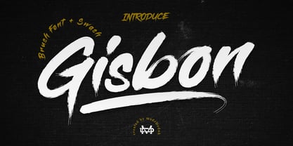 Gisbon is a modern brush typeface. This font is perfect for poster design, book covers, merchandising, fashion campaigns, newsletters, branding, advertising, magazines, greeting cards, album covers, quote designs and more. Includes: - Uppercase - Lowercase - Numbers & Symbols - International Glyphs - Alternative Uppercase - Alternative lowercase - Swash If you need anything else or you require an upgraded license please contact dedukvic@gmail.com
 - David Hadash Sans by Monotype,
$50.99Monotype Imaging is pleased to present David Hadash (New" David), the full family of typefaces by Ismar David, in its intended authentic form. The Estate of Ismar David has sought to revive this jewel of Twentieth-Century design by granting an exclusive license to Monotype Imaging to implement it in industry-standard format. Never before has the typeface in its full set of sub-styles been made available to the design community. David Hadash consists of three style families, Formal, Script, and Sans. Each of these appears in three weigths: regular, medium, and bold. Originally devised as a companion to the upright Formal style, the Script style has a beauty and grace all its own that allows it to be used for full-page settings also. While it is forward-leaning and dynamic, it does not match any of the existing cursive styles of Hebrew script. Ismar David created an eminently readable hybrid style which is like no other by inclining the forms of the upright while blending in some features of Rashi style softened with gentle curves. One can say that the Script style is the first truly italic, not just oblique, typeface for Hebrew script. Although the proportions of the Sans style are very similar to those of the Formal style, its visual impression is stunningly different. If the Formal style is believably written with a broad-point pen, the Sans is chiseled in stone. Rounded angles turn angular and stark. The end result is an informal style that evokes both ancient and contemporary impressions. David Hadash (Modern) supports the writing conventions of Modern Hebrew (including fully vocalized text) in addition to Yiddish and Ladino. David Hadash Biblical is a version of the Formal style that supports all the complexities of Biblical Hebrew, including vocalization and cantillation marks. " - David Hadash Script by Monotype,
$50.99Monotype Imaging is pleased to present David Hadash (New" David), the full family of typefaces by Ismar David, in its intended authentic form. The Estate of Ismar David has sought to revive this jewel of Twentieth-Century design by granting an exclusive license to Monotype Imaging to implement it in industry-standard format. Never before has the typeface in its full set of sub-styles been made available to the design community. David Hadash consists of three style families, Formal, Script, and Sans. Each of these appears in three weigths: regular, medium, and bold. Originally devised as a companion to the upright Formal style, the Script style has a beauty and grace all its own that allows it to be used for full-page settings also. While it is forward-leaning and dynamic, it does not match any of the existing cursive styles of Hebrew script. Ismar David created an eminently readable hybrid style which is like no other by inclining the forms of the upright while blending in some features of Rashi style softened with gentle curves. One can say that the Script style is the first truly italic, not just oblique, typeface for Hebrew script. Although the proportions of the Sans style are very similar to those of the Formal style, its visual impression is stunningly different. If the Formal style is believably written with a broad-point pen, the Sans is chiseled in stone. Rounded angles turn angular and stark. The end result is an informal style that evokes both ancient and contemporary impressions. David Hadash (Modern) supports the writing conventions of Modern Hebrew (including fully vocalized text) in addition to Yiddish and Ladino. David Hadash Biblical is a version of the Formal style that supports all the complexities of Biblical Hebrew, including vocalization and cantillation marks. " - David Hadash Biblical by Monotype,
$50.99Monotype Imaging is pleased to present David Hadash (New" David), the full family of typefaces by Ismar David, in its intended authentic form. The Estate of Ismar David has sought to revive this jewel of Twentieth-Century design by granting an exclusive license to Monotype Imaging to implement it in industry-standard format. Never before has the typeface in its full set of sub-styles been made available to the design community. David Hadash consists of three style families, Formal, Script, and Sans. Each of these appears in three weigths: regular, medium, and bold. Originally devised as a companion to the upright Formal style, the Script style has a beauty and grace all its own that allows it to be used for full-page settings also. While it is forward-leaning and dynamic, it does not match any of the existing cursive styles of Hebrew script. Ismar David created an eminently readable hybrid style which is like no other by inclining the forms of the upright while blending in some features of Rashi style softened with gentle curves. One can say that the Script style is the first truly italic, not just oblique, typeface for Hebrew script. Although the proportions of the Sans style are very similar to those of the Formal style, its visual impression is stunningly different. If the Formal style is believably written with a broad-point pen, the Sans is chiseled in stone. Rounded angles turn angular and stark. The end result is an informal style that evokes both ancient and contemporary impressions. David Hadash (Modern) supports the writing conventions of Modern Hebrew (including fully vocalized text) in addition to Yiddish and Ladino. David Hadash Biblical is a version of the Formal style that supports all the complexities of Biblical Hebrew, including vocalization and cantillation marks. " - David Hadash Formal by Monotype,
$50.99Monotype Imaging is pleased to present David Hadash (New" David), the full family of typefaces by Ismar David, in its intended authentic form. The Estate of Ismar David has sought to revive this jewel of Twentieth-Century design by granting an exclusive license to Monotype Imaging to implement it in industry-standard format. Never before has the typeface in its full set of sub-styles been made available to the design community. David Hadash consists of three style families, Formal, Script, and Sans. Each of these appears in three weigths: regular, medium, and bold. Originally devised as a companion to the upright Formal style, the Script style has a beauty and grace all its own that allows it to be used for full-page settings also. While it is forward-leaning and dynamic, it does not match any of the existing cursive styles of Hebrew script. Ismar David created an eminently readable hybrid style which is like no other by inclining the forms of the upright while blending in some features of Rashi style softened with gentle curves. One can say that the Script style is the first truly italic, not just oblique, typeface for Hebrew script. Although the proportions of the Sans style are very similar to those of the Formal style, its visual impression is stunningly different. If the Formal style is believably written with a broad-point pen, the Sans is chiseled in stone. Rounded angles turn angular and stark. The end result is an informal style that evokes both ancient and contemporary impressions. David Hadash (Modern) supports the writing conventions of Modern Hebrew (including fully vocalized text) in addition to Yiddish and Ladino. David Hadash Biblical is a version of the Formal style that supports all the complexities of Biblical Hebrew, including vocalization and cantillation marks. " - Upton by Halbfett,
$30.00Upton is a modern and condensed sans serif. The initial inspiration for its design came from lettering Wim Crouwel created for a poster design. It also takes some cues from neutral grotesks like Helvetica and Akzidenz. Because of its narrow letterforms, Upton is best applied to headlines and poster-sized typography. Upton’s italics were designed with high-quality compensation for all circles and strokes. Upton ships in two different formats. Depending on your preference, you can install the typeface as two Variable Fonts or use the family’s 14 static OpenType font files instead. Those weights run from Extralight to Extrabold. While the static-format fonts offer a good intermediary-step selection, users who install the Variable Font have vastly greater control over their text’s stroke width. The weight axes in Upton’s Variable Fonts allow users to differentiate between almost 1,000 possible font weights. That enables you to fine-tune your text’s exact appearance on-screen or in print. In its fonts, Upton has several ligatures. That includes optional “discretionary ligatures,” which bring a unique tone to display usage. For instance, the fonts include optional ligatures for the letter combinations “E-T”, “F-l”, “L-E-T-T-E”, “L-E-T-T”, “L-E-T”, “L-E-L-O”, “L-U”, “i-j”. and “m-m”. There are also many alternate glyphs. Stylistic Set 1 substitutes in new forms for “G”, “R”, “a”, “f”, “g”, “i”, “r”, “t”, and “y”. Six more Stylistic Sets have alternates for the “æ”, “g”, “k”, “o”, “K”, “O”, and “Q”. Additional OpenType features activate other useful features, such as fractions, numbers in circles, or symbols. - Pariphoom Compressed by Jipatype,
$27.00 ขอแนะนำ Pariphoom Compressed ส่วนเสริมของฟอนต์ Pariphoom ด้วยอักษรอันโฉบเฉี่ยวและทันสมัย เหมาะสำหรับงานออกแบบหลากหลายประเภท ด้วยอักษรแบบ sans-serif condensed และมุมโค้งมน แบบอักษรนี้ให้ความสมดุลที่ระหว่างความเป็นทางการและความเข้าถึงได้ง่าย ชื่อปริภูมิมาจากภาษาไทย แปลว่า “Space” และเช่นเดียวกับชื่อของมัน ฟอนต์นี้สามารถให้พื้นที่มากขึ้นในงานออกแบบของคุณ ไม่ว่าคุณกำลังสร้างสื่อสำหรับสร้างแบรนด์ พัฒนาแคมเปญการตลาด หรือออกแบบเว็บไซต์ Pariphoom Compressed มอบความยืดหยุ่นและความอเนกประสงค์เพื่อให้ได้รูปลักษณ์ที่คุณต้องการ Pariphoom Compressed มาพร้อมกับรูปแบบที่แตกต่างกันถึง 18 รูปแบบ สิ่งนี้ทำให้คุณมีตัวเลือกมากมายและมีความยืดหยุ่นในการใช้งานในหลากหลายบริบท นอกจากนี้ ฟอนต์นี้รองรับหลายภาษาสำหรับภาษาต่างๆ มากมาย แต่นั่นไม่ใช่ทั้งหมด Pariphoom Compressed มาพร้อมกับฟีเจอร์ Opentype เจ๋ง ๆ เช่น Small Caps และ Tabular ซึ่ง Small Caps เป็นวิธีที่ยอดเยี่ยมในการเพิ่มความหลากหลายให้กับงานออกแบบของคุณโดยใช้ตัวพิมพ์ใหญ่แทนตัวพิมพ์เล็ก ในขณะเดียวกัน Tabular ก็สมบูรณ์แบบสำหรับการสร้างตารางและจัดตำแหน่งตัวเลขเพื่อให้ดูเป็นระเบียบมากขึ้น โดยรวมแล้ว Pariphoom Compressed ทำให้เป็นตัวเลือกที่ยอดเยี่ยมสำหรับนักออกแบบที่ต้องการสร้างผลงานการออกแบบที่น่าจดจำและมีประสิทธิภาพ Introducing Pariphoom Compressed, a extended of Pariphoom with sleek and modern typeface that is perfect for a wide range of design projects. With its condensed sans-serif design and rounded corners, this font offers a unique balance of professionalism and approachability. Derived from the Thai language, the name Pariphoom means "Space" and just like its name suggests, this font can give you more space in your design. Whether you're creating branding materials, developing marketing campaigns, or designing websites, Pariphoom Compressed offers the flexibility and versatility you need to achieve your desired look. Pariphoom Compressed comes with 18 different styles. This gives you plenty of options to choose from and the flexibility to use it in various design contexts. Additionally, this font offers multi-language support for a wide range of languages. But that's not all – Pariphoom Compressed comes with some cool Opentype features such as Small Caps and Tabular. Small Caps are a great way to add variety to your design by using small capital letters instead of lowercase letters. Meanwhile, Tabular is perfect for creating tables and aligning numbers for a more organized look. Overall, Pariphoom Compressed making it a great choice for designers who want to create memorable and effective design projects.
 - Royalis by Julien Fincker,
$34.95 About Royalis: Royalis is an expressive and extravagant serif typeface family. It is characterized by a high contrast and dynamic features in the details, such as long terminals or deep inktraps. Royalis is available in three versions: a display version in six weights, a corresponding condensed version also for display applications, and a text version for body text in four weights. It also comes with all the corresponding italics. This makes Royalis versatile, especially for editorial, packaging, branding and advertising. The wide range of weights and possibilities allows Royalis to be used variably. The thinner weights are characterized by their elegance, while the thicker weights captivate with their powerful contrast. They complement each other like the three musketeers once did. Be it the charmingly elegant Aramis, the sober strategist Athos, the powerful ruffian Porthos or the charismatic d'Artagnan, who led the group. Features: The Royalis family has a total of 32 weights, from extralight to black with matching italics, as Display, Display Condensed and Text versions. With over 1027 characters, it covers more than 200 Latin-based languages, with a whole range of Open Type features. There are alternative characters as stylistic sets, small caps, automatic fractions - just to name a few. Arrows and numbers: In particular, the extensive selection of arrows and numbers should be mentioned here. Thanks to Open Type features and a simple system, the various designs of arrows and numbers can also be easily "written" without first having to select them in a glyph palette.
 - Gineso by insigne,
$- Michaelangelo. da Vinci. Bellini. Rafael. Masters of Italian art whose names have dwarfed those of many other great Italian artists. Yet relics from these other artists remain, though often unnoticed because of their practical nature. These unknowns are the Italian Masters of vernacular sign painting, and insigne now gives a nod to their work with its new sans serif, Gineso. Based on its inspiration, Gineso was created for posters, headlines and logotypes. (It does well in apps, too, though the sign painters probably weren’t thinking about that at the time.) Aesthetically remedied, yet still with an uncut charm, Gineso’s condensed qualities make it especially nice for signs and titling where horizontal space is at a premium. The tight, narrow forms of its geometric design leave you with a robust flavor that will remind you of mamma’s spaghetti. But don’t worry; the font’s ample counters ensure your audience won’t be reading through a bowl of pasta. These condensed forms look great on their own or when their seven different weights and matching italics are utilized together. With the included OpenType features, fractions and superior/inferior positions are also available to broaden your palette. Even more, this font is ready for complex, professional typography with OpenType features like alternate letters and a large character set including Central and Eastern European Languages. So when you find yourself (or your project) in a tight space, stir in Gineso to get the right taste for your copy. It may just make all the difference.
 - Guzzo by Monotype,
$50.99 A playful caricature of a midcentury grotesque, Guzzo is a fresh addition to the Monotype Library. Somewhat eccentric and full of surprises, its unmistakable quirk can be found on closer inspection, stemming from details proudly borrowed from brush lettering and calligraphy. The wide range of weights and style can take you through any design space, from the condensed weights squeezing in larger headlines or dense blocks of text with the condensed range, to experimenting with small point sizes, labels or packaging with the extended cut. However, Guzzo’s real charm is probably best expressed through its wonderfully playful shapes, its unusual 'laid-back italics' feature cursive forms and a backslant. The different stylistic sets allow you to decide what you make of Guzzo, with several sets of alternate glyphs steering it in any direction you want. Guzzo is a happy-go-lucky character, and has a warm, humble and painterly quality that - at a glance - may be unrecognizable as a typeface. It can almost pass for hand-lettering. Guzzo pairs exceptionally well with scripts and slab typefaces, and feels most at home in situ with toys, packaging, menus, broadcasting, cartoons and merchandising! Guzzo encourages you to turn up the silliness and is for designers who want to emulate hand-painted and casual motifs. Taking its name from American artist Jeremy Pinc, aka the painter Guzzo Pinc, the typeface channels the quirky, funny and poignant qualities of his paintings - with wacky characters, loosely painted geometric forms and bright colors. For this mid century, authentic, nostalgic typeface - the story is really what you make of it.
 - Prosaic Std by Typofonderie,
$59.00 A Postmodern vernacular sanserif in 8 fonts Prosaic designed by Aurélien Vret is a Postmodern typographic tribute to the french vernacular signs created by local producers in order to directly market their products visible along the roads. These signs drawn with a brush on artisanal billboards do not respect any typographic rules. The construction of these letterforms is hybrid and does not respect any ductus. Nevertheless the use of certain tools provokes a certain mechanism in the development of letter shapes. It’s after many experiments with a flat brush, that’s these letterforms have been reconstructed and perfected by Aurélien Vret. This is the starting point for the development of an easily reproducible sanserif with different contemporary writing tools. From non-typographical references of Prosaic towards readability innovation The influence of the tool is revealed in the letterforms: angular counterforms contrasting to the smoothed external shapes. This formal contrast gives to Prosaic a good legibility in small sizes. These internal angles indirectly influenced by the tool, open the counterforms. In the past, to deal with phototype limitations in typeface production, some foundries modified the final design by adding ink traps. In our high resolution digital world, these ink traps — now fashionable among some designers — have little or no effect when literally added to any design. Should one see in it a tribute to the previous limitations? Difficult to say. Meanwhile, there are typeface designers such as Ladislas Mandel, Roger Excoffon, and Gerard Unger who have long tried to push the limits of readability by opening the counters of their typefaces. Whatever the technology, such design research for a large counters have a positive impact on visual perception of typefaces in a small body text. The innovative design of counter-forms of the Prosaic appears in this second approach. Itself reinforced by an exaggerated x-height as if attempting to go beyond the formal limits of the Latin typography. It is interesting to note how the analysis of a non-typographical letters process has led to the development of a new typographic concept by improving legibility in small sizes. Disconnected to typical typographic roots in its elaboration, Prosaic is somewhat unclassifiable. The formal result could easily be described as a sturdy Postmodern humanistic sanserif! Humanistic sanserif because of its open endings. Sturdy because of its monumental x-height, featuring a “finish” mixing structured endings details. The visual interplay of angles and roundness produces a design without concessions. Finally, Prosaic is Postmodern in the sense it is a skeptical interpretation of vernacular sign paintings. Starting from a reconstruction of them in order to re-structure new forms with the objective of designing a new typeface. Referring to typographic analogy, the Prosaic Black is comparable to the Antique Olive Nord, while the thinner versions can refer to Frutiger or some versions of the Ladislas Mandel typefaces intended for telephone directories. Prosaic, a Postmodern vernacular sanserif Prosaic is radical, because it comes from a long artistic reflection of its designer, Aurélien Vret, as well a multidisciplinary artist. The Prosaic is also a dual tone typeface because it helps to serve the readability in very small sizes and brings a sturdy typographic power to large sizes. Prosaic, a Postmodern vernacular sanserif
 - Calagio by Eurotypo,
$38.00 Calagio is a casual and modern font, which can be categorized as expressive lettering style. This font contain 565 glyphs carefully designed, with OpenType features. A lot of alternative glyphs in upper and lower case letters, ligatures and ornaments, so you can combine and make your design more real at your convenience.
 - Reinkey by Sign Studio,
$15.00 Reinkey is a neat and clean brushed display font. It has alternate characters, which will give you convenience when choosing a character for each design project. It is suitable for logotypes, banners, brochures, branding and more. It is PUA encoding which means you can access all of the glyphs and swashes with ease.
 - Zone by Aboutype,
$24.99Graphically drawn face with a somewhat mono weight thick to thin contrast. Zone was designed for all media and can be used in a wide range of point sizes. Similar to FreeZone but with small flared endings. Family includes common capitals and alternate lowercase characters. Zone requires subjective display kerning and compensation. - Boom Amorita by Beary,
$15.00 Embrace the power of 'Boom Amorita' to transform your designs into captivating visual stories. Whether you're crafting logos, posters, invitations, or digital content, this font effortlessly blends modern aesthetics with timeless elegance. With 'Boom Amorita' at your fingertips, every project becomes an opportunity to create something extraordinary, reflecting the essence of your creativity.
 - Orange by ITC,
$40.99Orange is the work of British designer Timothy Donaldson and defies the conventional rules of letter construction. Its soft appearance and unusual stroke style produces a fascinating texture in both small and large point sizes. Orange is a departure from standard sans serif styles and ideal for a slightly off-beat look. - Bilground by Prioritype,
$17.00 Introducing Bilground - Handwritten Fonts Beautiful handwritten fonts with strong characters are now here to accompany your design projects. You can apply it to wedding designs, logos, quotes, social media posts, video content display etc. See some of the previews above for reference. Features: • Uppercase • Lowercase • Numeral • Punctuation • Multilingual • PUA Encoded • Opentype Features Thanks.
 - Korejat by Inumocca,
$20.00 Korejat Modern Typeface , All Caps Serif simple and Playfull. come with some simple Alternates for covering your Project, like Branding, Movie Title, Headline Letter, Bookcover or Book Content, Magazine cover, Poster, Quotes Lettering, Logos, and more your project design. - Unique glyphs - Multilingual Characters - UPPERCASE - Numeric - Symbol - Punctuation Character - Alternates Set inumocca type Studio
 - Anglez by Hurufatfont,
$29.00 Anglez was designed by Turkish calligraphy artist Mustafa Eren. It was inspired by the "British Script" style. "Anglez" is designed to meet modern and current needs. It offers user-specific solutions with rich ligatures, swashes, alternative characters, content alternatives, end forms and style sets. Ideal for special day designs, labels and invitation designs.
 - Helaw Wolau by Inumocca,
$13.00 Helaw Wolau Halloween Display Font, simple and strong Character. come with some simple Ligature for covering your Project, like Branding, Movie Title, Headline Letter, Bookcover or Book Content, Magazine cover, Poster, Quotes Lettering, Logos, and more your project design. - Unique glyphs - Multilingual Characters - UPPERCASE - Lowercase - Numeric - Symbol - Punctuation Character - Ligature inumocca type Studio
 - SA Tampico by Artcoast,
$9.00 Tampico Typeface is a new font with Rough version, which includes 80+ glyphs and alternative characters. The font looks great on various packages, goods with food. You can also use it to create logos, shortcuts and other design elements. Product Content: SA Tampico Rough SA Tampico Symbols Features: Accents (Multilingual characters) Stylistic Alternates
 - Traditional Spancer by Inumocca,
$18.00 Traditional Spancer Modern Serif Typeface , simple and powerfull. come with some simple Alternates for covering your Project, like Branding, Movie Title, Headline Letter, Bookcover or Book Content, Magazine cover, Poster, Quotes Lettering, Logos, and more your project design. - Unique glyphs - Multilingual Characters - UPPERCASE - Lowercase - Numeric - Symbol - Punctuation Character - Ligature - Alternates inumocca type Studio
 - Sonderlina by Craft Supply Co,
$9.00 Sonderlina is a convenient and modern grotesk sans serif features low contrast details to cover small text purposes. It can be used to create almost all types of design projects like print materials. Just use your imagination and your project will become more alive and look great than ever with this typeface.
 - SST by Monotype,
$82.99 Designed for global branding and supporting 93 languages, the SST® typefaces blend the organic readability and controlled structure of modern sans serif designs. In combining these attributes, the SST family is understated, versatile – and sure to be a timeless design. The SST Pan-European family has 17 fonts in total, supporting the W1G character set. It spans six weights from ultra light to heavy, each with an italic complement. In addition, three condensed designs and two monospaced (typewriter) typefaces were drawn to further expand the family’s vast range of uses. SST’s subtle design traits provide a quietly handsome and consistently friendly typographic presence that can be used for just about any typographic application. Broad range branding applicability combined with coverage for almost a hundred languages, makes SST one of the most widely accessible and usable typefaces available. Originally designed in partnership with the global consumer brand, Sony, the SST family is one of the most comprehensive type families available. Since extensive multi-lingual support was a critical design goal from the beginning, Akira Kobayashi, Monotype type director and primary designer on the project, turned to a network of local designers around the world for their individual language expertise. As a result, the details – which could be as subtle as stroke curvature and width – are consistent across Latin, Greek, Cyrillic, Arabic and multiple Asian languages. SST performs equally well in print and on-screen and the designs can be used at very small sizes in packaging and catalogs; while massive print headlines – even complicated wayfinding projects pose no stumbling blocks to the family’s typographic dexterity. While the family is also large enough to manage complicated typographic hierarchy, SST pairs handsomely with typefaces as far reaching as ITC Berkeley Old Style®, Meta®, PMN Caecilia®, Malabar® and Neue Swift®.
 - PTL Attention by Primetype,
$79.00 PTL Attention a robust and contemporary sans serif type family with its very own characteristics. Made for work in text as well as display it comes with nine weights in two styles, including small caps, a set of contemporary OpenType features, all standard figure sets and a rich language support. The concept for PTL Attention goes back to the days of Viktor’s thesis Type Attack!. From the beginning there was the idea not only to have a display stencil type like PTL Attack, but also to create a more serious companion. One of the intentions while designing it was also to come to an result that shows not another feel-good, streamlined corporate typeface. A pinch of "anti" should vibrate with it. Nevertheless the main intention was to create a highly legible and useful type family.
 - Orb by Superfried,
$32.50 Orb by Superfried has been re-released. Now re-drawn and improved the elegant, geometric uppercase display typeface now also includes a secondary character set activated via the shift key. The glyphs are constructed from two concentric paths featuring intricate interactions and angled incisions, which lead to a very distinct look and feel. Orb includes 266 glyphs in two character and is available in two weights: display and outline.
 - Rounded, Two. by Siren Fonts,
$10.00 Rounded, two was designed with a simple idea in mind: the basis for the majority of the characters is a perfect circle. That circle is then intersected and cropped to make unique, modern and stylish letterforms. Rounded, two is an improved version of my initial experimentation. The font looks good at all sizes, but particularly for large displays where the elegant simplicity of each character can be appreciated.
 - Zera JNL by Jeff Levine,
$29.00Zera JNL is one of those fonts that defy any simple description. While trying out effects on Transactive JNL, Jeff Levine came up with a set of letters comprised of intersecting rings that could illustrate chain, cellular structure, bubbles or probably anything your imagination can come up with to adapt the font to a particular project. Please keep in mind this design works best in larger point sizes. - Deliver by PizzaDude.dk,
$20.00 I am here to deliver! I used a semi dry brush for this font, and when views at large sizes you can really enjoy the brush traces. The font keeps the authentic feeling of something hastily written with a brush. Along with he very tight spacing and kerning, it does it job! Quite good for headlines that needs that extra punk, or T-shirts design, posters, Instagram photos or interactive designs!
 - Kymer Awon by Brenners Template,
$19.00 The Kymer Awon font family includes 5 weights and 20 styles. Whereas traditional Sans Serif typefaces show low contrast, this family has high contrast. And It brings out modern elegance through curved variations of glyphs with diagonal bars. Alternative fonts with Small Caps inherit the vertical stem width of the default capitals. These elegant and contemporary styles have an affinity to fit into any of your design work.
 - Zyklop NF by Nick's Fonts,
$10.00A random scan from a late nineteenth-century German type specimen book, encountered on the internet, provided the pattern for this surprisingly contemporary face. Although all of the characters are parallel to the baseline, the unusual dimensional treatment tends to give the impression that they slant upward to the right. Both versions of this font include the complete Unicode 1252 Latin and Unicode 1250 Central European character sets. - Kaleko 105 Remix by Talbot Type,
$19.50 A remixed variation, available in three weights, of the popular Talbot Type geometric sans Kaleko 105 . The addition of occasional flourishes at the intersections of strokes, in both upper and lower case, adds character charm, making the font a perfect titling font to accompany Kaleko 105, or a display font in its own right. Kaleko 105 Remix features a comprehensive glyph set including accented characters for central European languages.