10,000 search results
(0.039 seconds)
- MEORU GEND by Twinletter,
$17.00 Meoru Gend is a display font that presents superhero strength, courage, and modernity in every action. With a strong, bold, and futuristic style, this font is the perfect solution for creating action-packed and epic gaming experiences. In every letter, Meoru Gend brings life to your display with electrifying energy. From bold, sharply contoured typefaces to seamlessly blended modern elements, this font will bring immense visual power to your game projects. Meoru Gend offers not only impressive styles but also creative features that enrich your work. With the available ligatures and alternates, you can create unique and interesting variations of your style. Also, with multilingual support, this font can be used in multiple languages to reach a global audience. If you’re looking for a strong, bold, modern, and action-packed font for your game projects, Meoru Gend is the right choice. With benefits that include an impressive look, futuristic style, and creative features such as ligatures and alternates, this font will quickly catch the attention of your potential customers and bring you an extraordinary gaming experience in no time. What’s Included : File font All glyphs Iso Latin 1 Alternate, Ligature Simple installations We highly recommend using a program that supports OpenType features and Glyphs panels like many Adobe apps and Corel Draw so that you can see and access all Glyph variations. PUA Encoded Characters – Fully accessible without additional design software. Fonts include Multilingual support
 - Frant - Unknown license

- SF Slapstick Comic - Unknown license

- SF Minced Meat - Unknown license

- SF Shai Fontai - Unknown license

- SF Intoxicated Blues - Unknown license

- SF Square Root - Unknown license

- SF Proverbial Gothic - Unknown license

- SF Chrome Fenders - Unknown license

- DAMAGEPLAN PERSONAL USE - Unknown license

- Mastodon - Unknown license

- CSAR PARADE DRESS (Display Caps - 100% free

- Churchward by Wooden Type Fonts,
$15.00 Great ultra bold sans serif font and demi bold wonderful for display.
 - P22 Tyndale by IHOF,
$24.95Quill-formed roman/gothic with an olde-worlde flavor. Some background in the designer's own words: "A series of fonts came to mind which would be rooted in the medieval era -for me, a period of intense interest. Prior to Gutenberg's development of commercial printing with type on paper in the mid-1400s, books were still being written out by hand, on vellum. At that time, a Bible cost more than a common workman could hope to earn in his entire lifetime. Men like William Tyndale devoted their energies to translating the Scriptures for the benefit of ordinary people in their own language, and were burned to death at the stake for doing so. Those in authority correctly recognized a terminal threat to the fabric of feudal society, which revolved around the church. "This religious metamorphosis was reflected in letterforms: which, like buildings, reflect the mood of the period in which they take shape. The medieval era produced the Gothic cathedrals; their strong vertical emphasis was expressive of the vertical relationship then existing between man and God. The rich tracery to be seen in the interstices and vaulted ceilings typified the complex social dynamics of feudalism. Parallels could be clearly seen in Gothic type, with its vertical strokes and decorated capitals. Taken as a whole, Gothicism represented a mystical approach to life, filled with symbolism and imagery. To the common man, letters and words were like other sacred icons: too high for his own understanding, but belonging to God, and worthy of respect. "Roman type, soon adopted in preference to Gothic by contemporary printer-publishers (whose primary market was the scholarly class) represented a more democratic, urbane approach to life, where the words were merely the vehicle for the idea, and letters merely a necessary convenience for making words. The common man could read, consider and debate what was printed, without having the least reverence for the image. In fact, the less the medium interfered with the message, the better. The most successful typefaces were like the Roman legions of old; machine-like in their ordered functionality and anonymity. Meanwhile, Gutenberg's Gothic letterform, in which the greatest technological revolution of history had first been clothed, soon became relegated to a Germanic anachronism, limited to a declining sphere of influence. "An interesting Bible in my possession dating from 1610 perfectly illustrates this duality of function and form. The text is set in Gothic black-letter type, while the side-notes appear in Roman. Thus the complex pattern of the text retains the mystical, sacred quality of the hand-scripted manuscript (often rendered in Latin, which a cleric would read aloud to others), while the clear, open side-notes are designed to supplement a personal Bible study. "Tyndale is one of a series of fonts in process which explore the transition between Gothic and Roman forms. The hybrid letters have more of the idiosyncrasies of the pen (and thus, the human hand) about them, rather than the anonymity imbued by the engraving machine. They are an attempt to achieve the mystery and wonder of the Gothic era while retaining the legibility and clarity best revealed in the Roman form. "Reformers such as Tyndale were consumed with a passion to make the gospel available and understood to the masses of pilgrims who, in search of a religious experience, thronged into the soaring, gilded cathedrals. Centuries later, our need for communion with God remains the same, in spite of all our technology and sophistication. How can our finite minds, our human logic, comprehend the transcendent mystery of God's great sacrifice, his love beyond understanding? Tyndale suffered martyrdom that the Bible, through the medium of printing, might be brought to our hands, our hearts and our minds. It is a privilege for me to dedicate my typeface in his memory." - Columna by Linotype,
$29.99Columna is an all-caps, Classical Roman-inspired typeface designed by the renowned Swiss typographer Max Caflisch (interesting fact: Columna is Caflisch's only typeface). Caflisch's Columna adds a stately elegance to any application, and is best used in large sizes. - Junker by Gassstype,
$27.00 Introducing our latest display typeface called Junker - Normal And Italic Paint Brush Font with a natural style and dramatic movement can make your logotype become more interesting. Best Vintage font and multilingual support. inspired by the decorative arts and architecture movement
 - Selenic by Paul Dersidan,
$23.00 Selenic is a solid typeface with a clean look, interesting texture and quick impact. Friendly but also aggressive it is best suited for massive headlines, fashion photography, album covers, logo design or any other typographical work on digital and print.
 - Seleniak by Crestaco,
$19.00 Seleniak's outlines are based on the logo of the eponymous MSX video game, also created by its designer. Thus, all ratios are multiples of the typical 8x8 px video character unit, giving the typeface a characteristic appearance and interesting fitting properties.
 - Spooky Crack by AEN Creative Studio,
$15.00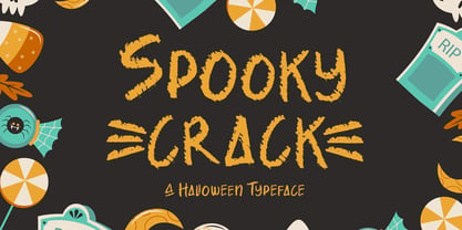 Spooky Crack is an incredibly unique and interesting display font. It is perfectly suitable for any Halloween-related project or crafty idea! Spooky Crack is PUA encoded which means you can access all of the glyphs and swashes with ease!
 - Sikandinarie by Attract Studio,
$19.00 Sikandinarie is a clean and neat serif font combined with swirl strokes to make this font unique yet elegant. This typeface has many unique alternatives that can make your designs even more interesting, making it the perfect choice for any project.
 - French Stencil Sans JNL by Jeff Levine,
$29.00 French Stencil Sans JNL is another typeface based on vintage French tin/zinc stencils. Slightly rounded corners and a "hand-cut" look add an interesting and charming variation that breaks away from the "standard" design of other metal stencil sets.
 - MB DECO by Ben Burford Fonts,
$25.00 All Caps Art Deco font with alternate characters in Upper and Lower Case glyphs, some nice ligatures to create interesting letter sets. Great for Logotypes, Headlines, Straplines and smaller descriptive text to give that authentic Art Deco look and feel.
 - Kular by Wilton Foundry,
$9.00 I set out to design a monospaced font and decided it would look way better if it wasn't. It gave me the freedom to make the individual glyphs more interesting while retaining the mono-look. The numerals are tabular! Enjoy!
 - Dear Nathan by Arendxstudio,
$12.00 Introducing my latest font is Dear Nathan, a handwritten font which is very elegant and modern for you to use and your design interests be it for logos, branding names, posters, podcasts and so on. This is perfect for you all.
 - April Rain by Scrowleyfonts,
$16.00 April rain is a delicate, elegant font with teardrop line endings. It is designed to be interesting and a little unusual while remaining robust enough to be used in a variety of contexts from titling and lists to short paragraphs.
 - Inlet JNL by Jeff Levine,
$29.00 An interesting bit of Art Deco influenced serif hand lettering was found on the cover of the sheet music for 1938's "Boatman's Serenade". This became the model for the digital font Inlet JNL; available in both regular and oblique versions.
 - Hamer by madeDeduk,
$18.00 I'm really excited to introduce Hamer, a new old school typeface with a vintage look! Hamer is available in 2 different styles, solid and rough. Hamer is perfect for poster design, book covers, merchandise, fashion campaigns, newsletters, branding, advertising, magazines, greeting cards, album covers, and quote designs and more. Features UPPERCASE Lowercase Numbers & Symbol International Glyphs Alternative UPPERCASE Alternative Lowercase Ligatures If you need anything else, just shoot me on email at: dedukvic@gmail.com
 - Point Panther by Sarid Ezra,
$13.00 Introducing, A NEW POWERFUL BOLD FONTS WITH ALTERNATES, Point Panther! Point Panther is a headline font with super bold style that contains up to 6 Alternates each characters! You can make a unique branding with this fonts. this powerful bold fonts also included italic and outline style! This fonts suitable to use for poster, branding, merchandise, and any street art style! Also support multilingual. What will you get: Point Panther Regular (Regular, Italic ) Point Panther Bold (Bold, Bold Italic) Point Panther Outline Regular (Regular, Italic ) Point Panther Outline Bold (Bold, Bold Italic) How to access the alternates! If you use PS/AI you can see the tutorial in this : https://helpx.adobe.com/illustrator/using/special-characters.html You can use the PUA for software design that not support Opentype. For another questions, please send a mail to saridezra@gmail.com. Thank You!
 - Irtusk - Unknown license

- Konstantin Forte by Wiescher Design,
$39.50My son Konstantin needs a bold face for his bold recipes. So I made Konstantin Forte for him — and the rest of the world. Your bold family designer, Gert Wiescher. - Heffer - 100% free

- VTC-BadEnglischOne - Personal use only

- !Limberjack - Unknown license

- Stylo - Unknown license

- DS Diploma Art - Unknown license

- Lemon Flush by PizzaDude.dk,
$15.00 According to my own knowledge, and the info found around the internet, lemons are good for your health. Not only do I care about my health, I also care for a good dessert! :) And this is where the lemon enters the the arena! I love the sweet and sour taste of the lemon - I love it in drinks (hot or cold) in ice creams, cakes, sweets ... you name it! I just had to name this font something with the word "lemon" in it, because I find it mouth watering! :)
 - CoolWool by Linotype,
$29.99Linotype CoolWool is part of the Take Type Library, featuring winners of Linotype’s International Digital Type Design Contest. This font was designed by A. Leonardi and P. Wollein, who took their inspiration from clothing labels and care instructions. CoolWool is designed to look like it was stitched, a style of typeface which goes back to the hand embroidery of the time of Biedermeier. CoolWool, however, is a distinctly modern font with a technical feel. The font is not suited for longer texts, but CoolWool is good for shorter texts and headlines, especially because of the possibilities allowed by its three different styles, regular, stone washed (bold) and Cotton Club (outline). - Pexico by Setup,
$- Pexico is a pixel typeface that uses 10 by 14 grid (capital letter) in 8 styles: 4 basic styles for text setting — Regular, Bold, Narrow, and Mono and 4 stylistic variations of the Regular style for display setting — Outline, Dots, Round, and Inverse. It fits the display's pixel grid when used at 20pt size or its multiples. Pexico supports Latin, Cyrillic, and Greek Monotonic scripts, all with thoroughly designed diacritics. Moreover, Pexico makes use of advanced OpenType features, just as any other modern text typeface. Each style also has 9 sets of numbers, small capitals and is properly kerned. For more information go to Urtd.
 - Mercado by MADType,
$24.00 Mercado is a versatile stencil font family with 3 styles and 3 weights of each style. I was inspired by local boutique supermarkets to create a stencil font family with both upper and lowercase as well as a large international characterset. Mercado Regular can be used at small point sizes without the stencil gaps filling in. It also makes a bold statement when used large. Mercado Display with it's precision slices is best used large, or in any design solution where the tight gaps will not become filled in. Mercado Sans is a quirky and strong sans serif based on the bones of the stencil version.
 - Freehouse by Device,
$39.00 Freehouse is a reinterpretation of the well-remembered Watney’s logo, a brewery and pub chain infamous for its poor quality beer and brutalist decor. In Design Research Unit’s corporate guidelines from 1966 the font is described as Clarendon Bold Expanded — however, this is not the case. Clarendon has square serifs, whereas the Watney’s font is rounder and friendlier. A fixture of the British high street landscape for decades, this digitisation adds a full international character set, numbers, punctuation and many other characters that did not exist in the original. A distressed version that evokes rough print on a wet beermat has also been developed.


