10,000 search results
(0.024 seconds)
- Yenthida by RCKY Studio,
$15.00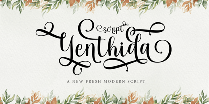 Yenthida Script is a modern calligraphy design, including Regular. This font is casual and beautiful with strokes. Can be used for various purposes. such as logos, product packaging, wedding invitations, branding, headlines, signage, labels, signatures, book covers, posters, quotes, and more. Yenthida Script includes changes in OpenType stylistics, binding, and international support for most Western languages.
 - Rembow by Tigade Std,
$15.00 Rembow is a custom calligraphy font which shows the strong but beautiful strokes. It is suitable for any occasions such as logo, brand, or even to write awesome quote on a poster. It came with a bunch of stylistic alternate glyphs as well as support International characters. Enjoy! You will get TTF, OTF as well as WOFF.
 - Tequila Sunrise by TypeClassHeroes,
$12.00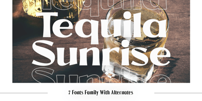 Introducing Tequila Sunrise, access your OpenType features to access the large selection of alternate letters and ligatures. Use this font for any branding, product packaging, invitation, quotes, t-shirt, label, poster, logo etc. Feature 7 Weight Uppercase & Lowercase Number & Symbol International Glyphs Multilingual support Alternative Ligature Feel free to drop us a message any time Hope you enjoy it.
 - Raque by madeDeduk,
$15.00 Introducing Raque is a Capital Modern Serif, use this font for any branding, product packaging, invitation, quotes, t-shirt, label, poster, logo etc. Feature Uppercase & Lowercase Number & Symbol International Glyphs Multilingual support Alternative Ligature Shoot me on email at: dedukvic@gmail.com and find more previews on my Instagram here : https://www.instagram.com/acekelgondolayu/?hl=en Hope you enjoy it.
 - Plastic Display JNL by Jeff Levine,
$29.00Plastic Display JNL was sketched from photo examples in an old sales promotion sheet for the Movitex Do-It-Yourself Plastic Sign Kit. The set was manufactured by Pryor Marking Products of Chicago, and featured a board with pre-spaced holes in a grid to which the letters and numbers would be inserted to form the sign. - Nigel Roos by madeDeduk,
$14.00 Really excited to introduce Nigel Roos is a realistic signature to give a incredible impression for all your project design. Nigel roos come with two alternative with extra swashes and more than 140 ligatures in each font to make everything look realistic handmade signature. Included: Uppercase Lowercase Number & Symbol International Glyphs Multilingual Support Ligature Hope you enjoy it.
 - Black Forte by TypeClassHeroes,
$15.00 Black Forte is a sans serif display with various width and weight that you can explore and combine. use this font for any branding, product packaging, invitation, quotes, t-shirt, label, poster, logo etc. Feature Uppercase & Lowercase Number & Symbol International Glyphs Multilingual support Feel free to drop us a message f you have any questions Hope you enjoy it.
 - Woliu Maners by madeDeduk,
$16.00 Woliu Maners is a Modern Sans, use this font for any branding, product packaging, invitation, fashion, label, poster, logo etc. Feature Uppercase & Lowercase Number & Symbol International Glyphs Multilingual support Alternative Ligature Feel free to drop us a message any time and follow my shop for upcoming updates Shoot me on email at: dedukvic@gmail.com Hope you enjoy it.
 - Chameron by madeDeduk,
$15.00 Chameron is a modern typeface. suitable to create any branding, product packaging, invitation, qoutes, t-shirt, label, poster, logo etc. Feature - UPPERCASE - Lowercase - Number & Symbol - International Glyphs - Multilingual Support - UPPERCASE Alternative - Lowercase Alternative If you need anything else please contact dedukvic@gmail.com. and more previews on my Instagram here : https://www.instagram.com/acekelgondolayu/?hl=en Hope you enjoy it.
 - Lansonia by Bosstypestudio,
$12.00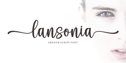 Lansonia is a modern calligraphy font with a dancing baseline and a clean, classic and elegant touch. It can be used for various purposes such as headings, signature, logos, wedding invitations, t-shirt, letterhead, signage, lable, news, posters, badges etc.Hello Bella Script features 300 total glyphs with 100 alternate characters including OpenType Stylistic alternates, ligatures and international language suppor
 - Duhai by SimpleType Studios,
$19.00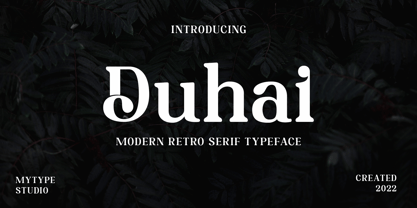 Duhai is a modern serif font that embodies elegance and charm in every character. It is perfect for luxury logos, branding, classy editorial designs, women magazines, cosmetic brand, promotional designs, the fashion industry, and more. This gorgeous font includes all lowercase and uppercase characters, numbers, punctuation, an array of standard ligatures and a selection of international characters as well.
 - Pinky Scream by Illushvara,
$18.00 Pinky Scream is the ideal for for any crafting project during the scariest time of the year. It will take any Halloween craft with the sweet feeling to the next level! Font includes: All caps glyphs, numbers, basic punctuation, and international characters. If you have any question, don’t hesitate to contact me. Happy Designing !!! Thank You, Bayu Suwirya
 - Sketchy in snow by Abo Daniel,
$13.00 This font "SKETCHY IN SNOW" is so cute and playful. It is great for quotes, logo, branding, packaging, t-shirt design, cover kids book, tote bag design, social media and anything your project Both uppercase and lowercase are match perfectly. You can combined them as you like. Features: Uppercase Lowercase Number & Punctuations International Accent PUA Encoded
 - Animal Hunter by JK Typeface,
$60.00 This unique font is characterized by the presence of only one sharp serif, skillfully positioned to give it an aggressive and distinctive appearance. This typographic singularity seamlessly blends the minimalism of sans-serif fonts with the visual intensity of a serif, resulting in a design that will undoubtedly catch the eye and make your message stand out.
 - Casty by TypeClassHeroes,
$12.00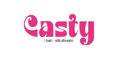 Introducing Casty, access your OpenType features to access the large selection of alternate letters and ligatures. Use this font for any branding, product packaging, invitation, quotes, t-shirt, label, poster, logo etc. Feature 7 Weight Uppercase & Lowercase Number & Symbol International Glyphs Multilingual support Alternative Ligature Feel free to drop us a message any time Hope you enjoy it.
 - Gamebred by Alphabet Agency,
$15.00 Alphabet Agency proudly present Gamebred. Gamebred font is all caps with many alternatives letter characters within. The font also contains numbers, punctuation and international (latin) letters. The original inspiration behind the font is vintage lettering used on tobacco products. The initial inspiration developed into Gamebred that uses more elaborate and unorthodox character styles to real make it uniquely dope.
 - Bruno Ace Pro by Stiggy & Sands,
$29.00 Our Bruno Ace Pro draws its inspiration from modern automotive logotypes. This geometric sans-serif has a wide stance with a tall x-height for a strong look and appeal, as well as ease of legibility. The SmallCaps and extensive figure sets offer a more extensive range of use as well as a more intense vibe.
 - Rush Twist by madeDeduk,
$14.00 Rust Twist is a font duo signature and sans display. Signature includes more than 145 ligatures to make everything look natural handmade signature and sans display come out with a lot alternative and ligature so you can be much creative with your designs. Feature Uppercase & Lowercase Number & Symbol International Glyphs Multilingual support Alternative Ligature Hope you enjoy it.
 - Heavy by madeDeduk,
$14.00 Introducing Heavy is a fun bold font and will be perfect for book, title branding, product packaging, invitation, quotes, t-shirt, label, poster, logo etc. Feature Uppercase & Lowercase Number & Symbol Alternates Ligatures International Glyphs Multilingual support Feel free to drop us a message any time and follow my shop for upcoming updates Hope you enjoy it.
 - Qusta by SimpleType Studios,
$15.00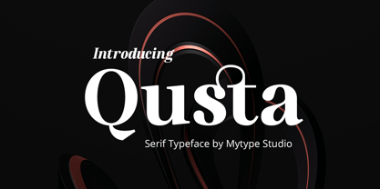 usta is a modern serif font that embodies elegance and charm in every character. It is perfect for luxury logos, branding, classy editorial designs, women’s magazines, cosmetic brand, promotional designs, the fashion industry, and more. This gorgeous font includes all lowercase and uppercase characters, numbers, punctuation, an array of standard ligatures and a selection of international characters as well.
 - Bakson Marinel by TypeClassHeroes,
$15.00 Bakson Marinel is a modern display sans, simplistic, high-contrast sans that is at home in high-end fashion and cultural environments that you can explore and combine. use this font for any branding, product packaging, invitation, fashion, label, poster, logo etc. Feature Uppercase & Lowercase Number & Symbol International Glyphs Multilingual support Alternative Ligature Hope you enjoy it.
 - PF Diplomat Serif by Parachute,
$45.00 Diplomat Serif is a modern serif typeface with Didone characteristics, quite useful for intense editorial jobs. Its open character shapes, low contrast and discreet serifs enhance legibility and provide a fresh, clean and contemporary look. Its matching sans-serif version Diplomat Sans was designed to complement it for demanding publishing and corporate applications. Supports Latin and Greek.
 - Logotype Frenzy by Decade Typefoundry,
$40.00 Logotype Frenzy is a display typographer’s guilty pleasure. It’s one of the very few fonts ever made that can take intense abuse and still look natural. It comes with over 1000 characters, including a lot of alternates and extended language support. In OpenType savvy applications, some letter combinations are automatically replaced with ligatures for a more natural look.
 - Uncertainty by Okaycat,
$25.50 Uncertainty 2010 Edition is an intensely textured typeface carefully rendered by hand. This font is faded with a chalk-like texture. Please be aware that working with this highly detailed font may slow some graphics software as it requires more memory. Uncertainty is extended, containing West European diacritics and ligatures, making it suitable for multilingual environments and publications.
 - Supremely Luxurious by TypeClassHeroes,
$15.00 Introducing Supremely Luxurious, Access your OpenType features to access the large selection of alternate letters and ligatures. Use this font for any branding, product packaging, invitation, quotes, t-shirt, label, poster, logo etc. Feature Uppercase & Lowercase Number & Symbol International Glyphs Multilingual support Alternative Ligature Feel free to drop us a message any time Hope you enjoy it.
 - Sidger Nakson by madeDeduk,
$14.00 Sidger Nakson is a display font regular and rough curly style with much alternative and ligature. Its clean and geometric letterforms make it ideal for various design applications, from corporate branding to editorial layouts. Feature Uppercase & Lowercase Number & Symbol International Glyphs Multilingual support Alternative Ligature Thanks so much for checking out my shop. Hope you enjoy it.
 - Sintonia by Bosstypestudio,
$14.00 Sintonia is a modern calligraphy font with a dancing baseline and a clean, classic and elegant touch. It can be used for various purposes such as headings, signature, logos, wedding invitations, t-shirt, letterhead, signage, lable, news, posters, badges etc.Hello Bella Script features 350 total glyphs with 100 alternate characters including OpenType Stylistic alternates, ligatures and international language support.
 - Introblues Script by Dhan Studio,
$19.00 Introblues Script is a modern brush font, organic, dynamic and energetic style. It can be used for various purposes. such as for titles, signatures, logos, correspondence, wedding invitations, letterhead, signage, labels, newsletters, posters, badges, etc. Introblues Script features 228 Glyphs, 118 alternate characters, including initial and terminal letters, alternates, ligatures and International support for most Western Languages is included.
 - Gisbon by madeDeduk,
$22.00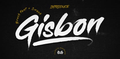 Gisbon is a modern brush typeface. This font is perfect for poster design, book covers, merchandising, fashion campaigns, newsletters, branding, advertising, magazines, greeting cards, album covers, quote designs and more. Includes: - Uppercase - Lowercase - Numbers & Symbols - International Glyphs - Alternative Uppercase - Alternative lowercase - Swash If you need anything else or you require an upgraded license please contact dedukvic@gmail.com
 - BD Megalona by Balibilly Design,
$25.00 The fundamental in creating this typeface is the implementation of our interest in typography over the past year. Inspired by the elegance, consistency, and hard work of Times New Roman pull up our minds to a daunting blank canvas and began to think about what we had to do to take this idea even further. Whatever comes to our mind and when it is poured out, it will certainly remain within the rules of the letterforms. This typeface is created by a careful approach, consisting of 28 fonts 13 weights with matching true italics forms. Feature an extended charset of over 1800 glyphs, covering 219 languages using Latin, Cyrillic (basic to extended), and Greek alphabets. Included advanced open type features like stylistic alternates, terminal form, swash, discretionary ligatures, ordinals, small caps, positional numbers, fractions, and case-sensitive forms. BD Megalona provides a range of choices that will give luxury vibes in symmetrical layouts with selective deviations, and work well in a stylish look for your typographic project. This is a complete package of problem solvers perfectly suited for body text and high-impact headlines. Advance open-type features definitely stunning on logos, branding, magazines, website, etc. BD Megalona is our ego in expression that aims to supply the necessity of design nowadays while still in the corridors of the glory of past traditions as a source of our inspiration. We would like to show you a SHORT FILM about the process of designing BD Megalona Font Family, Click Here!!!
 - Dassitzt by Linotype,
$29.99Dassitzt is a family of two typefaces, Dassitzt LT Typos and Dassitzt LT Pictos. Dassitzt LT Typos is a heavy industrial-grunge display face, with dark, even letters that appear cut out of black paper or iron. Dassitzt LT Pictos is a whimsical collection of pictograms. The figures in this font are black silhouettes that show a minimum amount of detail, but a maximum amount of expression. - Lapoya by Cuchi, qué tipo,
$9.95 “LAPOYA” (meaning in english “the coolest”) is a large slab serif typeface family, with a certain Italian inverted contrast touch. Specially designed for advertising big shows and commerces, Lapoya has 36 variables and four axes, including a text and decorative versions, where the drawing and width of its counterforms vary. It also has icons that remember the old aesthetics of wood types from the early 20th century, and more than 400 characters with a multitude of signs and ligatures, that make Lapoya ideal for up to 89 languages. It is clearly inspired by the large wood types designed for posters, advertisements and newspapers. Since they were introduced in the 19th century, slab serifs have become extremely popular. In fact, serifs are often enlarged, not so much to look like beautiful or balanced letters, but to be more graphic and visual powerful than others. Furthermore, in the case of this typeface, this idea has been applied not only to capital letters, but also to the lowercase, numbers and signs of all kinds. “That’s why this typeface is LAPOYA!” Designed by Carlos Campos in 2023. cuchi@cuchiquetipo.com OPENTYPE FONT 426 GLYPHS 388 CHARACTERS 4 AXES 36 INSTANCES 9 LAYOUT FEATURES 89 LANGUAGES
 - Pata Slab by In-House International,
$10.00 Pata Slab: the ultra-heavy optimism we all need in 2020 Pata Slab is the type equivalent of a catwalk stomp down a city sidewalk, a font that’s assertive, funky and more than a little sexy. Named after a colloquialism for ‘feet’, Pata features ultra-heavy slabs and contrasting hairline centers that rise from its chunky footprint. The resulting, retro-inspired vertiginous curves add instant attitude to any design. Developed in 2020, Pata is a type of its time.Pata is all upside, as it is a typeface with no descenders — one that elevates all characters to grow upward from the baseline (because, c’mon, we could all use something uplifting right now!) All uppercase characters were built to fit precisely inside a square, so they’re all the same width and height. The lowercase alphabet, eñes, cedillas, punctuation, numbers and symbols all follow the same height restrictions. Despite all that confinement, Pata sports standard-height terminals that connect seamlessly so there’s nearly endless options for modular ligatures. The upshot of all this meticulous awesomeness is that laying out, customizing and stacking text super simple. Pata Slab was created by In-House International, designed Alexander Wright in collaboration with Rodrigo Fuenzalida. It's available for Opentype format (.otf) compatible with Mac and PC.
 - Neue Plak by Monotype,
$57.99 Originally designed in 1928, Plak is something of a lost gem in the type world. Despite being drawn by Futura creator Paul Renner, it never achieved the same popularity and spent decades lacking a much-needed digital revival. Monotype designers Linda Hintz and Toshi Omagari have taken its existing three weights and, after extensive research into the original wood type, extended them into the vast Neue Plak family. The typeface is available in 60 weights that stay true to Renner’s intentions, and offer the same blend of “quirky” details and “German stiffness” – as Hintz describes it. The design is an unusual mixture, bringing together a defiant outer appearance that’s counteracted by more playful details found in the lowercase r, and the large dots of the lowercase i. Other distinctive details include open or strikethrough counters, and a set of hairline widths that reduce Renner’s original design to its bare bones. Neue Plak’s display weights are crying out to be used in editorial, on packaging or in logos, while its text weight works well in both print and digital environments. Neue Plak Text Variables are font files which are featuring one axis and have a preset instance from Thin to Black
 - Palmer Lake by Jen Wagner Co.,
$13.00 Features: Palmer Lake Print: Uppercase letters, numbers, & extended punctuation Palmer Lake Script: Lowercase letters, numbers, & extended punctuation Non-English support for the international designer Same stroke thickness with each font, so you don't need to make any time-consuming adjustments to get it looking right! Palmer Lake Print (uppercase font) letters are the same height as the Script lowercase letters, so making quotes is super easy! This is such a fun new duo, perfect for creating quotes, logos, or just adding a hand-written touch to any project! While other fonts usually take some size adjusting to look just right, Palmer Lake duo has the same stroke thickness for both fonts, so you can set each font to the same size and you're done! Plus, the uppercase letters of the Print font are the same height as the lowercase letters of the Script font (see the samples), so lining them up with one another is a breeze! Each font also has alternates for each letter, so when you type uppercase or lowercase for each font, the letters will change slightly. For example, tying in all caps with the Script font will connect each letter, whereas typing all lowercase will disconnect each letter. Test it out for yourself in the box above!
 - Nautilus Text by Linotype,
$29.99Hellmut G. Bomm first released his Linotype Nautilus typeface in 1999. Ten years later, he updated and expanded the design. Now users have two additional families at their disposal: Nautilus Text and Nautilus Monoline. Nautilus Text bears more similarities to the original Linotype Nautilus. The letters shows a high degree of contrast in their stroke modulation. Bomm's intention was to create a clear, highly legible face. While the even strokes of most sans serif types eventually tire the eyes in long texts, the marked stroke contrast of Nautilus Text lends the face its legibility. The characters were drawn with a broad tipped pen. Like serif typefaces, the forms of Nautilus Text display a variety of elements. Its characters are narrow, with relatively large spaces between them. This helps create an overall open appearance, and allows a large quantity of text to fit into a small space. Nautilus Monoline's letters share the same overall proportions as Nautilus Text's. But as their name implies, they are monolinear. Their strokes do not have the calligraphic modulation that Nautilus Text features. This allows them to set another sort of headline, making Nautilus Monoline a refreshing display type choice to pair with body text set in Nautilus Text. - Nautilus Monoline by Linotype,
$29.99Hellmut G. Bomm first released his Linotype Nautilus typeface in 1999. Ten years later, he updated and expanded the design. Now users have two additional families at their disposal: Nautilus Text and Nautilus Monoline. Nautilus Text bears more similarities to the original Linotype Nautilus. The letters shows a high degree of contrast in their stroke modulation. Bomm's intention was to create a clear, highly legible face. While the even strokes of most sans serif types eventually tire the eyes in long texts, the marked stroke contrast of Nautilus Text lends the face its legibility. The characters were drawn with a broad tipped pen. Like serif typefaces, the forms of Nautilus Text display a variety of elements. Its characters are narrow, with relatively large spaces between them. This helps create an overall open appearance, and allows a large quantity of text to fit into a small space. Nautilus Monoline's letters share the same overall proportions as Nautilus Text's. But as their name implies, they are monolinear. Their strokes do not have the calligraphic modulation that Nautilus Text features. This allows them to set another sort of headline, making Nautilus Monoline a refreshing display type choice to pair with body text set in Nautilus Text. - Redshift by Rocket Type,
$25.00 Redshift is sans with 12 upright weights and 12 oblique weights. Its a soft edged, spaced out offering from Rocket Type. It supports most extended Latin languages including English, Spanish, French, Italian, German, Polish and Portuguese. The name redshift means the displacement of spectral lines toward longer wavelengths (the red end of the spectrum) in radiation from distant galaxies and celestial objects. The original concept behind the font was that I wanted to create a massive heavy sans which would give the sense of tranquility within the user not unlike watching an object float through space. Redshift was designed by Dathan Boardman during 2016. Strongly rooted in the tradition of other notable geometric sans faces however much attention was paid to create a soothing experience for reading both large and small bodies of text. Each letter was painstakingly modified for optimal readability and warmth. Redshift was designed with the intent to create the ultimate bold header font. From there I wanted create the lighter weights to be readable when set within large bodies of text. Redshift works great for body headers & text as well as for logo design. It looks great juxtaposed with any number of other Rocket Type Fonts.
 - 112 Hours by Device,
$9.00 Rian Hughes’ 15th collection of fonts, “112 Hours”, is entirely dedicated to numbers. Culled from a myriad of sources – clock faces, tickets, watches house numbers – it is an eclectic and wide-ranging set. Each font contains only numerals and related punctuation – no letters. A new book has been designed by Hughes to show the collection, and includes sample settings, complete character sets, source material and an introduction. This is available print-to-order on Blurb in paperback and hardback: http://www.blurb.com/b/5539073-112-hours-hardback http://www.blurb.com/b/5539045-112-hours-paperback From the introduction: The idea for this, the fifteenth Device Fonts collection, began when I came across an online auction site dedicated to antique clocks. I was mesmerized by the inventive and bizarre numerals on their faces. Shorn of the need to extend the internal logic of a typeface through the entire alphabet, the designers of these treasures were free to explore interesting forms and shapes that would otherwise be denied them. Given this horological starting point, I decided to produce 12 fonts, each featuring just the numbers from 1 to 12 and, where appropriate, a small set of supporting characters — in most cases, the international currency symbols, a colon, full stop, hyphen, slash and the number sign. 10, 11 and 12 I opted to place in the capital A, B and C slots. Each font is shown in its entirety here. I soon passed 12, so the next logical finish line was 24. Like a typographic Jack Bauer, I soon passed that too -— the more I researched, the more I came across interesting and unique examples that insisted on digitization, or that inspired me to explore some new design direction. The sources broadened to include tickets, numbering machines, ecclesiastical brass plates and more. Though not derived from clock faces, I opted to keep the 1-12 conceit for consistency, which allowed me to design what are effectively numerical ligatures. I finally concluded one hundred fonts over my original estimate at 112. Even though it’s not strictly divisible by 12, the number has a certain symmetry, I reasoned, and was as good a place as any to round off the project. An overview reveals a broad range that nonetheless fall into several loose categories. There are fairly faithful revivals, only diverging from their source material to even out inconsistencies and regularize weighting or shape to make them more functional in a modern context; designs taken directly from the source material, preserving all the inky grit and character of the original; designs that are loosely based on a couple of numbers from the source material but diverge dramatically for reasons of improved aesthetics or mere whim; and entirely new designs with no historical precedent. As projects like this evolve (and, to be frank, get out of hand), they can take you in directions and to places you didn’t envisage when you first set out. Along the way, I corresponded with experts in railway livery, and now know about the history of cab side and smokebox plates; I travelled to the Musée de l’imprimerie in Nantes, France, to examine their numbering machines; I photographed house numbers in Paris, Florence, Venice, Amsterdam and here in the UK; I delved into my collection of tickets, passes and printed ephemera; I visited the Science Museum in London, the Royal Signals Museum in Dorset, and the Museum of London to source early adding machines, war-time telegraphs and post-war ration books. I photographed watches at Worthing Museum, weighing scales large enough to stand on in a Brick Lane pub, and digital station clocks at Baker Street tube station. I went to the London Under-ground archive at Acton Depot, where you can see all manner of vintage enamel signs and woodblock type; I photographed grocer’s stalls in East End street markets; I dug out old clocks I recalled from childhood at my parents’ place, examined old manual typewriters and cash tills, and crouched down with a torch to look at my electricity meter. I found out that Jane Fonda kicked a policeman, and unusually for someone with a lifelong aversion to sport, picked up some horse-racing jargon. I share some of that research here. In many cases I have not been slavish about staying close to the source material if I didn’t think it warranted it, so a close comparison will reveal differences. These changes could be made for aesthetic reasons, functional reasons (the originals didn’t need to be set in any combination, for example), or just reasons of personal taste. Where reference for the additional characters were not available — which was always the case with fonts derived from clock faces — I have endeavored to design them in a sympathetic style. I may even extend some of these to the full alphabet in the future. If I do, these number-only fonts could be considered as experimental design exercises: forays into form to probe interesting new graphic possibilities.
 - Signature Creation by Arterfak Project,
$17.00 Introducing "Signature Creation," a nostalgic display font inspired by vintage sign painting. Representing craftsmanship, creativity, and movement. Immerse yourself in a wave of nostalgia with this font set, available in 5 distinct styles that harmoniously interact as layers: Regular, Inline, Shadow, Outline, and Extrude. Signature Creation boasts a contemporary aesthetic and seamless design. Complete with swashes and special characters, Signature Creation infuses a playful feel into your design