10,000 search results
(0.022 seconds)
- Aura by Monotype,
$29.99Aura was designed by Jackson Burke for the Linotype foundry in 1960. Aura is a sans serif display font, very similar to Helvetica Inserat. Use the Aura font for headlines and posters. - Pompeian Cursive by Wordshape,
$30.00 Pompeian Cursive is a calligraphically-inspired display typeface featuring a limited number of alternate characters and a handful of graceful ligatures. A lively set of non-lining numerals accompanies, as well as a few calligraphically-inspired flourishes for ornament. The history of this typeface: Oswald Cooper’s relationship with the Barnhart Brothers & Spindler foundry was one instigated under the auspices of creating new styles of type in lieu of following stylistic trends. In 1927, BB&S requested that Cooper create a script-like cursive typeface design in step with Lucien Bernhard’s Schoenschrift and ATF’s similarly-styled Liberty typeface. In response to BB&S’s desire to emulate instead of innovate, Cooper wrote to Mcarthur, “I am desolated to see Barnhart’s hoist the black flag. Your own efforts through the years to boost the foundry into a place in the sun as an originator seem wasted.” Still, Cooper took up the task at hand, creating a delicate, sophisticated type design which he named Pompeian Cursive. The typeface featured a limited number of alternate characters and a handful of graceful ligatures. A lively set of non-lining numerals accompanied, as well as a few calligraphically-inspired flourishes for ornamenting the end of lines of type accompanied the typeface, as well. By reviewing the few remaining original drawings for the type, as well as copious samples of Pompeian Cursive from both Cooper & BB&S' proofing process and period-specific type specimens, Wordshape presents the first digital version of this classic hybrid script/sans typeface, complete with all original alternate characters and ornaments. Pompeian Cursive has been intensively spaced and kerned for the finest setting for weddings, announcements, and general display work. - What was the inspiration for designing the font? While researching a biographic essay for Japan’s IDEA Magazine, I came across the original proofs and drawings for Pompeian Cursive. While a number of foundries have released interpretations of Cooper’s assorted typefaces, they stray from the original rather dramatically in parts. Cooper is without a doubt my favorite type and lettering designer, and to bring a refined return to his original intentions is an immense gift. - What are its main characteristics and features? Pompeian Cursive is a typeface which functions as both a display face and a limited text face. It features classy, thoughtful, and delicate swash capitals and rugged lowercase characters with a low x-height and gracefully long ascenders and descenders. - Usage recommendations: Display type or text-setting. Perfect for newspaper work, editorial design, materials intended to invoke an "old-timey" flavor, or just about anything in need of personality.
 - Kinfolk Pro by Fontforecast,
$29.00 Kinfolk Pro is a font collection of six fonts. The main styles Rough and Smooth are extremely sturdy and bold brush fonts. As the name suggests the smooth style has clean, crisp contours and the rough version has the authentic strokes of a slightly dried out brush. Both versions have 606 glyphs and 4 alternate ornamented capital letters to play with, organized in stylistic sets. With Discretionary Ligatures and Contextual Alternates activated you can access elongated swashes by simply typing +1 (+2, +3, +4, +5) in front of any letter and =1 (=2, =3, =4, =5) at the back. On top of that Kinfolk Pro Rough and Smooth have some extra stand alone swashes that can be accessed via the glyphs panel or by typing _1, _2 ,_3 _4 _5. Kinfolk Pro Script is a fully connected script that goes together beautifully with the other styles. For the best connections, activate Discretionary Ligatures and Contextual Alternates. Additionally there is Kinfolk Pro Ornaments for extra swashes, ink blobs and interesting strokes. Kinfolk Pro Arrows and Kinfolk Pro Flowers both offer 230 glyphs to further juice up your designs. You'll need an Open Type savvy application to get the most out of Kinfolk Pro.
 - Solpera by Storm Type Foundry,
$32.00This type face fills one of the gaps between the world of Roman alphabets and that of linear alphabets. The first to be designed was the set of upper-case letters. The expression of these characters cannot conceal that they were originally intended only for the sculptor's use, as a type face for three-dimensional inscriptions. Their width proportions reflect a dialogue between the contemporary feeling and the legacy of classical Roman inscriptions. The type face was later complemented with a set of lower-case letters and elaborated into further designs. Its clear, concise letter forms end with small serifs which not only make the type face more refined, but above all anchor the individual letter signs visually to the horizontal of the text line. The austere construction of the majority of the letters is balanced by the more exuberant, humanizing forms of the most frequently used letters "a"; "e". (The three variants of the lower-case "e" enable to create rhythmically differentiated texts.) The letters in which a straight stroke is connected with an arch are designed in two ways. That means that the letters "n", "h","m" and the group of letters "b","d","p","q" are conceived in a different way. Thus an interesting tension is created in the structure of the text, which, however, does not endanger legibility. The economizing, slightly narrowed design of this type face predetermines its use for the setting of usual texts. In larger sizes, however, it produces a rather serious, even solemn, impression. - Jellyka - Estrya's Handwriting - Personal use only

- Vingo by Poole,
$32.00Vingo is an understated, elegant, sans serif face. This font is among the first in a series of alphabets I am creating that are dignified and sophisticated. I wish these fonts had been available when I was designing wine labels. These fonts are rooted in "old world" tradition, but are more utilitarian. Some of the funky aspects are downplayed, some are enhanced and updated. Any job that requires understated sophistication is perfect for this face. The name comes from the French for wine, "Vin", and "Go" from gothic-wine gothic or Vingo. - Kylo Sans by The Northern Block,
$29.95 Kylo Sans is a carefully blended typeface, one-part humanist, one-part grotesque and a small dose of geometric. It takes the essence of three distinct forms to create a unique, readable typeface with an exact and understated personality. Additionally, the design process includes a hand-eye adjustment to three master weights, giving a greater range of usability across text layouts. Kylo Sans remastered to version 2.0 for improved OpenType features and usability. Details include six weights and italics, over 700 characters with alternative lowercase Q, a, g, l and y. Open type features include six variations of numerals, small caps, ligatures, and language support covering Western, South and Central Europe.
 - Neue Kabel by Linotype,
$57.99 Marc Schütz, a type design teacher at the University for Art and Design Offenbach, took on the challenge of updating and re-imaging the original Kabel® typeface design. His goal was to create forms that perform well in modern imaging environments while keeping the original Kabel’s character and charm. View the Neue Kabel Video Neue Kabel maintains the spirit of Koch’s design, and adds to this the consistent traits and family structure of a 21st century design. Text copy set in Neue Kabel echoes the elegance and playfulness of Koch’s design, while delivering the versatility to shine in a wide variety of hardcopy and interactive environments.
 - Threepoints North by Type Associates,
$30.00 The Threepoints Series is the result of several years of work that bases three different sans serif type designs on one “shell”. Designed for optimal readability North, with its squarish shapes and rigidity are suggestive of an upright Swiss or Inserat typeface. The East variant takes on the look of another popular condensed grotesk with a softer, more rounded basic shape whilst maintaining the purpose of the original design. With minimal adjustments West leans towards more contemporary European designs. Although these are primarily display typefaces they function extremely well in text sizes in either upper or lowercase composition. Excellent for signage. Each variant comes with matched italic at no additional cost.
 - NeoGram by The Northern Block,
$29.00 Neogram is a modern neo-grotesque type family inspired by the early roots of Swiss design. The concept was to create a neutral typeface that would demonstrate great clarity while understated in its intended use and application. Stroke contrast is slightly increased, with a more geometric letter shape giving a warmer and more robust personality. Neogram is now available as version 2.0 (2021); the remastered letterforms meet a higher level of technical standards demanded by modern-day users. Details include nine weights with matching italics, three variable widths, 540 characters, five variations of numerals, Opentype features inferiors, superiors, fractions, case-sensitive punctuation, and language support covering Western, South and Central Europe.
 - IMA ISO GPS Frame by Iain Macleod Associates Ltd,
$27.00 ISO GPS framed font for producing geometrical tolerances and other ISO GPS specifications in different documents types such as CAD, word processor documents, spreadsheets or slideshow presentations. Full set of symbols and modifiers from ISO 1101:2017, ISO 1660:2017 and ISO 17863:2013. Includes recently added symbols such intersection plane indicators and collection plane indicators. Fully compliant with ISO 3098 series and ISO 7083. Use this in conjunction with the IMA ISO GPS No Frame font to cover all ISO GPS specification indications. Single user licence is provided with this font. Contact Iain Macleod Associates Ltd (www.macleod.co.uk) for multiuser licences, site-licences or corporate licences.
 - Threepoints West by Type Associates,
$30.00 The Threepoints Series is the result of several years of work that bases three different sans serif type designs on one “shell”. Designed for optimal readability North, with its squarish shapes and rigidity are suggestive of an upright Swiss or Inserat typeface. The East variant takes on the look of another popular condensed grotesk with a softer, more rounded basic shape whilst maintaining the purpose of the original design. With minimal adjustments West leans towards more contemporary European designs. Although these are primarily display typefaces they function extremely well in text sizes in either upper or lowercase composition. Excellent for signage. Each variant comes with matched italic at no additional cost.
 - Jalopy JNL by Jeff Levine,
$29.00 History, as it's said, tends to repeat itself. The round-point pen lettering used in the 1920s logo and ads for Dodge Brothers cars (pre-General Motors) is an early predecessor to the techno type styles of the 1980s. Square in shape, with unique stylization to some letters, Jalopy JNL can cross the decades and be used for a 1920s period piece and still look fresh in an ad for computer parts. Rather than round out the inside lines of the characters to fully emulate the strokes of a lettering pen, the inside lines have straight intersections for the contemporary side of this font's design.
 - Threepoints East by Type Associates,
$30.00 The Threepoints Series is the result of several years of work that bases three different sans serif type designs on one “shell”. Designed for optimal readability North, with its squarish shapes and rigidity are suggestive of an upright Swiss or Inserat typeface. The East variant takes on the look of another popular condensed grotesk with a softer, more rounded basic shape whilst maintaining the purpose of the original design. With minimal adjustments West leans towards more contemporary European designs. Although these are primarily display typefaces they function extremely well in text sizes in either upper or lowercase composition. Excellent for signage. Each variant comes with matched italic at no additional cost.
 - Azoe by Okaycat,
$29.95 The Azoe font family is cute unique handwriting. Azoe features extended characters, and contains West European diacritics & ligatures. Highly suitable for international environments & publications.
 - Brownstone Sans by Sudtipos,
$59.00 One design sparks another. As Alejandro Paul experimented with the strokes and curves of the monoline script Business Penmanship, he discovered interesting new forms and shapes that didn't fit the Spencerian theme of that typeface. These forms simmered in Ale’s subconscious over the next three years, during which time he visited New York City, pored over rare type specimen books in the New York Public Library, and explored Brooklyn’s neighborhoods. Brownstone, the face born from these explorations, is an original 21st-century design, yet one subtly infused with historical and cultural references -- keen observers might spot influences from decorative typefaces of 19th-century foundries. And just as faces from that era were influenced by contemporary architecture, the frames included with Brownstone echo the ornate iron railings of Park Slope’s row houses. (There’s also a slight 1960s vibe to Brownstone, of novelty swash-sans photocompositing faces, that can be played up at your discretion.) Influences aside, Brownstone has broad appeal to modern audiences. A soft, monoline sans-serif, with elements of Swiss geometry (see the ‘k’ and ‘x’), its marriage of highly legible, draftsman-like letterforms with decorative swashes and ornaments reflects the old-meets-new aesthetic of the DIY craft culture seen in Brooklyn and other urban centers. It’s ornamental but unfussy, romantic but understated. Brownstone includes character sets for Latin-based languages, including Western and Eastern European, Baltic, Turkish, Maltese, Celtic and Welsh. Over 1500 glyphs, including small capitals, swash characters, alternates, and ligatures, in both Light and Thin weights. Ornamental frames are also included in both weights. The Brownstone Frames fonts are available as separate fonts in the new Brownstone Slab family.
 - Narnia BLL - Unknown license

- Marne by Eurotypo,
$30.00 “Marne” is a new font inspired by letter designs from the 80's but updated. Standing out for its condensation, its angular touch, its slight slant and its thick and thin lines, “Marne” is the perfect mix of elegance and informality. Open Type features include a full complement of international characters, alternatives and ligatures. With all this, the text will look alive and dynamic, without the monotony of repeated letterforms. “Marne” can be the choice to create titles, logos and posters for branding and packaging, invitations, greeting cards, magazine and book covers, children's material, fashion, and wherever you want!
 - Nasty Life by Struggle Studio,
$12.00 Nasty Life is a beautiful hand-painted script, which is organic, fun and has a dancing baseline as well as different swashes that can be applied to the beginning and ends of all lowercase. International support for most Western Languages is included. For the separate swashes font, type lowercase a-z for the beginning swashes and end swashes. This fonts can be used for various purposes such as headings, signature, logos, wedding invitation, t-shirts, letterhead, signage, labels, news, posters, badges and more. Thanks so much for looking and please let me know if you have any questions.
 - Linotype Dropink by Linotype,
$29.99Linotype Dropink, from German designer Christine Voigts, is part of the TakeType Library, chosen from the entries of the Linotype-sponsored International Digital Type Design Contest 1999 for inclusion on the TakeType 3 CD. A spirited font, Linotype Dropink may remind you of your first attempts with a broad-tipped pen or of schoolwork in days of yore. However, the blots of ink are in this case done on purpose, are indeed the highlight of the font, large and small, round and irregularly sheped. Linotype Dropink is intended exclusively for headlines/display and should be used in point sizes of 18 or larger. - Bassanova by Julia Bausenhardt,
$35.00 Bassanova is a dynamic display font inspired by lettering on the "Love in the Afternoon" movie poster by Saul Bass. The font captures the minimalistic, yet very distinct look that is so typical for his designs. Bassanova offers four versions for each letter that change automatically and give the font a handlettered feel. It also contains over 100 discretionary ligatures to add even more dynamic letter combinations to the mix. This cool all-caps typeface fits a wide range of design applications, and it features a full international character set. Please activate Open Type Features to get the most out of this font.
 - Linotype Scott by Linotype,
$29.99Linotype Scott Mars, from German designer Hellmut Bomm, is part of the TakeType Library, chosen from the entries of the Linotype-sponsored International Digital Type Design Contest 1999 for inclusion on the TakeType 3 CD. Bomm constructed this typeface from a consciously limited repertoire of forms, producing a strictly constructed font with a cool, technical look. Worthy of note are also the exalted numeral forms and the unusual size relation of the lower case and capital letters. Scott Mars is best used for headlines and short to middle length texts in point sizes of 10 or larger. - Colmcille by Monotype,
$29.99Colmcille was designed by a Gaelic scholar, typographer and printer, and first released by Monotype for composition casting in 1936. The design intention was to provide a Gaelic looking type which worked well as a roman text face. The digital version of the Colmcille font family has been made in collaboration with the designer's son, Dara O Lochlainn. A number of changes have been made, including a new set of figures and the addition of a bold weight. Although originally designed as a text face, Colmcille can be used for advertisements, flyers, in fact wherever a touch of Gaelic charm is required. - P22 Cusp by IHOF,
$24.95 This typeface was originally inspired by Art Deco lettering. During the development of the letterforms a strick DeStijl grid was imposed. The lowercase letterforms were created with the influences of rave/techno design styles. The result is a distinctly contemporary display font. The P22 Cusp Family contains 4 fonts: P22 Cusp Round, P22 Cusp Round Slant, P22 Cusp Square, P22 Cusp Square Slant. This font was designed as a display font and may be a bit taxing on the eye at smaller point sizes. The P22 Cusp family is licensed exclusively to P22 type foundry/International House of Fonts.
 - Jonathan Andrea by Ergibi Studio,
$20.00 JONATHAN ANDREA A font combination, Modern signature and elegant Sans, we made this font with care and detail touchwhich makes the perfect font combination that you can apply for your design that needs an elegant touch, classy looks, and minimalist. perfectly for headlines, wedding, social media, logos, posters, packaging, T-shirts,coffee shops, restaurants, magazine’s headers, signs or gift/post cards,cafe’s and weddings or any type of advertising purpose. What's Included : Standard glyphs Ligatures International Accent Works on PC & Mac Simple installations If there is a problem, question, or anything about my fonts, don't hesitate to ask! Big Thanks ~ Ergibi Studio
 - Cavita Rounded by Underground,
$9.90 Cavita Rounded typeface is a mix between both grotesque and calligraphic models: regulars have a rough grotesque spirit, while the italics where inspired in calligraphic gestures. All of these details are reinforced with an inverted modulation (horizontals strokes are thicker than usual). The italics seem to move away from the traditional concept of type system, but work very well alongside. This typeface has very particular shapes and rhythm, itís different and identifiable from the rest, making it a very good option to use on any piece of design. Cavita Rounded is designed as an upgrade Cavita.
 - Be Bright by Seniors Studio,
$13.00 Be Bright is a sweet elegant handbrushed calligraphy font. It has a varying baseline with separate swashes that can be applied to the beginning and ends of all lowercase letters. Painted on paper, then scanned, vectorized and carefully made into a font. Be Bright includes several ligatures and international support for most western languages. For the separate swashes font, type lowercase a-z for the beginning swashes and end swashes (access to the glyphs panel is not available, just add swashes manually). The font is perfect for branding, logos, greeting cards, wedding stationery, quotes and more.
 - Brimley by Chank,
$49.00This slinky number will seduce you with its linking letters and special ligatures. Brimley's strokes are tight and sharp, and its characters are tied together with slender, whispy hooks. Although its elegance is timeless, this is a style that typifies lettering of last century's late '50s and early '60s. Chank Co. intern Tim Drabandt created Brimley with inspiration from antique type books. He named the font after Wilford Brimley. You know... the chubby old guy who tells you to check your blood sugar and eat your Grape Nuts and Quaker Oats. Haven't you ever seen Cocoon? - Plinc Goliath by House Industries,
$33.00 Vincent Pacella was a true giant of hand-lettering and typeface design. Of the dozens of styles he designed for Photo-Lettering and International Typeface Corporation, his dominant Goliath towers above the rest. The font is perhaps best known from Herb Lubalin’s American flag that the design legend created for Print magazine’s 40th anniversary cover. Pacella takes “slab” serif to heart with this colossally-proportioned font, using brawny stroke endings and minimal curves to create a powerful figure for maximum visual impact. Take advantage of Goliath’s superior stature to make viewers take notice in industrial settings, sports branding, and oversized outdoor media applications. For comparatively modest musings in accompanying running text, consider partnering it with a comparatively spartan slab serif like Municipal. Or, team up Goliath with a faceted fellow heavyweight like United Sans. Originally drawn in 1970, Goliath was digitized by Ben Kiel with Adam Cruz in 2011. GOLIATH CREDITS: Typeface Design: Vincent Pacella Typeface Digitization: Ben Kiel, Adam Cruz Typeface Production: Ben Kiel Like all good subversives, House Industries hides in plain sight while amplifying the look, feel and style of the world’s most interesting brands, products and people. Based in Delaware, visually influencing the world.
 - Rettisha by Stripes Studio,
$15.00 Rettisha Display is a stylish serif with beautiful ligatures. Available in two styles: Normal and Expanded fonts. Designed with clean and high contrast. Add interest with adding beautiful ligatures to make your typography truly unique. Perfect for anything your creativity. To access the Opentype Ligatures you will need software that supports Opentype features in fonts and also PUA unicodes support for other software.
 - Groove Thang NF by Nick's Fonts,
$10.00An interesting, unusual and righteously funky variation on the classic “Barnum” style of lettering, this typeface was originally named "Dado". As any woodworker knows, dado is also the name of a slot ploughed, chiseled or cut in wood: in other words, a groove thang. Both versions of the font include 1252 Latin and 1250 CE (with localization for Romanian and Moldovan) character sets. - Sleepless by Gassstype,
$27.00 Introducing of our new product Sleepless is a hand drawn Horror Brush font and dramatic movement. This font is great for your next creative project such as logos, printed quotes, invitations, cards, product packaging, headers, Logotype, Letterhead, Poster, Label, and etc. Best for project that need horror vibes , horror poster, childrenbook, cartoon, comic . You can activate Ligature OpenType panel design more interesting.
 - Little King Owl by Letter Art Studio,
$14.00 Little King Owl is a simple and interesting handwritten font. Its friendly feel makes this font incredibly versatile, fitting a wide range of contexts. It looks stunning on thank you cards, quotes, greeting cards, logos, business cards and every other design which needs of a art. Add it to your creative ideas and notice how it makes them stand out!
 - Jathafa by JprintStudio,
$15.00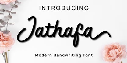 Jathafa is a cute and casual handwritten font with a very friendly feel. Whether you’re looking for fonts to make beautiful wedding invitations, beautiful artwork, interesting social media posts, and funny greeting cards. Jathafa also has several alternative letters that can make your project look modern, luxurious and classy. This font will turn any creative idea into a true work of art!
 - Brown Pro by Shinntype,
$39.00 At text size, Brown is a classic grotesque, distinguished by its semi-condensed proportions—especially in the capitals, which harmonize well with the lining figures—and an exceptional clarity in certain high-resolution media, such as offset printing, achieved by micro-detailing. At display size, the detailing provides the otherwise austere forms of the neo-grotesque with a subtle wealth of visual interest.
 - Willbelove by Realtype,
$16.00 Willbelove is a natural brush script typeface with swashes. This font will give your designs that fresh, edgy feel and will look lovely on quotes, fashion magazines, logo's & any other awesome project. Try mixing your design with this font. Feel free to pair Willbelove with a sans serif or serif typeface of your choice. Find interesting layouts to compliment your project.
 - Namyv by Poloskov,
$14.50 Namyv is the first font I did ... and now it’s improved! I combined all the best of the font. It’s unique and interesting. A great choice for website and app designs. I'm using Namyv Bold for posters and other print designs. It's very strong! And you can combine Namyv font with any Sans Serif font. They will look fantastic. Cyrillic characters included!
 - Golden Badge by Genesislab,
$17.00 Golden Badge is a luxurious yet elegant display uppercase font. characters that suit today's styles will be very interesting for you to create any design work with a classy model that still maintains a calm and classy style to look at. You definitely have inspiration to combine with your creativity! . Golden Badge . Multilingual Support. . Swash Thank You! Enjoy it for you
 - Kaleidos by Melvastype,
$32.00 Kaleidos is a lining and clean brush script with soft and round letterforms. It is sketched and drawn with a pointed brush pen. Kaleidos has plenty of alternates, ligatures and swashes so you can build interesting-looking words and headlines. Although Kaleidos is condensed and quite tightly spaced it is clear and legible. Check out also the Rough version: Kaleidos Rough
 - Bala Cynwyd NF by Nick's Fonts,
$10.00This distinctive poster face is based on the work of Dard Hunter, one of the pioneers of typographic design within the Arts & Crafts movement. Use it to create distinctive headlines, or to add some architectural interest to your designs. This font contains the complete Latin language character set (Unicode 1252) plus support for Central European (Unicode 1250) languages as well.

