10,000 search results
(0.021 seconds)
- Tamba Sans by Dharma Type,
$19.99 Tamba Sans has strong geometric frames. Somewhat condensed and somewhat squarish letterforms can create a powerful atmosphere. At the same time, the very clear, neutral and distinguishable letterforms make it legible and readable. With the spread of the internet, the digital world is overflowing with “designed” stuff. To survive this chaotic world as a designer, you should use a strong typeface to catch the eyes of an unspecified large number of visitors/customers. This is why it is so important to be strong and powerful. One more important thing is the legibility, but the eye-catching design has a tendency to be unusual. Those two things conflict with each other. Tamba Sans solved this problem with an exquisite balance. Tamba Sans consists of 7 weights and their matching Italics for a wide range of usages. Farther, Tamba Sans is supporting international Latin languages and basic Cyrillic languages including Basic Latin, Western Europe, Central and South-Eastern Europe. Also CSS covers Mac Roman, Windows1252, Adobe1 to 3. This wide range of international characters expands the capability of your works.
 - Linotype Nautilus by Linotype,
$29.99According to Hellmut G. Bomm "Nautilus was based on a handwritten type used for the text Li. Das Helle, Klare from the I Ging. "The intention was to create a clear, highly legible typeface. While the even strokes of sans serif types eventually tire the eyes in long texts, the marked stroke contrast of Nautilus lends the type its legibility. The characters were drawn with a broad tipped pen, and like an antiqua type, the forms of Nautilus display a variety of elements. The narrow figures with relatively large spaces between them create an overall open appearance and allow a large quantity of text to fit into a small space. "The headstrong forms of Nautilus make this an excellent display type. The italic weights are independent typefaces with hints of a handwritten character." - Mid Century Sans by Dharma Type,
$19.99 Mid Century Sans (MCS) is composed of high-geometric shapes. László Moholy-Nagy —professor in the Bauhaus— said “Typography is a tool of communication. It has to be communication in its most intense form. The emphasis must be on absolute clarity since this distinguishes the character of our own writing from that of ancient pictographic forms.” As same as you can see in modern typefaces in the early twentieth century, MCS has very efficient, clear and minima letterforms. There are not any decorative parts in the skeleton of letters. At the same time, Mid Century Sans has one more feature. In the middle of the twentieth century, one big movement which was called Mid-century modern had occurred. The Mid-century modern movement in the U.S. was an American reflection of the International and Bauhaus movements and it was slightly more organic in form and less formal than the International Bauhaus-style. In other words, it was friendly and stylish. We added Mid-century-spices to the Bauhaus-modernism. The basic letter form is geometric yet it has very friendly strokes and human touch. Mid Century Sans consists of 8 weights and their matching Italics for a wide range of usages. Farther, Mid Century Sans is supporting international Latin languages and basic Cyrillic languages including Basic Latin, Western Europe, Central and South-Eastern Europe. Also MCS covers Mac Roman, Windows1252, Adobe1 to 3. This wide range of international characters expands the capability of your works. Lowercase "a" has OpenType stylistic alternates for advanced typography.
 - Conrad by Linotype,
$29.00The award-winning Conrad was created by Japanese type designer Akira Kobayashi. Its design was based on the fifteenth-century type by Conrad Sweynheym and Arnold Pannartz, two German printers active in Rome at that time. They produced a unique, slightly unbalanced yet attractive type. Kobayashi says of his typeface, “I have designed a couple of typefaces inspired from the past, but this time the original print acted merely as a reference. The distinctive lowercase ‘a’ and some other letters were inspired by Sweynheym and Pannartz’s second roman type, but I revived the type in a more informal way. Here I used the historical type as a springboard. The resulting type looks different, taking on a rather temporary and lively look. I assume that the Conrad is the first revival of the Sweynheym and Pannartz type, though it does not closely resemble the original.” Conrad won first prize for the text typeface category in Linotype’s Third International Typeface Design Contest (2000) as well as the Certificate of Excellence in Type Design from the Type Directors Club (2001). - Fatman by AType,
$17.95Fatman is such big thick person. To me it seems to the most interesting font Fatman BL. I name it fatman with the broken leg. The letter A is similar to it. - Dioxide by Fype Co,
$16.00 Dioxide typeface classic taste including two styles regular and texture, its authentic and very interesting to make a memorable vintage logo, packaging, poster or title design with a serif and victorian style.
 - Lemon Salt by FadeLine Studio,
$18.00 Lemonsalt Script! This is a handwritten font made with care and sweetness. With upright calligraphy text form and dancing as well as some additional alternate characters will make it more interesting. Thanks!
 - The Soulty by Forberas Club,
$16.00 The Soulty made for something interesting and excited, or you can make your wedding invitation with this beautiful font and you can use this font for your party or cute moment. Cheers
 - Safina Bralyn by Arendxstudio,
$21.00 Safina Bralyn is a handwritten signature font which is very elegant and modern for you to use and your design interests be it for logos, branding names, posters, podcasts and so on.
 - Sinkin Sans Narrow by K-Type,
$20.00 Sinkin Sans Narrow is a simple, pleasantly proportioned and easy to read sans-serif, available in all 9 standard web weights, 100 to 900, plus italics, so the face is a comprehensive illustration of the CSS web font numerical scale. Sinkin Sans fonts are designed with tiny, inconspicuous notches that sink into verticals at the intersections of strokes, adding highlights to congested corners. The incisions make right angles appear sharper and improve definition in more intricate characters. Sinkin Sans Narrow inherits the enviable clarity and readability of the luxuriously wide original family. The Narrow typeface, however, is designed to economise on space within busy web pages and has been sensitively condensed for maximum legibility. Each weight of Sinkin Sans Narrow is supplied with a free Italic.
 - Electrum by Tower of Babel,
$9.00 Electrum is an all-caps layered font that presents a plethora of permutations for any use. Inspired by handlettered signage of the 1950's and 60's, Electrum has one foot in the past and one in the present. Use a single weight, or mix and match weights to create a number of interesting and eye-catching combinations. The "lightning" weight is especially interesting and adds a bit of electricity to any design. Perfect for logos, packaging designs, or poster designs. Whatever the usage, Electrum can add some spark to your project!
 - Anghones by Maculinc,
$18.00 Anghones Script is a simple typeface - easy to read and comfortable to wear! You can use them as logos, badges, badges, packaging, headlines, posters, t-shirts / clothing, greeting cards, business cards, and wedding invitations and more. The flowing characters are ideal for creating interesting messages to your taste. Mix and match a group of alternate characters to fit your project. It will be more interesting if you add swashes! Alternate characters in this font are divided into several OpenType features such as Stylistic Alternates, Ligatures and Ligature Alternates. Email support: maculinc@gmail.com Thank you! -Maculinc
 - YahoschWormy by Ingrimayne Type,
$9.00 Years ago the company that developed Fontographer marketed a program called Font-o-Matic, a program that distorted fonts in various ways. 99% of what it produced was garbage, but every once in a while it would yield something interesting. Since I had designed a lot of typefaces by that time, I had lots of material to feed it and it was fun to see what it produced. YahoschWormy is one of rare results that was interesting enough to save and clean up. The source font was Yahosch.
 - KolkFizzy by Ingrimayne Type,
$9.95 Years ago the company that developed Fontographer marketed a program called Font-o-Matic, a program that distorted fonts in various ways. 99% of what it produced was garbage, but every once in a while it would yield something interesting. Since I had designed a lot of typefaces by that time, I had lots of material to feed it and it was fun to see what it produced. KolkFizzy is one of rare results that was interesting enough to save and clean up. The source font is Kolkman.
 - BaumSquiggle by Ingrimayne Type,
$9.00 Years ago the company that developed Fontographer marketed a program called Font-o-Matic, a program that distorted fonts in various ways. 99% of what it produced was garbage, but every once in a while it would yield something interesting. Since I had designed a lot of typefaces by that time, I had lots of material to feed it and it was fun to see what it produced. BaumSquiggle is one of rare results that was interesting enough to save and clean up. The source font is Baumfuss.
 - Dryer Grain by Patrick Dewenter,
$- This typeface is intended for use with single words or phrases at a large point size. Suggesting some sort of calligraphic inspiration, I sketched a couple of these letters while creating a logo concept and decided to make a complete alphabet. The stroke through the letterforms adds some interest and elegance, although I believe this typeface expresses a sort of vehement or serious character. This is my new, and first, typeface. I plan to create more in the future. If you use it for anything interesting, I'd love to see!
 - Calypso I by Typolar,
$65.00 Calypso I (Italian) draws its inspiration from type founders' plentiful show-off-letters, which were typical on title pages and lithographs in the early 19th century. It borrows luscious details from these but inherits a stiff modern backbone from its parent, Calypso E (Egyptian). Within the Calypso type family all fonts share the same dimensions and work together consistently. Calypso I supports many languages and includes, for example, four sets of basic numerals, circled numbers, alternative characters, case sensitive forms and dingbats. Give it a go on drop caps and headlines or even set short paragraphs with it. It loves colour and effects.
 - Linotype Compendio by Linotype,
$40.99Linotype Compendio is a part of the Take Type Library, chosen from the contestants of the International Digital Type Design Contests from 1994 and 1997. Christian Bauer designed this font based on the basic forms of Transitional faces of the 17th century. The outer contours of the letters are purposely raw and irregular, much like alphabets printed on low-quality paper. The legibility of the font is thus reduced, making it necessary to use this font only for shorter texts or headlines, but it is exactly this characteristic which lends Linotype Compendio its distinctiveness. - Linotype Clascon by Linotype,
$29.99Linotype Clascon is part of the Take Type Library, which features winners of Linotype’s International Digital Type Design Contest. Designed by the British artist Rachel Godfrey, the constructed forms of the capitals are reminiscent of sketches of many famous 16th century artists, Albrecht Dürer and Nicolas Jaugeon among them. This style emphasizes the mathematic construction of the letters, based on the circle, rectangle and triangle, but Clascon’s historical roots lie in Transitional and Modern Face styles. This font is particularly suited to very short texts, headlines and initials. - Linotype Fresh Ewka by Linotype,
$29.00Linotype Fresh Ewka is part of the Take Type Library, chosen from the contestants of Linotype’s International Digital Type Design Contests of 1994 and 1997. This fun font was designed by Polish artist Dariusz Nowak-Nova and each letter seems to be a work in itself. The fine hair lines are decorated with tiny squares and look like wires with nodes while the thicker strokes have indefinite contours and seem to have been made with a thick brush. Linotype Fresh Ewka is suitable for headlines in large point sizes. - Linotype Sunburst by Linotype,
$29.99Linotype Sunburst is part of the Take Type Library, chosen from the contestants of Linotype’s International Digital Type Design Contests of 1994 and 1997. Designed by British artist Ed Bugg, Linotype Sunburst is a font which consistently avoids all that is round. The forms are angular and pointed with triangular serifs which seem almost like flags waving from the paper. This playful font could easily be associated with sun, sand and vacation. Linotype Sunburst is intended for headlines in large point sizes or short texts with medium point sizes, if used carefully. - Linotype Red Babe by Linotype,
$29.99Linotype Red Babe is part of the Take Type Library, chosen from the entries of the Linotype-sponsored International Digital Type Design Contests of 1994 and 1997. With Red Babe, Austrian designer Moritz Majce produced an energetic typeface which gives an impression of movement and change. The letter forms seem to be composed of countless fragments which can’t sit still, fragments which make the original forms burst and then draw them back together with their own rhythm. Linotype Red Babe is best used for headlines in larger point sizes. - Linotype Tapeside by Linotype,
$29.99Linotype Tapeside is part of the Take Type Library, chosen from the entries of the Linotype-sponsored International Digital Type Design Contests of 1994 and 1997. British designer Stephan B. Murphy created this typeface with light, regular and bold weights, each with its matching italic. Consciously awkward, the characters line themselves up and produce a young, lively image. Linotype Tapeside is best for headlines and shorter texts in point sizes of 12 and larger and its varying stroke strengths allow this font to be set more universally than others of its kind. - New Letter Gothic by ParaType,
$30.00 New Letter Gothic was designed for ParaType by Gayaneh Bagdasaryan based on monospaced Letter Gothic font by Roger Roberson, 1956–62. Due to clear and easy-to-read lettershapes of Letter Gothic the font is rather popular now for display and advertising matters. The idea was to create a font similar to Letter Gothic in lettershapes but with proportional widths of letters. For use in both display and text setting. New Letter Gothic has been adjudged an Award for Excellence in Type Design at Kyrillitsa ’99 International Type Design competition in Moscow, 1999.
 - Linotype Octane by Linotype,
$29.99Linotype Octane is part of the Take Type Library, selected from the contestants of Linotype’s International Digital Type Design Contests of 1994 and 1997. The font was designed by German artist Norbert Reiners, a tall, thin font with a narrow line width and marked stroke contrast. The regular and bold weights seem somewhat static while the italic cuts make a dynamic impression. Linotype Octane is available in four weights, each of which contains a number of ligatures. The cool and reserved Octane is best used for shorter texts and headlines in larger point sizes. - Linotype Algologfont by Linotype,
$29.99Linotype Algologfont is part of the Take Type Library, chosen from the contestants of Linotype’s International Digital Type Design Contests of 1994 and 1997. Designed by German artist Bjorn Hansen, the font contains exclusively capital letters and the forms of the characters look like branches or driftwood bent to form an alphabet and punctuation. The font is very flexible and can give text either a myterious and strange impression or a free and natural one, dependent on context. Linotype Algologfont is best suited to headlines in larger point sizes. - Linotype Pide Nashi by Linotype,
$29.99Linotype Pide Nashi is part of the Take Type Library, chosen from the entries of the Linotype-sponsored International Digital Type Design Contests of 1994 and 1997. German artist Verena Gerlach created a typeface which looks almost like Arabic at the first glance, only with the second do the familiar forms become clear. Rounded lower case letters, generous, sweeping capitals and diamond-shaped ornaments give the font its Arabic feel. The exotic Linotype Pide Nashi is best suited for short and middle length texts and headlines and especially for ornamental texts. - Linotype Bix by Linotype,
$29.99Linotype Bix Plain, from Argentinian designer Victor Luis Garcia, is part of the Take Type Library, chosen from the entries of the 1999 International Digital Type Design Contest for inclusion on the Take Type 3 CD. The font is composed exclusively of capital letters. The figures have constructed basic forms and show the influence of the advertisement types of the 1920s, with all their well-mannered details. The lower sections of the graceful letters are white and set against a black background, the upper sections are black on white. This makes the overall picture look as though written on stripes and gives the delicate letter stability. The nostalgic-modern Linotype Bix Pleain is best for headlines in point sizes of 18 or larger. - Delinda Script by Cooldesignlab,
$15.00 Delinda Script is a beautiful and interesting calligraphy handwriting font. You can see from scratches that give a realistic and modern style. font looks sweet and full of the best characters. you can use this font in your design product range like invitation, mockup, embossed, branding card and others. Bonus is Extra Swashes. Delinda Script includes a full set of large and attractive international letters, numbers, punctuation and ligatures. All lowercase letters include the beginning and end of the swashes. Also, follow multilingual symbols. The script is encoded with PUA Unicode, which allows full access to all additional characters without special design software. Mac users can use Font Books, and Windows users can use Map Characters to view and copy additional characters to be included in your favorite text editor / app. Thank you for the purchase. CooldesignLab,
 - Lost Brush by Stripes Studio,
$18.00 Lost Brush is a new, interesting brushed font, containing ligatures and swash. It is perfect for projects like brands, logos, product packaging, posters, invitations, greeting cards, news, blogs, and everything needing personal charm.
 - Dungarees by Victory Type,
$-Dungarees is a font on caffeine... It's a normal sans-serif typeface gone wild: jagged in some places, smooth in others. It makes documents not only fun to read but really interesting too! - Qundeasy by Tanya Savchenko,
$12.00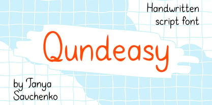 Qundeasy is a sloppy and cute handwritten font. First of all, it is suitable for handmade style design. Сan create interesting logos, posters, banners, social media creatives, postcards and greetings with this font.
 - Handprint by Turtle Arts,
$20.00Handprint was inspired by a set of old metal alphabet stamps, with a few modifications. Stamped in a sketchy manner, these metal stamps made the basis for a very interesting alphabet and font. - Delik by Typefactory,
$14.00 Delik is an interesting display font inspired by the style and feel of Arabic. This font is suitable for branding logos, Islamic themes, Ramadhan themes, and any other projects you can think of.
 - Barbarosa by Gassstype,
$27.00 Introducing our latest display typeface called Barbarosa - Vintage Typeface is Display Vintage Serif can make your logotype become more interesting. Best Vintage font multilingual support. inspired by the decorative arts and architecture movement.
 - Jamaistevie by Vladislav Ivanov,
$15.00Jamaistevie black is a very grungy but interesting 3D font, definitely better for a title than journaling, but particularly good for digital layouts as overlay text. It contains both Latin and Cyrillic alphabets. - Gruffly by Stripes Studio,
$19.00 Gruffly is a new font brushed very interesting, also provided some ligatures. It is perfect for projects for brands, logos, product packaging, posters, invitations, greeting cards, news, blogs, everything including personal charm etc.
 - Obschepit by Zaporozhan Dmitriy,
$15.00 When did it start. One day I was designing some stuff for a fast food café. By style the Café was made as an old Soviet canteen. So I had to do a special accent on this in menu, advertising posters and other print products. I decided to do this by interesting old school font. There are many cool retro fonts on the Internet, but not one of them satisfied me on 100%. The next step was to look at the old posters and find some inspiration. So I found some cool pictures with exact letters that I needed, but there were no typefaces to buy so that I can print some text with this exact letters. That's why I decided to do such typeface for my own. You can use this typeface in the field of nutrition, and it also will suit for cinema posters.
 - HWT Van Lanen by Hamilton Wood Type Collection,
$24.95 In 2002 Matthew Carter was commissioned to create a new design to be cut in wood by the then nascent Hamilton Wood Type Museum. This was significant in that this was the one format for which Carter had not yet designed type. The new design emerged as a two-part chromatic type to be cut specifically in wood. Originally called Carter Latin, the font was renamed Van Lanen after one of the Museum's founders. The first cutting and printing of the type took place in late 2009 and although it has been available through the Museum, contemporary wood-type production is expensive and few have acquired this font in wood. The digital version of the pair of Van Lanen fonts is now available. The design recalls Antique Latin wood type, but with a refined sensibility and intentional quirks (like the sideways ampersand). It is a wonderful addition to Carter's oeuvre, and to the ongoing history of wood type.
 - Airo by LetterMaker,
$28.90 Airo is a monospace type family with inverted contrast. The distinct shapes and detailing give Airo a strong typographic voice. The family comes in six carefully selected weights, from Light to Extra Bold, making it a versatile typographic tool. The family works best as a display typeface for creating a strong visual impact, but you can use the lighter weights for medium length text as well.