10,000 search results
(0.068 seconds)
- NBAres by Nicola Burgarella,
$9.00 This new font family full fit all your comic balloons, onomatopoeia and... SCREAMS! Comes with Regular, Italic and Bold Italic with a great organic look.
 - Boheld by Graptail,
$21.00 Boheld comes with 6 different style variations such as Sans, Serif, Bold, Condensed, and Inline. It is inspired by classic labels, tickets, posters, and more.
 - General Merchant JNL by Jeff Levine,
$29.00 General Merchant JNL is a bold, compressed sans design in the 'Grotesk' fashion with varying character widths and flattened tops on the usually rounded characters.
 - Susa by Hubert Jocham Type,
$29.90 Susa is an elegant and flowing brush script typeface. Ideal for short text in the lighter weights and for headlines in bold and heavy weights.
 - Boa by Alien,
$30.00 Boa bold is a basic display font made for print. It was created for an Artbook about reptiles. It needed to be round and clear.
 - Architec by Monotype,
$29.99This caps only hand lettering could have come from an architect. Speedy written on a 45 degree slope with a bold felt pen or brush. - Rosianne by HandletterYean,
$10.00 Rosianne is a bold and unique handwritten font with a distorted and classic feel. It will effortlessly turn any creative idea into a stand out.
 - Battom Glory by Sealoung,
$10.00 Battom Glory is a bold and distinct blackletter font. Add this font to your creative ideas and notice how it will make them stand out!
 - Buttoneer by DonkeyWorx,
$20.00Buttoneer is a specialist symbol font for representing media controls such as play, stop, fast forward, and so on as well as other icons useful in developing multimedia or interactive applications. Also useful in printed materials for representing these items - for example software or hardware manuals. Layout optimised for use with codepage utilities e.g: CharMap. - Evening Edition JNL by Jeff Levine,
$29.00Evening Edition JNL pays tribute to the ever-decreasing line of daily newspapers in this country by emulating the "wood type" look of the headlines. Way before the Internet took over as a popular information source, it was the morning, afternoon or evening edition of a paper that presented the big story of the day. - Angelus by Sudtipos,
$59.00 Angelus is a flowing script that can be seen as a more casual modern version of the copperplate script, with a fresh take on the way the ascenders and descenders interact with the totality of the setting. Angelus is ideal for use in package design, as well as on personalized collateral and book covers.
 - Ongunkan Slavic Runic by Runic World Tamgacı,
$40.00 This font contains the Slavic version of the Runic script. Slavic runic script contains 18 characters. This font can be used with both latin keyboards and cyrillic based keyboards. In the development of this font, I used internet resources and could not find a written source. I wish you to use it in good work.
 - Quarca by insigne,
$24.75 Quarca's masculine power runs strong across the page with bold self-assurance and a raw energy that courses through its thick veins. Don't think the continuous, smooth geometry of this semi-modular face is captively chained to the grid, though. Quarca has been cautiously optimized to engage the reader's eye. Achieving an attractive balance to its sturdy design, the open forms of this "rounded square" geometric sans -together with a tall x-height- make the font legible even when using the compact widths. This high-impact typeface definitely doesn't sacrifice versatility for style. These compact widths, with their raw heart and strength, are perfect for callouts, while the extended widths provide you with the platform for a punchy and extremely efficient headline. The font has a thinner weight and transcends to an intense bold. The face's geometric or technological construction also tends to make it right at home on the web. The family consists of 36 fonts -six weights plus italics. Where Quarca truly stands out, though, is its wide number of OpenType typographic choices and optional glyphs, allowing you to design your piece with a personal, one-of-a-kind variant touch. These variations consist of Experimental Capitals, Angled Capital Terminals, and "Future Stencil". In all, you can find more than one hundred of these alternate glyphs. Quarca is well-suited for anything you are able to throw at it. Devised for today's multi-disciplined designer, this clear and infinitely versatile family provides tremendous value to your toolbox.
 - Calissha Script by Mega Type,
$10.00 Calissha Script is a handmade font created with a brush and ink, bold and irregular baseline. Contains a complete set of lowercase, uppercase, alternates, ligatures, punctuation, numbers, and multilingual support. And additional Calissha Capitals, working in harmony with Calissha Script to create typography awesome creations. Get some inspiration from the preview above. Contains a complete set of lowercase, uppercase, ligatures, punctuation, numbers, and multilingual support. Calissha Script is perfect for use in watercolor design or lettering style bold hand, such as blog header, branding, t-shirt, weddings, social media, product design, stationery, advertising, apparel, cover books, business cards, greeting cards, branding, merchandise, invitations and handmade quotes and more. Calissha Script features OpenType stylistic alternates, ligatures and International support for most Western Languages is included. To enable the OpenType Stylistic alternates, you need a program that supports OpenType features such as Adobe Illustrator CS, Adobe Indesign & CorelDraw X6-X7, Microsoft Word 2010 or later versions.How to access all alternative characters using Adobe Illustrator: https://www.youtube.com/watch?v=XzwjMkbB-wQ Calissha Script is coded with PUA Unicode, which allows full access to all the extra characters without having special designing software. Mac users can use Font Book , and Windows users can use Character Map to view and copy any of the extra characters to paste into your favourite text editor/app.How to access all alternative characters, using Windows Character Map with Photoshop: https://www.youtube.com/watch?v=Go9vacoYmBw If you need help or have any questions, please let me know. I'm happy to help :) Thanks & Happy Designing!
 - Groundage by Mofr24,
$11.00 Groundage is a Gothic Blackletter font that offers three styles: Outline, Regular, and Shadow. With its bold and clean calligraphic strokes, this typeface boasts a modern-vintage look that exudes elegance and masculinity. Its Y2K-inspired design makes it perfect for stylish posters, marketing materials, logotypes, and headlines. Additionally, it is great for art and craft projects, y2k-streetwear designs, and much more. What sets Groundage apart from other Gothic Blackletter fonts is its unique combination of traditional and modern design elements. Its clean lines and bold strokes give it a contemporary feel while its Blackletter roots pay homage to its historical origins. Groundage also includes both Latin and Cyrillic character sets, making it a versatile option for a range of projects. This font pairs well with other modern-vintage fonts and looks great alongside sans-serif fonts for contrast. Its three styles allow for versatility in design and can be used for a variety of creative projects. Groundage was designed with the intention of creating a stylish, masculine font that could be used in a variety of contexts. Its Y2K-inspired design concept was chosen to evoke nostalgia while still feeling fresh and modern. The combination of traditional Blackletter elements with a contemporary twist creates a unique aesthetic that stands out from other fonts in its category. Groundage is not based on any historical design, but its Blackletter roots pay homage to centuries of typographical tradition. Its modern twist on the classic Gothic style creates a unique and versatile font that can be used in a range of creative projects.
 - Body by Zetafonts,
$39.00 Body graphic project at Behance Body is a type family designed for Zetafonts by Cosimo Lorenzo Pancini with Andrea Tartarelli. Conceived as a contemporary alternative to modernist superfamilies like Univers or Helvetica, Body tries to maximize text readability while providing a wide range of options for the designer. It comes in two variants (Body Text and Body Grotesque), each in four widths and four weights: regular and bold for basic typesetting, light and extrabold for display use. Body Grotesque applies to the sans serif modernist skeleton little imperfections and quirks inspired by our research in early 20th century type specimens. Curves are slightly more calligraphic and a light inverse contrast is applied to bold weights, giving the typeface a slight vintage appearance in display use. Body Text, on the contrary, challenges the modernist aesthetics maximizing horizontal lines and using open terminals for letters like “s” and “a” that appear normally dark in modernist grotesques. For both variants, the normal width family is slightly condensed in an effort to maximize space usage; the Slim width is provided for extremely dense texts or side notes while the Fit width is optimized for display usage as in logos, headings or titles. The Large width manages to look elegant in its light weight while becoming a valid heading or subtitle font in its extrabold weights. All the 64 fonts in the Body superfamily include a complete latin extended character set with small caps for over 70 languages, Russian cyrillic, open type positional numbers, stylist sets and alternate forms.
 - The "Janda Closer To Free" font, designed by Kimberly Geswein, embodies a perfect blend of casual charm and heartfelt emotion, making it stand out in the realm of typography. This font captures the e...
- Kardinal by Ani Dimitrova,
$30.00 Kardinal is a sans serif humanistic type family. The family has 16 weights, ranging from Thin to Black with extra drawn italics and small caps versions. The Kardinal type family is ideally suites for small text, books and magazines, branding, posters, as well as web and screen design, headlines and more. Kardinal comes in 16 styles with extended language support. All weights contain standard ligatures, proportional figures, tabular figures, old style figure, numerals and arrows, matching currency symbols and fraction. The construction of characters combines clean grotesque style and calligraphic features with humanist fragrance. Out standing for the designs are the small serifs. They are giving the letters movement and freshness, as well as contribute to a better readability in different volume texts and including lots of details that give it a unique personality. The Regular and Medium weights are perfect for body text while the italic give an interesting texture to the text. The range of styles give a good flexibility to this family. The fonts are carefully hinted and perfect for digital use.
 - Ansage by Sudtipos,
$49.00 Ansage does not claim to be neutral; it escapes from the rationalist sans of closed strokes and regular forms. Meaning Announcement in German, Ansage is versatile and communicates effectively across a broad range of media and formats such as branding, posters, websites, apps, titles and compositions with little spacing). Ansage is a sans serif font with a strong personality that emerges from an interest in and the study of a wide variety of typographic specimens of Gothic fonts from the nineteenth century. The design process behind Ansage brought about constant transformations in form; the result is a compact and robust font, with a large x-height, small ascenders and descenders, and open terminals that grow in expressiveness as it increases in weight. It is available in 10 weights, ranging from Hairline to Black, and 3 widths – Condensed, Regular and Expanded – plus italics, which make a total of 60 perfect variables to combine and contrast with each other. In addition, it also includes multiple open-type functions such as alternative styles, Old Style Figures, Tabular Forms, fractions, case sensitive, ligatures and more.
 - Bu Global by Butlerfontforge,
$18.00 While throned before your keys, under your drumming fingers awaits the most astounding standard computer typeface ever devised: BuGlobal. In addition to all the usual alphanumeric characters and symbols, this lone font lets you type more than 400 accented letters appearing in more than 80 English-variant languages worldwide, 70 common math and science symbols, and dozens of other useful characters —more than half a thousand all told— all within the digital parameters of one standard computer typeface, without needing any alternate keyboards or other clumsy digital luggage. Here is a sample: You can add any accent appearing in more than 80 English-variant languages used around the world to any letter appearing in all these languages simply by typing ANY letter then the accent. This includes more than 400 diacritic-laden letters in all —without needing to remember several keystrokes to type any of these letters as a few of them appear in standard computer typefaces. You can type more than 50 math/science symbols that do not appear in standard computer typefaces. These new symbols include several kinds of arrows plus constants, centerlines, dimensions, and graphs and scales that when retyped create continuous scales and graphs. Common symbols such as ballot boxes, rating stars, checkboxes, hearts, fancy fleurons, and similar motifs that do not appear in standard computer typefaces. Dozens of flashy arabesques like ========= [in BuGlobal these equal signs are kerned together so when you type them you create a continuous double line]. In this typeface more than 30 symbols that never appear twice in a row are kerned together so when you continuously type them you create all kinds of flashy arabesques that will make your typing more attractive. No other standard compute typeface allows you to do this. As for Beauty, BuGlobal’s characters are designed according to several axioms of ocular perception until each profile is as iconically simple as Shaker furniture. These axioms make BuGlobal’s letters easier to read compared to other typefaces, and a few of them are: Each letter should look much like the others but for one defining detail. The letters should be as similarly wide as possible. The letters’ midbars should be the same height and thickness. The higher the lowercase letters are compared to capital letters, the more legible and easily readable are their texts. BuGlobal has a typeface user’s guide, titled A Lovely Face, in which a description of each ocular axiom compares BuGlobal with Baskerville, Georgia, Palatino, and other commonly-used standard computer typefaces so you can quickly see why the other typefaces are inferior. You can download a pdf file of this typeface user’s guide, for free, at BuGlobal’s website, butlerfontforge.com, at any time so you can learn all about BuGlobal’s many amazingly new features before possibly buying it. BuGlobal’s plain letters are perfect for texts, its italics are gracefully emphatic, its bolds are ideal for titles and headers, and its arabesques are a fancy way to make your texts look dressy —all of which will add more shimmer to your semantic plumage. One good typeface is more useful than an infinity of poor ones. Robert Bringhurst
 - SaminoaDisplay - Unknown license

- Biggen - 100% free

- Penstyle - Unknown license

- Jellybean - Unknown license

- Pocono - Unknown license

- Maravilla by madeDeduk,
$14.00 Maravilla is a vintage font, come with single weight, legible and expressive shapes. A lot of stylish alternates characters will makes this font suitable for your any project design. Feature Uppercase & Lowercase Number & Symbol International Glyphs Multilingual support Alternative Ligature Hope you enjoy it.
 - Adolf William by Wildan Type,
$10.00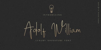 Adolf William is a handwritten signature script with a natural & stylish flow. This collection of scripts is perfect for personal branding. It was made with the intention to be used by Photographers as a watermark for Photography Business,personal branding & wedding invitations to advertising
 - Rapstomer by Dhan Studio,
$19.00 Rapstomer is a modern brush font, organic, dynamic, and energetic. It can be used for various purposes such as titles, signatures, logos, correspondence, letterheads, signage, labels, newsletters, posters, badges. Rapstomer includes alternates letters, ligatures and International support for most of the included Western Languages.
 - Yanus by ParaType,
$30.00 Designed at ParaType in 1997 by Tagir Safayev. Inspired by Neulin Sans of Ray Gun magazine (1996). The first version of the typeface was created as part of corporate identity program for Aeroflot–Russian International Airlines. For use in both text and display matters.
 - Ronal Diana by Sulthan Studio,
$12.00 Ronald - diana is a handwritten font of modern letters, very simple and light. This font is also very cute ... equipped with Alternative swash, and supports international languages as well., this font can also be connected by heart, it will be beautiful to look at.
 - Cortes by madeDeduk,
$14.00 Cortes is a retro display font, come with single weight, legible and expressive shapes. A lot of stylish alternates characters will makes this font suitable for your any project design. Feature Uppercase & Lowercase Number & Symbol International Glyphs Multilingual support Alternative Ligature Hope you enjoy it.
 - Delabasto by Seniors Studio,
$15.00 Delabasto is contemporary brush font, with the look of a stylish face. were painted on paper and carefully made into a font. can be used for stationery, fashion, logo, merchandise, books, clothing, magazines, cover artwork etc. Delabasto includes several ligatures, alternates and international support.
 - Bodoniez by Huy!Fonts,
$19.00 Nice typographic experiment consisting of the progressive "bodonization" I have summarized in two steps, by a letter drawn with the same concentration and intensity with which Paris Hilton reading a book, to get something like the sketches that Mr. Gianbattista used to Wrap the sandwich.
 - Punkstoric - Personal use only

- Spoonge Punk - Personal use only

- Black Audio - Personal use only

- Caligari Pro by Elsner+Flake,
$99.00 The silent film »The Cabinet of Dr. Caligari« (1920) is undoubtedly one of the breathtaking milestones within the German Expressionist Movement, a time of extraordinarily creative works of art as a reaction to a world in rapid change. The original intertitles of Caligari were worked out by the set designers (and painters) Walter Reimann, Walter Röhrig, and Hermann Warm, using a unique expressionistic language of form for dramatic and iconic lettering. When in 2010 KOMA AMOK’s Joerg Ewald Meißner and Gerd Sebastian Jakob were commissioned by the Institut Mathildenhöhe Darmstadt and publisher Hatje Cantz to design the catalog for the exhibition »The Total Artwork in Expressionism«—showing works of art, architecture, film, literature, theater, and dance—it was soon perfectly clear that a new typeface, inspired by the Caligari intertitles, should speak for all the expressionistic arts. An intense process of research and analysis began. The original letters of the Caligari intertitles were individuals on their own. Furthermore, each of the three title designers had added his specific approach to the basic Caligari type style. From hundreds of different As to Zs a choice had to be made, which should be THE characteristic Caligari letter for a digital typesetting font. Finally the chosen letters were cut and drawn again, missing letters were added according to the formal priniciples, all-in-all 1000 glyphs were digitised to complete a usefull OpenType font ready for use. When in the autumn of 2010 the exhibition started successfully with great media interest, the posters all over Darmstadt announced »You must become Caligari!« – set in the brandnew typeface. The font Caligari Pro offers alternative forms for every letter and a whole bunch of ligatures, thus creating an expressive, individual image of headlines and text. By using included Stylistic Alternates the image will get even more vivid. Caligari comes with a complete set of expressionist ornaments and true old style figures—thus the heyday of the Expressionist Movement and the era of the silent films can be revived typographically by the means of today: »Express Yourself!«.
 - Miedinger by Canada Type,
$24.95 Helvetica’s 50-year anniversary celebrations in 2007 were overwhelming and contagious. We saw the movie. Twice. We bought the shirts and the buttons. We dug out the homage books and re-read the hate articles. We mourned the fading non-color of an old black shirt proudly exclaiming that “HELVETICA IS NOT AN ADOBE FONT”. We took part in long conversations discussing the merits of the Swiss classic, that most sacred of typographic dreamboats, outlasting its builder and tenants to go on alone and saturate the world with the fundamental truth of its perfect logarithm. We swooned again over its subtleties (“Ah, that mermaid of an R!”). We rehashed decades-old debates about “Hakzidenz,” “improvement in mind” and “less is more.” We dutifully cursed every single one of Helvetica’s knockoffs. We breathed deeply and closed our eyes on perfect Shakti Gawain-style visualizations of David Carson hack'n'slashing Arial — using a Swiss Army knife, no less — with all the infernal post-brutality of his creative disturbance and disturbed creativity. We then sailed without hesitation into the absurdities of analyzing Helvetica’s role in globalization and upcoming world blandness (China beware! Helvetica will invade you as silently and transparently as a sheet of rice paper!). And at the end of a perfect celebratory day, we positively affirmed à la Shakti, and solemnly whispered the energy of our affirmation unto the universal mind: “We appreciate Helvetica for getting us this far. We are now ready for release and await the arrival of the next head snatcher.” The great hype of Swisspalooza '07 prompted a look at Max Miedinger, the designer of Neue Haas Grotesk (later renamed to Helvetica). Surprisingly, what little biographical information available about Miedinger indicates that he was a typography consultant and type sales rep for the Haas foundry until 1956, after which time he was a freelance graphic designer — rather than the full-time type designer most Helvetica enthusiasts presume him to have been. It was under that freelance capacity that he was commissioned to design the regular and bold weights of Neue Haas Grotesk typeface. His role in designing Helvetica was never really trumpeted until long after the typeface attained global popularity. And, again surprisingly, Miedinger designed two more typefaces that seem to have been lost to the dust of film type history. One is called Pro Arte (1954), a very condensed Playbill-like slab serif that is similar to many of its genre. The other, made in 1964, is much more interesting. Its original name was Horizontal. Here it is, lest it becomes a Haas-been, presented to you in digital form by Canada Type under the name of its original designer, Miedinger, the Helvetica King. The original film face was a simple set of bold, panoramically wide caps and figures that give off a first impression of being an ultra wide Gothic incarnation of Microgramma. Upon a second look, they are clearly more than that. This face is a quirky, very non-Akzidental take on the vernacular, mostly an exercise in geometric modularity, but also includes some unconventional solutions to typical problems (like thinning the midline strokes across the board to minimize clogging in three-storey forms). This digital version introduces four new weights, ranging from Thin to Medium, alongside the bold original. The Miedinger package comes in all popular font formats, and supports Western, Central and Eastern European languages, as well as Esperanto, Maltese, Turkish and Celtic/Welsh. A few counter-less alternates are included in the fonts.
 - Sign Letters JNL by Jeff Levine,
$29.00 A few scant examples of some condensed Roman style water-applied decals inspired Sign Letters JNL. The decals were once part of the gold and black "Signmaker" letters and numbers once manufactured by the Duro Decal Company of Chicago and were sold through hardware and variety stores across the country. The condensed letters (which were eight inches in height) did not sell as well as Duro's mainstay sizes of 1/2 inch to 3-1/2 inches and were discontinued long before the rest of the line was supplanted by self-adhesive lettering.
 - Hostrange by Ditatype,
$29.00 Hostrange is a captivating handwritten font that brings a touch of authenticity and personality to your designs. With its brush-style letterforms and varying brush stroke thicknesses, this typeface captures the essence of handcrafted charm. The special feature of this handwriting lies in its dynamic brush stroke variations, where each letter showcases a range of thicknesses. This adds a sense of organic movement and visual interest to the font, mimicking the natural variations found in hand-drawn brush calligraphy. The result is a font that feels alive and full of character. The brush strokes create a natural and flowing appearance, as if they were crafted by hand with a brush. The varying thicknesses add depth and dimension, enhancing the font's authenticity and handcrafted feel. The letterforms of Hostrange strike a balance between legibility and artistic expression. While each letter maintains its distinctive shape, the varying brush stroke thicknesses bring a sense of uniqueness to each character. Features: Alternates Ligatures Multilingual Supports PUA Encoded Numerals and Punctuations Hostrange fits in headlines, logos, posters, invitations, packaging, branding materials, or any project that calls for a handwritten aesthetic. Find out more ways to use this font by taking a look at the font preview. Thanks for purchasing our fonts. Hopefully, you have a great time using our font. Feel free to contact us anytime for further information or when you have trouble with the font. Thanks a lot and happy designing.


