10,000 search results
(0.165 seconds)
- M Windy HK by Monotype HK,
$523.99HK series fonts are in Unicode encoding and consists of BIG 5 character set and HKSCS characters. The character glyphs are based on the regular Traditional Chinese writing form and style. It is generally used in Taiwan ROC, Hong Kong and Macau. - Konega by Haniefart,
$17.00 Konega is a handmade typeface with a unique and modern style, comes in two versions, namely regular and italic, and is available in uppercase, lowercase, ligature and alternate. Konega is suitable for business brands, magazines, comics, t-shirts, banners and many others.
 - Mobil Pro by RMU,
$35.00 In 1960 Ludwig & Mayer released this Matheis design which was completely redrawn, digitized and extended for most main European languages, West and East. To take advantage of all ligatures in this font, I recommend to activate both OT features, standard and discretionary ligatures.
 - Post Box by Great Scott,
$16.00 Written in a ballpoint pen style POST BOX is a neighborly sans serif is slightly condensed and slanted. Scribbled quickly but readable. Exact but still human. Perfect for print, package and display use. You can also use it in shorter paragraph text.
 - Movie Nouveau JNL by Jeff Levine,
$29.00 A 1920s magazine featuring behind-the-scenes stories about the motion picture industry had its name [“Shadowland”] lettered in an Art Nouveau sans serif style. This has been recreated digitally as Movie Nouveau JNL, and is available in both regular and oblique versions.
 - No Liming by chicken,
$17.00 A chunky, laid-back typeface inspired by a hand-painted notice on the doors of a mechanic's workshop in Plymouth, Tobago. Two different mostly-uppercase alphabets in one font help to keep things loose. 'Liming'? hanging out, drinking rum, shooting the breeze...
 - M HG Reithic T HK by Monotype HK,
$523.99HK series fonts are in Unicode encoding and consists of BIG 5 character set and HKSCS characters. The character glyphs are based on the regular Traditional Chinese writing form and style. It is generally used in Taiwan ROC, Hong Kong and Macau. - GrottoGoth by Grey Fortress Ent,
$20.00 GrottoGoth is a sans serif created to expand the availability of fonts used in creating Gothic, Halloween, and overall spooky designs. This is the first font designed by Grey Fortress Enterprises. Additional variations are planned and other original fonts are in the works.
 - Vedo by Wiescher Design,
$19.50 The name Vedo is derived from the Latin word for "I see". Vedo is a new, sturdy Sans Monoline in 7 weights and 7 Italic cuts. The Thin cuts are free of charge. Yours designing new fonts in the Bauhaus tradition - Gert Wiescher
 - Common Stencil JNL by Jeff Levine,
$29.00 Common Stencil JNL takes a vintage lettering stencil from the 1980s with imperfectly bent cutting dies [which unintentionally gave the characters a distressed or "grunge" look] and recreates it in a digital form. The design is available in both regular and oblique versions.
 - Word From Radio by Dharma Type,
$14.99 Based on retro vinyl records in the middle of 20th century. the mixture of funky, hippie and mid-century’s futuristics. There are three other fonts designed by in the same concept. -African Elephant Trunk -Moon Star Soul -Rebel Train Goes -Word From Radio
 - Levnam by ParaType,
$30.00 Levnam is a sans-serif family with quite wide proportions, slightly thickened terminals and wide sidebearings. The font is well suitable for setting text in small point sizes, similar to Bell Centennial or Verdana. Designed by Manvel Shmavonyan. Released by ParaType in 2015.
 - Message Of The Birds by chicken,
$14.00 A handful of these spiky, sprightly letters made up the twittering title page of 'Message Of The Birds', a song by one Flora Warner, found in stacks of crumbling scores on an old upright piano in the basement of a favorite London bookstore.
 - Evening Sans by cm5dzyne,
$12.00Evening Sans is a slightly more formal, upright version of sibling font Morning Sans, most effectively used in small-to-medium sizes for print material. Its semi-condensed width and large x-height add to its legibility, particularly in long blocks of text. - Endure by Spinturnix,
$10.00 Endure is a new hand-painted brush font created to add a high detail and realistic feel to any project. Every glyph in Endure was painted by hand on actual paper and scanned in manually - A lengthy process, but worth the fine detail!
 - Sutton Place JNL by Jeff Levine,
$29.00 Named for a Manhattan neighborhood, Sutton Place JNL is based on a 1930s-era poster advertising training in the “Household Arts” that was produced by the Federal Art Project in Ohio; a segment of the larger Depression Era WPA (Works Progress Administration).
 - Astrospy JNL by Jeff Levine,
$29.00Astrospy JNL is a square-shaped, futuristic techno-style font from Jeff Levine. It is very well suited for short phrases, but caution should be used in setting too many words with it because of legibility issues. Best used in larger point sizes. - FDI Triumph by FDI,
$29.00 FDI Triumph revives Albert Auspurg’s “Triumph” typeface originally released in 1929 by the type foundry Ludwig Wagner in Leipzig. The forgotten design was carefully digitized from the original wood type font and extended to cover the Western codepages Win 1252 and Mac Roman.
 - Restrick by ZetDesign,
$15.00 Restrick is a strong display font. uses curved corners for flexible use on a variety of media displays. This font is very suitable for use as a headline in a newspaper, poster, or magazine. This font is available in regular and italic format.
 - Osnova Navigation by AndrijType,
$18.75 The common Slavic word Основа (Osnova) means basis in English and βάση in Greek. This universal but still distinctive typeface can make a good ground for any design project. Special Navigation version separated by Western Latin, Greek and Cyrillic families is here.
 - Kapra by Typoforge Studio,
$15.00 To design a font Kapra, I was inspired by a You And Me Monthly published by National Magazines Publisher RSW „Prasa” that appeared from Mai 1960 till December 1973 in Poland. The font Kapra is designed in eight versions – lower and uppercase characters.
 - Dada Slab Pro by Dada Studio,
$20.00 Dada Slab Pro is simple in form but an elegant font with huge language support and open-type features like ligatures, stylistic alternates, fractions, four variations of numerals and many more... It is suitable for large headlines in applications like magazines or newspapers.
 - Albion's White Christmas by Greater Albion Typefounders,
$14.00 “Albion’s White Christmas” can only be described as a snowy blackletter. In the tradition of old childrens' comics, yuletide magazine mastheads and vintage Christmas cards, it is a snow draped blackletter ideal for the winter holidays and letting in the spirit of Christmas.
 - Sur by Horacio Lorente,
$20.00 Sur is a modern minimalist sans-serif typeface available in two weights (normal and bold), with a good shape for big editorial headlines and fashion publications. It was developed during 2009, trying to find a new way to express ideas in editorial projects.
 - Slutsker Script by ParaType,
$30.00Designed in 2003 by Isay Slutsker and Irina Smirnova. Based on the calligraphic typeface of mid-1980 by Moscow type designer Isay Slutsker (1924-2002). There is a free variation of flat nib pen calligraphy. For use in advertising and display typography. - Julius by Wiescher Design,
$49.50 Julius comes in very handy if you want to jump back in time to the middle of the last century. Julius is also one of my first typefaces, recently I added the light version. Enjoy your trip back into the past, Gert Wiescher
 - Radio Show JNL by Jeff Levine,
$29.00 The 1933 sheet music compilation entitled "Kate Smith Memories Song Book" had the singer's name hand lettered in a bold, spurred serif typeface. This lettering design became the basis for Radio Show JNL, which is available in both regular and oblique versions.
 - FZ JAZZY 12 CRACKED - Unknown license

- Sign Artist JNL by Jeff Levine,
$29.00Sign Artist JNL is a casual typeface, emulating the hand-lettered look of show card and sign lettering. Created by Jeff Levine from lettering seen on some 1940's packaging, the slightly irregular letter stroke widths and shapes more closely resemble printing made with brush or ink. - Hardbones by Krntype Studio,
$16.00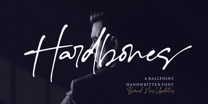 Hardbones is a stunning ballpoint signature font. font with unique natural flow and feminine style, made using a unique gel ballpoint ink. Each letter is deliberately imperfect to make it look more natural and charming. Hardbones comes with multilingual support, ligature, and ending swash from a-z.
 - Lettre by Latinotype,
$19.00 Lettre is a geometric serif font designed by Pablo Sinn. Thanks to its imperfections, this font looks like it is hand-lettered. Lettre brings back nostalgic feelings of mechanical typewriter characters and recovers the essence of the rustic and natural, what makes it a very modern typeface.
 - Maybelle by Monotype,
$15.99 Designed by calligrapher Rachel Yallop, Maybelle is pretty and proudly romantic, with delicate flourishes and a superbly handwritten, calligraphic sensibility. Drawn with a pointed pen and ink, this script boasts dainty loops and high contrast letterforms. Maybelle is available with some ligatures and alternate glyph shapes.
 - Superbrush by Hanoded,
$20.00 Superbrush is, well, a super brush font! Made with Chinese ink, a flat brush and a lot of patience. Superbrush would look great on book covers, product packaging, old school rock albums and T-shirts. Comes with a super amount of diacritics and double letter ligatures.
 - Arcano by Resistenza,
$39.00 After four long months of work, Arcano Type has finally been released. It was completely designed by hand, letter by letter, using Chinese ink on Japanese calligraphy paper. Arcano is inspired by nature, symbols, icons, jewels, hand-drawn designs and much more... Modern Love Slanted-Turquoise-Nautica
 - Lettering Project JNL by Jeff Levine,
$29.00 Lettering Project JNL was based on one of the many templates made by the Wood-Regan Instrument Company (also known as Wrico). Their sign making kits allowed anyone using the templates, special ink pens and alignment guides to create professional looking lettering with a minimum of experience.
 - Fontleroy NF Pro by CheapProFonts,
$10.00 I have completely redone the spacing in this font, making the sidebearings more conventional. And after replacing the kerning with fresh pairs working together with the new spacing the font looks like a real gem. I love it! The inline version has a wider spacing after the letters CEK = no connecting words. Otherwise just as lovely and retro! Nick Curtis says: "Here’s a strange hybrid: I took the lower case from the formal script font Stuyvesant, straightened out its rather extreme 22° slant, and combined them with caps from the font Bellevue, again making them upright, and adding an inline effect. The result is a font that flows very nicely, with a nice balance between clean lowercase characters and swashy caps. Thanks to Deb Dunbar for naming this font. Fontleroy Brown is the solid version, produced at the request of the King of Ding, Jeff Levine." ALL fonts from CheapProFonts have very extensive language support: They contain some unusual diacritic letters (some of which are contained in the Latin Extended-B Unicode block) supporting: Cornish, Filipino (Tagalog), Guarani, Luxembourgian, Malagasy, Romanian, Ulithian and Welsh. They also contain all glyphs in the Latin Extended-A Unicode block (which among others cover the Central European and Baltic areas) supporting: Afrikaans, Belarusian (Lacinka), Bosnian, Catalan, Chichewa, Croatian, Czech, Dutch, Esperanto, Greenlandic, Hungarian, Kashubian, Kurdish (Kurmanji), Latvian, Lithuanian, Maltese, Maori, Polish, Saami (Inari), Saami (North), Serbian (latin), Slovak(ian), Slovene, Sorbian (Lower), Sorbian (Upper), Turkish and Turkmen. And they of course contain all the usual “western” glyphs supporting: Albanian, Basque, Breton, Chamorro, Danish, Estonian, Faroese, Finnish, French, Frisian, Galican, German, Icelandic, Indonesian, Irish (Gaelic), Italian, Northern Sotho, Norwegian, Occitan, Portuguese, Rhaeto-Romance, Sami (Lule), Sami (South), Scots (Gaelic), Spanish, Swedish, Tswana, Walloon and Yapese.
 - TT Drugs Condensed by TypeType,
$29.00 TT Drugs useful links: Graphic presentation | Customization options TT Drugs Condensed—a modern font family which consists of 5 condensed sans serifs with a special contrast formula of lines and stems. TT Drugs Condensed is a condensed version of the TT Drugs font family. These fonts are perfect for design in the pharmaceutical industry: packaging, posters, blissery. However, those fonts can also be used in any other design, for example, in printing, logotypes and websites. Font family includes 10 most popular typefaces: thin, light, regular, bold, black and 5 appropriate italics. TT Drugs Condensed—a versatile tool for any design tasks. FOLLOW US: Instagram | Facebook | Website TT Drugs OpenType features: Case Sensitive Forms, Tabular Figures, Fractions, Numerators, Denominators, Superiors, Scientific Inferiors. TT Drugs language support: Acehnese, Afar, Albanian, Alsatian, Aragonese, Arumanian, Asu, Aymara, Banjar, Basque, Belarusian (cyr), Bemba, Bena, Betawi, Bislama, Boholano, Bosnian (cyr), Bosnian (lat), Breton, Bulgarian (cyr), Cebuano, Chamorro, Chiga, Colognian, Cornish, Corsican, Cree, Croatian, Czech, Danish, Embu, English, Erzya, Estonian, Faroese, Fijian, Filipino, Finnish, French, Friulian, Gaelic, Gagauz (lat), Galician, German, Gusii, Haitian Creole, Hawaiian, Hiri Motu, Hungarian, Icelandic, Ilocano, Indonesian, Innu-aimun, Interlingua, Irish, Italian, Javanese, Judaeo-Spanish, Judaeo-Spanish, Kalenjin, Karachay-Balkar (lat), Karaim (lat), Karakalpak (lat), Kashubian, Khasi, Khvarshi, Kinyarwanda, Kirundi, Kongo, Kumyk, Kurdish (lat), Ladin, Latvian, Laz, Leonese, Lithuanian, Luganda, Luo, Luxembourgish, Luyia, Macedonian, Machame, Makhuwa-Meetto, Makonde, Malay, Manx, Maori, Mauritian Creole, Minangkabau, Montenegrin (lat), Mordvin-moksha, Morisyen, Nahuatl, Nauruan, Ndebele, Nias, Nogai, Norwegian, Nyankole, Occitan, Oromo, Palauan, Polish, Portuguese, Quechua, Rheto-Romance, Rohingya, Romansh, Rombo, Rundi, Russian, Rusyn, Rwa, Salar, Samburu, Samoan, Sango, Sangu, Scots, Sena, Serbian (cyr), Serbian (lat), Seychellois Creole, Shambala, Shona, Slovak, Slovenian, Soga, Somali, Sorbian, Sotho, Spanish, Sundanese, Swahili, Swazi, Swedish, Swiss German, Swiss German, Tagalog, Tahitian, Taita, Tatar, Tetum, Tok Pisin, Tongan, Tsonga, Tswana, Turkish, Turkmen (lat), Ukrainian, Uyghur, Vepsian, Volapük, Võro, Vunjo, Xhosa, Zaza, Zulu.
 - P22 Stickley Pro by IHOF,
$39.95 Stickley Optical Family is an expansion of P22 Stickley Text, a humanist, Oldstyle-rooted design with a contemporary execution and full OpenType abilities. The font contains ten distinct cuts across four optical masters—in addition to Text for page content, the optical family includes Display for titling; Headline for emphasis; and Caption for footnotes and small sizes. Typefaces were originally designed for the physical size at which they were to be printed, with subtle variations in proportion, detail, contrast, and visual weight to ensure they were as clear at 6 pt. as they were elegant at 68 pt. This created a unified design as the various sizes were set together on a page. Text is the foundation of this typeface family and is built for use in extended reading. Its proportions are carefully balanced for visual clarity while retaining its character; designed for use at 9 to 13 pt. Caption is a sturdy, simplified interpretation of the Text letterforms, with ink traps, generous letters and spacing, and hefty proportions to give balance to the smallest content on a page; designed for use at 5 to 8pt. Headline is a complement to the Text master size. It is a gently modified version with larger small caps to add visual strength and has a greater delicacy; designed for use at 14 to 26 pt. Display is an elegant refinement with stylized details. It harmonizes with the smaller optical masters as a more intricate manifestation of the typeface. Designed for use at 34 pt. and above. Opentype features include ligatures, oldstyle and lining figures, alternates, Central European characters and diacritics, and Swash Caps for the Italics. Stickley Optical Family is a feature-rich workhorse with international functionality.
 - Geometry Soft Pro by CheapProFonts,
$10.00 The Geometry Pro family has been designed to be the final word in purely geometric fonts, and this rounded “Soft” sub-family is the ultimate web 2.0 style font collection. Even though it is strictly geometric (as drawn with a compass and a ruler fixed to 90 and 45 degree angles) it is not slavishly modular: letters have differing widths, and the sidebearings, spacing and kerning has been finely adjusted to create smooth text. The Soft family contains three weights each with 6 variants: A is the basic form and the starting point B has more dynamic and modern shapes C has open and swirly shapes X is the serious text version Y has a very horizontal look Z is a collection of all the remaining more funky shapes Mix and match to your heart’s desire! Please enjoy the free “Bold N” version - this “notched” variant lets you test out the quality of the outlines and the language support. ALL fonts from CheapProFonts have very extensive language support: They contain some unusual diacritic letters (some of which are contained in the Latin Extended-B Unicode block) supporting: Cornish, Filipino (Tagalog), Guarani, Luxembourgian, Malagasy, Romanian, Ulithian and Welsh. They also contain all glyphs in the Latin Extended-A Unicode block (which among others cover the Central European and Baltic areas) supporting: Afrikaans, Belarusian (Lacinka), Bosnian, Catalan, Chichewa, Croatian, Czech, Dutch, Esperanto, Greenlandic, Hungarian, Kashubian, Kurdish (Kurmanji), Latvian, Lithuanian, Maltese, Maori, Polish, Saami (Inari), Saami (North), Serbian (latin), Slovak(ian), Slovene, Sorbian (Lower), Sorbian (Upper), Turkish and Turkmen. And they of course contain all the usual “western” glyphs supporting: Albanian, Basque, Breton, Chamorro, Danish, Estonian, Faroese, Finnish, French, Frisian, Galican, German, Icelandic, Indonesian, Irish (Gaelic), Italian, Northern Sotho, Norwegian, Occitan, Portuguese, Rhaeto-Romance, Sami (Lule), Sami (South), Scots (Gaelic), Spanish, Swedish, Tswana, Walloon and Yapese.
 - Juvenis by Storm Type Foundry,
$32.00Designs of characters that are almost forty years old can be already restored like a historical alphabet – by transferring them exactly into the computer with all their details. But, of course, it would not be Josef Tyfa, if he did not redesign the entire alphabet, and to such an extent that all that has remained from the original was practically the name. Tyfa published a sans-serif alphabet under the title Juvenis already in the second half of the past century. The type face had a large x-height of lower-case letters, a rather economizing design and one-sided serifs which were very daring for their time. In 1979 Tyfa returned to the idea of Juvenis, modified the letter “g” into a one-storey form, narrowed the design of the characters even further and added a bold and an inclined variant. This type face also shows the influence of Jaroslav Benda, evident in the open forms of the crotches of the diagonal strokes. Towards the end of 2001 the author presented a pile of tracing paper with dozens of variants of letter forms, but mainly with a new, more contemporary approach: the design is more open, the details softer, the figures and non-alphabetical characters in the entire set are more integral. The original intention to create a type face for printing children’s books thus became even more emphasized. Nevertheless, Juvenis with its new proportions far exceeds its original purpose. In the summer of 2002 we inserted all of this “into the machine” and designed new italics. The final computer form was completed in November 2002. All the twelve designs are divided into six variants of differing boldness with the corresponding italics. The darkness of the individual sizes does not increase linearly, but follows a curve which rises more steeply towards the boldest extreme. The human eye, on the contrary, perceives the darkening as a more fluent process, and the neighbouring designs are better graded. The x-height of lower-case letters is extraordinarily large, so that the printed type face in the size of nine points is perceived rather as “ten points” and at the same time the line spacing is not too dense. A further ingenious optical trick of Josef Tyfa is the figures, which are designed as moderately non-aligning ones. Thus an imaginary third horizontal is created in the proportional scheme of the entire type face family, which supports legibility and suitably supplements the original intention to create a children’s type face with elements of playfulness. The same applies to the overall soft expression of the alphabet. The serifs are varied; their balancing, however, is well-considered: the ascender of the lower-case “d” has no serif and the letter appears poor, while, for example, the letter “y”, or “x”, looks complicated. The only serif to be found in upper-case letters is in “J”, where it is used exclusively for the purpose of balancing the rounded descender. These anomalies, however, fit perfectly into the structure of any smoothly running text and shift Juvenis towards an original, contemporary expression. Tyfa also offers three alternative lower-case letters *. In the case of the letter “g” the designer follows the one-storey form he had contemplated in the eighties, while in “k” he returns to the Benda inspiration and in “u” adds a lower serif as a reminder of the calligraphic principle. It is above all the italics that are faithful to the tradition of handwritten lettering. The fairly complicated “k” is probably the strongest characteristic feature of Juvenis; all the diagonals in “z”, “v”, “w”, “y” are slightly flamboyant, and this also applies to the upper-case letters A, V, W, Y. Juvenis blends excellently with drawn illustrations, for it itself is modelled in a very creative way. Due to its unmistakable optical effect, however, it will find application not only in children’s literature, but also in orientation systems, on posters, in magazines and long short-stories.
