7,484 search results
(0.017 seconds)
- Cendra by Locomotype,
$23.00 Introducing Cendra, a cutting-edge typeface meticulously crafted to seamlessly blend functionality and personality into a harmonious masterpiece. Elevate your design projects with Cendra, boasting an impressive range of 8 weights, from the delicate Thin to the commanding Black. Embrace the synergy of upright and matching italics versions, ensuring your designs exude a dynamic and cohesive aesthetic.
 - Kinghawk by Putracetol,
$19.00 Kinghawk is a natural handwritten brush font. Made by writing on paper first and then scanning. Then spruce up each character so that they blend into a very natural font. Like original handwriting. Kinghawk is perfect for logo, quote, stationery, wedding designs, social media posts, advertisements, product packaging, product designs, label, photography, watermark, special events or anything.
 - Gamebred by Alphabet Agency,
$15.00 Alphabet Agency proudly present Gamebred. Gamebred font is all caps with many alternatives letter characters within. The font also contains numbers, punctuation and international (latin) letters. The original inspiration behind the font is vintage lettering used on tobacco products. The initial inspiration developed into Gamebred that uses more elaborate and unorthodox character styles to real make it uniquely dope.
 - NT Novo by Novo Typo,
$26.00 An unordinary type of family: Novo Alla is part of the Novo Family (together with Novo Alla, Bila, Cela, Dada, Enno, Fika and Gigo). Although all members are also strong individuals, Novo Family is an exclusive selection which allows you to design beautiful typographic combinations. The Novo Family will take typography into a next phase of legibility.
 - Fauna by Del Alma,
$14.99 Fauna is the set of cute animals you were looking for! We know these animals will give their best in order to give a lovely touch to your work. With a total of 108 characters; the font family is divided into two styles of 54 each: Fauna Blanca and Fauna Negra. Choose one of them... or better, choose both!
 - Soap Opera by Gassstype,
$22.00 Here comes a New font, Soap Opera is a Funny Handmade Brush Font that is written casually and quickly amazing. Letters are made with brushes on Procreate. Then crafted carefully drawn into vector format. That is why Soap Opera has Stylish and unique characteristic more natural look to your text with a more modern look to your text.
 - Perfect Delight 1992 by Four Lines Std,
$15.00 Perfect Delight 1992 It's the font that turns ordinary into extraordinary. Let the font transport you to a world where the past and present coexist harmoniously. It's more than a font; it's an experience waiting to be explored. Try it today and embark on a creative journey that marries the best of retro aesthetics with contemporary readability.
 - Heraut by astype,
$35.00The Heraut is a typical art nouveau advertising display typeface. The design is based on the work of Hermann Hoffmann from 1901. OpenType features: over 580 Glyphs Central European Glyphs Small Capitals Contextual Alternates The ornaments typeface uses several common OpenType features to switch easily between the elements. Have a look into the Heraut specimen PDF. - Bastony Signature by Multype Studio,
$18.00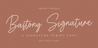 Bastony Signature is is a simple and classy font with unique curves and an elegant inky flow. Features : uppercase, lowercase, symbol, number, ligature, and also support multi language. Bastony Signature is perfect for photography, watermark, social media posts, advertisements, logos & branding, invitation, product designs, label, stationery, wedding designs, product packaging, special events or anything that need handwriting taste.
 - Deadlamp by Letterhend,
$18.00 Unveil the depths of terror and embrace the macabre with our latest font creation, Deadlamp – a hauntingly mesmerizing horror display font that beckons to the shadows. Prepare to embark on a spine-tingling journey into the darkest realms of design, where fear and fascination intertwine. Features : Uppercase & lowercase Numbers and punctuation Alternates & Ligatures Multilingual PUA encoded
 - Graveyard Smash by Comicraft,
$19.00 Tombstones tumble as the night shift begins; as bloodsucking bats turn into pale predators and the undead reach through the dirt that covers their coffins to crush and destroy those who dare cross the cemetery path... Finally there emerges a cold cast of creepy characters, a macabre cadre of lurid letters we had to call… GRAVEYARD SMASH.
 - Poster Linear by Jehansyah,
$9.00 Poster Linear Natural sans serif font is simple but looks very futuristic and very stylish, it adds to your confidence to make your designs look bolder and modern. Perfect for stickers, media posts, social media statuses, magazines, books, covers, game covers, banners, wall magazines, sports shades, and more, plus a few families you can incorporate into your designs.
 - Aussie Stencil JNL by Jeff Levine,
$29.00 An assortment of antique, hand-punched brass stencils from Australia [used for crate marking and shipping] served at the models for Aussie Stencil JNL, which is available in both regular and oblique versions. The lettering of the original stencil punches had rounded edges to the characters; looking more machine rendered than hand punched into the brass sheets.
 - Circles JY by JY&A,
$39.00Based on electrical circuitry, David Philpott's Circles typefaces are oddly legible, even though one might think they were destined for display usage only. The circle is the base form, repeated throughout the design. Originally drafted during his time at the Massey University School of Design, subsequent refinements have turned Circles into two complete fonts with a full character set. - AT Move Tremelo by André Toet Design,
$39.95 TREMELO a typeface based on a logotype (Microtel). We designed it as a complete capital alphabet. The original idea for the logotype font came from the products the firm produced. They provided the parts that go into hearing-aids. We thought the type should have some visual tremor in it. Concept/Art Direction/Design: André Toet © 2017
 - Stock Signs JNL by Jeff Levine,
$29.00 Stock Signs JNL is a collection of fifty-two signs resembling those made by engraving letters into plastic using a pantograph process. There is also a pair of blank signs on the parenthesis keys. To make your own signs or layouts emulating this classic look, try Sign Engraver JNL, which is the font used for these designs.
 - F. O. T. R. by JAF 34,
$9.90 F. O. T. R. is experimental sans serif display font. Space travelling is near so I decided to bring you a brand new typeface based on insight into the future. Clean shapes, a lot of atypical alternates and the futuristic appearance. F. O. T. R. typeface is conceptually connected with a chronophotography project FUTURE OF THE RHYTHM.
 - Oxo by Typedepot,
$24.00 Oxo is an expressive typeface from typedepot. Designed to be used as a decorative, headline font which quickly evolved into great new font usable for large amounts of text as well. Available in 4 weights - thin,light, regular and bold with their matching italics plus three extra weights: Outline, College and Deco which are great addition to the family.
 - Kybul by Invasi Studio,
$19.00 A bubbly, sweet font with a cutoff letterform on detail. Kabul takes another step and brings the bubbly into a casual style. Perfect for use in big sizes on posters or flyers. It's a good combination with sans font. Its imperfections keep it casual while still providing legibility. This is a great combination of casual and retro eras.
 - Haenel Antiqua by RMU,
$30.00 This narrow neoclassical revival is based upon a font released by the Haenel Foundry, Berlin, in the 19th century. By typing [alt] + p respectively [alt] + b you have access to a framing element as it can be seen on the posters. By using the OT feature stylistic alternative you can change the normal numbersign into an oldstyle numero sign.
 - Brighting Lovelyta by Letterena Studios,
$9.00 Brighting Lovelyta is a magical script font carefully created with a touch of elegance. Whether you’re looking for fonts for Instagram or calligraphy scripts for DIY projects, this font will turn any creative idea into a true piece of art! This font is PUA encoded which means you can access all of the glyphs and swashes with ease!
 - Deco Pen JNL by Jeff Levine,
$29.00 Hand lettering found across the sheet music cover of 1931's "Bend Down, Sister" [from the Eddie Cantor film "Palmy Days"] covered a couple of varying Art Deco styles; both made with a round-tipped pen nib. Deco Pen JNL combines the best of both styles into one design that's available in both regular and oblique versions.
 - Bipolar by VersusTwin,
$39.00 The Bipolar family of fonts is a synthetic blend of digital grid and historical blackletter forms, combining readability and ornamentation into a single modern interpretation. If you feel like you recognize this font style, you may have seen it as the menu font in the popular RockBand series of games. This trendy neo-medieval revival is hot!
 - Censorship JNL by Jeff Levine,
$29.00 Censorship JNL joins the wide array of stencil-themed fonts from Jeff Levine. An advantage to this particular design is the larger amount of stencil sections per letter or number. When used with a plotter/cutter, stencils in excess of 12 inches high can be cut into masking material without the cut-out characters becoming floppy or unstable.
 - LITLLE KING PERSONAL USE - Personal use only

- Gold Year Personal Use - Personal use only

- BEEF 3 PERSONAL USE - Personal use only

- THINK EXTRA PERSONAL USE - Personal use only

- BAHAMAS TWO PERSONAL USE - Personal use only

- WATERCOLORS CLEAN PERSONAL USE - Personal use only

- Angelica Personal Use - Personal use only

- Fork Brush Vector by Nirmana Visual,
$22.00 Fork Brush inspired by realistic dry brush. all-caps font was hand-drawn with a real acrylic ink, Fork Brush offers beautiful typographic harmony for a diversity of design projects, including logos & branding, social media posts, advertisements & product designs.
 - Inkblock by Turtle Arts,
$20.00Inkblock is based on various ink printing and rubbings from an ancient wood type set. Inkblock the alphabet has lots of detail, so looks great printed large. It's a good headline font or whenever an antique look is needed. - Kubikajiri by Hanoded,
$15.00 Kubikajiri is a scary, scratchy font, hand-made using India ink and a sharp, old-fashioned pen. You can use it for a variety of projects, like ads, posters and websites. Just be careful you don't lose your head...
 - Second Impression JNL by Jeff Levine,
$29.00Second Impression JNL is the solid version of Lasting Impression JNL by Jeff Levine. It emulates the look of ink-stamped letters and numerals. Based on a 1930s-era set of rubber stamps, there is a limited character set. - Dragon Spell by Hanoded,
$10.00 Dragon Spell is a magical handmade font. It was created with a small brush and Chinese ink. Use it for your spells, your books of magic, or some creepy halloween cards. Dragon Spell comes with a realm of diacritics.
 - Dashie by Muksal Creatives,
$17.00 The "Dashie" font is a captivating modern display typeface with a strong feminine touch. Designed with a blend of retro and vintage elements, this font carries an elegant and alluring vibe. Dashie boasts smooth lines while still exuding gracefulness. Each letter possesses a unique form, with soft contours and slightly curved angles, delivering a sense of sophistication and timelessness. This font is exceptionally fitting for creating feminine branding logos due to its gentle yet powerful characteristics. When integrated into designs, Dashie has the ability to infuse a classic touch of retro or vintage, emanating an aura reminiscent of the past yet maintaining a fresh and modern feel. Dashie is the perfect choice for crafting a visually captivating and memorable identity for brands seeking to stand out with an elegant, feminine style, while incorporating retro or vintage nuances into their brand.
 - Rekita by Twinletter,
$13.00 Introducing “Rekita Font” – Your Gateway to Playful Typography! Rekita Font is a captivating typeface designed to infuse playfulness and creativity into your projects. With its whimsical and charming characters, this font is your perfect companion for any design that seeks a touch of lightheartedness. Whether you’re crafting children’s books, eye-catching posters, or engaging social media graphics, Rekita Font effortlessly adds a fun and youthful vibe to your work. It’s a versatile choice that breathes life into your designs and sparks joy in your audience. Embrace the lively spirit of Rekita Font and unlock a world of creative possibilities. Elevate your design game, grab attention, and leave a lasting impression with this delightful typeface. Discover the magic of Rekita Font and let your creativity run wild with playful typography today! – PUA Encoded Characters – Fully accessible without additional design software.
 - Mont Blanc by Fontfabric,
$35.00 A new type giant emerges taking after the legendary geometric sans serif Mont! Mont Blanc elevates all prized unique details of Mont and translates them into an independent flawless text font family. This type prodigy comes with heaping legibility improvements dedicated to the smaller sizes and challenging paragraphs. The new type family is set to climb to the top of your “favorite design tools” with adjusted x-height, refined weight, and glyphs redesign to name but a few. Venture into new projects equipped with 8 font weights and matching italics, multi-script support, and rich OpenType features set. Language Support: Extended Latin (all Western languages), Cyrillic, Greek OpenType Features: Localized Forms Subscript Scientific Inferiors Superscript Numerators and Denominators Fractions Ordinals Lining Figures Proportional Figures Tabular Figures Oldstyle Figures Case-Sensitive Forms Standard Ligatures Stylistic Alternates Contextual Alternates
 - Ark by Fenotype,
$25.00 Let Ark, an Art Nouveau-infused high-contrast serif, transport your designs into the realm of elegant psychedelia. Ark draws deep inspiration from Heinz Keune's Edda, a remarkable design from 1900. While its vibe might evoke the groovy 70s and the mesmerizing world of trippy album covers, Ark transcends any assumed historical shabbiness. It trims the style into a refined and neatly cut serif, suitable for gallery-worthy presentations, all while maintaining a strong and unmistakable connection to its original roots. The standard letters of Ark maintain a respectable demeanor, only scratching the surface of the font's psychedelic potential. To truly unlock its full potency, try the Swash or Stylistic Alternates, or dig for even more Alternates from the Character palette. Needless to say, that Ark is a natural match for anything trendy, artsy, wierd and fun.


