10,000 search results
(0.011 seconds)
- Oops by Posterizer KG,
$22.00 The initial idea for the Oops font, was to create graphemes, and by using them it could imitate a mark of a spilled liquid-stain. In an attempt to make the most convincing effect, those graphemes were written on glass. The final appearance of the graphemes, mostly remain in their basic form, and have the characteristic of a liquid, like fluidity in motion. This manuscript is expressive, but that does not affect the readability of the letters. The generated font was created by using Photoshop, Illustrator and a little bit of interventions in Font Lab. Font Oops is updated and edited version of an old version of the Art decor font, which had just basic letters. Today, Oops font contains Latin and Cyrillic letters, and it can be ideal for use in subjects like a paintball, art, expression, ink, water...
 - Elvira Serif by Sudtipos,
$39.00 Elvira Serif is a typeface family that proposes to make the use of display serifs a little more fun, including in its anatomy some sharp points, ink traps implanted in some glyphs, and the formality of a traditional serif. All of these elements make Elvira Serif a great option that balances the contemporary with traditional touches. Elvira Serif has 9 weights, as well as true italics, which gives it dimension and versatility in its use. It can be used for a wide variety of purposes: it works well on the web, headlines and especially designed for book publishing at small sizes. Elvira Serif has the ability to look robust and imposing in its black weight, and subtle and elegant in its light weight. Enjoy it, it is made with a lot of passion and fun by Sudtipos and Vástago.
 - Shirah 25 by LightHouse,
$49.00Shirah 25 started as a freehand study, while experimenting with ink and new nibs. Later on, when David decided to have a digital version, he drew it merely with the tablet, trying to keep the spirit of the ink and the nib. Shirah 25 is an OpenType/TTF Unicode font. - Chase by Device,
$39.00 Type that preserves the over- and under-inked textures of true old-fashioned wood faces, now available without ink on your fingers straight from your keyboard. Based on samples taken from early and mid Nineteenth century Clarendons, the font carefully preserves all the battered idiosyncracies of vintage print shop type.
 - Riquet by Lipton Letter Design,
$20.00 In the nineteen-twenties and early thirties, all display typography flourished in Europe. This was especially true in Germany, where poster design set a high creative standard, stimulating the design of a fantastic group of dramatic display letterforms. Richard Lipton designed Riquet after being inspired by a handful of freehand capital and lowercase letters on posters designed by lettering and poster artist Ludwig Hohlwein. He expanded this small group of display letterforms into a variable family with a weight axis. Riquet is a low contrast, delightfully casual typeface with 6 weights and the perfect selection of alternates. All of which gives an expressive look of precisely inked letters perfect for any packaging or branding project.
 - Lianhua by Quatype,
$15.00 Lianhua is a handwritten font with a soft touch, given by a Chinese ink brush. There are lots of Chinese western fonts having a strong, sharp visual feeling, like the strokes of Chinese characters, so I decide to do the opposite: soft. Because except for Yang, there is also Yin in Chinese culture. The name 'Lianhua' means lotus in Chinese. This font is flexible and widely-used, it's suited for book titles, posters, brochures, flyers, even for menus of a Chinese restaurant. The total glyphs in this font is 351, including basic Latin letters and symbols, Latin-Expand A, 10 ligatures and 2 alternate letters, which are the letter g and letter y.
 - Sultania by URW Type Foundry,
$39.99 Sultania is a harmonic synthesis of the old characters’ suppleness and the resolute, clean design of modern typography. The rich in contrast calligraphic approach with thick and thin strokes is still visible and you can almost feel traces of ink on paper while it’s shapes in general, without serifs and any embellishments, proclaim its up-to-dateness swinging between roundness and rigor. Elegant, noble, yet still affected by traces of the handwritten script, Sultania is reminiscent of power, wealth, mind and culture. Sultania’s historical roots and it’s originality remind of oriental colors. A close Orient, at the gates of Europe, in which Latin characters are mixed with distant sounds. The Byzantium of the Sultans.
 - Mike Wieringo by Comicraft,
$29.00 SPIDER-MAN! THE HULK! THE FANTASTIC FOUR! BATMAN! SUPERMAN! Superstar artist Mike Wieringo has worked with the most well-known characters in comic books, and just a few short years ago Comicraft teamed up with Mike and writer Todd DeZago in the pages of their creator-owned comic book fantasy adventure series, TELLOS! At Mike's request, we created a special Wieringo font which incorporated Mike's distinctive, slick-and-easy, backward-sloping letters, as well as a slightly heavier font -- carrying just a little more ink -- for the Shadow Jumper characters featured in the first TELLOS story arc. Now the Mike Wieringo font can be yours as it joins our ever growing library of Masters of Comic Book Art fonts.
 - Creepy Tales by Ditatype,
$29.00 Creepy Tales is a spine-chilling display font that will send shivers down your spine. With its big letters and bold weight, this font demands attention and exudes fear. The horror theme is brought to life with meticulously crafted dripping ink details on each letter, adding a nightmarish and eerie touch to the font. Each letter in this font is bold and impactful, making a powerful statement in your designs. The large size of the letters further intensifies the font's haunting presence. The dripping ink details in this font give the font an organic and unsettling appearance, as if the letters are oozing with dread. These haunting details add a sense of macabre and create an atmosphere of suspense, immersing the viewer into a world of dark and chilling horrors. For the best legibility you can use this font in the bigger text sizes. Enjoy the available features here. Features: Multilingual Supports PUA Encoded Numerals and Punctuations Creepy Tales fits in headlines, logos, movie posters, flyers, invitations, branding materials, print media, editorial layouts, headers, and any project that requires a terrifying touch. Find out more ways to use this font by taking a look at the font preview. Thanks for purchasing our fonts. Hopefully, you have a great time using our font. Feel free to contact us anytime for further information or when you have trouble with the font. Thanks a lot and happy designing.
 - Trocadero Pro by RMU,
$35.00 In 1927 Albert Auspurg cut Trocadero for the Trennert foundry in Hamburg. This new version is not a mere digitalization, but many letterforms were altered and updated, and missing links in the complete alphabet had been drawn afresh. Out came a beautiful cursive font with a certain charm of its own which covers beside the West European languages also those of Central Europe and Turkish.
 - Kodama Forest by Hanoded,
$15.00 Kodama are spirits in Japanese folklore that inhabit trees. The term is also used for trees in which a kodama houses. Kodama Forest is a rough, spikey and inky font, in the style of the great Ralph Steadman. Kodama Forest comes with a bunch of alternates, some interesting ligatures and a lot of splatter. And, of course, all the diacritics you can throw a tree spirit at.
 - Olivetti Typewriter by Intellecta Design,
$28.90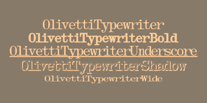 A typewriter font design, great for mimicking the sloppy ink effect of older machines.
 - Demented Avenger by Phat Phonts,
$20.00A splattery grunge font with ink blobs suitable for horror movies or Halloween use - Vacation Resort JNL by Jeff Levine,
$29.00 The hand lettered cast and production credits for the 1942 music comedy “Holiday Inn” (starring Bing Crosby and Fred Astaire) inspired Vacation Resort JNL, which is available in both regular and oblique versions.
 - Sanseki by Hanoded,
$20.00 The term Sanseki (Japanese for Three [Brush] Traces) is used to describe three famous Heian period calligraphers: Yaseki, Gonseki and Saseki. Not that I would ever dream of comparing my messy brush-work with theirs, but the name stuck and I kind of liked it. I used Chinese ink and a high quality brush (which I got in a sale actually) to create this font. All glyphs were hand painted in one go! Sanseki is a very detailed brush font. Upper and lower case letters mingle and there’s even an alternate for every lower case glyph. Comes with an abundance of diacritics.
 - Tokyo Geisha by Kitchen Table Type Foundry,
$15.00 My wife was watching ‘Memoirs Of A Geisha’ the other day, and I am going to take my son Sam to see Japan in May this year, so when I started drawing out the glyphs for this font, the name was already chosen! Tokyo Geisha is a handmade brush font. I made it with Chinese ink and one of the Chinese brushes my late father in law gave me. Tokyo Geisha is a font with speed and a certain flamboyance. It comes with extensive language support and a cool .notdef glyph. I am sure you will put it to good use! Arigato Kozaimasu!
 - Monospasz by Yanone,
$30.00Monospasz means mono-fun in English. It's spelled with 'sz' instead of 'ß' for all you english speaking folks out there who always mistake it with a 'B'. Monospaced fonts keep on drawing attention to them because their proportions stand out from the canon of common fonts. "Yuck. Look at the condensed little m. Isn't that ludicrous?" But Monospasz isn't copycatting traditional typewriters, the most popular of monospaced fonts. It's completely manually ink-written and hand crafted. Monospasz has been designed and first used for the third incarnation of our annual Weimar based typography symposium dubbed "TypograVieh lebt" in the summer 2006. - Youngblood Antique by insigne,
$21.99 Youngblood Antique is a distressed non-connected formal script with tall, sweeping ascenders. Three variants are available, including an inked regular font, a font drawn with a dry brush and a distressed, grungy version. Sixty-four OpenType ligatures add a realistic, natural effect and ensure that no two letters in a word repeat. Youngblood Antique also includes OpenType ending swashes, and old style figures and 30 alternate characters that allow designers to customize the ascender and descender swashes. Be sure to check out the non-distressed original Youngblood. Youngblood Antique works great in conjunction with insigne Splats!.
 - Merlin by Linotype,
$29.00Linotype Merlin is part of the Take Type Library, which features the winners of Linotype’s International Digital Type Design Contest from 1994 to 1997. This font was designed by Anne Boskamp and its alphabet consists exclusively of capital letters. At the same time aggressive and sensitive, Merlin looks as though it were scratched onto paper with a pen tip saturated with ink. Like characters from another time, the letters fall into place and make an impression which is both vulnerable and strong, lively and reserved. Merlin’s historical roots lie in the archaic pictograms in the caves of Stone Age civilizations. - Magical Brush by Hanoded,
$15.00 Personally I think a brush font should have the word ‘Brush’ in its name. It’s not that easy finding a name - you need some magic to come up with a good one! Magical Brush is a completely handmade font. I used a small brush (a number 3 to be precise) and Chinese Ink. I wanted just a little ‘erosion’, so I used copier paper rather than my expensive French water color paper (which is quite rough). Magical Brush comes in the normal variant and a chickenpox one. Use it for your posters, your book covers and your Christmas invitations!
 - Art Materials JNL by Jeff Levine,
$29.00 The cover of the 1930s-era “Catalog of Artists’ Materials” from Ernst H. Friedrichs, Inc. (New York) has the words “Artists’ Materials” hand lettered in a stylized Art Deco sans serif type style. This unique design is now the digital font Art Materials JNL, which is available in both regular and oblique versions.
 - Magie by Eurotypo,
$48.00 Magie is a handwritten font with a strong casual and expressive character. It has the peculiarity of being able to combine capitals and small letters in the same word or in all capital letters. Containing full OpenType features such as stylistic and contextual alternates, swashes, ligatures, initial and terminal forms, up to seven stylistic sets per letter (in uppercase and lowercase). We also include catchwords and ornaments. Imagine the amount of combinations you might do giving your text freshness and naturalness without equal! Magie has a Central European language support to fit your design. This font may looks beautiful on wedding invitations, greeting cards, logos, posters, labels, t-shirt designs, logos, business cards and is perfect for use in ink or watercolor works, fashion, magazines, packaging and food menus, children's books and more!
 - Rito by Wilton Foundry,
$19.00 Rito Regular and Italic is a clean, crisp and modern monospaced font ready to make your work shine. Its distinctive ink-trap inspired chiseled glyphs create a unique flavor that is more pronounced in the italics. Rito is not your typical monospaced boring font - from the outset the goal was to develop an exuberant, dynamic and contemporary mono-spaced font. Ideal for coding, writing and has plenty of attitude to stretch into display formats!
 - Pocomoke JNL by Jeff Levine,
$29.00 Two pieces of vintage sheet music (“Honeymoon Hotel” and “By a Waterfall”) from Warner Brothers' 1933 musical “Footlight Parade” featured a hand-lettered bold alphabet with a touch of the 1930s Art Deco influence. These song sheets served as the basis for Pocomoke JNL. As informal and casual as the design is, its strength is in the boldness of the letter forms (which showcases the era of pen-and-ink display lettering).
 - Slabic by Tour De Force,
$30.00 Slabic is modern slab serif font family available in 12 styles. It’s main characteristics are gently rounded edges, unique serifs and ink traps. Looks and feels compact, harmonized and visually balanced, so readers flow don’t get interrupted during reading. Slabic recommends itself for editorial use or main body webfont, for logos, package design and posters. Slabic contains Small Caps, Fractions, Tabular and Old Style Numerals as Open Type features. Supports extended Latin character map.
 - Panhandler by SparkyType,
$19.00With a hand-inked look, Panhandler flows like decorative but unfussy cursive writing. The font has automatically substituting glyphs and ligatures to avoid some of the problems other connnecting scripts encounter. It also includes a set of swash capital letters and a decorative swash ending lowercase set. Panhandler is available in the OpenType format (both flavours) and will work with on all standard platforms and software. Advanced features will require OpenType compatible software. - Hamada by Linotype,
$29.99 Hamada is a script typeface based on the powerful work of English calligrapher Gaynor Goffe. Hamada captures looseness and charming irregularities of the pen on the page, allowing ink to edge out from the contours and move across curves and letters. Thanks to OpenType, Hamada creates an impression very much like that of real calligraphy. Most of the letters in Hamada have alternate versions; the typeface comes with ligatures, ending swashes, and more.
 - Lorelei by insigne,
$21.99 Lorelei is an exuberant and bouncy script. The ink seems to be slathered onto the surface in a casual and spontaneous manner, making for a flowing and feminine script that is perfect for invitations or greeting cards. The script also contains a large number of OpenType alternates and ligatures to extend the impulsive nature of the lettering. Lorelei is named for a young German maiden that supposedly threw herself into the Rhine.
 - Primaria by PeGGO Fonts,
$18.00 Primaria is a display font, inspired on the very first basic handwrite style teaching at primary school, designed in cursive and print styles in three weights each one: light, Regular and Bold, considering stylistic and typographic needs, it also contain OpenType initial lowercase alternative forms in order to get better links in those case where pairs of letters could be look better. Recommended playful and friendly design, teaching and learning stuff, children toys projects, food & drink and soft stuff.
 - FT Stamper by Fenotype,
$19.95 FT Stamper is made with ink and rubber stamp. It has an oriental calligraphic vibe.
 - CalamityJoe by JOEBOB graphics,
$- CalamityJoe was made with an old brush and ink. Messy on purpose, but still readable.
 - Machia by Dharma Type,
$19.99 Handwriting script with more than enough ink. Rising Stars of My Fonts on September 2006.
 - Nightbird by Hanoded,
$15.00 A very detailed and scary brush font, made with ink, paint and stiff bristle brushes.
 - Big Stuff by ArFF,
$24.95Keep Big Stuff away from toner and ink as it can't resist eating them up. - Amor Serif by Storm Type Foundry,
$55.00Antique monumental incriptional majuscule, originally carved in stone, and sometimes called “Roman Capital”, is the origin of the upper-case part of our latin alphabet. Its narrowed form, derived from handwritten originals used between the first to third century A. D., served as the inspiration for the Mramor typeface, which I drew with ink on paper in 1988 under Jan Solpera’s leadership. After composing negative letters on a strip of film it was possible to use Mramor with the early phototypesetting devices. In 1994 with the help of Macintosh IIvi I added the lowercase letters and bolds, and issued this typeface as 14-font family. After some years of using Mramor for various purposes, I realized a need of modernization and humanizing its very fragile appearance, as well as removing numerous decorative and useless parts. Besides that, type design made a huge technical progress in past few years, so I was able to finish the remaining approximately 9600 glyphs contained in the present font system named Amor. It is already usual to combine sans and serif fonts within one family in order to distinguish (e. g. in a book) historical part from contemporary, a plain chapter from a special one, or, in quotations, to divide speaking persons. Sans-serif typefaces don't arise by simple removal of serifs; they have to be drawn completely separately, when occasionally many declined forms may be made, considered to the serifed original. Nevertheless, both parts of this type system appear consistent as for proportional, aesthetic and emotional atmosphere. Usage of type is often closely linked to its original inspiration, in this particular case with architecture and figurative sculpture. An inner “order” was also text setting in smaller sizes. A smooth scale of weights enriches the possibilities in designing of magazines, brochures, exposition catalogues and corporate identity. Economizing, but opened shape of characters is well legible and antique hint comes into play after longer reading. - Brush Drops by Ditatype,
$29.00 Brush Drops is a modern, impressive font that mixes the brush script characteristics and lovely, smooth ink drop details. This capital letter font shows stronger, more elegant displays. The letter shapes are in soft and smooth brush wipes with even edge lines to show firmer, clearer impressions. Furthermore, the ink drop details show personal, interesting touch on some of the letter parts. Bright, contrast colors will make this font outstanding and eye-catching. In addition, you may apply it for big text sizes to be greatly legible, and enjoy the available features here as well. Features: Multilingual Supports PUA Encoded Numerals and Punctuations Brush Drops fits best for various design projects, such as brandings, quotes, printed products, merchandise, social media, etc. Find out more ways to use this font by taking a look at the font preview. Thanks for purchasing our fonts. Hopefully, you have a great time using our font. Feel free to contact us anytime for further information or when you have trouble with the font. Thanks a lot and happy designing.
 - Varp by Kobuzan,
$25.00 Varp is a rather narrow 2-axis variable geometric typeface with slight reverse contrast inspired by utilitarian and technical design. In Slim and Tight styles, the reverse contrast is enhanced. Typeface is adjustable in width, as if by mechanical deformation of proportions, which is often found in technical and transport markings. The letterforms are based in part on the shapes of DIN fonts, with the deliberate addition of contrasting connections, sharp spurs and massive ink traps for sharpness. With the help of special spacing, selective kerning and adjusted letter width, the effect of a monospaced font is created with no obvious "holes" in the text set, while maintaining a special rhythm. In addition to the width, Varp is adjustable in tilt angle to an extreme 30 degrees and an intermediate 15 degrees in both directions. Features: – Total glyph set: 795 glyphs; – 15 styles (3 widths x 5 italics) + variable; – Support 210+ languages; – Latin Extended; – Cyrillic Basic + Bulgarian letters; – Greek. OpenType features: – Uppercase, lowercase; – Proportional, circled, tabular numerals, superiors, inferiors, fractions; – Punctuations and symbols; – Arrows; – Stylistic sets (ss01-ss04); – Ligatures; – Case-sensitive forms.
 - The Best We Could Do by Chank,
$39.00 The new font “The Best We Could Do” was created by artist and author Thi Bui who used the font in the graphic novel by the same name. The font is brush-script handwriting font which displays human personality rendered with bold confident strokes full of passion and expression. Chank’s work on this font captured Bui’s distinctive textual style and also saved her a ton of headache and time in inking. A debut memoir that tells the story of one family’s journey from their war-torn home in Vietnam in the 1970s to their new lives in America, the autobiographical book is lauded for its heart-breaking exploration of identity, family, and home. Bui ties her modern life with the multi-generational experiences of her family, weaving together the emotional threads of their relationships to find clarity in her current day. “The Best We Could Do” graphic novel is published by Abrams ComicArts and is available wherever fine books are sold.
 - Bizarries by Typephases,
$25.00 This series, with 104 illustrations in three files, collects original ink drawings with absurdities, bizarre people, whimsical personalities and risky behaviors! There is a very peculiar sense of narrative in the sucession of characters, even if they came out rather spontaneously and their order is random.With a vintage look and feel, these people seem to come out of a time capsule from Victorian times. Almost everything in the Bizarries (and also in their close relatives, our Illustries, Whimsies, Ombres, Absurdies and Genteta dingbats) is invented and drawn with no references —just a handful of images were sketched from historical photography. These illustrations can be very useful for a variety of projects, either in black and white, or colored in a paint or drawing application. You can use them at any size, from a small spot illustration to a huge poster, depending on your needs. The outlines remain crisp and clear no matter how much you enlarge, reduce, distort or tweak their shapes.
 - Bousni Ronde by Linotype,
$29.99The Bousni family's six faces display links unexpected by most readers of western alphabets. Inspired by both by Arabic calligraphy, and contemporary bitmap design, Bachir Soussi Chiadmi created this playful series of faces. Letters in each of the six typefaces link together, but not in the ways normally expected from script fonts. Suited for a wide array of fun functions, Bousni Carre and Bousni Ronde (each available in Light, Medium, and Bold weights) bring new a style and flavor to your collection. All six fonts in the Bousni family are included in the Take Type 5 collection from Linotype GmbH. The Bousni family espouses similar construction traits with other fonts from Linotype. Specifically, the straight lines and joints in the three Bousni Carre fonts are based off of a grid system similar to Anlinear, another member of the Take Type 5 collection from Linotype GmbH. The letter connections throughout the Bousni family are similar to Arabic kashidas, a typographic feature found recently in many non-Arabic typefaces, such as Linotype Atomatic."