10,000 search results
(0.065 seconds)
- Blue Goblet Drawn by insigne,
$5.00 This best selling series has now been extended to include a new member, Blue Goblet Drawn. Blue Goblet is hand-drawn by the artist, Cory Godbey, and is organic, charming and exuberant. Characters bounce and dance above and below the baseline and x-height, making this a whimsical and fun script. Not only is Blue Goblet Drawn a excellent choice, it also is also a versatile member of a wide family of different fonts. You can use it side by side with the original Blue Goblet fonts, and there are a wide range of ornaments available in the supplemental ornament sets--over 370 illustrations! These illustrations include doodley frames, lovely florals and other text ornaments that can be inserted into your text and resized at will. This makes the Blue Goblet series a great pick when you want a type system for a very unique and consistent look. The Blue Goblet series also continues to expand, making any of these family members a valuable investment for the future. Blue Goblet Drawn comes in three weights and three widths in each weight, with complementary italics for maximum impact for a total of eighteen pro fonts. The compact thin weights are delicate and tall, while the Regular has just enough heft for those situations where subtlety doesn't work. If you don't need the professional features, there are three stripped down fonts that include only the basic character set! Blue Goblet Drawn also includes auto-replacing ligatures that make it appear that the script was drawn by the artistís own hand--just for you! Blue Goblet Drawn also includes a wide variety of alternates that can be accessed in any OpenType enabled application. Blue Goblet includes over 190 additional glyphs and is loaded with features including an even more unique alternate alphabet. Included are swash alternates, style sets, old style figures and small caps. Please see the informative PDF brochure to see these features in action. OpenType enabled applications such as the Adobe suite or Quark can take full advantage of the automatic replacing ligatures and alternates. This family also includes the glyphs to support a wide range of languages. Blue Goblet Drawn is a great choice for friendly display type in children's books, packaging, organic packaging or other unique applications. Use Blue Goblet whenever you want to inject a handmade sense of fun and whimsy to your designs. Give the Blue Goblet series a whirl today!
 - Nu Sans by Typecalism Foundryline,
$30.00 Nu Sans is a modern and stylish sans-serif font product that was created in 2020. It is a versatile typeface that comes with three different axis options: weight, width, and slant, allowing users to create a wide variety of unique and dynamic typography designs. With a total of 90 complete static fonts, Nu Sans offers an extensive range of options for designers looking for a clean and contemporary font choice. The font family features a bold, geometric design with sharp angles and clean lines, giving it a distinct and modern. Nu Sans is perfect for use in a range of design applications, including advertising, branding, editorial design, and web design. Its dynamic and versatile nature makes it a great choice for any project that requires a strong and bold visual impact. a high-quality font product that offers designers a wide range of options and possibilities. Its modern and stylish design, combined with its triple axis options, makes it a great choice for anyone looking for a versatile and unique sans-serif font.
 - Termit by Ditatype,
$29.00 Termit is a striking display font designed with a game theme, featuring large letters with a fairly thick weight and a rectangular shape with sharp corners. This font shows large letters that demand attention and create a bold statement. The rectangular shape with sharp corners in Termit adds a sense of structure and stability to the font. The clean lines and defined angles create a visually bold and impactful appearance. This unique feature evokes a sense of strength and resilience, reflecting the competitive and strategic nature of the gaming world. Each character shares the same height and width, creating a cohesive and pleasing visual experience. With its low-contrast design, it offers a subtle and understated look. The minimal variation in stroke width adds a sense of uniformity and simplicity to the font, allowing the overall design to take center stage. This feature ensures that the focus remains on the content while still maintaining a strong visual impact. Enjoy the available features here. Features: Stylistic Sets Multilingual Supports PUA Encoded Numerals and Punctuations Termit fits in headlines, logos, posters, titles, branding materials, print media, editorial layouts, website headers, and any other game-themed projects. Find out more ways to use this font by taking a look at the font preview. Thanks for purchasing our fonts. Hopefully, you have a great time using our font. Feel free to contact us anytime for further information or when you have trouble with the font. Thanks a lot and happy designing.
 - Typer Pro by (v) design,
$25.00 Typer Pro (formerly Consul Typewriter Pro) is a modern OpenType font family reviving the look of old typewriters. Its carefully converted forms are detailed enough even for high pointsizes while keeping a reasonable number of outline points. Typer Pro comes in two variants: Typer Pro Mono is strictly monospaced (all characters occupy the same amount of horizontal space – this way old typewriters usually operated). However, sometimes a more even appearance may be desirable. Therefore, Typer Pro Text has been proportionally altered for a more pleasant and balanced look. Moreover, it is possible to achieve both proportional and monospaced look in both families via Stylistic Sets. You can choose from four different weights in each family and pick characters from its extensive glyph set. Typer also contains a number of Stylistic alternates, randomly replaced alternative letters to avoid the repetition of letters in a word. Typer Pro is a versatile typeface and is perfectly legible even at small sizes and on-screen. When printed, it looks best at its original size around 11–12 pt. Typer supports many OpenType features and offers great multilingual support for most of Latin-based languages. Feel free to download the detailed PDF Specimen.
 - Diaconia Old Style by Hackberry Font Foundry,
$24.95Diaconia Old Style is a new rendition of my workhorse body copy font that I originally designed to use for the body copy of "Printing in a Digital World." I became increasingly upset with the lack of lowercase numbers and true small caps. Diaconia started life as a modification of one of the Dutch Bible fonts I traced. It has changed a lot since then (although I have a hard time telling how much because I have lost the original). The plain and italic work especially well when used in very large sizes as display faces. The other four variants (small caps, heavy, heavy italic, and black) are designed for use in book production. Because I format all my own books, I was able to design fonts that met my needs exactly: lowercase numbers, SMALL CAPS font, Mac Command, Option, and Control symbols, ballot box in the section slot, and several other special characters. DiaconiaPro is the OpenType family of my body copy workhorse. This is the first font family I ever created: classic, elegant, easy to read. 583 characters: small caps, oldstyle figures, numerators, denominators, lining figures, accents and a lot more. - ITC Napoleone Slab by ITC,
$29.99There is something straight-forward and no-nonsense about slab serifed typefaces. Calligraphic designs, on the other hand, evoke a sense of humanity and immediacy - even intimacy. ITC Napoleone Slab combines both slab serif and calligraphic design traits into a single typeface design. Heady stuff. The result is unlike almost any other slab serif typeface. According to designer Silvio Napoleone, “The concept developed from my explorations as a student in an independent lettering class. I sketched many historical letterforms by brush. I continued experimenting for several years after, sketching by hand and on the computer. Eventually, I chose the slab serif for production because of its distinctive design quality.” ITC Napoleone Slab is exceptionally versatile. The family is economical in width and contains true italic designs, oldstyle numbers and a suite of special ligatures. According to Silvio, “Napoleone Slab was designed to work well at all sizes, and in on-screen applications.” Silvio currently lives in Toronto, where he works for a “young, enthusiastic interactive firm.” His designs have been exhibited nationally and internationally, and his work was also part of a traveling exhibit for the American Institute of Graphic Arts. - Klein by Zetafonts,
$39.00 Klein PDF Specimen Klein is Zetafonts love letter to the grandmother of all geometric sans typefaces, Futura. Starting from a dialogue with Paul Renner’s iconic letterforms and proportions, Francesco Canovaro and Andrea Tartarelli decided to depart from its distinctive modernist shapes with slight humanist touches and grotesque solutions - with some design choices evoking the softness of humanist sans serifs like Gill Sans. The end result is a workhorse superfamily of 54 fonts with full multilingual capabilities and coverage of over two hundred languages using latin, cyrillic and greek alphabets. The original display-oriented family, developed in nine weights with matching italics (from the hairline thin to the sturdy black), has been paired with a text version (with slightly higher x-height, better readability and maximum legibility at small point size) and with a condensed version, to be used for space-saving display solutions in editorial and advertising formats. With a name that is both a nod to its humble functionality and an homage to french nouveau realiste artist Yves Klein, this typeface aims to become your next trusted companion in all your adventures in print, digital and motion design.
 - Daiquiri by Wiescher Design,
$39.50 Daiquiri is a revival of a handlettered font in two weights, from an ad for Puerto Rico Rum dating back to the forties or fifties. I found the ad on a French antique market on my last visit for Mardi Gras in Nice. The ad read "Breeze through the heat, be a Daiquiri fan". That's why they had this "fan" in the illustration! Did they want you to rotate like a fan when you had enough Daiquiris? Or did they just do it for that little "Jeu des mots"? Anyway I found the handlettering very pretty, so I took those few letters and made a whole font out of them. I think Daiquiri has that touch that brings those happy and uncomplicated times back when advertising was still fun. I started something like 20 years later in advertising and things had gotten more stringent. We already had to satisfy those marketing guys with their scholarly attitude. They have taken all the fun out of the job, for the creators as well as for the consumers. I would like to see more uncomplicated ads like this again, yours Gert Wiescher
 - Mandilla by Create Big Supply,
$15.00 Introducing Mandilla, a captivating bold calligraphy font that showcases natural brush strokes and exudes elegance in every character. With its distinctive style and versatility, Mandilla is the perfect choice for a wide range of design projects, from logos and labels to magazines, books, packaging, and more. The bold and dynamic nature of Mandilla makes it ideal for creating impactful and eye-catching designs. Its smooth and fluid brush strokes lend a sense of authenticity and craftsmanship to your typography, adding a touch of sophistication to your visual compositions. Mandilla features a harmonious combination of uppercase and lowercase letters, offering flexibility and creativity in your design work. The font also includes numbers and punctuation, ensuring seamless integration of numerical and textual elements in your projects. With multilingual support, Mandilla allows you to communicate your message effectively in various languages, making it accessible to a global audience. The font incorporates ligatures and alternate characters, enabling you to add subtle variations and artistic flourishes to your text. Mandilla is designed with PUA (Private Use Area) Encoding, granting you easy access to special characters and alternate glyphs. This feature enhances your design process, empowering you to create unique and visually captivating compositions.
 - Behrens Ornaments by SIAS,
$39.90 With Behrens Ornaments SIAS presents a historic revival font for the very first time. Peter Behrens (1868–1940) was a German designer and architect rooted in the style of the Art nouveau era but later became one of the most prolific exponents of the modernist movement in the 1920ies and 1930ies. The design of typographic ornaments was one of many fields of his activities. The “Behrens Schmuck” set of adornment types layed dormant for many decades, known only to letterpress freaks and specialists. After 100 years, with this release SIAS celebrates one of the creative masterminds in German design history, unearthing a treasury of 80 unique ornaments and embellishment pieces for nowaday’s use. In order to attain a faithful remake as authentic as possible, the Behrens ornaments have been photographically reproduced from a 1914 specimen book. The outlines have been edited carefully to minimize accidental visual disturbances, yet the main goal was to keep the “smell” of the original letterpress printing as good as possible. If you like fine ornaments you should also have a look at Arthur Ornaments, Andron Ornaments and Leipziger Ornamente.
 - Various by Ahmad Jamaludin,
$17.00 Say hello to VARIOUS! Completely unique and custom font with a 00s style, inspired by vintage and hand-painted retro signs :D Various is a font with a delightful retro touch perfect for capturing the essence of the 60s, 70s, 80s, 90s, and even Y2K designs! Its unique characteristics will transport you to those iconic eras, adding a nostalgic vibe to your creative projects. Various come in two versions - Regular and Outline. With two different style fonts, you can easily create eye-catching designs without any extra effort This font is perfect for a retro 00s theme and can be used for cover magazines, brochures, logos, headlines or quotes, stand-alone displays, and short paragraphs or content. Each font in the family is dynamic and authoritative on its own, making it perfect for any display project. What do you get? Various Various Outline Alternates and Ligatures Instructions ( Access special characters, even in circuit design ) Letters, numbers, symbols, and punctuation No special software is required to use this typeface even work in Canva Multilingual Support Let Various take you on a journey through time Enjoy your day! Dharmas Studio
 - Galvantur by Ivangard Studios,
$12.00 Galvantur is a sans serif font, suitable for a wide range of applications. The main characteristic of this font is the slightly alien feel it can invoke, allowing it to really appear different and stand out, comparative to what other sans serifs may look like. The multiple styles included can further help customize your designs and projects, whether it's a body of text or an attention grabbing title. For example switching a block of text from regular style to oblique, can drastically change the overall appearance and feel of said text. Comes in 7 different styles - Regular, Oblique, Bold, Bold Oblique, Outlines, Bold Outlines and Oblique Outlines. To get an idea of the various styles, please check out the preview pictures or use the preview field to type in text. A full list of the glyphs included in this font can also be seen in the preview images. Galvantur supports Latin and Cyrillic based languages. The font includes a single alternative character for the letter "h". Because of the lack of ligatures and alternates, the font is rather standardized and will work with any and all software/applications.
 - Miss Mable by Cory Maylett Design,
$25.00 Miss Mable is a high-quality, well-proportioned contemporary typeface with variations in thick and thin strokes that contains a hint of previous decades. I wanted to create enough weights and widths to make the typeface suitable for a wide range of uses where a soft, stylish, and friendly look is appropriate. The Miss Mable type family consists of 44 fonts. The family encompasses seven weights across three widths in Roman and italics plus variable versions. Each font contains a complete set of characters for Western and Central European languages. In addition, OpenType features include dynamic fractions, alternate glyphs, ligatures, plus proportional, tabular, and old-style numerals. These high-quality fonts are fully compatible with Windows, Macintosh, and Linux. Also for sale are two Miss Mable variable fonts that include all Roman and italic glyphs of every width and weight plus everything in between. For example, if you need something slightly bolder than bold and a little wider than semi-condensed, the variable fonts make that possible without distortion. Variable technology is new, however. All modern web browsers support variable fonts, but support for most desktop software is still spotty.
 - Linotype Devanagari by Monotype,
$103.99 The new Linotype® Devanagari typeface is a traditional text face now available in five weights (from Light to Black) and suitable for a wide variety of print and digital uses. A compact design, Linotype Devanagari also provides economy of space where textual real estate is at a premium. In addition, its large character set enables the setting of Hindi, Marathi, Nepali and is suitable for Sanskrit passages. The design’s open counters ensure high levels of legibility at small sizes and at modest resolution. The history of Linotype Devanagari is quite extensive. Inspired by the late 19th and early 20th century Nirnaya Sagar designs, it was originally designed in 1977 by Mathew Carter for phototypesetting systems. It was then revised and expanded for digital typesetting by the Linotype letter-drawing studio headed by Georgie Surman under the art direction of Fiona Ross. This new, enhanced revival was designed by Lisa Timpi and Gunnar Vilhjálmsson with Fiona Ross as a consultant. This new Linotype Devanagari is part of a project to refresh the pivotal Linotype Bengali and Linotype Gujarati typefaces and make them available for the first time in the popular OpenType font format.
 - Vito by Dots&Stripes Type,
$70.00 Vito is a strong and elegant sans serif family in 60 styles. A wide range of weights and widths offering tremendous typographic flexibility. Perfect to mix in magazines or packaging, corporate designs or movie titles. Masculine and sporty for adrenaline junkies, reliable and elegant for serious typographers, but with a touch of bling for high snobiety. Vito was selected as one of Typographica’s favorite typefaces of 2015. The Vito Family sets its goal to stay very functional but with a strong and unique look. Neutrality is good, but sometimes you need a bit more edge. The extreme weights and widths work great in title sizes, while the normal weights make longer texts deliciously readable. The classic and elegant outlook in all sizes make the family suitable for everything high quality. While the family looks great on the outside, it is even greater on the inside. Loads of OpenType-Features, a big amount of language support, and the flexibility of alternative letters, make working with Vito easy and exciting. And the big range of widths invite you to mix all together, and find new ways to express your designs. We would love to see, what you come up with!
 - Cavole Slab by insigne,
$22.00 Cavole Slab is a new slab serif, designed in early 2011, that has a strong influence from Dutch typography. The name is an altered form of the Portuguese word for feather, emphasizing the typefaceís soft and friendly character. Slab serifs give this face plenty of impact and make it an excellent choice for contemporary designers. The font family includes a very dark and powerful black all the way down to a hairline thin weight, giving a tremendous versatility. The family also features dynamic italics that add plenty of emphasis and momentum. Cavole Slab is suitable for both headline and text settings and should easily find its place in a number of different settings, from corporate identity to magazine body copy. There are six weights that come with complementary italics, and each font includes over 450 characters and extended Latin-based language support. The typeface family comes in OpenType format, and OpenType alternates are easily accessible through OpenType enabled applications such as the Adobe suite or Quark. Please see the informative .pdf brochure to see what OpenType features are available and to see them in action.
 - Mousse Script by Sudtipos,
$79.00 Mousse Script is based on Glenmoy, a 1932 Stephenson Blake typeface. Glenmoy a prime example of what display typography was in pre-WWII American ad art. It graced the pages of magazines, sold numerous products and services, then simply died out when the typographic trends shifted towards the more personalized, stylized and handwritten types of calligraphy. The current trend in typography is a revivalism that brings all of the distinctive display typography of the 20th century, without chronological discrimination, back in the name of ‘retro’. Who are we to deny the masses what they want? Mousse Script doesn’t just bring Glenmoy back from the ashes of the 20th century. It expands upon the limited metal character set nearly twice over and takes advantage of the latest type technologies. This makes Mousse Script a striking typeface, both functionally and visually. A simple, attractive display font on the surface, Mousse Script is unique in its bold upright calligraphy, something rarely found these days. The OpenType version of Mousse Script combines both the regular and alternate character sets into a single, cross-platform package that takes advantage of the extended typographic features of the OpenType format.
 - Malaga by Emigre,
$59.00 Why do we need another typeface? This is a prickly question often asked of typeface designers. Depending on who you ask, the answer in simplified form is usually one of two: 1. As the basis of written communication, type design carries social responsibility, so we must continue to improve legibility. 2. Type design is a form of artistic expression. Without art, life is not worth living. The best work, of course, accomplishes both. Xavier Dupré, the designer of the Malaga typeface family, has at least one leg securely planted in the latter notion. He believes, like others, that within typeface design most legibility needs have been worked out and that today we are satisfying aesthetic desires. We design typefaces to differentiate our communications. Type design is primarily a formal exercise reflecting our personal quirks, technological obsessions, and cultural heritage. In case of Dupré’s work, issues of cultural heritage and personal quirks are of particular consequence. An incessant traveler, he visited the following countries during the development of the Malaga type family: Thailand, Malaysia, Indonesia, Myanmar, Cambodia, Vietnam, France, Belgium, and finally, Spain, where his choice for the name Malaga originates (Malaga is a port city in southern Spain). Dupré’s home is where his laptop is. He travels with a 12- or 15 inch PowerBook, without a printer, and with sporadic access to his reference books and other historical documents. All he needs is a table and chair. He even learned to design without a mouse since hotel and cafe tables are often too small to also fit a mousepad. Dupré is the new global designer who can take disparate influences and fluidly process the information into a coherent whole. Malaga is a case in point. It is inspired by ideas ranging from blackletter to Latin fonts, and from the Quattrocento’s first Venetian antiquas to brush stroke types. This makes Malaga a richly animated font saturated with unorthodox detail. Its black and bold weights are particularly suited for headlines and short texts, while the subtle modulation and moderate contrast in the regular and medium weights makes it perfectly readable in extended text settings. While Malaga doesn’t claim to resolve any particular legibility issues, it is nonetheless perfectly readable and will impart any design with a healthy dose of visual character.
 - Cut Sans Serif by Aksharasarovara,
$25.00The thought behind this font was not to join vertical, horizontal and diagonal stems. Each stem is designed separately and arranged in a good manner to create glyphs. Something different from tradition; liberal, but in the limit. - Song Sheet JNL by Jeff Levine,
$29.00 Sheet music for the 1930s song "Josephine" had its title hand lettered in a simple, bold sans design that is recreated in Song Sheet JNL. This bold sans is perfect for titling wherever strong emphasis is necessary.
 - Mundo DemiBold by Type-Ø-Tones,
$40.00 Mundo DemiBold is the perfect counterpart of the Hannover Modern, the other Javier Mariscal typeface in our catalogue. This nice font belongs to a series of drawings used in the Señor Mundo comic strip of the nineties.
 - Antiqua Roman by Yuanchen Jiang,
$30.00 This typeface is called Antiqua Roman. The biggest feature of this typeface is each letter contains a very thin stroke. Design based on the original handwriting letters made by Fritz Helmuth Ehmcke in 1907. Redesigned in 2015.
 - Blue Creek by ActiveSphere,
$30.00 BlueCreek is a extra condensed geometric typeface, and works best in text and display applications, such as headline, posters, signage, magazine, print, product branding, corporate branding, logos and titles. Several alternate characters are included in this typeface.
 - Secret Operation JNL by Jeff Levine,
$29.00 The movie poster for the 1952 bank heist drama “Kansas City Confidential” had its title hand lettered in a condensed serif stencil design. This inspired Secret Operation JNL, which is available in both regular and oblique versions.
 - Roadside Diner JNL by Jeff Levine,
$29.00 The hand painted signage from a 1950s era photo of the Miami Diner Restaurant in Miami, Florida inspired the digital version of its 1940s-influenced lettering. Roadside Diner JNL is available in both regular and oblique versions.
 - Portfolio by Wilton Foundry,
$29.00 In spite of the fact that Portfolio's capitals are highly ornate, it is still very legible. Portfolio, in combination with its elegant lowercase, creates a prestigious presentation useful for Certificates, Wedding Invitations, Corporate Identities, Brochures, and Headlines.
 - Nokian11 by GRIN3 (Nowak),
$16.00Nokian11 is a font inspired by an old Nokia phone display. It was created in 2001 and named Nokian. Nokian11 is a new, improved version with full set of glyphs and covers most of European languages. - Fixed by Produce,
$29.00 Every letters in this font family has a fix width. It has a softer take on the typical monospace fonts. The constraint has create an interesting and playful look on letters especially the extra long ones.
 - SarahfSlob by Ingrimayne Type,
$9.95 SarahfSlob is a crudely drawn, serifed typeface that abhors straight lines and smooth curves. It comes in five weights and ten styles. It is very legible and is suitable when a funny, informal font is desired.
 - Spring#7 by Joey Maul,
$12.00 Spring#7 is a 1900s-style font based on text on postcards found after the turn of the century. Italic in nature, it works nicely for text and graphics that need a humble old-timey look.
 - Channels by Arendxstudio,
$15.00 Channels is a semi-modern font family that is wrapped into a retro style that is very creative and strong and will be very suitable for the various types of design projects you place it in.
 - Absinette by Greater Albion Typefounders,
$8.95 Absinette takes us straight back to 19th century France. Its a decorative family of Roman faces in three widths as well as a more elaborate inline style, ideal for posters with an Edwardian or Victorian theme.
 - Melody and Memory by Epiclinez,
$19.00 Melody and Memory is a delicate and elegant handwritten font. Its distinct and well rounded letters make this font a masterpiece. Fall in love with its incredibly versatile style and use it to create spectacular designs!
 - Kitami by Talbot Type,
$19.50Talbot Type Kitami is a minimal, geometric, stencil display font, inspired by Herbert Bayer’s Universal Typeface, created at the Bauhaus in the 1920s. Each character is created from a single continuous stroke, or combination of strokes. - Sign Trade JNL by Jeff Levine,
$29.00Sign Trade JNL is a reworking of Sign Crafter JNL. With a traditional M,N and W replacing the stylized versions of these letters in the previous font, Sign Trade JNL also offers an oblique version. - Erasurehead by Aboutype,
$24.99A decorative display face suitable for short headlines, drop caps or banners. Erasurehead was designed for all media and can be used in a wide range of point sizes. Erasurehead requires subjective display kerning and compensation. - Floridian Script by Monotype,
$29.99Floridian Script is a contemporary script font, released in 1972, with a clean appearance. Floridian Script's uppercase M and Q are unusual while the lowercase script is more simple than standard scripts based on copperplate handwriting. - Typogravure by Jonahfonts,
$40.00 A family with a retro feel with 12 styles in 6 weights, for both headlines and body text use as well editorial and corporate design from advertising to packaging and digital design. Supports Central/European languages.
 - Thanks Friend by Attractype,
$12.00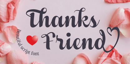 Thanks Friend is a beautiful script font with thickness suitable for greeting card designs, invitations, t-shirt sublimation, event lettering, and crafts. This font features a lovely swash in all lowercase and several ligatures and alternatives.
 - Roxy Vp by Bejeletter,
$14.00 Roxy Vp comes in bold, its a cool, robotic and thick lettered display font. This font is ideal for writing web designs, business cards, or pretty much anything else that requires a modern and techno touch.